This tutorial will review the steps necessary to ensure that your iOS apps will continue to look great when displayed on the new iPhone 5 screen.
Download the Latest Tools
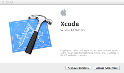
In order to create apps that are compatible with iOS 6 and the iPhone 5, you’ll need to ensure that you have Xcode 4.5 (or later) and the iOS 6 SDK installed on your development machine. With Xcode open, select Xcode > About Xcode from the menubar to check the currently installed version.

To get the latest tools, you’ll need to go to the Apple Developer Center after registering as an Apple developer.
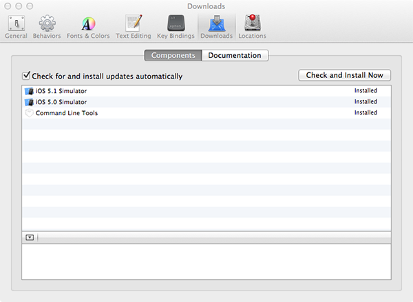
I would recommend taking the additional step of installing both the iOS 5.1 and iOS 5.0 simulators and the “command line tools” after you install the latest version of Xcode. To do this, select Xcode > Preferences and then go to the Downloads tab. Install the additional options listed. When you’ve done so, the window should look like this:

Use an iPhone 5 Default Launch Image
You’ll need to include an image named Default-568h@2x.png in your project in order to take full advantage of the iPhone 5 display. It may seem arbitrary, but the existence of this file is what will determine whether your application runs in letterbox mode (i.e. with black bands above and below the content) or in fullscreen mode.
Of course, the Default-568h@2x.png file has another purpose as well: it will be the default image shown when your application loads on an iPhone 5. This serves the same function as the Default.png file for non-retina iPhone/iPod touch devices and the Default@2x.png file for the iPhone 4/4S.
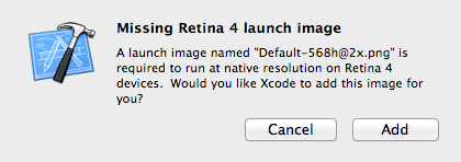
When running a project in Xcode 4.5 without the Default-568h@2x.png file, you might get an automated popup like this one:

If so, go ahead and click “Add” to have Xcode create a solid black launcher for you, just remember to change it later to something more appropriate for your application.
If you don’t see the Xcode popup, you can save this image to your computer and then drag it into the Xcode project navigator area to add it to your project. A plain black launch image isn’t ideal, but it will satisfy the requirement and place your app in fullscreen mode.
Build and run your project on an iPhone 5. Ideally, you should be good to go with no further adjustments! However, there are a number of reasons why your app might not look right at the new resolution. The second half of this tutorial will cover debugging applications that fail to display appropriately after following this step.
Transition to Dynamic Layouts
iOS developers have been somewhat pampered in comparison to their Android peers when it comes to view layout programming. To begin with, all of the initial iPhone and iPod touch screens had the same display resolution: 320×480 pixels. When the retina display used by the iPhone 4 and 4S was introduced in 2010, the display resolution doubled to 640×960 pixels, but developers were still able to refer to the screen size in code as 320×480. Why? Because with iOS 4 Apple introduced the concept of “logical points” into UIKit. These points could map to physical pixels dynamically via the contentScaleFactor property of the UIView class. The contentScaleFactor was then set to logically mirror the resolution change by defaulting to 1.0 on the iPhone 3G/3GS and 2.0 on the 4/4S.
To quote from Apple’s Drawing and Printing Guide for iOS:
In iOS there is a distinction between the coordinates you specify in your drawing code and the pixels of the underlying device. When using native drawing technologies such as Quartz, UIKit, and Core Animation, the drawing coordinate space and the view’s coordinate space are both logical coordinate spaces, with distances measured in points. These logical coordinate systems are decoupled from the device coordinate space used by the system frameworks to manage the pixels onscreen.
The system automatically maps points in the view’s coordinate space to pixels in the device coordinate space, but this mapping is not always one-to-one. This behavior leads to an important fact that you should always remember:
One point does not necessarily correspond to one physical pixel.
The purpose of using points (and the logical coordinate system) is to provide a consistent size of output that is device independent. For most purposes, the actual size of a point is irrelevant. The goal of points is to provide a relatively consistent scale that you can use in your code to specify the size and position of views and rendered content. How points are actually mapped to pixels is a detail that is handled by the system frameworks. For example, on a device with a high-resolution screen, a line that is one point wide may actually result in a line that is two physical pixels wide. The result is that if you draw the same content on two similar devices, with only one of them having a high-resolution screen, the content appears to be about the same size on both devices.
So, as iOS developers we’ve had it fairly easy thanks to this innovation. However, with the introduction of the 640x1136px resolution of the iPhone 5, using a vertical size of 480 points will no longer fill all available vertical space.
To see this in action, assume that a programmer is trying to add a custom background view programmatically to the root view controller of their application. Pretend that the programmer wrote this code in order to do so:
    UIView *customBackgroundView = [[UIView alloc]
                                    initWithFrame:
                                    CGRectMake(0.0f, 0.0f, 320.0f, 480.0f)];
    customBackgroundView.backgroundColor = [UIColor redColor];
    customBackgroundView.autoresizingMask = UIViewAutoresizingFlexibleHeight | UIViewAutoresizingFlexibleWidth;
    [self.view addSubview:customBackgroundView];
Prior to the iPhone 5, the above code block would have worked just fine. The 320×480 logical points would map to 640×960 with the default 2.0 scale factor of the iPhone 4/4S. However, on the iPhone 5, the height will still be mapped to 960 pixels and will come up short:

Solving this problem is fairly simple:
    UIView *customBackgroundView = [[UIView alloc]
                                    initWithFrame:
                                    CGRectMake(0.0f, 0.0f, self.view.frame.size.width, self.view.frame.size.height)];
    customBackgroundView.backgroundColor = [UIColor redColor];
    customBackgroundView.autoresizingMask = UIViewAutoresizingFlexibleHeight | UIViewAutoresizingFlexibleWidth;
    [self.view addSubview:customBackgroundView];
In this scenario, we just had to pull the size of the current root view dynamically in order to place the new, custom background view over the entire area.
For another example, let’s assume that the programmer wanted to create a new view programmatically in the loadView: method:
- (void)loadView
{
    CGRect applicationFrame = [[UIScreen mainScreen] applicationFrame];
    UIView *customView = [[UIView alloc] initWithFrame:applicationFrame];
    customView.backgroundColor = [UIColor redColor];
    customView.autoresizingMask = UIViewAutoresizingFlexibleHeight | UIViewAutoresizingFlexibleWidth;
    self.view = customView;
}
The applicationFrame property of UIScreen will return the frame rectangle bounds used for the window of the current application, minus the area occupied by the status bar (if visible). You can alternatively get just the bounding rectangle of the screen with [[UIScreen mainScreen] bounds]. Both values will be returned in logical points, not pixels.
While the above code examples are useful, they are also somewhat limited. In practice, you may have to deal with more complex scenarios that involve dynamically sizing many subviews depending on the device screen height.
Fortunately, there are at least three different approaches you can use to do so.
View Autoresizing
The UIView property autoresizingMask is a simple yet effective means for ensuring that subview objects adjust dynamically relative to their superview. In the above code snippet, I used this to make sure that both the width and height of the custom background view object would scale appropriately with orientation changes:
customBackgroundView.autoresizingMask = UIViewAutoresizingFlexibleHeight | UIViewAutoresizingFlexibleWidth;
Note that the autoresizingMask property can be controlled visually from within Xcode/Interface Builder as well.
Most applications that use UIKit controls and default containers should be able to work just fine on the iPhone 5 by combining variable values for frame creation (as shown earlier) and setting intelligent autoresizing properties on subviews.
Refer to the official Apple documentation and the view programming guide for more information.
The Auto Layout System
The new Auto Layout system introduced with iOS 6 provides an advanced method for controlling view placement. Auto Layout uses a system of constraints to explain and enforce view relationships. The only downside to using Auto Layout is that it is not compatible with iOS 5 and prior.
Further coverage of Auto Layout is beyond the scope of this tutorial. Those who want to learn more should consult Apple’s Cocoa Auto Layout Guide and the WWDC 2012 Introduction to Auto Layout session.
Device Testing
Another approach being adopted by some is to attempt to check if the current device is an iPhone 5 at runtime. The most advanced version of this I’ve found is from this answer on StackOverflow.
The following is a slightly modified version of the macros created in the StackOverflow post:
#define IS_IPHONE ( [[[UIDevice currentDevice] model] isEqualToString:@"iPhone"] )
#define IS_IPOD   ( [[[UIDevice currentDevice ] model] isEqualToString:@"iPod touch"] )
#define IS_HEIGHT_GTE_568 [[UIScreen mainScreen ] bounds].size.height >= 568.0f
#define IS_IPHONE_5 ( IS_IPHONE && IS_HEIGHT_GTE_568 )
The first and second macro check to see if the current device is an iPhone or iPod touch by using the UIDevice class.
The third macro checks to see if the screen height is greater than or equal to floating point value 568. Recall from above that the [[UIScreen mainScreen] bounds] message will return the application window’s bounding box in logical points, and that 568 logical points will map to 1136 pixels with the default view contentScaleFactor of 1.0.
Finally, the fourth macro combines two of the prior macros into an IS_IPHONE_5 macro that (for the time being) should only return TRUE if the code is running on an iPhone 5. You could use the final version in your own code like this:
if(IS_IPHONE_5)
{
    NSLog(@"Hey, this is an iPhone 5! Well, maybe. . .what year is it?");
}
else
{
    NSLog(@"Bummer, this is not an iPhone 5. . .");
}
While the above approach is potentially useful, it is also error-prone. For example, what happens if the iPhone 6 is released with completely new dimensions? I would advise against using this approach if at all possible. Instead, stick to Autoresizing Masks or Auto Layout if you can make one of those approaches work.
Wrap Up
This tutorial has explained the various methods available for accommodating the enlarged iPhone 5 display. If you’ve been struggling with adjusting to the new screen size, hopefully you’ve found the content helpful!
Feel free to leave any feedback you have in the comments section below. You can also connect with me on Twitter, Google Plus, or LinkedIN. Cheers!