Quantcast
Channel: Envato Tuts+ Code - Mobile Development
Viewing all 1836 articles
Browse latest View live

Connect Android Things to a Smartphone With Nearby Connections 2.0

$
0
0
tag:code.tutsplus.com,2005:PostPresenter/cms-28269

One of the first things users will want to do with a new smart home device is get it on their wireless network. Many IoT devices lack a screen or keyboard, so one way to do this is by allowing users to pair a smartphone to the device so that they can control and configure the device. This is how Nest and Google Home work, among others, and the Nearby Connections 2.0 API makes it possible.
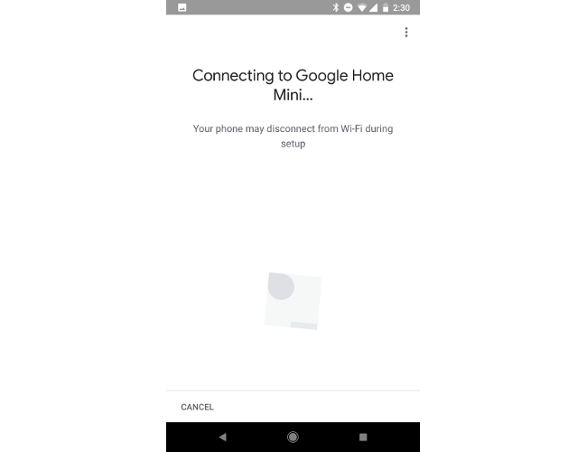
Google Home companion app connection screen

In this article you'll get an introduction to the Nearby Connections 2.0 API and how it can be used to pair an Android smartphone to an Android Things device in order to provide your users with a companion device experience.

What Is the Nearby Connections API?

The Nearby Connections API allows two devices to communicate with each other directly over Bluetooth or wireless without the use of a centralized access point. There are two roles that a device may take on: advertiser, which lets other devices know that it is available to be connected to, and discoverer, which attempts to find advertisers and connect to them. Once a set of devices (also known as "endpoints" at this stage) have connected together, they may send data to any other endpoint on the Nearby Connections network. 

There are two strategies that the Nearby Connections API can use for connecting devices together. The first, P2P_STAR, is the simplest to work with. It consists of one advertiser that can support multiple discoverers connecting to it. The second, P2P_CLUSTER, allows any number of devices to connect to, and accept connections from, any other number of devices. This creates a mesh network with a less centralized point of failure, though it also takes up more bandwidth. This strategy is ideal for smaller payloads that do not need to go through a central device, such as for games. 

This tutorial will focus on using the simpler star strategy to connect the IoT device as an advertiser and will use the user’s smartphone as a discoverer. However, by the end, you should also have enough information to implement a cluster strategy as well.

Let’s Get Set Up!

There will be two modules for this tutorial: the mobile app and the Android Things app. Once you have created those in Android Studio, you will need to include the Google Play Services dependency for Nearby Connections in the module-level build.gradle file for both apps.

After you have run a gradle sync, open the AndroidManifest.xml files for both modules and include the following permissions within the application nodes.

Android Things devices will have these permissions granted to the device after rebooting, though you will need to request the location permission from users on the phone app.

The MainActivity class in both the things and mobile modules will need to implement the interfaces used for Google Play Services callbacks, like so:

Once you have validated that the user has the proper location permissions in onCreate(), you can begin connecting to Google Play Services to use the Nearby Connections API.

When the GoogleApiClient has finished connecting, the onConnected() method will be called. This is where you will start the advertising or discovery process for your device. In addition, both applications will need a service id, which is a unique String identifier.

Advertising on Nearby Connections

When working with the Nearby Connections API, you will need to create a ConnectionLifecycleCallback that will, as the name implies, be triggered on various connection lifecycle events. For this demo, we will only use the onConnectionInitiated() method. It will save a reference to the first endpoint that attempts to connect to it, accept the connection, and then stop advertising. If the connection is not successful, the app can restart advertising.

You may have noticed that the above method also references a PayloadCallback object. This object has methods that are called when a payload of data is sent from the advertiser to an endpoint, as well as when data is received from an endpoint. The onPayloadReceived() method is where we would handle any data send to our Android Things device. This method contains the Payload object that can be turned into an array of bytes, and a String representing the endpoint address of the sending device.

At this point, you can start advertising on your IoT device with the following method:

You may notice that this is where we apply the P2P_STAR strategy to our Nearby Connections network.

When you want to send a payload to another device, you can use the Nearby.Connections.sendPayload() method with the Google API client reference, the name of your endpoint, and a byte array of the data you would like to send.

Tip: Enable WiFi on Reboot

One trick that I found useful while working with the Nearby Connections API on an Android Things device is re-enabling WiFi on reboot, as the device can end up with wireless disabled if the device is shut down or loses power while advertising. You can do this by retrieving the WifiManager system service and calling setWifiEnabled().

Discover Devices With Nearby Connections

Discovering a device follows a mostly similar pattern to advertising. The device will connect to the Google API Client and start discovering. When an advertiser is found, the discoverer will request to connect to the advertiser. If the advertiser approves the request, then the two devices will connect and be able to send payloads back and forth. The discoverer will use a PayloadCallback just like the advertiser.

The discoverer's (the mobile app's) ConnectionLifecycleCallback will also look similar to the advertiser's:

What is different is that discoverers will require an EndpointDiscoveryCallback that will be used when an advertiser is found but not yet connected to. This object will initiate the request to connect to the advertiser.

Once your discoverer has connected to Google Play Services, you can initiate discovery with the following command:

Finally, when you want to disconnect from an advertiser, you can use the disconnectFromEndpoint() method from the Nearby Connections API. It's generally a good idea to do this in your Activity's onDestroy() callback.

Conclusion

In this article you learned about the Nearby Connections 2.0 API for Android in the context of creating a companion app for an Android Things IoT device. 

It's worth noting that this API can be used for any Android devices that you would like to network together, from phones and tablets to Android TV boxes and Android Wear smartwatches. The API provides a simple way to connect and communicate without the use of the Internet or a centralized router, and adds a great utility to your collection of tools for Android development.

While you're here, check out some of our other posts on Android Things IoT development!

2018-02-17T12:51:05.000Z2018-02-17T12:51:05.000ZPaul Trebilcox-Ruiz

Easier React Native Development With Expo

$
0
0

Expo is a collection of tools that make it easier to code React Native apps. In this tutorial, I'm going to show you how you can quickly create React Native apps using Expo.

With Expo, developers can create React Native apps without all the frustrations that come with installing and configuring software dependencies such as Android Studio, Xcode, or all the other tools which are needed to develop and run a React Native app. 

In this tutorial, I'm going to show you how to create a simple memory game using Expo. Along the way you'll also learn the following:

  • How to use the tools provided by Expo. This includes the CLI, SDK, and the Expo client app.
  • How to create a React Native app using Expo.

What Is Expo?

Expo is a framework for quickly developing React Native apps. It's like Laravel or Symphony for PHP developers, or Ruby on Rails for Ruby developers. Expo provides a layer on top of the React Native APIs to make them easier to use and manage. It also provides tools that make it easier to bootstrap and test React Native apps. Lastly, it provides UI components and services that are commonly only available when you install a third-party React Native component. All of those are made available via the Expo SDK.

Limitations of Expo

Before you proceed further, it's important to be aware of some of the limitations of Expo: 

  1. Expo apps don't support background code execution. This means that you can't, for example, run code that listens for location changes when the app is closed.
  2. Expos apps are limited to the native APIs that the Expo SDK supports. This means that if your app has a very specific use-case such as communicating with a Bluetooth peripheral, the only option to implement such functionality is with plain React Native, or by writing native code using a library called ExpoKit.
  3. Expo locks you into their toolset. This means you cannot simply install and use most of the great tools available for React Native development such as command-line tools, scaffolders, and UI frameworks. But the good thing is that the Expo SDK is compatible with plain React Native apps, so you won't have any problem when you eject your app from Expo.
  4. Standalone binaries of Expo apps can only be built online. Expo provides a command-line tool called Exp. This allows developers to initiate the build process on Expo servers. Once it's done, a URL will be provided to download the .apk or .ipa file. 

Even with these limitations, it's important to keep in mind that Expo is a fully functional framework with lots of support for commonly used Android or iOS APIs. This means that it has got you covered for most of the functionalities that apps commonly need. So there's often no need to look outside of Expo to implement the native functionality.

App Overview

The app that we're going to create is a memory game. You may be familiar with this type of game—the user has to find matching pairs by turning over cards two at a time. Here's what the default screen looks like:

Memory game default app screen

And here's how it looks like once all the pairs have been opened:

Game completed

Once they've solved the game, the user can tap on the reset button to reset the items to their initial state. This allows them to start the game all over again.

Installing Expo

Unlike with plain React Native where you have to install and configure Android Studio or Xcode and other dependencies, with Expo there are only a few steps to follow in order to start developing apps:

  1. Download and Install Node.js. Expo depends on the Node.js platform for its command-line tools and dependency management.
  2. Install the Expo Client on your iOS or Android device. This is used to preview the app while you're developing it.
  3. Install the command line tool. This allows you to generate a new Expo project, initiate a build process, and more. Execute the following command to install it: 

Generating a New Expo App

Once you've installed all the dependencies, you can now generate a new Expo app:

Once that's done, it will create a new folder called MemoryGame. Navigate inside it and start running the development server:

Alternatively, you can also use the Expo XDE. This allows you to create and run Expo apps through a GUI. You can download the installer from the Expo GitHub repo. Currently, it only supports Windows and Mac. So if you're on Ubuntu or Linux it's better to stick with the command line for now.

Once the development server is running, you should now be able to see something like this:

Running the dev server

That's the QR code which points to the live preview of the project. Open the Expo client app on your phone and scan the code using the QR scanner. At this point, you should now be able to view the default screen. Every time you hit Control-S on any of the project files, the preview should automatically reload to reflect the changes.

You can find the full source code of the project on its GitHub repo. Or if you want to give the app a try, you can check out the demo. Just select QR Code, and scan it on your phone using the Expo client app.

Coding the App

Now we're ready to code the app. Let's begin with some UI components before we go back and implement the main component.

Header Component

The header is used to display the title of the app. Create a components folder. Inside it, create a Header.js file and add the following:

This is just a basic React Native component, with some styling to match the UI of our app. 

Score Component

Next is the component for displaying the score (components/Score.js):

Again, just a simple display component with a text view and some basic styling.

Card Component

The card component (components/Card.js) will display the cards. These cards use icons from the Expo vector icon set. This is one of the features that come right out of the box when you use Expo: it includes icons from icon sets like FontAwesome, Entypo, and Ionicons

In the code below, you can see that we're only using FontAwesome. It has the icon that we want for displaying the card's default state: a question mark. As you'll see later in the main app component, we'll also be using icons from Entypo and Ionicons. The reference to those icon sources will be passed to this component, so there's no need to specify them here:

Inside the render() method, we only use the source and icon passed as props if the card is opened. By default, it will only display the question mark icon from FontAwesome. But if the card is open, it will use the icon source, icon, and color that were passed as props. 

Each of the cards can be tapped. When tapped, the clickCard() function will be run, which is also passed via the props. Later on you'll see what the function does, but for now, just know that it updates the state to reveal the icon on the card: 

Don't forget to add the styles:

Helpers

We'll also be using a helper function called shuffle(). This allows us to sort the array of cards in random order so that their order will be different every time the game is reset:

Main Component

The main component (App.js) contains the main app logic and brings everything together. Start by including the React and Expo packages that we will be using. This time we're using all of the icon sources from Expo vector icons:

Next, include the components and the helper that we created earlier:

Inside the constructor, we first create the array which represents the unique cards. src is the icon source, name is the name of the icon (you can find the names on GitHub if you want to use other icons), and color is, naturally, the color of the icon:

Note that instead of directly specifying the src as FontAwesome, Entypo or Ionicons for each of the objects, we're using the property names used in the sources object. This is because we will need to create a copy of the array of cards in order for each card to have a pair. Creating a copy using array methods such as slice() will create a copy of the array, but the problem is that once the individual objects are modified in either the copy or the original, both arrays are also modified. 

This brings us to the solution below which is to create a completely new object by converting the cards array into a string and then parsing it to convert it back to an array. This is the reason why we're using strings since functions can't be converted into strings. We then combine the two to come up with the array, which contains all the cards that we need:

Next, go through that array and generate a unique ID for each one, set the icon source, and then set it to a closed state by default:

Sort the cards randomly and set the default state:

The render() method renders the header, cards, score, and the button for resetting the current game. It's using the renderRows() function to render the individual card rows. The screen will have six rows containing four cards each:

Here's the code for the renderRows() function. This uses the getRowContents() function, which is responsible for creating an array of arrays with four items each. This allows us to render each row, and then use another function for rendering cards for each iteration of the map() function:

Here's the getRowContents() function:

Next is the renderCards() function. This accepts the array of card objects and renders them via the Card component. All we need to do here is to pass the individual properties of each card object as props. This is then used to render the correct icon, as you've seen in the code for the Card component. The clickCard() function is also passed as a prop. The card ID is passed to that function so that the unique card can be identified and updated:

Inside the clickCard() function, we get the details of the selected card and check if it should be processed any further:

Now let's fill in the code for handling a selected card. 

First, we open the card and add it to the array of currently selected cards:

Once there are two items in the array of currently selected cards, we check if the icon names are the same. If they are then it means that the user has selected the correct pair. If they are not the same then it's an incorrect pair. In that case, we close the first card that was selected and then add a bit of delay before closing the second card. (This way the user can see the card icon before it reverts to the closed state.)

The last thing we need to do in the click event handler is to update the state to reflect the changes in the UI:

A related function is the reset event handler. When the reset button is tapped, we simply restore the default state by closing all the cards and shuffling.

Finally, we'll add a few basic styles to make our app look good.

Test the App

Since your Expo development server has been running this whole time, every change should be pushed to your mobile device with live reloading. Try the app out and make sure it works as it's supposed to.

Conclusion

That's it! In this tutorial you've learned how to use the Expo XDE to quickly wire up a React Native app. Expo is a really good way to start developing React Native apps because it removes the need to install a lot of software which is often a cause of frustration, especially for beginners. It also provides tools which makes it really easy to preview the app while it's being developed. Be sure to check out the resources mentioned on the Expo website if you want to learn more.

And in the meantime, have a look at some of our other posts about React Native app development!

2018-02-20T14:00:00.000Z2018-02-20T14:00:00.000ZWernher-Bel Ancheta

Easier React Native Development With Expo

$
0
0
tag:code.tutsplus.com,2005:PostPresenter/cms-30546

Expo is a collection of tools that make it easier to code React Native apps. In this tutorial, I'm going to show you how you can quickly create React Native apps using Expo.

With Expo, developers can create React Native apps without all the frustrations that come with installing and configuring software dependencies such as Android Studio, Xcode, or all the other tools which are needed to develop and run a React Native app. 

In this tutorial, I'm going to show you how to create a simple memory game using Expo. Along the way you'll also learn the following:

  • How to use the tools provided by Expo. This includes the CLI, SDK, and the Expo client app.
  • How to create a React Native app using Expo.

What Is Expo?

Expo is a framework for quickly developing React Native apps. It's like Laravel or Symphony for PHP developers, or Ruby on Rails for Ruby developers. Expo provides a layer on top of the React Native APIs to make them easier to use and manage. It also provides tools that make it easier to bootstrap and test React Native apps. Lastly, it provides UI components and services that are commonly only available when you install a third-party React Native component. All of those are made available via the Expo SDK.

Limitations of Expo

Before you proceed further, it's important to be aware of some of the limitations of Expo: 

  1. Expo apps don't support background code execution. This means that you can't, for example, run code that listens for location changes when the app is closed.
  2. Expos apps are limited to the native APIs that the Expo SDK supports. This means that if your app has a very specific use-case such as communicating with a Bluetooth peripheral, the only option to implement such functionality is with plain React Native, or by writing native code using a library called ExpoKit.
  3. Expo locks you into their toolset. This means you cannot simply install and use most of the great tools available for React Native development such as command-line tools, scaffolders, and UI frameworks. But the good thing is that the Expo SDK is compatible with plain React Native apps, so you won't have any problem when you eject your app from Expo.
  4. Standalone binaries of Expo apps can only be built online. Expo provides a command-line tool called Exp. This allows developers to initiate the build process on Expo servers. Once it's done, a URL will be provided to download the .apk or .ipa file. 

Even with these limitations, it's important to keep in mind that Expo is a fully functional framework with lots of support for commonly used Android or iOS APIs. This means that it has got you covered for most of the functionalities that apps commonly need. So there's often no need to look outside of Expo to implement the native functionality.

App Overview

The app that we're going to create is a memory game. You may be familiar with this type of game—the user has to find matching pairs by turning over cards two at a time. Here's what the default screen looks like:

Memory game default app screen

And here's how it looks like once all the pairs have been opened:

Game completed

Once they've solved the game, the user can tap on the reset button to reset the items to their initial state. This allows them to start the game all over again.

Installing Expo

Unlike with plain React Native where you have to install and configure Android Studio or Xcode and other dependencies, with Expo there are only a few steps to follow in order to start developing apps:

  1. Download and Install Node.js. Expo depends on the Node.js platform for its command-line tools and dependency management.
  2. Install the Expo Client on your iOS or Android device. This is used to preview the app while you're developing it.
  3. Install the command line tool. This allows you to generate a new Expo project, initiate a build process, and more. Execute the following command to install it: 

Generating a New Expo App

Once you've installed all the dependencies, you can now generate a new Expo app:

Once that's done, it will create a new folder called MemoryGame. Navigate inside it and start running the development server:

Alternatively, you can also use the Expo XDE. This allows you to create and run Expo apps through a GUI. You can download the installer from the Expo GitHub repo. Currently, it only supports Windows and Mac. So if you're on Ubuntu or Linux it's better to stick with the command line for now.

Once the development server is running, you should now be able to see something like this:

Running the dev server

That's the QR code which points to the live preview of the project. Open the Expo client app on your phone and scan the code using the QR scanner. At this point, you should now be able to view the default screen. Every time you hit Control-S on any of the project files, the preview should automatically reload to reflect the changes.

You can find the full source code of the project on its GitHub repo. Or if you want to give the app a try, you can check out the demo. Just select QR Code, and scan it on your phone using the Expo client app.

Coding the App

Now we're ready to code the app. Let's begin with some UI components before we go back and implement the main component.

Header Component

The header is used to display the title of the app. Create a components folder. Inside it, create a Header.js file and add the following:

This is just a basic React Native component, with some styling to match the UI of our app. 

Score Component

Next is the component for displaying the score (components/Score.js):

Again, just a simple display component with a text view and some basic styling.

Card Component

The card component (components/Card.js) will display the cards. These cards use icons from the Expo vector icon set. This is one of the features that come right out of the box when you use Expo: it includes icons from icon sets like FontAwesome, Entypo, and Ionicons

In the code below, you can see that we're only using FontAwesome. It has the icon that we want for displaying the card's default state: a question mark. As you'll see later in the main app component, we'll also be using icons from Entypo and Ionicons. The reference to those icon sources will be passed to this component, so there's no need to specify them here:

Inside the render() method, we only use the source and icon passed as props if the card is opened. By default, it will only display the question mark icon from FontAwesome. But if the card is open, it will use the icon source, icon, and color that were passed as props. 

Each of the cards can be tapped. When tapped, the clickCard() function will be run, which is also passed via the props. Later on you'll see what the function does, but for now, just know that it updates the state to reveal the icon on the card: 

Don't forget to add the styles:

Helpers

We'll also be using a helper function called shuffle(). This allows us to sort the array of cards in random order so that their order will be different every time the game is reset:

Main Component

The main component (App.js) contains the main app logic and brings everything together. Start by including the React and Expo packages that we will be using. This time we're using all of the icon sources from Expo vector icons:

Next, include the components and the helper that we created earlier:

Inside the constructor, we first create the array which represents the unique cards. src is the icon source, name is the name of the icon (you can find the names on GitHub if you want to use other icons), and color is, naturally, the color of the icon:

Note that instead of directly specifying the src as FontAwesome, Entypo or Ionicons for each of the objects, we're using the property names used in the sources object. This is because we will need to create a copy of the array of cards in order for each card to have a pair. Creating a copy using array methods such as slice() will create a copy of the array, but the problem is that once the individual objects are modified in either the copy or the original, both arrays are also modified. 

This brings us to the solution below which is to create a completely new object by converting the cards array into a string and then parsing it to convert it back to an array. This is the reason why we're using strings since functions can't be converted into strings. We then combine the two to come up with the array, which contains all the cards that we need:

Next, go through that array and generate a unique ID for each one, set the icon source, and then set it to a closed state by default:

Sort the cards randomly and set the default state:

The render() method renders the header, cards, score, and the button for resetting the current game. It's using the renderRows() function to render the individual card rows. The screen will have six rows containing four cards each:

Here's the code for the renderRows() function. This uses the getRowContents() function, which is responsible for creating an array of arrays with four items each. This allows us to render each row, and then use another function for rendering cards for each iteration of the map() function:

Here's the getRowContents() function:

Next is the renderCards() function. This accepts the array of card objects and renders them via the Card component. All we need to do here is to pass the individual properties of each card object as props. This is then used to render the correct icon, as you've seen in the code for the Card component. The clickCard() function is also passed as a prop. The card ID is passed to that function so that the unique card can be identified and updated:

Inside the clickCard() function, we get the details of the selected card and check if it should be processed any further:

Now let's fill in the code for handling a selected card. 

First, we open the card and add it to the array of currently selected cards:

Once there are two items in the array of currently selected cards, we check if the icon names are the same. If they are then it means that the user has selected the correct pair. If they are not the same then it's an incorrect pair. In that case, we close the first card that was selected and then add a bit of delay before closing the second card. (This way the user can see the card icon before it reverts to the closed state.)

The last thing we need to do in the click event handler is to update the state to reflect the changes in the UI:

A related function is the reset event handler. When the reset button is tapped, we simply restore the default state by closing all the cards and shuffling.

Finally, we'll add a few basic styles to make our app look good.

Test the App

Since your Expo development server has been running this whole time, every change should be pushed to your mobile device with live reloading. Try the app out and make sure it works as it's supposed to.

Conclusion

That's it! In this tutorial you've learned how to use the Expo XDE to quickly wire up a React Native app. Expo is a really good way to start developing React Native apps because it removes the need to install a lot of software which is often a cause of frustration, especially for beginners. It also provides tools which makes it really easy to preview the app while it's being developed. Be sure to check out the resources mentioned on the Expo website if you want to learn more.

And in the meantime, have a look at some of our other posts about React Native app development!

2018-02-20T14:00:00.000Z2018-02-20T14:00:00.000ZWernher-Bel Ancheta

Firebase Remote Config for Android Apps

$
0
0

Firebase Remote Config is a unique service designed to give you fine-grained control over instances of your apps while they are installed on user devices. By using it, you can reliably modify the looks and behaviors of your apps across your entire user base without publishing updates on Google Play.

If you're thinking that this could be a security risk, let me assure you that Remote Config doesn't let you remotely inject new code into your apps. It only lets you modify, through the Firebase console, the values of certain pre-decided variables that are already present in the code. In fact, you can think of the variables as server-side variables your app depends on.

In this tutorial, I'll show you how to use some of the most powerful features of Remote Config in Android apps.

1. Why Use Remote Config?

The Remote Config API is primarily meant to be used as an alternative to simple hard-coded values in your apps. Examples of such values can be colors, dimensions, delays, and labels.

To better understand the significance of the API, consider the following scenario: You create and publish an app with hard-coded values for the font size and color of all its labels. A few days later, your users tell you that they prefer a larger font size and a different font color. Because the values are hard-coded, in order to change them, you'll now have to modify your code, build the app again giving it a new version number, and republish it on Google Play. That's a lot of work for such a minor fix. Moreover, if the users change their minds, you'll have to do it all over again!

With Firebase Remote Config, you can make the font size and font color remotely configurable variables and use the Firebase console to quickly change their values any time you want, as many times as you want. This modern approach also ensures that the changes happen as soon as possible on the devices of all your users, without them having to manually download any updates.

2. Project Setup

With Android Studio's Firebase Assistant, adding Remote Config to your project takes just a few clicks.

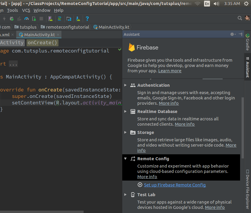
Start by going to Tools > Firebase and choosing Remote Config > Set up Firebase Remote Config in the panel that appears. 

Firebase Assistant for Remote Config

Next, press the Connect to Firebase button to associate your Android Studio project with a Firebase project. In the dialog that pops up, select the Create new Firebase project option and press the Connect to Firebase button.

Connect to Firebase dialog

After a successful connection, you can press the Add Remote Config to your app button to add all the required dependencies to your project's Gradle files. When prompted, press the Accept Changes button to complete the project setup.

Project changes prompt

3. Defining Config Parameters

All the variables you want to be able to change remotely must be defined in your Firebase project as Remote Config parameters. So use a browser to log in to the Firebase console, scroll down the Project Overview section to find the Remote Config card, and press the Get Started button.

In the welcome screen of the Remote Config service, press the Add your first parameter button to start adding the variables.

Remote Config welcome screen

Let us define two parameters now: font_size and font_color. The former shall be a number and the latter a string. Make sure you assign reasonable default values to both.

Parameter creation dialog

You should now be able to see the two parameters you created. However, their values will not be available to your app unless you publish them. So press the Publish changes button.

List of parameters

4. Preparing a Layout

To be able to use the parameters we created, add a TextView widget displaying a message in your activity's layout XML file. If you've created a new Android Studio project for this tutorial, feel free to use the "Hello World" TextView widget available by default, but make sure you give it an id.

Inside the onCreate() method of your activity, you can now get a reference to the widget using the findViewById() method.

5. Initializing Remote Config

Our app must be able to work correctly the first time it's opened, even if the user is not connected to the Internet. Therefore, it needs to know both the names and the default values of our Remote Config parameters. Creating a map to store them is a good idea.

Note that the names and default values must be identical to their counterparts in the Firebase console.

We can now initialize a client for the Remote Config service using the defaults map. To do so, first create an instance of the client by calling the getInstance() method of the FirebaseRemoteConfig class, and then pass the map to its setDefaults() method.

At this point, the Remote Config client is ready, and we can start using the values it supplies.

6. Using the Default Values

The FirebaseRemoteConfig instance offers a few intuitively named methods you can use to fetch the values of Remote Config parameters. For instance, you can call the getDouble() method to fetch values that are numbers. Similarly, you can call the getString() method to fetch values that are strings.

The following code shows you how to fetch the values of the font_size and font_color parameters.

Once you have the values, you are free to use them any way you want. For now, let's use them to change the looks of the myMessage widget.

If you run the app now, you will be able to see the TextView widget using the default values of the Remote Config parameters.

App running with default values

7. Fetching the Latest Values

Right now, the Remote Config client is merely returning values from the map we passed to it. To allow it to use values it gets from Firebase, we must call its activateFetched() method.

The activateFetched() method, however, doesn't actually fetch values from Firebase. Therefore, we must call the fetch() method next, which runs asynchronously, to fetch the values.

If you run the app at this point, it will still use the default values. However, if you wait for a few seconds, close it, and open it again, it will start using the values you entered in the Firebase console.

Usually, it's a good idea to let the changed values take effect only when the users open the app the next time. You could attach a listener to the Task object returned by the fetch() method and update your user interface inside the listener, but your users might not like the abrupt change.

You can, however, use the listener for debugging purposes.

8. Changing the Values

Currently, the values in the map match the remote values. To be able to see the Remote Config service in action, we must change the values we mentioned in the Firebase console. So go back to the console and click on one of the parameters you see in the Remote Config section.

In the dialog that pops up, leave the Parameter key field unchanged, but change the value. Similarly, you can change the value of the other parameter too.

Finally, make sure you press the Publish Changes button so that the values become available to the Remote Config client.

Updated values for the parameters

If you open the app now, close it, and open it again, you should see that the TextView widget looks different.

App running with latest values from Firebase

9. Adding Conditions to Parameters

You don't always have to roll out the same Remote Config values to all your users. The Firebase console allows you to add conditions to your parameters such that they return different values to different subsets of your user base. There are many rules you can use to create such subsets. For example, you can target users that belong to a specific country, users with devices running a specific version of Android, or even users who speak a specific language.

Because Firebase manages them transparently, you don't have to make any changes in your code to handle the conditions associated with your parameters.

For the sake of an example, let us now add a condition to the font_color parameter such that its value is blue for Indian users only.

Start by clicking on the parameter in the Firebase console. In the form that appears, click on the Add value for condition drop-down field and select Define new condition.

Add value for condition field

In the dialog that opens next, you'll be able to give a name to your condition and, from the Applies if... drop-down list, select a variety of options that will let you focus in on a specific group of users. To target users of a specific country, you will have to choose the Country/Region option. In the list that appears beside it, you can pick one or more countries. Choose India here.

Condition creation dialog

Once you've filled all the fields, press the Create condition button to finalize the condition.

At this point, your parameter will be able to accept two values instead of one. Leave the Default value field as it is and type in the hex code for the color blue in the conditional value field.

Conditional values dialog

If you publish the changes now, users in India will receive an additional update, and the text in the TextView widget will appear blue to them.

Same app running on devices in different countries

Conclusion

Now you know how to modify an app remotely using Firebase Remote Config and the Firebase console. With some creativity, there's a lot you can do with the service to improve your app's user experience. For example, most developers today use it to change the themes of their apps to mark festive days. Many also use it with Firebase Analytics to run A/B tests on their user bases.

To learn more about Remote Config, do refer to the official documentation.

2018-02-21T17:00:00.000Z2018-02-21T17:00:00.000ZAshraff Hathibelagal

Firebase Remote Config for Android Apps

$
0
0
tag:code.tutsplus.com,2005:PostPresenter/cms-30557

Firebase Remote Config is a unique service designed to give you fine-grained control over instances of your apps while they are installed on user devices. By using it, you can reliably modify the looks and behaviors of your apps across your entire user base without publishing updates on Google Play.

If you're thinking that this could be a security risk, let me assure you that Remote Config doesn't let you remotely inject new code into your apps. It only lets you modify, through the Firebase console, the values of certain pre-decided variables that are already present in the code. In fact, you can think of the variables as server-side variables your app depends on.

In this tutorial, I'll show you how to use some of the most powerful features of Remote Config in Android apps.

1. Why Use Remote Config?

The Remote Config API is primarily meant to be used as an alternative to simple hard-coded values in your apps. Examples of such values can be colors, dimensions, delays, and labels.

To better understand the significance of the API, consider the following scenario: You create and publish an app with hard-coded values for the font size and color of all its labels. A few days later, your users tell you that they prefer a larger font size and a different font color. Because the values are hard-coded, in order to change them, you'll now have to modify your code, build the app again giving it a new version number, and republish it on Google Play. That's a lot of work for such a minor fix. Moreover, if the users change their minds, you'll have to do it all over again!

With Firebase Remote Config, you can make the font size and font color remotely configurable variables and use the Firebase console to quickly change their values any time you want, as many times as you want. This modern approach also ensures that the changes happen as soon as possible on the devices of all your users, without them having to manually download any updates.

2. Project Setup

With Android Studio's Firebase Assistant, adding Remote Config to your project takes just a few clicks.

Start by going to Tools > Firebase and choosing Remote Config > Set up Firebase Remote Config in the panel that appears. 

Firebase Assistant for Remote Config

Next, press the Connect to Firebase button to associate your Android Studio project with a Firebase project. In the dialog that pops up, select the Create new Firebase project option and press the Connect to Firebase button.

Connect to Firebase dialog

After a successful connection, you can press the Add Remote Config to your app button to add all the required dependencies to your project's Gradle files. When prompted, press the Accept Changes button to complete the project setup.

Project changes prompt

3. Defining Config Parameters

All the variables you want to be able to change remotely must be defined in your Firebase project as Remote Config parameters. So use a browser to log in to the Firebase console, scroll down the Project Overview section to find the Remote Config card, and press the Get Started button.

In the welcome screen of the Remote Config service, press the Add your first parameter button to start adding the variables.

Remote Config welcome screen

Let us define two parameters now: font_size and font_color. The former shall be a number and the latter a string. Make sure you assign reasonable default values to both.

Parameter creation dialog

You should now be able to see the two parameters you created. However, their values will not be available to your app unless you publish them. So press the Publish changes button.

List of parameters

4. Preparing a Layout

To be able to use the parameters we created, add a TextView widget displaying a message in your activity's layout XML file. If you've created a new Android Studio project for this tutorial, feel free to use the "Hello World" TextView widget available by default, but make sure you give it an id.

Inside the onCreate() method of your activity, you can now get a reference to the widget using the findViewById() method.

5. Initializing Remote Config

Our app must be able to work correctly the first time it's opened, even if the user is not connected to the Internet. Therefore, it needs to know both the names and the default values of our Remote Config parameters. Creating a map to store them is a good idea.

Note that the names and default values must be identical to their counterparts in the Firebase console.

We can now initialize a client for the Remote Config service using the defaults map. To do so, first create an instance of the client by calling the getInstance() method of the FirebaseRemoteConfig class, and then pass the map to its setDefaults() method.

At this point, the Remote Config client is ready, and we can start using the values it supplies.

6. Using the Default Values

The FirebaseRemoteConfig instance offers a few intuitively named methods you can use to fetch the values of Remote Config parameters. For instance, you can call the getDouble() method to fetch values that are numbers. Similarly, you can call the getString() method to fetch values that are strings.

The following code shows you how to fetch the values of the font_size and font_color parameters.

Once you have the values, you are free to use them any way you want. For now, let's use them to change the looks of the myMessage widget.

If you run the app now, you will be able to see the TextView widget using the default values of the Remote Config parameters.

App running with default values

7. Fetching the Latest Values

Right now, the Remote Config client is merely returning values from the map we passed to it. To allow it to use values it gets from Firebase, we must call its activateFetched() method.

The activateFetched() method, however, doesn't actually fetch values from Firebase. Therefore, we must call the fetch() method next, which runs asynchronously, to fetch the values.

If you run the app at this point, it will still use the default values. However, if you wait for a few seconds, close it, and open it again, it will start using the values you entered in the Firebase console.

Usually, it's a good idea to let the changed values take effect only when the users open the app the next time. You could attach a listener to the Task object returned by the fetch() method and update your user interface inside the listener, but your users might not like the abrupt change.

You can, however, use the listener for debugging purposes.

8. Changing the Values

Currently, the values in the map match the remote values. To be able to see the Remote Config service in action, we must change the values we mentioned in the Firebase console. So go back to the console and click on one of the parameters you see in the Remote Config section.

In the dialog that pops up, leave the Parameter key field unchanged, but change the value. Similarly, you can change the value of the other parameter too.

Finally, make sure you press the Publish Changes button so that the values become available to the Remote Config client.

Updated values for the parameters

If you open the app now, close it, and open it again, you should see that the TextView widget looks different.

App running with latest values from Firebase

9. Adding Conditions to Parameters

You don't always have to roll out the same Remote Config values to all your users. The Firebase console allows you to add conditions to your parameters such that they return different values to different subsets of your user base. There are many rules you can use to create such subsets. For example, you can target users that belong to a specific country, users with devices running a specific version of Android, or even users who speak a specific language.

Because Firebase manages them transparently, you don't have to make any changes in your code to handle the conditions associated with your parameters.

For the sake of an example, let us now add a condition to the font_color parameter such that its value is blue for Indian users only.

Start by clicking on the parameter in the Firebase console. In the form that appears, click on the Add value for condition drop-down field and select Define new condition.

Add value for condition field

In the dialog that opens next, you'll be able to give a name to your condition and, from the Applies if... drop-down list, select a variety of options that will let you focus in on a specific group of users. To target users of a specific country, you will have to choose the Country/Region option. In the list that appears beside it, you can pick one or more countries. Choose India here.

Condition creation dialog

Once you've filled all the fields, press the Create condition button to finalize the condition.

At this point, your parameter will be able to accept two values instead of one. Leave the Default value field as it is and type in the hex code for the color blue in the conditional value field.

Conditional values dialog

If you publish the changes now, users in India will receive an additional update, and the text in the TextView widget will appear blue to them.

Same app running on devices in different countries

Conclusion

Now you know how to modify an app remotely using Firebase Remote Config and the Firebase console. With some creativity, there's a lot you can do with the service to improve your app's user experience. For example, most developers today use it to change the themes of their apps to mark festive days. Many also use it with Firebase Analytics to run A/B tests on their user bases.

To learn more about Remote Config, do refer to the official documentation.

2018-02-21T17:00:00.000Z2018-02-21T17:00:00.000ZAshraff Hathibelagal

How to Code a Settings Screen in an Android App

$
0
0
Final product image
What You'll Be Creating

The material design team at Google gives a clear definition of what settings in your Android app should do:

App settings let users indicate preferences for how an app should behave.

They at Google also state that your users should navigate to the app settings either from the side navigation or toolbar menu—with an item labeled Settings

Including settings in your app gives your users the power to control some of the functionality of your app. This makes your users happy instead of angry—because they are now in control of how the app behaves. 

It's highly recommended to give access to app settings. This will provide a better user experience for your users, which leads to a better review on the Google Play store, which then eventually gives rise to a higher number of app downloads (which boost revenue). 

I assume you must have interacted with an app's settings on your device, for example by selecting a default ringtone, or by controlling your privacy on the app. Almost all of the most popular apps you've downloaded or will download on the Google Play store include a settings screen for you to control the behaviour of the application. 

An example of a popular app that has a settings screen is the Chrome Android app from Google. In this app's settings screen, users can choose the default search engine, change the notification behaviour, control user privacy, etc. You can see this yourself by downloading the Chrome app from the Google Play store (if you don't already have it on your device). The following screenshot is from the Chrome app, displaying the app's settings screen.

Screenshot of Chrome app settings screen

In this post, you'll learn how to create an app settings screen from scratch and also how to read the values the user has selected from the app settings. For an additional bonus, you'll also learn how to use the Android Studio templates feature to quickly bootstrap your project with a settings screen. 

A sample project (in Kotlin) for this tutorial can be found on our GitHub repo so you can easily follow along.

Prerequisites

To be able to follow this tutorial, you'll need:

1. Create an Android Studio Project

Fire up Android Studio and create a new project (you can name it SettingsScreenDemo) with an empty activity called SettingsActivity. Make sure to also check the Include Kotlin support check box. 

Android Studio create project screen

2. Creating a PreferenceFragment

To support API Level 11 (Honeycomb) and above, we can use the PreferenceFragment. This class is simply a Fragment that shows a hierarchy of Preference objects as lists.

In the code above, we created a nested classSettingsFragment inside SettingsActivity (because the SetttingsFragment class is so small). Note that our class SettingsFragment extends the PreferenceFragment superclass and has a method addPrerenceFromResource inside onCreate(). In this method, we gave it a resource ID R.xml.preference of the preference XML to launch—when the Fragment is loaded. Finally, we host the Fragment to the activity by simply using the FragmentTransaction to add it to the UI—inside onCreate() of SettingsActivity.

3. Creating Our Preferences

Create an XML file and name it preferences.xml. Save this file inside the res/xml directory in your app project. Note that you can give this file any name, but it's highly recommended to stick with the conventional name "preferences". Also, you typically should have only one such file in an app project.

The root node for our preferences.xml file should be a <PreferenceScreen> element. Inside this root element, we now have our individual Preference. Here are the common attributes associated with a Preference:

  • android:key: this attribute is used to get the value in the SharedPreferences object.
  • android:title: sets the title for the Preference. This is the bold text.
  • android:summary: sets the summary for the Preference (this is not required). This is the faded text below the title.
  • android:defaultValue: sets the default value for the Preference

We'll go through each Preference we've defined above shortly. Note that you can also add or customize a Preference via the Android Studio preference editor—similar to the layout resource editor you're already familiar with. You can either choose to add/edit your preference XML file directly in "Text" mode or use the drag-and-drop UI in "Design" mode.

Android Studio preference editor

As you can see, in this editor, you can drag and drop any Preference in the palette section (on the left side). Once dropped, you should select it and modify its attributes on the attributes pane (on the right side) of the editor. Note that by default, we're given a few attributes to modify. To view or modify all the attributes associated with a selected Preference, make sure you click the View all attributes link at the bottom of the attributes pane. This is very similar to the layout editor you already know. 

Now, let's go through each of the Preference entities we have. 

Checkbox Preference

A CheckBoxPreference is simply a CheckBox widget that's included in the preference screen. This Preference returns the value "true" if checked or "false" otherwise. In other words, it returns a boolean depending on the state of the widget.

CheckBoxPreferense

Other attributes you can add to a CheckBoxPreference are:

  • android:summaryOff: sets the summary for the Preference in a preference screen when it's unchecked.
  • android:summaryOn: sets the summary for the Preference in a preference screen when it's checked.
  • android:disableDependentsState: The state (true for on, or false for off) that causes dependents to be disabled. May be a boolean value, such as "true" or "false".

Switch Preference

SwitchPreference performs similar functionality to the CheckBoxPreference. It provides a two-state ("on" or "off") toggleable option. This uses a Switch widget that allows the user to slide left ("off") and right ("on"). This Preference also includes the attributes described for the CheckBoxPreference above. In addition, it has the following attributes:

  • android:switchTextOff: sets the text used on the switch itself when in the "off" state. 
  • android:switchTextOn: sets the text used on the switch itself when in the "on" state. 
SwitchPreference

EditText Preference

This Preference, when clicked, shows a dialog for the user to enter an input text. It uses the EditText widget—including all the attributes of that widget that you're already familiar with.

Note that the value stored in the SharedPreferences is a string.

EditTextPreference

List Preference

This kind of Preference will display a list of entries in a dialog when tapped. Here, you can specify a pair of string-array resources in your preference XML. This string-array resource simply contains a collection of strings. This resource is located at res/values/arrays.xml.

Here is our sample ListPreference using this resource. 

We set the entries and entry values using the android:entries and android:entryValues attributes respectively.

  • android:entries: the human-readable array to present as a list.
  • android:entryValues: the array to find the value to save for a preference when an entry from entries is selected.
ListPreference dialog when clicked

For example, if we use the number of minutes in each duration as the entry values, when the user picks a time duration (e.g. 30 minutes), the corresponding integer value will be stored in SharedPreferences (e.g. 30).

MultiSelect List Preference

This one is similar to ListPreference but instead of having radio buttons, we have check boxes. In other words, the user can select multiple items in the dialog. Note that the result is stored in a “string set” in the SharedPreferences. This can be retrieved using getStringSet().

Ringtone Preference

When a RingtonePreference is tapped, a dialog is shown containing the list of available ringtones on the device or emulator.

  • android:showDefault: whether the Default ringtone option will be shown.
  • android:showSilent: whether a Silent option will be shown in the list. The user can select this option if they don't want to play any ringtone.  
RingtonePreference

Note that the value stored in the SharedPreferences for this preference is a special string. This special string is a URI which points to a ContentProvider.

4. Creating Setting Groups

It becomes a problem when you have a long list of preferences or settings, because users may have some trouble scanning or understanding them. To solve this problem, we can group our preferences. Take a look at the screenshot of the Chrome app I showed you in the beginning again—notice it grouped the preferences into two categories: Basics and Advanced. This makes it easier for the user to understand the preferences and to not make the list seem too overwhelming.

Let's now look at how simple it is to perform this task.

We simply surround the preferences we want to group in a <PreferenceCategory> tag and give each group a title using the android:title attribute.

Preferences grouped with PreferenceCategory

5. Starting an Intent

Note that's it's possible to open an activity by just clicking a preference item from the settings screen. This can come in handy when you want to open a web page. Here's the code to do that:

Here, we added a <intent> element inside the <Preference> element. 

  • android:action: sets the action for the Intent (this is similar to calling setAction() on an Intent object). 
  • android:targetClass: sets the class part of the component name (same as calling setComponent() on an Intent object).
  • android:targetPackage: sets the package part of the component name.
  • android:data: sets the data to assign (same as calling setData() on an Intent object). 

To open a web page, for example, you could use the following:

6. Binding the Preference Summary to the Value Selected

Let's now see how to update the preference summary with the value selected by the user. 

In this class, we created a helper method called bindPreferenceSummaryToValue(), which is inside our companion object, to update the preference summary text with the value the user has selected. We passed it a Preference object as an argument. The findPreference() will return a Preference using the Preference's key. 

We have a variable sBindPreferenceSummaryToValueListener that is an instance of Preference.OnPreferenceChangeListener. This is simply a preference change listener that will help us update the preference summary to the value the user has selected. We check for special cases, like when the selected preference is a RingtonePreference or a ListPreference. For those preference types, we do some special handling to get the summary string. If the preference is neither (like an EditTextPreference), we just set the summary to the preference's string value. 

Inside the bindPreferenceSummaryToValue(), we set the preference change listener by calling onPreferenceChangeListener (in Java, it's setOnPreferenceChangeListener instead) on the Preference object. 

Now run the project again to see how it all works!

Settings screen showing changed summary in response to selection

7. Retrieving Preference Values

To start getting preference values for the settings screen, we call getDefaultSharedPreference() which is inside the PreferenceManager class—passing it a Context object of the preferences whose values are wanted. Note that we get the values from the default SharedPreferences for our application. 

You call the corresponding getter method for the type we want to retrieve the value from in SharedPreferences. You pass it the key as the first argument, and the default value is the second argument. 

8. Bonus: Using Android Studio Templates

Now that you have learnt about the APIs involved to create a settings screen from scratch in Android, I'll show you a shortcut that will make it quicker next time. You can choose to use a template instead of coding a settings screen from scratch. 

Android Studio provides code templates that follow the Android design and development best practices. These existing code templates (available in Java and Kotlin) can help you quickly kick-start your project. One such template can be used to create a settings screen. 

To use this handy feature for a new project, first fire up Android Studio.

Android Studios Create Android Project dialog

Enter the application name and click the Next button. You can leave the defaults as they are in the Target Android Devices dialog. 

Click the Next button again.

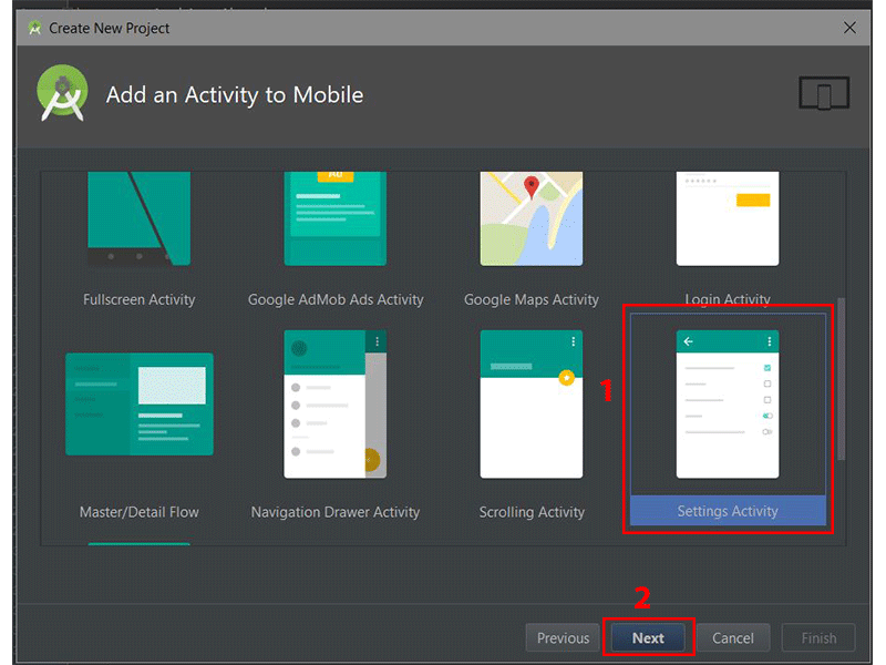
Android studios Add an Activity to Mobile dialog

In the Add an Activity to Mobile dialog, scroll down and select Settings Activity. Click the Next button after that. 

Android Studios Configure Activity dialog

In the last dialog, you can rename the Activity name, layout name or title if you want. Finally, click the Finish button to accept all configurations. 

Android Studio has now helped us to create a project with a settings activity. Really cool! You are strongly advised to explore the code generated. 

You can use templates for an already existing Android Studio project too. Simply go to File > New > Activity > Settings Activity.  

Navigation flow to creating a new settings activity in Android Studio

Note that the templates that come included with Android Studio are good for simple layouts and making basic apps, but if you want to really kick-start your app, you might consider some of the app templates available from Envato Market

They’re a huge time saver for experienced developers, helping them to cut through the slog of creating an app from scratch and focus their talents instead on the unique and customised parts of creating a new app

Conclusion

In this tutorial, you learned how to create app settings in Android from scratch. We also explored how to easily and quickly use the Android Studio templates to create app settings. 

I highly recommend checking out the official material design guidelines for settings to learn more about how to properly design and use settings in Android. Also, check out the official API guide to learn more about other APIs for creating a settings activity. 

To learn more about coding for Android, check out some of our other courses and tutorials here on Envato Tuts+!


2018-02-22T12:49:07.000Z2018-02-22T12:49:07.000ZChike Mgbemena

How to Code a Settings Screen in an Android App

$
0
0
tag:code.tutsplus.com,2005:PostPresenter/cms-30433
Final product image
What You'll Be Creating

The material design team at Google gives a clear definition of what settings in your Android app should do:

App settings let users indicate preferences for how an app should behave.

They at Google also state that your users should navigate to the app settings either from the side navigation or toolbar menu—with an item labeled Settings

Including settings in your app gives your users the power to control some of the functionality of your app. This makes your users happy instead of angry—because they are now in control of how the app behaves. 

It's highly recommended to give access to app settings. This will provide a better user experience for your users, which leads to a better review on the Google Play store, which then eventually gives rise to a higher number of app downloads (which boost revenue). 

I assume you must have interacted with an app's settings on your device, for example by selecting a default ringtone, or by controlling your privacy on the app. Almost all of the most popular apps you've downloaded or will download on the Google Play store include a settings screen for you to control the behaviour of the application. 

An example of a popular app that has a settings screen is the Chrome Android app from Google. In this app's settings screen, users can choose the default search engine, change the notification behaviour, control user privacy, etc. You can see this yourself by downloading the Chrome app from the Google Play store (if you don't already have it on your device). The following screenshot is from the Chrome app, displaying the app's settings screen.

Screenshot of Chrome app settings screen

In this post, you'll learn how to create an app settings screen from scratch and also how to read the values the user has selected from the app settings. For an additional bonus, you'll also learn how to use the Android Studio templates feature to quickly bootstrap your project with a settings screen. 

A sample project (in Kotlin) for this tutorial can be found on our GitHub repo so you can easily follow along.

Prerequisites

To be able to follow this tutorial, you'll need:

1. Create an Android Studio Project

Fire up Android Studio and create a new project (you can name it SettingsScreenDemo) with an empty activity called SettingsActivity. Make sure to also check the Include Kotlin support check box. 

Android Studio create project screen

2. Creating a PreferenceFragment

To support API Level 11 (Honeycomb) and above, we can use the PreferenceFragment. This class is simply a Fragment that shows a hierarchy of Preference objects as lists.

In the code above, we created a nested classSettingsFragment inside SettingsActivity (because the SetttingsFragment class is so small). Note that our class SettingsFragment extends the PreferenceFragment superclass and has a method addPrerenceFromResource inside onCreate(). In this method, we gave it a resource ID R.xml.preference of the preference XML to launch—when the Fragment is loaded. Finally, we host the Fragment to the activity by simply using the FragmentTransaction to add it to the UI—inside onCreate() of SettingsActivity.

3. Creating Our Preferences

Create an XML file and name it preferences.xml. Save this file inside the res/xml directory in your app project. Note that you can give this file any name, but it's highly recommended to stick with the conventional name "preferences". Also, you typically should have only one such file in an app project.

The root node for our preferences.xml file should be a <PreferenceScreen> element. Inside this root element, we now have our individual Preference. Here are the common attributes associated with a Preference:

  • android:key: this attribute is used to get the value in the SharedPreferences object.
  • android:title: sets the title for the Preference. This is the bold text.
  • android:summary: sets the summary for the Preference (this is not required). This is the faded text below the title.
  • android:defaultValue: sets the default value for the Preference

We'll go through each Preference we've defined above shortly. Note that you can also add or customize a Preference via the Android Studio preference editor—similar to the layout resource editor you're already familiar with. You can either choose to add/edit your preference XML file directly in "Text" mode or use the drag-and-drop UI in "Design" mode.

Android Studio preference editor

As you can see, in this editor, you can drag and drop any Preference in the palette section (on the left side). Once dropped, you should select it and modify its attributes on the attributes pane (on the right side) of the editor. Note that by default, we're given a few attributes to modify. To view or modify all the attributes associated with a selected Preference, make sure you click the View all attributes link at the bottom of the attributes pane. This is very similar to the layout editor you already know. 

Now, let's go through each of the Preference entities we have. 

Checkbox Preference

A CheckBoxPreference is simply a CheckBox widget that's included in the preference screen. This Preference returns the value "true" if checked or "false" otherwise. In other words, it returns a boolean depending on the state of the widget.

CheckBoxPreferense

Other attributes you can add to a CheckBoxPreference are:

  • android:summaryOff: sets the summary for the Preference in a preference screen when it's unchecked.
  • android:summaryOn: sets the summary for the Preference in a preference screen when it's checked.
  • android:disableDependentsState: The state (true for on, or false for off) that causes dependents to be disabled. May be a boolean value, such as "true" or "false".

Switch Preference

SwitchPreference performs similar functionality to the CheckBoxPreference. It provides a two-state ("on" or "off") toggleable option. This uses a Switch widget that allows the user to slide left ("off") and right ("on"). This Preference also includes the attributes described for the CheckBoxPreference above. In addition, it has the following attributes:

  • android:switchTextOff: sets the text used on the switch itself when in the "off" state. 
  • android:switchTextOn: sets the text used on the switch itself when in the "on" state. 
SwitchPreference

EditText Preference

This Preference, when clicked, shows a dialog for the user to enter an input text. It uses the EditText widget—including all the attributes of that widget that you're already familiar with.

Note that the value stored in the SharedPreferences is a string.

EditTextPreference

List Preference

This kind of Preference will display a list of entries in a dialog when tapped. Here, you can specify a pair of string-array resources in your preference XML. This string-array resource simply contains a collection of strings. This resource is located at res/values/arrays.xml.

Here is our sample ListPreference using this resource. 

We set the entries and entry values using the android:entries and android:entryValues attributes respectively.

  • android:entries: the human-readable array to present as a list.
  • android:entryValues: the array to find the value to save for a preference when an entry from entries is selected.
ListPreference dialog when clicked

For example, if we use the number of minutes in each duration as the entry values, when the user picks a time duration (e.g. 30 minutes), the corresponding integer value will be stored in SharedPreferences (e.g. 30).

MultiSelect List Preference

This one is similar to ListPreference but instead of having radio buttons, we have check boxes. In other words, the user can select multiple items in the dialog. Note that the result is stored in a “string set” in the SharedPreferences. This can be retrieved using getStringSet().

Ringtone Preference

When a RingtonePreference is tapped, a dialog is shown containing the list of available ringtones on the device or emulator.

  • android:showDefault: whether the Default ringtone option will be shown.
  • android:showSilent: whether a Silent option will be shown in the list. The user can select this option if they don't want to play any ringtone.  
RingtonePreference

Note that the value stored in the SharedPreferences for this preference is a special string. This special string is a URI which points to a ContentProvider.

4. Creating Setting Groups

It becomes a problem when you have a long list of preferences or settings, because users may have some trouble scanning or understanding them. To solve this problem, we can group our preferences. Take a look at the screenshot of the Chrome app I showed you in the beginning again—notice it grouped the preferences into two categories: Basics and Advanced. This makes it easier for the user to understand the preferences and to not make the list seem too overwhelming.

Let's now look at how simple it is to perform this task.

We simply surround the preferences we want to group in a <PreferenceCategory> tag and give each group a title using the android:title attribute.

Preferences grouped with PreferenceCategory

5. Starting an Intent

Note that's it's possible to open an activity by just clicking a preference item from the settings screen. This can come in handy when you want to open a web page. Here's the code to do that:

Here, we added a <intent> element inside the <Preference> element. 

  • android:action: sets the action for the Intent (this is similar to calling setAction() on an Intent object). 
  • android:targetClass: sets the class part of the component name (same as calling setComponent() on an Intent object).
  • android:targetPackage: sets the package part of the component name.
  • android:data: sets the data to assign (same as calling setData() on an Intent object). 

To open a web page, for example, you could use the following:

6. Binding the Preference Summary to the Value Selected

Let's now see how to update the preference summary with the value selected by the user. 

In this class, we created a helper method called bindPreferenceSummaryToValue(), which is inside our companion object, to update the preference summary text with the value the user has selected. We passed it a Preference object as an argument. The findPreference() will return a Preference using the Preference's key. 

We have a variable sBindPreferenceSummaryToValueListener that is an instance of Preference.OnPreferenceChangeListener. This is simply a preference change listener that will help us update the preference summary to the value the user has selected. We check for special cases, like when the selected preference is a RingtonePreference or a ListPreference. For those preference types, we do some special handling to get the summary string. If the preference is neither (like an EditTextPreference), we just set the summary to the preference's string value. 

Inside the bindPreferenceSummaryToValue(), we set the preference change listener by calling onPreferenceChangeListener (in Java, it's setOnPreferenceChangeListener instead) on the Preference object. 

Now run the project again to see how it all works!

Settings screen showing changed summary in response to selection

7. Retrieving Preference Values

To start getting preference values for the settings screen, we call getDefaultSharedPreference() which is inside the PreferenceManager class—passing it a Context object of the preferences whose values are wanted. Note that we get the values from the default SharedPreferences for our application. 

You call the corresponding getter method for the type we want to retrieve the value from in SharedPreferences. You pass it the key as the first argument, and the default value is the second argument. 

8. Bonus: Using Android Studio Templates

Now that you have learnt about the APIs involved to create a settings screen from scratch in Android, I'll show you a shortcut that will make it quicker next time. You can choose to use a template instead of coding a settings screen from scratch. 

Android Studio provides code templates that follow the Android design and development best practices. These existing code templates (available in Java and Kotlin) can help you quickly kick-start your project. One such template can be used to create a settings screen. 

To use this handy feature for a new project, first fire up Android Studio.

Android Studios Create Android Project dialog

Enter the application name and click the Next button. You can leave the defaults as they are in the Target Android Devices dialog. 

Click the Next button again.

Android studios Add an Activity to Mobile dialog

In the Add an Activity to Mobile dialog, scroll down and select Settings Activity. Click the Next button after that. 

Android Studios Configure Activity dialog

In the last dialog, you can rename the Activity name, layout name or title if you want. Finally, click the Finish button to accept all configurations. 

Android Studio has now helped us to create a project with a settings activity. Really cool! You are strongly advised to explore the code generated. 

You can use templates for an already existing Android Studio project too. Simply go to File > New > Activity > Settings Activity.  

Navigation flow to creating a new settings activity in Android Studio

Note that the templates that come included with Android Studio are good for simple layouts and making basic apps, but if you want to really kick-start your app, you might consider some of the app templates available from Envato Market

They’re a huge time saver for experienced developers, helping them to cut through the slog of creating an app from scratch and focus their talents instead on the unique and customised parts of creating a new app

Conclusion

In this tutorial, you learned how to create app settings in Android from scratch. We also explored how to easily and quickly use the Android Studio templates to create app settings. 

I highly recommend checking out the official material design guidelines for settings to learn more about how to properly design and use settings in Android. Also, check out the official API guide to learn more about other APIs for creating a settings activity. 

To learn more about coding for Android, check out some of our other courses and tutorials here on Envato Tuts+!


2018-02-22T12:49:07.000Z2018-02-22T12:49:07.000ZChike Mgbemena

Code an App With GraphQL, React Native and AWS AppSync: the App

$
0
0
Final product image
What You'll Be Creating

In these tutorials, I'll show you how to create and interact with a GraphQL database using AWS AppSync and React Native. This app will have real-time & offline functionality, something we get out of the box with AppSync. 

In the previous post we set up our GraphQL back-end with the Amazon AppSync service. Check it out if you haven't already. Or, if you want an introduction to GraphQL, take a look at some of our other posts.

In this post, we'll wrap it all up by walking through the build of the React Native client. The project is a bit too complicated to show walk you through step-by-step, but I'll explain the project architecture and show you the key parts of the source code.

Overview of App Architecture and Folder Structure

Our application will have a main entry point that will consist of two tabbed views. One tab will list the cities from our GraphQL database, the other will be the input form to add a new city. The Cities tab will be a navigator that will allow the user to navigate to the individual cities.

We will store the main components in the source folder, and will have other folders in the src directory to hold our GraphQL mutations, queries, and subscriptions.

We will also have an assets folder to hold our images.

folder structure

Creating and Configuring the React Native Client

For reference, take a look at the final code for this app in the tutorial GitHub repo, but I'll outline some of the steps I took to create the app from scratch.

First, we created a new React Native application using either Expo

Once in the newly created project, we installed our dependencies. For the GraphQL and AppSync functionality, we used the following dependencies:

We also used following dependencies for the UI design:

Also, one the Vector Icons library was installed, we linked it:

After installing our dependencies, we downloaded the AppSync.js file from our AppSync console. In our AppSync project console, we chose React Native at the bottom, and clicked on the orange Download button to download this config file.


This config file holds the AppSync client information we needed to create a new client. 

Configuring the Provider and Store

The top level of the app is where we will do our configuration to wire up the AppSync API with the React Native client. If you have used Redux or React Apollo before, this will all be familiar. If you have not, just remember that any child of a Provider, in our case the ApolloProvider, will have access to its given functionality. 

The following code is our new App.js file, which is the main component imported from our index.js entrypoint.

In this file, we are setting up a new AppSync client using a combination of the AWSAppSyncClient constructor from aws-appsync as well as the configuration in our aws-exports.js file, which provides the GraphQL API URL, region, authentication type, and authentication API key.

We then wrap our main entrypoint, the Tabs.js file which will hold our tab navigation, in a ApolloProvider and pass in the AppSync client as the client prop. We also wrap the Tabs component in a Rehydrated component that we import from aws-appsync-react. This will make sure that we have read from async storage and have rehydrated our cache before rendering the UI.

Now our app will be able to query data from our AppSync endpoint, and also to perform mutations and subscriptions!

Navigation

The main entry point of the app is a tabbed navigation, implemented in the Tabs.js file with React Navigation.

What we've done here is create and export a TabNavigator with two tabs. These are:

  1. Cities - This component lists our cities, and it is be a navigator component in and of itself. This component is a navigator because we want to be able to navigate to each individual city and view the locations within the city.
  2. AddCity - This component is a form for us to be able to add new cities.

Reusable Components

This app has only one reusable component, a customized TextInput. Since we will be duplicating this style and functionality over and over, we decided to make it its own component. The input component is implemented in Input.js.

Cities List and City Navigation

The main view of the app is a list of cities that we will be retrieving from GraphQL. We want to be able to navigate from each listed city to a detail view of that city where we can add locations.

To do this, we make Cities.js it's own StackNavigator, and City.js the component we navigate to when choosing a city. When clicking on a city in Cities, we pass its name and id as props to City.

Cities.js

In this component, we are fetching using the listCities query, and we are also subscribing to the NewCitySubscription, so that when a new city is added, even from another client, we'll handle that subscription and update our array of cities. The listCities query makes an array of cities available in our component as this.props.cities.

City.js

In this component, we are passed a city as props from navigation (available as props.navigation.state.params.city). We use the city id value to fetch the list of locations for the chosen city using the listLocations query. We subscribe to new locations in a similar way that we subscribed to new cities in Cities.js, using the NewLocationSubscription subscription. We also provide an optimisticResponse& update functions for when a new city is added. Optimistic response 

Adding Cities

Finally, we need to implement with the functionality for adding new cities to our GraphQL API in the AddCity.js file. To do this we have wired up a mutation along with a form that will call createCity, passing the value of the form input.

AddCity has an onAdd function that we define in our GraphQL composition, which not only writes a new city to our GraphQL database, but also implements an optimistic UI using a combination of optimisitcResponse and update.

Mutations, Queries, and Subscriptions

Mutations, queries, and subscriptions are the core functionality for integrating with our GraphQL API. In our app, this functionality is implemented in the Cities.js, City.js, and AddCity.js files using the AppSync client.

Let's take a closer look at how mutations, queries, and subscriptions are implemented in our code.

Queries

First, let's look at how to create and export a GraphQL query that could interact with the listCities uery in our AppSync Schema. This code is contained in the src/queries/LIstCities.js file.

Next, we import this query in the Cities.js file, along with some helpers from react-apollo, and wire up the component that we would like have access to this data using compose and graphql from react-apollo.

Now we have access to the cities array from our GraphQL server as a prop. We can use this.props.cities to map over the cities array coming in from GraphQL.

Mutations

To create a mutation, first we would need to create a basic GraphQL mutation and export it. We do this in the src/mutations/CreateCity.js file.

New we can import this mutation (along with the Apollo helpers) in the AddCity.js file and use it in a component: 

Now, we have access to a prop called onAdd, which we pass an object we would like to send to the mutation!

Subscriptions

Subscriptions allow us to subscribe to data changes and have them update in our application in real time. If we were to change our database by adding or removing a city, we would like our app to update in real time.

First we need to create the mutation and export it so we can have access to it within the client. We save this in the src/subscriptionsNewCitySubscriptions.js file.

Now we can import and attach the subscription in the Cities.js. We already looked at how to get the cities from our API. Let's now update this functionality to subscribe to new changes and update the cities array when a new city is added.

We add a new prop called subscribeToNewCities, which we call in componentDidMount. In the subscription, we pass in a document (the subscription definition) and updateQuery to describe what we want to happen when this updates.

We destructure createCity (containing the mutation) from the props that are passed into the updateQuery function, and return all existing values along with an updated listCities  array containing the previous cities along with the new city data that we get from createCity.

Optimistic UI

What if we don't want to wait for the subscription to return the most up to date data from our API in order to update our UI?

If a user creates a new city, we want to automatically add it the cities array and have it render in our app before receiving confirmation from the back-end service.

We can do that easily using a few techniques and functions.

Let's update our AddCityMutation to the following (you can view this code in the AddCity.js source file):

Here, we've added two new properties to the mutate function argument object:

  1. optimisticResponse defines the new response you would like to have available in the update function
  2. update takes two arguments, the proxy (which allows you to read from the cache) and the data you would like to use to make the update. We read the current cache (proxy.readQuery), add it our new item to the array of items, then write back to the cache, which updated our UI.

Conclusion

GraphQL is becoming more and more mainstream. Much of the complexity surrounding GraphQL has to do with managing the backend and the API layer. However, tools like AppSync abstract away this complexity, freeing developers from spending most of their time configuring and working on the server.

I look forward to much more innovation in this space, and can't wait to see what else we will see in 2018!

If you're interested in using AppSync along with the Serverless framework, check out this great introduction to using the two of them together.

If you would like to learn more about AWS AppSync, I would suggest taking a look at the AppSync homepage, and the documentation for building a GraphQL client.

If you want to contribute to this project, you can connect to our GitHub repo. If you have any ideas, feel free to send us a PR, or use this app as a starter for your next React Native GraphQL project!

And in the meantime, check out some of our other React Native tutorials here on Envato Tuts+!

2018-02-26T18:12:12.713Z2018-02-26T18:12:12.713ZNader Dabit

Code an App With GraphQL, React Native and AWS AppSync: The App

$
0
0
tag:code.tutsplus.com,2005:PostPresenter/cms-30569
Final product image
What You'll Be Creating

In these tutorials, I'm showing you how to create and interact with a GraphQL database using AWS AppSync and React Native. This app will have real-time and offline functionality, something we get out of the box with AppSync. 

In the previous post, we set up our GraphQL back-end with the Amazon AppSync service. Check it out if you haven't already. Or, if you want an introduction to GraphQL, take a look at some of our other posts.

In this post, we'll wrap it all up by walking through the build of the React Native client. The project is a bit too complicated to walk you through step by step, but I'll explain the project architecture and show you the key parts of the source code.

Overview of the App Architecture and Folder Structure

Our application will have a main entry point that will consist of two tabbed views. One tab will list the cities from our GraphQL database, and the other will be the input form to add a new city. The Cities tab will be a navigator that will allow the user to navigate to the individual cities.

We will store the main components in the source folder, and will have other folders in the src directory to hold our GraphQL mutations, queries, and subscriptions.

We will also have an assets folder to hold our images.

folder structure

Creating and Configuring the React Native Client

For reference, take a look at the final code for this app in the tutorial GitHub repo, but I'll outline some of the steps I took to create the app from scratch.

First, we created a new React Native application using Expo

Once in the newly created project, we installed our dependencies. For the GraphQL and AppSync functionality, we used the following dependencies:

We also used the following dependencies for the UI design:

Also, once the Vector Icons library was installed, we linked it:

After installing our dependencies, we downloaded the AppSync.js file from our AppSync console. In our AppSync project console, we chose React Native at the bottom, and clicked on the orange Download button to download this config file.

downloading the AppSyncjs file from our AppSync console

This config file holds the AppSync client information we needed to create a new client. 

Configuring the Provider and Store

The top level of the app is where we will do our configuration to wire up the AppSync API with the React Native client. If you have used Redux or React Apollo before, this will all be familiar. If you have not, just remember that any child of a Provider, in our case the ApolloProvider, will have access to its given functionality. 

The following code is our new App.js file, which is the main component imported from our index.js entrypoint.

In this file, we are setting up a new AppSync client using a combination of the AWSAppSyncClient constructor from aws-appsync as well as the configuration in our aws-exports.js file, which provides the GraphQL API URL, region, authentication type, and authentication API key.

We then wrap our main entrypoint, the Tabs.js file which will hold our tab navigation, in an ApolloProvider and pass in the AppSync client as the client prop. We also wrap the Tabs component in a Rehydrated component that we import from aws-appsync-react. This will make sure that we have read from async storage and have rehydrated our cache before rendering the UI.

Now our app will be able to query data from our AppSync endpoint, and also to perform mutations and subscriptions!

Navigation

The main entry point of the app is a tabbed navigation, implemented in the Tabs.js file with React Navigation.

What we've done here is create and export a TabNavigator with two tabs. These are:

  1. Cities: This component lists our cities, and it is a navigator component in and of itself. This component is a navigator because we want to be able to navigate to each individual city and view the locations within the city.
  2. AddCity: This component is a form for us to be able to add new cities.
The Cities screen in the app

Reusable Components

This app has only one reusable component, a customized TextInput. Since we will be duplicating this style and functionality over and over, we decided to make it its own component. The input component is implemented in Input.js.

Cities List and City Navigation

The main view of the app is a list of cities that we will be retrieving from GraphQL. We want to be able to navigate from each listed city to a detail view of that city where we can add locations.

To do this, we make Cities.js its own StackNavigator, and City.js the component we navigate to when choosing a city. When clicking on a city in Cities, we pass its name and id as props to City.

Cities.js

In this component, we are fetching using the listCities query, and we are also subscribing to the NewCitySubscription, so that when a new city is added, even from another client, we'll handle that subscription and update our array of cities. The listCities query makes an array of cities available in our component as this.props.cities.

City.js

In this component, we are passed a city as props from navigation (available as props.navigation.state.params.city). We use the city id value to fetch the list of locations for the chosen city using the listLocations query. We subscribe to new locations in a similar way to how we subscribed to new cities in Cities.js, using the NewLocationSubscription subscription. We also provide optimisticResponse and update functions for when a new city is added. 

Adding Cities

Finally, we need to implement the functionality for adding new cities to our GraphQL API in the AddCity.js file. To do this, we have wired up a mutation along with a form that will call createCity, passing the value of the form input.

AddCity has an onAdd function that we define in our GraphQL composition, which not only writes a new city to our GraphQL database, but also implements an optimistic UI using a combination of optimisticResponse and update.

Mutations, Queries, and Subscriptions

Mutations, queries, and subscriptions are the core functionality for integrating with our GraphQL API. In our app, this functionality is implemented in the Cities.js, City.js, and AddCity.js files using the AppSync client.

Let's take a closer look at how mutations, queries, and subscriptions are implemented in our code.

Queries

First, let's look at how to create and export a GraphQL query that could interact with the listCities query in our AppSync Schema. This code is contained in the src/queries/ListCities.js file.

Next, we import this query in the Cities.js file, along with some helpers from react-apollo, and wire up the component that we would like to have access to this data using compose and graphql from react-apollo.

Now we have access to the cities array from our GraphQL server as a prop. We can use this.props.cities to map over the cities array coming in from GraphQL.

Mutations

To create a mutation, first we need to create a basic GraphQL mutation and export it. We do this in the src/mutations/CreateCity.js file.

Now we can import this mutation (along with the Apollo helpers) in the AddCity.js file and use it in a component: 

Now, we have access to a prop called onAdd, which we pass an object we would like to send to the mutation!

Subscriptions

Subscriptions allow us to subscribe to data changes and have them update in our application in real time. If we were to change our database by adding or removing a city, we would like our app to update in real time.

First, we need to create the mutation and export it so we can have access to it within the client. We save this in the src/subscriptionsNewCitySubscriptions.js file.

Now we can import and attach the subscription in Cities.js. We already looked at how to get the cities from our API. Let's now update this functionality to subscribe to new changes and update the cities array when a new city is added.

We add a new prop called subscribeToNewCities, which we call in componentDidMount. In the subscription, we pass in a document (the subscription definition) and updateQuery to describe what we want to happen when this updates.

We destructure createCity (containing the mutation) from the props that are passed into the updateQuery function, and return all existing values along with an updated listCities  array containing the previous cities along with the new city data that we get from createCity.

Optimistic UI

What if we don't want to wait for the subscription to return the most up-to-date data from our API in order to update our UI?

If a user creates a new city, we want to automatically add it the cities array and have it render in our app before receiving confirmation from the back-end service.

We can do that easily using a few techniques and functions.

Let's update our AddCityMutation to the following (you can view this code in the AddCity.js source file):

Here, we've added two new properties to the mutate function argument object:

  1. optimisticResponse defines the new response you would like to have available in the update function.
  2. update takes two arguments, the proxy (which allows you to read from the cache) and the data you would like to use to make the update. We read the current cache (proxy.readQuery), add it our new item to the array of items, and then write back to the cache, which updated our UI.

Conclusion

GraphQL is becoming more and more mainstream. Much of the complexity surrounding GraphQL has to do with managing the back end and the API layer. However, tools like AppSync abstract away this complexity, freeing developers from spending most of their time configuring and working on the server.

I look forward to much more innovation in this space, and can't wait to see what else we will see in 2018!

If you're interested in using AppSync along with the Serverless framework, check out this great introduction to using the two of them together.

If you would like to learn more about AWS AppSync, I would suggest taking a look at the AppSync homepage and the documentation for building a GraphQL client.

If you want to contribute to this project, you can connect to our GitHub repo. If you have any ideas, feel free to send us a PR, or use this app as a starter for your next React Native GraphQL project!

And in the meantime, check out some of our other React Native tutorials here on Envato Tuts+!

2018-02-26T18:12:12.713Z2018-02-26T18:12:12.713ZNader Dabit

Code a Widget for Your Android App: Updating the Widget

$
0
0

Application widgets provide your users with easy access to your application’s most frequently used features, while giving your app a presence on the user’s homescreen. By adding a widget to your project, you can provide a better user experience, while encouraging users to remain engaged with your application, as every single time they glance at their homescreen they’ll see your widget, displaying some of your app’s most useful and interesting content.

In this three part series, we’re building an application widget that has all the functionality you’ll find in pretty much every Android application widget. 

In the first post, we created a widget that retrieves and displays data, and performs a unique action in response to onClick events. However, our widget is still missing one crucial piece of functionality: it never updates with new information. A widget that never has anything new to offer isn’t all that useful, so we’ll give our widget two different ways to update. 

By the end of this series, we’ll have expanded our widget to retrieve and display new data automatically based on a schedule, and in response to user interaction.

We’re picking up right where we left off, so if you don’t have a copy of the widget we created in the first post, then you can download it from GitHub.

Updating Your Layout

The first step is updating our layout to display some data that changes over time. To help us see exactly when our widget receives each update, I’m going to instruct the widget to retrieve and display the current time, whenever it performs an update. 

I’m going to add the following to the widget layout: 

  • A TextView that displays a Last Update label.
  • A TextView that will display the time of the last update.

While we’re working on the new_app_widget.xml file, I’m also going to add the TextView that’ll eventually allow the user to trigger an update manually: 

Next, define the new string resources that we reference in our layout: 

The @string/time looks different from your typical string, as it’s just a placeholder that’ll be replaced at runtime.

This gives us the finished layout:

Preview the complete Android application widget layout

Updating Your Widget Based on a Schedule 

Since it’s the easiest method to implement, I’m going to start by updating our widget automatically, after a set period of time has elapsed. 

When creating this kind of automatic update schedule, 1800000 milliseconds (30 minutes) is the smallest interval you can use. Even if you set your project's updatePeriodMillis to less than 30 minutes, you widget will still only update once every half an hour.

Deciding how frequently your widget should update is never straightforward. Frequent updates are a greater drain on the device’s battery, but set these updates too far apart and your widget may wind up displaying significantly out of date information to the user.

To find a balance that works for your particular project, you’ll need to test your widget across a range of update frequencies and measure the impact each frequency has on battery life, while monitoring whether the widget’s content ever becomes noticeably out of date. 

Since how-frequent-is-too-frequent is one of those frustrating subjective questions where there’s no “right” answer, it can help to get a second opinion by arranging some user testing. You could even setup some A/B testing to check whether certain update frequencies are received more positively than others. 

Open your project’s AppWidgetProviderInfo file (res/xml/new_app_widget_info.xml) and you’ll see that it already defines a default update interval of 86400000 milliseconds (24 hours). 

There are plenty of widgets that only update once every 24 hours, for example a widget that displays the weather forecast might only need to retrieve new information once per day. However, even if your widget does only need to update once per day, this isn’t ideal when testing your app. No-one wants to wait 24 hours just to see whether their onUpdate() method is triggering correctly, so you’ll typically use the shortest possible interval when performing initial testing, and then change this value later, if required.

To make it easier to test our app, I’m going to use the smallest possible interval: 

Retrieving and Displaying the Current Time 

The onUpdate() method is responsible for updating your widget’s Views with new information. If you open your project’s widget provider (java/values/NewAppWidget.java) then you’ll see that it already contains the outline of an onUpdate() method: 

Regardless of whether your widget updates automatically or in response to user interaction, the update process is exactly the same: the widget manager sends a broadcast intent with the ACTION_APPWIDGET_UPDATE action, and the widget-provider class responds by calling the onUpdate() method, which in turn calls the updateAppWidget() helper method. 

Once we’ve updated our NewAppWidget.java class to retrieve and display the current time, our project will use this same section of code regardless of how the onUpdate() method is triggered: 

There’s one problem with the above code: if the user taps the TextView multiple times during the span of a minute, there’ll be no visual indication that the widget has updated, simply because there’s no new time to display. This probably won’t cause problems for your end-users, who are unlikely to sit there, tapping the TextView multiple times per minute and wondering why the time hasn’t changed. However, this may be a problem when testing your app, as it means you’ll have to wait at least 60 seconds in between triggering the onUpdate() method. 

To ensure there’s always some kind of visual confirmation that the onUpdate() method has ran successfully, I’m going to display a toast whenever onUpdate() is called: 

Test that the widget is updating correctly by including a toast

Updating Your Widget in Response to User Action

Our widget will now update automatically once every half an hour, but what about updating in response to user interaction? 

We’ve already laid a lot of the groundwork by adding a Tap to UpdateTextView to our layout and expanding the NewAppWidget.java class to retrieve and display the current time whenever onUpdate() is called.

The only thing left to do is create an Intent with AppWidgetManager.ACTION_APPWIDGET_UPDATE, which is an action that informs the widget that it’s time to update, and then call this Intent in response to the user interacting with the Tap to UpdateTextView

Here’s the completed NewAppWidget.java class:

Being able to update a widget on demand can be invaluable when testing your project, as it means you’ll never have to wait for the update interval to elapse. Even if you don’t include this functionality in your finished application, you may want to add a temporary Tap to Update button, just to make your life easier when testing your project. 

Creating a Preview Image 

Our widget now looks completely different to the widget that Android Studio generated for us automatically, but at the moment it’s still using the auto-generated preview image.

Create a unique Android app widget preview image

Ideally, your preview image should encourage users to select your widget from the Widget Picker, but at the very least it should be an accurate representation of how your widget actually looks! Currently, our preview image ticks neither of those boxes, so we need to create a new one. 

The easiest method, is to use the Widget Preview application that’s included in the Android emulator.

Creating a Widget Preview

First, install your project on an Android Virtual Device (AVD). Then open the AVD’s app drawer and launch the Widget Preview application. The AVD will display a list of every app that’s installed on the device—select your app from the list. 

Your widget will be displayed on a blank background. Spend some time resizing and tweaking your widget so that it looks its best, and once you’re happy with the results, select Take Snapshot. The screenshot will be saved as a PNG in the AVD’s Download folder. To retrieve this file, switch back to Android Studio and open the Device File Explorer, by selecting View > Tool Windows > Device File Explorer from the toolbar. In the Device File Explorer view, navigate to the sdcard/Download folder, where you’ll find the preview image saved as: [app_name]_ori_[orientation].png

Create a preview image using the Android Virtual Devices built-in Widget Preview app

Drag this image out of Android Studio and drop it somewhere easily accessible, such as your Desktop. Give the image a more descriptive name, then drag and drop the image into your project’s drawable folder. Now you can open the AppWidgetProviderInfo file (in this instance, that’s new_app_widget_info.xml) and change the following line to reference your new preview image: 

Finally, you can remove the unnecessary example_appwidget_preview drawable from your project. 

Testing Your Widget

It’s time to put the finished widget to the test!

First, install the updated project on your physical Android device or AVD. Remove all existing instances of this widget from your homescreen, so you know you’re working with the latest version. 

To add your widget, press any empty space on the homescreen, tap Widget and then select your widget. You'll get a chance to resize and reposition the widget, as necessary. 

The Last Update value will display the time that you created this widget. Press Tap to Update and the widget should display a toast and a new time. If you place a second instance of the widget on your homescreen it should display a different time to the first one. 

Create multiple instances of the same application widget

You can update either of these widget instances, by giving its Tap to UpdateTextView a tap. If you trigger a manual update for the first widget, then the second widget will not be updated, and vice versa. 

In addition to manual updates, the App Widget Manager will update all instances of your widget once every 30 minutes, based on the time when you created the first instance. Although manual updates can result in instances displaying different times, once every half an hour all instances will be updated simultaneously, at which point they’ll display the same time.

You may want to keep a few instances of this widget on your homescreen, so you can monitor how their content changes over time in response to a combination of automatic and manual updates.

Conclusion

In this series, we’ve been creating an Android application widget that demonstrates how to implement all the most common features found in app widgets. If you’ve been following along since the beginning, then by this point you’ll have built a widget that updates automatically and in response to user input, and that’s capable of reacting to onClick events (you can also download the complete project from GitHub). 

In the next post, we'll look at some best practices for ensuring your widget provides a good user experience, and how to enhance your widget with a configuration Activity.

2018-02-27T01:15:48.040Z2018-02-27T01:15:48.040ZJessica Thornsby

Code a Widget for Your Android App: Updating the Widget

$
0
0
tag:code.tutsplus.com,2005:PostPresenter/cms-30528

Application widgets provide your users with easy access to your application’s most frequently used features, while giving your app a presence on the user’s homescreen. By adding a widget to your project, you can provide a better user experience, while encouraging users to remain engaged with your application, as every single time they glance at their homescreen they’ll see your widget, displaying some of your app’s most useful and interesting content.

In this three part series, we’re building an application widget that has all the functionality you’ll find in pretty much every Android application widget. 

In the first post, we created a widget that retrieves and displays data, and performs a unique action in response to onClick events. However, our widget is still missing one crucial piece of functionality: it never updates with new information. A widget that never has anything new to offer isn’t all that useful, so we’ll give our widget two different ways to update. 

By the end of this series, we’ll have expanded our widget to retrieve and display new data automatically based on a schedule, and in response to user interaction.

We’re picking up right where we left off, so if you don’t have a copy of the widget we created in the first post, then you can download it from GitHub.

Updating Your Layout

The first step is updating our layout to display some data that changes over time. To help us see exactly when our widget receives each update, I’m going to instruct the widget to retrieve and display the current time, whenever it performs an update. 

I’m going to add the following to the widget layout: 

  • A TextView that displays a Last Update label.
  • A TextView that will display the time of the last update.

While we’re working on the new_app_widget.xml file, I’m also going to add the TextView that’ll eventually allow the user to trigger an update manually: 

Next, define the new string resources that we reference in our layout: 

The @string/time looks different from your typical string, as it’s just a placeholder that’ll be replaced at runtime.

This gives us the finished layout:

Preview the complete Android application widget layout

Updating Your Widget Based on a Schedule 

Since it’s the easiest method to implement, I’m going to start by updating our widget automatically, after a set period of time has elapsed. 

When creating this kind of automatic update schedule, 1800000 milliseconds (30 minutes) is the smallest interval you can use. Even if you set your project's updatePeriodMillis to less than 30 minutes, you widget will still only update once every half an hour.

Deciding how frequently your widget should update is never straightforward. Frequent updates are a greater drain on the device’s battery, but set these updates too far apart and your widget may wind up displaying significantly out of date information to the user.

To find a balance that works for your particular project, you’ll need to test your widget across a range of update frequencies and measure the impact each frequency has on battery life, while monitoring whether the widget’s content ever becomes noticeably out of date. 

Since how-frequent-is-too-frequent is one of those frustrating subjective questions where there’s no “right” answer, it can help to get a second opinion by arranging some user testing. You could even setup some A/B testing to check whether certain update frequencies are received more positively than others. 

Open your project’s AppWidgetProviderInfo file (res/xml/new_app_widget_info.xml) and you’ll see that it already defines a default update interval of 86400000 milliseconds (24 hours). 

There are plenty of widgets that only update once every 24 hours, for example a widget that displays the weather forecast might only need to retrieve new information once per day. However, even if your widget does only need to update once per day, this isn’t ideal when testing your app. No-one wants to wait 24 hours just to see whether their onUpdate() method is triggering correctly, so you’ll typically use the shortest possible interval when performing initial testing, and then change this value later, if required.

To make it easier to test our app, I’m going to use the smallest possible interval: 

Retrieving and Displaying the Current Time 

The onUpdate() method is responsible for updating your widget’s Views with new information. If you open your project’s widget provider (java/values/NewAppWidget.java) then you’ll see that it already contains the outline of an onUpdate() method: 

Regardless of whether your widget updates automatically or in response to user interaction, the update process is exactly the same: the widget manager sends a broadcast intent with the ACTION_APPWIDGET_UPDATE action, and the widget-provider class responds by calling the onUpdate() method, which in turn calls the updateAppWidget() helper method. 

Once we’ve updated our NewAppWidget.java class to retrieve and display the current time, our project will use this same section of code regardless of how the onUpdate() method is triggered: 

There’s one problem with the above code: if the user taps the TextView multiple times during the span of a minute, there’ll be no visual indication that the widget has updated, simply because there’s no new time to display. This probably won’t cause problems for your end-users, who are unlikely to sit there, tapping the TextView multiple times per minute and wondering why the time hasn’t changed. However, this may be a problem when testing your app, as it means you’ll have to wait at least 60 seconds in between triggering the onUpdate() method. 

To ensure there’s always some kind of visual confirmation that the onUpdate() method has ran successfully, I’m going to display a toast whenever onUpdate() is called: 

Test that the widget is updating correctly by including a toast

Updating Your Widget in Response to User Action

Our widget will now update automatically once every half an hour, but what about updating in response to user interaction? 

We’ve already laid a lot of the groundwork by adding a Tap to UpdateTextView to our layout and expanding the NewAppWidget.java class to retrieve and display the current time whenever onUpdate() is called.

The only thing left to do is create an Intent with AppWidgetManager.ACTION_APPWIDGET_UPDATE, which is an action that informs the widget that it’s time to update, and then call this Intent in response to the user interacting with the Tap to UpdateTextView

Here’s the completed NewAppWidget.java class:

Being able to update a widget on demand can be invaluable when testing your project, as it means you’ll never have to wait for the update interval to elapse. Even if you don’t include this functionality in your finished application, you may want to add a temporary Tap to Update button, just to make your life easier when testing your project. 

Creating a Preview Image 

Our widget now looks completely different to the widget that Android Studio generated for us automatically, but at the moment it’s still using the auto-generated preview image.

Create a unique Android app widget preview image

Ideally, your preview image should encourage users to select your widget from the Widget Picker, but at the very least it should be an accurate representation of how your widget actually looks! Currently, our preview image ticks neither of those boxes, so we need to create a new one. 

The easiest method, is to use the Widget Preview application that’s included in the Android emulator.

Creating a Widget Preview

First, install your project on an Android Virtual Device (AVD). Then open the AVD’s app drawer and launch the Widget Preview application. The AVD will display a list of every app that’s installed on the device—select your app from the list. 

Your widget will be displayed on a blank background. Spend some time resizing and tweaking your widget so that it looks its best, and once you’re happy with the results, select Take Snapshot. The screenshot will be saved as a PNG in the AVD’s Download folder. To retrieve this file, switch back to Android Studio and open the Device File Explorer, by selecting View > Tool Windows > Device File Explorer from the toolbar. In the Device File Explorer view, navigate to the sdcard/Download folder, where you’ll find the preview image saved as: [app_name]_ori_[orientation].png

Create a preview image using the Android Virtual Devices built-in Widget Preview app

Drag this image out of Android Studio and drop it somewhere easily accessible, such as your Desktop. Give the image a more descriptive name, then drag and drop the image into your project’s drawable folder. Now you can open the AppWidgetProviderInfo file (in this instance, that’s new_app_widget_info.xml) and change the following line to reference your new preview image: 

Finally, you can remove the unnecessary example_appwidget_preview drawable from your project. 

Testing Your Widget

It’s time to put the finished widget to the test!

First, install the updated project on your physical Android device or AVD. Remove all existing instances of this widget from your homescreen, so you know you’re working with the latest version. 

To add your widget, press any empty space on the homescreen, tap Widget and then select your widget. You'll get a chance to resize and reposition the widget, as necessary. 

The Last Update value will display the time that you created this widget. Press Tap to Update and the widget should display a toast and a new time. If you place a second instance of the widget on your homescreen it should display a different time to the first one. 

Create multiple instances of the same application widget

You can update either of these widget instances, by giving its Tap to UpdateTextView a tap. If you trigger a manual update for the first widget, then the second widget will not be updated, and vice versa. 

In addition to manual updates, the App Widget Manager will update all instances of your widget once every 30 minutes, based on the time when you created the first instance. Although manual updates can result in instances displaying different times, once every half an hour all instances will be updated simultaneously, at which point they’ll display the same time.

You may want to keep a few instances of this widget on your homescreen, so you can monitor how their content changes over time in response to a combination of automatic and manual updates.

Conclusion

In this series, we’ve been creating an Android application widget that demonstrates how to implement all the most common features found in app widgets. If you’ve been following along since the beginning, then by this point you’ll have built a widget that updates automatically and in response to user input, and that’s capable of reacting to onClick events (you can also download the complete project from GitHub). 

In the next post, we'll look at some best practices for ensuring your widget provides a good user experience, and how to enhance your widget with a configuration Activity.

2018-02-27T01:15:48.040Z2018-02-27T01:15:48.040ZJessica Thornsby

10 Best Android Photo App Templates

$
0
0

Photo apps are among the most popular in the Android app categories worldwide and if you want to ride the wave of that popularity by creating a photo app or two yourself,  read on to discover the 10 best Android photo app templates available at CodeCanyon.

App templates are the perfect solution for inexperienced coders who want to create apps but don’t yet have the skill. This is because they already have core functions implemented for you, so you can customise the app easily and add the elements you think are most important to the app's code. This makes it quicker and easier to create the product you want.  

Whether you’re interested in building an app for photo editing, creating collages or adding artistic flourishes to photographs, take a look below to see some of the templates currently available. 

1. Photo Frame Editor

If you’ve been looking for a template to create an app with a wide selection of digital photo framing options, then check out the Photo Frame Editor.  The Editor offers frames for every occasion including birthdays,  Valentines, Christmas, weddings, etc.

Users are able to zoom in and zoom out, rotate their photo 360° and drag it easily into the selected photo frame. 

Photo Frame Editor

Best features:

  • supports all screen resolutions available on mobiles and tablets 
  • framed photos can be saved and used as digital wallpaper 
  • framed photos can be shared on various social media accounts and messengers
  • Admob and Startapp ad compatibility
  • and more

2. Natural Frames

If you’re somewhat of a nature lover and prefer a template that offers frames that are a bit more earthy, then Natural Frames might be more your cup of tea. The template doesn’t use photo frames in the same way that the Photo Frame Editor template does, rather it enables users to superimpose their photos within a nature shot in such a way that they’re framed by nature. 

The template also offers a number of fonts and effects that users can experiment with to further embellish their images. 

Natural Frames

Best features:

  • over 20 natural frames are provided
  • photos can be taken with camera or selected from existing gallery 
  • position, size and angle of photos can be adjusted in frame using figure gestures
  • enhanced images can be shared via a variety of social networks
  • and more

User natas6723 says:

“Best app, amazing support.”

3. Photo Hoardings

The Photo Hoardings template takes photo framing to new heights. Apps created with this template allows users to create a splash screen by digitally embedding their photos in impossible places like a billboard, the side of a bus, or the back of a truck. 

Photo Hoardings

Some of the best features are:

  • clean and easy to use interface
  • selection of over 25 hoarding frames available
  • shared images via variety of social networks, messengers, email, etc.

4. Photo Mirror Effect

The Photo Mirror Effect template, allows you to create a new app in a matter of minutes with just a basic knowledge of Java programming. As its name suggests, the app allows the end user to create a mirror image effect with their photos. 

Photo Mirror Effect

Some of the best features are: 

  • a choice of mirror or water effect
  • 10 photo effects filters
  • ability to move image left to right or up and down to perfect the mirroring effect 
  • Admob integration

5. Funny Face Maker

Funny Face Maker app template helps developers create one of those incredibly silly and irresistible apps that allow users to construct funny pictures of themselves, their friends and family.

The template provides a huge array of quirky and amusing objects and effects for developers to select for inclusion in their app.

For the end user, the app is very easy to use. They just need to take a photo with their camera or select the photo they want to manipulate from their photo library, and then select the fun object or objects they want to use. Users can resize and move the object(s) as needed, and save the image. Finally, they can share on social media, by email or messenger.

Funny Face Maker

Some of the best features are:

  • a large collection of funny objects
  • easy navigation for adding and removing object
  • drag and drop system for moving or resizing objects
  • support for all screen resolutions of mobiles and tablets
  • Admob integrated

User eyenetvoip says:

"Nice app. Easy to customise!"

6. Men In Suit Photo Maker

The Men In Suit Photo Maker app template is in the same vein as the Funny Face Maker template. It’s intended to deliver a bit of lighthearted entertainment to the end user, by allowing them to match a face to a wide selection of snazzy suits and presumably to share the results with friends and family. 

Men In Suit Photo Maker

The best features of this template are:

  • it easy to use and customise
  • banner and interstitials ads
  • includes a simple guide for customisation app

User NumberOne01 says:

“Great support and work.”

7. Photo Sticker

The Photo Sticker app is another fun app that’s an ideal template for developers who want to create an app for adding stickers to photos.

Developers can make use of the templates ready-made stickers or create a range of stickers for use in their app. End users are then able to drag and drop these stickers onto photos they’ve either taken with the app’s built-in camera or selected from their photo library. Users can move, scale, or rotate their stickers.

Once the user has created their composition, they can share it on Facebook, Twitter, Instagram, WhatsApp, etc. The app supports AdMob and iAD for easy monetisation.

Photo Sticker

Some of the key features are:

  • stickers are easy to resize
  • 26 ready made stickers available 
  • Admob and Interstitial ads are supported 

8. Photo Editor

Photo collages have really come into their own with the advent of digital photography which has made it so very easy to recombine photos. So it will come as not surprise that the final three app templates I’m featuring are dedicated to the art of photo collage.

First up, developers can customise the Photo Editor app template to create their own wonderful or wacky app that allows end users to cut backgrounds and subject matter in any photograph and interchange them with others. 

The app provides over 15 HD backgrounds that you can include in the app. Or you can bundle your own!

Photo Editor

Some of the cool things you can do with this template are:

  • swap faces by cutting out one person's face and pasting it on another
  • remove the actual photo background and replace with any background you wish
  • cut people out and put them on another background
  • save and share your creation with friends and family on any social networking sites
  • and more!

9. Photo Collage Maker

Photo Collage Maker helps developers create a fabulous photo collage app easily and quickly. This template comes with the ability for users to drag and drop photos from their photo library, edit them, and then arrange them in one of a wide selection of collage styles. Users can also select their frame style, size, and colour, as well as add text to their creation.

Photo Collage Maker

Some of the best features of this template are:

  • support for monetisation with AdMob
  • over 50 bundled frames 
  • collages can be made from up to three images 
  • built-in sharing via WhatsApp, Facebook, and others 

10. PIP Photo Collage Editor

Last but definitely not least, PIP Photo Collage Editor is probably the most feature-rich of all the app templates included here. It offers developers a range of features including a variety of filters and effects.

PIP Photo Collage Editor

Some of the best features are:

  • Admob Interstitial, Native and Banner ads
  • Google Analytics
  • Google Firebase Integration
  • easy re-skinning

User Toqi says:

"Customer quality is awesome. Responsive. All the documentation provided is very well managed.”

Conclusion

These top Android photo app templates are just a small selection of the Android photo app templates we have available at CodeCanyon, so if none of them quite fits your needs, there are plenty of other great options to choose from!

If you want to explore more Android apps and templates, then check out some of our other posts on CodeCanyon app templates!


2018-02-27T12:37:00.000Z2018-02-27T12:37:00.000ZNona Blackman

10 Best Android Photo App Templates

$
0
0
tag:code.tutsplus.com,2005:PostPresenter/cms-30644

Photo apps are among the most popular Android app categories worldwide, and if you want to ride the wave of that popularity by creating a photo app or two yourself, read on to discover the 10 best Android photo app templates available at CodeCanyon.

App templates are the perfect solution for inexperienced coders who want to create apps but don’t yet have the skill. This is because they already have core functions implemented for you, so you can customise the app easily and add the elements you think are most important to the app's code. This makes it quicker and easier to create the product you want.  

Whether you’re interested in building an app for photo editing, creating collages or adding artistic flourishes to photographs, take a look below to see some of the templates currently available. 

1. Photo Frame Editor

If you’ve been looking for a template to create an app with a wide selection of digital photo framing options, then check out the Photo Frame Editor. The Editor offers frames for every occasion, including birthdays, Valentines, Christmas, weddings, etc.

Users are able to zoom in and zoom out, rotate their photo 360°, and drag it easily into the selected photo frame. 

Photo Frame Editor

Best features:

  • supports all screen resolutions available on mobiles and tablets 
  • framed photos can be saved and used as digital wallpaper 
  • framed photos can be shared on various social media accounts and messengers
  • AdMob and StartApp ad compatibility
  • and more

2. Natural Frames

If you’re somewhat of a nature lover and prefer a template that offers frames that are a bit more earthy, then Natural Frames might be more your cup of tea. The template doesn’t use photo frames in the same way that the Photo Frame Editor template does, rather it enables users to superimpose their photos within a nature shot in such a way that they’re framed by nature. 

The template also offers a number of fonts and effects that users can experiment with to further embellish their images. 

Natural Frames

Best features:

  • over 20 natural frames are provided
  • photos can be taken with camera or selected from existing gallery 
  • position, size and angle of photos can be adjusted in frame using figure gestures
  • enhanced images can be shared via a variety of social networks
  • and more

User natas6723 says:

“Best app, amazing support.”

3. Photo Hoardings

The Photo Hoardings template takes photo framing to new heights. Apps created with this template allow users to create a splash screen by digitally embedding their photos in impossible places like a billboard, the side of a bus, or the back of a truck. 

Photo Hoardings

Some of the best features are:

  • clean and easy-to-use interface
  • selection of over 25 hoarding frames available
  • shared images via variety of social networks, messengers, email, etc.

4. Photo Mirror Effect

The Photo Mirror Effect template allows you to create a new app in a matter of minutes with just a basic knowledge of Java programming. As its name suggests, the app allows the end user to create a mirror image effect with their photos. 

Photo Mirror Effect

Some of the best features are: 

  • a choice of mirror or water effect
  • 10 photo effect filters
  • ability to move image left to right or up and down to perfect the mirroring effect 
  • AdMob integration

5. Funny Face Maker

The Funny Face Maker app template helps developers create one of those incredibly silly and irresistible apps that allow users to construct funny pictures of themselves, their friends and family.

The template provides a huge array of quirky and amusing objects and effects for developers to select for inclusion in their app.

For the end user, the app is very easy to use. They just need to take a photo with their camera or select the photo they want to manipulate from their photo library, and then select the fun object or objects they want to use. Users can resize and move the object(s) as needed, and save the image. Finally, they can share on social media, by email or messenger.

Funny Face Maker

Some of the best features are:

  • a large collection of funny objects
  • easy navigation for adding and removing object
  • drag-and-drop system for moving or resizing objects
  • support for all screen resolutions of mobiles and tablets
  • AdMob integrated

User eyenetvoip says:

"Nice app. Easy to customise!"

6. Men In Suit Photo Maker

The Men In Suit Photo Maker app template is in the same vein as the Funny Face Maker template. It’s intended to deliver a bit of lighthearted entertainment to the end user, by allowing them to match a face to a wide selection of snazzy suits and presumably to share the results with friends and family. 

Men In Suit Photo Maker

The best features of this template are:

  • easy to use and customise
  • banner and interstitials ads
  • includes a simple guide for customisation

User NumberOne01 says:

“Great support and work.”

7. Photo Sticker

The Photo Sticker app is another fun app that’s an ideal template for developers who want to create an app for adding stickers to photos.

Developers can make use of the template's ready-made stickers or create a range of stickers for use in their app. End users are then able to drag and drop these stickers onto photos they’ve either taken with the app’s built-in camera or selected from their photo library. Users can move, scale, or rotate their stickers.

Once the user has created their composition, they can share it on Facebook, Twitter, Instagram, WhatsApp, etc. The app supports AdMob and iAD for easy monetisation.

Photo Sticker

Some of the key features are:

  • stickers are easy to resize
  • 26 ready-made stickers available 
  • AdMob and interstitial ads are supported 

8. Photo Editor

Photo collages have really come into their own with the advent of digital photography which has made it so very easy to recombine photos. So it will come as not surprise that the final three app templates I’m featuring are dedicated to the art of photo collage.

First up, developers can customise the Photo Editor app template to create their own wonderful or wacky app that allows end users to cut backgrounds and subject matter in any photograph and interchange them with others. 

The app provides over 15 HD backgrounds that you can include in the app. Or you can bundle your own!

Photo Editor

Some of the cool things you can do with this template are:

  • swap faces by cutting out one person's face and pasting it on another
  • remove the actual photo background and replace with any background you wish
  • cut people out and put them on another background
  • save and share your creation with friends and family on any social networking sites
  • and more!

9. Photo Collage Maker

Photo Collage Maker helps developers create a fabulous photo collage app easily and quickly. This template comes with the ability for users to drag and drop photos from their photo library, edit them, and then arrange them in one of a wide selection of collage styles. Users can also select their frame style, size, and colour, as well as adding text to their creation.

Photo Collage Maker

Some of the best features of this template are:

  • support for monetisation with AdMob
  • over 50 bundled frames 
  • collages can be made from up to three images 
  • built-in sharing via WhatsApp, Facebook, and others 

10. PIP Photo Collage Editor

Last but definitely not least, PIP Photo Collage Editor is probably the most feature-rich of all the app templates included here. It offers developers a range of features, including a variety of filters and effects.

PIP Photo Collage Editor

Some of the best features are:

  • AdMob Interstitial, Native and Banner ads
  • Google Analytics
  • Google Firebase Integration
  • easy re-skinning

User Toqi says:

"Customer quality is awesome. Responsive. All the documentation provided is very well managed.”

Conclusion

These top Android photo app templates are just a small selection of the Android photo app templates we have available at CodeCanyon, so if none of them quite fits your needs, there are plenty of other great options to choose from!

If you want to explore more Android apps and templates, then check out some of our other posts on CodeCanyon app templates!

2018-02-27T12:37:00.000Z2018-02-27T12:37:00.000ZNona Blackman

Storing Data Securely on Android

$
0
0

An app's credibility today highly depends on how the user's private data is managed. The Android stack has many powerful APIs surrounding credential and key storage, with specific features only available in certain versions. 

This short series will start off with a simple approach to get up and running by looking at the storage system and how to encrypt and store sensitive data via a user-supplied passcode. In the second tutorial, we will look at more complex ways of protecting keys and credentials.

The Basics

The first question to think about is how much data you actually need to acquire. A good approach is to avoid storing private data if you don't really have to.

For data that you must store, the Android architecture is ready to help. Since 6.0 Marshmallow, full-disk encryption is enabled by default, for devices with the capability. Files andSharedPreferences that are saved by the app are automatically set with the MODE_PRIVATE constant. This means the data can be accessed only by your own app. 

It's a good idea to stick to this default. You can set it explicitly when saving a shared preference.

Or when saving a file.

Avoid storing data on external storage, as the data is then visible by other apps and users. In fact, to make it harder for people to copy your app binary and data, you can prevent users from being able to install the app on external storage. Adding android:installLocation with a value of internalOnly to the manifest file will accomplish that.

You can also prevent the app and its data from being backed up. This also prevents the contents of an app's private data directory from being downloaded using adb backup. To do so, set the android:allowBackup attribute to false in the manifest file. By default, this attribute is set to true.

These are best practices, but they won't work for a compromised or rooted device, and disk encryption is only useful when the device is secured with a lock screen. This is where having an app-side password that protects its data with encryption is beneficial.

Securing User Data With a Password

Conceal is a great choice for an encryption library because it gets you up and running very quickly without having to worry about the underlying details. However, an exploit targeted for a popular framework will simultaneously affect all of the apps that rely on it. 

It's also important to be knowledgeable about how encryption systems work in order to be able to tell if you're using a particular framework securely. So, for this post, we are going to get our hands dirty by looking at the cryptography provider directly. 

AES and Password-Based Key Derivation

We will use the recommended AES standard, which encrypts data given a key. The same key used to encrypt the data is used to decrypt the data, which is called symmetric encryption. There are different key sizes, and AES256 (256 bits) is the preferred length for use with sensitive data.

While the user experience of your app should force a user to use a strong passcode, there is a chance that the same passcode will also be chosen by another user. Putting the security of our encrypted data in the hands of the user is not safe. Our data needs to be secured instead with akey that is random and large enough (i.e. that has enough entropy) to be considered strong. This is why it's never recommended to use a password directly to encrypt data—that is where a function called Password-Based Key Derivation Function (PBKDF2) comes into play. 

PBKDF2 derives a key from a password by hashing it many times over with a salt. This is called key stretching. The salt is just a random sequence of data and makes the derived key unique even if the same password was used by someone else. 

Let's start by generating that salt. 

The SecureRandom class guarantees that the generated output will be hard to predict—it is a "cryptographically strong random number generator". We can now put the salt and password into a password-based encryption object: PBEKeySpec. The object's constructor also takes an iteration count form, making the key stronger. This is because increasing the number of iterations expands the time it would take to operate on a set of keys during a brute force attack. The PBEKeySpec then gets passed into the SecretKeyFactory, which finally generates the key as abyte[] array. We will wrap that raw byte[] array into a SecretKeySpec object.

Note that the password is passed as a char[] array, and the PBEKeySpec class stores it as a char[] array as well. char[] arrays are usually used for encryption functions because while the String class is immutable, a char[] array containing sensitive information can be overwritten—thus removing the sensitive data entirely from the device's phyc RAM.

Initialization Vectors

We are now ready to encrypt the data, but we have one more thing to do. There are different modes of encryption with AES, but we'll be using the recommended one: cipher block chaining (CBC). This operates on our data one block at a time. The great thing about this mode is that each next unencrypted block of data is XOR’d with the previous encrypted block to make the encryption stronger. However, that means the first block is never as unique as all the others! 

If a message to be encrypted were to start off the same as another message to be encrypted, the beginning encrypted output would be the same, and that would give an attacker a clue to figuring out what the message might be. The solution is to use an initialization vector (IV). 

An IV is just a block of random bytes that will be XOR’d with the first block of user data. Since each block depends on all blocks processed up until that point, the entire message will be encrypted uniquely—identical messages encrypted with the same key will not produce identical results. 

Let's create an IV now.

A note about SecureRandom. On versions 4.3 and under, the Java Cryptography Architecture had a vulnerability due to improper initialization of the underlying pseudorandom number generator (PRNG). If you are targeting versions 4.3 and under, a fix is available.

Encrypting the Data

Armed with anIvParameterSpec, we can now do the actual encryption.

Here we pass in the string "AES/CBC/PKCS7Padding". This specifies AES encryption with cypher block chaining. The last part of this string refers to PKCS7, which is an established standard for padding data that doesn't fit perfectly into the block size. (Blocks are 128 bits, and padding is done before encryption.)

To complete our example, we will put this code in an encrypt method that will package the result into a HashMap containing the encrypted data, along with the salt and initialization vector necessary for decryption.

The Decryption Method

You only need to store the IV and salt with your data. While salts and IVs are considered public, make sure they are not sequentially incremented or reused. To decrypt the data, all we need to do is change the mode in the Cipherconstructor fromENCRYPT_MODE to DECRYPT_MODE

The decrypt method will take a HashMap that contains the same required information (encrypted data, salt and IV) and return a decrypted byte[] array, given the correct password. The decrypt method will regenerate the encryption key from the password. The key should never be stored!

Testing the Encryption and Decryption

To keep the example simple, we are omitting error checking that would make sure the HashMap contains the required key, value pairs. We can now test our methods to ensure that the data is decrypted correctly after encryption.

The methods use a byte[] array so that you can encrypt arbitrary data instead of only String objects. 

Saving Encrypted Data

Now that we have an encrypted byte[] array, we can save it to storage.

If you didn't want to save the IV and salt separately, HashMap is serializable with the ObjectInputStream and ObjectOutputStream classes.

Saving Secure Data to SharedPreferences

You can also save secure data to your app's SharedPreferences.

Since the SharedPreferences is an XML system that accepts only specific primitives and objects as values, we need to convert our data into a compatible format such as a String object. Base64 allows us to convert the raw data into a String representation that contains only the characters allowed by the XML format. Encrypt both the key and the value so an attacker can't figure out what a value might be for. 

In the example above, encryptedKey and encryptedValue are both encrypted byte[] arrays returned from our encryptBytes() method. The IV and salt can be saved into the preferences file or as a separate file. To get back the encrypted bytes from the SharedPreferences, we can apply a Base64 decode on the stored String.

Wiping Insecure Data From Old Versions

Now that the stored data is secure, it may be the case that you have a previous version of the app that had the data stored insecurely. On an upgrade, the data could be wiped and re-encrypted. The following code wipes over a file using random data. 

In theory, you can just delete your shared preferences by removing the /data/data/com.your.package.name/shared_prefs/your_prefs_name.xml and your_prefs_name.bak files and clearing the in-memory preferences with the following code:

However, instead of attempting to wipe the old data and hoping that it works, it's better to encrypt it in the first place! This is especially true in general for solid state drives that often spread out data-writes to different regions to prevent wear. That means that even if you overwrite a file in the filesystem, the physical solid-state memory might preserve your data in its original location on disk.

Conclusion

That wraps up our tutorial on storing encrypted data. In this post, you learned how to securely encrypt and decrypt sensitive data with a user-supplied password. It's easy to do when you know how, but it's important to follow all the best practices to ensure your users' data is truly secure.

In the next post, we will take a look at how to leverage the KeyStore and other credential-related APIs to store items safely. In the meantime, check out some of our other great articles on Android app development.

2018-02-27T17:37:27.827Z2018-02-27T17:37:27.827ZCollin Stuart

Storing Data Securely on Android

$
0
0
tag:code.tutsplus.com,2005:PostPresenter/cms-30558

An app's credibility today highly depends on how the user's private data is managed. The Android stack has many powerful APIs surrounding credential and key storage, with specific features only available in certain versions. 

This short series will start off with a simple approach to get up and running by looking at the storage system and how to encrypt and store sensitive data via a user-supplied passcode. In the second tutorial, we will look at more complex ways of protecting keys and credentials.

The Basics

The first question to think about is how much data you actually need to acquire. A good approach is to avoid storing private data if you don't really have to.

For data that you must store, the Android architecture is ready to help. Since 6.0 Marshmallow, full-disk encryption is enabled by default, for devices with the capability. Files andSharedPreferences that are saved by the app are automatically set with the MODE_PRIVATE constant. This means the data can be accessed only by your own app. 

It's a good idea to stick to this default. You can set it explicitly when saving a shared preference.

Or when saving a file.

Avoid storing data on external storage, as the data is then visible by other apps and users. In fact, to make it harder for people to copy your app binary and data, you can prevent users from being able to install the app on external storage. Adding android:installLocation with a value of internalOnly to the manifest file will accomplish that.

You can also prevent the app and its data from being backed up. This also prevents the contents of an app's private data directory from being downloaded using adb backup. To do so, set the android:allowBackup attribute to false in the manifest file. By default, this attribute is set to true.

These are best practices, but they won't work for a compromised or rooted device, and disk encryption is only useful when the device is secured with a lock screen. This is where having an app-side password that protects its data with encryption is beneficial.

Securing User Data With a Password

Conceal is a great choice for an encryption library because it gets you up and running very quickly without having to worry about the underlying details. However, an exploit targeted for a popular framework will simultaneously affect all of the apps that rely on it. 

It's also important to be knowledgeable about how encryption systems work in order to be able to tell if you're using a particular framework securely. So, for this post, we are going to get our hands dirty by looking at the cryptography provider directly. 

AES and Password-Based Key Derivation

We will use the recommended AES standard, which encrypts data given a key. The same key used to encrypt the data is used to decrypt the data, which is called symmetric encryption. There are different key sizes, and AES256 (256 bits) is the preferred length for use with sensitive data.

While the user experience of your app should force a user to use a strong passcode, there is a chance that the same passcode will also be chosen by another user. Putting the security of our encrypted data in the hands of the user is not safe. Our data needs to be secured instead with akey that is random and large enough (i.e. that has enough entropy) to be considered strong. This is why it's never recommended to use a password directly to encrypt data—that is where a function called Password-Based Key Derivation Function (PBKDF2) comes into play. 

PBKDF2 derives a key from a password by hashing it many times over with a salt. This is called key stretching. The salt is just a random sequence of data and makes the derived key unique even if the same password was used by someone else. 

Let's start by generating that salt. 

The SecureRandom class guarantees that the generated output will be hard to predict—it is a "cryptographically strong random number generator". We can now put the salt and password into a password-based encryption object: PBEKeySpec. The object's constructor also takes an iteration count form, making the key stronger. This is because increasing the number of iterations expands the time it would take to operate on a set of keys during a brute force attack. The PBEKeySpec then gets passed into the SecretKeyFactory, which finally generates the key as abyte[] array. We will wrap that raw byte[] array into a SecretKeySpec object.

Note that the password is passed as a char[] array, and the PBEKeySpec class stores it as a char[] array as well. char[] arrays are usually used for encryption functions because while the String class is immutable, a char[] array containing sensitive information can be overwritten—thus removing the sensitive data entirely from the device's memory.

Initialization Vectors

We are now ready to encrypt the data, but we have one more thing to do. There are different modes of encryption with AES, but we'll be using the recommended one: cipher block chaining (CBC). This operates on our data one block at a time. The great thing about this mode is that each next unencrypted block of data is XOR’d with the previous encrypted block to make the encryption stronger. However, that means the first block is never as unique as all the others! 

If a message to be encrypted were to start off the same as another message to be encrypted, the beginning encrypted output would be the same, and that would give an attacker a clue to figuring out what the message might be. The solution is to use an initialization vector (IV). 

An IV is just a block of random bytes that will be XOR’d with the first block of user data. Since each block depends on all blocks processed up until that point, the entire message will be encrypted uniquely—identical messages encrypted with the same key will not produce identical results. 

Let's create an IV now.

A note about SecureRandom. On versions 4.3 and under, the Java Cryptography Architecture had a vulnerability due to improper initialization of the underlying pseudorandom number generator (PRNG). If you are targeting versions 4.3 and under, a fix is available.

Encrypting the Data

Armed with anIvParameterSpec, we can now do the actual encryption.

Here we pass in the string "AES/CBC/PKCS7Padding". This specifies AES encryption with cypher block chaining. The last part of this string refers to PKCS7, which is an established standard for padding data that doesn't fit perfectly into the block size. (Blocks are 128 bits, and padding is done before encryption.)

To complete our example, we will put this code in an encrypt method that will package the result into a HashMap containing the encrypted data, along with the salt and initialization vector necessary for decryption.

The Decryption Method

You only need to store the IV and salt with your data. While salts and IVs are considered public, make sure they are not sequentially incremented or reused. To decrypt the data, all we need to do is change the mode in the Cipherconstructor fromENCRYPT_MODE to DECRYPT_MODE

The decrypt method will take a HashMap that contains the same required information (encrypted data, salt and IV) and return a decrypted byte[] array, given the correct password. The decrypt method will regenerate the encryption key from the password. The key should never be stored!

Testing the Encryption and Decryption

To keep the example simple, we are omitting error checking that would make sure the HashMap contains the required key, value pairs. We can now test our methods to ensure that the data is decrypted correctly after encryption.

The methods use a byte[] array so that you can encrypt arbitrary data instead of only String objects. 

Saving Encrypted Data

Now that we have an encrypted byte[] array, we can save it to storage.

If you didn't want to save the IV and salt separately, HashMap is serializable with the ObjectInputStream and ObjectOutputStream classes.

Saving Secure Data to SharedPreferences

You can also save secure data to your app's SharedPreferences.

Since the SharedPreferences is an XML system that accepts only specific primitives and objects as values, we need to convert our data into a compatible format such as a String object. Base64 allows us to convert the raw data into a String representation that contains only the characters allowed by the XML format. Encrypt both the key and the value so an attacker can't figure out what a value might be for. 

In the example above, encryptedKey and encryptedValue are both encrypted byte[] arrays returned from our encryptBytes() method. The IV and salt can be saved into the preferences file or as a separate file. To get back the encrypted bytes from the SharedPreferences, we can apply a Base64 decode on the stored String.

Wiping Insecure Data From Old Versions

Now that the stored data is secure, it may be the case that you have a previous version of the app that had the data stored insecurely. On an upgrade, the data could be wiped and re-encrypted. The following code wipes over a file using random data. 

In theory, you can just delete your shared preferences by removing the /data/data/com.your.package.name/shared_prefs/your_prefs_name.xml and your_prefs_name.bak files and clearing the in-memory preferences with the following code:

However, instead of attempting to wipe the old data and hoping that it works, it's better to encrypt it in the first place! This is especially true in general for solid state drives that often spread out data-writes to different regions to prevent wear. That means that even if you overwrite a file in the filesystem, the physical solid-state memory might preserve your data in its original location on disk.

Conclusion

That wraps up our tutorial on storing encrypted data. In this post, you learned how to securely encrypt and decrypt sensitive data with a user-supplied password. It's easy to do when you know how, but it's important to follow all the best practices to ensure your users' data is truly secure.

In the next post, we will take a look at how to leverage the KeyStore and other credential-related APIs to store items safely. In the meantime, check out some of our other great articles on Android app development.

2018-02-27T17:37:27.827Z2018-02-27T17:37:27.827ZCollin Stuart

Easy Version Control With Git in Android Studio

$
0
0

As you know, it's best practice to always use source control management (SCM) for your projects—even personal projects. Do you know that Android Studio has an amazing integration with Git for source control management? If you didn't know or don't have experience using it, then continue reading this post. Even if you have already used Android Studio's Git integration, you might still pick up some useful tricks in this post.

I'll show you the many features of Git support in Android Studio and also how easy it is to do the different Git operations (commit, push, pull, branch, etc.) from inside Android Studio. 

In this tutorial, I'll walk you through the list of SCM features that are available in Android Studio. We'll look at the following areas:

  • integrating a new Android Studio project with Git
  • working with GitHub or Bitbucket
  • exploring the Version Control window
  • commits
  • branches 
  • pushing and pulling from a remote repository

Prerequisites

To be able to follow this tutorial, you'll need:

1. Create an Android Studio Project

Fire up Android Studio and create a new project (you can name it GitApplicationDemo) with an empty activity called MainActivity

Create Android Project dialog

2. Integrating Git 

After your Android Studio project has been set up, click the VCS menu, hover on the Import into Version Control menu, and select Create Git Repository...

Menu navigation to Create Git Repository

Then select the top parent folder of your Android Studio Project.

Select project folder in Android Studio

Click the OK button to initialize the project with Git. Under the hood, Android Studio executes the Git command:

As a reminder, here's what this command will do: 

This command creates an empty Git repository—basically a .git directory with subdirectories for objectsrefs/headsrefs/tags, and template files. An initial HEAD file that references the HEAD of the master branch is also created.

An information dialog will pop up: 

Add File to Git dialog

This is telling us about a file named vcs.xml inside the .idea folder. This folder just contains project-specific settings. Note that this is the format used by all recent IntelliJ IDEA versions.

Ideally, the files in the .idea/ should not reach Git—so you should add it to .gitignore

By default, we're switched to the master branch. You can always view your project's current branch in the bottom-right corner of Android Studio. 

Current Git branch toolbar

3. Integrating With GitHub or Bitbucket

You can easily work on any of your Android source code repository that is in a GitHub or Bitbucket account in Android Studio. Let me show you how to do that. 

Navigate to File > New > Project from Version Control > GitHub

Navigation to cloning Github repo

(If you want to work on a repo from Bitbucket, select Bitbucket instead. If you want to just clone a Git repo from the internet into your local machine, select the Git menu option.)

Next, enter your GitHub account credentials and click Login

GitHub login dialog

If the login was successful, the Clone Repository dialog will pop up. This dialog displays a drop-down containing a list of repositories on GitHub you currently own or have worked on.

Click Clone to clone the repo to your local machine inside the already selected parent directory.  

4. The Version Control Window

After successfully initiating our Android Studio project with Git, Android Studio will show the Version Control window. Click on the Version Control tab (at the bottom-left of Android Studio) and let's explore what we have there. Note that you can use Alt-9 to open up this window quickly. 

Version Control window

Inside this window, we have three different tabs: Local Changes, Console, and Log

The Local Changes Tab

This shows the list of files that have been modified locally (on your own machine) and not yet committed to the repository. 

Local changes tab

Let's take a look at the item toolbars available when you're in the Local changes tab.

Local changes window with item toolbars
  1. Click this icon to refresh the status of your files in the current workplace. The shortcut is Control-F5
  2. This icon when clicked will commit your current changes. The shortcut is Control-Alt-Z.
  3. Click this icon to roll back any selected changes. 
  4. Click this icon to create a new changelist. Note that a changelist is a set of changes in files that represents a logical change in source code. The shortcut is Alt-Insert
  5. Click this button to delete the selected changelist. 
  6. To make a changelist active, simply click this icon. 
  7. To move a selected file to another changelist, click this icon. 
Local changes window with more item toolbars
  1. Click this icon to expand to view all files. 
  2. Click this icon to collapse all files. 
  3. Click this icon to show the changed files which are grouped by folders. 
  4. Click this icon to copy the path to the selected file to the System's clipboard. 
  5. Click this icon to display the ignored files node with the list of existing files ignored by Git.
  6. Click this icon to set up the list of files that will be ignored by Git. 
  7. Click this icon to open up the Preview Diff pane to compare the current file with the latest committed revision. 

The Console Tab

Inside this tab, we see the result of performing Git-related commands. Note that you can't write Git commands inside this tab—do that in the terminal window in Android Studio instead. 

Console tab

The Log Tab

This tab shows up all changes that were committed to all branches of the local and remote repository. Inside this tab, you can browse commits to any branch. 

Log tab

The search box is used to search for commits that have the entered string or a regular expression. 

  1. This dropdown that is used to filter commits by branch. To view all local and remote commits, just select All (the default). 
  2. To filter commits by the author, use this dropdown list. You'll have to type the author's name to view their commits. Select All to view commits by all users. 
  3. Use this dropdown to filter commits by a time range or for a specific date. To be specific on the date, simply click Select and choose the date. Select All to view commits made on all dates. 
  4. Use this dropdown to filter commits by the path of modified files. 
  5. This button (IntelliSort) enables a more convenient way to see merges, by first displaying the incoming commits, directly below the merge commit. 
  6. If this button is enabled, long branches are displayed in full, even if there are no commits in them. 
  7. Use this button to refresh the list of commits in the project. 
  8. To go to a hash, tag, or branch, simply use this button. 
  9. Click this button to apply changes from the selected commit to the current branch. 
  10. Click this button to highlight the commits from the selected branch that have not yet been applied to the current branch. 

You can learn more about the Version Control tool window in the IntelliJ IDEA documentation

5. Making a Commit

You'll notice that when we set up the Git integration with our Android Studio project, our file name's colour became brown. According to the official IntelliJ IDEA documentation, for files with brown labels:

File exists locally, but is not in the repository, and is not scheduled for adding. 

Let's now see how to make a commit in Android Studio. But first, we need to add our changes in the working directory to the staging area. In the console, we would use the git add command. 

But we can do this right from within Android Studio. Select the Unversioned Files drop-down in the Local Changes tab, right-click and go to Git > Add or use Control-Alt-A. Remember that selecting the root folder will add everything inside it to the staging area. 

Adding unversioned files to git

Now, you will observe that your file label colours have changed from brown to green. Here is what the IntelliJ IDEA documentation says about file names that are coloured green: 

File is scheduled for addition to the repository. 

To learn more about the different colours a file name can have depending on the file status in Android Studio (IntelliJ IDEA), check out the file status highlights documentation

To finally commit our changes, click on the commit changes button in the Local Changes tab, and the Commit Changes dialog will pop up. 

Commit Changes dialog
  1. Here we can select or unselect files that should be included in this commit. By default, all staged files are checked. 
  2. Write your commit message inside here. If you have a previously written commit message, it will show here as a default. 
  3. Select operation(s) to perform before committing to Git. 
  4. Side-by-side comparison of the changed files. 
  5. With this dropdown button, you can either commit and push or just commit. 

So to make a commit, let's write a commit message:

Select Commit in the Commit drop-down to finally commit your changes. Note that you can use the shortcut Control-K to commit changes anytime from Android Studio. 

If you now revisit the Local Changes tab in the Version Control window, you won't see any of your files listed there anymore—because we successfully committed them to our local repo. 

Note that you can also navigate to VCS > Git > Commit File... to make a commit and VCS > Git > Add to add a file for staging. In addition, you can click the commit changes icon in the main top toolbar in Android Studio to make a quickly make a commit (or commit and push). 

commit changes icon

In our MainActivity.kt class, I did a simple modification in the class by overriding onResume(). You will notice that the file name colour after the modification is now blue; this means that we have modified the file. 

Commit changes dialog with file name colour blue

Viewing the Commit Log

Now, revisit the Version Control window once again and go to the Log tab. What you will now see are the commits that have been made to this project. To get more details on any commit, just click it. 

Log tab with commit details
  1. This main pane shows all commits on the project according to the filter selected. In other words, this shows us the commit history. 
  2. This pane displays the files and folders affected by the commit selected in the commits history pane. 
  3. This pane displays more details about the selected commit. 

By right-clicking on a commit, you can also see a menu that allows you to copy the revision number, create a patch, check out a revision, branch from that commit, create a new tag, and reset the current branch to that commit. 

Commit menu

Let's now look at how we can view what code was added, edited, or removed. In other words, we want to check out—in more detail—the changes made. 

Simply click on the show diff icon above the window where the files affected by the commit are shown. A shortcut is to use Control-D or to double-click on the file or folder. 

What you'll see is a Show Diff dialog, showing the differences between the previous commit and the selected commit. 

Show Diff dialog

A green coloured region in the file highlights lines that were added to file—you should see some if you're following along. Grey regions highlight lines that were removed. And blue highlights lines that were changed. Try to explore the filters and icon buttons available at the top of the Show Diff dialog to learn more about it. 

Note that you can also see changes to images in the Show Diff dialog!

By right-clicking on a file, you also have the option to see the difference between the last commit and the current commit of that file—show diff (shortcut Control-D). You can also edit the source (F4), open the version in the repository, revert selected changes, show history for the revision, and show details of the commit for that file.

File commit menu

6. Creating a Git Branch

The master branch will be current by default. However, it's recommended to always branch out from the master and do your work on a separate, feature-specific branch. When you are done coding your feature (and when you have tested your changes), you then merge your changes to the master branch. 

Let's see how to create a branch from the master. 

Go to the bottom-right corner of Android Studio and click on the Git: master drop-down menu. 

Git master drop-down menu

Click on the New Branch button. 

New Branch button

Enter the branch name. In our case, use dev

Finally, click the OK button for Android Studio to automatically create the devbranch and also checkout to that branch. 

We are now currently in the devbranch. As you can see below:

Currently at dev branch

Under the hood, Android Studio executes the command:

Note that we can also create a new branch by navigating to VCS > Git > Branches > New Branch

7. Merging Git Branches

Inside the dev branch, just create a basic activity ProfileActivity.kt and its layout files and commit your changes. We are going to see how to merge dev to master right inside Android Studio. 

Go and check out from the current branch (dev) to the master branch (meaning we're switching from devto the master). 

Merge, Checkout, Delete, Compare, Rename Branch

If you click on a branch, you'll be shown some operations you can perform on that branch. The operations include merging, comparing two branches, renaming the branch, rebasing, checking out, and deleting the branch. 

Checking out to the master branch

We're going to look at how to merge a branch in this post. In the master branch, merge the dev branch in by navigating to the dev branch and clicking Merge in the menu. 

Merging dev branch to master

That's it! We've now successfully merged our dev branch to the master branch. 

Log tab showing commits in master branch

Behind the scenes, Android Studio executes the command:

Note that we can also do advanced merging right inside Android Studio. We are able to specify the merging strategy (Resolve, Recursive, Octopus, Ours, or Subtree) or not to use the fast-forward merging mode. 

To set this up when merging, navigate to VCS > Git > Merge Changes...

Merge branches dialog

Here you can select multiple branches to merge, select the merge strategy, and write a commit message. It's highly recommended you really understand these merging strategies and whether to use the fast forward mode before merging. 

8. Pushing to a Remote Repository

Every Git project should have a remote or central repository where other developers can collaborate on the project from anywhere in the world. In Android Studio, it's also possible to push our commits or changes to a remote repository. To do that, navigate to VCS > Git > Push... 

Push Commits dialog

Here we can add the remote repository URL by clicking on the Define remote link in the Push Commits dialog that pops up. Finally, click on the Push button when done! A shortcut is to use Control-Shift-K

Android Studio executes the following command behind the scenes:

You can also quickly make a commit with a push by clicking on the commit changes icon in the main toolbar or using Control-K

commit changes icon

9. Pulling From a Remote Repository

To update your project (to make a pull) with the latest changes from the remote repository (you should have already added the remote origin), navigate to VCS > Git > Pull. This will automatically update your Android Studio project with the most recent code from the remote repository. 

To initiate a pull, you can also click on the update project icon in the main toolbar or use the Control-T shortcut. 

Update project icon

If you do this, Android Studio will execute the Git pull command behind the scenes:

Note that if you encounter a merge conflict while pulling or pushing, Android Studio will show a really handy merge conflict dialog which will help you resolve that conflict. 

Conclusion

In this tutorial, you learned how easy it is to perform different Git operations you might typically do on the command line or in the terminal. Using Android Studio's Git tools makes it easier and more efficient to collaborate on Android projects with other developers. 

To learn more about coding for Android, check out some of our other courses and tutorials here on Envato Tuts+!

2018-03-06T15:00:00.000Z2018-03-06T15:00:00.000ZChike Mgbemena

Easy Version Control With Git in Android Studio

$
0
0
tag:code.tutsplus.com,2005:PostPresenter/cms-30514

As you know, it's best practice to always use source control management (SCM) for your projects—even personal projects. Do you know that Android Studio has an amazing integration with Git for source control management? If you didn't know or don't have experience using it, then continue reading this post. Even if you have already used Android Studio's Git integration, you might still pick up some useful tricks in this post.

I'll show you the many features of Git support in Android Studio and also how easy it is to do the different Git operations (commit, push, pull, branch, etc.) from inside Android Studio. 

In this tutorial, I'll walk you through the list of SCM features that are available in Android Studio. We'll look at the following areas:

  • integrating a new Android Studio project with Git
  • working with GitHub or Bitbucket
  • exploring the Version Control window
  • commits
  • branches 
  • pushing and pulling from a remote repository

Prerequisites

To be able to follow this tutorial, you'll need:

1. Create an Android Studio Project

Fire up Android Studio and create a new project (you can name it GitApplicationDemo) with an empty activity called MainActivity

Create Android Project dialog

2. Integrating Git 

After your Android Studio project has been set up, click the VCS menu, hover on the Import into Version Control menu, and select Create Git Repository...

Menu navigation to Create Git Repository

Then select the top parent folder of your Android Studio Project.

Select project folder in Android Studio

Click the OK button to initialize the project with Git. Under the hood, Android Studio executes the Git command:

As a reminder, here's what this command will do: 

This command creates an empty Git repository—basically a .git directory with subdirectories for objectsrefs/headsrefs/tags, and template files. An initial HEAD file that references the HEAD of the master branch is also created.

An information dialog will pop up: 

Add File to Git dialog

This is telling us about a file named vcs.xml inside the .idea folder. This folder just contains project-specific settings. Note that this is the format used by all recent IntelliJ IDEA versions.

Ideally, the files in the .idea/ should not reach Git—so you should add it to .gitignore

By default, we're switched to the master branch. You can always view your project's current branch in the bottom-right corner of Android Studio. 

Current Git branch toolbar

3. Integrating With GitHub or Bitbucket

You can easily work on any of your Android source code repository that is in a GitHub or Bitbucket account in Android Studio. Let me show you how to do that. 

Navigate to File > New > Project from Version Control > GitHub

Navigation to cloning Github repo

(If you want to work on a repo from Bitbucket, select Bitbucket instead. If you want to just clone a Git repo from the internet into your local machine, select the Git menu option.)

Next, enter your GitHub account credentials and click Login

GitHub login dialog

If the login was successful, the Clone Repository dialog will pop up. This dialog displays a drop-down containing a list of repositories on GitHub you currently own or have worked on.

Click Clone to clone the repo to your local machine inside the already selected parent directory.  

4. The Version Control Window

After successfully initiating our Android Studio project with Git, Android Studio will show the Version Control window. Click on the Version Control tab (at the bottom-left of Android Studio) and let's explore what we have there. Note that you can use Alt-9 to open up this window quickly. 

Version Control window

Inside this window, we have three different tabs: Local Changes, Console, and Log

The Local Changes Tab

This shows the list of files that have been modified locally (on your own machine) and not yet committed to the repository. 

Local changes tab

Let's take a look at the item toolbars available when you're in the Local changes tab.

Local changes window with item toolbars
  1. Click this icon to refresh the status of your files in the current workplace. The shortcut is Control-F5
  2. This icon when clicked will commit your current changes. The shortcut is Control-Alt-Z.
  3. Click this icon to roll back any selected changes. 
  4. Click this icon to create a new changelist. Note that a changelist is a set of changes in files that represents a logical change in source code. The shortcut is Alt-Insert
  5. Click this button to delete the selected changelist. 
  6. To make a changelist active, simply click this icon. 
  7. To move a selected file to another changelist, click this icon. 
Local changes window with more item toolbars
  1. Click this icon to expand to view all files. 
  2. Click this icon to collapse all files. 
  3. Click this icon to show the changed files which are grouped by folders. 
  4. Click this icon to copy the path to the selected file to the System's clipboard. 
  5. Click this icon to display the ignored files node with the list of existing files ignored by Git.
  6. Click this icon to set up the list of files that will be ignored by Git. 
  7. Click this icon to open up the Preview Diff pane to compare the current file with the latest committed revision. 

The Console Tab

Inside this tab, we see the result of performing Git-related commands. Note that you can't write Git commands inside this tab—do that in the terminal window in Android Studio instead. 

Console tab

The Log Tab

This tab shows up all changes that were committed to all branches of the local and remote repository. Inside this tab, you can browse commits to any branch. 

Log tab

The search box is used to search for commits that have the entered string or a regular expression. 

  1. This dropdown that is used to filter commits by branch. To view all local and remote commits, just select All (the default). 
  2. To filter commits by the author, use this dropdown list. You'll have to type the author's name to view their commits. Select All to view commits by all users. 
  3. Use this dropdown to filter commits by a time range or for a specific date. To be specific on the date, simply click Select and choose the date. Select All to view commits made on all dates. 
  4. Use this dropdown to filter commits by the path of modified files. 
  5. This button (IntelliSort) enables a more convenient way to see merges, by first displaying the incoming commits, directly below the merge commit. 
  6. If this button is enabled, long branches are displayed in full, even if there are no commits in them. 
  7. Use this button to refresh the list of commits in the project. 
  8. To go to a hash, tag, or branch, simply use this button. 
  9. Click this button to apply changes from the selected commit to the current branch. 
  10. Click this button to highlight the commits from the selected branch that have not yet been applied to the current branch. 

You can learn more about the Version Control tool window in the IntelliJ IDEA documentation

5. Making a Commit

You'll notice that when we set up the Git integration with our Android Studio project, our file name's colour became brown. According to the official IntelliJ IDEA documentation, for files with brown labels:

File exists locally, but is not in the repository, and is not scheduled for adding. 

Let's now see how to make a commit in Android Studio. But first, we need to add our changes in the working directory to the staging area. In the console, we would use the git add command. 

But we can do this right from within Android Studio. Select the Unversioned Files drop-down in the Local Changes tab, right-click and go to Git > Add or use Control-Alt-A. Remember that selecting the root folder will add everything inside it to the staging area. 

Adding unversioned files to git

Now, you will observe that your file label colours have changed from brown to green. Here is what the IntelliJ IDEA documentation says about file names that are coloured green: 

File is scheduled for addition to the repository. 

To learn more about the different colours a file name can have depending on the file status in Android Studio (IntelliJ IDEA), check out the file status highlights documentation

To finally commit our changes, click on the commit changes button in the Local Changes tab, and the Commit Changes dialog will pop up. 

Commit Changes dialog
  1. Here we can select or unselect files that should be included in this commit. By default, all staged files are checked. 
  2. Write your commit message inside here. If you have a previously written commit message, it will show here as a default. 
  3. Select operation(s) to perform before committing to Git. 
  4. Side-by-side comparison of the changed files. 
  5. With this dropdown button, you can either commit and push or just commit. 

So to make a commit, let's write a commit message:

Select Commit in the Commit drop-down to finally commit your changes. Note that you can use the shortcut Control-K to commit changes anytime from Android Studio. 

If you now revisit the Local Changes tab in the Version Control window, you won't see any of your files listed there anymore—because we successfully committed them to our local repo. 

Note that you can also navigate to VCS > Git > Commit File... to make a commit and VCS > Git > Add to add a file for staging. In addition, you can click the commit changes icon in the main top toolbar in Android Studio to make a quickly make a commit (or commit and push). 

commit changes icon

In our MainActivity.kt class, I did a simple modification in the class by overriding onResume(). You will notice that the file name colour after the modification is now blue; this means that we have modified the file. 

Commit changes dialog with file name colour blue

Viewing the Commit Log

Now, revisit the Version Control window once again and go to the Log tab. What you will now see are the commits that have been made to this project. To get more details on any commit, just click it. 

Log tab with commit details
  1. This main pane shows all commits on the project according to the filter selected. In other words, this shows us the commit history. 
  2. This pane displays the files and folders affected by the commit selected in the commits history pane. 
  3. This pane displays more details about the selected commit. 

By right-clicking on a commit, you can also see a menu that allows you to copy the revision number, create a patch, check out a revision, branch from that commit, create a new tag, and reset the current branch to that commit. 

Commit menu

Let's now look at how we can view what code was added, edited, or removed. In other words, we want to check out—in more detail—the changes made. 

Simply click on the show diff icon above the window where the files affected by the commit are shown. A shortcut is to use Control-D or to double-click on the file or folder. 

What you'll see is a Show Diff dialog, showing the differences between the previous commit and the selected commit. 

Show Diff dialog

A green coloured region in the file highlights lines that were added to file—you should see some if you're following along. Grey regions highlight lines that were removed. And blue highlights lines that were changed. Try to explore the filters and icon buttons available at the top of the Show Diff dialog to learn more about it. 

Note that you can also see changes to images in the Show Diff dialog!

By right-clicking on a file, you also have the option to see the difference between the last commit and the current commit of that file—show diff (shortcut Control-D). You can also edit the source (F4), open the version in the repository, revert selected changes, show history for the revision, and show details of the commit for that file.

File commit menu

6. Creating a Git Branch

The master branch will be current by default. However, it's recommended to always branch out from the master and do your work on a separate, feature-specific branch. When you are done coding your feature (and when you have tested your changes), you then merge your changes to the master branch. 

Let's see how to create a branch from the master. 

Go to the bottom-right corner of Android Studio and click on the Git: master drop-down menu. 

Git master drop-down menu

Click on the New Branch button. 

New Branch button

Enter the branch name. In our case, use dev

Finally, click the OK button for Android Studio to automatically create the devbranch and also checkout to that branch. 

We are now currently in the devbranch. As you can see below:

Currently at dev branch

Under the hood, Android Studio executes the command:

Note that we can also create a new branch by navigating to VCS > Git > Branches > New Branch

7. Merging Git Branches

Inside the dev branch, just create a basic activity ProfileActivity.kt and its layout files and commit your changes. We are going to see how to merge dev to master right inside Android Studio. 

Go and check out from the current branch (dev) to the master branch (meaning we're switching from devto the master). 

Merge, Checkout, Delete, Compare, Rename Branch

If you click on a branch, you'll be shown some operations you can perform on that branch. The operations include merging, comparing two branches, renaming the branch, rebasing, checking out, and deleting the branch. 

Checking out to the master branch

We're going to look at how to merge a branch in this post. In the master branch, merge the dev branch in by navigating to the dev branch and clicking Merge in the menu. 

Merging dev branch to master

That's it! We've now successfully merged our dev branch to the master branch. 

Log tab showing commits in master branch

Behind the scenes, Android Studio executes the command:

Note that we can also do advanced merging right inside Android Studio. We are able to specify the merging strategy (Resolve, Recursive, Octopus, Ours, or Subtree) or not to use the fast-forward merging mode. 

To set this up when merging, navigate to VCS > Git > Merge Changes...

Merge branches dialog

Here you can select multiple branches to merge, select the merge strategy, and write a commit message. It's highly recommended you really understand these merging strategies and whether to use the fast forward mode before merging. 

8. Pushing to a Remote Repository

Every Git project should have a remote or central repository where other developers can collaborate on the project from anywhere in the world. In Android Studio, it's also possible to push our commits or changes to a remote repository. To do that, navigate to VCS > Git > Push... 

Push Commits dialog

Here we can add the remote repository URL by clicking on the Define remote link in the Push Commits dialog that pops up. Finally, click on the Push button when done! A shortcut is to use Control-Shift-K

Android Studio executes the following command behind the scenes:

You can also quickly make a commit with a push by clicking on the commit changes icon in the main toolbar or using Control-K

commit changes icon

9. Pulling From a Remote Repository

To update your project (to make a pull) with the latest changes from the remote repository (you should have already added the remote origin), navigate to VCS > Git > Pull. This will automatically update your Android Studio project with the most recent code from the remote repository. 

To initiate a pull, you can also click on the update project icon in the main toolbar or use the Control-T shortcut. 

Update project icon

If you do this, Android Studio will execute the Git pull command behind the scenes:

Note that if you encounter a merge conflict while pulling or pushing, Android Studio will show a really handy merge conflict dialog which will help you resolve that conflict. 

Conclusion

In this tutorial, you learned how easy it is to perform different Git operations you might typically do on the command line or in the terminal. Using Android Studio's Git tools makes it easier and more efficient to collaborate on Android projects with other developers. 

To learn more about coding for Android, check out some of our other courses and tutorials here on Envato Tuts+!

2018-03-06T15:00:00.000Z2018-03-06T15:00:00.000ZChike Mgbemena

10 Things Men Can Do to Support Women in Tech

$
0
0

While there is no shortage of books, seminars, articles, etc. created to help women succeed in male-dominated workplaces, there is precious little information designed to help men modify their attitude and behaviour in order to promote gender equality at work. 

This is a problem because, let’s face it, women will never achieve equity in the workplace or in life if they’re the only gender working towards it. Men need to be part of the solution. It's a solution worth fighting for when you consider that, according to a study by the National Center for Women & Information Technology, gender-balanced companies demonstrate superior team dynamics and productivity, perform better financially, and produce teams that stay on schedule and under budget. A win-win scenario for everyone!

So how can men be part of the solution? How can they be allies to women in male-dominated industries like tech, where female numbers are small and where they’re bound to feel outnumbered and isolated? In honour of International Women’s Day, with its theme of #PressforProgress, I offer you 10 things men can do to support women in the tech workplace.


Image Source Envato Elements Stock Photo

1. Understand What Privilege Is and Accept That You Have It

Before men can think of being allies to women in our quest for gender parity, you first have to acknowledge your privileged position in the workplace and in society as a whole. 

Now I know this is a hard one for many people to understand, let alone accept. So let me first define what I mean by privilege in this context. A privilege is “a special right, advantage, or immunity granted or available only to a particular person or group and not to others.” In relation to gender, being born male—particularly white, heterosexual, and Christian in an industrial nation—confers an enormous amount of privilege in comparison to men and women of other ethnicities, sexual orientations, religions, etc. But this doesn’t mean you haven’t worked hard to achieve what you have, it doesn’t invalidate the challenges you’ve personally had to overcome in your life, nor does it make you guilty of anything!

What it does mean is that as a result of a twisted structure of injustice that is no fault of yours, before you even start to work towards your goals, you are already ahead of the other players in the game. It means that people who weren’t born with your unique and totally accidental combination of characteristics have to overcome varying obstacles and sometimes seemingly insurmountable odds just to get to your starting point. It means, in other words, that some people have to work much harder for the same opportunities you’re automatically afforded. 

It also means taking responsibility for figuring out how the configuration of the playing field affects all players. And more than anything, as someone who benefits from privilege, it means having compassion for others with less privilege and taking active steps to help and support them when you can. 

If you don’t quite get what I’m saying, here are two videos that quite effectively demonstrate how privilege works:


If you'd like to discover your degree of privilege, you can try this quiz.

2. Recognise That Gender Inequality Has More Than One Face 

Though most women face some form of gender inequality at work, not all women face it in the same way. That is because the discrimination a woman faces in the workplace may overlap with her other identities: namely race, class, ethnicity, religion, sexual orientation, etc.

If feminism champions women's rights and promotes equity between the sexes, intersectional feminism questions how these other identities mentioned above affect the way women experience discrimination.

A white woman, for example, may be discriminated against for her gender but has the advantage of race on her side. However, a woman of African ancestry or an Asian lesbian may be discriminated against because of their gender, their ethnicity, and/or their sexual orientation.

Supporting women in the tech workplace means understanding that sexism is sometimes intersectional and requires different levels of awareness and action in order to address it effectively.

3. Hire, Pay, Promote

Many of the problems women face in tech begin with hiring practices. If you’re in a position to hire for your company, you may expand your scope for finding suitable female candidates by attending college job fairs at all-female colleges and reaching out to professional organisations that are geared towards women. In addition, to increase the likelihood of reaching a greater diversity of women, you may seek out professional organisations that cater to ethnic minorities. 

Even if you’re not in a position to hire for your company, you may still influence your company's hiring practices by raising awareness of the need to employ a greater diversity of talent. You might do this by researching relevant talent pools yourself and suggesting that your hiring department consider them as viable options.

4. Advocate for Fair Workplace Policies

Getting a diversity of women in the door is a good start for any tech company, but to keep them there, male allies are needed to champion fair workplace policies. 

One of the most important policies supports fair and equitable compensation by establishing transparent salary guidelines based on criteria like education and skill level, performance level, and going market rates. Other policies benefit everyone—like flexible hours, working from home, generous maternity and paternity leave programmes, and on-site child care. They are also the type of practices that can be of special benefit to women, who are often the primary caregivers in the family. 

5. Take Parental Leave

When women of child-bearing age join the workforce, one of the great difficulties they face is how to balance motherhood with their professional aspirations and their company’s expectations. In fact, companies often hesitate to hire women because of the assumption that they will leave after they have a baby. 

In the ideal world we’re working towards, for a two-parent household, parental leave isn’t just a woman’s issue, but an issue shared by the couple.

In addition to advocating for fair workplace policies, if more men spoke up and insisted on taking parental leave to share the obligations of parenthood equitably, this would lessen the stigma of taking time off for both women and men. It would help eradicate the motherhood bias against hiring women, since both women and men would be seen as potentially liable to take time off from work to care for their children. 

6. Offer to Mentor or Sponsor 

Mentors and sponsors are critical for career advancement—and in the tech world, men are 50% more likely than women to have a mentor or sponsor who can help guide their career path and support them in seeking out new opportunities. 

Elizabeth Borges is a senior manager for a 12-month leadership and networking programme called EverwiseWomen. She suggests that men working in tech can make a huge difference by seeking out a high-potential junior woman to mentor or sponsor. 

To become a mentor, she says to:

Set up time with a junior colleague to provide feedback about what’s she doing well and where she could improve. Ask her what work challenges she’s facing and help coach her through them.

To become a sponsor, male allies can:

Identify a woman who is doing amazing work, who could benefit from more visibility with senior leaders. Devise a stretch project that you could assign her or work with her on to help her gain that visibility, and help her expand her own perception of what she can do.

7. Be Mindful of Harassment

If there’s anything we’ve learnt from the #MeToo and Time's Up movements that took the globe by storm in 2017, it’s that sexual harassment and assault is rampant in the workplace. Women have had enough and are no longer prepared to suffer in silence. 

If men of good conscience in the tech industry are to be supportive allies to women, it’s not enough to avoid obvious harassment like sexual innuendo, sexist jokes, or commenting on a woman’s appearance. Men must also have the courage to highlight and report situations in which harassment occurs. Silence in the face of gendered harassment or abuse communicates complicity with the perpetrator and isolates and demoralises the victim.  

Male allies have to insist on a policy of zero tolerance for harassment in the workplace and codify this position with procedures and training about the law, as well as suggested strategies for witnesses and victims about how to react.

Image Source Envato Elements Stock Photo

8. Give Women Credit for Their Ideas

Another term that gained currency last year is “hepeating”, popularised by astronomer and physics professor Nicole Gugliucci. She tweeted about hepeating after friends of hers coined the term to describe the scenario where women share their idea at work and are met with silence and indifference. Then, immediately after, the very same idea is put forth by a man who claims it as his own, and everyone approves enthusiastically. 

This annoying and frustrating practice struck a chord with so many people that Gugliucci’s tweet received 200,000 likes and 65,000 retweets. 

According to the Washington Post, women have recently come up with a strategy called “amplification” to stop this from happening. Amplification takes place when other women in the room listen to and repeat the key points made by a female colleague during a meeting and give credit to the woman who came up with the idea, forcing others in the room to remember the contribution and who made it.

This is something that male allies to women in tech can absolutely practice themselves, especially considering that it is unlikely that women in tech may have any other female allies in the room. 

9. Don’t Interrupt

Apart from having their ideas stolen by male colleagues, several studies show that when it comes to meetings, women are more likely than other men to be interrupted and talked over by male colleagues. 

There’s not much to say here, other than don’t do it. It's rude, disrespectful, and unbecoming of an ally!

10. Speak Up

One of the greatest challenges women encounter in the face of sexism in the workplace is silence from men of good conscience. Often, men are silent because they don’t know how to respond. But men need to be aware that when they are silent, their silence is interpreted as support for the bad behaviour of others. 

Being an ally to women means noticing all the forms of injustice that women are exposed to  and taking action to hold the perpetrator accountable and to support the victim. 

Conclusion

Women in the tech workplace don’t need male saviours, but they certainly could use supportive allies of conscience and integrity. These allies are willing to hold themselves and their colleagues accountable and create a healthier and more equitable work environment for all—simply because it’s the right thing to do. 

2018-03-08T07:52:13.000Z2018-03-08T07:52:13.000ZNona Blackman

10 Things Men Can Do to Support Women in Tech

$
0
0
tag:code.tutsplus.com,2005:PostPresenter/cms-30726

While there is no shortage of books, seminars, articles, etc. created to help women succeed in male-dominated workplaces, there is precious little information designed to help men modify their attitude and behaviour in order to promote gender equality at work. 

This is a problem because, let’s face it, women will never achieve equity in the workplace or in life if they’re the only gender working towards it. Men need to be part of the solution. It's a solution worth fighting for when you consider that, according to a study by the National Center for Women & Information Technology, gender-balanced companies demonstrate superior team dynamics and productivity, perform better financially, and produce teams that stay on schedule and under budget. A win-win scenario for everyone!

So how can men be part of the solution? How can they be allies to women in male-dominated industries like tech, where female numbers are small and where they’re bound to feel outnumbered and isolated? In honour of International Women’s Day, with its theme of #PressforProgress, I offer you 10 things men can do to support women in the tech workplace.


Image Source Envato Elements Stock Photo

1. Understand What Privilege Is and Accept That You Have It

Before men can think of being allies to women in our quest for gender parity, you first have to acknowledge your privileged position in the workplace and in society as a whole. 

Now I know this is a hard one for many people to understand, let alone accept. So let me first define what I mean by privilege in this context. A privilege is “a special right, advantage, or immunity granted or available only to a particular person or group and not to others.” In relation to gender, being born male—particularly white, heterosexual, and Christian in an industrial nation—confers an enormous amount of privilege in comparison to men and women of other ethnicities, sexual orientations, religions, etc. But this doesn’t mean you haven’t worked hard to achieve what you have, it doesn’t invalidate the challenges you’ve personally had to overcome in your life, nor does it make you guilty of anything!

What it does mean is that as a result of a twisted structure of injustice that is no fault of yours, before you even start to work towards your goals, you are already ahead of the other players in the game. It means that people who weren’t born with your unique and totally accidental combination of characteristics have to overcome varying obstacles and sometimes seemingly insurmountable odds just to get to your starting point. It means, in other words, that some people have to work much harder for the same opportunities you’re automatically afforded. 

It also means taking responsibility for figuring out how the configuration of the playing field affects all players. And more than anything, as someone who benefits from privilege, it means having compassion for others with less privilege and taking active steps to help and support them when you can. 

If you don’t quite get what I’m saying, here are two videos that quite effectively demonstrate how privilege works:


If you'd like to discover your degree of privilege, you can try this quiz.

2. Recognise That Gender Inequality Has More Than One Face 

Though most women face some form of gender inequality at work, not all women face it in the same way. That is because the discrimination a woman faces in the workplace may overlap with her other identities: namely race, class, ethnicity, religion, sexual orientation, etc.

If feminism champions women's rights and promotes equity between the sexes, intersectional feminism questions how these other identities mentioned above affect the way women experience discrimination.

A white woman, for example, may be discriminated against for her gender but has the advantage of race on her side. However, a woman of African ancestry or an Asian lesbian may be discriminated against because of their gender, their ethnicity, and/or their sexual orientation.

Supporting women in the tech workplace means understanding that sexism is sometimes intersectional and requires different levels of awareness and action in order to address it effectively.

3. Hire, Pay, Promote

Many of the problems women face in tech begin with hiring practices. If you’re in a position to hire for your company, you may expand your scope for finding suitable female candidates by attending college job fairs at all-female colleges and reaching out to professional organisations that are geared towards women. In addition, to increase the likelihood of reaching a greater diversity of women, you may seek out professional organisations that cater to ethnic minorities. 

Even if you’re not in a position to hire for your company, you may still influence your company's hiring practices by raising awareness of the need to employ a greater diversity of talent. You might do this by researching relevant talent pools yourself and suggesting that your hiring department consider them as viable options.

4. Advocate for Fair Workplace Policies

Getting a diversity of women in the door is a good start for any tech company, but to keep them there, male allies are needed to champion fair workplace policies. 

One of the most important policies supports fair and equitable compensation by establishing transparent salary guidelines based on criteria like education and skill level, performance level, and going market rates. Other policies benefit everyone—like flexible hours, working from home, generous maternity and paternity leave programmes, and on-site child care. They are also the type of practices that can be of special benefit to women, who are often the primary caregivers in the family. 

5. Take Parental Leave

When women of child-bearing age join the workforce, one of the great difficulties they face is how to balance motherhood with their professional aspirations and their company’s expectations. In fact, companies often hesitate to hire women because of the assumption that they will leave after they have a baby. 

In the ideal world we’re working towards, for a two-parent household, parental leave isn’t just a woman’s issue, but an issue shared by the couple.

In addition to advocating for fair workplace policies, if more men spoke up and insisted on taking parental leave to share the obligations of parenthood equitably, this would lessen the stigma of taking time off for both women and men. It would help eradicate the motherhood bias against hiring women, since both women and men would be seen as potentially liable to take time off from work to care for their children. 

6. Offer to Mentor or Sponsor 

Mentors and sponsors are critical for career advancement—and in the tech world, men are 50% more likely than women to have a mentor or sponsor who can help guide their career path and support them in seeking out new opportunities. 

Elizabeth Borges is a senior manager for a 12-month leadership and networking programme called EverwiseWomen. She suggests that men working in tech can make a huge difference by seeking out a high-potential junior woman to mentor or sponsor. 

To become a mentor, she says to:

Set up time with a junior colleague to provide feedback about what’s she doing well and where she could improve. Ask her what work challenges she’s facing and help coach her through them.

To become a sponsor, male allies can:

Identify a woman who is doing amazing work, who could benefit from more visibility with senior leaders. Devise a stretch project that you could assign her or work with her on to help her gain that visibility, and help her expand her own perception of what she can do.

7. Be Mindful of Harassment

If there’s anything we’ve learnt from the #MeToo and Time's Up movements that took the globe by storm in 2017, it’s that sexual harassment and assault is rampant in the workplace. Women have had enough and are no longer prepared to suffer in silence. 

If men of good conscience in the tech industry are to be supportive allies to women, it’s not enough to avoid obvious harassment like sexual innuendo, sexist jokes, or commenting on a woman’s appearance. Men must also have the courage to highlight and report situations in which harassment occurs. Silence in the face of gendered harassment or abuse communicates complicity with the perpetrator and isolates and demoralises the victim.  

Male allies have to insist on a policy of zero tolerance for harassment in the workplace and codify this position with procedures and training about the law, as well as suggested strategies for witnesses and victims about how to react.

Image Source Envato Elements Stock Photo

8. Give Women Credit for Their Ideas

Another term that gained currency last year is “hepeating”, popularised by astronomer and physics professor Nicole Gugliucci. She tweeted about hepeating after friends of hers coined the term to describe the scenario where women share their idea at work and are met with silence and indifference. Then, immediately after, the very same idea is put forth by a man who claims it as his own, and everyone approves enthusiastically. 

This annoying and frustrating practice struck a chord with so many people that Gugliucci’s tweet received 200,000 likes and 65,000 retweets. 

According to the Washington Post, women have recently come up with a strategy called “amplification” to stop this from happening. Amplification takes place when other women in the room listen to and repeat the key points made by a female colleague during a meeting and give credit to the woman who came up with the idea, forcing others in the room to remember the contribution and who made it.

This is something that male allies to women in tech can absolutely practice themselves, especially considering that it is unlikely that women in tech may have any other female allies in the room. 

9. Don’t Interrupt

Apart from having their ideas stolen by male colleagues, several studies show that when it comes to meetings, women are more likely than other men to be interrupted and talked over by male colleagues. 

There’s not much to say here, other than don’t do it. It's rude, disrespectful, and unbecoming of an ally!

10. Speak Up

One of the greatest challenges women encounter in the face of sexism in the workplace is silence from men of good conscience. Often, men are silent because they don’t know how to respond. But men need to be aware that when they are silent, their silence is interpreted as support for the bad behaviour of others. 

Being an ally to women means noticing all the forms of injustice that women are exposed to  and taking action to hold the perpetrator accountable and to support the victim. 

Conclusion

Women in the tech workplace don’t need male saviours, but they certainly could use supportive allies of conscience and integrity. These allies are willing to hold themselves and their colleagues accountable and create a healthier and more equitable work environment for all—simply because it’s the right thing to do. 

2018-03-08T07:52:13.000Z2018-03-08T07:52:13.000ZNona Blackman

Code a Widget for Your Android App: Add a Configuration Activity

$
0
0

Application widgets provide your users with easy access to your application’s most frequently used features, while giving your app a presence on the user’s homescreen. By adding a widget to your project, you can provide a better user experience, while encouraging users to remain engaged with your application, as every single time they glance at their homescreen they’ll see your widget, displaying some of your app’s most useful and interesting content.

In this three-part series, we’re building an application widget that has all the functionality you’ll find in pretty much every Android application widget. 

In the first post, we created a widget that retrieves and displays data and performs a unique action in response to onClick events. Then in the second post, we expanded our widget to retrieve and display new data automatically based on a schedule, and in response to user interaction.

We’re picking up right where we left off, so if you don’t have a copy of the widget we created in part one, you can download it from GitHub.

Enhancing Your Widget With a Configuration Activity 

Although our widget functions out of the box, some widgets require initial setup—for example, a widget that displays the user’s messages will require their email address and password. You might also want to give your users the ability to customize the widget, such as changing its colour or even modifying its functionality, like how often the widget updates. 

If your widget is customisable or requires some setup, then you should include a configuration Activity, which will launch automatically as soon as the user places the widget on their homescreen.

Configuration Activities may also come in handy if you have lots of ideas about the information and features that you want to include in your widget. Rather than cramming all this content into a complex and potentially confusing layout, you could provide a configuration Activity where users pick and choose the content that matters to them. 

If you do include a configuration Activity, then don’t get carried away, as there’s a point where choice becomes too much choice. Setting up a widget shouldn’t feel difficult, so it’s recommended that you limit your widget to two or three configuration options. If you’re struggling not to exceed this limit, then consider whether all this choice is really necessary, or whether it’s just adding unnecessary complexity to the setup process.

To create a configuration Activity, you'll need to follow the following steps.

1. Create the Activity Layout

This is exactly the same as building the layout for a regular Activity, so create a new layout resource file and add all your UI elements as normal. 

A configuration Activity is where the user performs initial setup, so once they’ve completed this Activity they’re unlikely to need it again. Since a widget’s layout is already smaller than a regular Activity layout, you shouldn’t waste valuable space by giving users a way to relaunch the configuration Activity directly from the widget layout.

Here I’m creating a simple configuration_activity.xml layout resource file containing a button that, when tapped, will create the application widget. 

2. Create Your Configuration Class 

Your configuration Activity must include the App Widget ID passed by the Intent that launched the configuration Activity. 

If you do include a configuration Activity, then note that the onUpdate() method won’t be called when the user creates a widget instance, as the ACTION_APPWIDGET_UPDATE broadcast isn’t sent when a configuration Activity is launched. It’s the configuration Activity’s responsibility to request this first update directly from the AppWidgetManager. The onUpdate() method will be called as normal for all subsequent updates.

Create a new Java class named configActivity and add the following: 

3. Declare the Configuration Activity in Your Project’s Manifest

When you declare your configuration Activity in the Manifest, you need to specify that it accepts the ACTION_APPWIDGET_CONFIGURE action: 

4. Declare the Configuration Activity in Your AppWidgetProviderInfo File 

Since the configuration Activity is referenced outside of your package scope, you need to declare it using the fully qualified namespace: 

Now, whenever you create a new instance of this widget, the configuration Activity will launch, and you’ll need to complete all the options in this Activity before your widget is created. In this instance, that simply means giving the Create Widget button a tap. 

Test the application widget configuration Activity

Remember, you can download the finished widget, complete with configuration Activity, from GitHub. 

Application Widget Best Practices

Throughout this series, we’ve been building an application widget that demonstrates all the core features you’ll find in pretty much every Android application widget. By this point, you know how to create a widget that retrieves and displays data, reacts to onClick events,  updates with new information based on a schedule and in response to user interaction, and has a custom preview image. 

These may be the fundamental building blocks of Android application widgets, but creating something that just works is never enough—you also need to ensure your widget is providing a good user experience, by following best practices. 

Perform Time-Consuming Operations Off the Main Thread

Widgets have the same runtime restrictions as normal broadcast receivers, so they have the potential to block Android’s all-important main UI thread. 

Android has a single thread where all your application code runs by default, and since Android can only process one task at a time, it’s easy to block this important thread. Perform any kind of long-running or intensive operation on the main thread, and your app’s user interface will be unresponsive until the operation completes. In the worst-case scenario, this can result in Android’s Application Not Responding (ANR) error and the application crashes. 

If your widget does need to perform any time-consuming or labour-intensive tasks, then you should use a service rather than the main thread. You can create the service as normal and then start it in your AppWidgetProvider. For example, here we’re using a service to update our widget:

Create a Flexible Layout

Creating a layout that can adapt to a range of screen configurations is one of the most important rules of developing for Android, and it’s a rule that also extends to widgets. Just like regular Activities, your widget’s layout needs to be flexible enough to display and function correctly regardless of the screen configuration, but there are some additional reasons why widget layouts need to be as flexible as possible. 

Firstly, if your widget is resizeable, then the user can manually increase and decrease the size of your widget, which is something you don’t have to worry about with traditional Activities.

Secondly, there’s no guarantee that your widget’s minWidth and minHeight measurements will perfectly align with a particular device’s homescreen grid. When a widget isn’t a perfect fit, the Android operating system will stretch that widget horizontally and/or vertically to occupy the minimum number of cells required to satisfy the widget’s minWidth and minHeight constraints. While this shouldn’t be a significant increase, it’s still worth noting that right from the start your widget may be occupying more space than you’d anticipated. 

Creating a flexible widget layout follows the same best practices as designing a flexible Activity layout. There’s already plenty of information available on this topic, but here are some of the most important points to bear in mind when creating your widget layouts: 

  • Avoid absolute units of measure, such as defining a button in pixels. Due to varying screen densities, 50 pixels doesn’t translate to the same physical size on every device. So a 50px button is going to appear larger on low-density screens and smaller on high-density screens. You should always specify your layout’s dimensions in density-independent units (dpi) and use flexible elements such as wrap_content and match_parent.
  • Provide alternate resources that are optimised for different screen densities. You can also provide layouts that are optimised for different screen sizes, using configuration qualifiers such as smallestWidth (sw<N>dp). Don’t forget to provide a default version of every resource, so your app has something to fall back on if it ever encounters a screen with characteristics that it doesn’t have a specific resource for. You should design these default resources for normalmedium-density screens. 
  • Test your widget across as many screens as possible, using the Android emulator. When creating an AVD, you can specify an exact screen size and resolution, using the Screen controls that appear in the Configure this hardware profile menu. Don’t forget to test how your widget handles being resized across all these different screens!
Test your widget across a range of AVDs using the emulator

Don’t Wake the Device

Updating a widget requires battery power, and the Android operating system has no qualms about waking a sleeping device in order to perform an update, which amplifies the impact your widget has on the device’s battery. 

If the user realises that your widget is draining their battery, then at the very least they’re going to delete that widget from their homescreen. In the worst-case scenario, they may even delete your app entirely. 

You should always aim to update your widget as infrequently as possible while still displaying timely and relevant information. However, some widgets may have a legitimate reason for requiring frequent updates—for example, if the widget includes highly time-sensitive content. 

In this scenario, you can reduce the impact these frequent updates have on battery life, by performing updates based on an alarm that won’t wake a sleeping device. If this alarm goes off while the device is asleep, then the update won’t be delivered until the next time the device wakes up.

To update based on an alarm, you need to use the AlarmManager to set an alarm with an Intent that your AppWidgetProvider will receive, and then set the alarm type to either ELAPSED_REALTIME or RTC, as these alarm types won’t wake a sleeping device. For example:

If you do use an alarm, then make sure you open your project’s AppWidgetProviderInfo file (res/xml/new_app_widget_info.xml) and set the updatePeriodMillis to zero ("0"). If you forget this step, the updatePeriodMillis value will override the AlarmManager and your widget will still wake the device every single time it requires an update. 

Conclusion

In this three-part series, we’ve created an Android application widget that demonstrates how to implement all the most common features found in app widgets. 

If you’ve been following along since the beginning, then by this point you’ll have built a widget that updates automatically and in response to user input, and that’s capable of reacting to onClick events. Finally, we looked at some best practices for ensuring your widget provides a good user experience, and discussed how to enhance your widget with a configuration Activity.

Thanks for reading, and while you're here, check out some of our other great posts on Android app development!

2018-03-12T14:00:00.000Z2018-03-12T14:00:00.000ZJessica Thornsby
Viewing all 1836 articles
Browse latest View live