Quantcast
Channel: Envato Tuts+ Code - Mobile Development
Viewing all 1836 articles
Browse latest View live

iOS SDK: Localization with NSLocalizedString

$
0
0

The App Store is a global market, and by localizing your app, users in other countries will be more likely to download and enjoy it. In this iOS tutorial, we will go over how to localize the text in your app for additional languages.


Step 1: Translating Your Text

Unless you are fluent in the language you want to translate your app into, you may be stumped as to how to go about getting this step done. There are a few different options for translation. One option is simply to use Google Translate, a free translation site provided by Google. Unfortunately, automated computer translations can be far from perfect, but this still may be better than nothing. Another option is to hire a translation service. A quick Internet search will show that there are many companies available that will take the text from your app and manually translate it for you into the desired language. Lastly, you could try to find a friend or associate who is fluent in the target language and ask them to translate the app text for you. Keep in mind that a person who is also familiar with the target language’s culture may be able to provide you with more accurate translations than someone who only has academic knowledge of the language.


Step 2: Setting Up Your Project

Launch Xcode and click File > New > Project. Click “Application” under the iOS pane on the left. Click the “Single View Application” icon and then click “Next.”

Localizations: first screen of new project window

In the “Product Name” field, type “LocalizationDemo” and enter a name for your Company Identifier, such as “com.mobiletuts”. Choose “iPhone” from the “Device Family” menu. Uncheck “Use Storyboards” and “Include Unit Tests”, and check “Use Automatic Reference Counting”. Click “Next”, choose a location to save your project, and then click “Create”.

Localization: second screen of new project window

Step 3: Adding Localized Strings

First, we’ll add two new languages, French and Spanish, to the app’s info.plist file. This informs iTunes of the languages your app supports, which allows the additional languages to be displayed under your app’s name on the App Store. Click on “localizationDemo-info.plist”. Click on the last row of the file and click the gray plus button in the first cell. Type “Localizations” in the new cell. Click the arrow to the left of the cell to show your initial language, in our case, English. Click the plus button next to “Localizations” and add “French” to the array. Click the plus button again and type “Spanish”.

The .strings File

Next, we’ll add a strings file to store our localized text. Click File > New > New File.

Localization: screenshot of adding a strings file

Choose an iOS Resource Strings file and click “Next”. Make sure your file is named “Localizable” before clicking “Create”.

Localization: screenshot of naming the strings file

Adding an English Key-Value Pair

Click on the newly created “Localizable.strings” file and add the following code to create an English key-value pair.

"HelloKey" = "Hello";

A key-value pair is just what it says, the left side of the equals sign is the key and the right side is the value. We will use the key in a minute to access the associated value and set it as the label’s text.

Adding French and Spanish .strings Files

Now we’ll create the strings files for French and Spanish. Click View > Utilities > Show File Inspector. Click-and-hold the plus button at the bottom of the “Localization” pane. Select “French” from the drop down menu, and click the plus button again. This time select “Spanish” from the drop down menu.

Localization: adding French and Spanish strings files

Adding a French Key-Value Pair

Notice that “Localizable.strings” has an expand arrow next to it; click the arrow to view the three languages, English, French, and Spanish. Click the French strings file and change the key-value pair to the code below.

"HelloKey" = "Bonjour";

Adding a Spanish Key-Value Pair

Click the Spanish strings file and change its key-value pair to the following code.

"HelloKey" = "Hola!";

Step 4: Setting Up the User Interface

Click on the “ViewController.m” file and add the following code to the viewDidLoad method to create a label whose text is set from a localized strings file.

//get localized string from appropriate strings file 
NSString *localizedHelloString = NSLocalizedString(@"HelloKey", @"");
    
//create label - set text property to localized string
CGRect localizedLabel_Frame = CGRectMake(20.0f, 40.0f, 280.0f, 44.0f);
UILabel *localizedLabel = [[UILabel alloc] initWithFrame:localizedLabel_Frame];
localizedLabel.text = localizedHelloString;
localizedLabel.textAlignment = UITextAlignmentCenter;
localizedLabel.font = [UIFont boldSystemFontOfSize:20.0f];
    
//add label to view
[self.view addSubview:localizedLabel];

Note that we used the macro NSLocalizedString() to get the localized value from the strings file of the appropriate language. This is the means for setting the text based on the user’s language setting. By default, NSLocalizedString() looks for a file named “Localizable.strings”. If you named your strings file something different, the macro will not be able to find the strings file containing the localized value.


Step 5: Testing the Localizations

Click Product > Run, or click the Run arrow in the top left corner of the Xcode window. The project builds with our original English text, “Hello”.

Localization: screenshot of final product: label reads

Click the Home button to leave the app. Click Settings > General > International > Language to access the language settings.

Localization: screenshot showing the Language section of settings

Choose French or Spanish from the menu and go back into the LocalizationDemo app.

Localization: screenshot of changing language to French

See that the text has changed to the new language.

Localization: screenshot of app showing label that reads Bonjour

Conclusion

If your app is text heavy and you plan to localize for many languages, keeping your key-value pairs organized is important. To see how I organize my text, download the source code and take a look at the strings files. Questions or comments? Feel free to leave them in the comments section or send them directly via Twitter.


iOS SDK: Accessing Device Data with UIDevice and NSLocale

$
0
0

This tutorial demonstrates how to access key iOS device and user information, such as the device model, iOS version number, the user’s selected language, and more. This information can be useful in diagnosing application problems or in providing customized user experiences within your app.


Importance of Device Data

So, why do you want access the device data?

App users often e-mail developers with feedback or to get help if they have a problem. It can be useful to get more information about the user’s device and environment without having to ask them. For example, if your app requires Internet connectivity and a user with an iPod touch emails you saying the app is not working properly while hiking, you can quickly deduce that this is likely because the user did not have Internet access. In addition, knowing the iOS version, app version, and the user’s country and language gives you even more insight into the user, his device, and what may be contributing to the problem the user encountered.

In addition to the bug and issue tracking scenario presented above, accessing information from UIDevice or NSLocale may also prove useful for customizing your application interface or behavior.


Understanding the UIDevice Class

You may recognize the UIDevice class from encounters with device orientation, but UIDevice offers a variety of properties, methods, and notifications that offer insight into a device. From tracking battery levels to determining the device’s proximity to the user’s face, the purpose of UIDevice is to provide data about a user’s device. The UIDevice class also provides accessible properties relating to identifying specifics about a device, such as the model and iOS version. You will see some of these properties in action as we get into the tutorial.


Insight Into the NSLocale Class

The NSLocale class helps your app conform to the cultural and linguistic conventions of a user’s region. By providing the means to adjust formatting for things like currency symbols, decimal separators, time, or date, an app will function as the user expects. In addition, NSLocale can be used to find out which locale a user is set to, a helpful piece of information when a user emails you for support.


Getting the Device Information

Let’s start by getting the device’s model (iPhone, iPod touch, or iPad) and iOS version. The following code provides device specific information from UIDevice:

UIDevice *currentDevice = [UIDevice currentDevice];
NSString *model = [currentDevice model];
NSString *systemVersion = [currentDevice systemVersion];

In the first line, UIDevice returns an instance of the device in its current state. From here, we access the model and system version properties to get the device’s model and system version.


Getting the User’s Language

Next, we retrieve specifics about the user’s language and region settings.

NSArray *languageArray = [NSLocale preferredLanguages];
NSString *language = [languageArray objectAtIndex:0];
NSLocale *locale = [NSLocale currentLocale];
NSString *country = [locale localeIdentifier];

The user’s primary language can be obtained by using the NSLocale method preferredLanguages, which returns the user’s current language setting. The user’s locale, or country/region, can be obtained from the returned NSLocale object. The instance method localeIdentifier returns a specific code that represents the user’s country/region.


Getting the App Version

Finally, let’s find out what version of the app the user is running.

NSString *appVersion = [[NSBundle mainBundle]
                       objectForInfoDictionaryKey:(NSString *)kCFBundleVersionKey];

The app’s info.plist file stores the current app version information, and by accessing the mainBundle using the kCFBundleVersionKey, the app version will be returned.


Logging the Device Data

Next we’ll log the data collected.

NSString *deviceSpecs =
    [NSString stringWithFormat:@"%@ - %@ - %@ - %@ - %@",
    model, systemVersion, language, country, appVersion];

NSLog(@"Device Specs --> %@",deviceSpecs);

In this example, each piece of information is packaged into a string to be displayed in the console. In practical use, you may want to display it in the subject line or body of a feedback email.


Conclusion

When corresponding with app users, it is better to know more about the device if you need to offer solutions. Users often have a hard time articulating the scenario they are having trouble with. By knowing more about their device, you will be better able to help them with their issue, ultimately providing better service and generating happier users. Accessing device data is also useful for creating custom tailored interactions within your app. Questions or comments? Leave them in the comments section below or message me on Twitter @aaron_crabtree.


Mobiletuts+ Quiz: Android Application Fundamentals

$
0
0

A solid grasp of the application fundamentals is essential if you want to develop reliable Android apps. Have a go at the following quiz to see how well you understand the central features of Android app development and identify any potential problem areas in your knowledge.


Building a Customizable Android Analog Clock Widget – Tuts+ Premium

$
0
0

Developing widgets for the Android platform involves a slightly different set of tasks than standard app development. In this series of tutorials, we will work through the process of developing a customizable analog clock widget. The clock will be based on the Android AnalogClock class and customized with your own graphics.


Tutorial Teaser

Once the clock is added to the user’s homescreen it will continuously update to display the current time. We will define the properties of the widget in XML, with a Java class extending AppWidgetProvider to manage updates. We will also allow the user to configure the widget appearance by clicking on it, with an Activity class handling user interaction. As you may have noticed, the Google Play listings for widgets often have poor ratings and comments from users who don’t realize a widget is not launched in the same way as a normal app. For this reason, and to accommodate some issues with devices running Android 4.0 (Ice Cream Sandwich), we will also include an informative launcher Activity for the widget app. We will also specify the layout and various other application resources in XML.

This tutorial series on Building a Customizable Android Analog Clock Widget is in four parts:

  • Android Widget Project Setup
  • Designing the Clock
  • Receiving Updates and Launching
  • Implementing User Configuration

Here’s a snapshot of what the end result will look like with the default display (i.e. before user customization):

Clock Widget

In this first part of the series, we will setup our widget project, add the necessary elements to the Manifest file, and create the XML resource file that will define the basic properties of the widget. This initial tutorial only involves a few steps, but understanding each of them is vital for learning the essentials of widget development.


Step 1: Start an Android Widget Project

If you have only created standard Android apps in the past, creating a widget project is a little different. Start your project in Eclipse in the usual way, choosing “File,” “New” and then “Project.” Select “Android Project” from the list and then press “Next.” In the “New Android Project” window, enter the name you want to use for your widget project and click “Next.”

Widget Project

Select a build target for your app and click “Next.” We are targeting Android 4.0, which is API level 14.

Build Target

In the Application Info window, enter your package name. When you develop a widget app, you do not need to create an Activity, so you can optionally uncheck the “Create Activity” section. However, we are going to include an Activity to provide information about using the widget, so we will let Eclipse create the Activity for now. You can alter the minimum SDK here or optionally modify it in the Manifest file.

Application Info

Click “Finish” and Eclipse will build your project.


Step 2: Edit the Project Manifest

Open your project Manifest file – it should be saved as “AndroidManifest.xml” in the project folder, visible within the Package Explorer. Double-click to open it, then select the “AndroidManifest.xml” tab so that you can edit the XML code directly.

Manifest File

If you did not alter the minimum SDK when you created the project, but you wish to do so now, you can alter the “uses-sdk” element as in the following example:

<uses-sdk android:targetSdkVersion="14" android:minSdkVersion="8" />

As well as specifying the minimum SDK here, we also indicate the target SDK. By targeting level 14, we can make use of the automatic margin space between widgets that appears on devices running Ice Cream Sandwich.

At this point, you could edit the main Activity section of the Manifest if you did not want to use a launcher Activity. However, we are going to leave this section as it is. There are two reasons for doing so:

  • When users download a widget through Google Play, they often instinctively attempt to open it, forgetting or not knowing that widget apps are not launched in the normal way but are instead added to the homescreen. When this happens, we can use the main launcher Activity to display a little informative text explaining how to add the widget – preempting any negative comments or ratings from confused users.
  • There is an issue with widgets running on Android 4.0 that sometimes prevents users from being able to add new widgets to their screens. In 4.0, users add widgets by opening the device menu, selecting the Widget tab, finding the widget listed there then pressing to hold it, dropping it onto the homescreen. However, in some cases a new widget does not appear in the Widget tab – normally this is solved when the device is restarted, but it can of course cause confusion and prevent the use of your app. Providing a launch Activity prevents this issue.

Get the Full Series!

This tutorial series is available to Tuts+ Premium members only. Read a preview of this tutorial on the Tuts+ Premium web site or login to Tuts+ Premium to access the full content.


Joining Tuts+ Premium. . .

For those unfamiliar, the family of Tuts+ sites runs a premium membership service called Tuts+ Premium. For $19 per month, you gain access to exclusive premium tutorials, screencasts, and freebies from Mobiletuts+, Nettuts+, Aetuts+, Audiotuts+, Vectortuts+, and CgTuts+. You’ll learn from some of the best minds in the business. Become a premium member to access this tutorial, as well as hundreds of other advanced tutorials and screencasts.


Build a Windows Phone 7 Clock App

$
0
0

In this tutorial I will show you how to create a cool looking clock app for Windows Phone 7. Expression Blend will be used for designing this app as it is a very powerful tool for quickly creating compelling animations.

For following the tutorial you will need to download and install the Windows Phone 7 SDK. After finishing the installation you will end up with Visual Studio Express for Windows Phone 7, Expression Blend for Windows Phone 7, and Windows Phone Emulator.

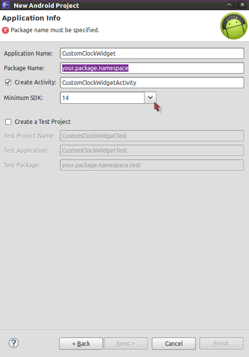
The first step is to download and install the Windows Phone 7.5 SDK.

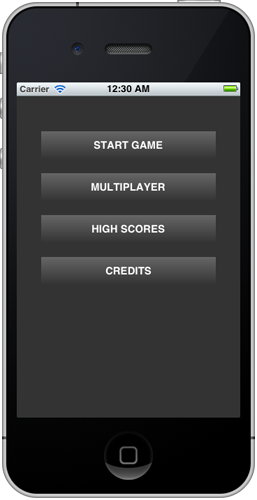
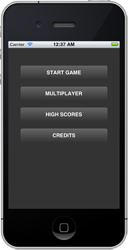
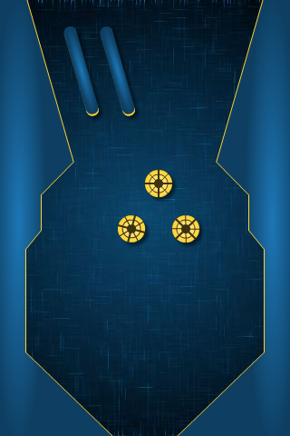
Before we start, here is the final image of what we are going to build.

Final App

The app itself is a very simple clock app that shows the time & date. We will use animation to bring in the elements when the application starts. The bulk of the work will be putting together the screen elements and aligning them properly and creating the startup animation. We will also add a little bit of code to update the date and time periodically.


Project Setup

First, you will need to create a project in Expression Blend. For this, you will need to select File > New Project in Expression Blend and select the Windows Phone Application Project template.

Provide a name for your project. I will use MinimalClock for my project.

Creating New Project

Once the project is created, select Project > Run Project to run your project. You will notice that the project compiles and then Blend launches the Windows Phone 7 emulator. Sooner or later, you will see your app running in the emulator. Hit the home button on the emulator to quit your app. Doing so will stop the debugging session and will get you to the home screen on your emulator. Once you’re done looking around in the emulator, switch back to Expression Blend.


Designing the UI

Now we will put together the UI for the MinimalClock app. After the project is created you will see this in your Expression Blend:

New Project in Expression Blend

First, we need to remove all the controls that were created by the project template for us. In the Objects and Timeline, right click on the TitlePanel and choose Delete to remove the control.

We also need to change the layout type to Canvas instead of Grid, so we can freely move around our controls. To do this, right-click on the ContentPanel and select Canvas in Change Layout Type menu.

Once finished, your Objects and Timeline should look like this.

Objects and Timeline

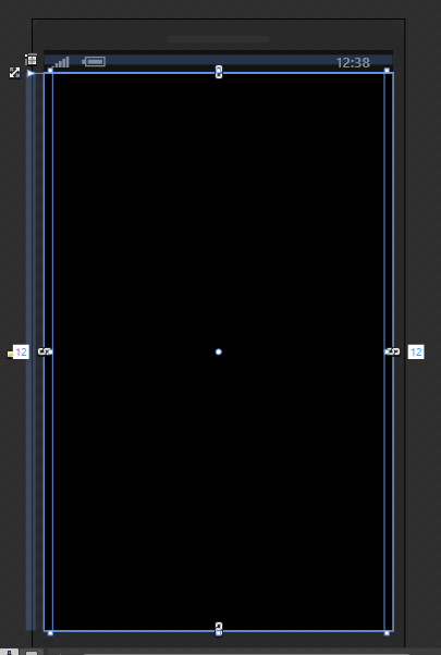
And your application page should be empty like this:

alt="Empty Application Page"
title="Empty Application Page" />

Now, we have the empty application page and we are ready to start adding controls to it.

On the toolbar menu, select the Text tool and TextBlock. Draw a rectangle on your application page in any size. We will fix the size later.

TextBlock tool

This will be the TextBlock that we will be using for displaying the hour part of the time, so we will need to rename it to TimeHour. We will also need to change this to be slightly larger.

TextBlock selected on Application page

On the right hand side, find the properties Window. Make sure that the TextBlock you have just created is selected and change its name to TimeHour and hit Enter.

Renaming TextBlock to TimeHours

Next, you will need to change the content of the TimeHour control, so navigate to the Text property and change its value to 12. Then hit Enter. A faster way to find any property on the properties tab is to use the search area and start typing the name of the property. Be careful to clear the search box after you have finished modifying your property as all the other properties will remain hidden by your search.

Changing the Text property of TimeHours to 12

Next, we will create a style for our TimeHour control. Styles are a collection of visual properties that can be applied on a given control type. We will be saving a lot of work with styles. This can be done by right clicking on the control itself in the Objects and Timeline palette and navigate to the Edit Style menu and select Create Empty

Creating an Empty Style

Next, we need to give the name of the style: TimeTextStyle, and then make sure to select This Document where the style will be defined.

Creating Style Resource

After creating the style, we will find ourselves in the style editor. You will be recognizing it by looking at the editor Window

Style editor for TimeTextStyle

On the properties pane, change the following. Do a search for Font in the Property Search field, but do not forget to clear it later to unhide the other properties.

  • Font: Segoe WP
  • Font: Size: 164
  • Font Wight: Bold
Style changes for TimeTextStyle

You will also need to change the Height and Width to Auto in our style, by clicking on the small crossed arrow symbol right next to the size field.

Setting Height and Width to Auto

Now we are done editing our style, so we can leave the style edit mode clicking on the TimeHours label on the top of our design surface.

Finishing editing our style

Now, we need another TextBlock to show the minutes for the current time and another for showing the dots between them. For this, select the TimeHours on the Objects and Timeline and press Ctrl-C to copy and press Ctrl-V twice to create two copies. You wil end up with this in your Objects and Timeline panel.

Duplicating the TimeHours control

You will need to do the following changes:

  • Rename TimeHours_Copy to TimeDots
  • Change the Text property to :
  • Rename TimeHours_Copy1 to TimeMinutes
  • Change TimeMinutes Text property to 59

Positioning the Time Elements

Now, we have all the textblocks that we need for displaying the Time. All we need is to align them and place them a bit further away from each other.

First, you will need to select all three controls in the Objects and Timeline palette and right-click on them, select Align and Vertical Centers.

Aligning textblocks

You will need to put a littlebit of spacing between the time elements. For moving the elements precisely, you can use the arrow keys. If you use the arrow keys the control will move one pixel in the given directions and if you use the arrow with shift key then the control will be moved by 10 pixels.

Select the TimeHours textblock on the Ojects and Timeline palette and move it 5 pixels left. Select the TimeMinutes textblock and press the right arrow five times to move it right 5 pixels. Once, you are done you will end up with omething like this.

Nudging textblocks

Finally, we will need to combine the elements into a single control, so it will be easier to manipulate later.

To do this you will need to select all TimeHours, TimeDots and TimeMinutes on the Objects and Timeline palette. Right click on the selected items and choose Group Into and Canvas.

Combining textblocks

Double click on the newly created [Canvas] element and rename it to TimeText. Now your object structure should look like this.

TimeText textblock

Adding Bars and the application title

Lastly, we will add two bars. One vertical and one horizontal to make the UI a bit more interesting. We will also add the name of the app.

First, make sure that ContentPanel is selected on the Objects and Timeline palette, then select the Rectangle on the toolbar or use its shortcode M. Draw a horizontal rectangle just above the TimeText control. Next, you will need to change the properties of this rectangle. Make sure that your rectangle is selected and on the Properties palette change the following:

  • Set Name property to HorizontalSeparator.
  • Set Height property to 4 px.
  • Set Width property to 587 px.

Now we are going to change the fill property of the HorizontalSpearator to one of the built in styles called PhoneAccentBrush. This will reuse the current selected theme’s accent color. With this modification the application will reuse the primary color of the current theme.

In order to change the fill, select HorizontalSeparator and locate the last tab on the color editor called Brush resources. Then select the PhoneAccentBrush from the list.

Selecting the PhoneAccentBrush

Also, we need to set the Stroke property of HorizontalSeparator to No Brush. You can do this by selecting Stroke property just right under of the Brush property and then select the first tab on the color editor.

Changing the Fill property to No Brush

We need a second bar called horizontal bar. For this, once more select the Rectangle tool or hit M to select it. Draw a rectangle just below the TimeText control and set the following properties.

  • Set the Name property to VerticalSeparator
  • Fill to PhoneAccentBrush
  • Stroke to No Brush
  • Width to 4px
  • Height to 350px

These separators will go over the boundaries of the screen, but this is intended. You will need to position the separators around the Time part like this:

Separators are placed around time

Now we need to add the application title. Select the TextBlock tool from the Tools palette or press T. Draw a TextBlock just above the HorizontalSeparator and change the following properties.

  • Set the Name property to ApplicationTitle
  • Set the Text property to MOBILETUTS MINIMAL CLOCK
  • Set the Foreground property to PhoneAccentStyle
  • Set the FontSize property to 12pt

This is what it should look like now:

Application title positioned

Creating Seconds

To create the seconds you will need to add a new TextBlock to the application page. Select the TextBlock tool from the Tools palette, or press the T key.

TextBlock tool

Draw a TextBlock just below the Time and set the following properties:

  • Set the Name property to SecondsLabel
  • Set the Text property to seconds.

Next we will define a style for this element and later we will reuse this style for formatting the day labels as well.

To create a new style select the SecondsLabel on the design surface, right click on it and in the Edit Style menu, choose Create Empty.

Creating the SmallTextStyle

Give SmallTextStyle as the name of style and click on the OK button to create the style.

Created the SmallTextStyle

Next, you will find yourself in the style editor. Change the following property:

  • Set the Font Size to 28px.

Also, set the top and bottom margin to 2 pixels.

Setting the margins

You can leave the style editing mode by clicking on the SecondsLabel on the top-left area on your design surface.

Leaving style editing

Draw a second TextBlock below SecondsLabel and change the properties like this:

  • Set the Name property to TimeSeconds
  • Set the Text property to 59
  • Set the FontSize property to 140pt
  • Set the Width property to 210px

With all the changes the phone application page should look like this:

Application page with seconds added

Creating Date

Now we are ready to create the part that will display the current date. For this select again the TextBlock tool or press the T key to access it quickly.

Draw a TextBlock just right above the HorizontalSeparator control and change its properties as the following:

  • Set the Name property to DateText
  • Set the Text property to 2012/12/13
  • Set the Font Size to 22 pt.

Here is how the application page looks after adding the DateText.

Date added to application page

Creating Days

Finally, we will create the control responsible for displaying the days. We will need seven TextBlock to display each day of the week. You will need to add the m one by one. Select the TextBlock tool from Tool palette or press the T key and place all TextBlocks on the right side of the VerticalSeparator.

  • Monday

    • Set the Name property to Day1
    • Set the Text property to mon
  • Tuesday

    • Set the Name property to Day2
    • Set the Text property to tue
  • Wednesday

    • Set the Name property to Day3
    • Set the Text property to wed
  • Thursday

    • Set the Name property to Day4
    • Set the Text property to thu
  • Friday

    • Set the Name property to Day5
    • Set the Text property to Fri
  • Saturday

    • Set the Name property to Day6
    • Set the Text property to sat
  • Sunday

    • Set the Name property to Day7
    • Set the Text property to sun

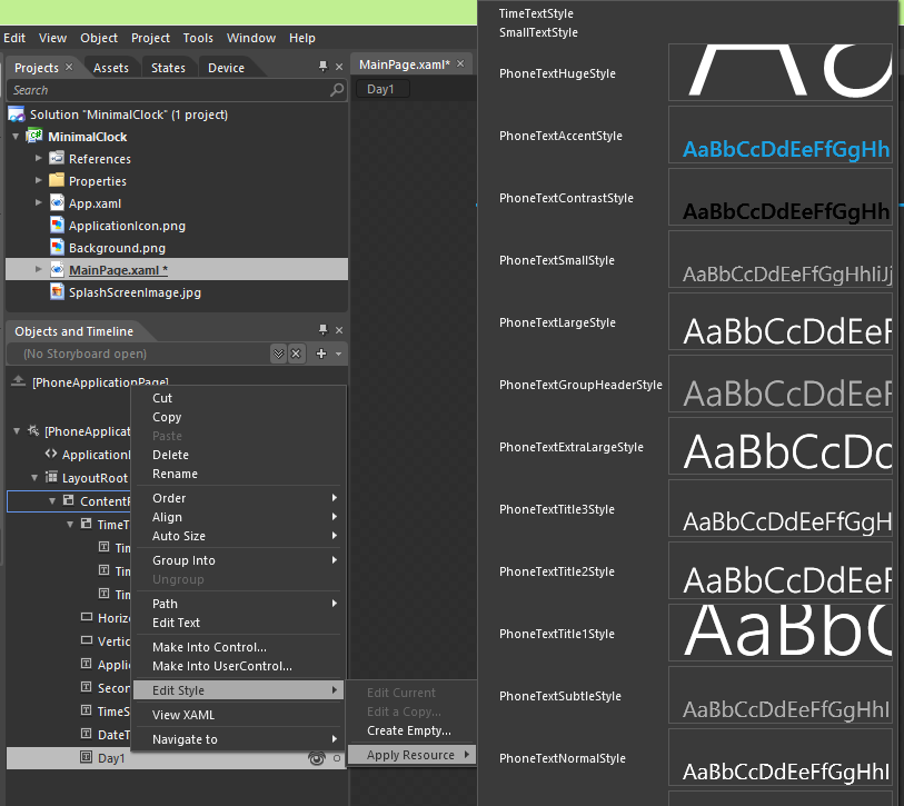
For each of the day text block change the style by right clicking one the controls one by one, select the Edit Style menu and then choose the Apply Resource. Select style SmallTextStyle that we defined earlier.

alt="Selecting SmallTextStyle" title="Selecting SmallTextStyle" />

After this we need to arrange the textblocks as shown in the screenshot below.

Ordering the days

If the days not aligned correctly, then select them all in the Objects and Timeline palette, right click and select Left Edges from Align menu.

Next we need to combine the days into a new container, so we can manipulate them easier later. With all the days selected, right click on them and select StackPanel from the Group Into menu.

Combining days to StackPanel

Double click on the newlz created [StackPanel] element and change it’s name to WeekDays.

WeekDays

We have one last step in order to finish the UI design phase and to get to the planned look of our application. We need to slightly rotate our whole UI.

For this, select the ContentPanel in the Objects and Timeline palette and then go to the Properties and change and in the Transform property group, change the Rotation Angle to -30 degrees.

Rotating the ContentPanel

After looking at the rotated screen, we notice that the screen elements are slightly off. They need to be repositioned in order to look nicer when rotated.

Rotated screen

We need to change the position of the DateText and the ApplicationTitle. You will need to change the following properties:

  • Set the Left property of DateText to 380.
  • Set the Width property of HorizontalSeparator to 620, so it goes over the screen boundaries.
  • Set the Left property of the ApplicationTitle to 16 to bring the application title to closer to the center of the screen.

You can also select the control that you would like to reposition and use the arrow keys for slightly moving around the controls pixel by pixel and use Shift key with the Arrow keys to move them around 10 pixels at a time.

Now that all the controls are in place, the UI is done and the animations can be added.

Final Application Page

### Device Tab

In the initial screenshot you can see that the separator lines are red, but in my screenshot they are blue. This happens, because the device has different accent color set up. You can change the device theme, by clicking the Device tab just next to the Project tab. Here you will be able to change the orientation of the device, applying different accent color and see how the application look like if the dark or light theme is selected. I encourage you to play around a little with the settings.

Device tab

States and Storyboards

Next, we will create the initial animation that will be playing when the application launched. The animation will move the TimeText, WeekDays, TimeSeconds, DateText controls to their initial location.

Animations in Expression Blend are based on creating key frames and then modify certain properties in that key frame. This will tell the animation subsystem that the property needs to be animated and the value should be as specified in the key frame. For example, if you create a key frame at 1 seconds for the TimeText and then change the location of and opacity of the control then these properties will be animated.

Creating Storyboard for the initial animation

First, you need to create a new story board in the Objects and Timeline palette by pressing the + button.

New storyboard

Provide the name InitialAnimation for your new storyboard and click Ok to create it.

Creating new storyboard

Now that we have the storyboard created, you will see something like this in the Objects and Timeline palette. On the left hand side you will see that our storyboard called InitialAnimation is selected and the little red led indicates that the recording is on. This means that if we change any properties of any control it will be part of the storyboard instead of changing the UI.

Objects and Timeline

Animating TimeText Opacity

On the left hand side of the palette you can see the timeline part. Here you can move forward or backwards in time and you can add keyframes. Next, we will animate the TimeText and its Opacity property. We will animate the Opacity property from 0 percent to 100 percent in 1 second. In order to do this, select TimeText in the Objects and Timeline palette and make sure that the playhead is at 0 seconds and click the Record Keyframe button.

Record Keyframe

The result will be that a new keyframe is added for Timetext at 0 seconds. You will also notice that a little red dot is added to TimeText, this means that the InitialAnimation is changing this control.

0s TimeText keyframe

Now, you will need to go to the Properties palette and change the Opacity of TimeText to be 0 percent.

0s TimeText Opacity 0

Next, you will need to move the playhead to 1 second and click the Record Keyframe.

Record Keyframe
1s TimeText keyframe

Then again, go to the Properties palette and change the Opacity of TimeText to 100 percent.

1s TimeText Opacity 100

The animation is now ready and you can observe it by clicking the Play button:

Play Animation

You can move around the keyframes, if you want to tweak the animation.

Animating TimeText position

Select the 0 second keyframe from TimeText. Temporarily change back the Opacity property to 95 percent, so you can see what you are doing. Then a couple of times hit the Shift and Left Arrow key combination. With this, you will move out TimeText from the screen. This will be the starting position of our movement. Do not forget to change back the Opacity property to 0 percent.

Select the 1 seconds keyframe of TimeText then you will need to do the following. Hit once the right arrow key on your keyboard – moving the control 1 pixel to the right – and then hit the left arrow key once – moving the control 1 pixel to the left. With this change we will essentially record the current position of our TimeText control and instruct the storyboard to move it to this location regardless of the initial position.

Try to play the animation. If everything worked out, then you should see the TimeText moving in to the screen and gradually appearing at the same time.

One more thing we can do to spice up the animation is to configure the easing for the animation. This will make the animation more natural. For this, select the 1s key frame of our animation. Then change the Easing Function property to Back InOut on the Property palette.

Changing the Easing

Play the animation once again to show how the animation behaves now. If you would like, change the easing to see how each easing function behaves.

Animating TimeSeconds

Next, we will be animating TimeSeconds, the control used to display the seconds part of the current time. For this, select TimeSeconds and add keyframes to the timeline at 0 seconds and at 1 seconds. Then do the following:

  • Select the first key frame of TimeSeconds
  • Set the Opacity property of TimeSeconds to 0 percent.
  • Press the shift + down arrow keys together on your keyboard a couple of times to move TimeSeconds out of the screen.
  • Select the second key frame of TimeSeconds

  • Set the Opacity property of TimeSeconds to 100 percent.
  • Press the down arrow on your keyboard once and then the up arrow once to record the position of TimeSeconds.
  • Select the second keyframe and change the easing function to Back InOut.

Lastly, we will need to animate the controls that are responsible for displaying the current date and days in the application. These animation will be simple they will animate the opacity of these controls from 0 percent to 100 percent.

  • Select Weekdays in the Objects and Timeline palette and add a keyframe at 0 seconds.
  • Change the opacity to 0 percent
  • Move the playhead to 1 second
  • Add the second key frame by clicking on the Record keyframe button Record Keyframe.
  • Change the opacity to 100 percent.

  • Select the DateText control in the Objects and Timeline palette and add a keyframe at 0 seconds.

  • Change the opacity to 0 percent
  • Move the playhead to 1 second
  • Add the second key frame by clicking on the Record keyframe button Record Keyframe.
  • Change the opacity to 100 percent.

Setting up the initial state

One last thing needed to be done is to quit the animation mode and change the opacity to 0 for all controls that we are animating in the InitialAnimation story board. Close the storyboard in the Objects and Timeline palette by clicking the X button next to the story board name.

Close storyboard

Then select each of the controls animated and set their opacity properties to 0 percent.

Now that the animation is done, all is needed to add a bit of code to do the screen updating, so the content of our screen is updated each seconds and to start our initial animation when the application screen is loaded.


Writing a Little Code

Now the application is almost finished. All we need to do is to add a little bit of code to refresh the screen every half second and to play our initial animation.

In order to update the screen periodically, a DispatchTimer needs to be created when the page finishes loading. For this, an event handler for the page loaded event needs to be created.

Create Event Handlers

First, select the application page from the Objects and Timeline palette.

Select application page

Then on the Properties palette select the Events tab.

Select Events

In the list of events, select the Loaded event and double-click to create the event handler. A new window with the code behind for our application page.

Code view

DispatchTimer

First, the dispatch timer needs to be defined in the class file (MainPage.xaml.cs). A “using” statement needs to be added just after the last using stement at the top of the class file.

using System.Windows.Threading;

Then add the following line just after the class definition:

        private DispatcherTimer _timer;

In the Loaded event add the following code lines:


        RefreshUI(this, null);

        Storyboard sb = (Storyboard)this.Resources["IntialAnimation"];
        sb.BeginTime = TimeSpan.FromSeconds(0.1);
        sb.Begin();

        _timer = new DispatcherTimer();
        _timer.Interval = TimeSpan.FromSeconds(0.4);
        _timer.Tick += RefreshUI;
        _timer.Start();

What this piece of code will do is first call a method that will update the UI to the current time and day before the initial animation is set up to run in 0.4 seconds and will wire up our timer to run every half seconds and call the RefreshUI method.

Next, a new method needs to be added to stop the timer when we leave the application. The method called OnNavigatedFrom looks like this:


    protected override void OnNavigatedFrom(System.Windows.Navigation.NavigationEventArgs e)
    {
        base.OnNavigatedFrom(e);

        if (_timer != null)
        {
            _timer.Stop();
        }
    }

One last piece is missing: the RefreshUI method that updates the UI.


    public void RefreshUI(object sender, EventArgs e)
    {
        DateTime dt = DateTime.Now;

        int seconds = dt.Second;
        int minutes = dt.Minute;
        int hour = dt.Hour;

        int year = dt.Year;

        // Time 
        if (TimeHours.Text != dt.Hour.ToString())
        {
            TimeHours.Text = dt.Hour.ToString();
        }

        if (TimeMinutes.Text != dt.Minute.ToString("D2"))
        {
            TimeMinutes.Text = dt.Minute.ToString("D2");
        }

        if (TimeSeconds.Text != dt.Second.ToString("D2"))
        {
            TimeSeconds.Text = dt.Second.ToString("D2");
        }
    }       

The final code will look like this:

Final Code

If all went well, then after pressing Ctrl-Shift-B or select menu, Project, Build Project, the project should build without errors. If the project is built without any problem then select Project, Run Project to run the application.


Summary

This article just scratched the surface of what is possible using Blend for creating Windows Phone 7 apps. I would encourage you to take this app and experiment with animating the UI or alter the app in other ways. It is fun!


Links:

If you have any questions or need some help with the app. Please, do not hesitate to contact me on twitter (@gyurisc) or visit my blog at www.littlebigtomatoes.com. I will be happy to answer your questions or help you with your problems.


Bluetooth Connectivity with GameKit

$
0
0

This iOS tutorial will teach you how to establish a Bluetooth connection between two iOS devices using the GKPeerPickerController, GKPeerPickerControllerDelegate, GKSession, and GKSessionDelegate classes. We’ll also cover how to send data back and forth through the connection by creating a simple text messaging app.


Step 1: Project Setup

Launch Xcode and click File > New > Project. Click “Application” under the iOS pane on the left. Click the “Single View Application” icon and click “Next.”

Bluetooth Connection: screenshot of new project screen

In the “Product Name” field, type “BluetoothTextMessenger” and enter a name for your Company Identifier, such as “com.mobiletuts.” Choose “iPhone” from the “Device Family” menu. Uncheck “Use Storyboards” and “Include Unit Tests” and then check “Use Automatic Reference Counting.” Click “Next”, choose a location to save your project, and then click “Create.”

Bluetooth Connection: screenshot 2 of new project screen

Step 2: Declaring the Methods

Let’s start by declaring and defining the methods to connect to a device and send data. In the “ViewController.m” file, add the following code:

@interface ViewController ()
- (void)sendMessage:(id)sender;
- (void)connectToDevice:(id)sender;

@end

- (void)connectToDevice:(id)sender {}
- (void)sendMessage:(id)sender {}

Step 3: Setting Up the Interface

Let’s create two buttons, a label, and a text field for our text messenger. Click on the “ViewController.h” file and add the following code:

@property (strong, nonatomic) UILabel           *messageReceivedLabel;
@property (strong, nonatomic) UITextField       *messageToSendTextField;
@property (strong, nonatomic) GKSession         *session;
@property (strong, nonatomic) UIButton          *sendButton;

Click on the “ViewController.m” file and add the following code to complete the properties.

@synthesize messageReceivedLabel    = _messageReceivedLabel;
@synthesize messageToSendTextField  = _messageToSendTextField;
@synthesize session                 = _session;
@synthesize sendButton              = _sendButton;

While still within the “ViewController.m” file, add the following code to programmatically create the interface:


//Button to connect to other device
UIButton *connectButton = [UIButton buttonWithType:UIButtonTypeRoundedRect];
connectButton.frame = CGRectMake(20.0f, 20.0f, 80.0f, 40.0f);
[connectButton setTitle:@"Connect" forState:UIControlStateNormal];
connectButton.tintColor = [UIColor darkGrayColor];
[connectButton addTarget:self action:@selector(connectToDevice:) forControlEvents:UIControlEventTouchUpInside];
[self.view addSubview:connectButton];
    
//Button to send message to other device
UIButton *sendButton_ = [UIButton buttonWithType:UIButtonTypeRoundedRect];
sendButton_.frame = CGRectMake(220.0f, 20.0f, 80.0f, 40.0f);
[sendButton_ setTitle:@"Send" forState:UIControlStateNormal];
sendButton_.tintColor = [UIColor darkGrayColor];
sendButton_.enabled = NO; 
[sendButton_ addTarget:self action:@selector(sendMessage:) forControlEvents:UIControlEventTouchUpInside];
self.sendButton = sendButton_;
[self.view addSubview:self.sendButton];
    
//Label for message that is received
self.messageReceivedLabel = nil;
CGRect messageReceivedLabel_Frame = CGRectMake(20.0f, 80.0f, 280.0f, 44.0f);
UILabel *messageReceivedLabel_ = [[UILabel alloc] initWithFrame:messageReceivedLabel_Frame];
messageReceivedLabel_.textAlignment = UITextAlignmentCenter;
messageReceivedLabel_.font = [UIFont boldSystemFontOfSize:20.0f];
self.messageReceivedLabel = messageReceivedLabel_;
[self.view addSubview:self.messageReceivedLabel];
    
//Text field to input message to send
CGRect messageToSendTextField_Frame = CGRectMake(20.0f, 144.0f, 280.0f, 44.0f);
UITextField *messageToSendTextField_ = [[UITextField alloc] initWithFrame:messageToSendTextField_Frame];
messageToSendTextField_.font = [UIFont systemFontOfSize:20.0f];
messageToSendTextField_.backgroundColor = [UIColor whiteColor];
messageToSendTextField_.clearButtonMode = UITextFieldViewModeAlways;
messageToSendTextField_.placeholder = @"Enter a message to send";
messageToSendTextField_.contentVerticalAlignment = UIControlContentVerticalAlignmentCenter;
self.messageToSendTextField = messageToSendTextField_;
[self.view addSubview:self.messageToSendTextField];

The two buttons initiate the connection and send a text message, while the text field holds the outgoing message and the label displays the incoming message.


Step 4: Adding the Framework

GameKit provides an easy way to connect through Bluetooth. Using GKPeerPickerControllerDelegate and GKSessionDelegate, the intricacies of the connection, such as windows to show the connections and who is nearby, are taken care of by the delegate automatically. Start by importing the “GameKit” framework. Click on the app’s target, the Xcode file listed at the top of the far left pane. Scroll down to the “Linked Frameworks and Libraries” pane. Click the plus button and type in “GameKit”. Click “GameKit.framework” and then click “Add”.

Bluetooth Connection: adding GameKit framework

Step 5: Conforming to the Delegates

Click on the “ViewController.h” file and edit the following code to conform to the GKSessionDelegate and GKPeerPickerControllerDelegate protocols.

@interface ViewController : UIViewController <GKSessionDelegate, GKPeerPickerControllerDelegate>

Step 6: Adding the Connection Logic

The two classes each perform different tasks relating to a connection. GKPeerPickerController provides an interface to establish the connection between two devices, then provides a GKSession object as the result of the connection. The GKSession object then handles the connection and any data passed depending on how your app is configured.

Establishing a Connection

Let’s add the logic in the order in which it occurs. First, we’ll create a connection using GKPeerPickerController. Navigate back to the previously defined method connectToDevice: and add the following logic inside the braces to attempt to connect to a device when the connect button is tapped.

if (self.session == nil) {
    //create peer picker and show picker of connections
    GKPeerPickerController *peerPicker = [[GKPeerPickerController alloc] init];
    peerPicker.delegate = self;
    peerPicker.connectionTypesMask = GKPeerPickerConnectionTypeNearby;
    [peerPicker show];
}

In the above code, we check to make sure there isn’t a session, meaning the device is not connected. If there is no session, a GKPeerPickerController is created and the ViewController is assigned as the delegate so that it can implement the GKPeerPickerControllerDelegate methods. Lastly, the GKPeerPickerController is shown on the screen with a list of available nearby Bluetooth connections.

Getting the GKSession Object

Once the peerPicker is shown, a series of delegate methods are called that handle the connection. While still in the “ViewController.m” file, add the following code:

- (GKSession *)peerPickerController:(GKPeerPickerController *)picker sessionForConnectionType:(GKPeerPickerConnectionType)type
{
    //create ID for session
    NSString *sessionIDString = @"MTBluetoothSessionID";
    //create GKSession object
    GKSession *session = [[GKSession alloc] initWithSessionID:sessionIDString displayName:nil sessionMode:GKSessionModePeer];
    return session;
}

This delegate method gets a session based on the connection type specified. In this instance, GKSessionModePeer is used because we want to look for connection devices like a client and advertise the connection like a server. The sessionID is necessary to identify the session and can be whatever value suits your needs. The returned GKSession uses the sessionID as its identifier, and new peers can use the identifier to connect to the same GKSession.

Dismissing the Picker

Next, you’ll want to implement peerPickerController:didConnectPeer:toSession: in order to take control of the session and dismiss the picker. Type the following code in the “ViewController.m” file.

- (void)peerPickerController:(GKPeerPickerController *)picker didConnectPeer:(NSString *)peerID toSession:(GKSession *)session
{
    //set session delegate and dismiss the picker
    session.delegate = self;
    self.session = session; 
    picker.delegate = nil;
    [picker dismiss];
}

The session delegate is set to self so that the ViewController can implement the GKSessionDelegate methods. Then the ViewController is removed as the picker’s delegate, and the picker is dismissed as it is no longer needed.

Set the ViewController to Receive Data

Set the ViewController object to receive data from its peers by adding the following code.

- (void)session:(GKSession *)session peer:(NSString *)peerID didChangeState:(GKPeerConnectionState)state
{
    if (state == GKPeerStateConnected){
        [session setDataReceiveHandler:self withContext:nil]; //set ViewController to receive data
        self.sendButton.enabled = YES; //enable send button when session is connected
    }
    else {
        self.sendButton.enabled = NO; //disable send button if session is disconnected
        self.session.delegate = nil; 
        self.session = nil; //allow session to reconnect if it gets disconnected
    }
}

Each time the connection state changes, this delegate method is called. In the code, we check to see if the session is connected, and, if it is, the ViewController is set to handle the data received from peers connected to the session. If the session is not connected, the delegate and session are set to nil so that another connection can be established.

Sending Data

To send the contents of the text field to the device that is connected, navigate back to the previously defined method sendMessage: and add the following code inside the braces.

//package text field text as NSData object 
NSData *textData = [self.messageToSendTextField.text dataUsingEncoding:NSASCIIStringEncoding];
//send data to all connected devices
[self.session sendDataToAllPeers:textData withDataMode:GKSendDataReliable error:nil];

The first line packages up the text of the text field as an NSData object so it can be sent through Bluetooth. The second line tells the session to send the data to all peers connected to the session.

Receiving Data

Data received from a peer comes in the form of an NSData object. In order to unpack the text, add the following code:

- (void)receiveData:(NSData *)data fromPeer:(NSString *)peer inSession:(GKSession *)session context:(void *)context
{   
    //unpackage NSData to NSString and set incoming text as label's text
    NSString *receivedString = [[NSString alloc] initWithData:data encoding:NSASCIIStringEncoding];
    self.messageReceivedLabel.text = receivedString;
    
}

The first line of code in this method unpacks the NSData object, returning an NSString object. Next the text property of the label is set as the incoming string.


Step 7: Testing the Connection

Connect a device to your computer. Click Product > Run, or the Run arrow in the upper left corner, to build and run the app on a device. Once the app is running on a device, disconnect it and connect a second device to your computer. Build and run the app on this device as well. Launch the app on both devices. Tap the connect button on both devices and follow the prompts to connect your devices. Type a message and tap “Send” to see it appear on the other device.


Conclusion

One thing to keep in mind is that a Bluetooth connection is designed for sending small bits of data, such as text or set of numbers. If you are planning on sending something large like a photo, you’ll probably want to use Wi-Fi or an Internet connection instead. While this app probably won’t have you dropping your favorite text messenger, it does show how to connect and send bits of data through Bluetooth, a handy feature for any app that could benefit from sharing small chunks of data between devices.


Corona SDK: Create a Compass Application

$
0
0

In this tutorial, you’ll learn how to create a Compass Application using the smartphone hardware. Read on!


Step 1: Application Overview

Using pre made graphics, we will code a Compass application using Lua and the Corona SDK API’s.

This is similar to Apple’s official compass app distributed with iOS.


Step 2: Target Device

The first thing we have to do is select the platform we want to run our app within, this way we’ll be able to choose the size for the images we will use.

The iOS platform has these characteristics:

  • iPad: 1024x768px, 132 ppi
  • iPhone/iPod Touch: 320x480px, 163 ppi
  • iPhone 4: 960x640px, 326 ppi

Because Android is an open platform, there are many different devices and resolutions. A few of the more common screen characteristics are:

  • Google Nexus One: 480x800px, 254 ppi
  • Motorola Droid X: 854x480px, 228 ppi
  • HTC Evo: 480x800px, 217 ppi

In this tutorial, we’ll be focusing on the iOS platform with the graphic design, specifically developing for distribution to an iPhone/iPod touch. However, the code presented here should apply to Android development with the Corona SDK as well.


Step 3: Interface

A simple and friendly interface will be used. The interface created includes a background and a compass pointer shape.

The interface graphic resources necessary for this tutorial can be found in the attached download.


Step 4: Export Graphics

Depending on the device you have selected, you may need to export the graphics in the recommended PPI and dimensions. You can do this in your favorite image editor.

I used the Adjust Size… function in the Preview app on Mac OS X. Remember to give the images a descriptive name and to save them in your project folder.


Step 5: App Configuration

An external file, config.lua, will be used to make the application go fullscreen across devices. This file shows the original screen size and the method used to scale that content in case the app is run in a different screen resolution.

application =
{
    content =
    {
        width = 320,
        height = 480,
        scale = "letterbox"
    },
}

Step 6: Main.lua

Let’s write the application!

Open your prefered Lua editor (any text editor will work, but not all support Lua syntax highlighting) and prepare to write your awesome app. Remember to save the file as main.lua in your project folder.


Step 7: Code Structure

We’ll structure our code as if it were a Class. If you know ActionScript or Java, you should find the general structure familiar.

Necessary Classes

Variables and Constants

Declare Functions

    contructor (Main function)
	
    class methods (other functions)

call Main function	

Step 8: Hide Status Bar

display.setStatusBar(display.HiddenStatusBar)

This code hides the status bar. The status bar is the bar on top of the device screen that shows the time, signal, and other indicators.


Step 9: Background

This image will be used as the background for the application interface. The next line of code will store the interface.

-- Graphics

-- [Background]

local bg = display.newImage('bg.png')

Step 10: Pointer

This will be used to indicate the current direction in the background.

-- [Pointer]

local pointer = display.newImage('pointer.png')

Step 11: Heading Text

The next variable is used to display the heading in degrees as well as the current direction.

-- Heading Text

local heading = display.newText('0', display.contentCenterX, 60, native.systemFont, 21)

Step 12: Declare Functions

Declare all functions as local at the start.

-- Functions

local Main = {}
local update = {}

Step 13: Constructor

Next, we’ll create the function that will initialize all the game logic:

function Main()
	pointer:setReferencePoint(display.CenterReferencePoint)
	pointer.x = display.contentCenterX
	pointer.y = display.contentCenterY
	
	heading:setTextColor(255)
	heading:setReferencePoint(display.CenterReferencePoint)
	
	Runtime:addEventListener('heading', update)
end

Step 14: Pointer Rotation

We use the magnetic property of the heading event to set the rotation of the pointer

function update(e)
    -- Pointer Rotation
	
    pointer.rotation = math.floor(e.magnetic)

Step 15: Heading Text & Direction

These lines of code detect the curren rotation of the Pointer. This will help us identify the current direction when working with the compass.

    -- Heading Text & Direction
	
	if(pointer.rotation >= 0 and pointer.rotation < 23) then
		heading.text = math.floor(e.magnetic) .. ' N'
		heading:setReferencePoint(display.CenterReferencePoint)
		heading.x = display.contentCenterX
	elseif(pointer.rotation >= 23 and pointer.rotation < 68) then
		heading.text = math.floor(e.magnetic) .. ' NE'
		heading:setReferencePoint(display.CenterReferencePoint)
		heading.x = display.contentCenterX
	elseif(pointer.rotation >= 68 and pointer.rotation < 113) then
		heading.text = math.floor(e.magnetic) .. ' E'
		heading:setReferencePoint(display.CenterReferencePoint)
		heading.x = display.contentCenterX
	elseif(pointer.rotation >= 113 and pointer.rotation < 158) then
		heading.text = math.floor(e.magnetic) .. ' SE'
		heading:setReferencePoint(display.CenterReferencePoint)
		heading.x = display.contentCenterX
	elseif(pointer.rotation >= 158 and pointer.rotation < 203) then
		heading.text = math.floor(e.magnetic) .. ' S'
		heading:setReferencePoint(display.CenterReferencePoint)
		heading.x = display.contentCenterX
	elseif(pointer.rotation >= 203 and pointer.rotation < 248) then
		heading.text = math.floor(e.magnetic) .. ' SW'
		heading:setReferencePoint(display.CenterReferencePoint)
		heading.x = display.contentCenterX
	elseif(pointer.rotation >= 248 and pointer.rotation < 293) then
		heading.text = math.floor(e.magnetic) .. ' W'
		heading:setReferencePoint(display.CenterReferencePoint)
		heading.x = display.contentCenterX
	elseif(pointer.rotation >= 293 and pointer.rotation < 360) then
		heading.text = math.floor(e.magnetic) .. ' NW'
		heading:setReferencePoint(display.CenterReferencePoint)
		heading.x = display.contentCenterX
	end
end

Step 16: Call the Main Function

In order to initially start the game, the Main function needs to be called. With the above code in place, we’ll do just that here:

Main()

Step 17: Loading Screen

The Default.png file is an image that will be displayed right when you start the application while the iOS loads the basic data to show the Main Screen. Add this image to your project source folder so it will be automatically added by the Corona compliler.


Step 18: Icon

Using the graphics you created before, you can now create a nice and good looking icon. The icon size for the non-retina iPhone icon is 57x57px, but the retina version is 114x114px, and the iTunes store will require a 512x512px version. I suggest creating the 512x512px version first and then scaling down for the other sizes.

It doesn’t need to have the rounded corners or the transparent glare. iTunes and the iPhone will provide that for you.


Step 19: Testing in the Simulator

It’s time to do the final test. Open the Corona Simulator, browse to your project folder, and then click open. If everything works as expected, you are ready for the final step!


Step 20: Build

In the Corona Simulator, go to File > Build and select your target device. Fill the required data and click build. Wait a few seconds and your app will be ready for device testing and/or submission for distribution!


Conclusion

Experiment with the final result and try to make your custom version of the app!

I hope you liked this tutorial and found it helpful. Thank you for reading!


Say Hello to the All-New Gamedevtuts+!

$
0
0

We’re excited to let you know about the latest addition to the Tuts+ family — Gamedevtuts+!

Gamedevtuts+ is dedicated to teaching game development, with tutorials, tips, and articles about level layout, game design, coding, and working in the industry. We walk you through how to create games from scratch, go into the theory behind game development, level and character design, discuss working in the industry, and much more…

Read on to find out more about the all-new Gamedevtuts+!


What to Expect on Gamedevtuts+

If you’ve ever wanted to learn about game development, or brush up on what you already know, we think you’re really going to love our latest site! We’ll be publishing a combination of step-by-step written tutorials and screencasts/video lessons. Most weeks you’ll see 4-5 high quality tutorials, tips, and articles, so make sure to subscribe to the Gamedevtuts+ RSS feed so you don’t miss a thing.

If you’re an experienced game developer and you have the skills to create a screencast or text and image tutorial for Gamedevtuts+, it’s easy to familiarize yourself with the guidelines and pitch your idea. We’d love to help you pass on your experience.


Subscribe, Follow & Stay Up To Date

Don’t forget to follow Gamedevtuts+ on Twitter, Facebook, and everywhere else! Here’s how to keep up to date with what’s going on:


Our First Few Posts…

If you’d like to delve straight into the content, here are a few quick links to our first handful of posts on Gametuts+. We hope you find them useful — it’s a good taster of what’s to come!

  • Build a Canabalt-Style Infinite Runner From Scratch

    Build a Canabalt-Style Infinite Runner From Scratch

    This screencast talks through and shows the entire process of creating a Canabalt-style platformer and discusses the tricks used to create an infinitely scrolling game. The final game has randomly generated levels, player movement, death conditions, along with basic scoring — and you’ll have created it in 30 minutes!

    Visit Article

  • Player/World Interaction Through the Lens of Player Mobility

    When Designing a World, Player Mobility Must Come First

    Ever played a game that was packed with great set pieces, concepts, characters, and mechanics, but nevertheless felt boring? Perhaps the problem lay in how your character moved through and interacted with the game world. In this article we’ll take a look at player/world interaction through the lens of player mobility for a few key games, and see how this helps us understand the way level design and character design should work together.

    Visit Article

  • Coding Destructible Pixel Terrain

    Coding Destructible Pixel Terrain: How to Make Everything Explode

    In this tutorial, we’ll implement fully destructible pixel terrain, in the style of games like Cortex Command and Worms. You’ll learn how to make the world explode wherever you shoot it – and how to make the “dust” settle on the ground to create new land.

    Visit Article


Wanted: Awesome Guest Writers

$
0
0

Mobiletuts+ is currently looking to hire guest writers to cover mobile web development (e.g. JavaScript, HTML, CSS, etc.), iOS SDK development, Android SDK Development, Mobile UI/UX, and more! If you’re a talented mobile developer with tips or techniques to share, we want to hear from you!

What We’re Looking For

  • Rock solid knowledge: Mobiletuts+ strives to be a highly respected source of information. Our authors must have excellent knowledge of their topic and be willing to perform thorough research when necessary.
  • Excellent writing skills: You must be comfortable with the English language. We can proof your content, but we can’t rewrite everything for you. To put it simply, if you struggle when deciding whether to write its or it’s, this might not be the gig for you.

What’s the Pay?

  • $150 – $250 USD per full-length tutorial.
  • $50 – $125 USD per quick-tip (depending on length).

The exact rate is dependent on your industry experience, communication skill, and tutorial idea.


Excellent! Where Do I Sign Up?

We’ll need the following information from you:

  • Name.
  • A few sentences about your background and why you’re a good fit.
  • A single link to an article that you’ve written, helped with, or like.
  • Two ideas for tutorials you’d like to write for us.
  • Optional: E-mails with a tutorial attached will get more attention from us since this means you’re serious about the gig.


Please e-mail the above information to:

contact e-mail

We get a fair number of single line e-mails. Don’t be that person. E-mails without the required information will be discarded.

We hope to hear from you soon!


Build a Custom Clock Widget: Clock Design

$
0
0

Developing widgets for the Android platform involves a slightly different set of tasks than standard app development. In this series of tutorials, we will work through the process of developing a customizable analog clock widget. The clock will be based on the Android AnalogClock class and customized with your own graphics.


Tutorial Teaser

Step 1: Create Images for the Clock Dial

We are going to create three clock designs, each with a dial, minute hand, and hour hand. You can of course use your own designs instead, but feel free to use the image files we are using here to get started. The image files for each design at each density are included in the download link for this tutorial and will also be included in the download for Part 4.

First up is the clock dial. Remember that we specified the widget as being two cells wide and two cells high, resulting in a maximum size of 146dp (density-independent pixels). For this tutorial series we will create four versions of each image to suit the four density categories.

Instead of creating images for each density, you can alternatively use NinePatch graphics, which are bitmaps that can be scaled up and down to suit device densities, allowing you to create a single image for each design. The feasibility of using NinePatch depends partly on the content of the designs you are using but there are tools to help you create them if you wish.

It’s easiest if you start with the medium density, which should be a maximum of 146px on both axes. Here is the default clock dial we are using at medium density, which you can use either as a reference for your own designs or if you don’t want to create your own until later:

Clock Dial

In this case, the image is 146px on both axes, but you can make it smaller if you wish. We will specify a margin for devices running Android APIs less than 14 but will not supply a margin for devices on 14-plus, because at the more recent API levels an automatic margin is placed between widgets. You can use pretty much any design you like – your clock doesn’t even have to be circular. Including either marks or numbers indicating the hours on the dial is advisable from a usability perspective although it is not essential.

Here are the two alternative clock dial designs we will be using, one stone style and the other metallic, displayed here at medium density:

Clock Dial
Clock Dial

Once you have your clock dials designed, you can create alternative versions of each image for the different densities. Depending on your designs this may not be necessary, but we will be including tailored versions of each image for the designs in this tutorial. The following indicates the maximum size we are using for our widget on both the X and Y axes at each density:

  • Low density: 110px
  • Medium density: 146px
  • High density: 220px
  • Extra high density: 292px

Get the Full Series!

This tutorial series is available to Tuts+ Premium members only. Read a preview of this tutorial series on the Tuts+ Premium web site or login to Tuts+ Premium to access the full content.


Joining Tuts+ Premium. . .

For those unfamiliar, the family of Tuts+ sites runs a premium membership service called Tuts+ Premium. For $19 per month, you gain access to exclusive premium tutorials, screencasts, and freebies from Mobiletuts+, Nettuts+, Aetuts+, Audiotuts+, Vectortuts+, and CgTuts+. You’ll learn from some of the best minds in the business. Become a premium member to access this tutorial, as well as hundreds of other advanced tutorials and screencasts.


Best of Tuts+ in July 2012

$
0
0

Each month, we bring together a selection of the best tutorials and articles from across the whole Tuts+ network. Whether you’d like to read the top posts from your favourite site, or would like to start learning something completely new, this is the best place to start!


Psdtuts+ — Photoshop Tutorials


Nettuts+ — Web Development Tutorials


Vectortuts+ — Illustrator Tutorials

  • How to Create Hand-Painted Sign in Adobe Illustrator

    How to Create Hand-Painted Sign in Adobe Illustrator

    In this tutorial we will learn how to create an inscription in a retro style based on the free font- the Agency FB. In the process of the font-change we will learn something about letter anatomy. The techniques described here will be useful not only for the work with typography but also for the work with any vector objects.

    Visit Article

  • Creating the Sole of a Sports Shoe with the Appearance Panel

    Creating the Sole of a Sports Shoe with the Appearance Panel

    In today’s tutorial I’m going to show you how I used the Appearance panel to create a stylized version of the bottom of a sneaker. It’s a great exercise for those who are just getting to grips with the Appearance panel.

    Visit Article

  • Quick Tip: How to Create Glowing Progress Bars

    Quick Tip: How to Create Glowing Progress Bars

    Follow this quick tip and learn how to create a glowing progress bar. We will take advantage of the Appearance Panel and use multiple attributes plus plenty of effects: Outer Glow, Inner Glow, Feather, Drop Shadow, Gaussian Blur and Radial Blur. Let’s begin!.

    Visit Article


Webdesigntuts+ — Web Design Tutorials

  • Web Font Services: the Good, the Bad, and the Ugly

    Web Font Services: the Good, the Bad, and the Ugly

    In this article we’ll be taking a look at a few of the most popular web font services, comparing features between them and talking about some of the red flags involved with working with real fonts on the web.

    Visit Article

  • Writing a Flexible Grid Script for Photoshop

    Writing a Flexible Grid Script for Photoshop

    Being a capable web designer means having a solid grasp on grids, especially if you want to pursue responsive web design. In this tutorial we’ll take a look at a Photoshop script for generating your own custom grids, plus we’ll open the hood and look at how the script is actually made.

    Visit Article

  • The Psychology of Content Design

    The Psychology of Content Design

    As web designers, we face a difficult task every time we sit down to produce content for the web. There’s no doubt that we understand Content is King; this term was most famously coined by Bill Gates in 1996, and (love or hate Microsoft) he was right about the future of computing.

    Visit Article


Phototuts+ — Photography Tutorials

  • An In-Depth Guide to Infrared Photography: Setup and Capture

    An In-Depth Guide to Infrared Photography: Setup and Capture

    Infrared photographs are a stunning way to make unique landscape photos, and will add variety to your portfolio. Understanding how to take and process them properly can be very difficult and time consuming due to the steep learning curve involved, but I hope to help.

    Visit Article

  • 20 Fast Tips for Portrait Photography

    Fast Tips for Portrait Photography

    I love portrait photography. I’m sure many of you do, too. However, doing a great portrait is one of the most challenging kinds of photography out there. So, here are 20 tips that will help you take better portraits and improve your workflow.

    Visit Article

  • Faces of Music: Interview with Andy Fallon

    Faces of Music: Interview with Andy Fallon

    I recently had the pleasure of meeting one of the UK’s top portrait photographers. Andy Fallon is at the top of his game. Over the past decade, he has been the go-to photographer for the top music magazines to capture their cover stars. Andy’s now moving on from the world of music and branching into new realms of portraiture. We met up with him to find out more.

    Visit Article


Cgtuts+ — Computer Graphics Tutorials

  • The Making Of “Brooklyn City”

    The Making Of “Brooklyn City”

    This tutorial is intend for anyone who wants a better understanding of what and why they’re doing what they’re doing. A higher level view of my personal workflow towards creating large scale environments. This is not a ’How to snap boxes onto a grid” type of tutorial, there’s nothing wrong with those types of tutorials, but I want to really provide a different perspective on a ‘making of tutorial.

    Visit Article

  • Creating A Low Poly Ninja Game Character Using Blender – Modeling

    Creating A Low Poly Ninja Game Character Using Blender – Modeling

    In this tutorial you’ll learn how to create a low poly ninja character model for games using Blender. The final model will be around 1,200 polys, which is a good amount for iphone or ipad games. Although this tutorial covers building the character in Blender, the workflow is universal and can easily be followed using any other 3D modeling/software package.

    Visit Article

  • An Introduction To Backburner And Render Farms

    An Introduction To Backburner And Render Farms

    This tutorial will teach you how to setup and utilize Autodesk’s Backburner software over multiple computers to speed up your render times. You’ll also learn about making smart decisions and choosing the most cost effective hardware when purchasing components for a personal or small studio sized render farm. If you’re a freelancer on a deadline, or just a hobbyist who wants to get more done – faster, this is a must watch!

    Visit Article


Aetuts+ — After Effects Tutorials


Audiotuts+ — Audio & Production Tutorials

  • Multi Track vs. Multi Channel Drum Setups In Your DAW

    Multi Track vs. Multi Channel Drum Setups In Your DAW

    I’ve been producing Electronic Dance Music for what seems like forever. I remember in the late nineties when I was just getting interested in computer based music sitting at my computer looking at the Sound Blaster General MIDI instrument wishing I knew how the heck to use it. Fast forward ten plus years past Fruity Loops 4, Sonic Foundry Acid Pro, Cool Edit and Reason 2.0, and I’ve learned a thing or two about making EDM.

    Visit Article

  • 20 Vibrant and Helpful Audio Forums Where You Can Find Support

    Vibrant and Helpful Audio Forums Where You Can Find Support

    Sometimes you’ll encounter a question or problem so specific, it’s unlikely you’ll find a tutorial that will help. Or you’re contemplating buying a new piece of gear, and you’d really like to hear from others who have experience with it before parting with your cash. You need a forum. A good one!

    Visit Article

  • Maximize Your Workflow in Logic with Folders

    Maximize Your Workflow in Logic with Folders

    I use Logic Pro quite extensively to compose and produce music. But one feature I never fully explored until recently was folders. I was aware they existed, but I just never seemed to have a practical use for them.

    Visit Article


Wptuts+ — WordPress Tutorials

  • Making the WordPress Editor Look Pretty Using CodeMirror

    Making the WordPress Editor Look Pretty Using CodeMirror

    WordPress contains two built-in editors that allow you to edit theme files directly from within the browser, they the Theme Editor and Plugin Editor. By default, the editor looks very simple, and hard to edit because the colors are totally black and grey. In this tutorial, I will show you how to integrate CodeMirror.js into the editors to make the look prettier. Our code snippets will be highlighted with more color, the editors will even have line numbers, and more.

    Visit Article

  • The Journey to WordPress 3.5 Begins

    The Journey to WordPress 3.5 Begins

    Hopefully by now, all your WordPress installations are successfully upgraded to version 3.4. One of the most exciting things about a version release is that work can then begin on the next version! Here’s a sneaky preview of what was discussed in the latest dev chat scoping session for WordPress 3.5.

    Visit Article

  • Integrating Google Rich Snippets Into a WordPress Theme

    Integrating Google Rich Snippets Into a WordPress Theme

    We’re all familiar with the way Google presents search results – with a page title and a little snippet of text for each result. With Google Rich Snippets we can add useful information to the web search result snippet to make it stand out from other results and ultimately attract more visitors. While there are already plugins that provide this kind of functionality in WordPress, there are situations when relaying on a third party plugin is not advisable. In this tutorial, we are going to integrate the microdata format into WordPress theme markup to display a culinary recipe, and make it compatible with Google Rich Snippets’ requirements.

    Visit Article


Mobiletuts+ — Mobile Development Tutorials

  • iOS 5 and the Twitter Framework: First Steps

    iOS 5 and the Twitter Framework: First Steps

    With the release of iOS 5, a small yet powerful framework is available for developers to quickly to integrate Twitter within an application. This tutorial will teach you how to make life much easier by using the Twitter framework!

    Visit Article

  • Capture and Crop an Image with the Device Camera

    Capture and Crop an Image with the Device Camera

    Many Android devices are equipped with built-in cameras. In this tutorial, we will work through the basic technique for capturing an image using the Android camera and then cropping it using apps the user already has installed on their device. Along the way, I’ll also show how to account for users whose devices do not support either the image capture or cropping actions.

    Visit Article

  • Build a Cross-Platform Puzzle Game with ShiVa3D Suite

    Build a Cross-Platform Puzzle Game with ShiVa3D Suite

    In this tutorial series, we will focus on cross-platform game development for the iPad and Android tablets using the ShiVa3D Suite game development framework. Although mainly for 3D games, ShiVa3D Suite can be used to develop 2D games as well. “Puzzle”, the game described in this series, is an example of a relatively simple 2D game that can be quickly created with ShiVa3D.

    Visit Article


Mactuts+ — Mac & OS X Tutorials

  • Create a Foolproof Backup System for Your Mac

    Create a Foolproof Backup System for Your Mac

    Over the course of this tutorial, Ill walk you through setting up a backup plan that works for you, Ill tell you about the surprising number of options available (and why you shouldnt pick just one!) and Ill also point out some of the subtler benefits to backing up that you may not have considered.

    Visit Article

  • 10 Tips for a Better Finder Experience

    Tips for a Better Finder Experience

    The Finder app is arguably the most central element of the OS X user experience. It lies at the very heart of nearly everything you do. In light of this, you should learn to make the most of it! Follow along as we go over ten awesome tips for improving your Finder use. We’ll cover everything from adding tabs to hidden shortcuts.

    Visit Article

  • Quick Tip: Get to Know Safari 6

    Quick Tip: Get to Know Safari 6

    Mountain Lion is officially here and along with that launch comes Safari 6, a major update to my favorite browser. In this QuickTip we’re going to take a brief look at how to use some of the great new features.

    Visit Article


Gamedevtuts+ — Game Development

  • Build a Canabalt-Style Infinite Runner From Scratch

    Build a Canabalt-Style Infinite Runner From Scratch

    With this screencast tutorial, you’ll create an infinitely scrolling, Canabalt-style platformer, from start to finish. The final game has randomly generated levels, player movement, death conditions and basic scoring. No previous programming or game development experience is required and graphics are provided for you, so all you need is a copy of Multimedia Fusion 2 (which has a free demo).

    Visit Article

  • Coding Destructible Pixel Terrain: How to Make Everything Explode

    Coding Destructible Pixel Terrain: How to Make Everything Explode

    In this tutorial, we’ll implement fully destructible pixel terrain, in the style of games like Cortex Command and Worms. You’ll learn how to make the world explode wherever you shoot it – and how to make the “dust” settle on the ground to create new land.

    Visit Article

  • When Designing a World, Player Mobility Must Come First

    When Designing a World, Player Mobility Must Come First

    Ever played a game that was packed with great set pieces, concepts, characters, and mechanics, but nevertheless felt boring? Perhaps the problem lay in how your character moved through and interacted with the game world. In this article we’ll take a look at player/world interaction through the lens of player mobility for a few key games, and see how this helps us understand the way level design and character design should work together.

    Visit Article


Create Eye-Catching Navigation with AwesomeMenu

$
0
0

This tutorial will teach you how to create an eye-catching iOS menu using the AwesomeMenu open-source project. Read on!


Project Preview

The following is a short demo of AwesomeMenu in action:

Note that all the icons provided by AwesomeMenu are completely customizable. The default star/plus icons above are used solely for demonstration purposes.


Step 1: Create a New Xcode Project

Open Xcode and create a new iOS project. Select “Single View Application” and then click “Next”.

Figure 1: Project Template Selection

Name the application AwesomeMenuDemo and enter appropriate values for the remaining text input fields. Select “iPhone” from the devices drop-down and make sure “Use Automatic Reference Counting” is selected. Do not select “Use Storyboards” or “Include Unit Tests”.

Figure 2: New Project Creation

Step 2: Add Project Resources

The next step is to download the AwesomeMenu code from the official project GitHub page. After you have access to the files, you’ll need to drag two folders into your own project: the “AwesomeMenu” folder containing the AwesomeMenu and AwesomeMenuItem classes, and the “Images” folder containing the star and plus sign images.

When you drag the image into Xcode, be sure to check the “Copy items into destination group’s folder” checkbox, select the “Create groups for any added folders” radio button, and check the box next to “AwesomeMenuDemo” in the Add to targets table.

Figure 3: New Project Creation

Step 3: Add the QuartzCore Framework

The animation’s provided by AwesomeMenu are dependent on the QuartzCore framework. To add this framework, select the AwesomeMenuDemo project in the Project Navigator pane, and then click the “Build Phases” tab. Next expand the “Link Binary with Libraries” drop-down and click the “plus” icon to add a new framework.

Figure 4: Build Phases - Adding a Library

Select QuartzCore from the list to add the framework to your project.

Figure 5: Select QuartzCore

If you’ve completed the above successfully, you should now see the “QuartzCore” framework in the Project Navigator to the left. You can either leave it where it is or drag it into the “Frameworks” folder to keep things organized.


Step 4: Import AwesomeMenu Headers

Now jump on over to the ViewController.h file. You’ll need to import the AwesomeMenu classes into the ViewController with the following code:

#import <UIKit/UIKit.h>
#import "AwesomeMenu.h"

This will allow the project’s main view controller to use the AwesomeMenu functionality.


Step 5: Disable ARC for AwesomeMenu

If you followed the instructions from step 1, the project you created is using Automatic Reference Counting (ARC) for memory management. ARC is a phenomenal method of managing application memory, but AwesomeMenu was written with Manual Reference Counting (MRC), and consequently cannot be compiled inside of an ARC project without some modification.

While you could try to convert the AwesomeMenu project from MRC to ARC manually, I wouldn’t recommend doing so. Instead, you can simply set the -fno-objc-arc compiler flag on each of the AwesomeMenu source code files to tell the compiler not to apply ARC on those files. Cool, huh?

Fortunately, doing this is easy. Go to the “Build Phases” tab for your project and expand the “Compile Sources” drop-down. Double-click the AwesomeMenu.m file and a popup box with a textfield will appear. Enter “-fno-objc-arc” in this box to apply the compiler flag and then click “Done”.

Figure 6: Adding Compiler Flags

Next, do the same thing for the AwesomeMenuItem.m file.

With these flags in place, the compiler knows to apply ARC to all source code files in your project except for the two non-arc files related to AwesomeMenu.


Step 6: Create the Menu

First, let’s create an instance of AwesomeMenu and place it in the center of the view controller:

- (void)viewDidLoad
{
    [super viewDidLoad];
	// Do any additional setup after loading the view, typically from a nib.
    
    AwesomeMenu *menu = [[AwesomeMenu alloc] initWithFrame:self.view.frame
                                                     menus:nil];
    
    [self.view addSubview:menu];
    
}

For now, the menus parameter was set to nil, but in the next step we will replace this with an array of AwesomeMenuItem objects. Go ahead and run the project and you should see a plus sign in the center of the screen. Toggling the icon will work, but no menu options are displayed yet.

Figure 8: Adding the AwesomeMenu Object

Step 7: Add Menu Items

Each menu item provided by AwesomeMenu can have three different images associated with it: a background image, a highlighted background image, and a content image. By default, AwesomeMenu includes the following images for these roles:

Figure 9: AwesomeMenu Default Images

Go ahead and create a UIImage object to refer to each of these files:

- (void)viewDidLoad
{
    [super viewDidLoad];
	// Do any additional setup after loading the view, typically from a nib.
    
    UIImage *storyMenuItemImage = [UIImage imageNamed:@"bg-menuitem.png"];
    UIImage *storyMenuItemImagePressed = [UIImage imageNamed:@"bg-menuitem-highlighted.png"];
    UIImage *starImage = [UIImage imageNamed:@"icon-star.png"];

    AwesomeMenu *menu = [[AwesomeMenu alloc] initWithFrame:self.view.frame
                                                     menus:nil];

Now create your first two menu options, place them in an NSArray, and assign that array to the menu object’s menus parameter:

    UIImage *storyMenuItemImage = [UIImage imageNamed:@"bg-menuitem.png"];
    UIImage *storyMenuItemImagePressed = [UIImage imageNamed:@"bg-menuitem-highlighted.png"];
    UIImage *starImage = [UIImage imageNamed:@"icon-star.png"];
    
    
    AwesomeMenuItem *starMenuItem1 = [[AwesomeMenuItem alloc] initWithImage:storyMenuItemImage
                                                           highlightedImage:storyMenuItemImagePressed
                                                               ContentImage:starImage
                                                    highlightedContentImage:nil];
    AwesomeMenuItem *starMenuItem2 = [[AwesomeMenuItem alloc] initWithImage:storyMenuItemImage
                                                           highlightedImage:storyMenuItemImagePressed
                                                               ContentImage:starImage
                                                    highlightedContentImage:nil];

    
    NSArray *menuOptions = [NSArray arrayWithObjects:starMenuItem1, starMenuItem2, nil];
    
    AwesomeMenu *menu = [[AwesomeMenu alloc] initWithFrame:self.view.frame
                                                     menus:menuOptions];
    
    [self.view addSubview:menu];

Build and run the project now, and should see a screen similar to the following:

Figure 10: Adding First Menu Options

As you add additional menu items, AwesomeMenu will automatically place them within a predefined angle. By default, the angle is equal to a full circle, with the center being the “plus” sign.

Add three more menu items to see this effect in action:

    
    AwesomeMenuItem *starMenuItem1 = [[AwesomeMenuItem alloc] initWithImage:storyMenuItemImage
                                                           highlightedImage:storyMenuItemImagePressed
                                                               ContentImage:starImage
                                                    highlightedContentImage:nil];
    AwesomeMenuItem *starMenuItem2 = [[AwesomeMenuItem alloc] initWithImage:storyMenuItemImage
                                                           highlightedImage:storyMenuItemImagePressed
                                                               ContentImage:starImage
                                                    highlightedContentImage:nil];
    
    AwesomeMenuItem *starMenuItem3 = [[AwesomeMenuItem alloc] initWithImage:storyMenuItemImage
                                                           highlightedImage:storyMenuItemImagePressed
                                                               ContentImage:starImage
                                                    highlightedContentImage:nil];
    
    AwesomeMenuItem *starMenuItem4 = [[AwesomeMenuItem alloc] initWithImage:storyMenuItemImage
                                                           highlightedImage:storyMenuItemImagePressed
                                                               ContentImage:starImage
                                                    highlightedContentImage:nil];
    
    AwesomeMenuItem *starMenuItem5 = [[AwesomeMenuItem alloc] initWithImage:storyMenuItemImage
                                                           highlightedImage:storyMenuItemImagePressed
                                                               ContentImage:starImage
                                                    highlightedContentImage:nil];
    
    NSArray *menuOptions = [NSArray arrayWithObjects:starMenuItem1, starMenuItem2, starMenuItem3, starMenuItem4, starMenuItem5, nil];
    
    AwesomeMenu *menu = [[AwesomeMenu alloc] initWithFrame:self.view.frame
                                                     menus:menuOptions];
    
    [self.view addSubview:menu];

Your menu should now look like the following:

Figure 11: Adding Additional Menu Items

Step 8: Customize Explosion Angles

The current effect will cause menu options to explode out in a 360 degree circle around the menu button. This works great when the menu is in the center of the screen, but you’re likely to want to reposition the menu start point to the top, bottom, or corner of the device.

Two menu properties work together to allow you to control this: menuWholeAngle and rotateAngle. The mathematical principles involved are beyond the scope of this tutorial, but the following screenshots illustrate the most useful combinations:

Upper Right Quad

menuWholeAngle: M_PI / 180 * 90
rotateAngle: M_PI / 180 * -90
Upper Left Quad

menuWholeAngle: M_PI / 180 * -90
rotateAngle: M_PI / 180 * 90
Lower Left Quad

menuWholeAngle: M_PI / 180 * -90
rotateAngle: M_PI / 180 * -90
Lower Right Quad

menuWholeAngle: M_PI / 180 * 90
rotateAngle: M_PI / 180 * 90
Right Semi

menuWholeAngle: M_PI / 180 * 180
Left Semi

menuWholeAngle: M_PI / 180 * -180

As an example, to implement the lower-right quadrant values specified above, modify the project code like so:

    AwesomeMenu *menu = [[AwesomeMenu alloc] initWithFrame:self.view.frame
                
                                                     menus:menuOptions];
    
    // Lower-right Quadrant
    menu.menuWholeAngle = M_PI / 180 * 90;
    menu.rotateAngle = M_PI / 180 * 90;

    [self.view addSubview:menu];

In addition to controlling the menu option placement angles, you can also control the menu options’ distance from center with the endRadius property. Play around with this value to see how it works.


Step 9: Customize Menu Placement

Now that you know how to control the angle and distance of the menu option placement, you are far more likely to want to place the menu in one of the four corners of the screen. In order to do so, you need to customize the starting point for the menu button. You can do this with the startPoint property, like so:

    // Lower-right Quadrant
    menu.menuWholeAngle = M_PI / 180 * 90;
    menu.rotateAngle = M_PI / 180 * 90;
    
    menu.startPoint = CGPointMake(30.0f, 30.0f);

    [self.view addSubview:menu];

The line added above will place the menu at point (30, 30) on the iPhone screen. In other words, it will now appear in the top left corner, and should look like this:

Figure 13: Repositioning the Menu

As you can see, repositioning the menu start point is easy. Just be sure to only display as many menu options as you can reasonably fit within the angle constraint set.


Step 9: Respond to Menu Selection

Now that you know how to create a customized menu, you’re ready to implement each option. Whenever a user taps on one of the menu option butons, a message is sent to the AwesomeMenu delegate with the index number of the option selected. In order to access that index value, you’ll need to implement the AwesomeMenuDelegate.

First, open ViewController.h and specify that it will conform to the delegate protocol:

#import <UIKit/UIKit.h>
#import "AwesomeMenu.h"

@interface ViewController : UIViewController <AwesomeMenuDelegate>

Next, switch to ViewController.m and add the delegate implementation:

- (void)AwesomeMenu:(AwesomeMenu *)menu didSelectIndex:(NSInteger)idx
{
    NSLog(@"Select the index : %d",idx);
}

You’ll also need to specify that the view controller is the delegate for the menu, like so:

    NSArray *menuOptions = [NSArray arrayWithObjects:starMenuItem1, starMenuItem2, starMenuItem3, nil];
    
    AwesomeMenu *menu = [[AwesomeMenu alloc] initWithFrame:self.view.frame
                                                     menus:menuOptions];    

    menu.delegate = self;

At this point you can figure out which menu option was selected by mapping the index clicked to the menuOptions array. To complete the menu navigation, you could add a new view controller to the screen or simply modify the existing view controller as necessary. Because the exact implementation will be specific to your own applications, doing so will be left as an exercise for the reader.


Conclusion

AwesomeMenu is an eye-catching and exciting open-source project for customizing your app’s navigation controls. I hope you’ve enjoyed this tutorial, and feel free to leave comments or questions below. You can also reach me via Twitter by sending a message to @markhammonds.


Five Tips for Creating Stylish UIButtons

$
0
0

Sometimes it only takes a few lines of code to make your interface pop. This tutorial will teach you five simple tricks for creating stylish UIButtons to make your app standout!


Project Preview

Project Demonstration

Project Setup

In the download that accompanies this tutorial, you’ll find folders entitled “Initial Build” and “Final Build”. Rather than showing all the steps necessary to setup the initial project, you should simply download the attachment and follow along using the project from the “Initial Build” folder.

With the initial project open, go to the ViewController.m file and locate the for loop within the viewDidLoad method. The code snippets from the tips below should be placed within this loop.


Tip #1: Tweak Colors & Gradients

The most fundamental step toward customizing the UIButton class is to adjust the color of the background and title for both the default and highlighted states. The following code snippet sets each button’s background color to black, normal title color to white, and highlighted title color to red:

// Set the button Text Color
[btn setTitleColor:[UIColor whiteColor] forState:UIControlStateNormal];
[btn setTitleColor:[UIColor redColor] forState:UIControlStateHighlighted];
        
// Set the button Background Color
[btn setBackgroundColor:[UIColor blackColor]];

Solid background colors are great, but a subtle gradient can often make the difference between bland and polished. Replace the setBackgroundColor: message above with the following to create a custom gradient:

// Draw a custom gradient
CAGradientLayer *btnGradient = [CAGradientLayer layer];
btnGradient.frame = btn.bounds;
btnGradient.colors = [NSArray arrayWithObjects:
                              (id)[[UIColor colorWithRed:102.0f / 255.0f green:102.0f / 255.0f blue:102.0f / 255.0f alpha:1.0f] CGColor],
                              (id)[[UIColor colorWithRed:51.0f / 255.0f green:51.0f / 255.0f blue:51.0f / 255.0f alpha:1.0f] CGColor],
                             nil];
[btn.layer insertSublayer:btnGradient atIndex:0];

Starting on line 4 above, an NSArray is created with the initial and target gradient colors. Note that the corresponding RGB values must be divided by 255 before being supplied to the colorWithRed:green:blue:alpha: message and that an alpha value of 1.0 represents fully opaque while an alpha value of 0.0 represents fully transparent. Unfortunately, a full explanation of the “magic” above is beyond the scope of this tutorial, but the important thing to remember is to that you simply need to replace the RGB values with the begin/end values you want to use in your own custom gradient.

If all went well, your menu should now look something like this:

Custom Color and Gradient

Not bad, huh? And we’ve only just begun. . .


Tip #2: Round the Corners

Next we want to add a custom corner radius to each UIButton in order to make things look a bit more sleek. Insert the following lines of code to make this happen:

// Round button corners
CALayer *btnLayer = [btn layer];
[btnLayer setMasksToBounds:YES];
[btnLayer setCornerRadius:5.0f];

In line 4 above the corner radius is set to 5.0. Play with this number to increase or decrease how noticeable the corners appear.

You should now have a menu that looks just a bit slicker:

Adding Corner Radius

Tip #3: Add a Stroke Border

Sometimes the small tweaks make all the difference. Add a 1px, black stroke around each button with the following lines of code:

// Apply a 1 pixel, black border
[btnLayer setBorderWidth:1.0f];
[btnLayer setBorderColor:[[UIColor blackColor] CGColor]];  

Can you tell the difference? It’s very subtle, but still valuable:

Adding A 1px Border

Tip #4: Use a Custom Font

Now let’s try a more noteworthy tweak. The default system font just isn’t cutting it. The game menu we’re building needs a font that can match the visual aesthetic of the game. A quick search on Google Fonts reveals just a font called Knewave by Tyler Finck that should do the trick. Download Knewave now.

After downloading the Knewave-Regular.ttf file, you’ll need to drag it into the Project Navigator pane in Xcode to add it to your project. Next, open up the Info.plist file. Add a new property list row and type in “Fonts provided by application”. An array should be created automatically. Set the string associated with Item 0 to “Knewave-Regular.ttf”. Double check the name because the value is case sensitive. Save the file.

After making the above modification, your Info.plist file should now look like this:

Plist Entry

Next, you’ll need to add the Knewave-Regular.ttf file to your project’s bundled resources. Select “SleekButtons” from the Project Navigator and then click the “Build Phases” tab. Expand the “Copy Bundle Resources” drop down and then click the plus sign.

Adding to Bundled Resources

At this point, you should be able to begin using the Knewave font in your project! Let’s test that out by jumping back to the ViewController.m file and modifying the viewDidLoad method to set a custom font:

// Set the button Text Color
[btn setTitleColor:[UIColor whiteColor] forState:UIControlStateNormal];
[btn setTitleColor:[UIColor redColor] forState:UIControlStateHighlighted];
              
// Add Custom Font
[[btn titleLabel] setFont:[UIFont fontWithName:@"Knewave" size:18.0f]];
        
// Draw a custom gradient
CAGradientLayer *btnGradient = [CAGradientLayer layer];
btnGradient.frame = btn.bounds;

Notice that the fontWithName value is specified as “Knewave”, not “Knewave-Regular” as you might expect. This is because there is a difference between the font’s filename and the font’s given name. You’ll need to be sure you use the given name when working with your own fonts.

With the above code in place, the game menu should be complete! Build and run now and you should see something like the following:

Custom Fonts

Tip #5: Optional: Apply a Rotation

While not utilized in the primary design demonstrated by this tutorial, it’s often useful to apply a slight rotation to UIKit elements, particularly UIButton or UIImage objects. Doing so is simple, and can be done with just one line of code.

You can try this out with the code written so far by doing the following:

self.startGameButton.transform = CGAffineTransformMakeRotation(M_PI / 180 * 5.0f);
    
for(UIButton *btn in buttons)
{
    // Set the button Text Color
    [btn setTitleColor:[UIColor whiteColor] forState:UIControlStateNormal];
    [btn setTitleColor:[UIColor redColor] forState:UIControlStateHighlighted];

In line 1 above, the constant M_PI is divided by 180 to generate 1 radian, which is then multiplied by 5.0f to result in a rotation of 5 radians. As you will notice if you build and run the project, the above is likely to result in anti-aliasing problems with UIKit elements that are drawn dynamically. Consequently, applying a rotation is more appropriate with a UIButton when the background image property is set and raster graphics are in use (i.e. this works best with PNG files).


Bonus Tip: Use UIButton-Glossy

With the five tips above, you’ve seen how easy it can be to make subtle yet significant tweaks to a UIButton object. However, what if I told you that doing so could be even easier? Meet UIButton-Glossy, an open-source category by George McMullen that automatically applies both a gradient and a glossy finish to UIButton objects.

Implementing UIButton-Glossy in your own project is simple. After you’ve downloaded the UIButton-Glossy.h and UIButton-Glossy.m files and added them to your Xcode project, import the *.h file in the main project view controller, like this:

#import "ViewController.h"
#import "UIButton+Glossy.h"

Now you can instantly apply a cool glossy effect on your buttons with just one line of code: [btn makeGlossy];.

To see this in action, replace the existing view controller code with the following:

for(UIButton *btn in buttons)
{
     // Set the button Text Color
    [btn setTitleColor:[UIColor whiteColor] forState:UIControlStateNormal];
    [btn setTitleColor:[UIColor redColor] forState:UIControlStateHighlighted];
        
    // Set default backgrond color
    [btn setBackgroundColor:[UIColor blackColor]];
        
    // Add Custom Font
    [[btn titleLabel] setFont:[UIFont fontWithName:@"Knewave" size:18.0f]];
        
    // Make glossy
    [btn makeGlossy];
}

Your buttons should now have a glossy finish and the end result should look something like this:

Glossy Finish

Wrap Up

This tutorial has demonstrated multiple techniques for making custom UIButton objects shine. Download the attached project for a glimpse at the full, final source code.

Questions? Comments? Sound off below or message me directly @markhammonds.


Working with Unity3D Physics

$
0
0

This tutorial will teach you how to build a knock down game with Unity3D! Along the way, you’ll learn about the importance of using a physics engine and how doing so will save countless hours of manual animation. Read on!

What modern game engine would be complete without a physics engine? Every current game engine, be it 3D or 2D, has a physics library of some sort, and Unity is no exception. Realtime physics are ideal for simulating complex interactions between objects in your game. A physics engine can save a lot of the manual coding and animation to achieve realistic movement, can make performing hit detection a breeze, and can quickly introduce a host of new gameplay mechanics to your games.

In this tutorial, we’ll use the physics engine in Unity to build a 3D knockdown game similar to BoomBlox and Angry Birds. We’ll learn how to give objects different physical properties, make them capable of colliding, and even allow them to be destroyed if the collisions are strong enough.

Final game

What is a Physics Engine?

A physics engine works by simulating how objects react with each other when forces are applied to them. These forces can be constant, like gravity or the momentum of a vehicle, while others are brief and powerful, like explosions. A physics simulation is sometimes called a “sandbox” because only objects within the simulation are impacted. Indeed, not every object in your game needs to be part of the simulation. This is important since player movements often need to be unrealistic while still responding realistically to collisions.


Project Setup

  • Click File > New Project
  • Browse to a suitable folder and name the project CannonBowl
  • Click Create
  • Click GameObject > Create Other > Directional Light
  • Click File > Save Scene
  • Name the scene Main
  • Click Save

Colliders

Colliders are what physics engines use to perform hit detection. Unlike mesh objects, they know when they’ve come in contact with each other. They are simple shapes like boxes, spheres, or capsules that are assigned to your GameObjects and follow them around. You can think of them like something of a “force field”.

Conveniently, whenever a GameObject is created, it is automatically assigned an appropriate collider. A Cube gets a BoxCollider, a Sphere gets a SphereCollider, a Cylinder gets a CapsuleCollider, and so on.

Colliders

We’ll eventually need some blocks to knock down:

  • Click GameObject > Create Other > Cube
  • Rename the Cube to WoodBlock
  • Set the Block’s position to 0, 0, 0. This will center the Block in the world
  • Download Wood.jpg
  • Drag Wood.jpg into your Project panel to make it a texture
  • Drag the Wood texture onto the Block in the Scene View, this will automatically create a Wood material for us and apply it to the Block
  • Drag the Block from the Hierarchy panel into the Project panel to turn it into a Prefab

If we press Play, the block won’t do anything. While it has a collider, it lacks a rigidbody, so it isn’t affected by any physical forces.


Rigidbodies

A rigidbody is the the most critical element in a physics engine. Any GameObject it is attached to is included in the simulation.

  • Select the Block prefab in the Project panel
  • Click Component > Physics > Rigidbody
Rigidbody component

By default, a rigidbody is affected by gravity and air resistance, also known as drag. If we press Play, the block will start to fall, accelerate, and eventually hit terminal velocity when the force of gravity and drag equalize.


Build a Structure

We’ll need to to create a few more elements in order to build a proper level. First, let’s add some ground so the the block has something to land on.

  • Click GameObject > Create Other > Plane
  • Rename the Plane to Ground
  • Set the Ground’s position to 0, 0, 0
  • Download Grass.jpg
  • Drag Grass.jpg into your Project panel to make it a texture
  • Drag the Grass texture onto the Ground in the Scene View

The Ground will automatically be given a MeshCollider which will prevent any rigidbodies from passing through it. Press Play and the Block should fall and settle on top of the Ground.

Gravity

Now we need a structure to knock down. Select the Block and press Ctrl+D in Windows, or Cmd+D in OSX, to duplicate the Block a few times. Use the scale and move tools to stretch and position the blocks in roughly the same configuration as the picture below.

Structure

NOTE: It’s a good idea to use precise numbers for your transformations. Blocks should rest against each other, but not overlap. Overlaps will cause the physics engine to freak out and do unpredictable things.


Camera Controls

Now that we’ve created our beautiful structure, let’s write a script that will allow us to move the camera so we can admire our creation from all angles.

  • Click Assets > Create > C# Script
  • Rename the script to Cannon (because eventually our camera will be doing the shooting)
  • Drag the script onto the Main Camera
  • Double click the script to edit it

The following script will cause the camera to orbit the center of the world, as well as tilt up and down:

public class Cannon : MonoBehaviour {
    void LateUpdate() {
        float x = Input.GetAxis("Mouse X") * 2;
        float y = -Input.GetAxis("Mouse Y");

        // vertical tilting
        float yClamped = transform.eulerAngles.x + y;
        transform.rotation = Quaternion.Euler(yClamped, transform.eulerAngles.y, transform.eulerAngles.z);

        // horizontal orbiting
        transform.RotateAround(new Vector3(0, 3, 0), Vector3.up, x);
    }
}

As a final touch, let’s make it easier to aim by adding a crosshair to our camera:

  • Click GameObjects > Create > Plane
  • Rename the Plane to Crosshair
  • Set the Crosshair’s position to 0, 0, 0
  • Download Crosshair.png
  • Drag Crosshair.png into the Project panel
  • Drag the Crosshair texture onto the Crosshair plane in the Scene panel
  • In the Inspector, right click the MeshCollider component and remove it so that it won’t affect other physics objects in the scene
Camera with crosshair

Shooting Cannonballs

Being able to look at our structure is okay, but this is supposed to be about physics! We need a way to knock it down to see the physics in action. What we need is something to shoot!

  • Click GameObject > Create Other > Sphere
  • Rename the Sphere to Cannonball
  • Set the Cannonball’s position to 0, 0, 0
  • With the Cannonball selected, click Components > Physics > Rigidbody
  • Drag Cannonball from the Hierarchy panel to the Project panel to turn it into a Prefab

Since we’re going to be shooting cannonballs directly from the camera, we can edit our existing Cannon script. First, we add a public attribute at the top of the class for our projectile prefab.

public class Cannon : MonoBehaviour {
    public GameObject projectilePrefab;

We add a FixedUpdate method to listen for the “Fire1” button to be pressed and then instantiate a Cannonball prefab, position it at the camera, and then add a force to it to move it forward.

void FixedUpdate () {
    if (Input.GetButtonDown("Fire1")) {
        GameObject projectile = Instantiate(projectilePrefab, transform.position, transform.rotation) as GameObject;
        projectile.rigidbody.AddRelativeForce(new Vector3(0, 0, 2000));
    }
}

Boundaries

You may have noticed that if a cannonball is fired far enough, it can fall off the edge of our ground plane. This cannonball will continue to exist as long as the game keeps running and its physics will continue to be calculated, eventually slowing things down. We need to create a boundary around the level and destroy any game objects that leave this boundary.

  • Click GameObject > Create Empty
  • Rename it to Boundary
  • Set the Boundary’s x, y, and z position to 0
  • With the Boundary selected, click Components > Physics > Box Collider
  • In the insepctor, make sure Is Trigger is checked
  • Set the Box Collider’s Center to 0, 25, 0
  • Set the Box Collider’s Size to 50, 50, 50
Boundary

Now we need to create the script that will destroy and objects that stray outside the boundary.

  • Click Assets > Create > C# Script
  • Rename the script to Boundary
  • Drag the script onto the Boundary object in the Hierarchy panel
  • Edit the script and add the following code
public class Boundary : MonoBehaviour {
    void OnTriggerExit(Collider other) {
        Destroy(other.gameObject);
    }
}

Causing Destruction

We need a way to win our level. To do this, our blocks need to be destroyed if they take enough damage from impacts.

  • Click Assets > Create > C# Script
  • Rename the script to Block
  • Drag the script onto the Block prefab in the Project panel
  • Double click the script in the Project panel to edit it

In the script, we give the prefab a public Health property which can be adjusted in the editor. This allows different blocks to have different amounts of health.

public class Block : MonoBehaviour {
    public float health = 20;

When a collision is detected, the magnitude of the impact is measured. The greater the magnitude, the more damage that was done. Anything above a light tap is subtracted from the block’s health. If the block’s health drops below 0, the block destroys itself. It then checks to see how many other blocks are remaining in the scene. If there is only one block left, the game is over and it reloads the scene to play again.

void OnCollisionEnter(Collision collision) {
    // apply collision damage
    if (collision.relativeVelocity.magnitude > 0.5) {
        health -= collision.relativeVelocity.magnitude;
    }

    // destroy if health is too low
    if (health <= 0) {
        Destroy(gameObject);

        // restart the scene if this was the last box
        GameObject[] boxes = GameObject.FindGameObjectsWithTag("Box");
        if (boxes.Length <= 1) {
            Application.LoadLevel("Main");
        }
    }
}

Concrete Blocks

So far, we’ve only been using wooden blocks. They’re light and relatively weak, making the structure too easy to destroy and fairly predictable in how it will move. We need to create another type of block, one that’s both heavier and stronger.

  • In the Project panel, duplicate the WoodBlock prefab (Ctrl+D in Windows, Cmd+D in OSX)
  • Rename the duplicate to ConcreteBlock
  • Download Concrete.jpg
  • Drag Concrete.jpg into the Project panel
  • Drag the Concrete texture on to the ConcreteBlock prefab in the Project panel
  • With the prefab selected, use the Inspector to update the Health to 50
  • In the Rigidbody component, increase the Mass to 5 to make it heavier
  • Drag the ConcreteBlock prefab into the Scene

Try replacing some of the cross members with concrete blocks. The concrete blocks should be harder to knock over, fall with great impact, and be harder to destroy with cannonballs.

Concrete blocks

Finished Game

Below is the finished game running in the Unity Web Player. Use the mouse to orbit the camera and press Ctrl or Left Mouse button to shoot cannonballs.


Conclusion

This tutorial only scratches the surface of what the Unity physics engine is capable of. Constant forces, explosive forces, physic materials, hinges, springs, ragdolls, etc. While this may seem daunting, the elements of the Unity physics engine all fit together, making it easy to understand and easy to implement physics in your games.

To learn more about the capabilities of the Unity physics engine, visit:

http://docs.unity3d.com/Documentation/Manual/Physics.html


Build a Custom Clock Widget: Launching & Receiving Updates

$
0
0

Developing widgets for the Android platform involves a slightly different set of tasks than standard app development. In this series of tutorials, we will work through the process of developing a customizable analog clock widget. The clock will be based on the Android AnalogClock class and customized with your own graphics.


Tutorial Teaser

Step 1: Implement the Launcher Activity

You may remember that in the first tutorial, we decided to include a launcher Activity within the widget app. This is not a necessity, but offers a couple of advantages. Users unaware of how to launch a widget app will see instructions on launching it. Also, devices running Android 4.0 sometimes fail to include new widget apps within the menu, but providing a launch Activity seems to circumvent this issue.

When you created your project in Eclipse, if you specified an initial Activity for the app, Eclipse should have created a Java class for it. Using the default steps outlined in Part 1, you should have a Java class in your project package named “CustomClockWidgetActivity” or an alternative name if you changed it. Open this in Eclipse – it should contain the following outline:

//package name

import android.app.Activity;
import android.os.Bundle;

public class CustomClockWidgetActivity extends Activity {
    /** Called when the activity is first created. */
    @Override
    public void onCreate(Bundle savedInstanceState) {
        super.onCreate(savedInstanceState);
        setContentView(R.layout.main);
    }
}

If Eclipse did not create the class, create it now and add the code, altering the class name if necessary. We can actually use the default behavior of this main Activity class and leave the code as it is. Notice that the code specifies the main XML layout for its content view. We will alter the main XML layout file next to suit the details of our widget app.

The Activity should already be included in your project Manifest file as follows:

<activity
	android:name=".CustomClockWidgetActivity"
	android:label="@string/app_name" >
	<intent-filter>
	<action android:name="android.intent.action.MAIN" />
	<category android:name="android.intent.category.LAUNCHER" />
	</intent-filter>
</activity>

Here we indicate that this Activity should start when the app is launched. This is the way a launcher Activity is listed within the Manifest for a standard (non-widget) app. Although our widget will generally run by being added to the user’s homescreen, we are providing a launcher Activity for the reasons mentioned above.


Step 2: Alter the Main XML Layout

Open the main XML layout file: “res/layout/main.xml”. Eclipse should have created this file when you created the project. Most of this file can be left with the default code, but we want to add the following attribute to the TextView element for improved readability:

android:padding="10dp"

Get the Full Series!

This tutorial series is available to Tuts+ Premium members only. Read a preview of this tutorial on the Tuts+ Premium web site or login to Tuts+ Premium to access the full content.


Joining Tuts+ Premium. . .

For those unfamiliar, the family of Tuts+ sites runs a premium membership service called Tuts+ Premium. For $19 per month, you gain access to exclusive premium tutorials, screencasts, and freebies from Mobiletuts+, Nettuts+, Aetuts+, Audiotuts+, Vectortuts+, and CgTuts+. You’ll learn from some of the best minds in the business. Become a premium member to access this tutorial, as well as hundreds of other advanced tutorials and screencasts.


Create a Pinball Game: Interface Creation

$
0
0
This entry is part 1 of 2 in the series Build a Pinball Game with Corona

In this two part tutorial series, you’ll learn how to create a Pinball game. The objective of the game is to hit the ball using the paddles to raise the score. Read on!


Step 1: Application Overview

Using pre made graphics we will code an entertaining game using Lua and the Corona SDK API’s.

The player will be able to hit a ball using on-stage buttons. You can modify the parameters in the code to customize the game.


Step 2: Target Device

The first thing we have to do is select the platform we want to run our app within, that way we’ll be able to choose the size for the images we use.

The iOS platform has these characteristics:

  • iPad: 1024x768px, 132 ppi
  • iPhone/iPod Touch: 320x480px, 163 ppi
  • iPhone 4: 960x640px, 326 ppi

Because Android is an open platform, there are many different devices and resolutions. A few of the more common screen characteristics are:

  • Google Nexus One: 480x800px, 254 ppi
  • Motorola Droid X: 854x480px, 228 ppi
  • HTC Evo: 480x800px, 217 ppi

In this tutorial we’ll be focusing on the iOS platform with the graphic design, specifically developing for distribution to an iPhone/iPod touch, but the code presented here should apply to Android development with the Corona SDK as well.


Step 3: Interface

A simple and friendly interface will be used, this involves multiple shapes, buttons, bitmaps and more.

The interface graphic resources necessary for this tutorial can be found in the attached download.


Step 4: Export Graphics

Depending on the device you have selected, you may need to export the graphics in the recommended ppi, you can do that in your favorite image editor.

I used the Adjust Size… function in the Preview app on Mac OS X.

Remember to give the images a descriptive name and save them in your project folder.


Step 5: Sound

We’ll use Sound Effects to enhance the feeling of the game, you can find the sounds used in this example in Soungle.com using the keywords bell and buzz.


Step 6: App Configuration

An external file will be used to make the application go fullscreen across devices, the config.lua file. This file shows the original screen size and the method used to scale that content in case the app is run in a different screen resolution.

application =
{
    content =
    {
        width = 320,
        height = 480,
        scale = "letterbox"
    },
}

Step 7: Main.lua

Let’s write the application!

Open your prefered Lua editor (any Text Editor will work, but you won’t have syntax highlighting) and prepare to write your awesome app. Remember to save the file as main.lua in your project folder.


Step 8: Code Structure

We’ll structure our code as if it were a Class. If you know ActionScript or Java, you should find the structure familiar.

Necesary Classes

Variables and Constants

Declare Functions

    contructor (Main function)
	
    class methods (other functions)

call Main function	

Step 9: Hide Status Bar

display.setStatusBar(display.HiddenStatusBar)

This code hides the status bar. The status bar is the bar on top of the device screen that shows the time, signal, and other indicators.


Step 10: Import Physics

We’ll use the Physics library to handle collisions. Use this code to import it:

local physics = require('physics')
physics.start()

Step 11: Game Background

A simple graphic is used as the background for the application interface, the next line of code stores it.

-- Graphics

-- [Background]

local bg = display.newImage('bg.png')

Step 12: Title View

This is the Title View, it will be the first interactive screen to appear in our game, these variables store its components.

-- [Title View]

local titleBg
local playBtn
local creditsBtn
local titleView

Step 13: Credits View

This view will show the credits and copyright of the game, this variable will be used to store it.

-- [CreditsView]

local creditsView

Step 14: Walls

The walls where the ball will be able to bounce.

Since we’ll be using physics to create the exact same polygons, we will break each side into four parts. The parts are marked with red lines.

-- [Walls]

local l1
local l2
local l3
local l4

local r1
local r2
local r3
local r4

Step 15: Ball

This is the ball graphic, referenced in the next variable.

-- [Ball]

local ball 

Step 16: Hit Lines

We will add some obstacles in the game, these will be them.

-- [Hit Lines]

local hitLine1
local hitLine2

Step 17: Hit Balls

These balls are the target of the pinball, hitting them will increase our score.

-- [Hit Balls]

local hitBall1
local hitBall2
local hitBall3

Step 18: Paddles

Left and right paddle. Used to hit the ball

-- [Paddles]

local pLeft
local pRight

Step 19: Control Buttons

These buttons will move the paddles making the ball bounce.

-- [Paddle Buttons]

local lBtn
local rBtn

Step 20: Score

A score variable is added to display it later on the screen.

-- Score

local score

Step 21: Sounds

The next lines store a reference for the sound files.

local bell = audio.loadSound('bell.caf')
local buzz = audio.loadSound('buzz.caf')

Step 22: Variables

This is the variable we’ll use, read the comments in the code to know more about it.

-- Variables

local lastY -- used to remember title bmp position

Step 23: Declare Functions

Declare all functions as local at the start.

-- Functions

local Main = {}
local startButtonListeners = {}
local showCredits = {}
local hideCredits = {}
local showGameView = {}
local gameListeners = {}
local movePaddle = {}
local onCollision = {}
local update = {}

Step 24: Constructor

Next we’ll create the function that will initialize all the game logic:

function Main()
	-- code...
end

Step 25: Add Title View

Now we place the TitleView in the stage and call a function that will add the tap listeners to the buttons.

function Main()
	titleBg = display.newImage('title.png', display.contentCenterX - 97, 96)
	playBtn = display.newImage('playBtn.png', display.contentCenterX - 30, display.contentCenterY + 10)
	creditsBtn = display.newImage('creditsBtn.png', display.contentCenterX - 44.5, display.contentCenterY + 65)
	titleView = display.newGroup(titleBg, playBtn, creditsBtn)
	
	startButtonListeners('add')
end

Step 26: Start Button Listeners

This function adds the necesary listeners to the TitleView buttons.

function startButtonListeners(action)
	if(action == 'add') then
		playBtn:addEventListener('tap', showGameView)
		creditsBtn:addEventListener('tap', showCredits)
	else
		playBtn:removeEventListener('tap', showGameView)
		creditsBtn:removeEventListener('tap', showCredits)
	end
end

Step 27: Show Credits

The credits screen is shown when the user taps the about button, a tap listener is added to the credits view to remove it.

function showCredits:tap(e)
	playBtn.isVisible = false
	creditsBtn.isVisible = false
	creditsView = display.newImage('credits.png', 0, display.contentHeight)
	
	lastY = titleBg.y
	transition.to(titleBg, {time = 300, y = (display.contentHeight * 0.5) - (titleBg.height + 50)})
	transition.to(creditsView, {time = 300, y = (display.contentHeight * 0.5) + 35, onComplete = function() creditsView:addEventListener('tap', hideCredits) end})
end

Step 28: Hide Credits

When the credits screen is tapped, it’ll be tweened out of the stage and removed.

function hideCredits:tap(e)
	transition.to(creditsView, {time = 300, y = display.contentHeight + 25, onComplete = function() creditsBtn.isVisible = true playBtn.isVisible = true creditsView:removeEventListener('tap', hideCredits) display.remove(creditsView) creditsView = nil end})
	transition.to(titleBg, {time = 300, y = lastY});
end

Next Time…

In this part of the series you’ve learned the interface and the basic setup of the game. In the next and final part of the series, we’ll handle the paddle movement, collision detection, and the final steps to take prior to release like app testing, creating a start screen, adding an icon and, finally, building the app. Stay tuned for the final part!


Create a Pinball Game: Adding Interaction

$
0
0
This entry is part 2 of 2 in the series Build a Pinball Game with Corona

This is the second installment in our Corona SDK Pinball Game tutorial. In today’s tutorial, we’ll add to our interface and then code the game interaction. Read on!


Where We Left Off. . .

Please be sure to check part 1 of the series to fully understand and prepare for this tutorial.


Step 1: Show Game View

When the Start button is tapped, the title view is tweened and removed, revealing the game view. There are many parts involved in this view, so we’ll split them up in the next few steps.

function showGameView:tap(e)
	transition.to(titleView, {time = 300, x = -titleView.height, onComplete = function() startButtonListeners('rmv') display.remove(titleView) titleView = nil end})

Step 2: Add the Left Wall

Here we place the left wall, remember that it was split into parts to apply the physics later.

-- Left Wall Parts
	
	l1 = display.newImage('l1.png')
	l2 = display.newImage('l2.png', 0, 214)
	l3 = display.newImage('l3.png', 0, 273)
	l4 = display.newImage('l4.png', 0, 387)

Step 3: Add Right Wall

This code places the right wall using the same method.

	-- Right Wall Parts
	
	r1 = display.newImage('r1.png', 238, 0)
	r2 = display.newImage('r2.png', 274, 214)
	r3 = display.newImage('r3.png', 291, 273)
	r4 = display.newImage('r4.png', 195, 387)

Step 4: Ball & HitLines

Add the ball and HitLines with the next code:

	ball = display.newImage('ball.png', display.contentWidth * 0.5, 0)
	hitLine1 = display.newImage('hitLine.png', 70, 28)
	hitLine2 = display.newImage('hitLine.png', 110, 28)

Step 5: Hit Balls

The targets are added using the next few lines:

	-- Hit balls
	
	hitBall1 = display.newImage('hitBall.png', 160, 186)
	hitBall2 = display.newImage('hitBall.png', 130, 236)
	hitBall3 = display.newImage('hitBall.png', 187, 236)
	hitBall1.name = 'hBall'
	hitBall2.name = 'hBall'
	hitBall3.name = 'hBall'

Step 6: Paddles

Next we add the paddles and give them a name to use it later.

	pLeft = display.newImage('paddleL.png', 74, 425)
	pRight = display.newImage('paddleR.png', 183, 425)
	pLeft.name = 'leftPaddle'
	pRight.name = 'rightPaddle'

Step 7: Paddle Buttons

These buttons will control the paddles, add them using this code:

	lBtn = display.newImage('lBtn.png', 20, 425)
	rBtn = display.newImage('rBtn.png', 260, 425)
	lBtn.name = 'left'
	rBtn.name = 'right'

Step 8: Score TextField

Lastly, we add the score textfield.

	-- Score TextField
	
	score = display.newText('0', 2, 0, 'Marker Felt', 14)
	score:setTextColor(255, 206, 0)

Step 9: Wall Physics Bodies

You’re probably wondering why we added the walls in parts. Since we are performing pixel perfect collisions on them, we cannot just use the addBody method (as this will add a box covering the alpha channel too) , instead we use the shape parameter to define a polygon for the image.

Why not a single polygon?

The shape parameter only accepts convex shapes and a maximum of 8 sides, our wall is neither, so we simply split it into pieces.

	-- Left Wall Parts
	
	physics.addBody(l1, 'static', {shape = {-40, -107, -11, -107, 40, 70, 3, 106, -41, 106}})
	physics.addBody(l2, 'static', {shape = {-23, -30, 22, -30, 22, 8, 6, 29, -23, 29}})
	physics.addBody(l3, 'static', {shape = {-14, -56, 14, -56, 14, 56, -14, 56}})
	physics.addBody(l4, 'static', {shape = {-62, -46, -33, -46, 61, 45, -62, 45}})
	
	-- Right Wall Parts
	
	physics.addBody(r1, 'static', {shape = {10, -107, 39, -107, 40, 106, -5, 106, -41, 70}})
	physics.addBody(r2, 'static', {shape = {-22, -30, 22, -30, 22, 29, -6, 29, -23, 9}})
	physics.addBody(r3, 'static', {shape = {-14, -56, 14, -56, 14, 56, -14, 56}})
	physics.addBody(r4, 'static', {shape = {32, -46, 61, -46, 61, 45, -62, 45}})

Step 10: Ball, Hit Areas, & Paddles

Similar methods are used with the other shapes, except for the circles that use the radius parameter.

	physics.addBody(ball, 'dynamic', {radius = 8, bounce = 0.4})
	physics.addBody(hitLine1, 'static', {shape = {-20, -42, -15, -49, -6, -46, 18, 39, 15, 44, 5, 44, }})
	physics.addBody(hitLine2, 'static', {shape = {-20, -42, -15, -49, -6, -46, 18, 39, 15, 44, 5, 44, }})
	physics.addBody(hitBall1, 'static', {radius = 15})
	physics.addBody(hitBall2, 'static', {radius = 15})
	physics.addBody(hitBall3, 'static', {radius = 15})
	physics.addBody(pRight, 'static', {shape = {-33, 11, 27, -12, 32, 1}})
	physics.addBody(pLeft, 'static', {shape = {-33, 1, -28, -12, 32, 11}})

Step 11: Top Wall

A simple line is added to the top of the screen as a wall to bounce the ball.

	-- Top Wall
	
	local topWall = display.newLine(display.contentWidth * 0.5, -1, display.contentWidth * 2, -1)
	physics.addBody(topWall, 'static')

Step 12: Game Listeners

This function adds the necessary listeners to start the game logic.

function gameListeners(action)
	if(action == 'add') then
		lBtn:addEventListener('touch', movePaddle)
		rBtn:addEventListener('touch', movePaddle)
		ball:addEventListener('collision', onCollision)
		Runtime:addEventListener('enterFrame', update)
	else
		lBtn:removeEventListener('touch', movePaddle)
		rBtn:removeEventListener('touch', movePaddle)
		ball:removeEventListener('collision', onCollision)
		Runtime:removeEventListener('enterFrame', update)
	end
end

Step 12: Rotate Paddle

The buttons on the screen will trigger the rotation of the paddles. This code handles that.

function movePaddle(e)
	if(e.phase == 'began' and e.target.name == 'left') then
		pLeft.rotation = -40
	elseif(e.phase == 'began' and e.target.name == 'right') then
		pRight.rotation = 40
	end

Step 14: Return to Original Rotation

The rotation will return to its initial state when the button is no longer being pressed.

	if(e.phase == 'ended') then
		pLeft.rotation = 0
		pRight.rotation = 0
	end
end

Step 15: Shoot

The ball will be shot when a collision with the paddle occurs, but only if the paddle rotation is active. This avoids shooting the ball when the buttons are not pressed.

function onCollision(e)
	-- Shoot
	if(e.phase == 'began' and e.other.name == 'leftPaddle' and e.other.rotation == -40) then
		ball:applyLinearImpulse(0.05, 0.05, ball.y, ball.y)
	elseif(e.phase == 'began' and e.other.name == 'rightPaddle' and e.other.rotation == 40) then
		ball:applyLinearImpulse(0.05, 0.05, ball.y, ball.y)
	end

Step 16: Increase the Score

The score will increase after a collision occurs with any hitBall.

	if(e.phase == 'ended' and e.other.name == 'hBall') then
		score.text = tostring(tonumber(score.text) + 100)
		score:setReferencePoint(display.TopLeftReferencePoint)
		score.x = 2
		audio.play(bell)
	end
end

Step 17: Check for Loss

This code checks if the ball falls through the space between the paddles and resets the ball if true.

function update()
	-- Check if ball hit bottom
	if(ball.y > display.contentHeight) then
		ball.y = 0
		audio.play(buzz)
	end
end

Step 18: Call Main Function

In order to initially start the game, the Main function needs to be called. With the above code in place, we’ll do that here:

Main()

Step 19: Loading Screen

The Default.png file is an image that will be displayed right when you start the application while the iOS loads the basic data to show the Main Screen. Add this image to your project source folder, it will be automatically added by the Corona compliler.


Step 20: Icon

Using the graphics you created before, you can now create a nice and good looking icon. The icon size for the non-retina iPhone icon is 57x57px, but the retina version is 114x114px, and the iTunes store requires a 512x512px version. I suggest creating the 512×512 version first and then scaling down for the other sizes. The icon doesn’t need to have the rounded corners or the transparent glare, iTunes and the iPhone will do that for you.


Step 21: Testing in the Simulator

It’s time to run the final test. Open the Corona Simulator, browse to your project folder, and then click open. If everything works as expected, you are ready for the final step!


Step 22: Build

In the Corona Simulator, go to File > Build and select your target device. Fill the required data and click build. Wait a few seconds and your app will be ready for device testing and/or submission for distribution!


Conclusion

Experiment with the final result and try to make your custom version of the game!

I hope you liked this tutorial series and found it helpful. Thank you for reading!


Build a Custom Clock Widget: Implementing User Configuration

$
0
0

Developing widgets for the Android platform involves a slightly different set of tasks than standard app development. In this series of tutorials, we will work through the process of developing a customizable analog clock widget. The clock will be based on the Android AnalogClock class and customized with your own graphics.


Tutorial Teaser

Step 1: Handle Widget Clicks

First, let’s add some code to the widget class to detect user clicks. In the “ClockWidget” class, inside the “if” statement in the “onReceive” method, after the line in which we retrieved the Remote Views object, add the following code to create an Intent for the chooser Activity we are going to use:

Intent choiceIntent = new Intent(context, ClockChoice.class);

Don’t worry about the Eclipse errors for now, they will disappear when we create the new Activity class in the next step. After this line, create a Pending Intent as follows:

PendingIntent clickPendIntent = PendingIntent.getActivity
	(context, 0, choiceIntent, PendingIntent.FLAG_UPDATE_CURRENT);

Launching Activities on widget clicks is a little different, as you can see. Notice that we pass the Context object and a reference to the new Intent. Now add the following code specifying that the Pending Intent should be launched when the widget is clicked:

views.setOnClickPendingIntent(R.id.custom_clock_widget, clickPendIntent);

We specify the widget by referring to the ID of the parent layout in the “clock_widget_layout” XML file. We need to use the Remote Views to refer to the user interface items as we are in a widget class rather than an Activity class. We will add more code to this class later.

Step 2: Create a Chooser Activity

Now for the Activity in which we let users choose a design. Create a new class in your project by right-clicking or selecting the source package folder and choosing “File” – then select “New,” “Class” and enter “ClockChoice” as the class name. Eclipse will open the new class when you click Finish. Remember that we included this Activity in the project Manifest file in Part 1.

Make your new class an Activity and one that will handle user clicks by extending its opening line as follows:

public class ClockChoice extends Activity implements OnClickListener {

Again, just ignore any error messages, they will appear until we provide the “onClick” method. You will need the following import statements:

import android.app.Activity;
import android.view.View.OnClickListener;

Provide the Activity “onCreate” method inside the class as follows:

public void onCreate(Bundle savedInstanceState) {
	super.onCreate(savedInstanceState);
	setContentView(R.layout.clock_choice);

}

We will create the layout file in the next step. You will need another import:

import android.os.Bundle;

We will be adding more code to this class later.

Step 3: Chooser Activity Design

Let’s create the layout we specified in the Activity class above. Create a new layout file by right-clicking or selecting the “res/layout” folder and choosing “File” then clicking “New,” “File” and entering “clock_choice.xml” to match the reference in the above code.


Get the Full Series!

This tutorial series is available to Tuts+ Premium members only. Read a preview of this tutorial on the Tuts+ Premium web site or login to Tuts+ Premium to access the full content.


Joining Tuts+ Premium. . .

For those unfamiliar, the family of Tuts+ sites runs a premium membership service called Tuts+ Premium. For $19 per month, you gain access to exclusive premium tutorials, screencasts, and freebies from Mobiletuts+, Nettuts+, Aetuts+, Audiotuts+, Vectortuts+, and CgTuts+. You’ll learn from some of the best minds in the business. Become a premium member to access this tutorial, as well as hundreds of other advanced tutorials and screencasts.


iBooks Bootcamp: Getting Started

$
0
0
This entry is part 1 of 2 in the series iBooks Bootcamp

The publishing industry has been revolutionized by technological advances that make it easier than ever for authors to self-publish their work. One of the best options for self-publishing today is Apple’s iBooks platform. This tutorial series will take you from zero-to-hero with iBooks by showing you how to create fixed-layout, flowing, and multi-touch e-books. Prior experience with web languages like CSS, JavaScript, and HTML is helpful when creating iBooks, but no prior knowledge is necessary to complete these tutorials.


What are iBooks?

You have most likely heard of digital books, sometimes referred to as Electronic Publications or EPUBs, as they have been gaining in popularity for many years. The EPUB global governing body is the International Digital Publishing Forum (IDPF). The IDPF provides a specific set of standards for the EPUB format. In 2010, Apple launched the iBooks app, an iPad app that brought readers an Apple version of digital books based on EPUB (iBooks is now available for all iOS devices). Over time, Apple has added and improved iBooks to include advanced features like Fixed Layout and Read Aloud.

Screenshot: bookshelf of iBooks app with a few books on the shelf

What is a Fixed Layout iBook?

The location of the text and images on each page of a Fixed Layout iBook is given a specific location in which to appear. No matter what iOS device you view it on, the book lays out the same way each time. Each page of a Fixed Layout iBook is coded in a separate XHTML file and has a set of CSS styles that define its layout. Fixed Layout iBooks provide the most control over an iBook, and, consequently, are the most labor intensive to create!

Screenshot: a Fixed Layout iBook

Other Types of iBooks

A Fixed Layout iBook is great for a 20-page children’s picture book, but it isn’t always the best type of iBook to use. Imagine coding a separate XHTML file and positioning all the text for a 250-page novel! That is definitely not ideal. In certain cases, you may want to consider a different type of iBook.

Flowing Books

Flowing books are just like they sound; the text on the page will flow to the next page if there isn’t enough room. The location of the text on a specific page isn’t guaranteed. The nice thing about Flowing books is that they can be created using a variety of programs. Even Pages will save your file as an EPUB. Flowing books are generally ideal for text-heavy books, such as novels, where a specific location for text or image placement isn’t necessary.

Screenshot: a Flowing Text iBook

Multi-Touch Books

Multi-Touch books are a specific type of interactive book created using Apple’s iBooks Author program. Multi-Touch iBooks are often text books, although any type of book can be created using iBooks Author and thus deemed a Multi-Touch iBook.

Screenshot: a Multi-Touch iBook

Getting Started with Apple

Becoming an iBooks Content Provider

Before you can upload free or paid books to the iBookstore, Apple’s storefront for selling iBooks, you will need to set up an account with Apple. Start by going to the Apple Content Provider Application site. Click the blue button at the bottom of the page to get started and follow the directions on each page to complete the application.

Free or Paid Account

You will need to choose between a free account and a paid account based on whether you plan to sell your books or give them away for free. If you plan to sell your books at some point in the future, you may want to get a paid account now. You can still offer free books with a paid account, and it is easier to be set up with a paid account from the start. If you are applying for a paid account, be sure to have a valid US tax id and bank routing and account numbers before beginning the application. Be prepared to wait for acceptance until Apple verifies your information. Once your application is accepted by Apple, you will be able to log in to iTunes Connect where you will find various documentation and programs available for download to assist you in producing an iBook.


Development Tools and Environment

Text Editor

There are a few development tools you will need to create an iBook. A good text editor is essential in speeding up the coding process. There are many free text editors available for download, and everyone seems to have a favorite. Two commonly used, free editors include Komodo Edit and Text Wrangler.

Screenshot: Komodo Edit interface

Terminal or a Command-Line Tool

Fixed Layout and Flowing Text books can be zipped into an EPUB file using Terminal or another command-line tool. For this series of tutorials, we will be demonstrating how to zip EPUB files using Terminal.

iTunes

You will need a recent version of iTunes in order to upload an iBook from your computer to a device. While there may be a better computer-to-device solution for approved iBooks Content Providers, we’re going to stick with using iTunes in this tutorial since it is available to everyone.

iOS Device

While it is possible to view each XHTML page of an iBook in Safari, there are also potential bugs that won’t show up in Safari that you will find when testing your book on a device in iBooks. Safari is great for quickly checking whether text or an image is correctly placed, but you will want to have an iOS device with iBooks installed for testing the book before uploading to the iBookstore.

Mac Computer

Although not required to code an iBook, you will need a Mac in order to upload your iBook to the iBookstore. This tutorial will provide instruction based on working in a Mac environment.


Filetypes

There are a variety of filetypes that work together to create a valid EPUB or iBook. Some filetypes you may recognize and some may be completely foreign. Let’s take a look at each type of file you will encounter and talk about its purpose.

Mimetype

A mimetype file is used regularly in the computer world to specify file types. In this case, the mimetype file is accessed by the iBooks app before anything else and it is used to determine how the book is configured.

OPF File

This file holds a reference to every piece of content in your iBook. From XHTML files to image files to sound and embedded fonts, it is all required to be listed in the .opf file. Additionally, the .opf file lists the order in which the pages should appear, defines the major sections of the book, and holds the book’s metadata, such as author, copyright holder, genre, and publishing date.

com.apple.ibooks.display-options.xml

This XML file allows you to specify certain characteristics of your iBook. Some of the options include whether the iBook is Fixed-Layout, if the book contains embedded fonts, and whether to lock the orientation in landscape, portrait, or not at all.

Container.xml

Also an XML file, the container file tells iBooks the name and location of the .opf file so iBooks can access the book’s metadata.

NCX File

The .ncx file is often referred to as the “table of contents” file because it stores information used to generate bookmarks that link a user to the important sections of a book, such as each chapter.

XHTML

If you are not familiar with XHTML, it is HTML that is written in an XML based document. When creating Fixed Layout iBooks, each page of the book must be contained in its own XHTML file.

CSS

CSS, or Cascading Style Sheets, are a collection of styles that can be applied to different HTML tags. When creating an iBook, external, internal, and in-line CSS is acceptable. However, for organizational purposes, it may be easier to create a separate external CSS file for each page.


Conclusion

Understanding the basic components of an iBook is the first step in learning to be a developer. Stick around for part two of this series where we will dive into creating the files that will ultimately become a working iBook.


Getting Started with Sencha Touch 2

$
0
0

Earlier this year, Sencha Touch released the second iteration of their cross-platform, mobile web development framework. This video spotlight will introduce you to the latest version of Sencha Touch and provide the information you need to begin building mobile web apps.

For more free educational material from Sencha, visit the official documentation page. Do you want to see Sencha Touch covered in greater detail on Mobiletuts+? Let us know in the comments section!


Viewing all 1836 articles
Browse latest View live