Quantcast
Channel: Envato Tuts+ Code - Mobile Development
Viewing all 1836 articles
Browse latest View live

Secure Coding With Concurrency in Swift 4

$
0
0

In my previous article about secure coding in Swift, I discussed basic security vulnerabilities in Swift such as injection attacks. While injection attacks are common, there are other ways your app can be compromised. A common but sometimes-overlooked kind of vulnerability is race conditions. 

Swift 4 introduces Exclusive Access to Memory, which consists of a set of rules to prevent the same area of memory being accessed at the same time. For example, the inout argument in Swift tells a method that it can change the value of the parameter inside the method.

But what happens if we pass in the same variable to change at the same time?

Swift 4 has made improvements that prevent this from compiling. But while Swift can find these obvious scenarios at compile time, it is difficult, especially for performance reasons, to find memory access problems in concurrent code, and most of the security vulnerabilities exist in the form of race conditions.

Race Conditions

As soon as you have more than one thread that needs to write to the same data at the same time, a race condition can occur. Race conditions cause data corruption. For these types of attacks, the vulnerabilities are usually more subtle—and the exploits more creative. For instance, there might be the ability to alter a shared resource to change the flow of security code happening on another thread, or in the case of authentication status, an attacker might be able to take advantage of a time gap between the time of check and the time of use of a flag.

The way to avoid race conditions is to synchronize the data. Synchronizing data usually means to "lock" it so that only one thread can access that part of the code at a time (said to be a mutex—for mutual exclusion). While you can do this explicitly using the NSLock class, there is potential to miss places where the code should have been synchronized. Keeping track of the locks and whether they are already locked or not can be difficult.

Grand Central Dispatch

Instead of using primitive locks, you can use Grand Central Dispatch (GCD)—Apple's modern concurrency API designed for performance and security. You don't need to think about the locks yourself; it does the work for you behind the scenes. 

As you can see, it's quite a simple API, so use GCD as your first choice when designing your app for concurrency.

Swift's runtime security checks cannot be performed across GCD threads because it creates a significant performance hit. The solution is to use the Thread Sanitizer tool if you are working with multiple threads. The Thread Sanitizer tool is great at finding problems you might never find by looking at the code yourself. It can be enabled by going to Product > Scheme > Edit Scheme > Diagnostics, and checking the Thread Sanitizer option.

If the design of your app makes you work with multiple threads, another way to protect yourself from the security issues of concurrency is to try to design your classes to be lock free so that no synchronization code is necessary in the first place. This requires some real thought about the design of your interface, and can even be considered a separate art in and of itself!

The Main Thread Checker

It is important to mention that data corruption can also occur if you do UI updates on any thread other than the main thread (any other thread is referred to as a background thread). 

Sometimes it's not even obvious you are on a background thread. For example, NSURLSession's delegateQueue, when set to nil, will by default call back on a background thread. If you do UI updates or write to your data in that block, there is a good chance for race conditions. (Fix this by wrapping the UI updates in DispatchQueue.main.async {} or pass in OperationQueue.main as the delegate queue.) 

New in Xcode 9 and enabled by default is the Main Thread Checker (Product > Scheme > Edit Scheme > Diagnostics > Runtime API Checking > Main Thread Checker). If your code is not synchronized, issues will show up in the Runtime Issues on the left pane navigator of Xcode, so pay attention to it while testing your app. 

To code for security, any callbacks or completion handlers that you write should be documented whether they return on the main thread or not. Better yet, follow Apple's newer API design which lets you pass a completionQueue in the method so you can clearly decide and see what thread the completion block returns on.

A Real-World Example

Enough talk! Let's dive into an example.

Here we have no synchronization, but more than one thread accesses the data at the same time. The good thing about Thread Sanitizer is that it will detect a case like this. The modern GCD way to fix this is to associate your data with a serial dispatch queue.

Now the code is synchronized with the .async block. You might be wondering when to choose .async and when to use .sync. You can use .async when your app doesn't need to wait until the operation inside the block is finished. It might be better explained with an example.

In this example, the thread that asks the transaction array if it contains a specific transaction provides output, so it needs to wait. The other thread doesn't take any action after appending to the transaction array, so it doesn't need to wait until the block is completed.

These sync and async blocks can be wrapped in methods that return your internal data, such as getter methods.

Scattering GCD blocks all over the areas of your code that access shared data is not a good practice as it is harder to keep track of all the places that need to be synchronized. It’s much better to try and keep all this functionality in one place. 

Good design using accessor methods is one way to solve this problem. Using getter and setter methods and only using these methods to access the data means that you can synchronize in one place. This avoids having to update many parts of your code if you are changing or refactoring the GCD area of your code.

Structs

While single stored properties can be synchronized in a class, changing properties on a struct will actually affect the entire struct. Swift 4 now includes protection for methods that mutate the structs. 

Let's first look at what a struct corruption (called a "Swift access race") looks like.

The two methods in the example change the stored properties, so they are marked mutating. Lets say thread 1 calls begin() and thread 2 calls finish(). Even if begin() only changes id and finish() only changes timestamp, it's still an access race. While normally it's better to lock inside accessor methods, this doesn't apply to structs as the entire struct needs to be exclusive. 

One solution is to change the struct to a class when implementing your concurrent code. If you needed the struct for some reason, you could, in this example, create a Bank class which stores Transaction structs. Then the callers of the structs inside the class can be synchronized. 

Here is an example:

Access Control

It would be pointless to have all this protection when your interface exposes a mutating object or an UnsafeMutablePointer to the shared data, because now any user of your class can do whatever they want with the data without the protection of GCD. Instead, return copies to the data in the getter. Careful interface design and data encapsulation are important, especially when designing concurrent programs, to make sure that the shared data is really protected.

Make sure the synchronized variables are markedprivate, as opposed to open or public, which would allow members from any source file to access it. One interesting change in Swift 4 is that theprivate access level scope is expanded to be available in extensions. Previously it could only be used within the enclosing declaration, but in Swift 4, a private variable can be accessed in an extension, as long as the extension of that declaration is in the same source file.
Not only are variables at risk for data corruption but files as well. Use the FileManager Foundation class, which is thread-safe, and check the result flags of its file operations before continuing in your code.

Interfacing With Objective-C

Many Objective-C objects have a mutable counterpart depicted by their title. NSString's mutable version is named NSMutableString, NSArray's isNSMutableArray, and so on. Besides the fact that these objects can be mutated outside of synchronization, pointer types coming from Objective-C also subvert Swift optionals. There is a good chance that you could be expecting an object in Swift, but from Objective-C it is returned as nil. 

If the app crashes, it gives valuable insight into the internal logic. In this case, it could be that user input was not properly checked and that area of the app flow is worth looking at to try and exploit.

The solution here is to update your Objective-C code to include nullability annotations. We can take a slight diversion here as this advice applies to safe interoperability in general, whether between Swift and Objective-C or between two other programming languages. 

Preface your Objective-C variables with nullable when nil can be returned, and nonnull when it shouldn't.

You can also add nullable and nonnull to the attribute list of Objective-C properties.

The Static Analyzer tool in Xcode has always been great for finding Objective-C bugs. Now with nullability annotations, in Xcode 9 you can use the Static Analyzer on your Objective-C code and it will find nullability inconsistencies in your file. Do this by navigating toProduct > Perform Action > Analyze.

While it's enabled by default, you can also control the nullability checks in LLVM with -Wnullability* flags.

Nullability checks are good for finding issues at compile time, but they don't find runtime issues. For example, sometimes we assume in a part of our code that an optional value will always exist and use the force unwrap ! on it. This is an implicitly unwrapped optional, but there is really no guarantee that it will always exist. After all, if it were marked optional, it's likely to be nil at some point. Therefore, it's a good idea to avoid force unwrapping with !. Instead, an elegant solution is to check at runtime like so:

To further help you out, there is a new feature added in Xcode 9 to perform nullability checks at runtime. It is part of the Undefined Behavior Sanitizer, and while it's not enabled by default, you can enable it by going to Build Settings > Undefined Behavior Sanitizer and setting Yes for Enable Nullability Annotation Checks.

Readability

It’s good practice to write your methods with only one entry and one exit point. Not only is this good for readability, but also for advanced multithreading support. 

Let's say a class was designed without concurrency in mind. Later the requirements changed so that it must now support the .lock() and .unlock() methods of NSLock. When it comes time to place locks around parts of your code, you may need to rewrite a lot of your methods just to be thread-safe. It's easy to miss a return hidden in the middle of a method that was later supposed to lock your NSLock instance, which can then cause a race condition. Also, statements such as return will not automatically unlock the lock. Another part of your code that assumes the lock is unlocked and tries to lock again will deadlock the app (the app will freeze and eventually be terminated by the system). Crashes can also be security vulnerabilities in multithreaded code if temporary work files are never cleaned up before the thread terminates. If your code has this structure:

You can instead store the Boolean, update it along the way and then return it at the end of the method. Then synchronization code can easily be wrapped in the method without much work.

The .unlock() method must be called from the same thread that called .lock(),  otherwise it results in undefined behavior.

Testing

Often, finding and fixing vulnerabilities in concurrent code comes down to bug hunting. When you find a bug, it's like holding a mirror up to yourself—a great learning opportunity. If you forgot to synchronize in one place, it's likely that the same mistake is elsewhere in the code. Taking the time to check the rest of your code for the same mistake when you encounter a bug is a very efficient way of preventing security vulnerabilities that would keep appearing over and over again in future app releases. 

In fact, many of the recent iOS jailbreaks have been because of repeated coding mistakes found in Apple's IOKit. Once you know the developer's style, you can check other parts of the code for similar bugs.

Bug finding is good motivation for code reuse. Knowing that you fixed a problem in one place and don't have to go find all the same occurrences in copy/paste code can be a big relief.

Race conditions can be complicated to find during testing because memory might have to be corrupted in just the “right way” in order to see the problem, and sometimes the problems appear a long time later in the app's execution. 

When you are testing, cover all your code. Go through each flow and case and test each line of code at least once. Sometimes it helps to input random data (fuzzing the inputs), or choose extreme values in hopes of finding an edge case that would not be obvious from looking at the code or using the app in a normal way. This, along with the new Xcode tools available, can go a long way towards preventing security vulnerabilities. While no code is 100% secure, following a routine, such as early-on functional tests, unit tests, system test, stress and regression tests, will really pay off.

Beyond debugging your app, one thing that is different for the release configuration (the configuration for apps published on the store) is that code optimizations are included. For example, what the compiler thinks is an unused operation can get optimized out, or a variable may not stick around longer than necessary in a concurrent block. For your published app, your code is actually changed, or different from the one that you tested. This means that bugs can be introduced that only exist once you release your app. 

If you are not using a test configuration, make sure you test your app on release mode by navigating to Product > Scheme > Edit Scheme. Select Run from the list on the left, and in the Info pane on the right, change Build Configuration to Release. While it's good to cover your entire app in this mode, know that because of optimizations, the breakpoints and the debugger will not behave as expected. For example, variable descriptions might not be available even though the code is executing correctly.

Conclusion

In this post, we looked at race conditions and how to avoid them by coding securely and using tools like the Thread Sanitizer. We also talked about Exclusive Access to Memory, which is a great addition to Swift 4. Make sure it's set to Full Enforcement in Build Settings > Exclusive Access to Memory

Remember that these enforcements are only on for debug mode, and if you are still using Swift 3.2, many of the enforcements discussed come in the form of warnings only. So take the warnings seriously, or better yet, make use of all the new features available by adopting Swift 4 today!

And while you're here, check out some of my other posts on secure coding for iOS and Swift!


2017-11-27T13:18:32.000Z2017-11-27T13:18:32.000ZCollin Stuart

Secure Coding With Concurrency in Swift 4
$
0
0
tag:code.tutsplus.com,2005:PostPresenter/cms-29917

In my previous article about secure coding in Swift, I discussed basic security vulnerabilities in Swift such as injection attacks. While injection attacks are common, there are other ways your app can be compromised. A common but sometimes-overlooked kind of vulnerability is race conditions. 

Swift 4 introduces Exclusive Access to Memory, which consists of a set of rules to prevent the same area of memory being accessed at the same time. For example, the inout argument in Swift tells a method that it can change the value of the parameter inside the method.
But what happens if we pass in the same variable to change at the same time?

Swift 4 has made improvements that prevent this from compiling. But while Swift can find these obvious scenarios at compile time, it is difficult, especially for performance reasons, to find memory access problems in concurrent code, and most of the security vulnerabilities exist in the form of race conditions.
Race Conditions

As soon as you have more than one thread that needs to write to the same data at the same time, a race condition can occur. Race conditions cause data corruption. For these types of attacks, the vulnerabilities are usually more subtle—and the exploits more creative. For instance, there might be the ability to alter a shared resource to change the flow of security code happening on another thread, or in the case of authentication status, an attacker might be able to take advantage of a time gap between the time of check and the time of use of a flag.

The way to avoid race conditions is to synchronize the data. Synchronizing data usually means to "lock" it so that only one thread can access that part of the code at a time (said to be a mutex—for mutual exclusion). While you can do this explicitly using the NSLock class, there is potential to miss places where the code should have been synchronized. Keeping track of the locks and whether they are already locked or not can be difficult.

Grand Central Dispatch

Instead of using primitive locks, you can use Grand Central Dispatch (GCD)—Apple's modern concurrency API designed for performance and security. You don't need to think about the locks yourself; it does the work for you behind the scenes. 

As you can see, it's quite a simple API, so use GCD as your first choice when designing your app for concurrency.

Swift's runtime security checks cannot be performed across GCD threads because it creates a significant performance hit. The solution is to use the Thread Sanitizer tool if you are working with multiple threads. The Thread Sanitizer tool is great at finding problems you might never find by looking at the code yourself. It can be enabled by going to Product > Scheme > Edit Scheme > Diagnostics, and checking the Thread Sanitizer option.

If the design of your app makes you work with multiple threads, another way to protect yourself from the security issues of concurrency is to try to design your classes to be lock free so that no synchronization code is necessary in the first place. This requires some real thought about the design of your interface, and can even be considered a separate art in and of itself!

The Main Thread Checker

It is important to mention that data corruption can also occur if you do UI updates on any thread other than the main thread (any other thread is referred to as a background thread). 

Sometimes it's not even obvious you are on a background thread. For example, NSURLSession's delegateQueue, when set to nil, will by default call back on a background thread. If you do UI updates or write to your data in that block, there is a good chance for race conditions. (Fix this by wrapping the UI updates in DispatchQueue.main.async {} or pass in OperationQueue.main as the delegate queue.) 

New in Xcode 9 and enabled by default is the Main Thread Checker (Product > Scheme > Edit Scheme > Diagnostics > Runtime API Checking > Main Thread Checker). If your code is not synchronized, issues will show up in the Runtime Issues on the left pane navigator of Xcode, so pay attention to it while testing your app. 

To code for security, any callbacks or completion handlers that you write should be documented whether they return on the main thread or not. Better yet, follow Apple's newer API design which lets you pass a completionQueue in the method so you can clearly decide and see what thread the completion block returns on.

A Real-World Example

Enough talk! Let's dive into an example.

Here we have no synchronization, but more than one thread accesses the data at the same time. The good thing about Thread Sanitizer is that it will detect a case like this. The modern GCD way to fix this is to associate your data with a serial dispatch queue.

Now the code is synchronized with the .async block. You might be wondering when to choose .async and when to use .sync. You can use .async when your app doesn't need to wait until the operation inside the block is finished. It might be better explained with an example.

In this example, the thread that asks the transaction array if it contains a specific transaction provides output, so it needs to wait. The other thread doesn't take any action after appending to the transaction array, so it doesn't need to wait until the block is completed.

These sync and async blocks can be wrapped in methods that return your internal data, such as getter methods.

Scattering GCD blocks all over the areas of your code that access shared data is not a good practice as it is harder to keep track of all the places that need to be synchronized. It’s much better to try and keep all this functionality in one place. 

Good design using accessor methods is one way to solve this problem. Using getter and setter methods and only using these methods to access the data means that you can synchronize in one place. This avoids having to update many parts of your code if you are changing or refactoring the GCD area of your code.

Structs

While single stored properties can be synchronized in a class, changing properties on a struct will actually affect the entire struct. Swift 4 now includes protection for methods that mutate the structs. 
Let's first look at what a struct corruption (called a "Swift access race") looks like.

The two methods in the example change the stored properties, so they are marked mutating. Lets say thread 1 calls begin() and thread 2 calls finish(). Even if begin() only changes id and finish() only changes timestamp, it's still an access race. While normally it's better to lock inside accessor methods, this doesn't apply to structs as the entire struct needs to be exclusive. 

One solution is to change the struct to a class when implementing your concurrent code. If you needed the struct for some reason, you could, in this example, create a Bank class which stores Transaction structs. Then the callers of the structs inside the class can be synchronized. 

Here is an example:

Access Control

It would be pointless to have all this protection when your interface exposes a mutating object or an UnsafeMutablePointer to the shared data, because now any user of your class can do whatever they want with the data without the protection of GCD. Instead, return copies to the data in the getter. Careful interface design and data encapsulation are important, especially when designing concurrent programs, to make sure that the shared data is really protected.

Make sure the synchronized variables are markedprivate, as opposed to open or public, which would allow members from any source file to access it. One interesting change in Swift 4 is that theprivate access level scope is expanded to be available in extensions. Previously it could only be used within the enclosing declaration, but in Swift 4, a private variable can be accessed in an extension, as long as the extension of that declaration is in the same source file.
Not only are variables at risk for data corruption but files as well. Use the FileManager Foundation class, which is thread-safe, and check the result flags of its file operations before continuing in your code.

Interfacing With Objective-C

Many Objective-C objects have a mutable counterpart depicted by their title. NSString's mutable version is named NSMutableString, NSArray's isNSMutableArray, and so on. Besides the fact that these objects can be mutated outside of synchronization, pointer types coming from Objective-C also subvert Swift optionals. There is a good chance that you could be expecting an object in Swift, but from Objective-C it is returned as nil. 

If the app crashes, it gives valuable insight into the internal logic. In this case, it could be that user input was not properly checked and that area of the app flow is worth looking at to try and exploit.

The solution here is to update your Objective-C code to include nullability annotations. We can take a slight diversion here as this advice applies to safe interoperability in general, whether between Swift and Objective-C or between two other programming languages. 

Preface your Objective-C variables with nullable when nil can be returned, and nonnull when it shouldn't.

You can also add nullable and nonnull to the attribute list of Objective-C properties.

The Static Analyzer tool in Xcode has always been great for finding Objective-C bugs. Now with nullability annotations, in Xcode 9 you can use the Static Analyzer on your Objective-C code and it will find nullability inconsistencies in your file. Do this by navigating toProduct > Perform Action > Analyze.

While it's enabled by default, you can also control the nullability checks in LLVM with -Wnullability* flags.

Nullability checks are good for finding issues at compile time, but they don't find runtime issues. For example, sometimes we assume in a part of our code that an optional value will always exist and use the force unwrap ! on it. This is an implicitly unwrapped optional, but there is really no guarantee that it will always exist. After all, if it were marked optional, it's likely to be nil at some point. Therefore, it's a good idea to avoid force unwrapping with !. Instead, an elegant solution is to check at runtime like so:

To further help you out, there is a new feature added in Xcode 9 to perform nullability checks at runtime. It is part of the Undefined Behavior Sanitizer, and while it's not enabled by default, you can enable it by going to Build Settings > Undefined Behavior Sanitizer and setting Yes for Enable Nullability Annotation Checks.

Readability

It’s good practice to write your methods with only one entry and one exit point. Not only is this good for readability, but also for advanced multithreading support. 

Let's say a class was designed without concurrency in mind. Later the requirements changed so that it must now support the .lock() and .unlock() methods of NSLock. When it comes time to place locks around parts of your code, you may need to rewrite a lot of your methods just to be thread-safe. It's easy to miss a return hidden in the middle of a method that was later supposed to lock your NSLock instance, which can then cause a race condition. Also, statements such as return will not automatically unlock the lock. Another part of your code that assumes the lock is unlocked and tries to lock again will deadlock the app (the app will freeze and eventually be terminated by the system). Crashes can also be security vulnerabilities in multithreaded code if temporary work files are never cleaned up before the thread terminates. If your code has this structure:

You can instead store the Boolean, update it along the way and then return it at the end of the method. Then synchronization code can easily be wrapped in the method without much work.

The .unlock() method must be called from the same thread that called .lock(),  otherwise it results in undefined behavior.

Testing

Often, finding and fixing vulnerabilities in concurrent code comes down to bug hunting. When you find a bug, it's like holding a mirror up to yourself—a great learning opportunity. If you forgot to synchronize in one place, it's likely that the same mistake is elsewhere in the code. Taking the time to check the rest of your code for the same mistake when you encounter a bug is a very efficient way of preventing security vulnerabilities that would keep appearing over and over again in future app releases. 

In fact, many of the recent iOS jailbreaks have been because of repeated coding mistakes found in Apple's IOKit. Once you know the developer's style, you can check other parts of the code for similar bugs.

Bug finding is good motivation for code reuse. Knowing that you fixed a problem in one place and don't have to go find all the same occurrences in copy/paste code can be a big relief.

Race conditions can be complicated to find during testing because memory might have to be corrupted in just the “right way” in order to see the problem, and sometimes the problems appear a long time later in the app's execution. 

When you are testing, cover all your code. Go through each flow and case and test each line of code at least once. Sometimes it helps to input random data (fuzzing the inputs), or choose extreme values in hopes of finding an edge case that would not be obvious from looking at the code or using the app in a normal way. This, along with the new Xcode tools available, can go a long way towards preventing security vulnerabilities. While no code is 100% secure, following a routine, such as early-on functional tests, unit tests, system test, stress and regression tests, will really pay off.

Beyond debugging your app, one thing that is different for the release configuration (the configuration for apps published on the store) is that code optimizations are included. For example, what the compiler thinks is an unused operation can get optimized out, or a variable may not stick around longer than necessary in a concurrent block. For your published app, your code is actually changed, or different from the one that you tested. This means that bugs can be introduced that only exist once you release your app. 

If you are not using a test configuration, make sure you test your app on release mode by navigating to Product > Scheme > Edit Scheme. Select Run from the list on the left, and in the Info pane on the right, change Build Configuration to Release. While it's good to cover your entire app in this mode, know that because of optimizations, the breakpoints and the debugger will not behave as expected. For example, variable descriptions might not be available even though the code is executing correctly.

Conclusion

In this post, we looked at race conditions and how to avoid them by coding securely and using tools like the Thread Sanitizer. We also talked about Exclusive Access to Memory, which is a great addition to Swift 4. Make sure it's set to Full Enforcement in Build Settings > Exclusive Access to Memory

Remember that these enforcements are only on for debug mode, and if you are still using Swift 3.2, many of the enforcements discussed come in the form of warnings only. So take the warnings seriously, or better yet, make use of all the new features available by adopting Swift 4 today!
And while you're here, check out some of my other posts on secure coding for iOS and Swift!


2017-11-27T13:18:32.000Z2017-11-27T13:18:32.000ZCollin Stuart

Beginner's Guide to Android Layout

$
0
0

While Activity handles user interaction with your app, Layout determines how the app should look. In this post, you'll learn how a layout defines the visual structure for a user interface, such as the UI for an activity or app widget.

The Layout

The Layout file is an XML file that describes the GUI of a screen of your app. For this example, we'll be creating a linear layout, which is used to display GUI components side by side. These components can be displayed vertically or horizontally. When displayed horizontally, they are displayed in a single row. When displayed vertically, they are displayed in a single column.

Here is an example of what a linear layout looks like.

In the image below, you can see the code, and how it displays on an Android device.

how the code displays on an Android device

The layout starts with an XML declaration. It specifies the XML version and the encoding.

The next line is the opening tag for the linear layout. Inside it, you have a line that looks like this:

This specifies the XML namespace, used to provide unique names for elements and attributes in an XML document. xmlns:android here describes the Android namespace. This namespacing system was chosen by Google to help Android Studio handle errors during compile time. The Android namespace helps distinguish official Android widgets from custom ones. For example, it lets you distinguish between a custom textview widget and the Android textview widget. The URI of the namespace is http://schemas.android.com/apk/res/android.

The next namespace—xmlns:tools—gives you access to tools attributes. This is not the default namespace: you can build your Android application without making use of it. However, using it helps you add metadata to your resource files that help in the manipulation and rendering of layouts in the Design View. When referencing elements or attributes provided by the tools attributes, you must add the tools prefix. I'll explain later how we use the tools attributes in this code.

For now, let's look at the next part.

These attributes are used to determine the width and height of the layout. They also state the amount of padding to be used and whether the components are to be placed vertically or horizontally. Here, vertical orientation is chosen.

Width and Height

android:layout_width and android:layout_height are used to specify the width and height to be used for the layout component. You can use the values wrap_content or match_parent to determine the width and height of your component. wrap_content means the layout (or view) should be big enough for the content. match_parent means it should be as wide as the parent layout.

Padding

Padding is the space between the view or layout and its border. When you make use of android:padding, the space on all four sides of the view or layout will have the specified measurement. If you want to control the individual parts of the padding separately, you can use android:paddingBottom, android:paddingLeft, android:paddingRight, and android:paddingTop. Note that these values are specified in "dp"—density-independent pixels. More on these soon!

Margins

While the padding is applied to the layout or view and its border (within the component), the margin is applied to layout or view border and other surrounding components outside the component. You can use android:layout_margin to specify the margin on all sides at once, or you can control the individual parts of the padding separately with android:layout_marginBottom, android:layout_marginLeft, android:layout_marginRight, and android:layout_marginTop. These are also specified in dp.

What Is dp?

A density-independent pixel, or dp for short, is an abstract unit that is based on the physical density of the screen. Density-independent pixels are used when defining UI layouts. They're used to express the dimensions of the layout or position in a density-independent way. You can read more about density independence in Android here.

Context

The context attribute is used to declare the activity the layout is associated with by default. Here you can see that the sample layout is associated with the MainActivity. 

You can also write this in a shorter form as:

This is only used when working in Design View, as a layout can be associated with more than one activity.

Child Components

Layouts contain child components. Actually, that is their whole purpose: to organize and display other components.

Let's add some components to the linear layout—starting with a button view.

We'll also add a text view, which has very similar properties to a button view.

We have covered android:layout_height and android:layout_width, so now let's see the others.

Component Id

The android:id property is used to give the component an identifying name. This allows you to access your component from within the Java code of an activity, using the findViewById() method.

Component Text

The android:text attribute is used to tell Android what the text component should display. In the case of the button view, the text Button will be displayed.

Let's run our code so far and see what it looks like.

Android device showing a button on screen

Recapping, the first element has to be the layout you will be making use of. Here it is LinearLayout. The orientation specified tells Android to display the components in the layout in a single vertical column. The <Button> element is the first element that will be displayed. It will take up the width of the parent, and its height will be determined by its text content.

The second element is a text view which will be displayed underneath the button. Both the height and width will be restricted to the height and width of the content.

String Resources

In our example above, we hardcoded the text for the text view using android:text="This is a text view". This is fine when you start off as a beginner, but it's not the best approach. Suppose you created an app that hits big on Google Play Store, and you don't want to limit yourself to just one country or language. If you hardcoded all the text in your layout files, making your app available for different languages will be difficult. So what is the best approach?

The best approach involves you putting your text values in a string resource file: strings.xml. This makes internationalization for your app easy. It makes it easier to make global changes to your application as you need to edit only one file.

The strings.xml file is located in the app/src/main/res/values folder. When you open it, it should have a structure like this.

Here you have one string resource named app_name, with a value of Tutsplus Upload.

You can add other string resources using the same structure. For the button and text in your layout, the structure can look like this.

To use these string resources in your layout, you have to update the text part of both views with their respective resource.

The @string tells Android to look for a text value in the string resource file. After that is the resource name. Android will look up the value of the resource that corresponds to that name and use it for your component.

Wrapping up, here's how your layout will look:

Final code and layout on Android device

Conclusion

In this post, you've learned some of the basics of working with layouts. As you build more complex applications, you will see how all the parts fit together. After following along with this post, you should be able to understand how to work with linear layouts, text and button views, and string resources. 

While you're here, check out some of our other great posts on Android app development.

2017-11-28T16:00:00.000Z2017-11-28T16:00:00.000ZChinedu Izuchukwu

Beginner's Guide to Android Layout

$
0
0
tag:code.tutsplus.com,2005:PostPresenter/cms-29984

While Activity handles user interaction with your app, Layout determines how the app should look. In this post, you'll learn how a layout defines the visual structure for a user interface, such as the UI for an activity or app widget.

The Layout

The Layout file is an XML file that describes the GUI of a screen of your app. For this example, we'll be creating a linear layout, which is used to display GUI components side by side. These components can be displayed vertically or horizontally. When displayed horizontally, they are displayed in a single row. When displayed vertically, they are displayed in a single column.

Here is an example of what a linear layout looks like.

In the image below, you can see the code, and how it displays on an Android device.

how the code displays on an Android device

The layout starts with an XML declaration. It specifies the XML version and the encoding.

The next line is the opening tag for the linear layout. Inside it, you have a line that looks like this:

This specifies the XML namespace, used to provide unique names for elements and attributes in an XML document. xmlns:android here describes the Android namespace. This namespacing system was chosen by Google to help Android Studio handle errors during compile time. The Android namespace helps distinguish official Android widgets from custom ones. For example, it lets you distinguish between a custom textview widget and the Android textview widget. The URI of the namespace is http://schemas.android.com/apk/res/android.

The next namespace—xmlns:tools—gives you access to tools attributes. This is not the default namespace: you can build your Android application without making use of it. However, using it helps you add metadata to your resource files that help in the manipulation and rendering of layouts in the Design View. When referencing elements or attributes provided by the tools attributes, you must add the tools prefix. I'll explain later how we use the tools attributes in this code.

For now, let's look at the next part.

These attributes are used to determine the width and height of the layout. They also state the amount of padding to be used and whether the components are to be placed vertically or horizontally. Here, vertical orientation is chosen.

Width and Height

android:layout_width and android:layout_height are used to specify the width and height to be used for the layout component. You can use the values wrap_content or match_parent to determine the width and height of your component. wrap_content means the layout (or view) should be big enough for the content. match_parent means it should be as wide as the parent layout.

Padding

Padding is the space between the view or layout and its border. When you make use of android:padding, the space on all four sides of the view or layout will have the specified measurement. If you want to control the individual parts of the padding separately, you can use android:paddingBottom, android:paddingLeft, android:paddingRight, and android:paddingTop. Note that these values are specified in "dp"—density-independent pixels. More on these soon!

Margins

While the padding is applied to the layout or view and its border (within the component), the margin is applied to layout or view border and other surrounding components outside the component. You can use android:layout_margin to specify the margin on all sides at once, or you can control the individual parts of the padding separately with android:layout_marginBottom, android:layout_marginLeft, android:layout_marginRight, and android:layout_marginTop. These are also specified in dp.

What Is dp?

A density-independent pixel, or dp for short, is an abstract unit that is based on the physical density of the screen. Density-independent pixels are used when defining UI layouts. They're used to express the dimensions of the layout or position in a density-independent way. You can read more about density independence in Android here.

Context

The context attribute is used to declare the activity the layout is associated with by default. Here you can see that the sample layout is associated with the MainActivity. 

You can also write this in a shorter form as:

This is only used when working in Design View, as a layout can be associated with more than one activity.

Child Components

Layouts contain child components. Actually, that is their whole purpose: to organize and display other components.

Let's add some components to the linear layout—starting with a button view.

We'll also add a text view, which has very similar properties to a button view.

We have covered android:layout_height and android:layout_width, so now let's see the others.

Component Id

The android:id property is used to give the component an identifying name. This allows you to access your component from within the Java code of an activity, using the findViewById() method.

Component Text

The android:text attribute is used to tell Android what the text component should display. In the case of the button view, the text Button will be displayed.

Let's run our code so far and see what it looks like.

Android device showing a button on screen

Recapping, the first element has to be the layout you will be making use of. Here it is LinearLayout. The orientation specified tells Android to display the components in the layout in a single vertical column. The <Button> element is the first element that will be displayed. It will take up the width of the parent, and its height will be determined by its text content.

The second element is a text view which will be displayed underneath the button. Both the height and width will be restricted to the height and width of the content.

String Resources

In our example above, we hardcoded the text for the text view using android:text="This is a text view". This is fine when you start off as a beginner, but it's not the best approach. Suppose you created an app that hits big on Google Play Store, and you don't want to limit yourself to just one country or language. If you hardcoded all the text in your layout files, making your app available for different languages will be difficult. So what is the best approach?

The best approach involves you putting your text values in a string resource file: strings.xml. This makes internationalization for your app easy. It makes it easier to make global changes to your application as you need to edit only one file.

The strings.xml file is located in the app/src/main/res/values folder. When you open it, it should have a structure like this.

Here you have one string resource named app_name, with a value of Tutsplus Upload.

You can add other string resources using the same structure. For the button and text in your layout, the structure can look like this.

To use these string resources in your layout, you have to update the text part of both views with their respective resource.

The @string tells Android to look for a text value in the string resource file. After that is the resource name. Android will look up the value of the resource that corresponds to that name and use it for your component.

Wrapping up, here's how your layout will look:

Final code and layout on Android device

Conclusion

In this post, you've learned some of the basics of working with layouts. As you build more complex applications, you will see how all the parts fit together. After following along with this post, you should be able to understand how to work with linear layouts, text and button views, and string resources. 

While you're here, check out some of our other great posts on Android app development.

2017-11-28T16:00:00.000Z2017-11-28T16:00:00.000ZChinedu Izuchukwu

Build a Music App With an Android App Template

$
0
0
Final product image
What You'll Be Creating

Developing a beautiful user interface for Android apps can be a time-consuming endeavour. Here are some of the steps we typically go through to design an app:

  • We begin to brainstorm and then draw (with paper and pen) what the UI should look like. In other words, we do a wireframe of the app. 
  • We create the actual design of the UI from the wireframe in design software like Photoshop or Sketch. 
  • We translate the UI design to actual code in Android Studio. Here we code the business logic. It's recommended we also adhere to the material design principles. 

And this is only the tip of the iceberg—designing an app is a lot of work! All these tasks can be time-consuming—especially if you are the only one doing them. 

However, in this already highly competitive app market, you have to move fast and make sure your app has a beautiful user interface (in addition to making sure your code is bug-free) or else users will go and install your competitors' apps. 

Fortunately, CodeCanyon offers a wide range of beautiful application templates to kickstart your mobile app project. In this tutorial, I'll help you get started with one such template, called Android Material UI Template 3.0. We are going to build a material design music app using this template and also explore some of its useful functionality. 

If music be the food of love, play on. — William Shakespeare

Prerequisites

To be able to follow this tutorial, you'll need Android Studio 3.0 or higher. 

1. Get the Template

To begin building the music app, you'll need an account with Envato Market. So sign up if you haven't already, and purchase the Android Material UI Template 3.0 on CodeCanyon. You'll see how much work it saves you!

Envato Android Material UI Template 30

After you've successfully purchased the template, the template's source code is available in a ZIP file—so make sure you download that ZIP file to your computer. 

2. Unzip the File

Now visit the folder where the ZIP file was downloaded and unzip or extract it. 

Folders available in root folder

When you enter the root folder and click on the Project folder, you will see a list of template folders. Here is what I have on my Windows 10 machine after extracting it. Note that when you purchase this template, you have access not only to the Music App template but also to eight other templates (as you can see in the image above). 

3. Import the Template

Fire up Android Studio 3 and select File New Import project... 

Make sure to navigate to the folder where the extracted template is located and select the Music App template to import. 

After a successful import, an Android Gradle plugin update dialog will pop up. It's recommended you click on the Update button—to allow Android Studio to upgrade our Gradle plugin to the latest version (3.0.0) for us. 

Update Gradle plugin dialog

When Gradle has finished syncing your project automatically, you will come across this error in Android Studio because we have successfully upgraded our Gradle dependency to 3.0.0

Android Studio logcat error

To resolve this, visit the project app's module build.gradle file and use outputFileName instead of output.outputFile inside the release build type configuration settings. Make sure yours is similar to the one in the screenshot below. 

Project Gradle file

Inside the same build.gradle file, also do the following:

  • Update your buildToolsVersion to '26.0.2'.
  • Set targetVersion and compileSdkVersion to 26.
  • Make sure the Android artifacts are updated too.

These Android artifacts are available at Google’s Maven repository. So visit your project's build.gradle file to include it. 

By adding the artifacts, we have taught Gradle how to find the library. Make sure you remember to sync your project after adding them. 

Notice that this template uses the Picasso artifact to load and display the images. You can easily swap it for Glide instead if you want. 

Now, if you run the project, you'll get an error displayed on Android Studio Logcat. 

Project error displayed on Android Studio logcat

To resolve this error, go to /data/Tools.java and remove the getAPIVersion() method. Make sure you modify the following methods—in the screenshot below—in your code to be similar to what we have here.

Project methods in Toolsjava

You can see how well structured the project files are. You're advised to dive in and take a look at the source code (it's easily understandable). While there, you can freely modify any part of the code to suit your needs. 

Project files structure in Android Studio

For example, if you don't like the colour choices used for the template, nothing is stopping you from visiting the colors.xml resource and modifying them to suit your taste. 

Project colorsxml resource folder

4. Test the App

Finally, you can run the app! 

Tutorial project result

You can tell that this music app interface is well designed. By default, the first tab is selected—it shows a list of songs available. Click on any of the songs and enjoy the music that is being played (though only one song is available in the app). 

Note that this template doesn't list the songs available on the host device. Instead, it comes with its own dummy data (for demonstration purposes). So you'll need to code the functionality for listing the songs on the host device. The dummy data class generator is located at /data/Constant.java

Project Constantjava

If you click the caret inside the current playing song container (located at the bottom of the screen), it will open up a nice-looking detail activity about the current song playing. Here we can easily implement more functionalities such as shuffle, repeat, and move to the next or previous song. Note that these functionalities aren't implemented by default in the template.  

Music app showing detail of the current song playing

Observe that this beautiful template interface is an Android tabbed interface using ViewPager. If you swipe right, you will see the list of albums with pictures in the tab.  

Music app showing a list of albums in current tab

If you swipe right again, you will see the list of artists displayed in the current tab. 

Music app showing a list of artists in current tab

Swiping to the last tab shows the playlists. Here, you can even add a new playlist by clicking the "+" toolbar menu. 

Music app showing list of playlists in current tab

Remember, if you want to make some money from this app by displaying ads, you can easily integrate it with AdMob. To learn about how to integrate AdMob with an Android app, check out my tutorial here on Envato Tuts+.

Conclusion

App templates are a great way to jumpstart your next development project or to learn from other people's work. This article showed you how we quickly created a nice-looking music app using Android Material UI Template 3.0 on CodeCanyon. Remember, if you are looking for inspiration or you're building an application and need help with a particular feature, then you may find your answer in some of these templates.

Envato Market has hundreds of other Android app templates that you can choose from. There are templates for games and complete applications, as well as comprehensive starter templates like the one we used in this post. So take a look, and you just might save yourself a lot of work on your next Android app.

If you want to explore more iOS apps and templates, then check out some of our other posts on CodeCanyon app templates!

2017-11-30T19:00:00.000Z2017-11-30T19:00:00.000ZChike Mgbemena

Build a Music App With an Android App Template

$
0
0
tag:code.tutsplus.com,2005:PostPresenter/cms-29966
Final product image
What You'll Be Creating

Developing a beautiful user interface for Android apps can be a time-consuming endeavour. Here are some of the steps we typically go through to design an app:

  • We begin to brainstorm and then draw (with paper and pen) what the UI should look like. In other words, we do a wireframe of the app. 
  • We create the actual design of the UI from the wireframe in design software like Photoshop or Sketch. 
  • We translate the UI design to actual code in Android Studio. Here we code the business logic. It's recommended we also adhere to the material design principles. 

And this is only the tip of the iceberg—designing an app is a lot of work! All these tasks can be time-consuming—especially if you are the only one doing them. 

However, in this already highly competitive app market, you have to move fast and make sure your app has a beautiful user interface (in addition to making sure your code is bug-free) or else users will go and install your competitors' apps. 

Fortunately, CodeCanyon offers a wide range of beautiful application templates to kickstart your mobile app project. In this tutorial, I'll help you get started with one such template, called Android Material UI Template 3.0. We are going to build a material design music app using this template and also explore some of its useful functionality. 

If music be the food of love, play on. — William Shakespeare

Prerequisites

To be able to follow this tutorial, you'll need Android Studio 3.0 or higher. 

1. Get the Template

To begin building the music app, you'll need an account with Envato Market. So sign up if you haven't already, and purchase the Android Material UI Template 3.0 on CodeCanyon. You'll see how much work it saves you!

Envato Android Material UI Template 30

After you've successfully purchased the template, the template's source code is available in a ZIP file—so make sure you download that ZIP file to your computer. 

2. Unzip the File

Now visit the folder where the ZIP file was downloaded and unzip or extract it. 

Folders available in root folder

When you enter the root folder and click on the Project folder, you will see a list of template folders. Here is what I have on my Windows 10 machine after extracting it. Note that when you purchase this template, you have access not only to the Music App template but also to eight other templates (as you can see in the image above). 

3. Import the Template

Fire up Android Studio 3 and select File New Import project... 

Make sure to navigate to the folder where the extracted template is located and select the Music App template to import. 

After a successful import, an Android Gradle plugin update dialog will pop up. It's recommended you click on the Update button—to allow Android Studio to upgrade our Gradle plugin to the latest version (3.0.0) for us. 

Update Gradle plugin dialog

When Gradle has finished syncing your project automatically, you will come across this error in Android Studio because we have successfully upgraded our Gradle dependency to 3.0.0

Android Studio logcat error

To resolve this, visit the project app's module build.gradle file and use outputFileName instead of output.outputFile inside the release build type configuration settings. Make sure yours is similar to the one in the screenshot below. 

Project Gradle file

Inside the same build.gradle file, also do the following:

  • Update your buildToolsVersion to '26.0.2'.
  • Set targetVersion and compileSdkVersion to 26.
  • Make sure the Android artifacts are updated too.

These Android artifacts are available at Google’s Maven repository. So visit your project's build.gradle file to include it. 

By adding the artifacts, we have taught Gradle how to find the library. Make sure you remember to sync your project after adding them. 

Notice that this template uses the Picasso artifact to load and display the images. You can easily swap it for Glide instead if you want. 

Now, if you run the project, you'll get an error displayed on Android Studio Logcat. 

Project error displayed on Android Studio logcat

To resolve this error, go to /data/Tools.java and remove the getAPIVersion() method. Make sure you modify the following methods—in the screenshot below—in your code to be similar to what we have here.

Project methods in Toolsjava

You can see how well structured the project files are. You're advised to dive in and take a look at the source code (it's easily understandable). While there, you can freely modify any part of the code to suit your needs. 

Project files structure in Android Studio

For example, if you don't like the colour choices used for the template, nothing is stopping you from visiting the colors.xml resource and modifying them to suit your taste. 

Project colorsxml resource folder

4. Test the App

Finally, you can run the app! 

Tutorial project result

You can tell that this music app interface is well designed. By default, the first tab is selected—it shows a list of songs available. Click on any of the songs and enjoy the music that is being played (though only one song is available in the app). 

Note that this template doesn't list the songs available on the host device. Instead, it comes with its own dummy data (for demonstration purposes). So you'll need to code the functionality for listing the songs on the host device. The dummy data class generator is located at /data/Constant.java

Project Constantjava

If you click the caret inside the current playing song container (located at the bottom of the screen), it will open up a nice-looking detail activity about the current song playing. Here we can easily implement more functionalities such as shuffle, repeat, and move to the next or previous song. Note that these functionalities aren't implemented by default in the template.  

Music app showing detail of the current song playing

Observe that this beautiful template interface is an Android tabbed interface using ViewPager. If you swipe right, you will see the list of albums with pictures in the tab.  

Music app showing a list of albums in current tab

If you swipe right again, you will see the list of artists displayed in the current tab. 

Music app showing a list of artists in current tab

Swiping to the last tab shows the playlists. Here, you can even add a new playlist by clicking the "+" toolbar menu. 

Music app showing list of playlists in current tab

Remember, if you want to make some money from this app by displaying ads, you can easily integrate it with AdMob. To learn about how to integrate AdMob with an Android app, check out my tutorial here on Envato Tuts+.

Conclusion

App templates are a great way to jumpstart your next development project or to learn from other people's work. This article showed you how we quickly created a nice-looking music app using Android Material UI Template 3.0 on CodeCanyon. Remember, if you are looking for inspiration or you're building an application and need help with a particular feature, then you may find your answer in some of these templates.

Envato Market has hundreds of other Android app templates that you can choose from. There are templates for games and complete applications, as well as comprehensive starter templates like the one we used in this post. So take a look, and you just might save yourself a lot of work on your next Android app.

If you want to explore more iOS apps and templates, then check out some of our other posts on CodeCanyon app templates!

2017-11-30T19:00:00.000Z2017-11-30T19:00:00.000ZChike Mgbemena

Accessibility for iOS Apps: Accessibility Inspector

$
0
0

Developers are constantly striving to make their apps more advanced, but are they actually usable by everybody? For most apps, the answer is no. In order to reach the largest audience, let's learn about ways to make our apps more accessible.

To mark the United Nations' International Day of Persons with Disabilities, let's take a look at how we can make our iOS apps more accessible.

There are many millions of smartphone users worldwide who have some sort of disability, such as limited vision, partial hearing loss, or difficulty with fine motor control. If you don't consider the accessibility implications of your app and UI design, you'll miss the chance for them to benefit from your app.

Apple is committed to making their products available to every user, and has provided developers with a plethora of tools to help make this possible. One of these tools is the Accessibility Inspector, which is used to show the attributes of elements displayed on a screen.

Even though the Accessibility Inspector isn't a very well-known tool, it is highly useful if you want to make your app as accessible as possible. In this post, I'll show you how to use Accessibility Inspector to audit the accessibility of your apps.

1. Opening the Accessibility Inspector

To bring up the Accessibility Inspector, first you'll need to open Xcode. If you have an iPhone, you can use the Accessibility Inspector with it, but for this article, we'll simply inspect the default apps on a Mac.

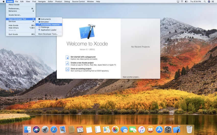
Once Xcode has been opened, navigate to Xcode > Open Developer Tool > Accessibility Inspector. 

Opening the Accessibility Inspector

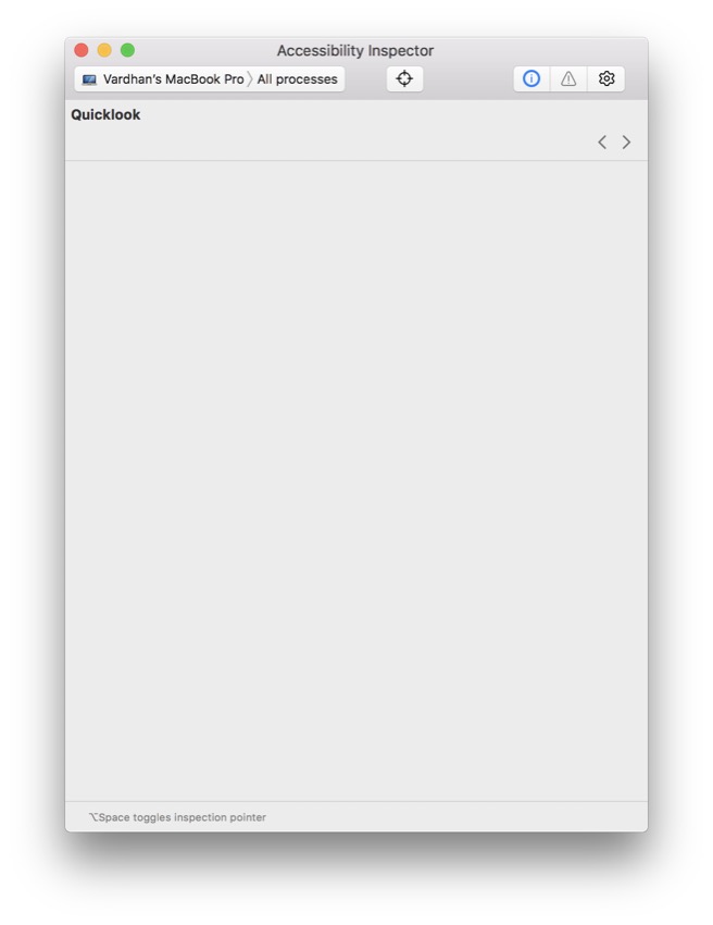
You should see a window pop up which looks something like this:

Accessibility Inspector

That was easy! In the next steps, we'll look at how to take advantage of the Accessibility Inspector features.

2. Permissions for Accessibility Inspector

The first step in using the Accessibility Inspector is allowing your Mac to be controlled by it. To authorize this, you must go to System Preferences on your Mac. You can do this by either opening the app from Launchpad or pressing Command-Space on your keyboard and then searching for "System Preferences".

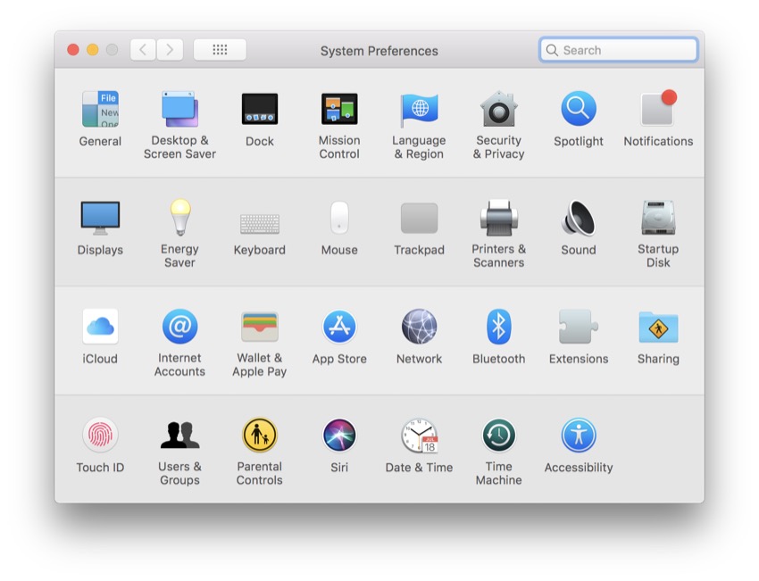
Once you've opened System Preferences, you'll see something which looks like this:

System Preferences

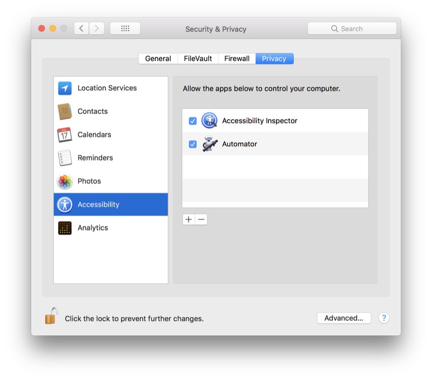
From here, head to Security & Privacy, which you'll find in the top row. Once you click on it, you'll see this:

Figure 4 Security  Privacy

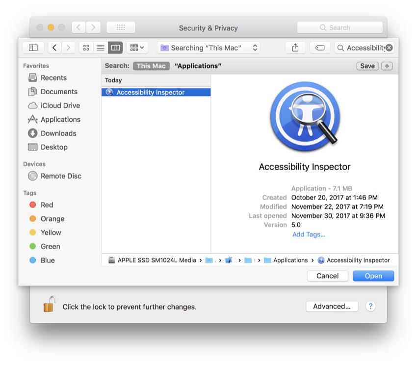
Lastly, go to the Privacy tab and scroll down to Accessibility. You'll need to add the Accessibility Inspector as one of the apps, so hit the plus button and search for it.

Figure 5 Grant Access to Acccessibility Inspector

Okay, you've now given the Accessibility Inspector full access to your Mac, and you can move on to the next step to learn how to configure different devices.

3. Inspecting Specific Devices

As mentioned in the previous step, you can use the Accessibility Inspector on any device; it isn't limited to just iPhone or just Mac. So let's learn how to configure the Accessibility Inspector with various devices.

Figure 6 Device Selection

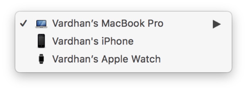
If you've used your iPhone with Xcode previously, you should be able to see it in the Target Selector. Usually, by default, your development Mac is selected. If you have an Apple Watch, you may also see it appear in the dropdown.

If you look just to the right of that, you'll be able to select certain processes from your selected device to inspect. Again, by default, All Processes should be selected. Spend some time and play around with different devices, and when you're ready, move to the next step, where we'll learn how to use the Inspection Pointer tool.

4. Using the Inspection Pointer

The biggest part of the Accessibility Inspector is the Inspection Pointer. This useful tool is able to give meaningful information about a certain user interface element. Locate the icon which looks like a target, just right of the center of the menu bar (it's between the Target Selector and the Inspection Detail icons).

As I mentioned earlier, we'll be using the stock apps on our development Mac to use this tool, so make sure your development Mac is selected along with the Finder in the Target Selector. Tap the Inspection Pointer icon so that it turns blue, and now you're ready to start inspecting.

If you look at my Finder below, you'll see that what I have pointed to is highlighted in green, and you can see some basic information.

Inspection Pointer

Also, if you look closer at the Advanced tab, you'll be able to change certain attributes of the selected element. In the next step, you'll learn how to audit the accessibility of apps.

5. Auditing Accessibility

Before ending this tutorial, I would like to introduce you to auditing your apps for accessibility. Even though you might not be able to see some issues that people may have using your app, the Accessibility Inspector has your back.

Take a moment to locate the Audit icon in the toolbar. This is where you'll be able to see specific issues with the selected process on your chosen device. To begin, you'll need to reselect your scheme and device (just as you did in the previous step), but this time you simply tap the Audit icon and click on the Run Audit button which appears.

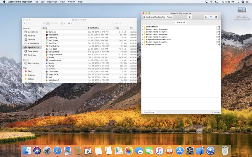
Your Accessibility Inspector should return with all of the warnings and accessibility errors your program has. For example, if you don't provide a good description for one of the images in your app, you may see something like "Image name used in description". Then you can tap on the arrow to expand that warning and find more information about it. You can also tap the Eye icon next to an issue, and Accessibility Inspector will show you a screen capture with the issue highlighted.

Here's what Accessibility Inspector returned when I audited macOS's Finder:

Run Accessibility Audit

As you can see, even Apple has some work to do to ensure their apps are accessible!

Conclusion

You may have never heard of the Accessibility Inspector, but it is a very powerful tool which can help you distinguish your apps from others. Using this tool, you can make your app more accessible and usable by more people. If you liked this article, stay tuned—I'll be writing more about ways to make your app accessible in the coming week.

And while you're here, check out some of our other posts on iOS app development!

2017-12-03T07:38:53.000Z2017-12-03T07:38:53.000ZVardhan Agrawal

Accessibility for iOS Apps: Accessibility Inspector

$
0
0
tag:code.tutsplus.com,2005:PostPresenter/cms-30073

Developers are constantly striving to make their apps more advanced, but are they actually usable by everybody? For most apps, the answer is no. In order to reach the largest audience, let's learn about ways to make our apps more accessible.

To mark the United Nations' International Day of Persons with Disabilities, let's take a look at how we can make our iOS apps more accessible.

There are many millions of smartphone users worldwide who have some sort of disability, such as limited vision, partial hearing loss, or difficulty with fine motor control. If you don't consider the accessibility implications of your app and UI design, you'll miss the chance for them to benefit from your app.

Apple is committed to making their products available to every user, and has provided developers with a plethora of tools to help make this possible. One of these tools is the Accessibility Inspector, which is used to show the attributes of elements displayed on a screen.

Even though the Accessibility Inspector isn't a very well-known tool, it is highly useful if you want to make your app as accessible as possible. In this post, I'll show you how to use Accessibility Inspector to audit the accessibility of your apps.

1. Opening the Accessibility Inspector

To bring up the Accessibility Inspector, first you'll need to open Xcode. If you have an iPhone, you can use the Accessibility Inspector with it, but for this article, we'll simply inspect the default apps on a Mac.

Once Xcode has been opened, navigate to Xcode > Open Developer Tool > Accessibility Inspector. 

Opening the Accessibility Inspector

You should see a window pop up which looks something like this:

Accessibility Inspector

That was easy! In the next steps, we'll look at how to take advantage of the Accessibility Inspector features.

2. Permissions for Accessibility Inspector

The first step in using the Accessibility Inspector is allowing your Mac to be controlled by it. To authorize this, you must go to System Preferences on your Mac. You can do this by either opening the app from Launchpad or pressing Command-Space on your keyboard and then searching for "System Preferences".

Once you've opened System Preferences, you'll see something which looks like this:

System Preferences

From here, head to Security & Privacy, which you'll find in the top row. Once you click on it, you'll see this:

Figure 4 Security  Privacy

Lastly, go to the Privacy tab and scroll down to Accessibility. You'll need to add the Accessibility Inspector as one of the apps, so hit the plus button and search for it.

Figure 5 Grant Access to Acccessibility Inspector

Okay, you've now given the Accessibility Inspector full access to your Mac, and you can move on to the next step to learn how to configure different devices.

3. Inspecting Specific Devices

As mentioned in the previous step, you can use the Accessibility Inspector on any device; it isn't limited to just iPhone or just Mac. So let's learn how to configure the Accessibility Inspector with various devices.

Figure 6 Device Selection

If you've used your iPhone with Xcode previously, you should be able to see it in the Target Selector. Usually, by default, your development Mac is selected. If you have an Apple Watch, you may also see it appear in the dropdown.

If you look just to the right of that, you'll be able to select certain processes from your selected device to inspect. Again, by default, All Processes should be selected. Spend some time and play around with different devices, and when you're ready, move to the next step, where we'll learn how to use the Inspection Pointer tool.

4. Using the Inspection Pointer

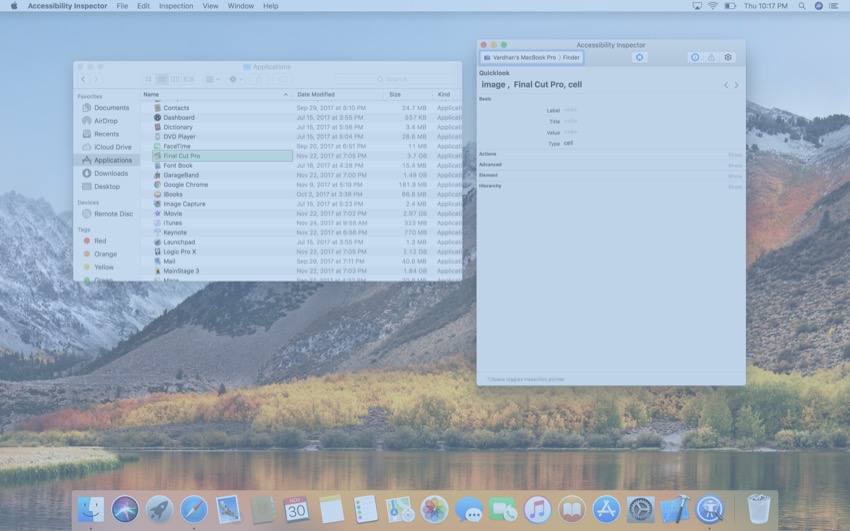
The biggest part of the Accessibility Inspector is the Inspection Pointer. This useful tool is able to give meaningful information about a certain user interface element. Locate the icon which looks like a target, just right of the center of the menu bar (it's between the Target Selector and the Inspection Detail icons).

As I mentioned earlier, we'll be using the stock apps on our development Mac to use this tool, so make sure your development Mac is selected along with the Finder in the Target Selector. Tap the Inspection Pointer icon so that it turns blue, and now you're ready to start inspecting.

If you look at my Finder below, you'll see that what I have pointed to is highlighted in green, and you can see some basic information.

Inspection Pointer

Also, if you look closer at the Advanced tab, you'll be able to change certain attributes of the selected element. In the next step, you'll learn how to audit the accessibility of apps.

5. Auditing Accessibility

Before ending this tutorial, I would like to introduce you to auditing your apps for accessibility. Even though you might not be able to see some issues that people may have using your app, the Accessibility Inspector has your back.

Take a moment to locate the Audit icon in the toolbar. This is where you'll be able to see specific issues with the selected process on your chosen device. To begin, you'll need to reselect your scheme and device (just as you did in the previous step), but this time you simply tap the Audit icon and click on the Run Audit button which appears.

Your Accessibility Inspector should return with all of the warnings and accessibility errors your program has. For example, if you don't provide a good description for one of the images in your app, you may see something like "Image name used in description". Then you can tap on the arrow to expand that warning and find more information about it. You can also tap the Eye icon next to an issue, and Accessibility Inspector will show you a screen capture with the issue highlighted.

Here's what Accessibility Inspector returned when I audited macOS's Finder:

Run Accessibility Audit

As you can see, even Apple has some work to do to ensure their apps are accessible!

Conclusion

You may have never heard of the Accessibility Inspector, but it is a very powerful tool which can help you distinguish your apps from others. Using this tool, you can make your app more accessible and usable by more people. If you liked this article, stay tuned—I'll be writing more about ways to make your app accessible in the coming week.

And while you're here, check out some of our other posts on iOS app development!

2017-12-03T07:38:53.000Z2017-12-03T07:38:53.000ZVardhan Agrawal

Creating Accessible Android Apps: Assistive Technologies

$
0
0

Whenever you design an Android app, you want as many people as possible to download and use that app, but this can only happen if your app is accessible to everyone—including people who access their Android devices via assistive features, or who experience mobile apps without elements such as colour or sound.

In my last post about Creating Accessible Android Apps, I showed you how to provide the best experience for everyone who uses your app, by optimizing your application for the accessibility features that are baked into every Android device. I’ll also covered accessibility best practices, and how to really put your app’s accessibility to the test, before sending it out into the world. 

By the time you’ve completed this article, you’ll know how to create applications that integrate with screen readers, directional controls, and Switch devices, plus other handy Android accessibility features such as closed captions.

Supporting Assistive Technologies

An assistive technology or accessibility feature is a piece of software or hardware that makes devices more accessible. Android has a number of accessibility features built in, and there are many apps and even external devices that people can download or purchase in order to make their Android devices better fit their needs. 

In the same way that you optimize your Android apps to work well with the touchscreen and different screen configurations, you should optimize your app for these accessibility services.

Optimizing for assistive technologies is one of the most important steps in creating an accessible app, so in this section I’m going to cover all the major accessibility services and show how to optimize your app to provide a better experience for each of these services. 

Supporting Screen Readers

Users with vision-related difficulties may interact with their Android devices using a screen reader, which is a speech synthesizer that reads text out loud as the user moves around the screen. 

Recent releases of Android typically come with Google’s Text-to-Speech (TTS) engine pre-installed. To check whether TTS is installed on your device:

  • Open your device’s Settings app.
  • Navigate to Accessibility > Text-to-speech output
  • Check the Preferred engine value—this should be set to Google text-to-speech engine.

The TTS engine powers various screen readers, including Google’s TalkBack, which is the screen reader I’ll be using:

  • Download Google TalkBack from the Google Play store.
  • Navigate to Settings > Accessibility.
  • Select TalkBack.
  • Push the slider to the On position. 

If you own a Samsung device, then you may have the Voice Assistant screen reader pre-installed. Voice Assistant is a port of Google TalkBack that has many of the same features, so you typically won’t need to install TalkBack if you already have access to Voice Assistant. 

Navigating in Screen Readers

Most screen readers support two methods of navigation: 

  • Linear navigation. Delivers audio prompts as the user moves around the UI in a linear fashion, either by swiping left or right or by using a directional control (which is another accessibility service we’ll be looking at shortly).
  • Explore by Touch. The screen reader announces each UI element as the user touches it.

It’s important to test your application using both linear navigation and the Explore by Touch methods.

Note that some people may use TalkBack alongside the BrailleBack application and an external, refreshable braille display. Braille support isn’t something you can fully test without purchasing a braille display, but if you’re interested in learning more about these devices, then there are plenty of braille display videos on YouTube.

You can also use the BrailleBack app to preview how your app’s text will render on a braille display. Once BrailleBack is installed, navigate to Settings > Accessibility > BrailleBack > Settings > Developer options > Show Braille output on screen. Navigate back to the main BrailleBack screen, push the slider into the On position, and BrailleBack will then add an overlay that displays the braille cells for whichever screen you’re currently viewing.

Now that you’ve set up your screen reader (and optionally, BrailleBack) let’s look at how you can optimize your app for this accessibility service. 

Adding Content Descriptions

Text labels add clutter to the screen, so wherever possible you should avoid adding explicit labels to your UI. 

Communicating a button’s purpose using a trashcan icon rather than a Delete label may be good design, but it does present a problem for screen readers, as there’s nothing for that screen reader to read! 

You should provide a content description for any controls that don’t feature visible text, such as ImageButtons and CheckBoxes, and for visual media such as images. 

These content labels don’t appear onscreen, but accessibility services such as screen readers and braille displays will announce the label whenever the corresponding UI element is brought into focus. 

You add a content description to a static element, using android:contentDescription:

If you’re adding a content description to a control that may change during the Activity or Fragment’s lifecycle, then you should use setContentDescription() instead:

Crafting the perfect content description is a tricky balancing act, as providing too much information can often be just as bad as providing too little information. If your content descriptions are unnecessarily detailed, or you add content descriptions to elements that the user doesn’t need to know about, then that’s a lot of white noise for them to navigate in order to make sense of the current screen. 

Your content descriptions need to be helpfully descriptive, independently meaningful, and provide just enough context for the user to be able to successfully navigate your app. 

To avoid overwhelming the user with unnecessary information: 

  • Don’t include the control’s type in your content descriptions. Accessibility services often announce the control’s type after its label, so your "submit button” description may become “submit button button.”
  • Don’t waste words describing a component’s physical appearance. The user needs to know what’ll happen when they interact with a control, not necessarily how that control looks.
  • Don’t include instructions on how to interact with a control. There are many different ways to interact with a device besides the touchscreen, so telling the user to “tap this link to edit your Settings” isn’t just adding unnecessary words to your content description, it’s also potentially misleading the user. 
  • Don’t add content descriptions to everything. Screen readers can often safely ignore UI elements that exist solely to make the screen look nicer, so you typically don’t need to provide a content description for your app’s decorative elements. You can also explicitly instruct a View not to respond to an accessibility service, by marking it as android:contentDescription=“@null” or android:isImportantForAccessibility=“no” (Android 4.1 and higher).

Users must be able to identify items from their content description alone, so each content description must be unique. In particular, don’t forget to update the descriptions for reused layouts such as ListView and RecyclerView.

Once you’re satisfied with your content descriptions, you should put them to the test by attempting to navigate your app using spoken feedback only, and then make any necessary adjustments. 

Don’t Drown Out Screen Readers

Some screen readers let you adjust an app audio’s independently of other sounds on the device, and some even support “audio ducking,” which automatically decreases the device’s other audio when the screen reader is speaking. However, you shouldn’t assume that the user’s chosen screen reader supports either of these features, or that they’re enabled. 

If your app features music or sound effects that could potentially drown out a screen reader, then you should provide users with a way of disabling these sounds. Alternatively, your app could disable all unnecessary audio automatically whenever it detects that a screen reader is enabled. 

Don’t Rely on Visual Cues 

It may be common practice to format links as blue, underlined text, but people who are experiencing your UI as a series of screen reader prompts may be unaware of these visual cues.  

To make sure all users are aware of your app’s hyperlinks, either:

  • Phrase your anchor text so that it’s clear this piece of text contains a hyperlink.
  • Add a content description.
  • Extract the hyperlink into a new context. For example, if you move the link into a button or a menu item, then the user will already know that they’re supposed to interact with this control. 

Consider Replacing Timed Controls

Some controls may disappear automatically after a period of time has elapsed. For example, video playback controls tend to fade out once you’re a few seconds into a video. 

Since screen readers only announce a control when it gains focus, there’s a chance that a timed control could vanish before the user has a chance to focus on it. If your app includes any timed controls, then you should consider making them permanent controls when your application detects that a screen reader is enabled, or at least extend the amount of time this control remains onscreen. 

Don’t Rely on Colours

Unless you include them in your content descriptions, screen readers won’t communicate colour cues to your users, so you should never use colour as the sole means of communicating important information. This rule also helps ensure your app is accessible for people who are colour-blind, or who have problems differentiating between certain colours. 

If you use colour to highlight important text, then you need to emphasise this text using other methods, for example by providing a content description, sound effects, or haptic (touch-based) feedback when this text is brought into focus. You should also provide additional visual cues for people who are colour-blind, such as varying the font size or using italic or underline effects.

Switch Access and Directional Controls

Users with limited vision or manual dexterity issues may operate their device using directional controls or Switch Access, rather than the touchscreen. 

1. Testing Your App’s Switch Access 

Switch Access lets you interact with your Android device using a “switch,” which sends a keystroke signal to the device, similar to pressing an OK or Select button.

In this section, we’ll be creating separate ‘Next,’ ‘Previous’ and ‘Select’ switches, but it’s also possible to create a ‘Select’ switch and have Switch Access cycle through the screen’s interactive elements on a continuous loop. If you’d prefer to test your app using this auto-scan method, then navigate to Settings > Accessibility > Switch Access > Settings > Auto-scan.

Android supports the following switches:

  • The device’s hardware buttons, such as Home or Volume Up/Volume Down. This is typically how you’ll test your app’s switch support, as it doesn’t require you to purchase a dedicated switch device.
  • An external device, such as a keyboard that’s connected to your Android device via USB or Bluetooth. 
  • A physical action. You can use your device’s front camera to assign the “switch” feature to a physical action, such as blinking your eyes or opening your mouth. 

To enable Switch Access:

  • Navigate to Settings > Accessibility > Switch Access.
  • Select Settings in the upper-right corner. 
  • Select the NextPrevious and Select items in turn, press the hardware key you want to assign to this action, and then tap Save.
  • Navigate back to the main Switch Access screen, and push the slider into the On position. 

You can disable Switch Access at any point, by navigating to Settings > Accessibility > Switch Access and pushing the slider into the Off position.

2. Testing Your App’s Directional Control Support 

Directional controls let the user navigate their device in a linear fashion, using Up/Down/Left/Right actions, in the same way you use your television remote to navigate the TV guide.

Android supports the following directional controls:

  • the device’s hardware keys.
  • external devices that are connected via USB or Bluetooth, for example a trackpad, keyboard, or directional pad (D-pad)
  • software that emulates a directional control, such as TalkBack gestures

Designing for Directional Controls and Switch Access

When the user is interacting with your app using Switch Access or a directional control, you need to ensure that: 

  1. They can reach and interact with all of your app’s interactive components.
  2. Focus moves from one UI control to the next in a logical fashion. For example, if the user presses the Right button on their directional control, then focus should move to the UI element they were expecting. 

If you’re using Android’s standard Views, then your controls should be focusable by default, but you should always put this to the test. 

To check that all of your interactive components are focusable via Switch Access, use your switches to navigate from the top of the screen to the bottom, ensuring that each control gains focus at some point. 

The easiest way to test your app’s directional control support is to emulate a directional pad on an Android Virtual Device (AVD).

The downside is that this requires editing your AVD’s config.ini settings. Note that the following instructions are written for macOS, so if you’re developing on Windows or Linux, then the steps may be slightly different. 

  • Open a ‘Finder’ window and select Go > Go to Folder… from the toolbar.
  • In the subsequent popup, enter ~/.android/avd and then click Go.
  • Open the folder that corresponds to the AVD you want to use.
  • Control-click the config.ini file and select Open with > Other...
  • Select a text editing program; I’m opting for TextEdit.
  • In the subsequent text file, find the hw.dPad=no line and change it to hw.dPad=yes. Save this file. 
  • Launch your application on the AVD you’ve just edited.
  • Select the More button (where the cursor is positioned in the following screenshot). 
Select the More button in your Android Virtual Device AVD
  • Select Directional pad from the left-hand menu.
  • You can now navigate your application using an emulated directional pad.
Put your app to the test by navigating it using the emulated D-pad

 Android’s standard UI controls are focusable by default, but if you’re struggling to focus on a particular control then you may need to explicitly mark it as focusable, using either android:focusable="true" or View.setFocusable().

You should also check that the focus order moves from one UI element to the next in a logical fashion, by navigating around all of your app’s controls, in all directions. (Don’t forget to test reverse!) 

Android determines each screen’s focus order automatically based on an algorithm, but occasionally you may be able to improve on this sequence by changing the focus order manually. 

You can specify the View that should gain focus when the user moves in a certain direction, using the following XML attributes: android:nextFocusUpandroid:nextFocusDownandroid:nextFocusRight, and android:nextFocusLeft.

For example, imagine you have the following layout: 

A layout consisting of a Button EditText and CheckBox

By default, when the Button control is in focus:

  • Pressing Down will bring the CheckBox into focus.
  • Pressing Right will bring the EditText into focus. 

You can switch this order, using the android:next attributes. In the following code:

  • Pressing Down brings the EditText into focus.
  • Pressing Right brings the CheckBox into focus. 

Alternatively, you can modify the focus order at runtime using setNextFocusDownIdsetNextFocusForwardIdsetNextFocusLeftIdsetNextFocusRightId, and setNextFocusUpId.

Simplify Your Layouts

Simpler layouts are easier for everyone to navigate, but this is particularly true for anyone who’s interacting with your app using Switch Access or a directional control. 

When testing your app’s navigation, look for any opportunities to remove elements from your UI. In particular, you should consider removing any nesting from your layouts, as nested layouts make your application significantly more difficult to navigate. 

Don’t Neglect Your App’s Touchscreen Support

Some users with manual dexterity issues may prefer to interact with their devices using the touchscreen. 

To help support these users, all of your app’s interactive elements should be 48 x 48 dp or larger, with at least 8 dp between all touchable elements. You may also want to experiment with increasing the size of a touch target without actually increasing the size of its related View, using Android’s TouchDelegate API.

Closed Captions 

You should provide subtitles for all of your app’s spoken audio.

To enable closed captions on your device:

  • Navigate to Settings > Accessibility > Captions.
  • Push the slider into the On position. 

On Android 4.4 and higher, you add an external subtitle source file in WebVTT format using addSubtitleSource(), for example:

Captions are a system-wide setting, so someone who relies on captions is likely to launch your application with captions already enabled. However, if a user doesn't have captions enabled, then it’s crucial you make it clear that your app supports closed captions and provide a way of enabling captions. Often, you can achieve both of these things by featuring a Captions button prominently in your UI—for example, adding a Captions button to your app’s video playback controls. 

Since captions are a system-wide setting, your app simply needs to forward the user to the appropriate section of their device’s Settings application (Settings > Accessibility > Captions). For example: 

Android will change your caption’s formatting according to the user’s system-wide captions settings, located in Settings > Accessibility > Captions. To ensure your captions remain legible regardless of the user’s settings, you’ll need to test your captions across Android’s full range of formatting options.

Font Size

Users who are struggling to read onscreen text can increase the font size that’s used on their device.

You'll have to ensure that your app still works across a range of text sizes. To test this, try changing the text size device-wide.

  • Launch your device’s Settings app.
  • Navigate to Settings > Accessibility > Font size
  • Push the slider towards the large A to increase the font size, and towards the small A to decrease the font size. 

Assuming you defined your text in scaleable pixels (sp), your app should update automatically based on the user’s font-size preferences.

If you’ve designed a flexible layout, then ideally your app should be able to accommodate a range of text sizes, but you should always test how your app handles the full range of Font size settings, and make any necessary adjustments. Text that increases or decreases based on the user’s preferences isn’t going to improve the user experience if some settings render your app unusable! 

Conclusion

In this post, you learned how to optimize your app for some of Android's most commonly used assistive technology and accessibility features. 

If you’re interested in learning more about accessibility, then Google has published a sample app that includes code for many of the techniques discussed in this article. You’ll also find lots of information about mobile accessibility in general, over at the Web Accessibility Initiative website.

In the meantime, check out some of our other posts about Android app development!

2017-12-06T11:00:00.000Z2017-12-06T11:00:00.000ZJessica Thornsby

Creating Accessible Android Apps: Assistive Technologies

$
0
0
tag:code.tutsplus.com,2005:PostPresenter/cms-30090

Whenever you design an Android app, you want as many people as possible to download and use that app, but this can only happen if your app is accessible to everyone—including people who access their Android devices via assistive features, or who experience mobile apps without elements such as colour or sound.

In my last post about Creating Accessible Android Apps, I showed you how to provide the best experience for everyone who uses your app, by optimizing your application for the accessibility features that are baked into every Android device. I’ll also covered accessibility best practices, and how to really put your app’s accessibility to the test, before sending it out into the world. 

By the time you’ve completed this article, you’ll know how to create applications that integrate with screen readers, directional controls, and Switch devices, plus other handy Android accessibility features such as closed captions.

Supporting Assistive Technologies

An assistive technology or accessibility feature is a piece of software or hardware that makes devices more accessible. Android has a number of accessibility features built in, and there are many apps and even external devices that people can download or purchase in order to make their Android devices better fit their needs. 

In the same way that you optimize your Android apps to work well with the touchscreen and different screen configurations, you should optimize your app for these accessibility services.

Optimizing for assistive technologies is one of the most important steps in creating an accessible app, so in this section I’m going to cover all the major accessibility services and show how to optimize your app to provide a better experience for each of these services. 

Supporting Screen Readers

Users with vision-related difficulties may interact with their Android devices using a screen reader, which is a speech synthesizer that reads text out loud as the user moves around the screen. 

Recent releases of Android typically come with Google’s Text-to-Speech (TTS) engine pre-installed. To check whether TTS is installed on your device:

  • Open your device’s Settings app.
  • Navigate to Accessibility > Text-to-speech output
  • Check the Preferred engine value—this should be set to Google text-to-speech engine.

The TTS engine powers various screen readers, including Google’s TalkBack, which is the screen reader I’ll be using:

  • Download Google TalkBack from the Google Play store.
  • Navigate to Settings > Accessibility.
  • Select TalkBack.
  • Push the slider to the On position. 

If you own a Samsung device, then you may have the Voice Assistant screen reader pre-installed. Voice Assistant is a port of Google TalkBack that has many of the same features, so you typically won’t need to install TalkBack if you already have access to Voice Assistant. 

Navigating in Screen Readers

Most screen readers support two methods of navigation: 

  • Linear navigation. Delivers audio prompts as the user moves around the UI in a linear fashion, either by swiping left or right or by using a directional control (which is another accessibility service we’ll be looking at shortly).
  • Explore by Touch. The screen reader announces each UI element as the user touches it.

It’s important to test your application using both linear navigation and the Explore by Touch methods.

Note that some people may use TalkBack alongside the BrailleBack application and an external, refreshable braille display. Braille support isn’t something you can fully test without purchasing a braille display, but if you’re interested in learning more about these devices, then there are plenty of braille display videos on YouTube.

You can also use the BrailleBack app to preview how your app’s text will render on a braille display. Once BrailleBack is installed, navigate to Settings > Accessibility > BrailleBack > Settings > Developer options > Show Braille output on screen. Navigate back to the main BrailleBack screen, push the slider into the On position, and BrailleBack will then add an overlay that displays the braille cells for whichever screen you’re currently viewing.

Now that you’ve set up your screen reader (and optionally, BrailleBack) let’s look at how you can optimize your app for this accessibility service. 

Adding Content Descriptions

Text labels add clutter to the screen, so wherever possible you should avoid adding explicit labels to your UI. 

Communicating a button’s purpose using a trashcan icon rather than a Delete label may be good design, but it does present a problem for screen readers, as there’s nothing for that screen reader to read! 

You should provide a content description for any controls that don’t feature visible text, such as ImageButtons and CheckBoxes, and for visual media such as images. 

These content labels don’t appear onscreen, but accessibility services such as screen readers and braille displays will announce the label whenever the corresponding UI element is brought into focus. 

You add a content description to a static element, using android:contentDescription:

If you’re adding a content description to a control that may change during the Activity or Fragment’s lifecycle, then you should use setContentDescription() instead:

Crafting the perfect content description is a tricky balancing act, as providing too much information can often be just as bad as providing too little information. If your content descriptions are unnecessarily detailed, or you add content descriptions to elements that the user doesn’t need to know about, then that’s a lot of white noise for them to navigate in order to make sense of the current screen. 

Your content descriptions need to be helpfully descriptive, independently meaningful, and provide just enough context for the user to be able to successfully navigate your app. 

To avoid overwhelming the user with unnecessary information: 

  • Don’t include the control’s type in your content descriptions. Accessibility services often announce the control’s type after its label, so your "submit button” description may become “submit button button.”
  • Don’t waste words describing a component’s physical appearance. The user needs to know what’ll happen when they interact with a control, not necessarily how that control looks.
  • Don’t include instructions on how to interact with a control. There are many different ways to interact with a device besides the touchscreen, so telling the user to “tap this link to edit your Settings” isn’t just adding unnecessary words to your content description, it’s also potentially misleading the user. 
  • Don’t add content descriptions to everything. Screen readers can often safely ignore UI elements that exist solely to make the screen look nicer, so you typically don’t need to provide a content description for your app’s decorative elements. You can also explicitly instruct a View not to respond to an accessibility service, by marking it as android:contentDescription=“@null” or android:isImportantForAccessibility=“no” (Android 4.1 and higher).

Users must be able to identify items from their content description alone, so each content description must be unique. In particular, don’t forget to update the descriptions for reused layouts such as ListView and RecyclerView.

Once you’re satisfied with your content descriptions, you should put them to the test by attempting to navigate your app using spoken feedback only, and then make any necessary adjustments. 

Don’t Drown Out Screen Readers

Some screen readers let you adjust an app audio’s independently of other sounds on the device, and some even support “audio ducking,” which automatically decreases the device’s other audio when the screen reader is speaking. However, you shouldn’t assume that the user’s chosen screen reader supports either of these features, or that they’re enabled. 

If your app features music or sound effects that could potentially drown out a screen reader, then you should provide users with a way of disabling these sounds. Alternatively, your app could disable all unnecessary audio automatically whenever it detects that a screen reader is enabled. 

Don’t Rely on Visual Cues 

It may be common practice to format links as blue, underlined text, but people who are experiencing your UI as a series of screen reader prompts may be unaware of these visual cues.  

To make sure all users are aware of your app’s hyperlinks, either:

  • Phrase your anchor text so that it’s clear this piece of text contains a hyperlink.
  • Add a content description.
  • Extract the hyperlink into a new context. For example, if you move the link into a button or a menu item, then the user will already know that they’re supposed to interact with this control. 

Consider Replacing Timed Controls

Some controls may disappear automatically after a period of time has elapsed. For example, video playback controls tend to fade out once you’re a few seconds into a video. 

Since screen readers only announce a control when it gains focus, there’s a chance that a timed control could vanish before the user has a chance to focus on it. If your app includes any timed controls, then you should consider making them permanent controls when your application detects that a screen reader is enabled, or at least extend the amount of time this control remains onscreen. 

Don’t Rely on Colours

Unless you include them in your content descriptions, screen readers won’t communicate colour cues to your users, so you should never use colour as the sole means of communicating important information. This rule also helps ensure your app is accessible for people who are colour-blind, or who have problems differentiating between certain colours. 

If you use colour to highlight important text, then you need to emphasise this text using other methods, for example by providing a content description, sound effects, or haptic (touch-based) feedback when this text is brought into focus. You should also provide additional visual cues for people who are colour-blind, such as varying the font size or using italic or underline effects.

Switch Access and Directional Controls

Users with limited vision or manual dexterity issues may operate their device using directional controls or Switch Access, rather than the touchscreen. 

1. Testing Your App’s Switch Access 

Switch Access lets you interact with your Android device using a “switch,” which sends a keystroke signal to the device, similar to pressing an OK or Select button.

In this section, we’ll be creating separate ‘Next,’ ‘Previous’ and ‘Select’ switches, but it’s also possible to create a ‘Select’ switch and have Switch Access cycle through the screen’s interactive elements on a continuous loop. If you’d prefer to test your app using this auto-scan method, then navigate to Settings > Accessibility > Switch Access > Settings > Auto-scan.

Android supports the following switches:

  • The device’s hardware buttons, such as Home or Volume Up/Volume Down. This is typically how you’ll test your app’s switch support, as it doesn’t require you to purchase a dedicated switch device.
  • An external device, such as a keyboard that’s connected to your Android device via USB or Bluetooth. 
  • A physical action. You can use your device’s front camera to assign the “switch” feature to a physical action, such as blinking your eyes or opening your mouth. 

To enable Switch Access:

  • Navigate to Settings > Accessibility > Switch Access.
  • Select Settings in the upper-right corner. 
  • Select the NextPrevious and Select items in turn, press the hardware key you want to assign to this action, and then tap Save.
  • Navigate back to the main Switch Access screen, and push the slider into the On position. 

You can disable Switch Access at any point, by navigating to Settings > Accessibility > Switch Access and pushing the slider into the Off position.

2. Testing Your App’s Directional Control Support 

Directional controls let the user navigate their device in a linear fashion, using Up/Down/Left/Right actions, in the same way you use your television remote to navigate the TV guide.

Android supports the following directional controls:

  • the device’s hardware keys.
  • external devices that are connected via USB or Bluetooth, for example a trackpad, keyboard, or directional pad (D-pad)
  • software that emulates a directional control, such as TalkBack gestures

Designing for Directional Controls and Switch Access

When the user is interacting with your app using Switch Access or a directional control, you need to ensure that: 

  1. They can reach and interact with all of your app’s interactive components.
  2. Focus moves from one UI control to the next in a logical fashion. For example, if the user presses the Right button on their directional control, then focus should move to the UI element they were expecting. 

If you’re using Android’s standard Views, then your controls should be focusable by default, but you should always put this to the test. 

To check that all of your interactive components are focusable via Switch Access, use your switches to navigate from the top of the screen to the bottom, ensuring that each control gains focus at some point. 

The easiest way to test your app’s directional control support is to emulate a directional pad on an Android Virtual Device (AVD).

The downside is that this requires editing your AVD’s config.ini settings. Note that the following instructions are written for macOS, so if you’re developing on Windows or Linux, then the steps may be slightly different. 

  • Open a ‘Finder’ window and select Go > Go to Folder… from the toolbar.
  • In the subsequent popup, enter ~/.android/avd and then click Go.
  • Open the folder that corresponds to the AVD you want to use.
  • Control-click the config.ini file and select Open with > Other...
  • Select a text editing program; I’m opting for TextEdit.
  • In the subsequent text file, find the hw.dPad=no line and change it to hw.dPad=yes. Save this file. 
  • Launch your application on the AVD you’ve just edited.
  • Select the More button (where the cursor is positioned in the following screenshot). 
Select the More button in your Android Virtual Device AVD
  • Select Directional pad from the left-hand menu.
  • You can now navigate your application using an emulated directional pad.
Put your app to the test by navigating it using the emulated D-pad

 Android’s standard UI controls are focusable by default, but if you’re struggling to focus on a particular control then you may need to explicitly mark it as focusable, using either android:focusable="true" or View.setFocusable().

You should also check that the focus order moves from one UI element to the next in a logical fashion, by navigating around all of your app’s controls, in all directions. (Don’t forget to test reverse!) 

Android determines each screen’s focus order automatically based on an algorithm, but occasionally you may be able to improve on this sequence by changing the focus order manually. 

You can specify the View that should gain focus when the user moves in a certain direction, using the following XML attributes: android:nextFocusUpandroid:nextFocusDownandroid:nextFocusRight, and android:nextFocusLeft.

For example, imagine you have the following layout: 

A layout consisting of a Button EditText and CheckBox

By default, when the Button control is in focus:

  • Pressing Down will bring the CheckBox into focus.
  • Pressing Right will bring the EditText into focus. 

You can switch this order, using the android:next attributes. In the following code:

  • Pressing Down brings the EditText into focus.
  • Pressing Right brings the CheckBox into focus. 

Alternatively, you can modify the focus order at runtime using setNextFocusDownIdsetNextFocusForwardIdsetNextFocusLeftIdsetNextFocusRightId, and setNextFocusUpId.

Simplify Your Layouts

Simpler layouts are easier for everyone to navigate, but this is particularly true for anyone who’s interacting with your app using Switch Access or a directional control. 

When testing your app’s navigation, look for any opportunities to remove elements from your UI. In particular, you should consider removing any nesting from your layouts, as nested layouts make your application significantly more difficult to navigate. 

Don’t Neglect Your App’s Touchscreen Support

Some users with manual dexterity issues may prefer to interact with their devices using the touchscreen. 

To help support these users, all of your app’s interactive elements should be 48 x 48 dp or larger, with at least 8 dp between all touchable elements. You may also want to experiment with increasing the size of a touch target without actually increasing the size of its related View, using Android’s TouchDelegate API.

Closed Captions 

You should provide subtitles for all of your app’s spoken audio.

To enable closed captions on your device:

  • Navigate to Settings > Accessibility > Captions.
  • Push the slider into the On position. 

On Android 4.4 and higher, you add an external subtitle source file in WebVTT format using addSubtitleSource(), for example:

Captions are a system-wide setting, so someone who relies on captions is likely to launch your application with captions already enabled. However, if a user doesn't have captions enabled, then it’s crucial you make it clear that your app supports closed captions and provide a way of enabling captions. Often, you can achieve both of these things by featuring a Captions button prominently in your UI—for example, adding a Captions button to your app’s video playback controls. 

Since captions are a system-wide setting, your app simply needs to forward the user to the appropriate section of their device’s Settings application (Settings > Accessibility > Captions). For example: 

Android will change your caption’s formatting according to the user’s system-wide captions settings, located in Settings > Accessibility > Captions. To ensure your captions remain legible regardless of the user’s settings, you’ll need to test your captions across Android’s full range of formatting options.

Font Size

Users who are struggling to read onscreen text can increase the font size that’s used on their device.

You'll have to ensure that your app still works across a range of text sizes. To test this, try changing the text size device-wide.

  • Launch your device’s Settings app.
  • Navigate to Settings > Accessibility > Font size
  • Push the slider towards the large A to increase the font size, and towards the small A to decrease the font size. 

Assuming you defined your text in scaleable pixels (sp), your app should update automatically based on the user’s font-size preferences.

If you’ve designed a flexible layout, then ideally your app should be able to accommodate a range of text sizes, but you should always test how your app handles the full range of Font size settings, and make any necessary adjustments. Text that increases or decreases based on the user’s preferences isn’t going to improve the user experience if some settings render your app unusable! 

Conclusion

In this post, you learned how to optimize your app for some of Android's most commonly used assistive technology and accessibility features. 

If you’re interested in learning more about accessibility, then Google has published a sample app that includes code for many of the techniques discussed in this article. You’ll also find lots of information about mobile accessibility in general, over at the Web Accessibility Initiative website.

In the meantime, check out some of our other posts about Android app development!

2017-12-06T11:00:00.000Z2017-12-06T11:00:00.000ZJessica Thornsby

10 Best Android App Templates for Business

$
0
0

Business apps for Android are a constantly growing market thanks to a community of avid developers and the increasing popularity of mobile devices.

It is no surprise, therefore, that business app templates are also in demand as they help cut down some of the tedious parts of coding and allow developers to focus on the more interesting work of making their app unique.

Today I’ll be looking at 10 of the best business app templates for Android developers to be found at CodeCanyon.

The app templates I’ve chosen relate to all aspects of business, from increasing productivity to keeping on top of expenses and increasing a company’s visibility in an ever more crowded marketplace.

1. Productivity Timer

Time is a precious commodity and no more so than in business, where there are always a million people and pressing tasks vying for attention. It stands to reason that if you want to get things done, you need to carve out specific blocks of time when you can focus single-mindedly on the task at hand. This is where the Productivity Timer comes in. 

Productivity Timer

This template is designed for developers who want to create a productivity app to help users carve out blocks of time to concentrate on important tasks. Users set a timer for a specific task, and during that period they can choose to disable features on their phone such as sounds, vibration, and Wi-Fi so they can avoid interruptions and give the task at hand their full attention.

2. Expense Manager

Keeping track of our expenses helps us have better control over our money, but it can be a real pain. Expense Manager is an app template for designers who want to create an efficient financial tracker. It is designed to organize income and expenses, and record movement of money by date. 

Expense Manager

Users can review reports on their finances over a day, a week, a month, or a year. The app can remind users to pay bills and can also help them to manage receipts so that getting reimbursements for business expenses is easy.

3. Biz Tool

With so much international exchange, most business people need to move seamlessly between different cultures and systems. This is where an app like Biz Tool is indispensable. 

Biz Tool

The Biz Tool template allows developers to create an app that combines a number of essential functions in one handy app. It has a calculator function and can convert units like mass, length, area, speed, temperature, volume, and even currency.

4. Business Card Maker

Business Card Maker is one great idea in a beautifully designed app template. Developers can use the template to create an app that allows users to make their own digital business cards which they can share with colleagues or clients digitally, thus eliminating the need and expense of creating a physical card. 

 Business Card Maker

The app contains a number of card templates that are easy for users to customise according to their taste and requirements.

5. Inventory Management App

The Inventory Management App template helps developers create an app that will track a business’s stock inventory, check which products are running low, and send out notifications of low inventory levels.

Inventory Management Android App

It is a very useful tool for businesses to stay on top of their stock inventory, reduce paperwork, and manage their orders and suppliers more efficiently.

6. Events App Template

One thing a good business has to do is communicate, and with the Events App Template developers can create an app that allows business users to store and share information about upcoming events with clients and colleagues alike. 

Events App Template

Users just need to press a button in order to add events they’re interested in to their native Calendar app or to open an event’s address in Google Maps to get directions. They can also share news about the event on Facebook, Twitter, mail, messenger or other social apps they use.

7. Conference App

Developers can use the Conference App template as a skeleton or ready-made mobile app for businesses that want to share information about internally organised conferences and meetings within and outside of their organisation.  

Conference App

The app will act as a mobile guide for guests, giving them a variety of information about the conference including the goals of the conference, the day’s agenda, the speakers, sponsors, location, etc.

8. My Business App

My Business App helps developers create apps that users can use to turn their website into an app. And why would a business want to do this, you might ask? Well, mobile apps are actually a simplified version of websites and thus are more purpose-focused and easier to use. 

My Business App

They also offer a more interactive experience and more brand awareness because users see the company’s logo on their screen each time they unlock their smartphone. In addition, companies can use push notifications to inform users of updates and special features or send custom messages. What’s great about this is that push notifications have an open rate of 90%, which is higher than any other current communication method. 

9. Business Portfolio App

The Business Portfolio App is a great way for businesses to market themselves to prospective clients, by presenting a portfolio of their business in a modern and innovative way. 

Business Portfolio App

The app template can be customised to present whatever information the business wants to highlight, including team information, a portfolio of successful projects, clients worked for, testimonials, contact details, and social media addresses.

10. News App Template

Keeping on top of the news—particularly as it pertains to business—is critical to every business, and so a great news app is a crucial asset. News App Template allows developers to create their own News App with headlines, breaking news labels, various categories, deep link sharing, video and image support, and much more. 

What’s great is that the app can be customised to pull news from pre-determined sources so that users only get news that is relevant to their needs.

Conclusion

These 10 best business app templates for Android are just a small selection of hundreds of Android app templates we have available at CodeCanyon, so if none of them quite fits your needs, there are plenty of other great options to choose from.

And if you want to improve your skills building Android apps and templates, then check out some of the ever-so-useful Android tutorials we have on offer.

2017-12-15T12:00:00.000Z2017-12-15T12:00:00.000ZNona Blackman

10 Best Android App Templates for Business

$
0
0
tag:code.tutsplus.com,2005:PostPresenter/cms-30044

Business apps for Android are a constantly growing market thanks to a community of avid developers and the increasing popularity of mobile devices.

It is no surprise, therefore, that business app templates are also in demand as they help cut down some of the tedious parts of coding and allow developers to focus on the more interesting work of making their app unique.

Today I’ll be looking at 10 of the best business app templates for Android developers to be found at CodeCanyon.

The app templates I’ve chosen relate to all aspects of business, from increasing productivity to keeping on top of expenses and increasing a company’s visibility in an ever more crowded marketplace.

1. Productivity Timer

Time is a precious commodity and no more so than in business, where there are always a million people and pressing tasks vying for attention. It stands to reason that if you want to get things done, you need to carve out specific blocks of time when you can focus single-mindedly on the task at hand. This is where the Productivity Timer comes in. 

Productivity Timer

This template is designed for developers who want to create a productivity app to help users carve out blocks of time to concentrate on important tasks. Users set a timer for a specific task, and during that period they can choose to disable features on their phone such as sounds, vibration, and Wi-Fi so they can avoid interruptions and give the task at hand their full attention.

2. Expense Manager

Keeping track of our expenses helps us have better control over our money, but it can be a real pain. Expense Manager is an app template for designers who want to create an efficient financial tracker. It is designed to organize income and expenses, and record movement of money by date. 

Expense Manager

Users can review reports on their finances over a day, a week, a month, or a year. The app can remind users to pay bills and can also help them to manage receipts so that getting reimbursements for business expenses is easy.

3. Biz Tool

With so much international exchange, most business people need to move seamlessly between different cultures and systems. This is where an app like Biz Tool is indispensable. 

Biz Tool

The Biz Tool template allows developers to create an app that combines a number of essential functions in one handy app. It has a calculator function and can convert units like mass, length, area, speed, temperature, volume, and even currency.

4. Business Card Maker

Business Card Maker is one great idea in a beautifully designed app template. Developers can use the template to create an app that allows users to make their own digital business cards which they can share with colleagues or clients digitally, thus eliminating the need and expense of creating a physical card. 

 Business Card Maker

The app contains a number of card templates that are easy for users to customise according to their taste and requirements.

5. Inventory Management App

The Inventory Management App template helps developers create an app that will track a business’s stock inventory, check which products are running low, and send out notifications of low inventory levels.

Inventory Management Android App

It is a very useful tool for businesses to stay on top of their stock inventory, reduce paperwork, and manage their orders and suppliers more efficiently.

6. Events App Template

One thing a good business has to do is communicate, and with the Events App Template developers can create an app that allows business users to store and share information about upcoming events with clients and colleagues alike. 

Events App Template

Users just need to press a button in order to add events they’re interested in to their native Calendar app or to open an event’s address in Google Maps to get directions. They can also share news about the event on Facebook, Twitter, mail, messenger or other social apps they use.

7. Conference App

Developers can use the Conference App template as a skeleton or ready-made mobile app for businesses that want to share information about internally organised conferences and meetings within and outside of their organisation.  

Conference App

The app will act as a mobile guide for guests, giving them a variety of information about the conference including the goals of the conference, the day’s agenda, the speakers, sponsors, location, etc.

8. My Business App

My Business App helps developers create apps that users can use to turn their website into an app. And why would a business want to do this, you might ask? Well, mobile apps are actually a simplified version of websites and thus are more purpose-focused and easier to use. 

My Business App

They also offer a more interactive experience and more brand awareness because users see the company’s logo on their screen each time they unlock their smartphone. In addition, companies can use push notifications to inform users of updates and special features or send custom messages. What’s great about this is that push notifications have an open rate of 90%, which is higher than any other current communication method. 

9. Business Portfolio App

The Business Portfolio App is a great way for businesses to market themselves to prospective clients, by presenting a portfolio of their business in a modern and innovative way. 

Business Portfolio App

The app template can be customised to present whatever information the business wants to highlight, including team information, a portfolio of successful projects, clients worked for, testimonials, contact details, and social media addresses.

10. News App Template

Keeping on top of the news—particularly as it pertains to business—is critical to every business, and so a great news app is a crucial asset. News App Template allows developers to create their own News App with headlines, breaking news labels, various categories, deep link sharing, video and image support, and much more. 

What’s great is that the app can be customised to pull news from pre-determined sources so that users only get news that is relevant to their needs.

Conclusion

These 10 best business app templates for Android are just a small selection of hundreds of Android app templates we have available at CodeCanyon, so if none of them quite fits your needs, there are plenty of other great options to choose from.

And if you want to improve your skills building Android apps and templates, then check out some of the ever-so-useful Android tutorials we have on offer.

2017-12-15T12:00:00.000Z2017-12-15T12:00:00.000ZNona Blackman

Showing Material Design Dialogs in an Android App

$
0
0

The material design team at Google defines the functionality of dialogs in Android as follows:

Dialogs inform users about a specific task and may contain critical information, require decisions, or involve multiple tasks.

Now you have understood what dialogs are used for, it's now time to learn how to display them. In this tutorial, I'll take you through the process of showing different kinds of material design dialogs in Android. We'll cover the following dialogs:

  • alert
  • single and multiple choice 
  • time and date picker
  • bottom sheet dialog
  • full-screen dialog

A sample project for this tutorial can be found on our GitHub repo for you to easily follow along.

1. Alert Dialog

According to the official Google material design documentation:

Alerts are urgent interruptions, requiring acknowledgement, that inform the user about a situation.

Creating an Alert Dialog

Make sure you include the latest appcompat artifact in your build.gradle file (app module). The minimum supported API level is Android 4.0 (API level 14). 

The next thing is to create an instance of AlertDialog.Builder

Here we created an instance of AlertDialog.Builder and began configuring the instance by calling some setter methods on it. Note that we are using the AlertDialog from the Android support artifact.

Here are the details of the setter methods we called on the AlertDialog.Builder instance. 

  • setTitle(): set the text to show in the title bar of the dialog. 
  • setMessage(): set the message to display in the dialog. 
  • setPositiveButton(): the first argument supplied is the text to show in the positive button, while the second argument is the listener called when the positive button is clicked. 
  • setNegativeButton(): the first argument supplied is the text to show in the negative button, while the second argument is the listener called when the negative button is clicked. 

Note that AlertDialog.Builder has a setView() to set your custom layout view to it. 

To show our dialog on the screen, we just invoke show().

Alert dialog

There is another setter method called setNeutralButton(). Calling this method will add another button on the far left side of the dialog. To call this method, we have to pass a String that will serve as the button text, and also a listener that is called when the button is tapped. 

Alert dialog with neutral button

Note that touching outside the dialog will automatically dismiss it. To prevent that from happening, you will have to call the setCanceledOnTouchOutside() on the AlertDialog instance and pass false as an argument. 

To further prevent dismissing the dialog by pressing the BACK button, you then have to call setCancelable() on the AlertDialog instance and pass false to it as an argument. 

Styling an Alert Dialog

It's quite easy to style our dialog. We just create a custom style in the styles.xml resource. Observe that this style parent is Theme.AppCompat.Light.Dialog.Alert. In other words, this style inherits some style attributes from its parent. 

We begin customising the dialog style by setting the values of the attributes to be applied on the dialog—for example, we can change the dialog button colour to be @android:color/holo_orange_dark and also set the dialog background to a custom drawable in our drawable resource folder (android:windowBackground set to @drawable/background_dialog).

Here is my background_dialog.xml resource file. 

Here we created a custom InsetDrawable which allows us to add insets on any side of the ShapeDrawable. We created a rectangle shape using the <shape> tag. We set the android:shape attribute of the <shape> tag to a rectangle (other possible values are line, oval, ring). We have a child tag <corners> that sets the radius of the rectangle corners. For a solid fill, we added the <solid> tag with an android:color attribute which indicates what color to use. Finally, we gave our drawable a border by using the <stroke> tag on the <shape>.

To apply this style to the dialog, we just pass the custom style to the second parameter in the AlertDialog.Builder constructor. 

Alert dialog with custom style

2. Confirmation Dialogs

According to the material design documentation:

Confirmation dialogs require users to explicitly confirm their choice before an option is committed. For example, users can listen to multiple ringtones but only make a final selection upon touching “OK.”

The following different kinds of confirmation dialog are available:

  • multiple choice dialog
  • single choice dialog
  • date picker
  • time picker

Multiple Choice Dialog 

We utilize a multiple choice dialog when we want the user to select more than one item in a dialog. In a multiple choice dialog, a choice list is displayed for the user to choose from. 

To create a multiple choice dialog, we simply call the setMultiChoiceItems() setter method on the AlertDialog.Builder instance. Inside this method, we pass an Array of type String as the first parameter. Here's my array, located in the arrays resource file /values/arrays.xml

The second parameter to the method setMultiChoiceItems() accepts an array which contains the items that are checked. The value of each element in the checkedItems array corresponds to each value in the multiChoiceItems array. We used our checkedItems array (the values of which are all false by default) to make all items unchecked by default. In other words, the first item "Dark Knight" is unchecked because the first element in the checkedItems array is false, and so on. If the first element in the checkedItems array was true instead, then "Dark Knight" would be checked.

Note that this array checkedItems is updated when we select or click on any item displayed—for example, if the user should select "The Shawshank Redemption", calling checkedItems[1] would return true

The last parameter accepts an instance of OnMultiChoiceClickListener. Here we simply create an anonymous class and override onClick(). We get an instance of the shown dialog in the first parameter. In the second parameter, we get the index of the item that was selected. Finally, in the last parameter, we find out if the selected item was checked or not. 

Multichoice dialog

Single Choice Dialog 

In a single choice dialog, unlike the multiple choice dialog, only one item can be selected. 

To create a single choice dialog, we simply invoke the setSingleChoiceItems() setter on the AlertDialog.Builder instance. Inside this method, we also pass an Array of type String as the first parameter. Here's the array we passed, which is located in the arrays resource file: /values/arrays.xml

The second parameter of the setSingleChoiceItems() is used to determine which item is checked. The last parameter in onClick() gives us the index of the item that was selected—for example, selecting the Female item, the value of selectedIndex will be 1

Single choice dialog

Date Picker Dialog

This is a dialog picker that is used to select a single date.

To start, we'll create a Calendar field instance in the MainActivity and initialize it. 

Here we called Calendar.getInstance() to get the current time (in the default time zone) and set it to the mCalendar field. 

To show a date picker dialog, we create an instance of the DatePickerDialog. Here is the explanation of the parameter definitions when creating an instance of this type. 

  • The first parameter accepts a parent context—for example, in an Activity, you use this, while in a Fragment, you call getActivity().  
  • The second parameter accepts a listener of type OnDateSetListener. This listener onDateSet() is called when the user sets the date. Inside this method, we get the selected year, the selected month of the year, and also the selected day of the month. 
  • The third parameter is the initially selected year. 
  • The fourth parameter is the initially selected month (0-11). 
  • The last parameter is the initially selected day of the month (1-31). 

Finally, we call the show() method of the DatePickerDialog instance to display it on the current screen. 

Date picker dialog

Setting a Custom Theme

It's quite easy to customize the theme of the date picker dialog (similar to what we did to the alert dialog). 

Briefly, you create a custom drawable, create a custom style or theme, and then apply that theme when creating a DatePickerDialog instance in the second parameter.  

Time Picker Dialog

The time picker dialog allows the user to pick a time, and adjusts to the user’s preferred time setting, i.e. the 12-hour or 24-hour format.

As you can see in the code below, creating a TimePickerDialog is quite similar to creating a DatePickerDialog. When creating an instance of the TimePickerDialog, we pass in the following parameters:

  • The first parameter accepts a parent context. 
  • The second parameter accepts an OnTimeSetListener instance that serves as a listener.
  • The third parameter is the initial hour of the day. 
  • The fourth parameter is the initial minute.
  • The last parameter is to set whether we want the view in 24-hour or AM/PM format. 

The onTimeSet() method is called every time the user has selected the time. Inside this method, we get an instance of the TimePicker, the selected hour of the day chosen, and also the selected minute. 

To display this dialog, we still call the show() method.

Time picker dialog

The time picker can be styled in a similar way to the date picker dialog. 

3. Bottom Sheet Dialog

According to the official Google material design documentation:

Bottom sheets slide up from the bottom of the screen to reveal more content.

To begin using the bottom sheet dialog, you have to import the design support artifact—so visit your app module's build.gradle file to import it. 

Make sure that the activity or fragment for the bottom sheet dialog will pop up—its parent layout is the CoordinatorLayout

Here we also have a FrameLayout that would serve as a container for our bottom sheet. Observe that one of this FrameLayout's attributes is app:layout_behavior, whose value is a special string resource that maps to android.support.design.widget.BottomSheetBehavior. This will enable our FrameLayout to appear as a bottom sheet. Note that if you don't include this attribute, your app will crash. 

Here we declared an instance of BottomSheetDialog as a field to our MainActivity.java and initialized it in the onCreate() method of our activity. 

In the preceding code, we inflated our bottom sheet layout R.layout.bottom_sheet_dialog. We set listeners for the Cancel and Ok buttons in the bottom_sheet_dialog.xml. When the Cancel button is clicked, we simply dismiss the dialog. 

We then initialized our mBottomSheetDialog field and set the view using setContentView(). Finally, we call the show() method to display it on the screen. 

Here is my bottom_sheet_dialog.xml:

Bottom sheet dialog

Make sure you check out How to Use Bottom Sheets With the Design Support Library by Paul Trebilcox-Ruiz here on Envato Tuts+ to learn more about botttom sheets.

4. Full-Screen Dialog

According to the official Google material design documentation:

Full-screen dialogs group a series of tasks (such as creating a calendar entry) before they may be committed or discarded. No selections are saved until “Save” is touched. Touching the “X” discards all changes and exits the dialog.

Let's now see how to create a full-screen dialog. First, make sure you include the Android support v4 artifact in your app's module build.gradle. This is required to support Android 4.0 (API level 14) and above. 

Next, we will create a FullscreenDialogFragment that extends the DialogFragment super class. 

Here we override the onCreateView() (just as we would do with an ordinary Fragment). Inside this method, we simply inflate and return the layout (R.layout.full_screen_dialog) that will serve as the custom view for the dialog. We set an OnClickListener on the ImageButton (R.id.button_close) which will dismiss the dialog when clicked. 

We also override onCreateDialog() and return a Dialog. Inside this method, you can also return an AlertDialog created using an AlertDialog.Builder

Our R.layout.full_screen_dialog consists of an ImageButton, a Button, and some TextView labels:

In the ImageButton widget, you will see an attribute app:srcCompat which references a custom VectorDrawable (@drawable/ic_close). This custom VectorDrawable creates the X button, which closes the full-screen dialog when tapped. 

In order to use this app:srcCompat attribute, make sure you include it in your build.gradle file. Next, configure your app to use vector support libraries and add the vectorDrawables element to your build.gradle file in the app module.

We did this so that we can support all Android platform versions back to Android 2.1 (API level 7+). 

Finally, to show the FullscreenDialogFragment, we simply use the FragmentTransaction to add our fragment to the UI. 

Full screen dialog

5. Surviving Device Orientation

Note that all the dialogs discussed here, except the full-screen dialog, will be dismissed automatically when the user changes the screen orientation of the Android device—from portrait to landscape (or vice versa). This is because the Android system has destroyed and recreated the Activity so as to fit the new orientation. 

For us to sustain the dialog across screen orientation changes, we'll have to create a Fragment that extends the DialogFragment super class (just as we did for the full-screen dialog example). 

Let's see a simple example for an alert dialog. 

Here, we created a class that extends the DialogFragment and also implements the DialogInterface.OnClickListener. Because we implemented this listener, we have to override the onClick() method. Note that if we tap the positive or negative button, this onClick() method will be invoked. 

Inside our onCreateDialog(), we create and return an instance of AlertDialog

We've also overridden:

  • onCancel(): this is called if the user presses the BACK button to exit the dialog. 
  • onDismiss(): this is called whenever the dialog is forced out for any reason (BACK or a button click). 

To show this dialog, we simply call the show() method on an instance of our AlertDialogFragment

The first parameter is an instance of the FragmentManager. The second parameter is a tag that can be used to retrieve this fragment again later from the FragmentManager via findFragmentByTag().

Alert dialog on rotation

Now, if you change the device orientation from portrait to landscape (or vice versa), the alert dialog won't be dismissed. 

You can follow similar steps for the other dialog types to maintain the dialog during device rotation. You simply create a Fragment that extends the DialogFragment super class, and you create and return the particular dialog in onCreateDialog()

Progress Dialog (deprecated)

Some of you may have heard about ProgressDialog. This simply shows a dialog with a progress indicator on it. I didn't include it here, because ProgressDialog has been deprecated in API level 26—because it can lead to a bad user experience for your users. According to the official documentation:

ProgressDialog is a modal dialog, which prevents the user from interacting with the app. Instead of using this class, you should use a progress indicator like ProgressBar, which can be embedded in your app's UI. Alternatively, you can use a notification to inform the user of the task's progress.

Conclusion

In this tutorial, you learned the different ways of showing material design dialogs in an Android app. We covered the following material design dialog types:

  • alerts
  • single and multiple choice dialogs
  • time and date pickers
  • bottom sheet dialog
  • full-screen dialog

You also learned how to create a custom style for a dialog and make your dialog survive orientation configuration changes between landscape and portrait using DialogFragment

It's highly recommended you check out the official material design guidelines for dialogs to learn how to properly design and use dialogs in Android.   

To learn more about coding for Android, check out some of our other courses and tutorials here on Envato Tuts+!

2017-12-18T15:00:00.000Z2017-12-18T15:00:00.000ZChike Mgbemena

Showing Material Design Dialogs in an Android App

$
0
0
tag:code.tutsplus.com,2005:PostPresenter/cms-30013

The material design team at Google defines the functionality of dialogs in Android as follows:

Dialogs inform users about a specific task and may contain critical information, require decisions, or involve multiple tasks.

Now you have understood what dialogs are used for, it's now time to learn how to display them. In this tutorial, I'll take you through the process of showing different kinds of material design dialogs in Android. We'll cover the following dialogs:

  • alert
  • single and multiple choice 
  • time and date picker
  • bottom sheet dialog
  • full-screen dialog

A sample project for this tutorial can be found on our GitHub repo for you to easily follow along.

1. Alert Dialog

According to the official Google material design documentation:

Alerts are urgent interruptions, requiring acknowledgement, that inform the user about a situation.

Creating an Alert Dialog

Make sure you include the latest appcompat artifact in your build.gradle file (app module). The minimum supported API level is Android 4.0 (API level 14). 

The next thing is to create an instance of AlertDialog.Builder

Here we created an instance of AlertDialog.Builder and began configuring the instance by calling some setter methods on it. Note that we are using the AlertDialog from the Android support artifact.

Here are the details of the setter methods we called on the AlertDialog.Builder instance. 

  • setTitle(): set the text to show in the title bar of the dialog. 
  • setMessage(): set the message to display in the dialog. 
  • setPositiveButton(): the first argument supplied is the text to show in the positive button, while the second argument is the listener called when the positive button is clicked. 
  • setNegativeButton(): the first argument supplied is the text to show in the negative button, while the second argument is the listener called when the negative button is clicked. 

Note that AlertDialog.Builder has a setView() to set your custom layout view to it. 

To show our dialog on the screen, we just invoke show().

Alert dialog

There is another setter method called setNeutralButton(). Calling this method will add another button on the far left side of the dialog. To call this method, we have to pass a String that will serve as the button text, and also a listener that is called when the button is tapped. 

Alert dialog with neutral button

Note that touching outside the dialog will automatically dismiss it. To prevent that from happening, you will have to call the setCanceledOnTouchOutside() on the AlertDialog instance and pass false as an argument. 

To further prevent dismissing the dialog by pressing the BACK button, you then have to call setCancelable() on the AlertDialog instance and pass false to it as an argument. 

Styling an Alert Dialog

It's quite easy to style our dialog. We just create a custom style in the styles.xml resource. Observe that this style parent is Theme.AppCompat.Light.Dialog.Alert. In other words, this style inherits some style attributes from its parent. 

We begin customising the dialog style by setting the values of the attributes to be applied on the dialog—for example, we can change the dialog button colour to be @android:color/holo_orange_dark and also set the dialog background to a custom drawable in our drawable resource folder (android:windowBackground set to @drawable/background_dialog).

Here is my background_dialog.xml resource file. 

Here we created a custom InsetDrawable which allows us to add insets on any side of the ShapeDrawable. We created a rectangle shape using the <shape> tag. We set the android:shape attribute of the <shape> tag to a rectangle (other possible values are line, oval, ring). We have a child tag <corners> that sets the radius of the rectangle corners. For a solid fill, we added the <solid> tag with an android:color attribute which indicates what color to use. Finally, we gave our drawable a border by using the <stroke> tag on the <shape>.

To apply this style to the dialog, we just pass the custom style to the second parameter in the AlertDialog.Builder constructor. 

Alert dialog with custom style

2. Confirmation Dialogs

According to the material design documentation:

Confirmation dialogs require users to explicitly confirm their choice before an option is committed. For example, users can listen to multiple ringtones but only make a final selection upon touching “OK.”

The following different kinds of confirmation dialog are available:

  • multiple choice dialog
  • single choice dialog
  • date picker
  • time picker

Multiple Choice Dialog 

We utilize a multiple choice dialog when we want the user to select more than one item in a dialog. In a multiple choice dialog, a choice list is displayed for the user to choose from. 

To create a multiple choice dialog, we simply call the setMultiChoiceItems() setter method on the AlertDialog.Builder instance. Inside this method, we pass an Array of type String as the first parameter. Here's my array, located in the arrays resource file /values/arrays.xml

The second parameter to the method setMultiChoiceItems() accepts an array which contains the items that are checked. The value of each element in the checkedItems array corresponds to each value in the multiChoiceItems array. We used our checkedItems array (the values of which are all false by default) to make all items unchecked by default. In other words, the first item "Dark Knight" is unchecked because the first element in the checkedItems array is false, and so on. If the first element in the checkedItems array was true instead, then "Dark Knight" would be checked.

Note that this array checkedItems is updated when we select or click on any item displayed—for example, if the user should select "The Shawshank Redemption", calling checkedItems[1] would return true

The last parameter accepts an instance of OnMultiChoiceClickListener. Here we simply create an anonymous class and override onClick(). We get an instance of the shown dialog in the first parameter. In the second parameter, we get the index of the item that was selected. Finally, in the last parameter, we find out if the selected item was checked or not. 

Multichoice dialog

Single Choice Dialog 

In a single choice dialog, unlike the multiple choice dialog, only one item can be selected. 

To create a single choice dialog, we simply invoke the setSingleChoiceItems() setter on the AlertDialog.Builder instance. Inside this method, we also pass an Array of type String as the first parameter. Here's the array we passed, which is located in the arrays resource file: /values/arrays.xml

The second parameter of the setSingleChoiceItems() is used to determine which item is checked. The last parameter in onClick() gives us the index of the item that was selected—for example, selecting the Female item, the value of selectedIndex will be 1

Single choice dialog

Date Picker Dialog

This is a dialog picker that is used to select a single date.

To start, we'll create a Calendar field instance in the MainActivity and initialize it. 

Here we called Calendar.getInstance() to get the current time (in the default time zone) and set it to the mCalendar field. 

To show a date picker dialog, we create an instance of the DatePickerDialog. Here is the explanation of the parameter definitions when creating an instance of this type. 

  • The first parameter accepts a parent context—for example, in an Activity, you use this, while in a Fragment, you call getActivity().  
  • The second parameter accepts a listener of type OnDateSetListener. This listener onDateSet() is called when the user sets the date. Inside this method, we get the selected year, the selected month of the year, and also the selected day of the month. 
  • The third parameter is the initially selected year. 
  • The fourth parameter is the initially selected month (0-11). 
  • The last parameter is the initially selected day of the month (1-31). 

Finally, we call the show() method of the DatePickerDialog instance to display it on the current screen. 

Date picker dialog

Setting a Custom Theme

It's quite easy to customize the theme of the date picker dialog (similar to what we did to the alert dialog). 

Briefly, you create a custom drawable, create a custom style or theme, and then apply that theme when creating a DatePickerDialog instance in the second parameter.  

Time Picker Dialog

The time picker dialog allows the user to pick a time, and adjusts to the user’s preferred time setting, i.e. the 12-hour or 24-hour format.

As you can see in the code below, creating a TimePickerDialog is quite similar to creating a DatePickerDialog. When creating an instance of the TimePickerDialog, we pass in the following parameters:

  • The first parameter accepts a parent context. 
  • The second parameter accepts an OnTimeSetListener instance that serves as a listener.
  • The third parameter is the initial hour of the day. 
  • The fourth parameter is the initial minute.
  • The last parameter is to set whether we want the view in 24-hour or AM/PM format. 

The onTimeSet() method is called every time the user has selected the time. Inside this method, we get an instance of the TimePicker, the selected hour of the day chosen, and also the selected minute. 

To display this dialog, we still call the show() method.

Time picker dialog

The time picker can be styled in a similar way to the date picker dialog. 

3. Bottom Sheet Dialog

According to the official Google material design documentation:

Bottom sheets slide up from the bottom of the screen to reveal more content.

To begin using the bottom sheet dialog, you have to import the design support artifact—so visit your app module's build.gradle file to import it. 

Make sure that the activity or fragment for the bottom sheet dialog will pop up—its parent layout is the CoordinatorLayout

Here we also have a FrameLayout that would serve as a container for our bottom sheet. Observe that one of this FrameLayout's attributes is app:layout_behavior, whose value is a special string resource that maps to android.support.design.widget.BottomSheetBehavior. This will enable our FrameLayout to appear as a bottom sheet. Note that if you don't include this attribute, your app will crash. 

Here we declared an instance of BottomSheetDialog as a field to our MainActivity.java and initialized it in the onCreate() method of our activity. 

In the preceding code, we inflated our bottom sheet layout R.layout.bottom_sheet_dialog. We set listeners for the Cancel and Ok buttons in the bottom_sheet_dialog.xml. When the Cancel button is clicked, we simply dismiss the dialog. 

We then initialized our mBottomSheetDialog field and set the view using setContentView(). Finally, we call the show() method to display it on the screen. 

Here is my bottom_sheet_dialog.xml:

Bottom sheet dialog

Make sure you check out How to Use Bottom Sheets With the Design Support Library by Paul Trebilcox-Ruiz here on Envato Tuts+ to learn more about botttom sheets.

4. Full-Screen Dialog

According to the official Google material design documentation:

Full-screen dialogs group a series of tasks (such as creating a calendar entry) before they may be committed or discarded. No selections are saved until “Save” is touched. Touching the “X” discards all changes and exits the dialog.

Let's now see how to create a full-screen dialog. First, make sure you include the Android support v4 artifact in your app's module build.gradle. This is required to support Android 4.0 (API level 14) and above. 

Next, we will create a FullscreenDialogFragment that extends the DialogFragment super class. 

Here we override the onCreateView() (just as we would do with an ordinary Fragment). Inside this method, we simply inflate and return the layout (R.layout.full_screen_dialog) that will serve as the custom view for the dialog. We set an OnClickListener on the ImageButton (R.id.button_close) which will dismiss the dialog when clicked. 

We also override onCreateDialog() and return a Dialog. Inside this method, you can also return an AlertDialog created using an AlertDialog.Builder

Our R.layout.full_screen_dialog consists of an ImageButton, a Button, and some TextView labels:

In the ImageButton widget, you will see an attribute app:srcCompat which references a custom VectorDrawable (@drawable/ic_close). This custom VectorDrawable creates the X button, which closes the full-screen dialog when tapped. 

In order to use this app:srcCompat attribute, make sure you include it in your build.gradle file. Next, configure your app to use vector support libraries and add the vectorDrawables element to your build.gradle file in the app module.

We did this so that we can support all Android platform versions back to Android 2.1 (API level 7+). 

Finally, to show the FullscreenDialogFragment, we simply use the FragmentTransaction to add our fragment to the UI. 

Full screen dialog

5. Surviving Device Orientation

Note that all the dialogs discussed here, except the full-screen dialog, will be dismissed automatically when the user changes the screen orientation of the Android device—from portrait to landscape (or vice versa). This is because the Android system has destroyed and recreated the Activity so as to fit the new orientation. 

For us to sustain the dialog across screen orientation changes, we'll have to create a Fragment that extends the DialogFragment super class (just as we did for the full-screen dialog example). 

Let's see a simple example for an alert dialog. 

Here, we created a class that extends the DialogFragment and also implements the DialogInterface.OnClickListener. Because we implemented this listener, we have to override the onClick() method. Note that if we tap the positive or negative button, this onClick() method will be invoked. 

Inside our onCreateDialog(), we create and return an instance of AlertDialog

We've also overridden:

  • onCancel(): this is called if the user presses the BACK button to exit the dialog. 
  • onDismiss(): this is called whenever the dialog is forced out for any reason (BACK or a button click). 

To show this dialog, we simply call the show() method on an instance of our AlertDialogFragment

The first parameter is an instance of the FragmentManager. The second parameter is a tag that can be used to retrieve this fragment again later from the FragmentManager via findFragmentByTag().

Alert dialog on rotation

Now, if you change the device orientation from portrait to landscape (or vice versa), the alert dialog won't be dismissed. 

You can follow similar steps for the other dialog types to maintain the dialog during device rotation. You simply create a Fragment that extends the DialogFragment super class, and you create and return the particular dialog in onCreateDialog()

Progress Dialog (deprecated)

Some of you may have heard about ProgressDialog. This simply shows a dialog with a progress indicator on it. I didn't include it here, because ProgressDialog has been deprecated in API level 26—because it can lead to a bad user experience for your users. According to the official documentation:

ProgressDialog is a modal dialog, which prevents the user from interacting with the app. Instead of using this class, you should use a progress indicator like ProgressBar, which can be embedded in your app's UI. Alternatively, you can use a notification to inform the user of the task's progress.

Conclusion

In this tutorial, you learned the different ways of showing material design dialogs in an Android app. We covered the following material design dialog types:

  • alerts
  • single and multiple choice dialogs
  • time and date pickers
  • bottom sheet dialog
  • full-screen dialog

You also learned how to create a custom style for a dialog and make your dialog survive orientation configuration changes between landscape and portrait using DialogFragment

It's highly recommended you check out the official material design guidelines for dialogs to learn how to properly design and use dialogs in Android.   

To learn more about coding for Android, check out some of our other courses and tutorials here on Envato Tuts+!

2017-12-18T15:00:00.000Z2017-12-18T15:00:00.000ZChike Mgbemena

New Course: Image Recognition on iOS With Core ML

$
0
0

With machine learning, the possibilities for developers are multiplying fast! Get up to speed with Apple's new machine learning library in our new course, Image Recognition on iOS With Core ML.

Core ML website

What You’ll Learn

Machine learning is one of the hottest topics in the tech world right now. It's being used more and more widely for applications such as image, speech and gesture recognition, as well as for natural language processing. With recent advances, it's even possible to run machine learning algorithms on your mobile device.

In this course, Markus Mühlberger will show you how to put machine learning to work in iOS 11 with Apple's new Core ML library. You'll get an overview of the key machine learning algorithms along with examples of where each one can be applied. You'll learn how to import and convert publicly available models for use with Core ML, and you'll learn how to build an app that applies these models for image recognition. And as a bonus, you'll learn how to build an app that does natural language processing!

Watch the Introduction


Take the Course

You can take our new course straight away with a subscription to Envato Elements. For a single low monthly fee, you get access not only to this course, but also to our growing library of over 1,000 video courses and industry-leading eBooks on Envato Tuts+. 

Plus you now get unlimited downloads from the huge Envato Elements library of 400,000+ creative assets. Create with unique fonts, photos, graphics and templates, and deliver better projects faster.

2017-12-19T10:13:52.000Z2017-12-19T10:13:52.000ZAndrew Blackman

New Course: Image Recognition on iOS With Core ML

$
0
0
tag:code.tutsplus.com,2005:PostPresenter/cms-30193

With machine learning, the possibilities for developers are multiplying fast! Get up to speed with Apple's new machine learning library in our new course, Image Recognition on iOS With Core ML.

Core ML website

What You’ll Learn

Machine learning is one of the hottest topics in the tech world right now. It's being used more and more widely for applications such as image, speech and gesture recognition, as well as for natural language processing. With recent advances, it's even possible to run machine learning algorithms on your mobile device.

In this course, Markus Mühlberger will show you how to put machine learning to work in iOS 11 with Apple's new Core ML library. You'll get an overview of the key machine learning algorithms along with examples of where each one can be applied. You'll learn how to import and convert publicly available models for use with Core ML, and you'll learn how to build an app that applies these models for image recognition. And as a bonus, you'll learn how to build an app that does natural language processing!

Watch the Introduction


Take the Course

You can take our new course straight away with a subscription to Envato Elements. For a single low monthly fee, you get access not only to this course, but also to our growing library of over 1,000 video courses and industry-leading eBooks on Envato Tuts+. 

Plus you now get unlimited downloads from the huge Envato Elements library of 400,000+ creative assets. Create with unique fonts, photos, graphics and templates, and deliver better projects faster.

2017-12-19T10:13:52.000Z2017-12-19T10:13:52.000ZAndrew Blackman

Ionic From Scratch: Editing Your Ionic Project

$
0
0

In this post we'll take a look at Ionic pages. I'll show you how to edit content inside your app as well as how to create additional app pages and set up navigation.

Editing Page Content

In Getting Started With Ionic, we learned how to create our very first Ionic project. Carrying on from there, in this tutorial, we are going to edit one of the pages we created for our app. 

In order to edit our page, we need to open up our project using a text editor tool. In my case, I'll be using Visual Studio Code, but please feel free to use your own preferred text editor. Once you have your project opened, it should look similar to the image below (note we open the entire project folder and not just a specific page):

ionic project file opened in visual studio code

Ionic uses page files that contain all the necessary files you will need to make changes to any given page in your application. These pages can be found in a folder under the src folder in your Ionic project.

We are going to be making a simple change in our Ionic app, by editing the home page. In order to do so, navigate to the home.html file in src/pages/home and make the following changes to the file:

With that done, navigate to the home.scss file, also in src/pages/homeand make the following changes:

Here, we changed the background color of the home page from white to black by targeting ion-content. This is where our page content exists. In addition, we also targeted the h2 header element as well as the p (paragraph) elements and changed the color of the text for both to white.

With your changes complete (don't forget to save), run either ionic serve or ionic lab from the command line. These Ionic CLI tools will compile your app and make it available for testing. I'll be using ionic labin this example. 

Once you've successfully run either of these commands, your local development server should spin up your application, and it should look something like this:

ionic cli command to serve app

Ionic Page Structures

So, we've edited the home page by changing the text as well as the background color of the page. How did we go about doing this? Our home page folder consists of three files: home.html,home.scss, and home.ts

The home.ts file is a TypeScript file that consists of an Angular component with the following component decorator:

The home.html file acts as the component's template, which we can use to make changes to our home page content. It is specified with the templateUrl parameter to the component decorator.

To change the style of the home page, we can use CSS or SCSS in the home.scss file. 

Creating Additional Pages

Next, we are going to be creating an additional page in our application called info. In order to create this new page, we need to run the following command in our project: ionic generate page info. In Visual Studio Code, we can do so by opening up the integrated terminal from View > Integrated Terminal. Simply type the command there and press Enter.

This will generate a new page in your project, with the files info.html, info.ts, and info.scss

integrated terminal in visual studio code

After the page is successfully generated, you should be able to see it under the pages folder in your project files. In order for us to be able to use this newly created page within our application, we will need to first register it in our app.module.ts file. You can find this in the src/app folder. 

First, add an import statement for your info page's component file near the top of app.module.ts.

You can add this in below the import statements for the other pages.

Then, add InfoPage to the declarations and entryComponents arrays of your app module. Your @NgModule declaration should now look like the following:

Navigation in Ionic

In its simplest form, Ionic pushes and pops pages as its navigation concept. The idea is that we are stacking pages on top of one another—when we open a new page, we push it onto the stack, and when we go back to the previous page, we pop the current page off. 

So when you are viewing a page in an Ionic application, you are always viewing the topmost page on the stack, and if you click to view a different page, you will be pushing this page on top of the navigation stack covering the previous page in the view. 

If you were to go back to the previous page, you will then be popping the current page off the stack and viewing the page below it. Think of it as a deck of cards, where you are adding and removing cards from the deck.

Add a Navigation Button

Carrying on with our example, with our page successfully created and registered within our application, let's set up navigation to our newly created page from the home page. 

Using the home page we edited earlier, let's further customize it by adding a button that will allow us to navigate to our info page. Add the following code to home.html, inside ion-content and below the paragraph text:

The code above specifies an Ionic component, namely an ion-button. Later we'll add a click handler so when this button is pressed, we will navigate to the info page. 

Your home page should look similar to this now:

ionic serve command reflecting page changes

However, if we were to click on our newly created button now, it wouldn't take us anywhere as we haven't programmed it yet with any functionality. In order to do so, we'll need to add a click listener event followed by a function onto our button as follows:

Next, let's go ahead and declare the function we wrote above, navigateToInfo(), in our home.ts file. First, import the NavController helper from the ionic-angular core library. NavController allows us to manage navigation in our Ionic application, and we'll use it to push the info page on top of the home page when the button is clicked. 

We'll also need to import the InfoPage component. Put these lines at the top of your home.ts file.

Next, we'll modify the home page component to receive an instance of NavController via dependency injection. Change the home page constructor to the following:

Finally, we can declare the navigateToInfo function inside of our HomePage component.

All we do is push a reference to the info page component to the NavController.

Update the Info Page 

With the above complete, navigate to the info.html page, and add a new header to ion-content. Perhaps something like <h2>This is awesome...</h2>

Now, if you run your application and click the Navigate to Info button on the home page, you will see your newly created info page. Also note the back button, which is automatically created for you by Ionic.

navigation in ionic

Congratulations! You have successfully created and navigated to a new page. Feel free to repeat this process and create other pages within this demo project.

Conclusion

So far in this series, we've managed to create a new Ionic project, create new pages, edit the contents of our pages, and set up navigation. We've now covered a few of the core concepts that will aid us further as we continue on our journey of developing Ionic applications.

While you're here, check out some of our other posts about Ionic app development!

2017-12-19T13:00:00.000Z2017-12-19T13:00:00.000ZTinashe Munyaka

Ionic From Scratch: Editing Your Ionic Project

$
0
0
tag:code.tutsplus.com,2005:PostPresenter/cms-30052

In this post we'll take a look at Ionic pages. I'll show you how to edit content inside your app as well as how to create additional app pages and set up navigation.

Editing Page Content

In Getting Started With Ionic, we learned how to create our very first Ionic project. Carrying on from there, in this tutorial, we are going to edit one of the pages we created for our app. 

In order to edit our page, we need to open up our project using a text editor tool. In my case, I'll be using Visual Studio Code, but please feel free to use your own preferred text editor. Once you have your project opened, it should look similar to the image below (note we open the entire project folder and not just a specific page):

ionic project file opened in visual studio code

Ionic uses page files that contain all the necessary files you will need to make changes to any given page in your application. These pages can be found in a folder under the src folder in your Ionic project.

We are going to be making a simple change in our Ionic app, by editing the home page. In order to do so, navigate to the home.html file in src/pages/home and make the following changes to the file:

With that done, navigate to the home.scss file, also in src/pages/homeand make the following changes:

Here, we changed the background color of the home page from white to black by targeting ion-content. This is where our page content exists. In addition, we also targeted the h2 header element as well as the p (paragraph) elements and changed the color of the text for both to white.

With your changes complete (don't forget to save), run either ionic serve or ionic lab from the command line. These Ionic CLI tools will compile your app and make it available for testing. I'll be using ionic labin this example. 

Once you've successfully run either of these commands, your local development server should spin up your application, and it should look something like this:

ionic cli command to serve app

Ionic Page Structures

So, we've edited the home page by changing the text as well as the background color of the page. How did we go about doing this? Our home page folder consists of three files: home.html,home.scss, and home.ts

The home.ts file is a TypeScript file that consists of an Angular component with the following component decorator:

The home.html file acts as the component's template, which we can use to make changes to our home page content. It is specified with the templateUrl parameter to the component decorator.

To change the style of the home page, we can use CSS or SCSS in the home.scss file. 

Creating Additional Pages

Next, we are going to be creating an additional page in our application called info. In order to create this new page, we need to run the following command in our project: ionic generate page info. In Visual Studio Code, we can do so by opening up the integrated terminal from View > Integrated Terminal. Simply type the command there and press Enter.

This will generate a new page in your project, with the files info.html, info.ts, and info.scss

integrated terminal in visual studio code

After the page is successfully generated, you should be able to see it under the pages folder in your project files. In order for us to be able to use this newly created page within our application, we will need to first register it in our app.module.ts file. You can find this in the src/app folder. 

First, add an import statement for your info page's component file near the top of app.module.ts.

You can add this in below the import statements for the other pages.

Then, add InfoPage to the declarations and entryComponents arrays of your app module. Your @NgModule declaration should now look like the following:

Navigation in Ionic

In its simplest form, Ionic pushes and pops pages as its navigation concept. The idea is that we are stacking pages on top of one another—when we open a new page, we push it onto the stack, and when we go back to the previous page, we pop the current page off. 

So when you are viewing a page in an Ionic application, you are always viewing the topmost page on the stack, and if you click to view a different page, you will be pushing this page on top of the navigation stack covering the previous page in the view. 

If you were to go back to the previous page, you will then be popping the current page off the stack and viewing the page below it. Think of it as a deck of cards, where you are adding and removing cards from the deck.

Add a Navigation Button

Carrying on with our example, with our page successfully created and registered within our application, let's set up navigation to our newly created page from the home page. 

Using the home page we edited earlier, let's further customize it by adding a button that will allow us to navigate to our info page. Add the following code to home.html, inside ion-content and below the paragraph text:

The code above specifies an Ionic component, namely an ion-button. Later we'll add a click handler so when this button is pressed, we will navigate to the info page. 

Your home page should look similar to this now:

ionic serve command reflecting page changes

However, if we were to click on our newly created button now, it wouldn't take us anywhere as we haven't programmed it yet with any functionality. In order to do so, we'll need to add a click listener event followed by a function onto our button as follows:

Next, let's go ahead and declare the function we wrote above, navigateToInfo(), in our home.ts file. First, import the NavController helper from the ionic-angular core library. NavController allows us to manage navigation in our Ionic application, and we'll use it to push the info page on top of the home page when the button is clicked. 

We'll also need to import the InfoPage component. Put these lines at the top of your home.ts file.

Next, we'll modify the home page component to receive an instance of NavController via dependency injection. Change the home page constructor to the following:

Finally, we can declare the navigateToInfo function inside of our HomePage component.

All we do is push a reference to the info page component to the NavController.

Update the Info Page 

With the above complete, navigate to the info.html page, and add a new header to ion-content. Perhaps something like <h2>This is awesome...</h2>

Now, if you run your application and click the Navigate to Info button on the home page, you will see your newly created info page. Also note the back button, which is automatically created for you by Ionic.

navigation in ionic

Congratulations! You have successfully created and navigated to a new page. Feel free to repeat this process and create other pages within this demo project.

Conclusion

So far in this series, we've managed to create a new Ionic project, create new pages, edit the contents of our pages, and set up navigation. We've now covered a few of the core concepts that will aid us further as we continue on our journey of developing Ionic applications.

While you're here, check out some of our other posts about Ionic app development!

2017-12-19T13:00:00.000Z2017-12-19T13:00:00.000ZTinashe Munyaka

Get Started With Natural Language Processing in iOS 11

$
0
0

Machine learning has undoubtedly been one of the hottest topics over the past year, with companies of all kinds trying to make their products more intelligent to improve user experiences and differentiate their offerings. 

Now Apple has entered the race to provide developer-facing machine learning. Core ML makes it easy for developers to add deep machine learning to their apps.

Just by taking a look at your iOS device, you will see machine learning incorporated in almost every system app—the most obvious being Siri. For example, when you send text messages, Apple uses Natural Language Processing (NLP) to either predict your next word or intelligently suggest a correction whilst typing a word. Expect machine learning and NLP to continue to become ever-present and further ingrained in our use of technology, from search to customer service. 

Objectives of This Tutorial

This tutorial will introduce you to a subset of machine learning: Natural Language Processing (NLP). We'll cover what NLP is and why it's worth implementing, before looking at the various layers or schemes that make up NLP. These include:

  • language identification
  • tokenization
  • part of speech identification
  • named entity recognition

After going through the theory of NLP, we will put our knowledge to practice by creating a simple Twitter client which analyzes tweets. Go ahead and clone the tutorial’s GitHub repo and take a look.

Assumed Knowledge

This tutorial assumes you are an experienced iOS developer. Although we will be working with machine learning, you don’t need to have any background in the subject. Additionally, while other components of Core ML require some knowledge of Python, we won’t be working with any Python-related aspects with NLP. 

Introduction to Machine Learning and NLP

The goal of machine learning is for a computer to do tasks without being explicitly programmed to do so—the ability to think or interpret autonomously. A high-profile contemporary use-case is autonomous driving: giving cars the ability to visually interpret their environment and drive unaided. 

Beyond visual recognition, machine learning has also introduced speech recognition, intelligent web searching, and more. With Google, Microsoft, Facebook and IBM at the forefront of popularizing machine learning and making it available to ordinary developers, Apple has also decided to move in that direction and make it easier for machine learning to be incorporated into third-party applications. 

Core ML is new to Apple’s family of SDKs, introduced as part of iOS 11 to allow developers to implement a vast variety of machine learning modes and deep learning layer types. 

Core ML technology stack source Apple

Natural Language Processing (NLP) logically sits within the Core ML framework alongside two other powerful libraries, Vision and GameplayKit. Vision provides developers with the ability to implement computer vision machine learning to accomplish things such as detecting faces, landmarks, or other objects, while GameplayKit provides game developers with tools for authoring games and specific gameplay features. 

In this tutorial, we will focus on Natural Language Processing. 

Natural Language Processing (NLP)

Natural Language Processing is the science of being able to analyze and comprehend text, breaking down sentences and words to accomplish tasks such as sentiment analysis, relationship extraction, stemming, text or sentence summarization, and more. Or to put it simply, NLP is the ability for computers to understand human language in its naturally spoken or written form.

Diagram showing how Natural Language Processing works

The ability to extract and encapsulate words and sentences contextually allows for improved integration between users and devices, or even between two devices, through meaningful chunks of content. We will explore each of these components in detail shortly, but firstly it is important to understand why you would want to implement NLP.

Why Implement Natural Language Processing? 

With companies continuing to rely on the storing and processing of big data, NLP enables the interpretation of free and unstructured text, making it analyzable. With much information stored in unstructured text files—in medical records, for example—NLP can sift through troves of data and provide data on context, intent, and even sentiment. 

Beyond being able to analyze spoken and written text, NLP has now become the engine behind bots—from ones in Slack that you can almost have a complete human conversation with, to tools for customer service. If you go to Apple’s support website and request to speak to customer service, you will be presented with a web bot that will try and point you in the right direction based on the question you’ve asked. It helps customers feel understood in real time, without actually needing to speak to a human. 

Taking a look at email spams and spam filters, NLP has made it possible to be able to understand text better, and to better classify emails with greater certainty about their intents. 

Summarization is an important NLP technique to provide sentiment analysis, something that companies would want to employ on data from their social media accounts, in order to track the perception of the company’s products. 

Machine Learning and NLP at work source Apple

The Photos app on iOS 11 is another good example. When searching for photos, machine learning works on multiple levels. Besides using machine learning and vision to recognize the face and type of photo (i.e. beach, location), search terms are filtered through NLP, and if you search for the term ‘beaches’, it will also search for photos that contain the description ‘beach’. This is called lemmatization, and you will learn more about this below, as we learn to appreciate how powerful machine learning is, yet how easy Apple makes it for you to make your apps more intelligent. 

With your app having better understanding of, for example, a search string, it will be able to interact more intelligently with users, understanding the intent behind the search term rather than taking the word in its literal sense. By embracing Apple’s NLP library, developers can support a consistent text processing approach and user experience across the entire Apple ecosystem, from iOS to macOS, tvOS, and watchOS. 

With machine learning performed on-device, users benefit by leveraging the device’s CPU and GPU to deliver performance efficiency in computations, instead of accessing external machine learning APIs. This allows user data to stay on-device and reduces latency due to network accesses. With machine learning requiring a more intimate knowledge of users in order to infer suggestions and predictions, being able to contain processing to the physical device, and utilizing differential privacy for any network-related activities, you can provide an intelligent yet non-invasive experience for your users. 

Next, we'll take a look at the makeup of Apple’s Natural Language Processing engine.

Introducing NSLinguisticTagger

The Foundational class NSLinguisticTagger plays a central role in analyzing and tagging text and speech, segmenting content into paragraphs, sentences and words, and is made up of the following schemes:

NSLinguisticTagger components source Apple

When you initialize NSLinguisticTagger, you pass in the NSLinguisticTagScheme you are interested in analyzing. For example:

let tagger = NSLinguisticTagger(tagSchemes: [.language, .tokenType, ...], options: 0)

You would then set up the various arguments and properties, including passing in the input text, before enumerating through the NSLinguisticTagger instance object, extracting entities and tokens. Let’s dive deeper and see how to implement each of the schemes, step by step, starting with the language identification scheme. 

Language Identification

The first tag scheme type, language identification, attempts to identify the BCP-47 language most prominent at either a document, paragraph, or sentence level. You can retrieve this language by accessing the dominantLanguage property of the NSLinguisticTagger instance object:

Pretty straightforward. Next, we'll look at classifying text using the tokenization method.

Tokenization

Tokenization is the process of demarcating and possibly classifying sections of a string of input characters. The resulting tokens are then passed on to some other form of processing. (source: Wikipedia)

Taking a block of text, tokenization would logically decompose and classify that text into paragraphs, sentences, and words. We start off by setting the appropriate scheme (.tokenType) for the tagger. Unlike the previous scheme, we are expecting multiple results, and we need to enumerate through the returned tags, as illustrated in the example below:

Now we have a list of words. But wouldn’t it be interesting to get the origins of those words? So for example, if a user searches for a term like ‘walks’ or ‘walking’, it would be really useful to get the origin word, ‘walk’, and classify all these permutations of ‘walk’ together. This is called lemmatization, and we will cover that next. 

Lemmatization 

Lemmatization groups together the inflected forms of a word to be analyzed as a singular item, allowing you to infer the intended meaning. Essentially, all you need to remember is that it is deriving the dictionary form of the word.

Knowing the dictionary form of the word is really powerful and allows your users to search with greater ‘fuzziness’. In the previous example, we consider a user searching for the term ‘walking’. Without lemmatization, you would only be able to return literal mentions of that word, but if you were able to consider other forms of the same word, you would be able to also get results that mention ‘walk’. 

Similarly to the previous example, to perform lemmatization, we would set the scheme in the tagger initialization to .lemma, before enumerating the tags:

Next up, we'll look at part of speech tagging, which allows us to classify a block of text as nouns, verbs, adjectives, or other parts. 

Part of Speech (PoS)

Part of Speech tagging aims to associate the part of the speech to each specific word, based on both the word's definition and context (its relationship to adjacent and related words). As an element of NLP, part of speech tagging allows us to focus on the nouns and verbs, which can help us infer the intent and meaning of text. 

Implementing part of speech tagging involves setting the tagger property to use .lexicalClass, and enumerating in the same manner demonstrated in the previous examples. You will get a decomposition of your sentence into words, with an associative tag for each, classifying the word as belonging to a noun, preposition, verb, adjective, or determiner. For more information on what these mean, refer to Apple’s documentation covering the Lexical Types

Another process within Apple’s NLP stack is Named Entity Recognition, which decomposes blocks of text, extracting specific entity types that we are interested in, such as names, locations, organizations, and people. Let’s look at that next. 

Named Entity Recognition 

Named Entity Recognition is one of the most powerful NLP classification tagging components, allowing you to classify named real-world entities or objects from your sentence (i.e. locations, people, names). As an iPhone user, you would have already seen this in action when you text your friends, and you would have observed certain keywords highlighted, such as phone numbers, names, or dates. 

You can implement Named Entity Recognition in a similar fashion as our other examples, setting the tag scheme to .nameType, and looping through the tagger by a specific range. 

Next, you’ll put what you learned into action, with a simple app that will take a predetermined set of tweets, as you put each tweet through the NLP pipeline. 

Implementing Natural Language Processing

To wrap things up, we'll a look at a simple Twitter client app that retrieves five tweets in a table view and applies some NLP processing for each one.

In the following screenshot, we used NLP’s Named Entity Recognition to highlight the key entity words (organizations, locations etc.) in red.

Phone screenshot with key words highlighted in red

Go ahead and clone the TwitterNLPExample project from the tutorial GitHub repo and take a quick look at the code. The class we are most interested in is TweetsViewController.swift. Let’s take a look at its tableView(_ tableView: cellForRowAt) method.

For each cell (tweet), we call four methods which we will define shortly: 

  • detectLanguage()
  • getTokenization()
  • getNamedEntityRecognition()
  • getLemmatization()

For each of those methods, we call the enumerate method, passing in the scheme and text label to extract the text, as we do to identify the language:

Finally, the enumerate function is where all of the NLP action is really happening, taking in the properties and arguments based on the type of NLP processing we intend to do, and storing the results in arrays for us to use later on. For the purposes of this example, we simply print out the results to the console, for observation purposes. 

For the .nameType Named Entity Recognition scheme, we take the entity keywords we extracted and go through to highlight the words that match those entities. You could even take it a step further and make those keywords links—maybe to search for tweets matching those keywords. 

Go ahead and build and run the app and take a look at the output, paying particular attention to the lemmas and entities we have extracted. 

Conclusion

From Google leveraging Natural Language Processing in its search engines to Apple’s Siri and Facebook’s messenger bots, there is no doubt that this field is growing exponentially. But NLP and Machine Learning are no longer the exclusive domain of large companies. By introducing the Core ML framework earlier this year, Apple has made it easy for everyday developers without a background in deep learning to be able to add intelligence into their apps.

In this tutorial, you saw how with a few lines of code you can use Core ML to infer context and intent from unstructured sentences and paragraphs, as well as detect the dominant language. We will be seeing further improvements in future iterations of the SDK, but NLP is already promising to be a powerful tool that will be widely used in the App Store.

While you're here, check out some of our other posts on iOS app development and machine learning!

2017-12-20T14:00:00.000Z2017-12-20T14:00:00.000ZDoron Katz

Get Started With Natural Language Processing in iOS 11

$
0
0
tag:code.tutsplus.com,2005:PostPresenter/cms-30091

Machine learning has undoubtedly been one of the hottest topics over the past year, with companies of all kinds trying to make their products more intelligent to improve user experiences and differentiate their offerings. 

Now Apple has entered the race to provide developer-facing machine learning. Core ML makes it easy for developers to add deep machine learning to their apps.

Just by taking a look at your iOS device, you will see machine learning incorporated in almost every system app—the most obvious being Siri. For example, when you send text messages, Apple uses Natural Language Processing (NLP) to either predict your next word or intelligently suggest a correction whilst typing a word. Expect machine learning and NLP to continue to become ever-present and further ingrained in our use of technology, from search to customer service. 

Objectives of This Tutorial

This tutorial will introduce you to a subset of machine learning: Natural Language Processing (NLP). We'll cover what NLP is and why it's worth implementing, before looking at the various layers or schemes that make up NLP. These include:

  • language identification
  • tokenization
  • part of speech identification
  • named entity recognition

After going through the theory of NLP, we will put our knowledge to practice by creating a simple Twitter client which analyzes tweets. Go ahead and clone the tutorial’s GitHub repo and take a look.

Assumed Knowledge

This tutorial assumes you are an experienced iOS developer. Although we will be working with machine learning, you don’t need to have any background in the subject. Additionally, while other components of Core ML require some knowledge of Python, we won’t be working with any Python-related aspects with NLP. 

Introduction to Machine Learning and NLP

The goal of machine learning is for a computer to do tasks without being explicitly programmed to do so—the ability to think or interpret autonomously. A high-profile contemporary use-case is autonomous driving: giving cars the ability to visually interpret their environment and drive unaided. 

Beyond visual recognition, machine learning has also introduced speech recognition, intelligent web searching, and more. With Google, Microsoft, Facebook and IBM at the forefront of popularizing machine learning and making it available to ordinary developers, Apple has also decided to move in that direction and make it easier for machine learning to be incorporated into third-party applications. 

Core ML is new to Apple’s family of SDKs, introduced as part of iOS 11 to allow developers to implement a vast variety of machine learning modes and deep learning layer types. 

Core ML technology stack source Apple

Natural Language Processing (NLP) logically sits within the Core ML framework alongside two other powerful libraries, Vision and GameplayKit. Vision provides developers with the ability to implement computer vision machine learning to accomplish things such as detecting faces, landmarks, or other objects, while GameplayKit provides game developers with tools for authoring games and specific gameplay features. 

In this tutorial, we will focus on Natural Language Processing. 

Natural Language Processing (NLP)

Natural Language Processing is the science of being able to analyze and comprehend text, breaking down sentences and words to accomplish tasks such as sentiment analysis, relationship extraction, stemming, text or sentence summarization, and more. Or to put it simply, NLP is the ability for computers to understand human language in its naturally spoken or written form.

Diagram showing how Natural Language Processing works

The ability to extract and encapsulate words and sentences contextually allows for improved integration between users and devices, or even between two devices, through meaningful chunks of content. We will explore each of these components in detail shortly, but firstly it is important to understand why you would want to implement NLP.

Why Implement Natural Language Processing? 

With companies continuing to rely on the storing and processing of big data, NLP enables the interpretation of free and unstructured text, making it analyzable. With much information stored in unstructured text files—in medical records, for example—NLP can sift through troves of data and provide data on context, intent, and even sentiment. 

Beyond being able to analyze spoken and written text, NLP has now become the engine behind bots—from ones in Slack that you can almost have a complete human conversation with, to tools for customer service. If you go to Apple’s support website and request to speak to customer service, you will be presented with a web bot that will try and point you in the right direction based on the question you’ve asked. It helps customers feel understood in real time, without actually needing to speak to a human. 

Taking a look at email spams and spam filters, NLP has made it possible to be able to understand text better, and to better classify emails with greater certainty about their intents. 

Summarization is an important NLP technique to provide sentiment analysis, something that companies would want to employ on data from their social media accounts, in order to track the perception of the company’s products. 

Machine Learning and NLP at work source Apple

The Photos app on iOS 11 is another good example. When searching for photos, machine learning works on multiple levels. Besides using machine learning and vision to recognize the face and type of photo (i.e. beach, location), search terms are filtered through NLP, and if you search for the term ‘beaches’, it will also search for photos that contain the description ‘beach’. This is called lemmatization, and you will learn more about this below, as we learn to appreciate how powerful machine learning is, yet how easy Apple makes it for you to make your apps more intelligent. 

With your app having better understanding of, for example, a search string, it will be able to interact more intelligently with users, understanding the intent behind the search term rather than taking the word in its literal sense. By embracing Apple’s NLP library, developers can support a consistent text processing approach and user experience across the entire Apple ecosystem, from iOS to macOS, tvOS, and watchOS. 

With machine learning performed on-device, users benefit by leveraging the device’s CPU and GPU to deliver performance efficiency in computations, instead of accessing external machine learning APIs. This allows user data to stay on-device and reduces latency due to network accesses. With machine learning requiring a more intimate knowledge of users in order to infer suggestions and predictions, being able to contain processing to the physical device, and utilizing differential privacy for any network-related activities, you can provide an intelligent yet non-invasive experience for your users. 

Next, we'll take a look at the makeup of Apple’s Natural Language Processing engine.

Introducing NSLinguisticTagger

The Foundational class NSLinguisticTagger plays a central role in analyzing and tagging text and speech, segmenting content into paragraphs, sentences and words, and is made up of the following schemes:

NSLinguisticTagger components source Apple

When you initialize NSLinguisticTagger, you pass in the NSLinguisticTagScheme you are interested in analyzing. For example:

let tagger = NSLinguisticTagger(tagSchemes: [.language, .tokenType, ...], options: 0)

You would then set up the various arguments and properties, including passing in the input text, before enumerating through the NSLinguisticTagger instance object, extracting entities and tokens. Let’s dive deeper and see how to implement each of the schemes, step by step, starting with the language identification scheme. 

Language Identification

The first tag scheme type, language identification, attempts to identify the BCP-47 language most prominent at either a document, paragraph, or sentence level. You can retrieve this language by accessing the dominantLanguage property of the NSLinguisticTagger instance object:

Pretty straightforward. Next, we'll look at classifying text using the tokenization method.

Tokenization

Tokenization is the process of demarcating and possibly classifying sections of a string of input characters. The resulting tokens are then passed on to some other form of processing. (source: Wikipedia)

Taking a block of text, tokenization would logically decompose and classify that text into paragraphs, sentences, and words. We start off by setting the appropriate scheme (.tokenType) for the tagger. Unlike the previous scheme, we are expecting multiple results, and we need to enumerate through the returned tags, as illustrated in the example below:

Now we have a list of words. But wouldn’t it be interesting to get the origins of those words? So for example, if a user searches for a term like ‘walks’ or ‘walking’, it would be really useful to get the origin word, ‘walk’, and classify all these permutations of ‘walk’ together. This is called lemmatization, and we will cover that next. 

Lemmatization 

Lemmatization groups together the inflected forms of a word to be analyzed as a singular item, allowing you to infer the intended meaning. Essentially, all you need to remember is that it is deriving the dictionary form of the word.

Knowing the dictionary form of the word is really powerful and allows your users to search with greater ‘fuzziness’. In the previous example, we consider a user searching for the term ‘walking’. Without lemmatization, you would only be able to return literal mentions of that word, but if you were able to consider other forms of the same word, you would be able to also get results that mention ‘walk’. 

Similarly to the previous example, to perform lemmatization, we would set the scheme in the tagger initialization to .lemma, before enumerating the tags:

Next up, we'll look at part of speech tagging, which allows us to classify a block of text as nouns, verbs, adjectives, or other parts. 

Part of Speech (PoS)

Part of Speech tagging aims to associate the part of the speech to each specific word, based on both the word's definition and context (its relationship to adjacent and related words). As an element of NLP, part of speech tagging allows us to focus on the nouns and verbs, which can help us infer the intent and meaning of text. 

Implementing part of speech tagging involves setting the tagger property to use .lexicalClass, and enumerating in the same manner demonstrated in the previous examples. You will get a decomposition of your sentence into words, with an associative tag for each, classifying the word as belonging to a noun, preposition, verb, adjective, or determiner. For more information on what these mean, refer to Apple’s documentation covering the Lexical Types

Another process within Apple’s NLP stack is Named Entity Recognition, which decomposes blocks of text, extracting specific entity types that we are interested in, such as names, locations, organizations, and people. Let’s look at that next. 

Named Entity Recognition 

Named Entity Recognition is one of the most powerful NLP classification tagging components, allowing you to classify named real-world entities or objects from your sentence (i.e. locations, people, names). As an iPhone user, you would have already seen this in action when you text your friends, and you would have observed certain keywords highlighted, such as phone numbers, names, or dates. 

You can implement Named Entity Recognition in a similar fashion as our other examples, setting the tag scheme to .nameType, and looping through the tagger by a specific range. 

Next, you’ll put what you learned into action, with a simple app that will take a predetermined set of tweets, as you put each tweet through the NLP pipeline. 

Implementing Natural Language Processing

To wrap things up, we'll a look at a simple Twitter client app that retrieves five tweets in a table view and applies some NLP processing for each one.

In the following screenshot, we used NLP’s Named Entity Recognition to highlight the key entity words (organizations, locations etc.) in red.

Phone screenshot with key words highlighted in red

Go ahead and clone the TwitterNLPExample project from the tutorial GitHub repo and take a quick look at the code. The class we are most interested in is TweetsViewController.swift. Let’s take a look at its tableView(_ tableView: cellForRowAt) method.

For each cell (tweet), we call four methods which we will define shortly: 

  • detectLanguage()
  • getTokenization()
  • getNamedEntityRecognition()
  • getLemmatization()

For each of those methods, we call the enumerate method, passing in the scheme and text label to extract the text, as we do to identify the language:

Finally, the enumerate function is where all of the NLP action is really happening, taking in the properties and arguments based on the type of NLP processing we intend to do, and storing the results in arrays for us to use later on. For the purposes of this example, we simply print out the results to the console, for observation purposes. 

For the .nameType Named Entity Recognition scheme, we take the entity keywords we extracted and go through to highlight the words that match those entities. You could even take it a step further and make those keywords links—maybe to search for tweets matching those keywords. 

Go ahead and build and run the app and take a look at the output, paying particular attention to the lemmas and entities we have extracted. 

Conclusion

From Google leveraging Natural Language Processing in its search engines to Apple’s Siri and Facebook’s messenger bots, there is no doubt that this field is growing exponentially. But NLP and Machine Learning are no longer the exclusive domain of large companies. By introducing the Core ML framework earlier this year, Apple has made it easy for everyday developers without a background in deep learning to be able to add intelligence into their apps.

In this tutorial, you saw how with a few lines of code you can use Core ML to infer context and intent from unstructured sentences and paragraphs, as well as detect the dominant language. We will be seeing further improvements in future iterations of the SDK, but NLP is already promising to be a powerful tool that will be widely used in the App Store.

While you're here, check out some of our other posts on iOS app development and machine learning!

2017-12-20T14:00:00.000Z2017-12-20T14:00:00.000ZDoron Katz
Viewing all 1836 articles
Browse latest View live