Quantcast
Channel: Envato Tuts+ Code - Mobile Development
Viewing all 1836 articles
Browse latest View live

Create a Music Player App With Anko

$
0
0
Final product image
What You'll Be Creating

A good approach to becoming proficient in a new programming language or library is to try and create something useful with it. In my tutorial on simplifying Android development with Anko, I introduced you to Anko's domain-specific language and helper functions. Although I'm sure you found them impressive, you might still be apprehensive about using them in large and complex apps, since they are so different from traditional Android classes and methods.

So today, we're going to use Kotlin and Anko to create a music player app for Android, one that can automatically pick and play random songs from the user's device. Its reasonably complex user interface, which will have several different widgets interacting with each other, should help you gain a better understanding of how Anko apps work.

Prerequisites

To be able to follow this step-by-step tutorial, you'll need:

  • the latest version of Android Studio
  • a phone or tablet running Android 5.0 or higher
  • and a few MP3 albums

If you haven't done so already, do read the following tutorial before proceeding:

1. Creating a New Project

Launch Android Studio and press the Start a new Android Studio project button to start the project creation wizard. In the next screen, give your app a name and make sure that the Include Kotlin support field is checked.

Project creation wizard

Next, target API level 21 or higher and choose the Empty Activity template. Because we won't be needing any layout XML files, make sure you deselect the Generate Layout File field.

Activity configuration screen

Finally, press Finish to create the project.

2. Adding Dependencies

To add Anko to the project, add the following implementation dependency in the build.gradle file of the app module:

We'll be using Kotlin's coroutines to perform a few operations asynchronously, so add a dependency for it next.

Our music player, because it plays songs randomly, needs a list of all songs that are available on the device. In order to avoid implementing the logic for creating such a list, add DroidMelody, a library I created specifically for this tutorial, as the last dependency. Because it's approved and published by jcenter, Android Studio's default repository, adding it is no different from adding any other dependency.

Additionally, we'll be needing a few media-related icons, so open the Vector Asset Studio next. Inside it, navigate to the AV category and choose the icons with the play, pause, and shuffle symbols.

AV section of the Vector Asset Studio

At this point, the following files should be present in the res/drawable folder of your project:

  • ic_play_arrow_black_24dp.xml
  • ic_pause_black_24dp.xml
  • ic_shuffle_black_24dp.xml

3. Requesting Permissions

Most users store their songs on external storage media. Therefore, on devices running Android Marshmallow or higher, we will need to explicitly request the READ_EXTERNAL_STORAGE permission at run time.

Before you request the permission, however, you must check if the user has already granted it. You can do so by calling the ContextCompat.checkSelfPermission() method inside the onCreate() method of your activity. If the permission has not been granted, you can ask for it by calling the ActivityCompat.requestPermissions() method.

Accordingly, add the following code:

Note that the above code calls a method named createPlayer() if the permission has been granted already. We'll be creating that method in the next step.

After asking for the permission, you must override the onRequestPermissionsResult() method of the activity to determine if the user has accepted your request. If they did, you must again call the createPlayer() method. If they didn't, display an error message using Anko's longToast() helper and close the app.

4. Fetching All Songs

It's now time to define the createPlayer() method, which will be responsible for both the looks and the functionality of our app.

Inside the method, the first thing you need to do is generate a list of all the songs available on the device. Because this is, as you might expect, a potentially long-running operation, you can launch it in a new coroutine using the async() function.

Inside the coroutine, create a new instance of DroidMelody's SongFinder class and call its prepare() method, which uses your activity's content resolver to actually find all the songs and place them in a list named allSongs. Once the method completes, you can simply return allSongs from the coroutine. The following code shows you how:

The above coroutine runs asynchronously. To wait for its result, you must call the await() method inside another coroutine created using the launch() function. Because we'll be using the result to create our app's user interface, the new coroutine should run on the UI thread. This is specified by passing kotlinx.coroutines.experimental.android.UI as an argument to launch().

You now have a list of Song objects. Each Song object will have several important details about the song it references, such as its title, artist, album art, and URI.

5. Creating an Anko Component

By default, Anko's DSL is directly available only inside the onCreate() method of an activity. To be able to use it inside the createPlayer() method, you can either depend on the UI() function or create a new Anko component. In this tutorial, we'll go with the latter approach because it is more reusable.

To create a new Anko component, you must extend the abstract AnkoComponent class and override its createView() method, inside which you will have access to the DSL.

6. Defining the User Interface

Because our app is a random music player—and not one that can work with playlists—it will have a slightly unconventional user interface. Here are the visible widgets it will contain:

  • an ImageView widget to display the currently playing song's album art
  • an ImageButton widget that allows the user to pause or resume the song
  • an ImageButton widget that allows the user to pick another random song
  • a TextView widget to display the song's title
  • a TextView widget to display the name of the song's artist

Accordingly, add the following fields to the Anko Component:

Additionally, we'll need a RelativeLayout and a couple of LinearLayout containers to position the above widgets and to establish relationships between them. The following diagram shows the view hierarchy we will be creating next:

View hierarchy of the music player

Because the RelativeLayout widget is at the root of the view hierarchy, you must create it first by adding the following code inside the createView() method of the Anko component:

Note that we've used the backgroundColor property of the widget to give it a black color. We'll be using several such properties throughout this tutorial to make our app look better. You're free to change their values to match your preferences.

Inside the RelativeLayout widget, add the ImageView widget for the album art. It should take up all the space available on the screen, so use the lparams() method after adding it and pass the matchParent constant to it twice, once for the width and once for the height. Here's how:

The lparams() method, as its name suggests, allows you to specify the layout parameters that should be associated with a widget. Using it, you can quickly specify details such as the margins a widget should have, its dimensions, and its position.

Next, create a LinearLayout widget with a vertical orientation by calling the verticalLayout() function and add the TextView widgets to it. The layout must be placed at the bottom of the screen, so you must call the alignParentBottom() function while specifying its layout parameters.

Similarly, create the LinearLayout widget with a horizontal orientation by calling the linearLayout() function, and add the two ImageButton widgets to it. Make sure you use the imageResource property of the buttons to specify the icons they should display. The following code shows you how:

You can see that the above code has click event handlers for both the ImageButton widgets. Inside the handlers, there are calls to two intuitively named methods: playOrPause() and playRandom(). We'll create them in the next few steps.

At this point, we've finished defining the looks of our app. 

7. Playing Songs

Our app is still incapable of actually playing any music. Let's fix that by creating the playRandom() method.

We'll be using an instance of the MediaPlayer class to play the music. It is a rather expensive resource, and should be released when the user closes the app. Therefore, it must be defined as a field of the activity—and not the Anko component—and released inside the onDestroy() method of the activity.

Inside the playRandom() method, we can now pick a random song from the list of songs we generated earlier by simply shuffling the list and picking the first element. This approach is not very efficient, but it is very concise.

You can now initialize the media player with the URI of the newly chosen song. Additionally, use the setOnCompletionListener() method to make sure that a new random song starts playing as soon as the current song completes.

The contents of the ImageView and TextView widgets too must be updated to display the details associated with the new song.

Finally, to actually start playing the song, you can call the start() method of the media player. Now would also be the right time to update the ImageButton widget to change the "play" icon to a "pause" icon.

8. Pausing and Resuming

In an earlier step, we called a method named playOrPause() inside the click-handler of one of the ImageButton widgets. Define it as another method of the Anko component.

The logic you need to implement inside this method should be fairly obvious. If the media player is already playing a song, which you can check by using the isPlaying property, call its pause() method and display the "play" icon in the ImageButton. Otherwise, call the start() method and display the "pause" icon.

Our Anko component is now ready.

9. Displaying the Anko Component

Just creating an Anko component is not enough. You must also make sure you render it by calling its setContentView() method and passing an activity to it. For now, you can pass the main activity to it.

Optionally, if you want the app to start playing a song as soon as the user opens it, you can call the playRandom() method again now.

Our app is ready. If you run it on a device that has one or more MP3 files with properly formatted ID3 tags and embedded album art, you should see something similar to this:

A screenshot of the app

Conclusion

In this tutorial, you learned how to create a music player app with a complex view hierarchy using just Anko and Kotlin. While doing so, you worked with several advanced features of both, such as coroutines and layout parameter helpers. You also learned how to make Anko code more modular and reusable by creating Anko components.

Feel free to add more functionality to the app or modify its looks to give it a personal touch!

And while you're here, check out some of our other posts on Kotlin and coding Android apps!

2017-12-26T10:00:00.000Z2017-12-26T10:00:00.000ZAshraff Hathibelagal

Create a Music Player App With Anko

$
0
0
tag:code.tutsplus.com,2005:PostPresenter/cms-30200
Final product image
What You'll Be Creating

A good approach to becoming proficient in a new programming language or library is to try and create something useful with it. In my tutorial on simplifying Android development with Anko, I introduced you to Anko's domain-specific language and helper functions. Although I'm sure you found them impressive, you might still be apprehensive about using them in large and complex apps, since they are so different from traditional Android classes and methods.

So today, we're going to use Kotlin and Anko to create a music player app for Android, one that can automatically pick and play random songs from the user's device. Its reasonably complex user interface, which will have several different widgets interacting with each other, should help you gain a better understanding of how Anko apps work.

Prerequisites

To be able to follow this step-by-step tutorial, you'll need:

  • the latest version of Android Studio
  • a phone or tablet running Android 5.0 or higher
  • and a few MP3 albums

If you haven't done so already, do read the following tutorial before proceeding:

1. Creating a New Project

Launch Android Studio and press the Start a new Android Studio project button to start the project creation wizard. In the next screen, give your app a name and make sure that the Include Kotlin support field is checked.

Project creation wizard

Next, target API level 21 or higher and choose the Empty Activity template. Because we won't be needing any layout XML files, make sure you deselect the Generate Layout File field.

Activity configuration screen

Finally, press Finish to create the project.

2. Adding Dependencies

To add Anko to the project, add the following implementation dependency in the build.gradle file of the app module:

We'll be using Kotlin's coroutines to perform a few operations asynchronously, so add a dependency for it next.

Our music player, because it plays songs randomly, needs a list of all songs that are available on the device. In order to avoid implementing the logic for creating such a list, add DroidMelody, a library I created specifically for this tutorial, as the last dependency. Because it's approved and published by jcenter, Android Studio's default repository, adding it is no different from adding any other dependency.

Additionally, we'll be needing a few media-related icons, so open the Vector Asset Studio next. Inside it, navigate to the AV category and choose the icons with the play, pause, and shuffle symbols.

AV section of the Vector Asset Studio

At this point, the following files should be present in the res/drawable folder of your project:

  • ic_play_arrow_black_24dp.xml
  • ic_pause_black_24dp.xml
  • ic_shuffle_black_24dp.xml

3. Requesting Permissions

Most users store their songs on external storage media. Therefore, on devices running Android Marshmallow or higher, we will need to explicitly request the READ_EXTERNAL_STORAGE permission at run time.

Before you request the permission, however, you must check if the user has already granted it. You can do so by calling the ContextCompat.checkSelfPermission() method inside the onCreate() method of your activity. If the permission has not been granted, you can ask for it by calling the ActivityCompat.requestPermissions() method.

Accordingly, add the following code:

Note that the above code calls a method named createPlayer() if the permission has been granted already. We'll be creating that method in the next step.

After asking for the permission, you must override the onRequestPermissionsResult() method of the activity to determine if the user has accepted your request. If they did, you must again call the createPlayer() method. If they didn't, display an error message using Anko's longToast() helper and close the app.

4. Fetching All Songs

It's now time to define the createPlayer() method, which will be responsible for both the looks and the functionality of our app.

Inside the method, the first thing you need to do is generate a list of all the songs available on the device. Because this is, as you might expect, a potentially long-running operation, you can launch it in a new coroutine using the async() function.

Inside the coroutine, create a new instance of DroidMelody's SongFinder class and call its prepare() method, which uses your activity's content resolver to actually find all the songs and place them in a list named allSongs. Once the method completes, you can simply return allSongs from the coroutine. The following code shows you how:

The above coroutine runs asynchronously. To wait for its result, you must call the await() method inside another coroutine created using the launch() function. Because we'll be using the result to create our app's user interface, the new coroutine should run on the UI thread. This is specified by passing kotlinx.coroutines.experimental.android.UI as an argument to launch().

You now have a list of Song objects. Each Song object will have several important details about the song it references, such as its title, artist, album art, and URI.

5. Creating an Anko Component

By default, Anko's DSL is directly available only inside the onCreate() method of an activity. To be able to use it inside the createPlayer() method, you can either depend on the UI() function or create a new Anko component. In this tutorial, we'll go with the latter approach because it is more reusable.

To create a new Anko component, you must extend the abstract AnkoComponent class and override its createView() method, inside which you will have access to the DSL.

6. Defining the User Interface

Because our app is a random music player—and not one that can work with playlists—it will have a slightly unconventional user interface. Here are the visible widgets it will contain:

  • an ImageView widget to display the currently playing song's album art
  • an ImageButton widget that allows the user to pause or resume the song
  • an ImageButton widget that allows the user to pick another random song
  • a TextView widget to display the song's title
  • a TextView widget to display the name of the song's artist

Accordingly, add the following fields to the Anko Component:

Additionally, we'll need a RelativeLayout and a couple of LinearLayout containers to position the above widgets and to establish relationships between them. The following diagram shows the view hierarchy we will be creating next:

View hierarchy of the music player

Because the RelativeLayout widget is at the root of the view hierarchy, you must create it first by adding the following code inside the createView() method of the Anko component:

Note that we've used the backgroundColor property of the widget to give it a black color. We'll be using several such properties throughout this tutorial to make our app look better. You're free to change their values to match your preferences.

Inside the RelativeLayout widget, add the ImageView widget for the album art. It should take up all the space available on the screen, so use the lparams() method after adding it and pass the matchParent constant to it twice, once for the width and once for the height. Here's how:

The lparams() method, as its name suggests, allows you to specify the layout parameters that should be associated with a widget. Using it, you can quickly specify details such as the margins a widget should have, its dimensions, and its position.

Next, create a LinearLayout widget with a vertical orientation by calling the verticalLayout() function and add the TextView widgets to it. The layout must be placed at the bottom of the screen, so you must call the alignParentBottom() function while specifying its layout parameters.

Similarly, create the LinearLayout widget with a horizontal orientation by calling the linearLayout() function, and add the two ImageButton widgets to it. Make sure you use the imageResource property of the buttons to specify the icons they should display. The following code shows you how:

You can see that the above code has click event handlers for both the ImageButton widgets. Inside the handlers, there are calls to two intuitively named methods: playOrPause() and playRandom(). We'll create them in the next few steps.

At this point, we've finished defining the looks of our app. 

7. Playing Songs

Our app is still incapable of actually playing any music. Let's fix that by creating the playRandom() method.

We'll be using an instance of the MediaPlayer class to play the music. It is a rather expensive resource, and should be released when the user closes the app. Therefore, it must be defined as a field of the activity—and not the Anko component—and released inside the onDestroy() method of the activity.

Inside the playRandom() method, we can now pick a random song from the list of songs we generated earlier by simply shuffling the list and picking the first element. This approach is not very efficient, but it is very concise.

You can now initialize the media player with the URI of the newly chosen song. Additionally, use the setOnCompletionListener() method to make sure that a new random song starts playing as soon as the current song completes.

The contents of the ImageView and TextView widgets too must be updated to display the details associated with the new song.

Finally, to actually start playing the song, you can call the start() method of the media player. Now would also be the right time to update the ImageButton widget to change the "play" icon to a "pause" icon.

8. Pausing and Resuming

In an earlier step, we called a method named playOrPause() inside the click-handler of one of the ImageButton widgets. Define it as another method of the Anko component.

The logic you need to implement inside this method should be fairly obvious. If the media player is already playing a song, which you can check by using the isPlaying property, call its pause() method and display the "play" icon in the ImageButton. Otherwise, call the start() method and display the "pause" icon.

Our Anko component is now ready.

9. Displaying the Anko Component

Just creating an Anko component is not enough. You must also make sure you render it by calling its setContentView() method and passing an activity to it. For now, you can pass the main activity to it.

Optionally, if you want the app to start playing a song as soon as the user opens it, you can call the playRandom() method again now.

Our app is ready. If you run it on a device that has one or more MP3 files with properly formatted ID3 tags and embedded album art, you should see something similar to this:

A screenshot of the app

Conclusion

In this tutorial, you learned how to create a music player app with a complex view hierarchy using just Anko and Kotlin. While doing so, you worked with several advanced features of both, such as coroutines and layout parameter helpers. You also learned how to make Anko code more modular and reusable by creating Anko components.

Feel free to add more functionality to the app or modify its looks to give it a personal touch!

And while you're here, check out some of our other posts on Kotlin and coding Android apps!

2017-12-26T10:00:00.000Z2017-12-26T10:00:00.000ZAshraff Hathibelagal

New Course: Get Started With Augmented Reality for iOS

$
0
0
Final product image
What You'll Be Creating

With the recent enhancements to Android and iOS, it's now easier than ever to begin developing augmented reality applications. In our new course, Get Started With Augmented Reality for iOS, you will learn to code augmented reality apps for iOS using the ARKit framework. 

Your instructor Markus Mühlberger will show you how to detect flat surfaces in the real world, how to add geometric primitives and models to the AR scene, how to light your scene in a way that matches the ambient conditions, and even how to apply physics to your AR models. 

As if that's not enough, you'll also learn how to create an AR measurement app, to measure the distance between any two points in the real world!

Augmented Reailty measurement app

You can take our new course straight away with a subscription to Envato Elements. For a single low monthly fee, you get access not only to this course, but also to our growing library of over 1,000 video courses and industry-leading eBooks on Envato Tuts+. 

Plus you now get unlimited downloads from the huge Envato Elements library of 400,000+ creative assets. Create with unique fonts, photos, graphics and templates, and deliver better projects faster.


2017-12-26T12:28:38.000Z2017-12-26T12:28:38.000ZAndrew Blackman

New Course: Get Started With Augmented Reality for iOS

$
0
0
tag:code.tutsplus.com,2005:PostPresenter/cms-30228
Final product image
What You'll Be Creating

With the recent enhancements to Android and iOS, it's now easier than ever to begin developing augmented reality applications. In our new course, Get Started With Augmented Reality for iOS, you will learn to code augmented reality apps for iOS using the ARKit framework. 

Your instructor Markus Mühlberger will show you how to detect flat surfaces in the real world, how to add geometric primitives and models to the AR scene, how to light your scene in a way that matches the ambient conditions, and even how to apply physics to your AR models. 

As if that's not enough, you'll also learn how to create an AR measurement app, to measure the distance between any two points in the real world!

Augmented Reailty measurement app

You can take our new course straight away with a subscription to Envato Elements. For a single low monthly fee, you get access not only to this course, but also to our growing library of over 1,000 video courses and industry-leading eBooks on Envato Tuts+. 

Plus you now get unlimited downloads from the huge Envato Elements library of 400,000+ creative assets. Create with unique fonts, photos, graphics and templates, and deliver better projects faster.


2017-12-26T12:28:38.000Z2017-12-26T12:28:38.000ZAndrew Blackman

Get Started With Firebase Storage for iOS

$
0
0
tag:code.tutsplus.com,2005:PostPresenter/cms-30203

Introduction 

Beyond enabling iOS developers to easily store data on the cloud, as well as authenticating users through their robust SDKs, Firebase also provides a convenient storage solution for media. Firebase Storage allows developers to store and retrieve audio, image, and video files on the cloud. That is, Firebase Storage exposes a set of SDKs to give developers the ability to manage their user-generated content assets alongside its sibling product, the Firebase Realtime Database, which stores user text content. 

However, Firebase Storage is more than just a storage container for rich media assets. It assists developers by offering offline synchronization for users and their devices, queuing and resuming images and videos when the user goes off and back online. This works similarly to how Firebase Realtime Database orchestrates synchronization of user data to the back-end.

Firebase Storage logo

This tutorial continues from our previous tutorial on Getting Started With Firebase Authentication for iOS, where we looked at how to manage, store and work with users in Firebase.

Objectives of This Tutorial

This tutorial will expose you to the Firebase Storage SDKs, to help you manage your app’s media assets—such as image, audio and video files—storing them remotely on the cloud, and retrieving them throughout your app. In this tutorial, you will learn how to:

  • set up your app for Firebase Storage
  • create and work with storage references 
  • upload media to Firebase Storage
  • download media from Firebase Storage

Assumed Knowledge

This tutorial assumes you have had some exposure to Firebase, and a background developing with Swift and Xcode. It is also important that you have gone through our Get Started With Firebase Authentication for iOS tutorial first as you will need to authenticate your users prior to accessing much of the Firebase Storage functionality, including asset paths.

What Is Firebase Storage?

As a developer, you can use the Firebase Realtime Database to access and interact with your Firebase Storage bucket in a serverless fashion, without the need to create and host your own servers. Firebase Storage makes use of local on-device caching to store assets when offline and serve assets when the user gets back online, with the local data automatically synchronized.

Developers no longer have to deal with the complexities of synchronizing data and content through Apple’s standard iOS networking libraries, and having to deal with multiple scenarios that may cause transfer interruptions.

In fact, the Firebase products recognize that real-world mobile users face the prospect of interrupted or low-signal situations. Being able to synchronize data on-device for later transfer makes for a much better user experience, whilst saving developers a lot of work.

Security is also paramount with Firebase Storage, as it is with the rest of the Firebase suite of products. This means developers can restrict access to storage items by authenticating users using Firebase Authentication, which is built on top of an imperative security model that allows control of access to paths, files, and metadata on a role-by-role basis.

Finally, apps hosted on Firebase Storage benefit from a Google infrastructure that scales as the user base grows. We will explore some of these concepts later in the tutorial, but to start with, let’s go through setting up your app to work with Firebase. Then we'll take a look at Storage Reference pointers.

Set Up the Project

If you have worked with Firebase before, a lot of this should be familiar to you. Otherwise, you will need to create an account in Firebase, and follow the instructions in the Set Up the Project section of the article Get Started With Firebase Authentication for iOS

You can download the complete source code for this project by entering the following in terminal:

For Storage, we will need to add Firebase/Storage to our Podfile, as shown below:

Save and then enter the following in your terminal to build the pods:

Within the AppDelegate  application:didFinishLaunchingWithOptions: method, the following line is present:

Ensure you also have configured your project via the Firebase Console correctly, as described in the Set Up the Project section of the Get Started With Firebase Authentication for iOS tutorial. 

Once your environment is ready, we can move on to taking a look at storage references, starting with how to create a reference pointer. 

Creating & Working With Storage References

Using Firebase Storage, you can interact with your own cloud bucket, which represents a filesystem of your stored images and videos. You use what is called a storage reference to a particular path or file within a path, within the filesystem that you then give your app access to, so that you can interact with it by transferring data. 

Having a pointer to a path or file within the path allows you to upload, download, update, or delete that path. To create a reference, you simply create an instance of Storage.storage(), as follows:

You now have a reference to the root of your filesystem hierarchy, and you can set the structure for your bucket as you wish, for example by creating a folder structure. 

To access files and paths in your bucket, call the child() method, as follows:

References are a shorthand for the complete Firebase path to your file via your bucket, instead of entering your entire Firebase bucket URL path. Besides the child() method, you can also navigate your hierarchy using the root() and parent() methods, and you can chain these methods, as you will see below:

As you can see, we would get the same results for userProfilesRef as we had in the previous block of code. The great thing about references is that they are extremely lightweight, so you can have as many references within your app instance as you wish, without affecting the performance of your app. 

Now that you understand the fundamental aspects of working with Firebase Storage references, let’s move on to uploading and downloading files from your bucket. 

Uploading Media to Firebase Storage

The simplest way to upload a file is to pass in an NSData representation of its contents in memory:

You can manage your uploads in progress, by controlling when to commence, pause, resume, and cancel your uploads. You can also listen for the subsequent events that are triggered, which are:

  • pause
  • resume
  • cancel

Referencing the uploadUserProfileTask we used earlier, you can control your uploads using the following methods:

You can also monitor a transfer in progress by simply setting an observer to the task instance object:

Let’s see how you would approach downloading images or videos from the storage bucket. 

Downloading Media From Firebase Storage

To be able to download and present your images, you start off as you did with uploading, and declare a reference pointer to your designated path. Then commence download using the closure function dataWithMaxSize:completion::

If you make use of FirebaseUI, you can simply have FirebaseUI manage the downloading, caching, and displaying of images for you in an even simpler way:

For information on implementing FirebaseUI, refer to the FirebaseUI documentation. 

Managing downloads works in a similar manner to managing and controlling uploads. Here's an example: 

You can also designate an observer as we did for uploads, to track the progress of the download transfer in real time:

Armed with an overview of how to work with references and how to upload and download assets from your bucket, you are now ready to take a look at how to implement Firebase Storage for our sample project: FirebaseDo.

The Sample FirebaseDo Project

You should have cloned the FirebaseDo app by now, so go ahead and build and run the project. You will see that all it does is authenticate users, using either phone or email:

App screen with sign in options by phone or email

Our goal is to incrementally improve on the app’s functionality, so that once our users authenticate successfully, they will be able to upload a profile photo. Most of our work will be in the HomeViewController and its Associated Storyboard. Let’s address the HomeViewController file first. 

The HomeViewController

Before we jump into the methods of this controller, we'll need to add the UIImagePickerControllerDelegate protocol to our class so that we can work with its delegate methods. We will also need to add a picker instance so that our users can choose a photo from their library.

Add the following towards the end of the viewDidLoad() method:

We are going to implement the refreshProfileImage() method, which will be called to download the image we have displayed in our ViewController. We are going to first assert that the user is indeed authenticated, before creating a reference that will retrieve the user’s profile image from the /images/user_id/profile_photo.jpg path within our bucket. Finally, we'll update our image view with the image retrieved.

Next, we create an @IBAction method for the photo library button which we will shortly connect to from our storyboard:

Finally, we add two delegate methods for our UIImagePickerController, to handle when the user cancels the UIImagePicker, as well as handling the selected image: 

Once the user selects an image, we dismiss the picker but keep a reference to the selected image. Next, we create a StorageMetadata() instance so that we can tell Firebase we are going to upload a JPEG file. 

As we did in the refreshProfileImage() method, we are going to assert that the user is authenticated, and then create a reference to the images path where we want to store our user’s profile. Using the putData() method, we then asynchronously upload our image to the designated bucket location, before setting our image view to the newly selected image. 

Before we can build and run our app, we will need to add the appropriate controls to our storyboard.

Storyboard

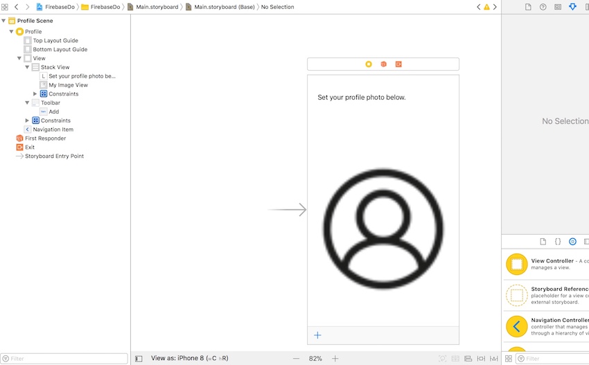
Within our main storyboard, add an image view with a placeholder image that will represent the user’s current profile, and then drag to associate the image view with the one we have declared as an @IBOutlet in our HomeViewController class. Next, add a toolbar with a button that you will use as an @IBAction to call the libraryAction() method we created earlier in the HomeViewController

Your Storyboard should now resemble the following:

Storyboard view with placeholder profile image

Absent of any errors, you can go ahead and build and run your app once again, and authenticate by either creating a new user or using an existing user's set of credentials. 

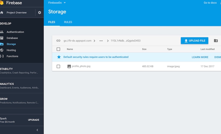
You will then be presented with the HomeViewController, where you will select the + button to add an image from your device or simulator’s photo library. Once you’ve chosen a photo, it will upload it to the Firebase bucket. You can confirm that it has successfully uploaded by going to the Storage tab of your Firebase Console, as shown below:

The Storage tab of your Firebase Console

If you stop and re-run the app in Xcode, you should also see the image you last uploaded reappear, further confirming we have successfully uploaded and downloaded using Firebase Storage. 

Conclusion

This tutorial demonstrated how to easy it is to add asynchronous asset storage and management to an existing Firebase app with just a few lines of code. This provides you with a convenient way to manage your app’s assets, while letting you handle offline synchronization elegantly and conveniently. 

Firebase Storage is an obvious choice for iOS developers who are already within the Firebase ecosystem. It provides developers with the security of an imperative security model provided by Firebase Authentication, as well as the capability provided by the Firebase Realtime Database. 

While you're here, check out some of our other posts on iOS app development!

2017-12-29T12:32:10.000Z2017-12-29T12:32:10.000ZDoron Katz

Create a Material Design Tabbed Interface in an Android App

$
0
0
Final product image
What You'll Be Creating

The material design team at Google simply defines the functionality of tabs in Android as follows:

Tabs make it easy to explore and switch between different views.

In this post you'll learn how to display tabs using the TabLayout and ViewPager API. In this practical tutorial, we'll cover the following:

  • The TabLayout and ViewPager components. 
  • The different tab modes: scrollable and fixed.
  • How to display icons instead of text for the tab titles.
  • For a bonus, you'll also learn how to use the Android Studio templates feature to quickly bootstrap your project with a tabbed interface. 

A sample project for this tutorial can be found on our GitHub repo so you can easily follow along.

Prerequisites

To be able to follow this tutorial, you'll need:

You can also learn all the ins and outs of the Kotlin language in my Kotlin From Scratch series.

Introduction to the TabLayout Component

According to the official Android documentation on TabLayout, it says:

TabLayout provides a horizontal layout to display tabs.

The TabLayout component is one of the components introduced as part of the material design artifacts. Moreover, it is also included in the design support library. In a TabLayout, when a tab is selected or tapped, a different page (or fragment) is shown to the user. 

The TabLayout component can have its displayed tabs function in one of two ways: fixed and scrollable. If the tabs are fixed, all of the tabs will be displayed on the screen at the same time.  

The screenshot below is the latest official WhatsApp Android app (as of this writing), which uses a TabLayout with a fixed mode configuration. 

WhatsApp fixed TabLayout sample

In scrollable tabs, if the number of tabs becomes too wide for the screen, the user can swipe left or right to view more tabs. 

Here is an example of a TabLayout with scrollable tab mode—showcased in the latest version of the News & Weather Android app by Google. 

Scrollable tab mode in Google News  Weather app

Furthermore, the information displayed on a tab can be text, an icon, or a combination of both text and an icon. For example, the latest Twitter app for Android uses icons instead of text on each tab. 

Icons on tabs in Twitter Android app

In the following sections, we'll dive into coding a simple app that makes use of TabLayout with a ViewPager. Let's get rolling! 

Design is not just what it looks like and feels like. Design is how it works. — Steve Jobs

1. Create an Android Studio Project

Fire up Android Studio 3 and create a new project (you can name it TabLayoutDemo) with an empty activity called MainActivity.

Create Android Project page

2. Creating the Fragments (Pages)

We're going to create a TabLayout with just three tabs. When each of the tabs is selected, it displays a different Android fragment or page. So let's now create the three Android fragments for each of the tabs. We'll start with the first fragment class, and you should follow a similar process for the remaining two fragment classes—FragmentTwo.kt and FragmentThree.kt

Here is my FragmentOne.kt:

Here is also my R.layout.fragment_one

3. Adding the TabLayout and ViewPager

To begin using TabLayout and ViewPager in your project, make sure you import the design support and also the Android support artifact—so add these to your module's build.gradle file to import them. 

Also, visit your res/layout/activlty_main.xml file to include both the TabLayout widget and the ViewPager view. 

Here we created a simple TabLayout with id tab_layout. In our TabLayout XML widget, you can see that we included some attributes—such as app:tabMode to be fixed and also app:tabGravity to be fill. The app:tabGravity property is used to configure how the tab items will be displayed so as to take up the available space. We set this to fill, which will distribute the items evenly across the width of the TabLayout. Note that this will be more visible in wider displays, such as tablets. 

I also included a custom style attribute (@style/CustomTabLayout) in our TabLayout widget. 

We begin customising our TabLayout by setting the values of the attributes to be applied on the TabLayout. Here are the details for some of the attributes applied:

  • tabIndicatorColor: sets the tab indicator's color for the currently selected tab. This can also be set programmatically by calling setSelectedTabIndicatorColor() on a TabLayout instance. 
  • tabIndicatorHeight: sets the tab indicator's height for the currently selected tab. This can be also be set programmatically by calling the setSelectedTabIndicatorHeight() on a TabLayout instance. 
  • tabSelectedTextColor: sets the text colors for the different states (normal, selected) used for the tabs. The equivalent of this attribute in Java is setTabTextColors()

Immediately after creating our TabLayout widget in XML, the next view was a ViewPager. The official documentation says the following about ViewPager:

Layout manager that allows the user to flip left and right through pages of data...

4. Creating the PagerAdapter

We need to create a subclass in SampleAdapter.kt that extends the FragmentPagerAdapter. This class is responsible for managing the different fragments that will be displayed on the tabs. 

Here we override three methods from the parent class: getItem()getCount(), and getPageTitle(). Here are the explanations for the methods:

  • getItem(): returns a Fragment for a particular position within the ViewPager
  • getCount(): indicates how many pages will be in the ViewPager
  • getPageTitle(): this method is called by the ViewPager to obtain a title string to describe the specified tab.

For example, if the selected tab is the first tab with title "Tab 1 Item", a FragmentOne page will be shown to the user immediately. 

5. Initialization of Components

Next, we are going to initialize instances of our TabLayout, ViewPager, and SampleAdapter. Initialization is going to happen inside onCreate() in MainActivity.kt.

We got references to our TabLayout and ViewPager from R.layout.activity_main and initialized them. We also created an instance of our SampleAdapter—passing an instance of FragmentManager as an argument. We need to supply the views for our ViewPager, so we called setAdapter() and passed in our created adapter to it. Finally, we called setupWithViewPager() on an instance of TabLayout to do some work:

  • creation of the required tab for every page
  • setting up the required listeners

When the user taps on a tab, it changes the pages in the ViewPager and shows the required page (or Fragment). Also, swiping between pages updates the selected tab. In other words, this method helps us take care of scroll state change and clicks on the tabs.

The onTabSelectedListener() is used to include a listener that will be invoked when tab selection changes. We've overridden the following callbacks:

  • onTabSelected(): triggered when a tab enters the selected state.
  • onTabUnselected(): invoked when a tab exits the selected state.
  • onTabReselected(): invoked when a tab that is already selected is chosen again by the user.

Note that we can also set the tab mode programmatically—instead of via the layout XML—using setTabMode() on an instance of TabLayout. We pass the mode (fixed or scrollable) to this method as arguments. For example, we can pass TabLayout.MODE_FIXED for a fixed mode—or TabLayout.MODE_SCROLLABLE for a scrollable mode.

Note that if you want to explicitly create the tabs instead of using the helper method setUpWithViewPager(), you can instead use newTab() on a TabLayout instance. 

Note also that we could explicitly create the tabs via XML instead of programmatically. 

6. Testing the App

Finally, you can run the app! 

Final demo app

Try interacting with the application by swiping left or right and tapping the tabs. 

7. Scrollable Tabs

The official material design guidelines on tabs says the following about scrollable tabs:

Scrollable tabs display a subset of tabs at any given moment. They can contain longer tab labels and a larger number of tabs than fixed tabs. Scrollable tabs are best used for browsing contexts in touch interfaces when users don’t need to directly compare the tab labels.

Let's see how to create tabs with scrollable mode configuration. I made the title for each of the tabs longer than before. Here is the result in fixed mode:

Longer tab title in TabLayout

You can see that TabLayout has used multiple lines to display each of the tab's titles. In some situations, it will even truncate the titles! This creates a bad user experience, so if your tab titles need to be very long, you should consider using scrollable mode. Note also that if you are going to have more than four tabs, it's recommended to make the tab mode scrollable.

Let's change the app:tabMode property from fixed to scrollable.

Remember, you can also set the tab mode programmatically, as discussed earlier. 

Scrollable mode for tabs

8. Showing Tab Icons

Let's now dive into how to replace the tab item text with icons instead. 

Here we called the getTabAt() on an instance of TabLayout. Calling this method will return the tab at the specified index. Next, we call setIcon(). Calling this method will set the icon displayed on this tab. 

I also set the tab mode to be fixed.

I still override the getPageTitle() inside the SampleAdapter

Here is the result:

App demo with tab icons and titles

Now, if you want only the icons, you simply don't override getPageTitle().

App demo with tab icons

9. Bonus: Using Android Studio Templates

Instead of writing so much code just to create a tabbed interface or activity from scratch, Android Studio 3.0 has some pre-existing code templates (available in Java and Kotlin) to help kick-start your project. One such template can be used to create a tabbed activity. 

I'll show you how to use this handy feature in Android Studio 3. 

For a new project, fire up Android Studio 3. 

Android Studio create project dialog

Enter the application name and click the Next button. 

You can leave the defaults as they are in the Target Android Devices dialog. Click the Next button again. 

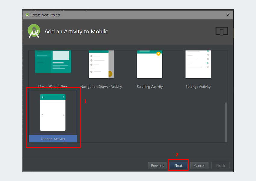
Add an Activity to Mobile dialog

In the Add an Activity to Mobile dialog, scroll down and select Tabbed Activity. Click the Next button after that. 

Configure Activity dialog

In the last dialog, scroll down to the Navigation Style drop-down menu and select Action Bar Tabs (with ViewPager). Finally, click the Finish button to accept all configurations. 

Android Studio has now helped us to create a project with a tabbed activity. Really cool!

Android Studio XML design view for layout

You are strongly advised to explore the code generated. 

In an already existing Android Studio project, to use this template, simply go to File > Activity > Tabbed Activity. And follow the similar steps that were described previously. 

Navigation to tabbed activity button in Android Studio

The templates that come included with Android Studio are good for simple layouts and making basic apps, but if you want to kick-start your app even further, you might consider some of the app templates available from Envato Market

They’re a huge time saver for experienced developers, helping them to cut through the slog of creating an app from scratch and focus their talents instead on the unique and customised parts of creating a new app.

Conclusion

In this tutorial, you learned how to create a tabbed interface in Android using the TabLayout and ViewPager API from scratch. We also explored how to easily and quickly use the Android Studio templates to create a tabbed interface. 

I highly recommend checking out the official material design guidelines for tabs to learn more about how to properly design and use tabs in Android.   

To learn more about coding for Android, check out some of our other courses and tutorials here on Envato Tuts+!

2017-12-29T13:37:05.000Z2017-12-29T13:37:05.000ZChike Mgbemena

Create a Material Design Tabbed Interface in an Android App

$
0
0
tag:code.tutsplus.com,2005:PostPresenter/cms-30120
Final product image
What You'll Be Creating

The material design team at Google simply defines the functionality of tabs in Android as follows:

Tabs make it easy to explore and switch between different views.

In this post you'll learn how to display tabs using the TabLayout and ViewPager API. In this practical tutorial, we'll cover the following:

  • The TabLayout and ViewPager components. 
  • The different tab modes: scrollable and fixed.
  • How to display icons instead of text for the tab titles.
  • For a bonus, you'll also learn how to use the Android Studio templates feature to quickly bootstrap your project with a tabbed interface. 

A sample project for this tutorial can be found on our GitHub repo so you can easily follow along.

Prerequisites

To be able to follow this tutorial, you'll need:

You can also learn all the ins and outs of the Kotlin language in my Kotlin From Scratch series.

Introduction to the TabLayout Component

According to the official Android documentation on TabLayout, it says:

TabLayout provides a horizontal layout to display tabs.

The TabLayout component is one of the components introduced as part of the material design artifacts. Moreover, it is also included in the design support library. In a TabLayout, when a tab is selected or tapped, a different page (or fragment) is shown to the user. 

The TabLayout component can have its displayed tabs function in one of two ways: fixed and scrollable. If the tabs are fixed, all of the tabs will be displayed on the screen at the same time.  

The screenshot below is the latest official WhatsApp Android app (as of this writing), which uses a TabLayout with a fixed mode configuration. 

WhatsApp fixed TabLayout sample

In scrollable tabs, if the number of tabs becomes too wide for the screen, the user can swipe left or right to view more tabs. 

Here is an example of a TabLayout with scrollable tab mode—showcased in the latest version of the News & Weather Android app by Google. 

Scrollable tab mode in Google News  Weather app

Furthermore, the information displayed on a tab can be text, an icon, or a combination of both text and an icon. For example, the latest Twitter app for Android uses icons instead of text on each tab. 

Icons on tabs in Twitter Android app

In the following sections, we'll dive into coding a simple app that makes use of TabLayout with a ViewPager. Let's get rolling! 

Design is not just what it looks like and feels like. Design is how it works. — Steve Jobs

1. Create an Android Studio Project

Fire up Android Studio 3 and create a new project (you can name it TabLayoutDemo) with an empty activity called MainActivity.

Create Android Project page

2. Creating the Fragments (Pages)

We're going to create a TabLayout with just three tabs. When each of the tabs is selected, it displays a different Android fragment or page. So let's now create the three Android fragments for each of the tabs. We'll start with the first fragment class, and you should follow a similar process for the remaining two fragment classes—FragmentTwo.kt and FragmentThree.kt

Here is my FragmentOne.kt:

Here is also my R.layout.fragment_one

3. Adding the TabLayout and ViewPager

To begin using TabLayout and ViewPager in your project, make sure you import the design support and also the Android support artifact—so add these to your module's build.gradle file to import them. 

Also, visit your res/layout/activlty_main.xml file to include both the TabLayout widget and the ViewPager view. 

Here we created a simple TabLayout with id tab_layout. In our TabLayout XML widget, you can see that we included some attributes—such as app:tabMode to be fixed and also app:tabGravity to be fill. The app:tabGravity property is used to configure how the tab items will be displayed so as to take up the available space. We set this to fill, which will distribute the items evenly across the width of the TabLayout. Note that this will be more visible in wider displays, such as tablets. 

I also included a custom style attribute (@style/CustomTabLayout) in our TabLayout widget. 

We begin customising our TabLayout by setting the values of the attributes to be applied on the TabLayout. Here are the details for some of the attributes applied:

  • tabIndicatorColor: sets the tab indicator's color for the currently selected tab. This can also be set programmatically by calling setSelectedTabIndicatorColor() on a TabLayout instance. 
  • tabIndicatorHeight: sets the tab indicator's height for the currently selected tab. This can be also be set programmatically by calling the setSelectedTabIndicatorHeight() on a TabLayout instance. 
  • tabSelectedTextColor: sets the text colors for the different states (normal, selected) used for the tabs. The equivalent of this attribute in Java is setTabTextColors()

Immediately after creating our TabLayout widget in XML, the next view was a ViewPager. The official documentation says the following about ViewPager:

Layout manager that allows the user to flip left and right through pages of data...

4. Creating the PagerAdapter

We need to create a subclass in SampleAdapter.kt that extends the FragmentPagerAdapter. This class is responsible for managing the different fragments that will be displayed on the tabs. 

Here we override three methods from the parent class: getItem()getCount(), and getPageTitle(). Here are the explanations for the methods:

  • getItem(): returns a Fragment for a particular position within the ViewPager
  • getCount(): indicates how many pages will be in the ViewPager
  • getPageTitle(): this method is called by the ViewPager to obtain a title string to describe the specified tab.

For example, if the selected tab is the first tab with title "Tab 1 Item", a FragmentOne page will be shown to the user immediately. 

5. Initialization of Components

Next, we are going to initialize instances of our TabLayout, ViewPager, and SampleAdapter. Initialization is going to happen inside onCreate() in MainActivity.kt.

We got references to our TabLayout and ViewPager from R.layout.activity_main and initialized them. We also created an instance of our SampleAdapter—passing an instance of FragmentManager as an argument. We need to supply the views for our ViewPager, so we called setAdapter() and passed in our created adapter to it. Finally, we called setupWithViewPager() on an instance of TabLayout to do some work:

  • creation of the required tab for every page
  • setting up the required listeners

When the user taps on a tab, it changes the pages in the ViewPager and shows the required page (or Fragment). Also, swiping between pages updates the selected tab. In other words, this method helps us take care of scroll state change and clicks on the tabs.

The onTabSelectedListener() is used to include a listener that will be invoked when tab selection changes. We've overridden the following callbacks:

  • onTabSelected(): triggered when a tab enters the selected state.
  • onTabUnselected(): invoked when a tab exits the selected state.
  • onTabReselected(): invoked when a tab that is already selected is chosen again by the user.

Note that we can also set the tab mode programmatically—instead of via the layout XML—using setTabMode() on an instance of TabLayout. We pass the mode (fixed or scrollable) to this method as arguments. For example, we can pass TabLayout.MODE_FIXED for a fixed mode—or TabLayout.MODE_SCROLLABLE for a scrollable mode.

Note that if you want to explicitly create the tabs instead of using the helper method setUpWithViewPager(), you can instead use newTab() on a TabLayout instance. 

Note also that we could explicitly create the tabs via XML instead of programmatically. 

6. Testing the App

Finally, you can run the app! 

Final demo app

Try interacting with the application by swiping left or right and tapping the tabs. 

7. Scrollable Tabs

The official material design guidelines on tabs says the following about scrollable tabs:

Scrollable tabs display a subset of tabs at any given moment. They can contain longer tab labels and a larger number of tabs than fixed tabs. Scrollable tabs are best used for browsing contexts in touch interfaces when users don’t need to directly compare the tab labels.

Let's see how to create tabs with scrollable mode configuration. I made the title for each of the tabs longer than before. Here is the result in fixed mode:

Longer tab title in TabLayout

You can see that TabLayout has used multiple lines to display each of the tab's titles. In some situations, it will even truncate the titles! This creates a bad user experience, so if your tab titles need to be very long, you should consider using scrollable mode. Note also that if you are going to have more than four tabs, it's recommended to make the tab mode scrollable.

Let's change the app:tabMode property from fixed to scrollable.

Remember, you can also set the tab mode programmatically, as discussed earlier. 

Scrollable mode for tabs

8. Showing Tab Icons

Let's now dive into how to replace the tab item text with icons instead. 

Here we called the getTabAt() on an instance of TabLayout. Calling this method will return the tab at the specified index. Next, we call setIcon(). Calling this method will set the icon displayed on this tab. 

I also set the tab mode to be fixed.

I still override the getPageTitle() inside the SampleAdapter

Here is the result:

App demo with tab icons and titles

Now, if you want only the icons, you simply don't override getPageTitle().

App demo with tab icons

9. Bonus: Using Android Studio Templates

Instead of writing so much code just to create a tabbed interface or activity from scratch, Android Studio 3.0 has some pre-existing code templates (available in Java and Kotlin) to help kick-start your project. One such template can be used to create a tabbed activity. 

I'll show you how to use this handy feature in Android Studio 3. 

For a new project, fire up Android Studio 3. 

Android Studio create project dialog

Enter the application name and click the Next button. 

You can leave the defaults as they are in the Target Android Devices dialog. Click the Next button again. 

Add an Activity to Mobile dialog

In the Add an Activity to Mobile dialog, scroll down and select Tabbed Activity. Click the Next button after that. 

Configure Activity dialog

In the last dialog, scroll down to the Navigation Style drop-down menu and select Action Bar Tabs (with ViewPager). Finally, click the Finish button to accept all configurations. 

Android Studio has now helped us to create a project with a tabbed activity. Really cool!

Android Studio XML design view for layout

You are strongly advised to explore the code generated. 

In an already existing Android Studio project, to use this template, simply go to File > Activity > Tabbed Activity. And follow the similar steps that were described previously. 

Navigation to tabbed activity button in Android Studio

The templates that come included with Android Studio are good for simple layouts and making basic apps, but if you want to kick-start your app even further, you might consider some of the app templates available from Envato Market

They’re a huge time saver for experienced developers, helping them to cut through the slog of creating an app from scratch and focus their talents instead on the unique and customised parts of creating a new app.

Conclusion

In this tutorial, you learned how to create a tabbed interface in Android using the TabLayout and ViewPager API from scratch. We also explored how to easily and quickly use the Android Studio templates to create a tabbed interface. 

I highly recommend checking out the official material design guidelines for tabs to learn more about how to properly design and use tabs in Android.   

To learn more about coding for Android, check out some of our other courses and tutorials here on Envato Tuts+!

2017-12-29T13:37:05.000Z2017-12-29T13:37:05.000ZChike Mgbemena

How to Train a Core ML Model for an iOS App

$
0
0
Final product image
What You'll Be Creating

Core ML makes it easy for iOS developers to add deep machine learning to their apps. In this post, I'll show you how you can train a Core ML model to derive intelligent insights.

Machine learning has undoubtedly been one of the hottest topics over the past year, with companies of all kinds trying to make their products more intelligent to improve user experiences and differentiate their offerings. Google invested between $20B and $30B in artificial intelligence just last year alone, according to McKinsey’s State Of Machine Learning And AI, 2017

AI is turning into a race for patents and intellectual property (IP) among the world’s leading tech companies...The report cites many examples of internal development including Amazon’s investments in robotics and speech recognition, and Salesforce on virtual agents and machine learning. BMW, Tesla, and Toyota lead auto manufacturers in their investments in robotics and machine learning for use in driverless cars. Toyota is planning to invest $1B in establishing a new research institute devoted to AI for robotics and driverless vehicles. (source: Forbes)

Apple is no exception to this trend, having utilized Machine Learning in their own apps. For example, the Photos app for iOS can recognize faces, objects and landmarks, and Siri infers intent and meaning from speech. Messages for iOS intelligently suggests and predicts words based on previous user behaviors. 

In this tutorial, you will learn about how to apply machine learning algorithms to a set of training data, to create a trained model which will subsequently make predictions based on new input. All thanks to Apple’s new Core ML framework. 

Objectives of This Tutorial

This tutorial will introduce you to a subset of Machine Learning.  You'll train and integrate a machine learning model in a simple iOS app, using a popular deep learning algorithm framework. In this tutorial, you will:

  • learn some of the basic Machine Learning concepts 
  • train your model using sample data
  • integrate the trained model in an iOS app

After going through the theory of NLP, we'll put our knowledge to practice by working through a simple twitter client, analyzing tweet messages. Go ahead and clone the tutorial’s GitHub repo and take a look at the final version of the app we will create from scratch. 

Assumed Knowledge

This tutorial assumes you are a seasoned iOS developer, but although you will be working with machine learning, you don’t need to have any background on the subject. You'll be using a bit of Python to create your trained model, but you can follow through the tutorial example without prior knowledge of Python. 

Machine Learning 101

The goal of machine learning is for a computer to do tasks without being explicitly programmed to do so—the ability to think or interpret autonomously. A high-profile contemporary use-case is autonomous driving: giving cars the ability to visually interpret their environment and drive unaided. 

Machine Learning is today leveraged by large companies to make better business decisions based on historical data, by using deep learning algorithms to identify patterns and correlations, which allow them to make better predictions of the future. For instance, you can resolve problems such as “How likely it is for a specific customer to purchase a specific product or service?” with greater confidence based on prior behavior. 

Machine learning is best applied to problems where you have a history of answers, as you will discover later in this tutorial when we go through our sample problem. An example of machine learning in action would be your email spam filter, which uses supervised learning (as you flag items as spam or not) to better filter spam over time. The machine learning model encodes all of this knowledge about past results and makes it available to the algorithm for efficient use at run-time.

It may all sound a bit overwhelming at first, but it isn’t complicated, and we will walk you through how to create a trained model shortly. Once you have devised a trained model via an algorithm, you will then convert it to a model that can be consumed by iOS, thanks to Core ML.

Core ML is new to Apple’s family of SDKs, introduced as part of iOS 11 to allow developers to implement a vast variety of machine learning modes and deep learning layer types. 

The Core ML technology stack source Apple

Natural Language Processing (NLP) logically sits within the Core ML framework alongside two other powerful libraries, Vision and GameplayKit. Vision provides developers with the ability to implement computer vision machine learning to accomplish things such as detecting faces, landmarks, or other objects, while GameplayKit provides game developers with tools for authoring games and specific gameplay features. 

The benefits of CoreML compared to other solutions is that Apple has optimized machine learning to run on-device, which means reduced memory power consumption and reduced latency. This also containerizes user information within the device, improving privacy.

Core ML and models source Apple

With an overview of Machine Learning and models out of the way, let’s put the theory into practice by creating your first training model. 

Training your Model

In order for a model to be useful, it needs to be trained to recognize data as information that it can subsequently use to assert predictions with an appropriate algorithm. Core ML currently supports the following model types:

Core ML model types and tools source Apple

In addition to designating an algorithm, the more data you have the better your model will be trained, and the more accurate the predictions will be. Before we start creating our Core ML model, let’s take a look at the example app we will be working with, and in particular, the sample data. 

Example App: Las Vegas Hotel Score Predictor

For this tutorial we are going to use an open-sourced set of data on hotel reviews in the Las Vegas Strip, which we had sourced from UCI to illustrate how to train a model and compute correlations. You can take a look at the complete set of comma-delimited CSV file that we will be using in our app. The structure of the data is as follows:

We will be interested in predicting the hotel star ratings for hotels based on the correlation of number of hotel reviews, and general reviews, for each specific hotel, which is quite a contrived example but simple enough to illustrate the concept of training a model with straightforward data. 

Download the comma-delimited CSV file into a new folder that you will use for this exercise. Now let’s go ahead and get our hands dirty with some Python, with the aim of accomplishing the following: 

  • importing the necessary libraries, including the Python CoreML libraries
  • importing our sample data
  • applying a linear regression algorithm to our data, using a library called SciKit
  • identifying the columns in the data we are interested in modeling (Nr. reviews, Nr. hotel reviews, Hotel stars)
  • identifying the column that it may be influencing (Score
  • converting the trained model into a CoreML model

It may seem like there are quite a few steps, but it is not as daunting as you may think. The Python code we will demonstrate next won’t be difficult to follow regardless of your experience with the language. 

First, we are going to setup our required modules an dependencies, including SciKitcoremltools Apple’s official CoreML tools for python, and pandas, a powerful tool for data structure analysis. 

Open up a terminal window, navigate to the project folder where you have the CSV file, and enter the following:

sudo -H pip install --ignore-installed coremltools scikit-learn pandas

Next, using an editor of your choice, create a new .py file, and name it something like convert_reviews.py, adding the following lines to import the libraries you will be using:

Straight after the import statements, add the following:

So far we are simply importing the CSV using the pandas framework, printing out the imported data to the screen, and then using the SciKit framework to establish a linear regression algorithm to apply to the columns we are interested in extrapolating. Don’t worry too much about what a linear regression algorithm means, but just know we are using a simple modeling algorithm technique to make predictions. In this project, we are interested in how it affects the score of our hotel, which we just established using the model.fit function. 

We now have our trained model, but we still need to convert it into a model that Core ML can consume, which is where coremltools comes in. Insert the following lines of code:

The last two lines convert your model into a Core ML-compliant model before saving the result as an .mlmodel object, ready to be consumed in your Xcode project. Save the Python script and run it via terminal:

python convert_reviews.py

Presuming you haven’t encountered any errors, the  Vegas_Reviews.mlmodel file will be generated, and your trained model primed to be imported into Xcode. 

Integrating the Trained Model

For the second part of this tutorial, you are going to create a simple app with a single view controller, a few sliders, and a segment control to enable users to toggle various values, allowing you to observe various Core ML predictions. The final app will look close to the following:

The final app UI

In Xcode, create a new Single View App Swift project, and give it a name.

Create a new App

Next make sure you've included the generated Vegas_Reviews.mlmodel file in your project, by dragging it into your navigation project pane.

Import the Core ML model

Now, open up the ViewController.swift file, and add the following:

The first thing you are doing is creating an instance of our model, which you will use to make predictions later in the class. You are also creating a few IBOutlet variables that you will wire up in the storyboard shortly, that map to the individual model properties we want to play around with.

Switch over to Storyboard, and add the corresponding controls we declared in your view controller, making sure you wire up each control to the view controller:

Wire up the controls in Storyboard

Switch back to the ViewController.swift file, and add the following @IBAction method: 

This is the primary functional code of our prediction engine, so let’s dissect this method step-by-step. We first cast the various controls into the Double type, which will be passed as arguments when we call our predictions method. Within a try? block, call self.reviews.prediction() which is an auto-generated method belonging to our model, along with the expected properties we had defined when importing our trained model.

The result of the predictions block is then passed to the label ScoreValue, to display in you app. We are almost finished, just switch back once more to the storyboard and map each control’s valueChanged: property to the @IBAction method we created in the view controller. You want this method to be called every time you change a slider or segment value. And for good measure, you can also ensure that you also automatically call this method within your viewDidLoad() method so that it updates right from the start:

Build and run the app in Xcode, and in the Simulator toggle the various sliders and observe the score value prediction as it changes based on the other attributing factors of number of hotel reviews and reviews in general. As emphasized earlier, this is indeed a contrived example but it gives you an idea of how to construct your own experiments to correlate, and more importantly, how simple it is to implement trained models in iOS. 

Conclusion

Thanks to Core ML in iOS 11, Apple has made it easy for everyday developers without a background in deep learning to be able to add intelligence into their apps. All the processing is done on-device, ensuring greater performance without the privacy concerns of storing data on the cloud. With Apple previously ‘dog-fooding’ its machine learning implementation on built-in apps like Photos and Mail, third-party developers now have the opportunity to recognize patterns, images and textual intent with only a few lines of code. 

This is no doubt only the beginning of Apple’s Core ML movement, but it is a great opportunity for developers to start thinking more holistically about data. With Core ML we can provide users with better user experiences while providing product managers with greater business insights into user behaviors. 

While you're here, check out some of our other posts on iOS app development and machine learning!

2017-12-31T23:03:44.000Z2017-12-31T23:03:44.000ZDoron Katz

How to Train a Core ML Model for an iOS App

$
0
0
tag:code.tutsplus.com,2005:PostPresenter/cms-30147
Final product image
What You'll Be Creating

Core ML makes it easy for iOS developers to add deep machine learning to their apps. In this post, I'll show you how you can train a Core ML model to derive intelligent insights.

Machine learning has undoubtedly been one of the hottest topics over the past year, with companies of all kinds trying to make their products more intelligent to improve user experiences and differentiate their offerings. Google invested between $20 billion and $30 billion in artificial intelligence just last year alone, according to McKinsey’s State Of Machine Learning And AI, 2017

AI is turning into a race for patents and intellectual property (IP) among the world’s leading tech companies...The report cites many examples of internal development including Amazon’s investments in robotics and speech recognition, and Salesforce on virtual agents and machine learning. BMW, Tesla, and Toyota lead auto manufacturers in their investments in robotics and machine learning for use in driverless cars. Toyota is planning to invest $1B in establishing a new research institute devoted to AI for robotics and driverless vehicles. (source: Forbes)

Apple is no exception to this trend, having utilized machine learning in its own apps. For example, the Photos app for iOS can recognize faces, objects, and landmarks, and Siri infers intent and meaning from speech. Messages for iOS intelligently suggests and predicts words based on previous user behaviors. 

In this tutorial, you will learn about how to apply machine learning algorithms to a set of training data, to create a trained model which will subsequently make predictions based on new input. All thanks to Apple’s new Core ML framework. 

Objectives of This Tutorial

This tutorial will introduce you to a subset of machine learning. You'll train and integrate a machine learning model in a simple iOS app, using a popular deep learning algorithm framework. In this tutorial, you will:

  • learn some of the basic machine learning concepts 
  • train your model using sample data
  • integrate the trained model in an iOS app

After going through the theory of NLP, we'll put our knowledge into practice by working through a simple Twitter client, analyzing tweet messages. Go ahead and clone the tutorial’s GitHub repo and take a look at the final version of the app we will create from scratch. 

Assumed Knowledge

This tutorial assumes you are a seasoned iOS developer, but although you will be working with machine learning, you don’t need to have any background on the subject. You'll be using a bit of Python to create your trained model, but you can follow the tutorial example without prior knowledge of Python. 

Machine Learning 101

The goal of machine learning is for a computer to do tasks without being explicitly programmed to do so—the ability to think or interpret autonomously. A high-profile contemporary use-case is autonomous driving: giving cars the ability to visually interpret their environment and drive unaided. 

Machine learning is today leveraged by large companies to make better business decisions based on historical data, by using deep learning algorithms to identify patterns and correlations, which allow them to make better predictions of the future. For instance, you can resolve problems such as “How likely it is for a specific customer to purchase a specific product or service?” with greater confidence based on prior behavior. 

Machine learning is best applied to problems where you have a history of answers, as you will discover later in this tutorial when we go through our sample problem. An example of machine learning in action would be your email spam filter, which uses supervised learning (as you flag items as spam or not) to better filter spam over time. The machine learning model encodes all of this knowledge about past results and makes it available to the algorithm for efficient use at run-time.

It may all sound a bit overwhelming at first, but it isn’t complicated, and I'll walk you through how to create a trained model shortly. Once you have devised a trained model via an algorithm, you will then convert it to a model that can be consumed by iOS, thanks to Core ML.

Core ML is new to Apple’s family of SDKs, introduced as part of iOS 11 to allow developers to implement a vast variety of machine learning modes and deep learning layer types. 

The Core ML technology stack source Apple

Natural Language Processing (NLP) logically sits within the Core ML framework alongside two other powerful libraries, Vision and GameplayKit. Vision provides developers with the ability to implement computer vision machine learning to accomplish things such as detecting faces, landmarks, or other objects, while GameplayKit provides game developers with tools for authoring games and specific gameplay features. 

The benefit of Core ML compared to other solutions is that Apple has optimized machine learning to run on-device, which means reduced memory power consumption and reduced latency. This also containerizes user information within the device, improving privacy.

Core ML and models source Apple

With an overview of machine learning and models out of the way, let’s put the theory into practice by creating your first training model. 

Training Your Model

In order for a model to be useful, it needs to be trained to recognize data as information that it can subsequently use to assert predictions with an appropriate algorithm. Core ML currently supports the following model types:

Core ML model types and tools source Apple

In addition to designating an algorithm, the more data you have, the better your model will be trained, and the more accurate the predictions will be. Before we start creating our Core ML model, let’s take a look at the example app we will be working with, and in particular, the sample data. 

Example App: Las Vegas Hotel Score Predictor

For this tutorial, we are going to use an open-sourced set of data on hotel reviews in the Las Vegas Strip, which I sourced from UCI to illustrate how to train a model and compute correlations. You can take a look at the complete comma-delimited CSV file that we will be using in our app. The structure of the data is as follows:

We will be interested in predicting the hotel star ratings for hotels based on the correlation of the number of hotel reviews, and general reviews, for each specific hotel, which is quite a contrived example but simple enough to illustrate the concept of training a model with straightforward data. 

Download the comma-delimited CSV file into a new folder that you will use for this exercise. Now let’s go ahead and get our hands dirty with some Python, with the aim of accomplishing the following: 

  • importing the necessary libraries, including the Python Core ML libraries
  • importing our sample data
  • applying a linear regression algorithm to our data, using a library called SciKit
  • identifying the columns in the data we are interested in modeling (Nr. reviews, Nr. hotel reviews, Hotel stars)
  • identifying the column that it may be influencing (Score
  • converting the trained model into a Core ML model

It may seem as if there are quite a few steps, but it's not as daunting as you may think. The Python code we will demonstrate next won’t be difficult to follow, regardless of your experience with the language. 

First, we are going to set up our required modules and dependencies, including SciKitcoremltools (Apple’s official Core ML tools for Python), and pandas, a powerful tool for data structure analysis. 

Open up a terminal window, navigate to the project folder where you have the CSV file, and enter the following:

sudo -H pip install --ignore-installed coremltools scikit-learn pandas

Next, using an editor of your choice, create a new .py file, and name it something like convert_reviews.py, adding the following lines to import the libraries you will be using:

Straight after the import statements, add the following:

So far, we are simply importing the CSV using the pandas framework, printing out the imported data to the screen, and then using the SciKit framework to establish a linear regression algorithm to apply to the columns we are interested in extrapolating. 

Don’t worry too much about what a linear regression algorithm means, but just know we are using a simple modeling algorithm technique to make predictions. In this project, we are interested in how it affects the score of our hotel, which we just established using the model.fit function. 

We now have our trained model, but we still need to convert it into a model that Core ML can consume, which is where coremltools comes in. Insert the following lines of code:

The last two lines convert your model into a Core ML-compliant model before saving the result as an .mlmodel object, ready to be consumed in your Xcode project. Save the Python script and run it via terminal:

python convert_reviews.py

Presuming you haven’t encountered any errors, the  Vegas_Reviews.mlmodel file will be generated, and your trained model primed to be imported into Xcode. 

Integrating the Trained Model

For the second part of this tutorial, you are going to create a simple app with a single view controller, a few sliders, and a segment control to enable users to toggle various values, allowing you to observe various Core ML predictions. The final app will look close to the following:

The final app UI

In Xcode, create a new Single View App Swift project, and give it a name.

Create a new App

Next, make sure you've included the generated Vegas_Reviews.mlmodel file in your project, by dragging it into your navigation project pane.

Import the Core ML model

Now, open up the ViewController.swift file, and add the following:

The first thing you are doing is creating an instance of our model, which you will use to make predictions later in the class. You are also creating a few IBOutlet variables that you will wire up in the storyboard shortly, that map to the individual model properties we want to play around with.

Switch over to Storyboard, and add the corresponding controls we declared in your view controller, making sure you wire up each control to the view controller:

Wire up the controls in Storyboard

Switch back to the ViewController.swift file, and add the following @IBAction method: 

This is the primary functional code of our prediction engine, so let’s dissect this method step by step. We first cast the various controls into the Double type, which will be passed as arguments when we call our predictions method. Within a try? block, call self.reviews.prediction(), which is an auto-generated method belonging to our model, along with the expected properties we defined when importing our trained model.

The result of the predictions block is then passed to the label ScoreValue, to display in your app. We are almost finished—just switch back once more to the storyboard and map each control’s valueChanged: property to the @IBAction method we created in the view controller. You want this method to be called every time you change a slider or segment value. And for good measure, you can also ensure that you automatically call this method within your viewDidLoad() method so that it updates right from the start:

Build and run the app in Xcode, and in the Simulator, toggle the various sliders and observe the score value prediction as it changes based on the other attributing factors of the number of hotel reviews and reviews in general. 

As emphasized earlier, this is indeed a contrived example, but it gives you an idea of how to construct your own experiments to correlate, and more importantly, how simple it is to implement trained models in iOS. 

Conclusion

Thanks to Core ML in iOS 11, Apple has made it easy for everyday developers without a background in deep learning to be able to add intelligence into their apps. All the processing is done on-device, ensuring greater performance without the privacy concerns of storing data in the cloud. With Apple previously ‘dog-fooding’ its machine learning implementation on built-in apps like Photos and Mail, third-party developers now have the opportunity to recognize patterns, images, and textual intent with only a few lines of code. 

This is no doubt only the beginning of Apple’s Core ML movement, but it is a great opportunity for developers to start thinking more holistically about data. With Core ML, we can provide users with better user experiences while providing product managers with greater business insights into user behaviors. 

While you're here, check out some of our other posts on iOS app development and machine learning!

2017-12-31T23:03:44.000Z2017-12-31T23:03:44.000ZDoron Katz

Quick Tip: Create a Custom Quick Settings Tile for Android

$
0
0

The quick settings panel needs no introduction to Android users. They use the switches it offers all the time to turn services such as WiFi, Bluetooth, and GPS on and off. Over the years, it has grown and improved so much that there's rarely a need to open the actual Settings app these days.

Until recently, the quick settings panel was locked, and users had to be satisfied with a large, but fixed collection of switches—commonly known as tiles. With the launch of Android Nougat though, that's no longer the case. Users are now free to add, remove, and rearrange tiles. What's more, as an app developer, you can offer your own custom tiles.

In this quick tip, I'll show you how to use the Quick Settings Tile API to create a custom tile from scratch.

Prerequisites

Before you proceed, make sure you have the following:

  • the latest version of Android Studio
  • a phone running Android Nougat or higher 

1. Understanding Tiles

In essence, tiles are just readily-accessible switches users can press at any time—even when their devices are locked. Because they can display nothing more than an icon and a label, they can only be used for very specific yet simple actions.

Every tile has a state associated with it. Just like a real-world switch, it can either be in an "on" state or an "off" state. As you might expect, a tile that's on is brighter than one that's off. Although you must manage the state of your tile yourself, the Android platform automatically manages its brightness.

2. Creating a Custom Tile

In order to offer a custom tile, your app must have a service that extends the TileService class.

While mentioning the service in the project's manifest, you must give it a label and an icon, both of which will be used to create the default look of the tile. To give you a realistic example, we'll now be creating a tile that makes the user's device vibrate continuously as long as its on. Its label will be Tremble and its icon will be vibration, which is available in the Vector Asset Studio under the Notification section.

Vector Asset Studios Notification section

Next, you must add an intent filter to the service's definition so that it can respond to the android.service.quicksettings.action.QS_TILE action. To make sure that it can be launched only by the Android system, you must also protect it with the android.permission.BIND_QUICK_SETTINGS_TILE permission.

At this point, the service's definition should look like this:

That's all the code you need to display a custom tile. If you deploy your app now and navigate to the Edit section of the quick settings panel, you should be able to see your tile in the list of available tiles.

Quick settings panels Edit section

Drag it and drop it near one of the default tiles so that you can access it more easily.

Custom tile placed among default tiles

3. Initializing the Tile

You must have noticed that our tile is quite bright. That's because we still haven't initialized its state, and the system thinks it is "on". To change the tile such that it starts in the off state when the user adds it, you can override the onTileAdded() event handler of the service and set the state property of the qsTile object to Tile.STATE_INACTIVE.

Whenever you change the state, you must remember to also call the updateTile() method so that the tile's looks change to match the state.

If you run the app now, remove the tile, and add it back again, you should see that it's off.

Custom tile in off state

4. Adding a Click Handler

Right now, nothing happens when you click on the tile. You can change that by overriding the onClick() event handler of the service.

Inside the event handler, you can turn the tile on and off by alternating between the Tile.STATE_ACTIVE and Tile.STATE_INACTIVE states. The following code shows you how to do so with a simple if-else statement:

5. Using the Vibrator

The action associated with the tile should start as soon as the tile is turned on and stop as soon as it's turned off. Therefore, in addition to updating the state, the code we added in the previous step contains calls to the startVibrating() and stopVibrating() methods.

The startVibrating() method can use the vibrate() method of Android's Vibrator class to make the phone vibrate. The vibrate() method, however, expects a fixed duration. To make sure that the phone vibrates continuously as long as the tile is on, you can call it inside a loop, preferably with a short duration. Such a loop can't be run inside the UI thread, the thread the tile service uses for its click event handler.

Ideally, any long-running operation you want your tile service to start or stop should be placed inside an IntentService instance. To keep this tutorial short though, let's make do with a coroutine for now.

The following code shows you how to run the loop inside a coroutine created using the launch() coroutine builder:

Although the above loop will terminate when the user turns the tile off, the vibrations may last for an extra second. To stop them immediately, you can call the cancel() method of the Vibrator service inside the stopVibrating() method.

Our custom tile is ready. However, it won't work unless it has the permission to use the phone's vibrator. You can request for it by adding the following line to your project's manifest file:

If you deploy the app now and click on the custom tile, your phone should start vibrating. By clicking on it again, you should be able to stop the vibrations immediately.

Custom tile in on state

Conclusion

If you are building an app that offers unique functionality or information users will need access to very frequently, offering a custom tile with it can dramatically improve the user experience. In this tutorial, you saw how easy it is to create such a tile using the Quick Settings Tile API.

To learn more about it, do refer to the official documentation.

And while you're here, check out some of our other posts on Android app development!

2018-01-12T11:31:48.000Z2018-01-12T11:31:48.000ZAshraff Hathibelagal

Quick Tip: Create a Custom Quick Settings Tile for Android

$
0
0
tag:code.tutsplus.com,2005:PostPresenter/cms-30318

The quick settings panel needs no introduction to Android users. They use the switches it offers all the time to turn services such as WiFi, Bluetooth, and GPS on and off. Over the years, it has grown and improved so much that there's rarely a need to open the actual Settings app these days.

Until recently, the quick settings panel was locked, and users had to be satisfied with a large, but fixed collection of switches—commonly known as tiles. With the launch of Android Nougat, though, that's no longer the case. Users are now free to add, remove, and rearrange tiles. What's more, as an app developer, you can offer your own custom tiles.

In this quick tip, I'll show you how to use the Quick Settings Tile API to create a custom tile from scratch.

Prerequisites

Before you proceed, make sure you have the following:

  • the latest version of Android Studio
  • a phone running Android Nougat or higher 

1. Understanding Tiles

In essence, tiles are just readily accessible switches users can press at any time—even when their devices are locked. Because they can display nothing more than an icon and a label, they can only be used for very specific yet simple actions.

Every tile has a state associated with it. Just like a real-world switch, it can either be in an "on" state or an "off" state. As you might expect, a tile that's on is brighter than one that's off. Although you must manage the state of your tile yourself, the Android platform automatically manages its brightness.

2. Creating a Custom Tile

In order to offer a custom tile, your app must have a service that extends the TileService class.

While mentioning the service in the project's manifest, you must give it a label and an icon, both of which will be used to create the default look of the tile. To give you a realistic example, we'll now be creating a tile that makes the user's device vibrate continuously as long as it's on. Its label will be Tremble, and its icon will be vibration, which is available in the Vector Asset Studio under the Notification section.

Vector Asset Studios Notification section

Next, you must add an intent filter to the service's definition so that it can respond to the android.service.quicksettings.action.QS_TILE action. To make sure that it can be launched only by the Android system, you must also protect it with the android.permission.BIND_QUICK_SETTINGS_TILE permission.

At this point, the service's definition should look like this:

That's all the code you need to display a custom tile. If you deploy your app now and navigate to the Edit section of the quick settings panel, you should be able to see your tile in the list of available tiles.

Quick settings panels Edit section

Drag it and drop it near one of the default tiles so that you can access it more easily.

Custom tile placed among default tiles

3. Initializing the Tile

You must have noticed that our tile is quite bright. That's because we still haven't initialized its state, and the system thinks it is "on". To change the tile such that it starts in the off state when the user adds it, you can override the onTileAdded() event handler of the service and set the state property of the qsTile object to Tile.STATE_INACTIVE.

Whenever you change the state, you must remember to also call the updateTile() method so that the tile's looks change to match the state.

If you run the app now, remove the tile, and add it back again, you should see that it's off.

Custom tile in off state

4. Adding a Click Handler

Right now, nothing happens when you click on the tile. You can change that by overriding the onClick() event handler of the service.

Inside the event handler, you can turn the tile on and off by alternating between the Tile.STATE_ACTIVE and Tile.STATE_INACTIVE states. The following code shows you how to do so with a simple if-else statement:

5. Using the Vibrator

The action associated with the tile should start as soon as the tile is turned on and stop as soon as it's turned off. Therefore, in addition to updating the state, the code we added in the previous step contains calls to the startVibrating() and stopVibrating() methods.

The startVibrating() method can use the vibrate() method of Android's Vibrator class to make the phone vibrate. The vibrate() method, however, expects a fixed duration. To make sure that the phone vibrates continuously as long as the tile is on, you can call it inside a loop, preferably with a short duration. Such a loop can't be run inside the UI thread, the thread the tile service uses for its click event handler.

Ideally, any long-running operation you want your tile service to start or stop should be placed inside an IntentService instance. To keep this tutorial short, though, let's make do with a coroutine for now.

The following code shows you how to run the loop inside a coroutine created using the launch() coroutine builder:

Although the above loop will terminate when the user turns the tile off, the vibrations may last for an extra second. To stop them immediately, you can call the cancel() method of the Vibrator service inside the stopVibrating() method.

Our custom tile is ready. However, it won't work unless it has permission to use the phone's vibrator. You can request it by adding the following line to your project's manifest file:

If you deploy the app now and click on the custom tile, your phone should start vibrating. By clicking on it again, you should be able to stop the vibrations immediately.

Custom tile in on state

Conclusion

If you are building an app that offers unique functionality or information users will need access to very frequently, offering a custom tile with it can dramatically improve the user experience. In this tutorial, you saw how easy it is to create such a tile using the Quick Settings Tile API.

To learn more about it, do refer to the official documentation.

And while you're here, check out some of our other posts on Android app development!

2018-01-12T11:31:48.000Z2018-01-12T11:31:48.000ZAshraff Hathibelagal

Three Ways to Make Your Swift Code More Readable

$
0
0

The importance of code readability is often underestimated, especially when programming in an environment which emphasizes user interface and user experience. While it's true that it is extremely important to make a great app, it's equally important to be able to change it in the future. With unreadable code, it can be much harder to solve bugs, with countless hours of trying to find the correct lines of code and to understand how it works.

Any fool can write code that a computer can understand. Good programmers write code that humans can understand. — Martin Fowler

With that in mind, let's get started and learn some ways to make your code more readable both for yourself and for others who may need to make changes to it in the future.

1. Use Comments

This may seem like an obvious method of making code more readable, but it's often overlooked. If you're writing Swift code, it's likely that you're using Xcode as a compiler, and conveniently, it turns out that Xcode is packed with features that help make your code more readable.

Single-Line Comments

The most widely used type of comment is a single-line comment. Lots of us use the two forward slashes in front of a line so that it will be ignored by the compiler, but don't forget how useful it is for documenting your code!

As a refresher, here's how to do a traditional single-line comment:

By convention, the comment is above the line that it explains in more detail. Try to use your comments to add explanation or insight into your code, beyond just describing what the line does. For example, the following comment for the code above is not helpful, because it doesn't add any further explanation beyond what is immediately apparent.

Quick Help Comment

You may have used Command-Click to get more information about a particular variable, class, or method, but did you know that you can add information like this to your own code? You can! To do this, use a special single-line comment syntax as follows: three slashes, followed by a space and a dash. Then add the attribute name (for example, "parameter") and then finally, type out the word, and then its definition.

Here's an example of a quick help comment syntax:

When you Command-Click the foobar function anywhere that it's used, you'll see its definition shown under parameters.

Block Comments

A less widely used type of comment is a block comment. These comments are typically used to put licensing information and copyright information at the top of the file, but they can also be used if you need write multiple lines explaining your code (though it's a good rule of thumb that if you need that many words to explain your code, it probably isn't readable enough).

To make a block comment, start with a forward slash, an asterisk, and then your code. Once you're ready to end the comment, you can simply place an asterisk and then another forward slash.

Here's an example of it:

Block Comments for Quick Help Documentation

Getting back to the quick help documentation, block comments are the correct way to create full documentation of your code within Xcode. For these, simply use two asterisks to start and end as you would for a regular block comment with a single asterisk. You can even use the markdown syntax to format your comment and make it more readable.

This is how you would document some code:

Start adding good comments to your code and you'll be one step closer to writing readable code.

2. Naming Based on Role

You may have heard this a lot, but code needs to be able to read like English. Actually, the computer doesn't care one bit about how it looks to humans, but one of the signs of a good programmer is how well they can articulate their code to be as readable as possible.

In Swift, it's best to name things based on the role that the object plays in the code. For example, instead of simply using the name apple for a variable of type Apple, if the apple serves as food for an animal, it could be named food instead.

It can sometimes be tempting to give many responsibilities to an object which is supposed to be specialized, and this can make your app less modular and more confusing for anyone who's reading the code. Naming your objects based on what they do can help remind you to only give roles to the objects which they're responsible for.

Variables and Constants

The names of...properties, variables, and constants should read as nouns. — Apple

This general rule of thumb makes sense because of the role that these types play in an app are typically representable by nouns. Here are some examples:

  • var scoreCounter for a SpriteKit game state variable.
  • let sharedInstance for a singleton.

Booleans

Uses of Boolean methods and properties should read as assertions about the receiver. — Apple

By saying that booleans "should be assertions about the receiver", we simply mean that they should be yes or no declarations. Let's look at a few examples:

  • var isEmpty for an array.
  • let touchesEdge for a game sprite.

Protocols

Protocols that describe what something is should read as nouns. — Apple

If you're using protocols to make a "template" type, you should use the same naming as you would use for variables and constants. This makes sense as well because you're naming the type of the methods, classes, etc. Here are a few examples:

  • protocol Fruits for different types of fruit classes.
  • protocol Collections for arrays, lists, and more.
Protocols that describe a capability should be named using the suffixes: able, ible, or ing. — Apple

If your protocols are defining what a type is able to do, it should be named with the suffixes above. This should be read as if the protocol is "able" to do something. Here's another list of examples:

  • protocol Returnable for types which can be returned.
  • protocol ProgressReporting for types which report progress.

Keep It Simple!

In addition to these naming conventions, Apple also recommends that you avoid what they call "terms of art," or in other words, terms which may not be easily understandable. They don't say to avoid them completely, but don't use them when a basic word will suffice instead.

3. Use Design Patterns

In production-grade apps, developers use design patterns to structure their code in a way that can be changed and is also more readable. Let's discuss a few design patterns that you can use in your next iOS app.

As cliché as this may sound, this really is the foundation of how you program your app. Let's say you are building a home, your dream house. This house is five stories high, so if you don't build a strong foundation and follow the blueprints, it will probably just topple over. The foundation of an iOS app is the design pattern or patterns that you choose. Let's look at two of the most commonly used patterns.

MVC (Model-View-Controller)

The Model-View-Controller or MVC design pattern is an industry standard. It separates each part of your code into three parts: the model, the view, and the controller. 

  • Model: The model is essentially the data of the app. This handles things like reusable structures and classes that deal only with the data of the app. The model does not handle anything relating to the view or how the information will be shown to the user.
  • View: The view is responsible for only the visual representation of the data, and it also handles user interaction. It does not handle anything regarding data, nor does it deal with specific views. It is simply a reusable class which can be used multiple times without repeating code.
  • Controller: The controller is the boss. It brings data from the model, and then sends it to the view to finally display it to the user. This is typically in ViewController.swift, and it listens to input and changes the model as needed.

There are many variations of this, such as MVVM and MVP. It's worth reading up on them, but the principle is similar to MVC. For more about MVC and MVVM, take a look these articles by Bart Jacobs here on Envato Tuts+.

Whichever one you choose, they are all called design patterns, and they make our code more modular. Let's look at another design pattern which can complement the app pattern you choose to use.

Singletons

A singleton is a single instance of a class that is present at all times in memory. So why do we care about this? Well, let's say that you are building an app that connects to a database. You need a place to put all of your data service connections. This would be a perfect place to use singletons. 

Look at the code below—it will show you how to construct a singleton:

It's that easy!

If you use design patterns, your code will be much more readable, as well as organized and modular, so that you can isolate issues with your app much more easily and make large changes with minimal code rewiring. 

To learn more design patterns for Swift, check out our full-length course. 

In this course, you'll learn 21 different design patterns. You might just find one that will transform the way you code!

Conclusion

As you can see, it's not that hard to make your code more readable and organized. When you make the effort to do so, you'll have the benefit of easy-to-modify code, as well as making your code easier for others to understand. Employers look for these things, so get in the habit of applying these tips on a regular basis!

I hope you enjoyed this tutorial, and while you're here, check out some of our other tutorials on Swift and iOS app development.

2018-01-16T10:00:00.000Z2018-01-16T10:00:00.000ZVardhan Agrawal

Three Ways to Make Your Swift Code More Readable

$
0
0
tag:code.tutsplus.com,2005:PostPresenter/cms-30262

The importance of code readability is often underestimated, especially when programming in an environment which emphasizes user interface and user experience. While it's true that it is extremely important to make a great app, it's equally important to be able to change it in the future. With unreadable code, it can be much harder to solve bugs, with countless hours of trying to find the correct lines of code and to understand how it works.

Any fool can write code that a computer can understand. Good programmers write code that humans can understand. — Martin Fowler

With that in mind, let's get started and learn some ways to make your code more readable both for yourself and for others who may need to make changes to it in the future.

1. Use Comments

This may seem like an obvious method of making code more readable, but it's often overlooked. If you're writing Swift code, it's likely that you're using Xcode as a compiler, and conveniently, it turns out that Xcode is packed with features that help make your code more readable.

Single-Line Comments

The most widely used type of comment is a single-line comment. Lots of us use the two forward slashes in front of a line so that it will be ignored by the compiler, but don't forget how useful it is for documenting your code!

As a refresher, here's how to do a traditional single-line comment:

By convention, the comment is above the line that it explains in more detail. Try to use your comments to add explanation or insight into your code, beyond just describing what the line does. For example, the following comment for the code above is not helpful, because it doesn't add any further explanation beyond what is immediately apparent.

Quick Help Comment

You may have used Command-Click to get more information about a particular variable, class, or method, but did you know that you can add information like this to your own code? You can! To do this, use a special single-line comment syntax as follows: three slashes, followed by a space and a dash. Then add the attribute name (for example, "parameter") and then finally, type out the word, and then its definition.

Here's an example of a quick help comment syntax:

When you Command-Click the foobar function anywhere that it's used, you'll see its definition shown under parameters.

Block Comments

A less widely used type of comment is a block comment. These comments are typically used to put licensing information and copyright information at the top of the file, but they can also be used if you need write multiple lines explaining your code (though it's a good rule of thumb that if you need that many words to explain your code, it probably isn't readable enough).

To make a block comment, start with a forward slash, an asterisk, and then your code. Once you're ready to end the comment, you can simply place an asterisk and then another forward slash.

Here's an example of it:

Block Comments for Quick Help Documentation

Getting back to the quick help documentation, block comments are the correct way to create full documentation of your code within Xcode. For these, simply use two asterisks to start and end as you would for a regular block comment with a single asterisk. You can even use the markdown syntax to format your comment and make it more readable.

This is how you would document some code:

Start adding good comments to your code and you'll be one step closer to writing readable code.

2. Naming Based on Role

You may have heard this a lot, but code needs to be able to read like English. Actually, the computer doesn't care one bit about how it looks to humans, but one of the signs of a good programmer is how well they can articulate their code to be as readable as possible.

In Swift, it's best to name things based on the role that the object plays in the code. For example, instead of simply using the name apple for a variable of type Apple, if the apple serves as food for an animal, it could be named food instead.

It can sometimes be tempting to give many responsibilities to an object which is supposed to be specialized, and this can make your app less modular and more confusing for anyone who's reading the code. Naming your objects based on what they do can help remind you to only give roles to the objects which they're responsible for.

Variables and Constants

The names of...properties, variables, and constants should read as nouns. — Apple

This general rule of thumb makes sense because of the role that these types play in an app are typically representable by nouns. Here are some examples:

  • var scoreCounter for a SpriteKit game state variable.
  • let sharedInstance for a singleton.

Booleans

Uses of Boolean methods and properties should read as assertions about the receiver. — Apple

By saying that booleans "should be assertions about the receiver", we simply mean that they should be yes or no declarations. Let's look at a few examples:

  • var isEmpty for an array.
  • let touchesEdge for a game sprite.

Protocols

Protocols that describe what something is should read as nouns. — Apple

If you're using protocols to make a "template" type, you should use the same naming as you would use for variables and constants. This makes sense as well because you're naming the type of the methods, classes, etc. Here are a few examples:

  • protocol Fruits for different types of fruit classes.
  • protocol Collections for arrays, lists, and more.
Protocols that describe a capability should be named using the suffixes: able, ible, or ing. — Apple

If your protocols are defining what a type is able to do, it should be named with the suffixes above. This should be read as if the protocol is "able" to do something. Here's another list of examples:

  • protocol Returnable for types which can be returned.
  • protocol ProgressReporting for types which report progress.

Keep It Simple!

In addition to these naming conventions, Apple also recommends that you avoid what they call "terms of art," or in other words, terms which may not be easily understandable. They don't say to avoid them completely, but don't use them when a basic word will suffice instead.

3. Use Design Patterns

In production-grade apps, developers use design patterns to structure their code in a way that can be changed and is also more readable. Let's discuss a few design patterns that you can use in your next iOS app.

As cliché as this may sound, this really is the foundation of how you program your app. Let's say you are building a home, your dream house. This house is five stories high, so if you don't build a strong foundation and follow the blueprints, it will probably just topple over. The foundation of an iOS app is the design pattern or patterns that you choose. Let's look at two of the most commonly used patterns.

MVC (Model-View-Controller)

The Model-View-Controller or MVC design pattern is an industry standard. It separates each part of your code into three parts: the model, the view, and the controller. 

  • Model: The model is essentially the data of the app. This handles things like reusable structures and classes that deal only with the data of the app. The model does not handle anything relating to the view or how the information will be shown to the user.
  • View: The view is responsible for only the visual representation of the data, and it also handles user interaction. It does not handle anything regarding data, nor does it deal with specific views. It is simply a reusable class which can be used multiple times without repeating code.
  • Controller: The controller is the boss. It brings data from the model, and then sends it to the view to finally display it to the user. This is typically in ViewController.swift, and it listens to input and changes the model as needed.

There are many variations of this, such as MVVM and MVP. It's worth reading up on them, but the principle is similar to MVC. For more about MVC and MVVM, take a look these articles by Bart Jacobs here on Envato Tuts+.

Whichever one you choose, they are all called design patterns, and they make our code more modular. Let's look at another design pattern which can complement the app pattern you choose to use.

Singletons

A singleton is a single instance of a class that is present at all times in memory. So why do we care about this? Well, let's say that you are building an app that connects to a database. You need a place to put all of your data service connections. This would be a perfect place to use singletons. 

Look at the code below—it will show you how to construct a singleton:

It's that easy!

If you use design patterns, your code will be much more readable, as well as organized and modular, so that you can isolate issues with your app much more easily and make large changes with minimal code rewiring. 

To learn more design patterns for Swift, check out our full-length course. 

In this course, you'll learn 21 different design patterns. You might just find one that will transform the way you code!

Conclusion

As you can see, it's not that hard to make your code more readable and organized. When you make the effort to do so, you'll have the benefit of easy-to-modify code, as well as making your code easier for others to understand. Employers look for these things, so get in the habit of applying these tips on a regular basis!

I hope you enjoyed this tutorial, and while you're here, check out some of our other tutorials on Swift and iOS app development.

2018-01-16T10:00:00.000Z2018-01-16T10:00:00.000ZVardhan Agrawal

How to Use the Android ListView Component

$
0
0

Introduction

Lists of related items are needed for almost every app. An example of this is your Gmail app, which displays a scrollable list of messages. To add this functionality to your app, make use of the Android ListView component.

In this tutorial, you will build an app that uses ListView to display a list of data. By the end, you will have a good understanding of ListView and how to use it in your own apps.

Application Structure

We'll be building an app with information about different programming languages. The app will contain three activities. The MainActivity will be the top-level activity. From there, the user will navigate to the LanguageCategoryActivity. This will contain a list of programming languages. The third activity will be the LanguageActivity, which will display details of each programming language. The language data will be held in instances of a  Java class.

Create the Project

Create a new Android project named Proglist with the company domain name as code.tutsplus.com. This will make the package name com.tutsplus.code.android.proglist.

You'll need an empty activity called MainActivity, and the layout should be activity_main. Make sure to uncheck the Backwards Compatibility (AppCompat) checkbox.

The Language Class

The Language class will be where the activities get their language data from. Each language will be composed of a name, description, and image resource ID.

In your Android Studio, switch to the Project view and select the com.tutsplus.code.android.proglist package, which can be found in the app/src/main/java folder. Right click on it, and then go to New > Java Class. The name of the class should be Language, and make sure the package name is com.tutsplus.code.android.proglist. Insert the code below into the file you just created.

In the code above, you can see that each Language has a name, description, and image resource ID. The image resource ID refers to language images which will be added soon. We've also created a static array, languages, with some sample data. 

We've also created a constructor and getters for the private variables. Also note that the string representation of a Language is its name.

Drawable Files

The class you created refers to three image resources, so you need to add those image files to the project. You should have a folder called drawable in the app/src/main/res folder. If the drawable folder is not there, go ahead and create it from Android Studio. You can do this by selecting res, right clicking on it, and then going to New > Android resource directory. Choose a resource type of drawable, name the folder drawable, and click OK.

Download the files from the tutorial source repo and add each one to the app/src/main/res/drawable folder.

Main Activity Layout 

Next, you'll need to add a list view to your layout using the <ListView> element. Then you will add an array of entries to the list view by using an android:entries attribute—this will be set to an array of strings. The array will be displayed as a list of text views. So your main activity layout should look like this:

The values in the list view are given by the options array, which is defined in the strings.xml file like this:

You can find the strings.xml file in the app/src/main/java/res/values folder of your project. This will populate the list view with three values: Languages, Frameworks, and Tools.

Responding to Clicks

Items in a list view respond to clicks through an event listener. For this application, you need to create an OnItemClickListener and implement its onItemClick() method. The OnItemClickListener listens for when the items are clicked, and the onItemClick() method lets you determine how the activity should respond to the click.

In the application, you want to start the LanguageCategoryActivity when the first item on the list is clicked. Here's the code to create the listener.

Insert it inside the onCreate method. 

OnItemClickListener is a nested class within the AdapterView class. The parameters passed to onItemClick give it information about the item that was clicked, such as the item's view and its position.

After creating the listener, you need to attach it to the list view. This is done using the setOnItemClickListener() method, passing the listener as an argument. This call should be added just below the listener you created, still inside the onCreate method.

The above code notifies the listener when an item on the list view is clicked. Without this, the items in your list view would not respond to clicks!

Create the Language Category Activity

This activity will list all the programming languages. Create a new activity called LanguageCategoryActivity. Let's start with the layout. Here's how it should look.

You may notice that the layout above is very similar to the one used for the main activity. In this layout, however, the list data is not specified. That's because the data has been programmatically specified in the Language class. For data like this, an adapter is used instead.

An adapter acts a bridge between the data source and the list view. For this app, you'll be making use of array adapters (just one of the several different kinds of adapter).

An array adapter binds arrays to views. In this case, you will bind the Language.languages array in the list view using an array adapter. Insert the code below inside the onCreate method of the LanguageCategoryActivity.

This code starts by initializing the array adapter. To initialize the adapter, the type of data contained in the array is specified. You can then inform the adapter of the current activity, a layout resource that specifies how each item in the array should be displayed, and the array itself.

The array adapter is then attached to the list view using the ListView.setAdapter() method.

Adding Intent to the Language Category Activity

When an item in the LanguageCategoryActivity is clicked, you want to pass control to another activity that displays the information of that language. This new activity should be called LanguageActivity.

You need to obtain the ID of the clicked item as an extra piece of information, and pass it to LanguageActivity. LanguageActivity will use the ID to obtain the details of the right language.

The code for the intent should be inserted in LanguageCategoryActivity.

Here, you start by obtaining the ID of the clicked item. This will be added to the LanguageActivity when it is created.

In the onCreate method, you'll also need to assign the listener to the list view like so.

Create the Language Activity

Create a new activity named LanguageActivity. Replace the contents of the layout with what you have below.

This layout contains two text views and an image view. The information to be displayed in those views will be retrieved from the Intent that launches the activity. 

Update your LanguageActivity class to look like the following:

Here's how it works:

  1. The key that the language id was encoded with in LanguageCategoryActivity is defined. 
  2. When the LanguageActivity is started with the intent from LanguageCategoryActivity, the id of the language is retrieved with the intent. After retrieving the information from the intent, you use the getIntent() method to obtain extra information about the language. languageId is the ID of the language.
  3. Populate the name of the language.
  4. Populate the description of the language.
  5. Populate the language image.

Now run your app to see what you have built!

Here is a preview of the app.


Conclusion

ListView is a very important and useful component for building Android apps, so understanding how to use it is important in your Android development journey. Now that you know how to use a ListView with static list items and how to use an adapter to wire up dynamic items, there's nothing stopping you! Get out there and build some amazing apps.

And while you're here, check out some of our other Android app tutorials here on Envato Tuts+!

2018-01-16T18:00:00.000Z2018-01-16T18:00:00.000ZChinedu Izuchukwu

How to Use the Android ListView Component

$
0
0
tag:code.tutsplus.com,2005:PostPresenter/cms-30235

Introduction

Lists of related items are needed for almost every app. An example of this is your Gmail app, which displays a scrollable list of messages. To add this functionality to your app, make use of the Android ListView component.

In this tutorial, you will build an app that uses ListView to display a list of data. By the end, you will have a good understanding of ListView and how to use it in your own apps.

Application Structure

We'll be building an app with information about different programming languages. The app will contain three activities. The MainActivity will be the top-level activity. From there, the user will navigate to the LanguageCategoryActivity. This will contain a list of programming languages. The third activity will be the LanguageActivity, which will display details of each programming language. The language data will be held in instances of a  Java class.

Create the Project

Create a new Android project named Proglist with the company domain name as code.tutsplus.com. This will make the package name com.tutsplus.code.android.proglist.

You'll need an empty activity called MainActivity, and the layout should be activity_main. Make sure to uncheck the Backwards Compatibility (AppCompat) checkbox.

The Language Class

The Language class will be where the activities get their language data from. Each language will be composed of a name, description, and image resource ID.

In your Android Studio, switch to the Project view and select the com.tutsplus.code.android.proglist package, which can be found in the app/src/main/java folder. Right click on it, and then go to New > Java Class. The name of the class should be Language, and make sure the package name is com.tutsplus.code.android.proglist. Insert the code below into the file you just created.

In the code above, you can see that each Language has a name, description, and image resource ID. The image resource ID refers to language images which will be added soon. We've also created a static array, languages, with some sample data. 

We've also created a constructor and getters for the private variables. Also note that the string representation of a Language is its name.

Drawable Files

The class you created refers to three image resources, so you need to add those image files to the project. You should have a folder called drawable in the app/src/main/res folder. If the drawable folder is not there, go ahead and create it from Android Studio. You can do this by selecting res, right clicking on it, and then going to New > Android resource directory. Choose a resource type of drawable, name the folder drawable, and click OK.

Download the files from the tutorial source repo and add each one to the app/src/main/res/drawable folder.

Main Activity Layout 

Next, you'll need to add a list view to your layout using the <ListView> element. Then you will add an array of entries to the list view by using an android:entries attribute—this will be set to an array of strings. The array will be displayed as a list of text views. So your main activity layout should look like this:

The values in the list view are given by the options array, which is defined in the strings.xml file like this:

You can find the strings.xml file in the app/src/main/java/res/values folder of your project. This will populate the list view with three values: Languages, Frameworks, and Tools.

Responding to Clicks

Items in a list view respond to clicks through an event listener. For this application, you need to create an OnItemClickListener and implement its onItemClick() method. The OnItemClickListener listens for when the items are clicked, and the onItemClick() method lets you determine how the activity should respond to the click.

In the application, you want to start the LanguageCategoryActivity when the first item on the list is clicked. Here's the code to create the listener.

Insert it inside the onCreate method. 

OnItemClickListener is a nested class within the AdapterView class. The parameters passed to onItemClick give it information about the item that was clicked, such as the item's view and its position.

After creating the listener, you need to attach it to the list view. This is done using the setOnItemClickListener() method, passing the listener as an argument. This call should be added just below the listener you created, still inside the onCreate method.

The above code notifies the listener when an item on the list view is clicked. Without this, the items in your list view would not respond to clicks!

Create the Language Category Activity

This activity will list all the programming languages. Create a new activity called LanguageCategoryActivity. Let's start with the layout. Here's how it should look.

You may notice that the layout above is very similar to the one used for the main activity. In this layout, however, the list data is not specified. That's because the data has been programmatically specified in the Language class. For data like this, an adapter is used instead.

An adapter acts a bridge between the data source and the list view. For this app, you'll be making use of array adapters (just one of the several different kinds of adapter).

An array adapter binds arrays to views. In this case, you will bind the Language.languages array in the list view using an array adapter. Insert the code below inside the onCreate method of the LanguageCategoryActivity.

This code starts by initializing the array adapter. To initialize the adapter, the type of data contained in the array is specified. You can then inform the adapter of the current activity, a layout resource that specifies how each item in the array should be displayed, and the array itself.

The array adapter is then attached to the list view using the ListView.setAdapter() method.

Adding Intent to the Language Category Activity

When an item in the LanguageCategoryActivity is clicked, you want to pass control to another activity that displays the information of that language. This new activity should be called LanguageActivity.

You need to obtain the ID of the clicked item as an extra piece of information, and pass it to LanguageActivity. LanguageActivity will use the ID to obtain the details of the right language.

The code for the intent should be inserted in LanguageCategoryActivity.

Here, you start by obtaining the ID of the clicked item. This will be added to the LanguageActivity when it is created.

In the onCreate method, you'll also need to assign the listener to the list view like so.

Create the Language Activity

Create a new activity named LanguageActivity. Replace the contents of the layout with what you have below.

This layout contains two text views and an image view. The information to be displayed in those views will be retrieved from the Intent that launches the activity. 

Update your LanguageActivity class to look like the following:

Here's how it works:

  1. The key that the language id was encoded with in LanguageCategoryActivity is defined. 
  2. When the LanguageActivity is started with the intent from LanguageCategoryActivity, the id of the language is retrieved with the intent. After retrieving the information from the intent, you use the getIntent() method to obtain extra information about the language. languageId is the ID of the language.
  3. Populate the name of the language.
  4. Populate the description of the language.
  5. Populate the language image.

Now run your app to see what you have built!

Here is a preview of the app.


Conclusion

ListView is a very important and useful component for building Android apps, so understanding how to use it is important in your Android development journey. Now that you know how to use a ListView with static list items and how to use an adapter to wire up dynamic items, there's nothing stopping you! Get out there and build some amazing apps.

And while you're here, check out some of our other Android app tutorials here on Envato Tuts+!

2018-01-16T18:00:00.000Z2018-01-16T18:00:00.000ZChinedu Izuchukwu

Design Patterns for Cocoa: MVC and MVVM

$
0
0

Design patterns make your app's code more modular and forgiving when it comes to bug fixes and changes. In this article, you'll be learning about the MVC (Model-View-Controller) and the MVVM (Model-View-ViewModel) design patterns.

Although design patterns (also known as architectural patterns) are key for the development of scalable Cocoa Touch apps, there is a lot of controversy around which architectural pattern is actually best for use in your app. 

Check out these recent posts by Bart Jacobs on MVC and MVVM for more perspectives on these design patterns and the choice between them.

The collection of objects of a certain [architectural pattern] in an application is sometimes referred to as a layer—for example, model layer. — Apple

Without further ado, let's take a look at a few of the design patterns that you can use in your next app.

MVC (Model-View-Controller)

This is the most commonly used pattern in Cocoa Touch development, and it's also my personal favorite. This design pattern efficiently and effectively sorts out your code into three categories (or layers): the Model, the View, and the Controller.

How Does It Work and Why Should I Use It?

With this design pattern, you can make changes to one layer without affecting the other layers of the pattern. For example, if you need to change the database, you'd just remove the model and replace it without having to edit the view or controller. Or if you want to change the way a view looks, you don't have to worry about messing up the database code. This is called "separation of concerns", and it makes your code easier to debug, maintain, and reuse.

In addition, this is the design pattern that is recommended by Apple themselves, and it's a norm in the iOS development community. If you're just starting out, I highly recommend just sticking to this pattern. You can try out different design patterns later in your Cocoa development career.

Layers and Responsibilities

Let's take a closer look at the different layers in this pattern and what each one is responsible for. Here's a quick diagram of the interactions between the layers:

Model-View-Controller

The MVC design pattern separates each part of your code into one of three parts: the Model, the View, and the Controller. 

  • Model: This layer is only responsible for the data and its form as it appears in your app. The Controller layer can make changes to the app data by notifying the model. The model is not responsible for anything else, including how the data is shown to the user or who or what uses the data.
  • View: The View is responsible for the representation of the data—only how the user sees and interacts with the data. This can include reusable cells, tables, and other user interface elements which know nothing about the data or how it's being handled. The data is supplied to the view elements by the Controller.
  • Controller: The Controller is the star of the show. It brings data from the Model and then passes it on to the View to be displayed to the user. This is the only layer between the Model and the View, which can cause some issues, which we'll look into later in this article. The Controller is typically implemented in ViewController.swift, and it is responsible for listening to input and changing the model as needed.

One thing to keep in mind is that you shouldn't cram too many responsibilities into any one of these layers because that would defeat the purpose of having a design pattern!

Also, if you don't keep the connections between the layers clean and clear, you'll end up with a messy and unmaintainable app, despite using the MVC design pattern! In particular, make sure you don't let the view and the model communicate directly. These interactions must happen solely through the Controller.

MVVM (Model-View-ViewModel)

Although the Model-View-Controller design pattern is pretty common and should work for most cases, it comes with its own set of challenges and drawbacks. Because of this, we have another design pattern called MVVM, which stands for Model-View-ViewModel.

MVC Is Great, So Why Do I Need MVVM?

Well, there's one major problem which you should be aware of. As you saw in the previous section, the Controller layer is the only layer between the View and the Model, so it's not surprising that people abuse this layer and quickly give it too many things to do. This might seem like the easiest thing to do at the time, because it avoids changing the other layers, but eventually it leads to a bloated Controller and difficult-to-maintain code.

This has led to MVC being given the whimsical nickname "Massive-View-Controller" in some circles.

The MVVM architectural pattern, which was borrowed by Cocoa developers from Microsoft, can help combat this problem of massive view controllers. Though it isn't as common in iOS development as MVC, it's increasingly being used to make up for the shortcomings of MVC.

Layers and Responsibilities

Let's take a look at the different layers and their responsibilities in MVVM. (You should probably note that in the Cocoa community, there aren't any formal guidelines on how to use these layers.) 

Here's a quick diagram demonstrating the layers of this architectural pattern and their connections to one another.

Model-View-ViewModel

If you think about it, you'll see that even though views and controllers are separate layers in the MVC design pattern, they are very closely coupled. So in MVVM, we simply take the View and the Controller and combine them into one layer. 

Let's compare each layer to its counterpart in the MVC pattern. 

  • (View) Controller: This layer, usually just known as the View, is tightly connected with the Controller. So much so that they aren't even separated into different layers! The View only communicates with the Controller, but the Controller communicates with the ViewModel and the View. The View and the Controller do the same tasks as in MVC, but the difference is that some tasks which were given to the Controller (in MVC) are now handled by an intermediate layer, the ViewModel, to prevent misuse of the Controller. The View still handles the display of data to the user, and the Controller responds to user events and communicates with the rest of the layers of the pattern.
  • ViewModel: This layer does not actually contain any "views" on its own, but instead handles the logic behind showing views—usually called presentation logic. This includes creating custom formatting and processing strings to display, as well as actually crunching numbers to be shown to the user based on the data in the Model layer. 
  • Model: The Model isn't very different the Model layer in the MVC pattern. As we saw before, the Model only handles the data and makes changes to that data if it receives updates from the ViewModel layer. It does not know anything about who's using the data, what they're doing with it, or how the user sees the data.

As you've seen previously, you shouldn't mix the responsibilities of any of these layers as this can cause your app code to spiral in complexity, making the use of any design pattern redundant.

Conclusion

I hope you enjoyed learning more about these foundational design patterns for iOS. Hopefully, you gained a better understanding of the MVC and MVVM design patterns and are confident enough to use these in your future applications. 

Of course, the architectural pattern which you use for your app is totally up to you, and it depends on the type of application that you're trying to develop. However, if you're new to iOS development, I still highly recommend sticking to the MVC design pattern because it is still the most mainstream in Cocoa development.

While you're still here, be sure to check out some of our other tutorials and articles here on Envato Tuts+!

2018-01-18T13:02:03.000Z2018-01-18T13:02:03.000ZVardhan Agrawal

Design Patterns for Cocoa: MVC and MVVM

$
0
0
tag:code.tutsplus.com,2005:PostPresenter/cms-30265

Design patterns make your app's code more modular and forgiving when it comes to bug fixes and changes. In this article, you'll be learning about the MVC (Model-View-Controller) and the MVVM (Model-View-ViewModel) design patterns.

Although design patterns (also known as architectural patterns) are key for the development of scalable Cocoa Touch apps, there is a lot of controversy around which architectural pattern is actually best for use in your app. 

Check out these recent posts by Bart Jacobs on MVC and MVVM for more perspectives on these design patterns and the choice between them.

The collection of objects of a certain [architectural pattern] in an application is sometimes referred to as a layer—for example, model layer. — Apple

Without further ado, let's take a look at a few of the design patterns that you can use in your next app.

MVC (Model-View-Controller)

This is the most commonly used pattern in Cocoa Touch development, and it's also my personal favorite. This design pattern efficiently and effectively sorts out your code into three categories (or layers): the Model, the View, and the Controller.

How Does It Work and Why Should I Use It?

With this design pattern, you can make changes to one layer without affecting the other layers of the pattern. For example, if you need to change the database, you'd just remove the model and replace it without having to edit the view or controller. Or if you want to change the way a view looks, you don't have to worry about messing up the database code. This is called "separation of concerns", and it makes your code easier to debug, maintain, and reuse.

In addition, this is the design pattern that is recommended by Apple themselves, and it's a norm in the iOS development community. If you're just starting out, I highly recommend just sticking to this pattern. You can try out different design patterns later in your Cocoa development career.

Layers and Responsibilities

Let's take a closer look at the different layers in this pattern and what each one is responsible for. Here's a quick diagram of the interactions between the layers:

Model-View-Controller

The MVC design pattern separates each part of your code into one of three parts: the Model, the View, and the Controller. 

  • Model: This layer is only responsible for the data and its form as it appears in your app. The Controller layer can make changes to the app data by notifying the model. The model is not responsible for anything else, including how the data is shown to the user or who or what uses the data.
  • View: The View is responsible for the representation of the data—only how the user sees and interacts with the data. This can include reusable cells, tables, and other user interface elements which know nothing about the data or how it's being handled. The data is supplied to the view elements by the Controller.
  • Controller: The Controller is the star of the show. It brings data from the Model and then passes it on to the View to be displayed to the user. This is the only layer between the Model and the View, which can cause some issues, which we'll look into later in this article. The Controller is typically implemented in ViewController.swift, and it is responsible for listening to input and changing the model as needed.

One thing to keep in mind is that you shouldn't cram too many responsibilities into any one of these layers because that would defeat the purpose of having a design pattern!

Also, if you don't keep the connections between the layers clean and clear, you'll end up with a messy and unmaintainable app, despite using the MVC design pattern! In particular, make sure you don't let the view and the model communicate directly. These interactions must happen solely through the Controller.

MVVM (Model-View-ViewModel)

Although the Model-View-Controller design pattern is pretty common and should work for most cases, it comes with its own set of challenges and drawbacks. Because of this, we have another design pattern called MVVM, which stands for Model-View-ViewModel.

MVC Is Great, So Why Do I Need MVVM?

Well, there's one major problem which you should be aware of. As you saw in the previous section, the Controller layer is the only layer between the View and the Model, so it's not surprising that people abuse this layer and quickly give it too many things to do. This might seem like the easiest thing to do at the time, because it avoids changing the other layers, but eventually it leads to a bloated Controller and difficult-to-maintain code.

This has led to MVC being given the whimsical nickname "Massive-View-Controller" in some circles.

The MVVM architectural pattern, which was borrowed by Cocoa developers from Microsoft, can help combat this problem of massive view controllers. Though it isn't as common in iOS development as MVC, it's increasingly being used to make up for the shortcomings of MVC.

Layers and Responsibilities

Let's take a look at the different layers and their responsibilities in MVVM. (You should probably note that in the Cocoa community, there aren't any formal guidelines on how to use these layers.) 

Here's a quick diagram demonstrating the layers of this architectural pattern and their connections to one another.

Model-View-ViewModel

If you think about it, you'll see that even though views and controllers are separate layers in the MVC design pattern, they are very closely coupled. So in MVVM, we simply take the View and the Controller and combine them into one layer. 

Let's compare each layer to its counterpart in the MVC pattern. 

  • (View) Controller: This layer, usually just known as the View, is tightly connected with the Controller. So much so that they aren't even separated into different layers! The View only communicates with the Controller, but the Controller communicates with the ViewModel and the View. The View and the Controller do the same tasks as in MVC, but the difference is that some tasks which were given to the Controller (in MVC) are now handled by an intermediate layer, the ViewModel, to prevent misuse of the Controller. The View still handles the display of data to the user, and the Controller responds to user events and communicates with the rest of the layers of the pattern.
  • ViewModel: This layer does not actually contain any "views" on its own, but instead handles the logic behind showing views—usually called presentation logic. This includes creating custom formatting and processing strings to display, as well as actually crunching numbers to be shown to the user based on the data in the Model layer. 
  • Model: The Model isn't very different the Model layer in the MVC pattern. As we saw before, the Model only handles the data and makes changes to that data if it receives updates from the ViewModel layer. It does not know anything about who's using the data, what they're doing with it, or how the user sees the data.

As you've seen previously, you shouldn't mix the responsibilities of any of these layers as this can cause your app code to spiral in complexity, making the use of any design pattern redundant.

Conclusion

I hope you enjoyed learning more about these foundational design patterns for iOS. Hopefully, you gained a better understanding of the MVC and MVVM design patterns and are confident enough to use these in your future applications. 

Of course, the architectural pattern which you use for your app is totally up to you, and it depends on the type of application that you're trying to develop. However, if you're new to iOS development, I still highly recommend sticking to the MVC design pattern because it is still the most mainstream in Cocoa development.

While you're still here, be sure to check out some of our other tutorials and articles here on Envato Tuts+!

2018-01-18T13:02:03.000Z2018-01-18T13:02:03.000ZVardhan Agrawal

Android Things: Adding Google Assistant

$
0
0
tag:code.tutsplus.com,2005:PostPresenter/cms-27690

With the growth of the Internet of Things (IoT), developers and engineers have had to rethink how users interact with devices on a day-to-day basis. 

While screens work well for websites and most apps, devices that interface with the real world can be a bit more tedious to operate if you have to use multiple buttons or a screen in order to function. One of the ways around this is to enable voice controls on your devices. 

In this tutorial you will learn about Google Assistant and how you can add it to your Android Things IoT devices.

If you need a little background on Android Things before you start, check out some of my other posts here on Envato Tuts+.

Assistant SDK

The Google Assistant SDK allows you to add voice controls with key word detection, natural language processing, and other machine learning features to your IoT devices. There's a lot that can be done with the Assistant SDK, but this tutorial will just focus on the basics: how you can include it on your Android Things devices in order to ask questions, get information, and interact with standard "out of the box" Assistant functionality.

As far as hardware requirements, you have a few options. You can use a Raspberry Pi flashed with Android Things with an AIY Voice Kit.

Or you can use a standard speaker with AUX connector and a USB microphone.

Additionally, you can use any other I²S hardware configuration. While we won't discuss I²S in detail in this tutorial, it's worth noting that the Voice Kit will use this protocol. Once you have a microphone and speaker set up, you will also need to add a button to your device. This button will need to keep track of two states: pressed and released. You can accomplish this with a multi-pronged arcade button, or a standard button with a pull-down resistor attached to one of the poles.

Credentials

Once you have hooked up your hardware, it's time to add the Assistant SDK to your device. First, you will need to create a new credentials file for your device. You can find the instructions for this in the Google Assistant docs. Once you have your credentials.json file, you will need to place it into the res/raw directory of your Android Things module.

credentialsjson file in the resraw directory

After your credentials are created with Google, you will need to declare some permissions for your app. Open the AndroidManifest.xml file and add the following lines within the manifest tag, but before the application tag.

It's worth noting that you will need to restart your device after installing the app with these permissions in order for them to be granted.

Next you will need to copy the gRPC module into your app for communicating with the home device. This gets a little tricky, so the best place to get it is from the Google Assistant Android Things sample app, which can be found in the Android Things GitHub account. You will then need to update your settings.gradle file to reflect the new module.

After updating settings.gradle, include the module as a dependency in your things module by including the following line in the things module's build.gradle file and include Google's button driver (you will need this for activating the microphone) and optional Voice Hat driver if you are using that hardware.

You'll also need to include protobuf as a dependency in your project-level build.gradle file.

Next, let's include the oauth2 library in our project by opening the things module's build.gradle file and adding the following under the dependencies node:

You may run into conflicts here if your project has the Espresso dependency, with an error message similar to this:

If so, just remove the Espresso dependency from build.gradle.

After you have synced your project, create a new class named Credentials.java to access your credentials.

Embedded Assistant Helper Class

Once your Credentials.java class is created, it's time to create a new class named EmbeddedAssistant.java. This is a helper class that was originally written by engineers at Google to easily wrap the Google Assistant for Android Things. While this class is fairly straightforward to use by just including it into your project, we will want to dive into it and understand how it actually works. 

The first thing you will do is create two inner abstract classes that will be used for handling callbacks in the conversation and requests to the Assistant API.

Once your two inner classes are written, go ahead and define the following set of global values at the top of your class. The majority of these will be initialized later in this file. These values are used to keep track of device state and interactions with the Assistant API.

Handling API Responses

While the above has a StreamObserver<ConverseRequest> object for requests to the Assistant API, you will also need one for responses. This object will consist of a switch statement that checks the state of the response and then handles it accordingly.

The first case checks for the end of a user speaking and uses the ConversationCallback to let the rest of the class know that a response is imminent.

The next case will check and update conversation, volume, and microphone state.

The third case will take an audio result and play it back for the user.

The final case will simply forward errors that occurred during the conversation process.

The final two methods within this stream handle error states and cleanup on completion of a conversation result.

Streaming Audio

Next, you will need to create a Runnable that will handle audio streaming on a different thread.

Creating the Assistant

Now that your global values are defined, it's time to go over the framework for creating the EmbeddedAssistant. You will need to be able to retrieve the credentials for your app using the Credentials.java class that was created earlier.

In order to instantiate itself, this class uses a private constructor and the builder pattern.

The Builder inner class contains multiple methods for initializing the values within the EmbeddedAssistant class, such as sample rate, volume, and user credentials. Once the build() method is called, all of the defined values will be set on the EmbeddedAssistant, global objects necessary for operation will be configured, and an error will be thrown if any necessary data is missing.

Connecting to the Assistant API

After the EmbeddedAssistant has been created, the connect() method will need to be called in order to connect to the Assistant API.

After you have connected to the API, you will use two methods for starting and stopping conversations. These methods will post Runnable objects to mAssistantHandler in order to pass conversation state objects to the request and response streams.

Shutting Down

Finally, the destroy() method will be used for teardown when your app is closing and no longer needs to access the Assistant API.

Using the Assistant

Once your helper classes are fleshed out, it's time to use them. You will do this by editing your Android Things MainActivity class to interact with the EmbeddedAssistant and hardware for controlling the Google Assistant. First, add the Button.OnButtonEventListener interface to your Activity.

Next you will need to add the member variables and constants that will be required by your app. These values will control the debounce of the button that triggers the Assistant, as well as the volume, the audio format, the UserCredentials class that you created earlier, and the hardware for your device.

Once you have your constants defined, you will need to create a few callback objects that will be used for conversations and requests with the assistant.

In mConversationCallback, you will notice that we save a volume change percentage in a shared preference. This allows your device volume to stay consistent for your users, even across reboots.

As the assistant works asynchronously on your device, you will initialize everything for using the Assistant API in onCreate() by calling a set of helper methods that we will define over the rest of this tutorial.

The first helper method is initVoiceHat(). If the Voice Hat shield is attached to a Raspberry Pi, this method will initialize the device so that users can use the attached microphone and speaker. If a Voice Hat is not attached, then a standard AUX speaker and USB microphone can be used and will be routed to automatically. The Voice Hat uses I2S to handle audio peripherals on the bus, and is wrapped by a driver class that was written by Google.

The assistant will only respond in this sample while a triggering button is held down. This button is initialized and configured like so:

When the button is pressed, the assistant will start listening for a new conversation.

You can find more information about GPIO and Android Things in my tutorial about input and output with Android Things.

Since we stored volume information in our device's SharedPreferences, we can access it directly to initialize the device's volume.

The Assistant SDK requires authentication for use. Luckily we created a method in the EmbeddedAssistant class earlier in this tutorial specifically for this situation.

The final helper method that was called in onCreate() will initialize the EmbeddedAssistant object and connect it to the API.

The last thing that you will need to do is properly tear down your peripherals by updating the onDestroy() method in your Activity.

After all of this, you should be able to interact with your Android Things device as if it were a Google Home!


Conclusion

In this tutorial, you learned about the Google Assistant and how it can be added to your Android Things applications. This feature gives your users a new way of interacting with and controlling your device, as well as access to the many features available from Google. This is only one part of the fantastic features that can go into an Android Things app and allow you to create new and amazing devices for your users.

While you're here, check out some of my other posts on Android Things on Envato Tuts+!

2018-01-19T12:05:23.000Z2018-01-19T12:05:23.000ZPaul Trebilcox-Ruiz

How to Code a Navigation Drawer for an Android App

$
0
0
Final product image
What You'll Be Creating

The material design team at Google defines the functionality of a navigation drawer in Android as follows:

The navigation drawer slides in from the left and contains the navigation destinations for your app.

An example of a popular Android app that implements the navigation drawer is the Inbox app from Google, which uses a navigation drawer to navigate to different sections of the application. You can check it yourself by downloading the Inbox app from the Google Play store, if you don't already have it on your device. The screenshot below shows Inbox with the navigation drawer pulled open.

Google Inbox Android app

The user can view the navigation drawer when they swipe a finger from the left edge of the activity. They can also find it from the home activity (the top level of the app), by tapping the app icon (also known as the "hamburger" menu) in the action bar. 

Note that if you have many different destinations (more than six, say) in your app, it's recommended that you use a navigation drawer. 

In this post, you'll learn how to display navigation items inside a navigation drawer in Android. We'll cover how to use the DrawerLayout and NavigationView API to perform this task. For a bonus, you'll also learn how to use the Android Studio templates feature to quickly bootstrap your project with a navigation drawer. 

A sample project (in Kotlin) for this tutorial can be found on our GitHub repo so you can easily follow along.

Prerequisites

To be able to follow this tutorial, you'll need:

1. Create an Android Studio Project

Fire up Android Studio and create a new project (you can name it NavigationDrawerDemo) with an empty activity called MainActivity. Make sure to also check the Include Kotlin support check box. 

Android Studio new project dialog

2. Adding the DrawerLayout and NavigationView

To begin using DrawerLayout and NavigationView in your project, you'll need to import the design support and also the Android support artifact. So add these to your module's build.gradle file to import them. 

Also, include both the DrawerLayout widget and also the NavigationView widget in your res/layout/activlty_main.xml file.

Here we created a DrawerLayout widget with the id drawer_layout. The tools:openDrawer property is used to display the navigation drawer when the XML layout is open in Android Studio design view. 

The official documentation says the following about DrawerLayout:

DrawerLayout acts as a top-level container for window content that allows for interactive "drawer" views to be pulled out from one or both vertical edges of the window.

After adding the DrawerLayout widget, we included a child layout which points to @layout/app_bar_main

Here is my app_bar_main.xml resource file. This file simply has a CoordinatorLayout, an AppBarLayout, and a Toolbar widget. 

Finally, we created a NavigationView widget. The official documentation says the following about NavigationView:

NavigationView represents a standard navigation menu for application. The menu contents can be populated by a menu resource file.

In the NavigationView XML widget, you can see that we added an android:layout_gravity attribute with value start. This is used to position the drawer—you want the drawer to come out from left or right (the start or end on platform versions that support layout direction). In our own case, the drawer will come out from the left. 

We also included an app:headerLayout attribute which points to @layout/nav_header_main. This will add a View as a header of the navigation menu.

Here is my nav_header_main.xml layout resource file:

This layout file simply has a LinearLayout, an ImageView, and a TextView

Android Studio layout preview

To include the menu items for the navigation drawer, we can use the attribute app:menu with a value that points to a menu resource file. 

Here is the res/menu/activity_main_drawer.xml menu resource file:

Here we have defined a Menu using the <menu> which serves as a container for menu items. An <item> creates a MenuItem, which represents a single item in a menu.

We then defined our first menu group using the <group>. A <group> serves as an invisible container for <item> elements—menu items in our case. Each of the <item> elements has an id, an icon, and a title. Note that a horizontal line will be drawn at the end of each <group> for us when shown in the navigation drawer. 

A <item> can also contain a nested <menu> element in order to create a submenu—we did just this in our last <item>. Notice that this last <item> has a title property. 

Note that when showing the navigation list items from a menu resource, we could use a ListView instead. But, by configuring the navigation drawer with a menu resource, we get the material design styling on the navigation drawer for free! If you used a ListView, you would have to maintain the list and also style it to meet the recommended material design specs for the navigation drawer

3. Initialization of Components

Next, we are going to initialize instances of our DrawerLayout and ActionBarDrawerToggle. Initialization is going to happen inside onCreate() in MainActivity.kt.

The ActionBarDrawerToggle sets up the app icon located on the left of the action bar or toolbar to open and close the navigation drawer. To be able to create an instance of ActionBarDrawerToggle, we have to provide the following parameters: 

  • a parent context—for example, in an Activity you use this, while in a Fragment you call getActivity()
  • an instance of the DrawerLayout widget to link to the activity's ActionBar
  • the icon to place on top of the app icon to indicate that there is a toggle
  • the string resources for the open and close operations respectively (for accessibility)

We invoked the method addDrawerListener() on a DrawerLayout so as to connect an ActionBarDrawerToggle with a DrawerLayout

Note that we also enable the app icon via setHomeButtonEnabled() and enable it for “up” navigation via setDisplayHomeAsUpEnabled()

We then forward the onPostCreate(), onConfigurationChanged(), and onOptionsItemSelected() activity callback methods on to the toggle:

Here is what the syncState() does, according to the official documentation

Synchronizes the state of the drawer indicator/affordance with the linked DrawerLayout... This should be called from your Activity's onPostCreate method to synchronize after the DrawerLayout's instance state has been restored, and any other time when the state may have diverged in such a way that the ActionBarDrawerToggle was not notified. (For example, if you stop forwarding appropriate drawer events for a period of time.)

4. Testing the App

At this point, we can run the app!

First app demo

As you can see, launching the app will show the “hamburger” navigation drawer icon in the action bar. Try tapping this app icon to open the drawer. Also, clicking on the navigation drawer items won't do anything—we're going to handle that part in the next section. 

5. Handling Click Events

Now, let's see how to handle click events for each of the items in the navigation drawer. Note that clicking on any item is supposed to take you to a new Activity or Fragment—that's why it's called a navigation drawer!

First, your activity needs to implement the NavigationView.OnNavigationItemSelectedListener

By implementing this contract or interface, we must now override the only method: onNavigationItemSelected()

This method is invoked when an item in the navigation menu is selected. We used the when expression to perform different actions based on the menu item that was clicked—the menu item ids serve as constants for the when expression. 

Next, we have to initialize our NavigationView and set this listener inside onCreate() of our activity. 

Run the project again!

App demo with navigation item clicks configuration

When you click on some items, a toast message is displayed—just what we expected. But remember that clicking on an item should take the user to a new Activity or Fragment (we ignored this here for brevity's sake). 

You will notice that when you click on an item, the drawer still remains. It would be better if it closed automatically anytime an item was clicked. Let's see how to do that. 

To close the drawer after a link has been clicked, simply invoke closeDrawer() on an instance of DrawerLayout and pass GravityCompat.START to the method. 

Run the project one more time and see the result! 

6. Handling the Back Button Being Pressed

When the drawer is open, it would be a better user experience not to close the home activity if the Back button is pressed. This is the way popular apps like Google's Inbox app work. 

So, when the drawer is open and the Back button is pressed, only close the drawer instead of the current home activity. Then, if the user presses the Back button again, the home activity should be closed. 

Here's how we can achieve this: 

Run the project again and test it out! 

7. Bonus: Using Android Studio Templates

Now that you have learnt about the APIs involved to create a navigation drawer, I'll show you a shortcut that will make it faster next time. You can simply use a template instead of coding a navigation drawer Activity from scratch. 

Android Studio provides code templates that follow the Android design and development best practices. These existing code templates (available in Java and Kotlin) can help you quickly kick-start your project. One such template can be used to create a navigation drawer activity. 

I'll show you how to use this handy feature in Android Studio. 

For a new project, fire up Android Studio. 

Create Android Project dialog

Enter the application name and click the Next button. 

You can leave the defaults as they are in the Target Android Devices dialog. Click the Next button again. 

Add an Activity to Mobile dialog

In the Add an Activity to Mobile dialog, scroll down and select Navigation Drawer Activity. Click the Next button after that. 

Configure Activity dialog

In the last dialog, you can rename the Activity name, layout name or title if you want. Finally, click the Finish button to accept all configurations. 

Android Studio has now helped us to create a project with a navigation drawer activity. Really cool!

You are strongly advised to explore the code generated. 

You can use templates for an already existing Android Studio project too. Simply go to File > New > Activity > Navigation Drawer Activity.  

Navigation from file menu too Navigation Drawer Activity

The templates that come included with Android Studio are good for simple layouts and making basic apps, but if you want to kick-start your app even further, you might consider some of the app templates available from Envato Market

They’re a huge time saver for experienced developers, helping them to cut through the slog of creating an app from scratch and focus their talents instead on the unique and customised parts of creating a new app.

Conclusion

In this tutorial, you learned how to create a navigation drawer in Android using the DrawerLayout and NavigationView API from scratch. We also explored how to easily and quickly use the Android Studio templates to create a navigation drawer. 

I highly recommend checking out the official material design guidelines for navigation drawers to learn more about how to properly design and use navigation drawers in Android.   

To learn more about coding for Android, check out some of our other courses and tutorials here on Envato Tuts+!

2018-01-19T12:39:50.000Z2018-01-19T12:39:50.000ZChike Mgbemena

How to Code a Navigation Drawer for an Android App

$
0
0
tag:code.tutsplus.com,2005:PostPresenter/cms-30263
Final product image
What You'll Be Creating

The material design team at Google defines the functionality of a navigation drawer in Android as follows:

The navigation drawer slides in from the left and contains the navigation destinations for your app.

An example of a popular Android app that implements the navigation drawer is the Inbox app from Google, which uses a navigation drawer to navigate to different sections of the application. You can check it yourself by downloading the Inbox app from the Google Play store, if you don't already have it on your device. The screenshot below shows Inbox with the navigation drawer pulled open.

Google Inbox Android app

The user can view the navigation drawer when they swipe a finger from the left edge of the activity. They can also find it from the home activity (the top level of the app), by tapping the app icon (also known as the "hamburger" menu) in the action bar. 

Note that if you have many different destinations (more than six, say) in your app, it's recommended that you use a navigation drawer. 

In this post, you'll learn how to display navigation items inside a navigation drawer in Android. We'll cover how to use the DrawerLayout and NavigationView API to perform this task. For a bonus, you'll also learn how to use the Android Studio templates feature to quickly bootstrap your project with a navigation drawer. 

A sample project (in Kotlin) for this tutorial can be found on our GitHub repo so you can easily follow along.

Prerequisites

To be able to follow this tutorial, you'll need:

1. Create an Android Studio Project

Fire up Android Studio and create a new project (you can name it NavigationDrawerDemo) with an empty activity called MainActivity. Make sure to also check the Include Kotlin support check box. 

Android Studio new project dialog

2. Adding the DrawerLayout and NavigationView

To begin using DrawerLayout and NavigationView in your project, you'll need to import the design support and also the Android support artifact. So add these to your module's build.gradle file to import them. 

Also, include both the DrawerLayout widget and also the NavigationView widget in your res/layout/activlty_main.xml file.

Here we created a DrawerLayout widget with the id drawer_layout. The tools:openDrawer property is used to display the navigation drawer when the XML layout is open in Android Studio design view. 

The official documentation says the following about DrawerLayout:

DrawerLayout acts as a top-level container for window content that allows for interactive "drawer" views to be pulled out from one or both vertical edges of the window.

After adding the DrawerLayout widget, we included a child layout which points to @layout/app_bar_main

Here is my app_bar_main.xml resource file. This file simply has a CoordinatorLayout, an AppBarLayout, and a Toolbar widget. 

Finally, we created a NavigationView widget. The official documentation says the following about NavigationView:

NavigationView represents a standard navigation menu for application. The menu contents can be populated by a menu resource file.

In the NavigationView XML widget, you can see that we added an android:layout_gravity attribute with value start. This is used to position the drawer—you want the drawer to come out from left or right (the start or end on platform versions that support layout direction). In our own case, the drawer will come out from the left. 

We also included an app:headerLayout attribute which points to @layout/nav_header_main. This will add a View as a header of the navigation menu.

Here is my nav_header_main.xml layout resource file:

This layout file simply has a LinearLayout, an ImageView, and a TextView

Android Studio layout preview

To include the menu items for the navigation drawer, we can use the attribute app:menu with a value that points to a menu resource file. 

Here is the res/menu/activity_main_drawer.xml menu resource file:

Here we have defined a Menu using the <menu> which serves as a container for menu items. An <item> creates a MenuItem, which represents a single item in a menu.

We then defined our first menu group using the <group>. A <group> serves as an invisible container for <item> elements—menu items in our case. Each of the <item> elements has an id, an icon, and a title. Note that a horizontal line will be drawn at the end of each <group> for us when shown in the navigation drawer. 

A <item> can also contain a nested <menu> element in order to create a submenu—we did just this in our last <item>. Notice that this last <item> has a title property. 

Note that when showing the navigation list items from a menu resource, we could use a ListView instead. But, by configuring the navigation drawer with a menu resource, we get the material design styling on the navigation drawer for free! If you used a ListView, you would have to maintain the list and also style it to meet the recommended material design specs for the navigation drawer

3. Initialization of Components

Next, we are going to initialize instances of our DrawerLayout and ActionBarDrawerToggle. Initialization is going to happen inside onCreate() in MainActivity.kt.

The ActionBarDrawerToggle sets up the app icon located on the left of the action bar or toolbar to open and close the navigation drawer. To be able to create an instance of ActionBarDrawerToggle, we have to provide the following parameters: 

  • a parent context—for example, in an Activity you use this, while in a Fragment you call getActivity()
  • an instance of the DrawerLayout widget to link to the activity's ActionBar
  • the icon to place on top of the app icon to indicate that there is a toggle
  • the string resources for the open and close operations respectively (for accessibility)

We invoked the method addDrawerListener() on a DrawerLayout so as to connect an ActionBarDrawerToggle with a DrawerLayout

Note that we also enable the app icon via setHomeButtonEnabled() and enable it for “up” navigation via setDisplayHomeAsUpEnabled()

We then forward the onPostCreate(), onConfigurationChanged(), and onOptionsItemSelected() activity callback methods on to the toggle:

Here is what the syncState() does, according to the official documentation

Synchronizes the state of the drawer indicator/affordance with the linked DrawerLayout... This should be called from your Activity's onPostCreate method to synchronize after the DrawerLayout's instance state has been restored, and any other time when the state may have diverged in such a way that the ActionBarDrawerToggle was not notified. (For example, if you stop forwarding appropriate drawer events for a period of time.)

4. Testing the App

At this point, we can run the app!

First app demo

As you can see, launching the app will show the “hamburger” navigation drawer icon in the action bar. Try tapping this app icon to open the drawer. Also, clicking on the navigation drawer items won't do anything—we're going to handle that part in the next section. 

5. Handling Click Events

Now, let's see how to handle click events for each of the items in the navigation drawer. Note that clicking on any item is supposed to take you to a new Activity or Fragment—that's why it's called a navigation drawer!

First, your activity needs to implement the NavigationView.OnNavigationItemSelectedListener

By implementing this contract or interface, we must now override the only method: onNavigationItemSelected()

This method is invoked when an item in the navigation menu is selected. We used the when expression to perform different actions based on the menu item that was clicked—the menu item ids serve as constants for the when expression. 

Next, we have to initialize our NavigationView and set this listener inside onCreate() of our activity. 

Run the project again!

App demo with navigation item clicks configuration

When you click on some items, a toast message is displayed—just what we expected. But remember that clicking on an item should take the user to a new Activity or Fragment (we ignored this here for brevity's sake). 

You will notice that when you click on an item, the drawer still remains. It would be better if it closed automatically anytime an item was clicked. Let's see how to do that. 

To close the drawer after a link has been clicked, simply invoke closeDrawer() on an instance of DrawerLayout and pass GravityCompat.START to the method. 

Run the project one more time and see the result! 

6. Handling the Back Button Being Pressed

When the drawer is open, it would be a better user experience not to close the home activity if the Back button is pressed. This is the way popular apps like Google's Inbox app work. 

So, when the drawer is open and the Back button is pressed, only close the drawer instead of the current home activity. Then, if the user presses the Back button again, the home activity should be closed. 

Here's how we can achieve this: 

Run the project again and test it out! 

7. Bonus: Using Android Studio Templates

Now that you have learnt about the APIs involved to create a navigation drawer, I'll show you a shortcut that will make it faster next time. You can simply use a template instead of coding a navigation drawer Activity from scratch. 

Android Studio provides code templates that follow the Android design and development best practices. These existing code templates (available in Java and Kotlin) can help you quickly kick-start your project. One such template can be used to create a navigation drawer activity. 

I'll show you how to use this handy feature in Android Studio. 

For a new project, fire up Android Studio. 

Create Android Project dialog

Enter the application name and click the Next button. 

You can leave the defaults as they are in the Target Android Devices dialog. Click the Next button again. 

Add an Activity to Mobile dialog

In the Add an Activity to Mobile dialog, scroll down and select Navigation Drawer Activity. Click the Next button after that. 

Configure Activity dialog

In the last dialog, you can rename the Activity name, layout name or title if you want. Finally, click the Finish button to accept all configurations. 

Android Studio has now helped us to create a project with a navigation drawer activity. Really cool!

You are strongly advised to explore the code generated. 

You can use templates for an already existing Android Studio project too. Simply go to File > New > Activity > Navigation Drawer Activity.  

Navigation from file menu too Navigation Drawer Activity

The templates that come included with Android Studio are good for simple layouts and making basic apps, but if you want to kick-start your app even further, you might consider some of the app templates available from Envato Market

They’re a huge time saver for experienced developers, helping them to cut through the slog of creating an app from scratch and focus their talents instead on the unique and customised parts of creating a new app.

Conclusion

In this tutorial, you learned how to create a navigation drawer in Android using the DrawerLayout and NavigationView API from scratch. We also explored how to easily and quickly use the Android Studio templates to create a navigation drawer. 

I highly recommend checking out the official material design guidelines for navigation drawers to learn more about how to properly design and use navigation drawers in Android.   

To learn more about coding for Android, check out some of our other courses and tutorials here on Envato Tuts+!

2018-01-19T12:39:50.000Z2018-01-19T12:39:50.000ZChike Mgbemena
Viewing all 1836 articles
Browse latest View live