Quantcast
Channel: Envato Tuts+ Code - Mobile Development
Viewing all 1836 articles
Browse latest View live

Android ADB Quick Guide

$
0
0

On your path to learning Android development, you’ll certainly run across a command line tool used for debugging called ADB (Android Debug Bridge). Continue reading to learn more about what you can do with this core tool common to all Android developers.


Part 0: Getting Started

This tutorial is for the Java developer just getting started learning Android, but who is familiar with Eclipse and has installed the Android SDK and Android Developer Plugin for Eclipse. Readers should also be familiar with the command-line. If you’re not yet prepared, see the previous tutorials in this series.

Step 1: Using the ADB Command

The ADB tool is launched from the command line.

At your command prompt, simply type:

adb

This runs ADB and shows a list of a bunch of commands.

If you do not see the list of commands, go back and check your installation and environment path settings, as described in previous tutorials. It could be that you have the ADB program installed, but if you don’t have your shell’s PATH environment variable configured correctly, you would need to type the full file path to ADB at the terminal to launch the program. Done? Good.

So back to that list of commands. The ADB tool serves two purposes. The first is to allow many of the other Android tools to interact with devices and emulators. The second is to allow you, the developer, to talk to devices and emulators by issuing different commands manually.

ADB commands come in two forms. One form of command you run directly from ADB. Another form of command, which isn’t directly ADB but is commonly done through ADB, is done through the “adb shell” command.

Now, before going on, have an emulator instance running or an Android device connected to your development machine. Now, if you use the ADB devices command, it should list any attached devices or emulator instances:

adb devices

You should see something like this:
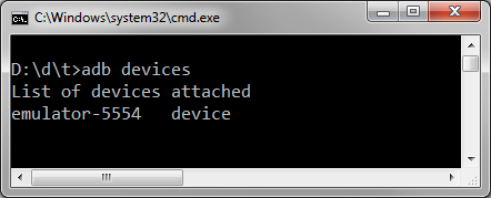
If not, make sure your emulator is running or restart the ADB server.

Step 2: Restarting the ADB Server

To restart the ADB server, here’s another command for you:

adb stop-server
adb start-server
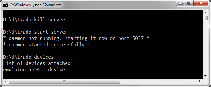
Once you’re ready to, continue on. We’ll be covering many commands, in no particular order.


Part 1: Regular Commands

Here are a variety of commands run directly via ADB. This will be followed by several commands that first require opening a shell.

Push and Pull

You can copy files to and from a connected device using the ADB push and ADB pull commands.

adb push <local source file path> <device destination file path>
adb pull <device source file path> <local destination file path>

These commands are very useful for things like refreshing preference XML files for your app during testing, and other such things.

App Installation and Removal

You can use ADB to install or remove apps (apks) from your devices. Use the install command to install an Android package file/

adb install <file path to apk>

Likewise, you can remove an existing app by its package name.

adb uninstall <package name>

You may find yourself needing to uninstall apps if you’re moving between development machines that don’t share the same app signing key. It’s also a fast way to clean up, or load up, a device without having to use Eclipse and the ADT plug-in.

Backup and Restore

You can backup and restore the contents of a device. This has limitations on devices that aren’t rooted.

adb backup
adb restore <archive name>

See ‘adb help’ for all the options of backup and restore. This could be useful for storing off app data during testing and then restoring this data easily for repeat testing.

Device Rebooting

You can reboot a device either normally, into the bootloader, or into recovery mode.

adb reboot
adb reboot recovery
adb reboot bootloader

In our experience, these aren’t appropriate for the emulator. However, there are times with Android devices get confused and need a hard reboot.

Shell Command

The ADB tool has a shell interface. To issue shell commands, you must first launch this interface by typing adb shell:

adb shell

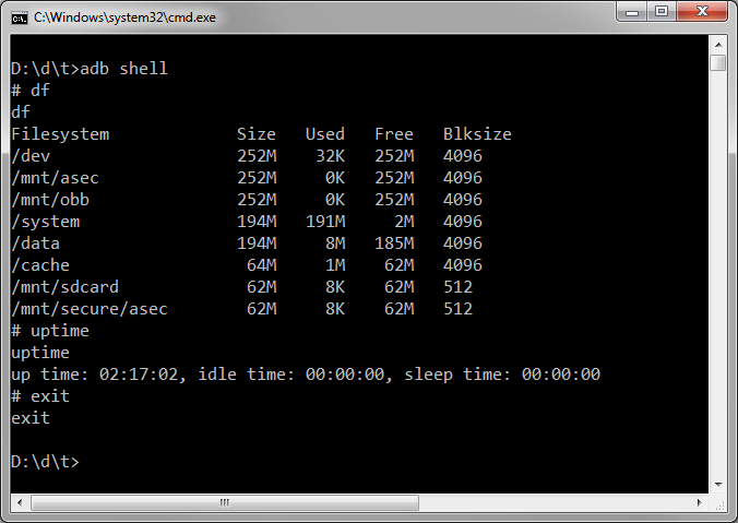
Once run, you’ll be in a bash environment. You can run bash commands, like df to show free disk space, uptime to see how long the device has been running or exit to exit the shell interface:
If you’re not familiar with Linux, you may have a harder time getting around in the shell. There are numerous guides online that will provide you with help for bash commands such as ls, cp, cd, and so on.


Part 2: Shell Commands

Here are several special commands you can run when in the shell. Not all ADB shell commands work on physical devices or emulators.

Logcat

You can use the logcat command to view logging output much as you do in Eclipse:

adb shell
logcat --help
logcat -t 5
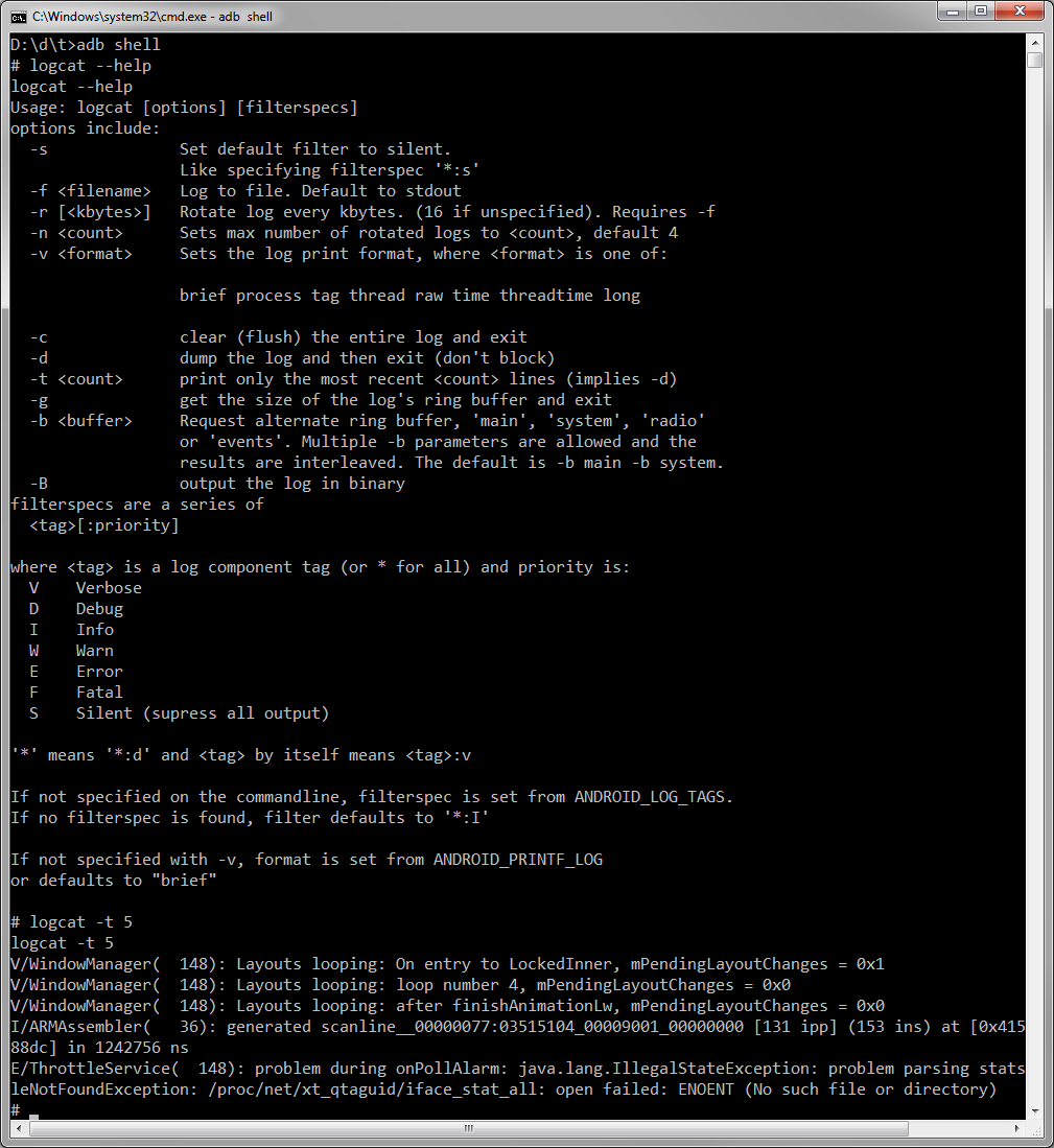
There are many options available with the logcat tool. By default, the output comes in real time, much like it does when viewed with Eclipse. One feature that’s nice is you can send the output to a file using the -f option.

Backup Manager

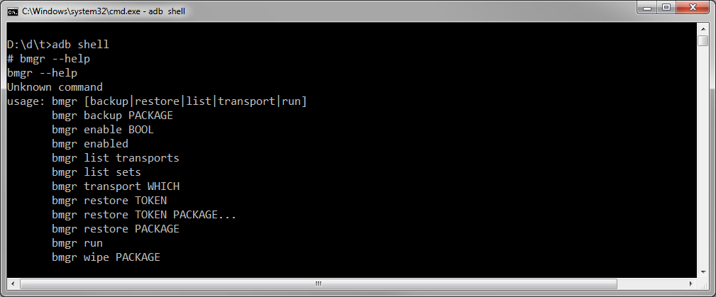
The bmgr tool is the backup manager. You can use this tool to trigger app-level data backup and restore operations. Your app must support backups for this to be useful.
Monkey Stress Tester

You can use the monkey tool to test your apps. This simulates a variety of different user input events, much like a monkey or toddler banging on a keyboard. Use this for stress testing.
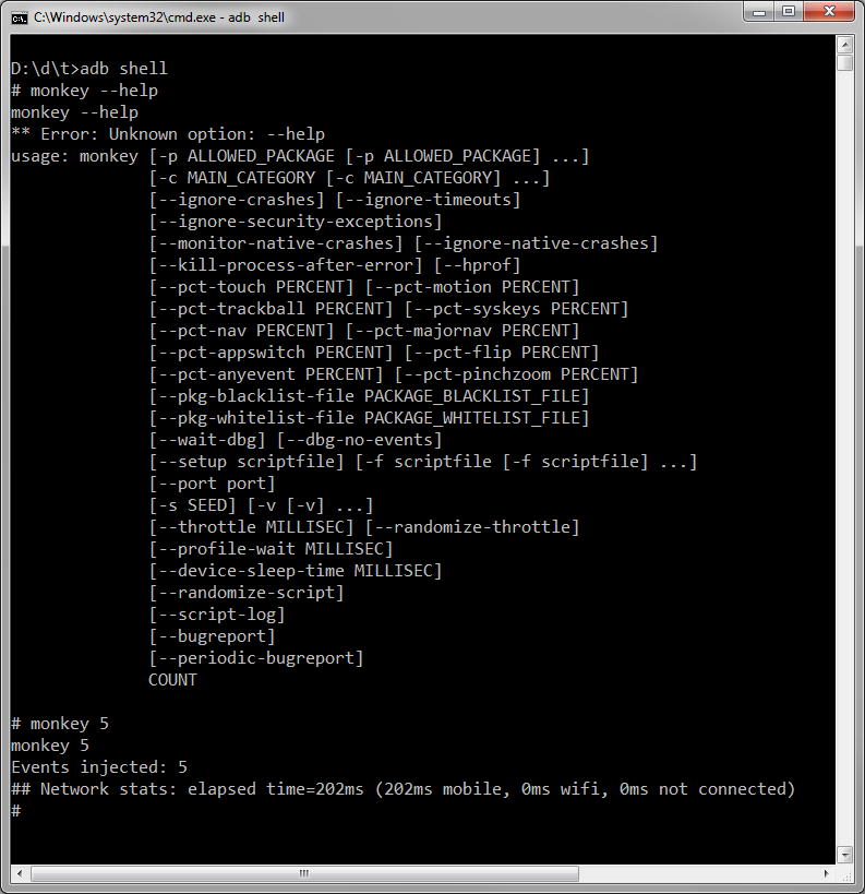
The monkey tool can be scripted, as well, and supports repeatable streams of events through the -s switch, so tests can be reviewed and repeated.

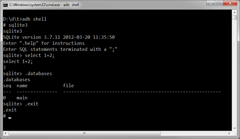
SQLite 3

You can run sqlite commands and interact with application databases using the adb shell as well. You’ll need read/write access to the databases you’re interested in inspecting or altering (in other words, your own apps, not others).

Conclusion

You’ve seen much of what ADB can do for you. From poking around the file system to restarting devices to running sqlite commands, there’s not a lot you can’t do. There’s also much more than what we’ve covered, including managing network connections, port forwarding, debug dumps, and plenty of shell commands to keep you busy. See the official ADB documentation for an exhaustive list of features

You’re well on your way to Android development. What kinds of apps are you looking forward to creating? Let us know in the comments!

About the Authors

Mobile developers Lauren Darcey and Shane Conder have coauthored several books on Android development: an in-depth programming book entitled Android Wireless Application Development (now in it’s third edition as a two-volume set), Sams Teach Yourself Android Application Development in 24 Hours, and Learning Android Application Programming for the Kindle Fire: A Hands-On Guide to Building Your First Android Application. When not writing, they spend their time developing mobile software at their company and providing consulting services. They can be reached at via email to androidwirelessdev+mt@gmail.com, via their blog at androidbook.blogspot.com, and on Twitter @androidwireless.

Need More Help Writing Android Apps? Check out our Latest Books and Resources!

Buy Android Wireless Application Development, 3rd Edition, Volume 1  Buy Sam's Teach Yourself Android Application Development in 24 Hours, 2nd Edition  Mamlambo code at Code Canyon


Android Sample Apps

$
0
0

The Android SDK includes many sample apps that can help you learn Android by inspecting how different APIs are used to build a mobile application. These sample apps are available for download through the Android SDK Manager. Learn how to easily create Eclipse projects around these sample apps, compile them, and use them in your own projects.


Part 0: Getting Started

This tutorial is for the Java developer just getting started learning Android app development, who is familiar with Eclipse, and who has installed the Android SDK with the Android Developer Plugin for Eclipse. If you are not prepared, see the previous tutorials in this series.


Step 1: Download the Android Samples

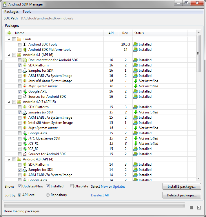
The Android SDK Samples can be downloaded using the Android SDK Manager. The samples are organized by the API Level they were designed for, and can be downloaded under the label “Samples for SDK”. On a related note, the Google API add-on downloads tend to come with samples specifically to illustrate their usage.

As you’re aware, the Android SDK Manager downloads samples into a directory under your SDK installation. You could use these to start the project. You could even copy them out so you don’t modify the originals. But, that’s not how we’re going to do it! There’s a better way!


Step 2: Start the Sample Project Wizard

In Eclipse, choose File > New > Other…, then expand the Android folder, and choose “Android Sample Project”.


Step 3: Pick a Build Target

Next, you’ll be presented with a list of build targets. What you see here is directly related to which API Level samples you have installed through the Android SDK Manager. What you see in our screenshot is probably overkill. Few will want to target Android 1.1 (Really).

You can only choose one build target for your project. To follow along, choose Android 4.1, Android Open Source Project, which is API Level 16.


Step 4: Pick a Sample Project

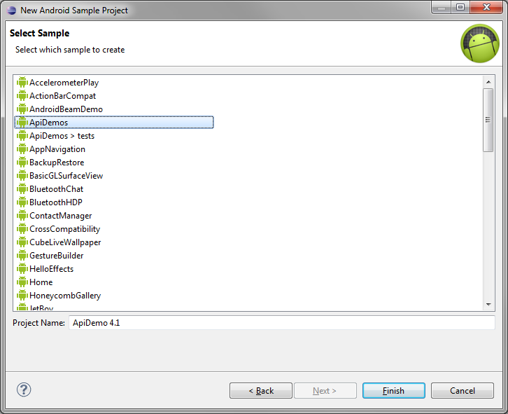
On the next screen, you’ll be shown a variety of compatible sample projects to choose from. Projects that end in “> tests” are JUnit test projects that match up to a primary project. They are less interesting for the beginner, so stick to non-test projects for now.

Pick a sample project, then type in a name if you’d like to change it. Changing the name is useful if you’ve already created the sample project once and want to create a new version within the sample Eclipse workspace. To continue following along, pick ApiDemos. We’re naming it “ApiDemo 4.1″ so as not to confuse it with other ApiDemos samples from other SDK versions.


Step 5: Explore a Sample Project

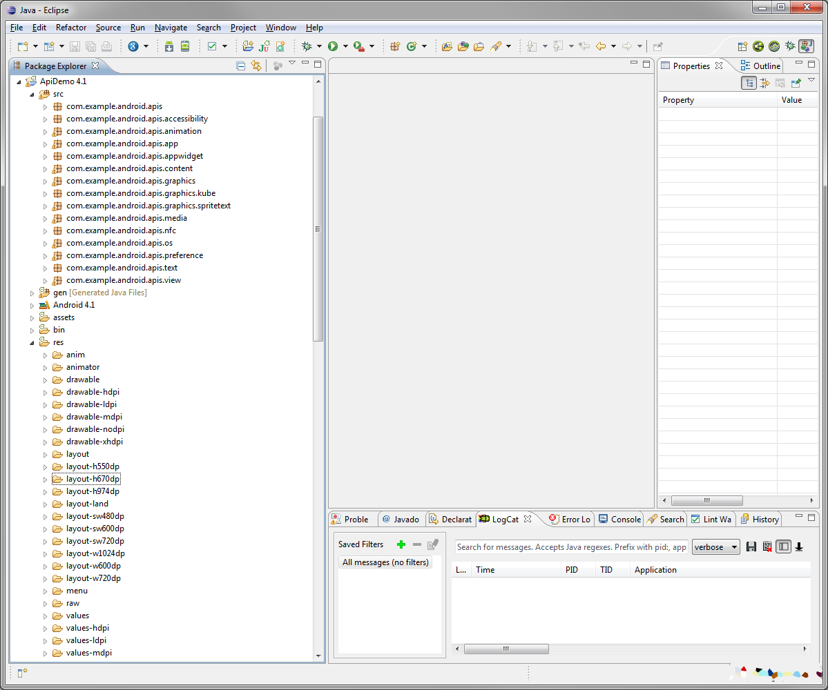
Your new project will now show up in Eclipse. You can look through its files, packages, and the structure of the sample app. The ApiDemos sample app is particularly big, as it has sample code to demonstrate almost every core Android API.


Step 6: Launch a Sample Project

Let’s compile and launch our new sample project on the emulator. First, start your emulator and wait for it to fully launch (forget how this works? See Android Virtual Device Creation).

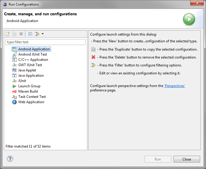
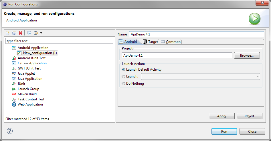
Next, choose Run > Run Configurations…

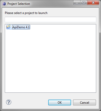
Double-click on Android Application (or right-click and choose New). On the first tab, choose the Browse… button, pick your new sample project, and click OK.

Now fill in the Name field. We usually name our Run Configurations with the project name to avoid confusion but you can name it whatever you like. Run and Debug Configurations have different options such that you could want multiple configurations for a single project.

On the Target tab, check the radio button for “Always prompt to pick device.” Take note of some of the other Run Configuration options, like the network speed and latency; we’re not going to use any of these options right now but it’s worth knowing where they are.

Now click the Run button. You should get the Android Device Chooser dialog now. This dialog will display any currently connected Android devices and running emulator instances in the top section, as well as offer the option of launching a new emulator instance via a compatible AVD configuration on-the-fly.

Pick the emulator you already have running and click the OK button. You’ll see something like, “Uploading ApiDemo 4.1.apk onto device ‘emulator-5554′” in the Eclipse console while the binary is being copied to the emulator and installed. After a moment, the ApiDemos sample app will launch within the emulator.

Tip: If the app doesn’t launch, but instead you see an error such as “Re-installation failed due to different application signatures”, then you need to uninstall an existing version. ApiDemos sometimes exists on otherwise clean emulator images. Forcefully uninstall the previous version by using the adb command-line tool with the following options: “adb -e uninstall com.example.android.apis”

Step 7: Try More Sample Apps

Now that you know how to create an Eclipse project for and run an Android SDK sample app, you can create any that you’d like. Remember that each API may have a different set of sample apps. Explore them. For example, here’s an image of the Weather List Widget sample app:


Step 8: Try Samples on Your Device

Connect your Android phone or tablet up to your development machine (forget how? Read Connecting Physical Android Devices To Your Development Machine). Your device will appear in the Android Device Chooser whenever you try to launch your app via its Run Configuration. As long as the app’s API target meets the API level version requirements for the sample app, you should be able to load it and run it in just the same as the emulator.


Conclusion

You’ve learned how to create projects out of the sample apps through a few simple steps in Eclipse. You’ve also learned how to run them on the emulator and even your own Android devices! You’re well on your way to Android development. What kinds of apps are you looking forward to creating? Which sample app was your favorite? Let us know in the comments!

About the Authors

Mobile developers Lauren Darcey and Shane Conder have coauthored several books on Android development: an in-depth programming book entitled Android Wireless Application Development (now in it’s third edition as a two-volume set), Sams Teach Yourself Android Application Development in 24 Hours, and Learning Android Application Programming for the Kindle Fire: A Hands-On Guide to Building Your First Android Application. When not writing, they spend their time developing mobile software at their company and providing consulting services. They can be reached at via email to androidwirelessdev+mt@gmail.com, via their blog at androidbook.blogspot.com, and on Twitter @androidwireless.

Need More Help Writing Android Apps? Check out our Latest Books and Resources!

Buy Android Wireless Application Development, 3rd Edition, Volume 1  Buy Sam's Teach Yourself Android Application Development in 24 Hours, 2nd Edition  Mamlambo code at Code Canyon


The Unity Asset Store

$
0
0

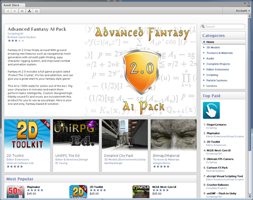
This article is meant as a definitive guide for purchasing and publishing on the Unity Asset Store.

Introduced in Unity 3, the Unity Asset Store is like most app stores. However, instead of apps, it has pre-built assets that can be imported directly into your project the moment you purchase them. Additionally, enterprising designers and developers can publish their own assets to the store and earn money from their sales.

Meshes, scripts, GUIs, pathfinding, artificial intelligence, level generators, particle systems, 2D tools, social integration, audio, fully rigged characters, vehicles and even complete projects are just some of the many assets available instantly. Developers no longer need to build from scratch all the time, and can make money from those times that they do.

Unity Asset Store

Registering An Account

Before we can do anything on the Asset Store we’ll need to register an account. First we need to open the Asset Store panel by either clicking Window > Asset Store or by pressing Ctrl+F9.

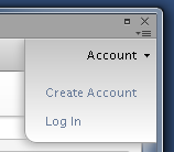
Click the Account menu in the top right of the Asset Store panel, then click Create Account.

Account menu

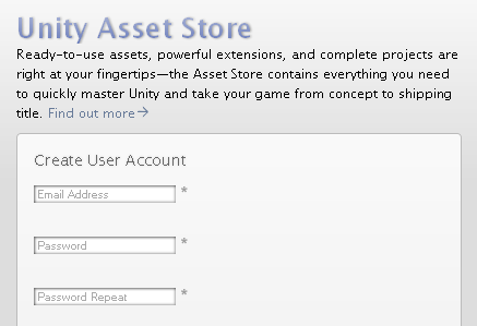
Fill out the Create User Account form with your credentials and then click Go at the bottom.

Sign up form

An activation e-mail should arrive shortly after. Open it and click the activation link within.

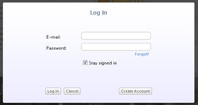
When registration is complete, log into the Asset Store by clicking the Account > Log In menu. Feel free to browse the store and check out all the great artwork and tools available. This is all that’s necessary to start buying assets.

Login form

Purchasing Assets

Like most things in Unity, buying assets on the Asset Store is incredibly easy. Even with so many assets, there are plenty of well defined categories that make it easy to find exactly what you’re looking for.

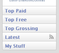
While the paid assets in the store are worth every penny, there are plenty of free ones as well. Click the Top Free link in the bottom left corner of the Asset Store page.

Top free

You can also find free assets by simply typing free into the search box in the top right corner of the store. Search for Medieval Village. It is an excellent example of a high quality assets.

Search

Click on the search result that looks like the one in the following image.

Medieval Village asset

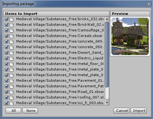
Click the Download button to download and import the package. Since the Medieval Village is free, you won’t be prompted to make a purchase. Once the download completes, an Importing Package dialogue will appear giving you the option to choose what parts of the package to import. Make sure everything is selected by clicking All and then click Import to bring it into the project.

Import village

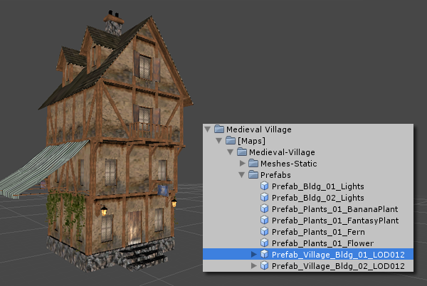
A Medieval Village folder will appear in the Project panel. Expand the folder to find the meshes, prefabs, lights, textures and terrain contained within the package. Try dragging some of the prefabs into an empty scene.

Village prefab

There’s even a fully built scene you can run around in using first person shooter-style controls. W, A, S and D keys move you and the mouse is used for looking around.

Village scene

Publishing Assets

If you’re a talented artist or developer you can become a publisher and make money selling your assets on the store. Be sure to read through the submission guidelines to ensure the submission process is as smooth as possible.

Preparing the Project

It is always best to publish assets from a clean project to prevent any cross-contamination.

  • Click File > New Project
  • Browse to a new folder
  • Name the project Publishing
  • Click Create
  • Click File > Save Scene
  • Save the scene as Main

Download the Asset Store Tools

The Asset Store Tools is a package that adds the necessary menus and panels to the Unity editor in order to connect to the store’s online publishing system.

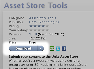
Scroll to the bottom of the main Asset Store page and click the Publish your best stuff with Asset Store Tools link.

Download Asset Store Tools

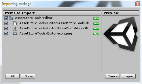
Once the download completes, an Importing Package dialogue will appear, giving you the option to choose what parts of the package to import. Make sure everything is selected by clicking All and then click Import to bring it into the project.

Import package

Once you can see the AssetStoreTools folder in your Project panel, save your scene.

Project panel

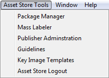
The Asset Store Tools menu should appear up in the toolbar.

Asset Store Tools menu

Registering a Publisher Account

Every publisher needs an account to identify themselves on the store. You’ll only need to do this step once as you’ll be able to login with the same account in the future.

First, click Asset Store Tools > Package Manager menu.

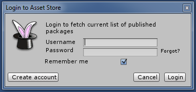
Next, fill out the login form using your Asset Store account credentials and click Login.
Remember, your username is your email address.

Package manager login

The AssetStoreMgr panel will appear. Click Publisher Account in the top right corner.

Publisher account button

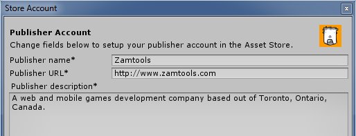
Fill out the details in the Publisher Account form with your name, your website address and a brief description of yourself or your company.

Publisher form top

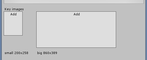
Using your favourite imaging software, create two Key Images for your publisher profile. The first should be a small profile image 200 x 258 pixels in size. The other should be larger landscape image 860 x 389 pixels. These could be your company logo, an avatar or even a picture of your own face.

Export these images as PNGs. Assign them to the appropriate fields in the Publisher Account form by clicking Add on each image field.

Publisher form bottom

Finally, click Save.

Creating a New Package

Back in the AssetStoreMgr panel, click the Package menu in the top left corner, then click [ New Package ].

Create new package

A lengthy, but straightforward, package details form will appear. The first thing to do is name the page by filling out the Package Title field. Next, fill out the Description field with a detailed explanation of what your package contains and what problem it solves. These are the first pieces of information users browsing the Asset Store will see, so be clear, thorough and check your spelling and grammar carefully.

Name and description

Setting a Version Number

Each time you upload a new version of your package, either to add features or fix bugs, it must have a new version number and a description of the changes since the last version. Since this is the first version we can leave these fields alone.

Version

Each version number has a decimal point to help indicate major and minor versions. Major versions increase the number before the decimal point, minor versions increase the number after the decimal point. A good rule of thumb to follow is that fixes and tweaks are minor versions, new functionality, or things that break backwards compatibility, are major versions.

Setting a Category

The Asset Store has a large set of categories and sub-categories to help organize the huge number of assets it contains. Click the Category list and take a moment to browse through the entire list. Once you’re sure, choose the category your package most likely belongs to.

Category

Setting a Price

The price of an asset can range anywhere between totally free all the way up to $1000 with Unity taking a 30% commission in every sale. With that in mind, click the Price list and choose what price you want to charge.

Price

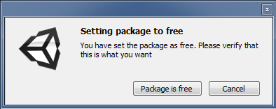
If you set the price to Free, a confirmation dialog will appear, asking you to confirm that you want to give away your asset free of charge.

Free

Preparing Assets

Before we can consider publishing an asset, we need to make sure it’s prepared properly.

  • Open the Main scene file from the Project panel if it isn’t already open
  • Drag the desired asset from the Project panel to the Hierarchy panel
  • Create a new folder in the Project panel, this will be our package folder
  • Rename the folder to whatever you plan on calling the finished package (eg: Space Marine, Troll Cave, Rope Bridge, etc.)
  • Drag all assets that you want in your package into this folder
  • Organize the assets any way you like; use sub-folders if necessary
Project panel with asset

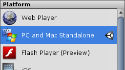
Click File > Build Settings and make sure Standalone is chosen from the Platforms list. This should already be the case with brand new projects, but it’s always a good idea to double check.

Standalone

Once you are done organizing the package folder, return to the AssetStoreMgr panel and click the Upload button in the Assets section.

Package upload

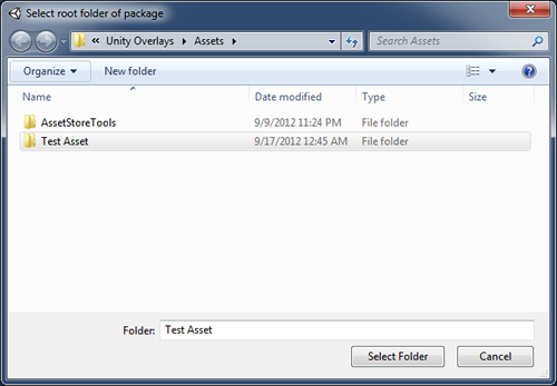
In the Select root folder of package dialog, browse to the package folder we just created, highlight it and click the Select Folder button.

Select folder

Unity will take a few moments to build and upload the package. Once complete, a file system window will open to prove the package was properly created. Close the window and confirm that the the Assets field now has a Last uploaded label after it.

Labeling Assets

The Asset Store uses labels as keywords. In order to make sure your assets show up during a keyword search, they need to be labeled appropriately.

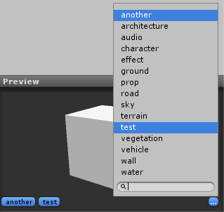
Labels can be applied individually by first selecting the asset in the Project panel, then clicking the Add label button button in the Preview pane found near the bottom of Inspector. In the list that appears, click existing labels or enter new labels into the text field.

To remove labels, click highlighted items in the list to unhighlight them.

Labels

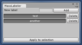
When dealing with multiple assets, labeling them all can be time consuming so the Asset Store tools contains a mass labeler. Click Asset Store Tools > Mass Labeler to open it.

Mass labeler

Enter any labels into the New Label field and click the Add button. Select all the assets in the Project panel you want to apply the labels to then click the Apply to Selection button.

Similarly, labels can be removed by click the Delete button next to them. Once again, ensure all assets are selected and click Apply to Selection.

Preparing Key Images

Before anyone will purchase your assets, they’ll want to see what they look like. Clear and attractive icons and screenshots will make buyers feel more confident in their purchases.

Fortunately, a set of templates exist that make it easy to create the necessary key images. While you don’t have to use these templates, they give a good starting point for laying out images so they don’t interfere with the Asset Store interface. These templates can be found by clicking Asset Store Tools > Key Image Templates or by clicking the following link.

http://files.unity3d.com/will/keyimages.zip

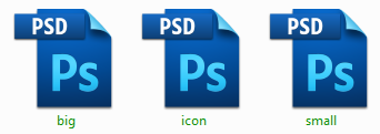
The keyimages.zip file contains templates for both Photoshop and GIMP. Extract the templates folder for the application you’re most comfortable using. In our case, we’ll be using the Photoshop templates, but the process is the same in GIMP.

Key PSDs

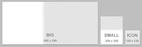
Inside the templates folder should be three files named big, small, and icon. The big template is 860 x 389 pixels, the small is 200 x 258 pixels and the icon is 128 x 128 pixels. Open all of them.

Key image templates

Starting with the big template, drag some appropriate artwork such as a logo, screenshot or diagram into the document. In the Layers palette, drag the layer named Mask – Keep as Top Layer to the top of the layer stack.

Layers

This should cause the white overlay to appear on top of the artwork, leaving an unobstructed region of the image for the Asset Store to display information.

Big key image

Repeat this same process with the small and icon templates.

Small and icon key images

Export each image as a PNG. In the package form, click Add on each image field and select the corresponding image for each.

Key Images

Adding Screenshots

Screenshots can be PNG or JPEG images and, while there’s no published size restrictions, they should be fairly large to show off as much detail as possible. That said, the Asset Store automatically resizes larger images to be approximately 630 pixels wide.

To add an image, click Add on the screenshot field, choose a suitable screenshot and wait a few moments for the image to be processed. Additional screenshots can be added by repeating these steps.

Screenshots

To delete an image simply click on it. This functions as more than just an undo function, it also lets you delete much older screenshots if they become outdated as you publish new versions of your package.

Submitting

Now that we have the entire package form filled out we need to preview it to ensure all the details are correct and the images look good.

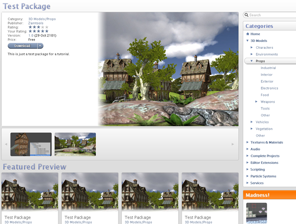
Click the Preview button at the bottom of the form. The Asset Store panel should appear with a test page showing your package information.

Package preview

Verify that everything is correct by clicking the download button and clicking through every screenshot. If the package won’t download or there are issues with image quality, return to the AssetStoreMgr panel and correct them.

Once you’re sure everything is perfect, return to the AssetStoreMgr panel and click Submit.

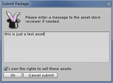
The Submit Package dialog will appear in which you can leave any special instructions the reviewer might need to test your asset. Check the I own the rights to sell these assets checkbox, then click OK to confirm the submission.

Submit package

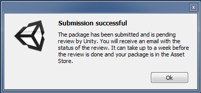
Finally, a dialog will appear telling you that the submission was successful and is pending review.

Submission successful

Now all you have to do is sit back and wait for the review to be completed by the Unity staff. The approval process can take up to a week, but you will receive an email letting you know when it has been completed.

Fixing Mistakes

If you happen to discover you’ve made a mistake after submitting your package, don’t panic, you can correct it. Spelling mistakes, key images, screenshots and labels can all be modified in-place as long as you don’t change the version number. You can then resubmit.

Be advised that this should only be used for correcting mistakes in the content. Bug fixes, tweaks and new functionality must be released under new version numbers.


Administrating Published Packages

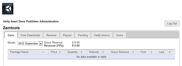
The Publisher Administration page is where you’ll find all the information about your currently published packages including how many times they’ve been downloaded, how much revenue you’ve made and the last time the Asset Store paid you.

Click Asset Store Tools > Publisher Administration to open the page.

Publisher Administration

Conclusion

The Unity Asset Store not only makes it easier for developers to build great games, but allows them to earn money for sharing their tools, artwork, knowledge and skills.

For more information about the submission process, please read visit this page and remember to carefully read the Asset Store Submission Guidelines.


Using the Environment Sensors – Tuts+ Premium

$
0
0

Learn how to use the Android Environment Sensors to detect information about the user’s environment, including ambient temperature, pressure, humidity, and light.


Tutorial Teaser

The Android system supports a range of device Sensors, some implemented in hardware and some in software. The Environment Sensors are all hardware features, providing access to information about ambient temperature, pressure, humidity, and light. These sensors return values as follows: temperature is measured in degrees Celsius, atmospheric pressure in hPa millibars, relative ambient air humidity as a percentage value, and ambient light in SI lux units. In this tutorial, we will run through the basic process for using these four main Environment Sensors. We will not be using the device temperature sensor, as it is now deprecated as of Android 4.0.

There are many possible applications for these sensors, such as barometers and thermometers. You may have come across such apps in Google Play already, but it is worth noting that they may not necessarily be implementing their functions using Environment Sensors. For example, weather apps often use location data fetched over the Web to determine environment information based on where you are.

Since these sensors are provided via users’ hardware, support does vary between devices and manufacturers. At the time of writing, very few Android smartphones or tablets support all of the Environment Sensors, but many of the more recent models support one or more of them. It is vital to carry out checks on whether the user has particular sensors and to avoid using functionality that is totally reliant on them. The only exception to this is if you ensure only users with the required hardware can download your application – you can do this using the filters for an app as listed in the Google Play store.


Step 1: Create a New Android Project

Create a new Android project in Eclipse and give it a name of your choice. Let Eclipse create a main Activity, as this is the only class we will need. For the code used in this tutorial, we are targeting Android API level 14 (Android 4.0 – Ice Cream Sandwich), but you can target a more recent version if you wish. You do not need to make any alterations to the Manifest file. Your main Activity class should have the following initial structure, with your chosen class name:

public class EnvironmentCheckerActivity extends Activity {
	/** Called when the activity is first created. */
	@Override
	public void onCreate(Bundle savedInstanceState) {
		super.onCreate(savedInstanceState);
		setContentView(R.layout.main);
	}
}

We are going to implement a couple of Interfaces, so extend your opening class declaration line as follows:

public class EnvironmentCheckerActivity extends Activity implements OnClickListener, SensorEventListener {

The click listener is for user interaction and the Sensor Event Listener is for receiving data from the device sensors. Eclipse should have provided import statements for the Activity and Bundle classes, but you also need to add the following to the list:

import android.content.Context;
import android.hardware.Sensor;
import android.hardware.SensorEvent;
import android.hardware.SensorEventListener;
import android.hardware.SensorManager;
import android.view.View;
import android.view.View.OnClickListener;
import android.widget.Button;
import android.widget.TextView;
import android.widget.Toast;

We will be adding code to the class later.


Step 2: Design User Interaction

In order to demonstrate the basic process for using the Environment Sensors, we are going to build a simple user interface. The app will display a list of four buttons, one for each of the sensors we will be using. When the user selects a button, the app will attempt to retrieve the appropriate information and present it within a Text View. First, let’s define some text Strings we will use within the interface. Open your “res/values/strings.xml” file and edit it to contain the following:

<resources>
<string name="hello">Choose from the options to check your environment</string>
<string name="app_name">Environment Checker</string>
<string name="ambient_label">Ambient Temperature</string>
<string name="light_label">Light</string>
<string name="pressure_label">Pressure</string>
<string name="humidity_label">Relative Humidity</string>
<string name="text_placeholder">-</string>
</resources>

These represent the title, introductory text, button labels, and a placeholder for the Text Views. We are going to use a couple of drawable resources for the design, but you can omit them if you wish. To use them, in each of your app’s drawables folders, you will need to create two additional files, “back.xml” and “btn.xml” (select each drawable folder in turn and choose “File” > “New” > “File”, then enter the file name). For the “back.xml” file, enter the following code:

<shape xmlns:android="http://schemas.android.com/apk/res/android"
	android:dither="true">
	<gradient
		android:startColor="#FF000033"
		android:endColor="#FF000033"
		android:centerColor="#FF000066"
		android:angle="180" />
</shape>

For the “btn.xml” file, enter the following:

<shape xmlns:android="http://schemas.android.com/apk/res/android"
	android:dither="true">
	<gradient
		android:startColor="#FF00CC00"
		android:endColor="#FF66CC66"
		android:angle="90" />
	<padding android:left="10dp" android:top="10dp"
		android:right="10dp" android:bottom="10dp" />
	<corners android:radius="2dp" />
</shape>

The back drawable is for the Activity background and the “btn” drawable is for the button backgrounds. Feel free to alter these designs in any way you wish – make sure you copy them to each drawable folder in your app.

Now open your app’s “main.xml” layout file (res/layout/main.xml). Enter a Scroll View and Linear Layout as follows:

<ScrollView xmlns:android="http://schemas.android.com/apk/res/android"
	android:layout_width="fill_parent"
	android:layout_height="fill_parent"
	android:background="@drawable/back">
<LinearLayout xmlns:android="http://schemas.android.com/apk/res/android"
	android:layout_width="fill_parent"
	android:layout_height="wrap_content"
	android:padding="10dp"
	android:orientation="vertical" >
</LinearLayout>
</ScrollView>

Inside the Linear Layout, add the introduction, then a Button and Text View for each of the four sensors:

<TextView android:layout_width="fill_parent"
	android:layout_height="wrap_content"
	android:paddingBottom="10dp"
	android:textColor="#FFFFFF00"
	android:text="@string/hello" />
<Button android:id="@+id/ambient_btn"
	android:layout_height="wrap_content"
	android:layout_width="wrap_content"
	android:text="@string/ambient_label"
	android:background="@drawable/btn" />
<TextView android:id="@+id/ambient_text"
	android:paddingBottom="20dp"
	android:layout_width="fill_parent"
	android:layout_height="wrap_content"
	android:text="@string/text_placeholder"
	android:textColor="#FFFF66FF"
	android:textStyle="bold" />
<Button android:id="@+id/light_btn"
	android:layout_height="wrap_content"
	android:layout_width="wrap_content"
	android:text="@string/light_label"
	android:background="@drawable/btn" />
<TextView android:id="@+id/light_text"
	android:paddingBottom="20dp"
	android:layout_width="fill_parent"
	android:layout_height="wrap_content"
	android:text="@string/text_placeholder"
	android:textColor="#FFFF66FF"
	android:textStyle="bold" />
<Button android:id="@+id/pressure_btn"
	android:layout_height="wrap_content"
	android:layout_width="wrap_content"
	android:text="@string/pressure_label"
	android:background="@drawable/btn" />
<TextView android:id="@+id/pressure_text"
	android:paddingBottom="20dp"
	android:layout_width="fill_parent"
	android:layout_height="wrap_content"
	android:text="@string/text_placeholder"
	android:textColor="#FFFF66FF"
	android:textStyle="bold" />
<Button android:id="@+id/humidity_btn"
	android:layout_height="wrap_content"
	android:layout_width="wrap_content"
	android:text="@string/humidity_label"
	android:background="@drawable/btn" />
<TextView android:id="@+id/humidity_text"
	android:paddingBottom="20dp"
	android:layout_width="fill_parent"
	android:layout_height="wrap_content"
	android:text="@string/text_placeholder"
	android:textColor="#FFFF66FF"
	android:textStyle="bold" />

Each Button and Text View pair is virtually identical, with ID attributes to identify them in the Java code. Of course, you can alter any of the design elements if you wish. The layout refers to the drawable resources and Strings.


Get the Full Series!

This tutorial series is available to Tuts+ Premium members only. Read a preview of this tutorial on the Tuts+ Premium web site or login to Tuts+ Premium to access the full content.


Joining Tuts+ Premium. . .

For those unfamiliar, the family of Tuts+ sites runs a premium membership service called Tuts+ Premium. For $19 per month, you gain access to exclusive premium tutorials, screencasts, and freebies from Mobiletuts+, Nettuts+, Aetuts+, Audiotuts+, Vectortuts+, and CgTuts+. You’ll learn from some of the best minds in the business. Become a premium member to access this tutorial, as well as hundreds of other advanced tutorials and screencasts.


iOS Simulator Tips & Tricks

$
0
0

This quick tip will introduce you to some of the powerful features available for testing & debugging apps with Xcode and the iOS Simulator.


Tip #1: Go Anywhere with Custom Coords

For years, developers struggled with debugging CoreLocation based applications in the simulator due to lack of built-in Simulator support for custom coordinates. While projects like FTLocationSimulator were a great help, many of us were still left envying Android developers who could easily set the location of the Android simulator using the bundled DDMS tools.

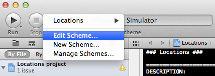
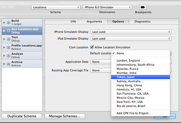
Fortunately, those days of quiet envy have been gone for awhile. With the release of Xcode 4.2, iOS Developers were able to simulate a default device location for a number of worldwide cities. This approach still exists, and can be done by selecting “Edit Scheme”:

Configuring a Default Location

And then navigating to the “Options” tab of the popup window:

Configuring a Default Location

However, recent versions of the iOS Simulator have made it even easier to change the simulated location, and you can now accomplish this at run-time.

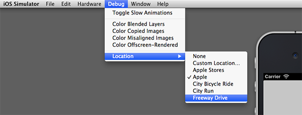
After you’ve launched the Simulator, selecting Debug > Location will produce the following menu options:

Simulator Location Options

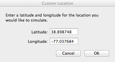
As you can see, you can now easily set your own coordinates using the “Custom Location” option:

Setting Simulator Location

Of course, this does require that you actually know the exact coordinates of the location you want to simulate, and not just the street address. The process of generating latitude and longitude coordinates from an address is referred to as geocoding, and there are a number of free web sites and iOS apps that will generate coordinates from a street address for you. The free iOS App Geocode Something as well as the geocoder.us web site are both worth mentioning, and this geocoder mashup is a quick and easy way to pull coordinates directly from Google Maps.

The simulator also comes with a number of pre-defined locations and paths that you can use for testing your own applications. A brief description of each is provided below.

Apple Headquarters

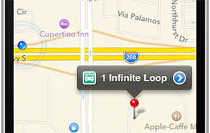
Selecting “Apple” from the Location menu will set the current location to Apple HQ at 1 Infinite Loop, Cupertino, CA. For users of early versions of Xcode, you’ll recognize this as the only location originally supported by the Simulator.

Cupertino, CA

City Bicycle Ride

If you select the “City Bicycle Ride” option, the CoreLocation framework will start generating coordinates that follow a preset path close to Apple HQ. The bicycle option will cause updates to occur with a speed of about 5 – 7 meters per second.

City Run

The “City Run” option is just like the “City Bicycle Ride” setting, with the exception that updates occur with a tracking speed setting of about 3 – 4 meters per second.

Freeway Drive

The “Freeway Drive” option differs from the previous two in both the path followed and the speed in meters per second. The path moves along the Junipero Serra Freeway just north of Apple HQ, and the speed generally seems to be between 20 – 35 meters per second.

Simulated Freeway Drive

Apple Stores

In theory, this option should generate coordinates tied to Apple Store locations. However, with the iOS 6.0 Simulator and Xcode 4.5, this option seems to be badly broken. In my experience testing this, the coordinates always seem to start around approximately 33.7718 N, 112.9031 W, and then gradually increase in both the North and West readings, moving the current location on a diagoal path to nowhere. I have submitted this as a bug report to Apple, so if others are experiencing the same issue, hopefully it will be resolved soon!

Because the Apple Maps app can run in the simulator, testing out any of the above options is easy. Just launch the iOS Simulator as you normally would, set your simulated location, and then launch the Maps application.

With the iOS 6 SDK you can now run applications that use Maps directly in the simulator!


Tip #2: Bend Time with Slow Motion

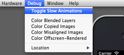
Another great feature of the iOS Simulator is the ability to place animations in slow-motion with the Debug > Toggle Slow Animations menu option.

Setting Simulator Location

Doing so can be extremely helpful when you’re trying to create a custom UIKit animation and need to make sure each frame looks just right.

Perhaps a more practical use of this feature is to slow-down the animations that occur when rotating the device in order to polish the orientation change animations (see Session 517 from WWDC 2012 for more information on how you can polish orientation animations).


Tip #3: Dynamically Color Views

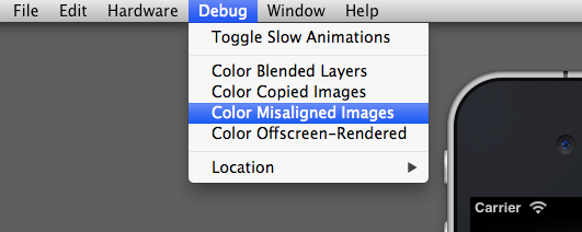
The Debug menu option also provides the incredibly useful ability to color views in realtime:

Realtime View Coloring

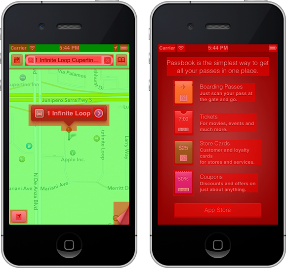
You can use these options to visually identify blended layers, copied images, misaligned images, and views rendered offscreen.

This is a helpful feature for debugging your own applications, and it can also be insightful for examining the default applications on the Simulator. The following screenshot shows the Maps app and the Passbook app with the “Color Blended Layers” option selected:

Color Blended Layers

Tip #4: Simulate Hardware/Software Events

While nothing will replace the experience of testing applications on real hardware, the simulator has come a long way in the past few years with real-world event emulation. In fact, some events, like toggling an “in-call” status bar or generating memory warnings, are likely easier to debug in the simulator than with an actual device.

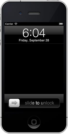
Simulator Lock Screen
SIMULATED LOCK SCREEN

A look at the Hardware menu will reveal the following event options:

  • Rotate Left
  • Rotate Right
  • Shake Gesture
  • Home Button Press
  • Lock Screen Press
  • Simulate Memory Warning
  • Toggle In-Call Status Bar
  • Simulate Hardware Keyboard
  • TV Out

Most of these are self-explanatory, but a few deserve further note.

The “Simulate Hardware Keyboard” option is mainly for debugging iPad applications where the user is likely to have a physical Keyboard connected via Bluetooth or the dock connector. Testing with the hardware keyboard option should be an important part of iPad app beta testing.

The “TV Out” option allows you to simulate VGA/HDMI connections by creating a new window that can have a resolution as low as 640×480 or as high as 1920×1080 (i.e. 1080p).


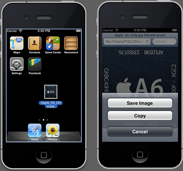
Tip #5: Adding Simulator Photos

The easiest way to add photos to the iOS Simulator is to simply drag-and-drop them individually from the OS X Finder window onto the Simulator Window.

Adding photos to the iOS Simulator

However, if you need to add many different photos for testing, this process quickly becomes inefficient. When you need to add a lot of images at once, you might consider writing a simple iOS application that can loop through your photo list and add each image to the Photo Library with the UIImageWriteToSavedPhotosAlbum function. To see how this is done, take a look at Step 6 in my Build a Photo App with GPUImage tutorial.

Another approach would be to add the image files to the Simulator filesystem directly, but the steps for accomplishing this seem to change with each new version of iOS. Building your own importer might be a more reliable approach long-term (know of a better way to achieve this? Leave a comment below!).


Bonus: Download the 5.0/5.1 Simulators

For my own iOS applications, I always try to deploy for both the current version of iOS and one prior version. However, by default, Xcode only includes a Simulator for the current iOS version. Fortunately, there’s an easy method for getting the Simulator for the previous iOS release as well.

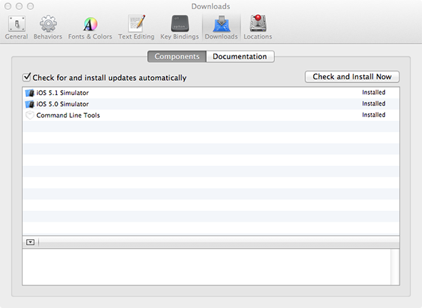
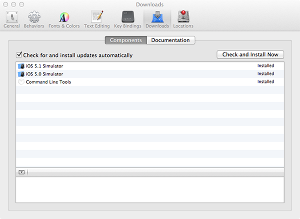
With Xcode open, select Xcode > Preferences from the menubar, and then navigate to the “Downloads” tab. From here you will have the option to install prior iOS Simulators as well as the Command Line Tools package. I recommend installing all three of the options shown:

Installing Additional Simulators

After the install completes, you’ll be able to select the 5.0/5.1 iOS simulators when building and running your applications.


How Do You Use the Simulator?

What tips or tricks do you have for working with the iOS Simulator? Leave your feedback in the comments section below!


Objective-C Literals

$
0
0

This tutorial will teach you how to program more efficiently using object literals!


Literals & Literal Expressions

In programming, a literal is simply a fixed value that a programmer enters into a source code file. A few examples from C include:

int year = 2012;
char initial = 'M';

In the above, ’2012′ is an int literal and ‘M’ is a char literal.

Computer Scientists also sometimes refer to literal expressions. An expression is simply a group of values and operators that return a new value, such as “2 * pi * r”. A literal expression is an expression that only contains literal values, such as “2 * 3.14 * 10″.

The following code snippet demonstrates how variables can be created and assigned with literal expressions in C:

int result = 15 / 5;  // The literal expression "15 / 5" yields 3
double = 5 / 2;       // The literal expression "5 / 2" yields 2.5

Because Objective-C is a superset of C, all of the lines of code demonstrated in C so far are also valid Objective-C syntax. However, all of the literals demonstrated have also been for primitive data types. A more interesting use of literals is to apply them to objects.

The following is an example of an object literal:

NSString *siteTitle = @"Mobiletuts+";

In the above line of code, @"Mobiletuts+" is an object literal that is used to represent a string object. Without the use of an object literal, the above line of code would need to be written very differently, perhaps like this:

NSString *siteTitle = [NSString stringWithUTF8String:"Mobiletuts"];

As you can see, the object literal syntax is much more concise and readable.

With the release of the Apple LLVM Compiler 4.0, additional object literal support has been added for NSNumber objects, Array objects, and Dictionary objects.


NSNumber Literals

NSNumber objects can now be represented with object literals.

The following code snippet illustrates the traditional style:

NSNumber *boolYES = [NSNumber numberWithBool:YES];
NSNumber *boolNO  = [NSNumber numberWithBool:NO];
NSNumber *charX = [NSNumber numberWithChar:'X'];
NSNumber *fortySevenInt = [NSNumber numberWithInt:47];
NSNumber *fortySevenUnsigned = [NSNumber numberWithUnsignedInt:47U];
NSNumber *fortySevenLong = [NSNumber numberWithLong:47L];
NSNumber *goldenRatioFloat = [NSNumber numberWithFloat:1.61803F];
NSNumber *goldenRatioDouble = [NSNumber numberWithDouble:1.61803];

Using object literals, the above can be rewritten as simply:

NSNumber *boolYES = @YES;
NSNumber *boolNO  = @NO;
NSNumber *charX = @'X';
NSNumber *fortySevenInt = @47;
NSNumber *fortySevenUnsigned = @47U;
NSNumber *fortySevenLong = @47L;
NSNumber *goldenRatioFloat = @1.61803F;
NSNumber *goldenRatioDouble = @1.61803;

Objective-C Collection Literals

Collection literals are an incredibly useful addition to Objective-C. The new LLVM Compiler provides the ability for creating collection literals for both arrays and dictionaries, but not sets.

NSArray Literals

The old syntax for creating an NSArray:

    NSArray *instruments = [NSArray
                            arrayWithObjects: @"Ocarina", @"Flute", @"Harp", nil];

The new, object literal syntax for creating an NSArray:

NSArray *instruments = @[ @"Ocarina", @"Flute", @"Harp" ];

Unfortunately, the above syntax won’t work for declaring an NSMutableArray, but there is an easy work around. Just pass the mutableCopy message to the newly formed object:

NSMutableArray *instrumentsMutable = [ @[ @"Ocarina", @"Flute", @"Harp" ] mutableCopy];

Dictionary Literals

The traditional method for creating a dictionary with Objective-C looks something like this:

NSArray *keys   = [NSArray arrayWithObjects:@"Character", @"Weapon", @"Hitpoints", nil];
NSArray *objects = [NSArray arrayWithObjects:@"Zelda", @"Sword", [NSNumber numberWithInt:50], nil];
NSDictionary *stats = [NSDictionary dictionaryWithObjects:objects forKeys:keys];

Or, a slightly less verbose alternative:

NSDictionary *stats = [NSDictionary dictionaryWithObjectsAndKeys:
                           @"Zelda", @"Character",
                           @"Sword", @"Weapon",
                           [NSNumber numberWithInt:50], @"Hitpoints",
                           nil];

Both of the above are prime examples for why Objective-C has developed a bad reputation for being excessively verbose. No more! With object literals, the above code can be rewritten as simply:

NSDictionary *stats = @{ @"Character" : @"Zelda",
                         @"Weapon" : @"Sword",
                         @"Hitpoints" : @50 };

This is much easier to both understand and write.

Collection Subscripting

In addition to being able to create collections with object literals, the latest LLVM Compiler has also introduced support for accessing array or dictionary values with subscripts.

For example, this is the traditional form used for accessing an object from an array or dictionary:

NSString *instrument = [instruments objectAtIndex:0]; // Returns 'Ocarina'
NSString *name = [stats objectForKey:@"Character"]; // Returns 'Zelda'

With the new, subscripting capability you can just do this:

NSString *instrument = instruments[0]; // Returns 'Ocarina'
NSString *name = stats[@"Character"]; // Returns 'Zelda'

Better still, collection subscripts aren’t just limited to selecting objects. If the collection is mutable, you can also reassign values:

instrumentsMutable[0] = @"Ocarina of Time";
statsMutable[@"Weapon"] = @"Hammer";

This is a huge step forward for Objective-C programmers, and I think it will make the language more accessible to those transitioning from other languages like Java or C++ as well.


Boxed Expressions

The final topic worth mentioning in this tutorial is the concept of “Boxed Expressions”. Essentially, Objective-C now supports converting the result of a C-style expression into an Objective-C object. The basic syntax for this is like so:

@( 2 * pi * r)

The result of the above would be an NSNumber object that contained the product of 2 times the value of pi times the value of r. We could, of course, immediately assign that product into an NSNumber variable:

NSNumber *diameter = @( 2 * pi * r );

This technique will work with enums and strings as well:

// Boxed Expressions with Enums
typedef enum { Sword, Hammer, Shield, Arrow } Weapons;
NSNumber *currentWeapon = @( Sword ); // Returns 0
// Boxed Expressions with char *
NSString *login = @( getlogin() ); // Returns login name
// Results
NSLog(@"Weapon: %@\nLogin: %@", currentWeapon, login);

Wrap Up

This tutorial has provided you with a quick overview of object literals, a new technique introduced with the Apple LLVM Compiler 4.0. For more in-depth coverage of this topic, refer to the official LLVM documentation.

I hope you enjoyed reading this tutorial. Feel free to leave any feedback you have in the comments section below. You can also connect with me on Twitter or Google Plus. Cheers!


Android App Debugging

$
0
0

In this tutorial, we will explore the core set of debugging tools that new Android app developers need to be aware of in order to create and perfect their apps.


Part 0: Getting Started

This series of Android tutorials is meant to help you build the skills and confidence necessary to build high-quality Android apps. This tutorial is for the Java developer just getting started learning Android app development, who is somewhat familiar with Eclipse, and who has installed the Android SDK and the Android Developer Plugin for Eclipse. Also, you should know how to create a simple Android application (Hello World will suffice) in order to complete this tutorial. If you are not prepared, see the previous tutorials in this series.


Part 1:
Creating Debug Configurations in Eclipse

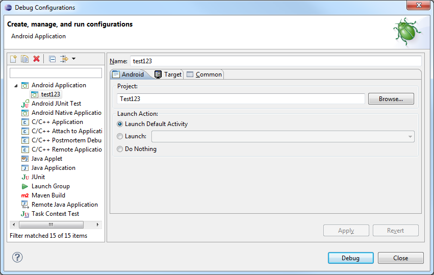
In the Android Sample Apps tutorial in this series, you learned how to create a Run configuration in Eclipse. Debug configurations are created much the same way, but are used to configure the options for launching and debugging applications.

To create a debug configuration for your application within Eclipse, choose Run, Debug Configurations….

Double-click on Android Application (or right-click and choose New). On the first tab, choose the Browse… button, pick the Android project you want to debug, and then click OK.

Now fill in the Name field. We usually name our Debug Configurations with the project name to avoid confusion, but you can name it whatever you would like.

On the Target tab, check the radio button for “Always prompt to pick device.”

Now click the Debug button. You should get the Android Device Chooser dialog. This dialog will display any currently connected Android devices and running emulator instances in the top section, as well as offer the option of launching a new emulator instance via a compatible AVD configuration on-the-fly.

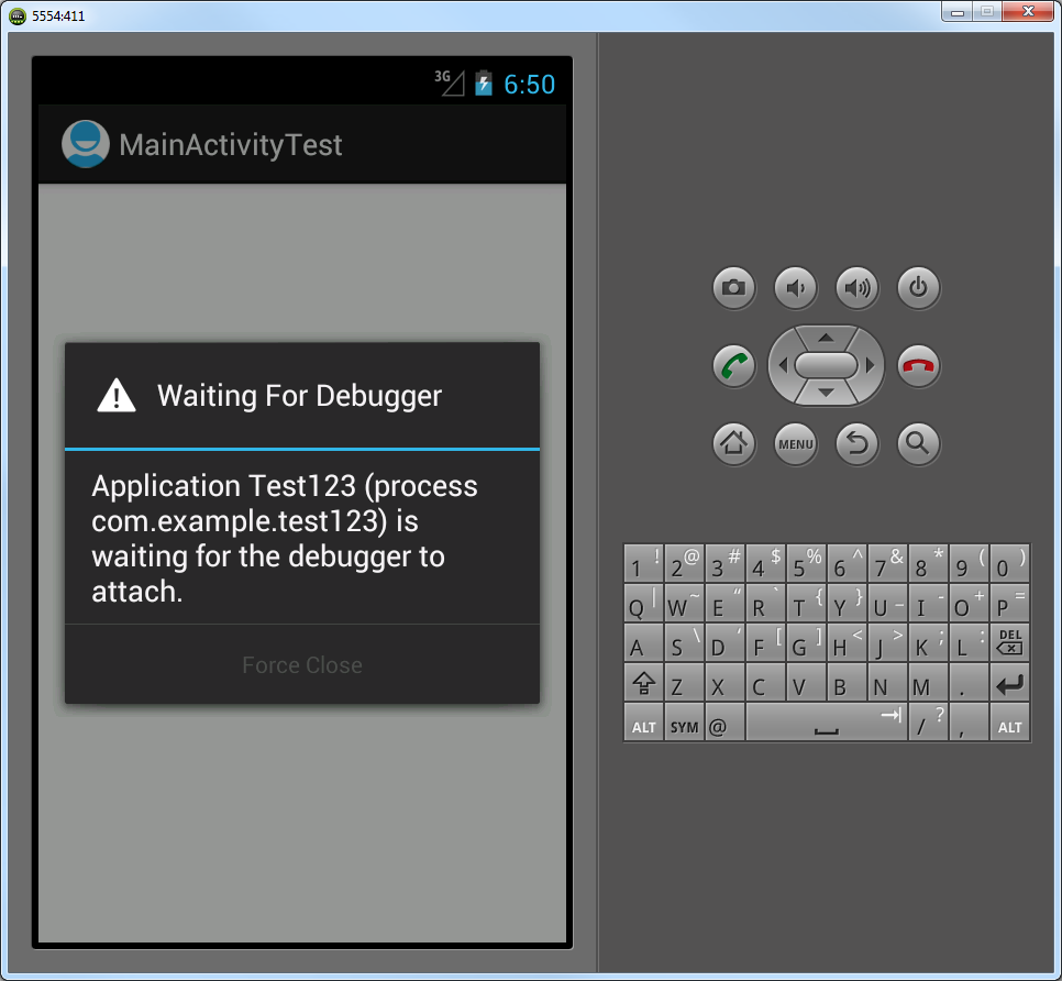
Pick the emulator you already have running and click the OK button. After a moment, your app will launch on the emulator or device, and you will see a dialog that says “Waiting for Debugger” as it attaches.


Part 2:
Exploring the Eclipse Debug Perspective

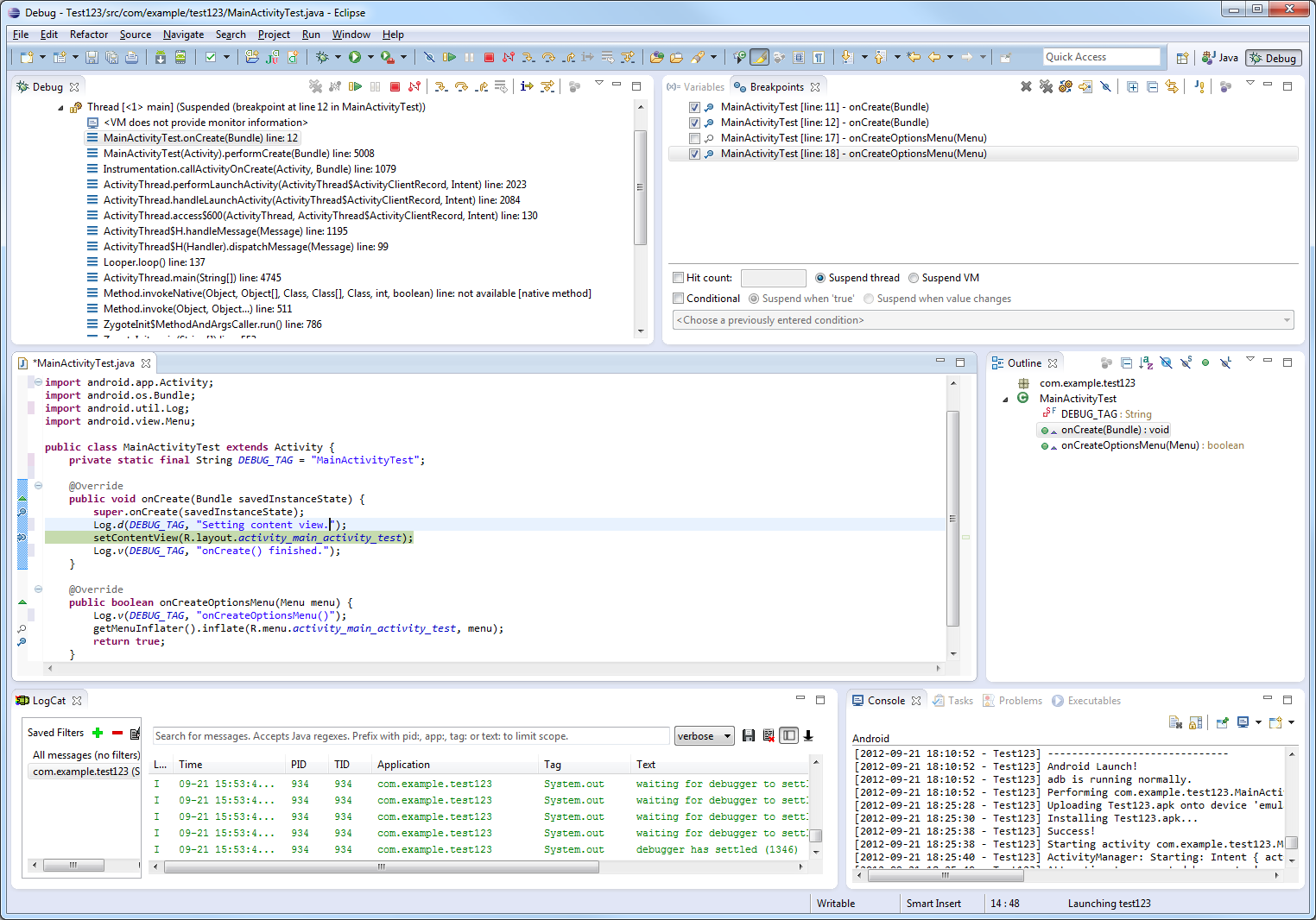
Once your application is running in the emulator or on a device, you can begin debugging it. Most of the basic debugging features of Eclipse and the ADT plug-in are combined on the Debug perspective for ease-of-use.

The Debug perspective often opens automatically when you start debugging an Android app, but if it doesn’t for some reason, you can always switch to it by clicking on the Debug perspective in the top right-hand corner of Eclipse, or by going to Window, Open Perspective, Debug.

The Debug perspective has several panes of information. You can, of course, move them around if you don’t like how they are set up.

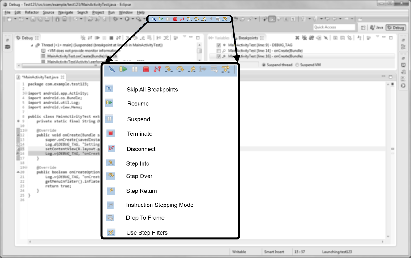
You’ve got a panel in the top left-hand corner called Debug, that shows your application, threads. This is where you find the debug toolbar that allows you to attach and detach the debugger and step through the code.

In the right-hand corner, you’ve got a panel that allows you to inspect variables and manage breakpoints. Breakpoints are locations in your code that you flag where you want your debugger to pause execution so that you can methodically step through your code line-by-line and figure out what’s going on.

You’ve got a panel in the middle of the Debug perspective that displays the code currently being executed.

At the bottom of the Debug perspective, you’ve got two diagnostic panes: the LogCat pane which displays logging output from the emulator or device, as well as the Console pane that shows higher level console output from DDMS.


Part 3:
Stepping Through Code in Eclipse

Let’s work through a quick example of debugging with Eclipse using the application you just launched.

First, we need to get set up since there’s nothing wrong with our code and the Debugger hasn’t stopped automatically at a problem. Switch to the Java perspective by clicking on the Java button in the top right-hand corner of Eclipse. Double-click on the activity class file associated with your application to open it, then switch back to the Debug perspective and you’ll now see that the file is displayed in the middle pane of the Debug perspective. Ok, now we’re ready to step through our code.

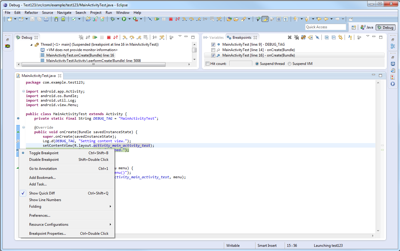
First, let’s set a breakpoint in the code. There are numerous ways to do this. I like to find the line I want to set a breakpoint on, and then right-click on the vertical blue band to the left of the code line and select Toggle Breakpoint from the menu or just click on the band itself to create a breakpoint, toggle it, and then remove it. You can also click on the line you want a breakpoint on and hit Control-Shift-B. A little magnifying glass will appear next to the line of code when the breakpoint is set. A good place to set your first breakpoint would be in the onCreate() method of your Activity.

Once you have set your breakpoint, relaunch the application in debug mode using the Debug configuration. You can do this from within Eclipse using the little bug icon on the toolbar. Click the down arrow next to it, choose your Debug configuration, and it will run. The debugger will attach, your application will start, and then stop at your breakpoint. You will see a little arrow next to the line of code that is currently about to execute.

Now you can step through your code using basic debugging features. These features are available on the Debug panel toolbar, or you can use the hot keys associated with these features.

The most common debugging features in Eclipse that you will need in order to step through your code are:

Step Into: Use this feature to move deeper into your code by moving into method code. Use this if you think the method you are currently executing needs debugging. If this method is well tested and you know it will return the right result, then you probably don’t need to step into it, but instead step over it to the next code line on the same “level” as the previous one. Press F5 to step-into code.

Step Over: Use this feature to move to the next line of code on the same level as the previous one. Press F6 to step-over code.

Step Return: Use this feature if you are in the middle of stepping into a method, and are past the area of the method you wanted to inspect. The current method will finish up and you will pop up to the next line of execution after that method has returned so you can continue debugging. Press F7 to step-return.

Resume: Done with this little session of debugging and want the app to start running again (until the next breakpoint is reached)? Then use the Resume feature. Press F8 to resume running without stepping.

Terminate: Done with this little session of debugging and want the app to stop running altogether? Then use the Terminate feature. Press Control-F2 to terminate execution.


Part 4:
Viewing Diagnostic Logging with Logcat

Logging, or printing out diagnostic information from within your code, can be a helpful way to diagnose problems, especially race conditions or timing-related problems that don’t happen readily when you are stepping carefully through the code. In this case, you have your code run as normal, but you print out whatever info you like as it runs. You can view this diagnostic info from the LogCat pane of the Debug perspective. You can also access Logcat output in a variety of other ways, from the DDMS tool, the DDMS perspective within Eclipse, or the adb command-line tool, for example.

Adding LogCat logging output to your application is easy but it requires you to change your app Java code and recompile. Also, logging will slow down your application to some extent, so you always want to remove logging from your application before you release it to the public. Learn more about Android logging in Android Essentials: Application Logging.


Conclusion

In this tutorial, you’ve learned the basics of debugging Android applications with Eclipse and the ADT Plugin. You learned how to navigate Eclipse in debug mode, using the Debug perspective, and how to step through your code and view Logcat logging output. You’ve learned about debugging on both emulators and devices. You now have a handle on the basic skills that are required to get started developing real-world Android applications. You’re well on your way to Android development. What kinds of apps are you looking forward to creating? Which sample app was your favorite? Let us know in the comments!

About the Authors

Mobile developers Lauren Darcey and Shane Conder have coauthored several books on Android development: an in-depth programming book entitled Android Wireless Application Development (now in it’s third edition as a two-volume set), Sams Teach Yourself Android Application Development in 24 Hours, and Learning Android Application Programming for the Kindle Fire: A Hands-On Guide to Building Your First Android Application. When not writing, they spend their time developing mobile software at their company and providing consulting services. They can be reached at via email to androidwirelessdev+mt@gmail.com, via their blog at androidbook.blogspot.com, and on Twitter @androidwireless.
Need More Help Writing Android Apps? Check out our Latest Books and Resources!

Buy Android Wireless Application Development, 3rd Edition, Volume 1  Buy Sam's Teach Yourself Android Application Development in 24 Hours, 2nd Edition  Mamlambo code at Code Canyon


Corona SDK: Build an Audio Recording App

$
0
0

In this tutorial, you’ll learn how to create an audio recording app using the smartphone’s microphone. Read on!


Tutorial Teaser

Step 1: Application Overview

Using pre-made graphics we will code a recording application with Lua and the Corona SDK.

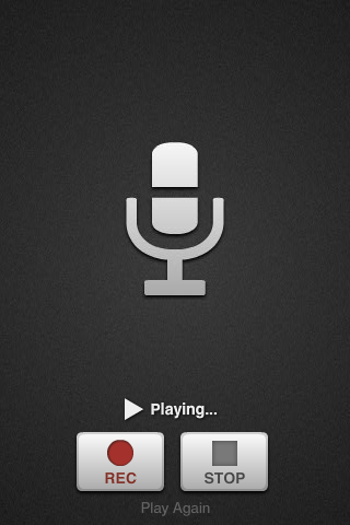
The user will be able to record, play and replay the selected audio.

Step 2: Target Device

The first thing we have to do is select the platform we want to run our app within. That way we’ll be able to choose the size for the images we will use.

The iOS platform has these characteristics:

  • iPad 1/2: 1024x768px, 132 ppi
  • iPad 3: 2048×1536, 264 ppi
  • iPhone/iPod Touch: 320x480px, 163 ppi
  • iPhone 4/iPod Touch: 960x640px, 326 ppi
  • iPhone 5/iPod Touch: 1136×640, 326 ppi

Because Android is an open platform, there are many different devices and resolutions. A few of the more common screen characteristics are:

  • Asus Nexus 7 Tablet: 800x1280px, 216 ppi
  • Motorola Droid X: 854x480px, 228 ppi
  • Samsung Galaxy SIII: 720x1280px, 306 ppi

In this tutorial we’ll be focusing on the iOS platform with the graphic design, specifically developing for distribution to an iPhone/iPod touch, but the code presented here should apply to Android development with the Corona SDK as well.

Step 3: Interface

A simple and friendly interface will be used with a background and multiple buttons.

The interface graphic resources necessary for this tutorial can be found in the attached download.

Step 4: Export Graphics

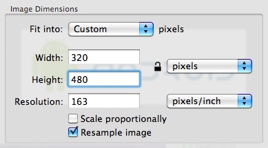
Depending on the device you have selected, you may need to export the graphics in the recommended ppi, you can do that in your favorite image editor.

I used the Adjust Size… function in the Preview app on Mac OS X.

Remember to give the images a descriptive name and to save them in your project folder.

Step 5: App Configuration

An external file will be used to make the application go fullscreen across devices, the config.lua file. This file shows the original screen size and the method used to scale that content in case the app is run in a different screen resolution.

application =
{
    content =
    {
        width = 320,
        height = 480,
        scale = "letterbox"
    },
}

Step 6: Main.lua

Let’s write the application!

Open your prefered Lua editor (any Text Editor will work, but you won’t have syntax highlighting) and prepare to write your awesome app. Remember to save the file as main.lua in your project folder.

Step 7: Code Structure

We’ll structure our code as if it were a Class. If you know ActionScript or Java, you should find the structure familiar.

Necessary Classes
Variables and Constants
Declare Functions
    contructor (Main function)
    class methods (other functions)
call Main function

Get the Full Series!

This tutorial series is available to Tuts+ Premium members only. Read a preview of this tutorial on the Tuts+ Premium web site or login to Tuts+ Premium to access the full content.


Joining Tuts+ Premium. . .

For those unfamiliar, the family of Tuts+ sites runs a premium membership service called Tuts+ Premium. For $19 per month, you gain access to exclusive premium tutorials, screencasts, and freebies from Mobiletuts+, Nettuts+, Aetuts+, Audiotuts+, Vectortuts+, and CgTuts+. You’ll learn from some of the best minds in the business. Become a premium member to access this tutorial, as well as hundreds of other advanced tutorials and screencasts.


Best of Tuts+ in September 2012

$
0
0

Each month, we bring together a selection of the best tutorials and articles from across the whole Tuts+ network. Whether you’d like to read the top posts from your favourite site, or would like to start learning something completely new, this is the best place to start!


Psdtuts+ — Photoshop Tutorials


Nettuts+ — Web Development Tutorials

  • Perfect Workflow in Sublime Text: Free Course!

    Perfect Workflow in Sublime Text: Free Course!

    I’m pleased to announce that my newest course on Tuts+ Premium is out…and free to everyone! I have a confession: I’m a code editor addict, and have tried them all! I was an early adopter of Coda, a TextMate advocate, even a Vim convert. But all of that changed when I discovered Sublime Text 2, the best code editor available today.

    Visit Article

  • The ABCs of Web Development

    The ABCs of Web Development

    Web development can often be an utterly perplexing affair. Today, aimed at beginners, I’d like to introduce you to twenty six concepts or technologies, each mapping to a letter of the alphabet. Sounds wonky? It probably is! Let’s get started after the jump.

    Visit Article

  • How to Build Your Own Custom jQuery

    In this quick tip screencast, I’m going to show you a trick that I bet you don’t know about. Did you know that, as of jQuery 1.8, you can now build a custom version of the library?

    Visit Article


Vectortuts+ — Illustrator Tutorials

  • Session: Infographic Design

    Taking a collection of data and showing it in a way that’s not only informative but looks good, can be a hard thing to do. You need to be mindful of design while at the same making sure that the data you’re presenting is shown clearly and is easy to understand.
    In this Creative Session, take your data to the next level with our collection of tutorials that cover useful techniques and tips for creating infographics, charts and maps that not only look
    great, but communicate effectively with your audience.

    Visit Article

  • Cut the Clutter, How to Create a Professional Work Portfolio

    Cut the Clutter, How to Create a Professional Work Portfolio

    Creating a personal identity seems to be one of the most difficult tasks for a designer. For some reason, it is infinitely easier determining how others should project themselves. Unfortunately, this is no excuse to have an outdated, unorganized, or overall weak portfolio. Find out how to improve your portfolio at the jump.

    Visit Article

  • How to Design and Vector a Set of Character Poses for a Video Game

    How to Design and Vector a Set of Character Poses for a Video Game

    In this tutorial we will look at how to design a character for a video game, in this case a "beat ‘em up". We will work from the very first sketch to the final artwork. I will share my process and workflow for drawing vector characters with lots of tips, tricks and shortcuts to use in your everyday vector workflow. So lets get started!

    Visit Article

  • Create a Fantasy Style Potion Illustration with Gradients and the Bristle Brush

    Create a Fantasy Style Potion Illustration with Gradients and the Bristle Brush

    If you play a lot of fantasy video games, you’ll often come across potions… be it mana, health, strength etc… and it’s with this inspiration I’m going to show you how I created this trio of potion bottles. I’ll be using a mixture of tools including Gradients, Bristle Brush, 3D Revolve and the Blob Brush Tool. So let’s get started!

    Visit Article


Webdesigntuts+ — Web Design Tutorials

  • Has Adobe Gotten its Mojo Back?

    Has Adobe Gotten its Mojo Back?

    For the past several months a creeping sense of ambivalence between myself and my relationship with Adobe had been rattling through my consciousness like a song I couldn’t get out of my head. As a web guy I couldn’t shake the sense that Adobe was spending an inordinate amount of time telling the universe how great things were with DPS and mobile with very little chatter over on the web side of the fence.

    Visit Article

  • An Introduction to Structured Data Markup

    An Introduction to Structured Data Markup

    The term Structured data refers to information formatted in a universally understandable way. Search engines such as Google, Bing and Yahoo use structured data (implemented within web pages) to refine search results, filter with greater accuracy and enhance the way results are displayed. This all makes it easier for users to find the information they’re looking for.

    Visit Article

  • The What, Why and How of Textures in Web Design

    The What, Why and How of Textures in Web Design

    The use of textures and patterns in webdesign has come a long way in only a short amount of time. From cliche grunge and gaudy vintage textures, today's best websites use texture in a wide variety of ways to create a more immersive experience, define the personality of the site and create a more refined look and feel.

    Visit Article


Phototuts+ — Photography Tutorials

  • A 12-Step Beginners Guide to iPhoneography

    A 12-Step Beginners Guide to iPhoneography

    Now we all know about the rise of the smart phone in recent years and in particular, Apples iPhone and as it has progressed through the various upgrades. Its significance for photographers has been well documented. The iPhone has become an invaluable tool, not only for photographers, but for the public at large as it begins to take the place of the digital entry level point and shoot cameras that are on the market.

    Visit Article

  • How to Shoot Perfect Portraits

    After assembling a huge quantity of knowledge from all corners of the globe, we present to you a complete and in-depth look at photographic portraiture. You can search far and wide and not find a resource this extensive or fun. Learn everything about portraiture you ever wanted to know, right here.

    Visit Article

  • How To Take Photos That Require No Post-Production

    How To Take Photos That Require No Post-Production

    In a world where using post-production suites to enhance your photos is almost a necessity, it can be hard for the beginner, computer illiterate or photography purist to feel they have something to offer. How does one create a beautiful picture from the get go which requires no post editing? In this tutorial, I aim to outline some tips which will tackle just that!

    Visit Article


Cgtuts+ — Computer Graphics Tutorials


Aetuts+ — After Effects Tutorials


Audiotuts+ — Audio & Production Tutorials

  • Masterful Reverb: Everything You Need to Know

    Reverb is an incredibly important effect that can add life to a track. How you use it is totally up to you. Reverb can be subtle or blatant, sound natural or add interesting flavors to the mix. Using it effectively takes skill and experience, and knowing the right techniques.

    Visit Article

  • Reducing Mud In Your Electronic Productions

    Reducing Mud In Your Electronic Productions

    Electronic music tends to have a very pronounced separation of frequencies: thumping bass, crisp highs and warm mids are what most producers are going for in electronic music. One of the main topics that comes up when I’m chatting about audio production with fellow producers is taming the lower and middle frequencies in a mix.

    Visit Article

  • How to Use Convolution for Reverb & Effects

    In this tutorial we’re going to dive into the crazy world of impulse responses and convolution reverbs. You’re going to see how modern software reverbs are no longer just for simulating spaces, they can also be used for anything from speaker simulations and equalizers, to powerful sound design tools.

    Visit Article


Wptuts+ — WordPress Tutorials

  • Displaying Posts in a Carousel

    Displaying Posts in a Carousel

    Having a recent posts carousel on your blog is a great way to make it more interactive for your visitors.

    Visit Article

  • Writing Extensible Plugins With Actions and Filters

    Writing Extensible Plugins With Actions and Filters

    One of the many things you will find when investigating a good plugin developer’s source code are custom hooks and filters that the developer has placed throughout the plugin. The presence of these action hooks and filters make the plugin “extensible”, meaning that other plugins and themes can manipulate or add onto the behavior of the plugin.

    Visit Article

  • WordPress 3.5 Beta 1 Wants You!

    WordPress 3.5 Beta 1 Wants You!

    WordPress 3.5 Beta 1 has just been released, and hopefully you're excited for all the new features that are nearly ready for the full release of WordPress 3.5. But first, we need your help!

    Visit Article


Mobiletuts+ — Mobile Development Tutorials

  • A Developer Looks at iOS 6 and the iPhone 5

    A Developer Looks at iOS 6 and the iPhone 5

    The release of the iPhone 5 and iOS 6 has generated a lot of excitement, but the many new hardware and SDK changes can leave iOS developers feeling overwhelmed. This article will help you keep your skills up-to-date by providing a quick, high-level overview of the most important changes for iOS developers!

    Visit Article

  • Android Virtual Device Creation

    Android Virtual Device Creation

    A fundamental part of creating Android applications is running and testing them. Testing your code and app implementation on real devices is important, but emulating other scenarios and having the convenience, protection, and cost savings of not owning every Android device ever created keeps development realistic. Learn how to create Android Virtual Devices (AVDs) in this tutorial.

    Visit Article

  • Build a Photo App with GPUImage

    Build a Photo App with GPUImage

    This tutorial will teach you how to apply Instagram-like filters and special effects to images with the incredibly powerful GPUImage project. Along the way, you’ll learn how to build a simple camera application capable of either taking new photos or accessing existing images from the photo album.

    Visit Article


Gamedevtuts+ — Game Development


Mactuts+ — Mac & OS X

  • How to Launch Any App with a Keyboard Shortcut

    How to Launch Any App with a Keyboard Shortcut

    Today we’re going to rise up and face a challenge that was posed to me recently: how do I assign a keyboard shortcut to launch an app? There’s no obvious built-in functionality for achieving this, but with a little ingenuity we can pull it off with very little effort. Read on to find out how.

    Visit Article

  • How to Clean Your MacBook Safely and Effectively

    How to Clean Your MacBook Safely and Effectively

    My MacBook is probably the thing I use most in a day, and that might just be the case for you too. Through the excessive use of our MacBooks, the need to clean them regularly becomes more and more evident. In this article, we’re going to take a look at some techniques for cleaning your MacBook both safely and properly. id="more-4031">

    Visit Article

  • 20 Awesome Reader Submitted Mac Tips and Tricks

    Awesome Reader Submitted Mac Tips and Tricks

    When Mactuts+ first launched, we gave $1,000 to the person who submitted the best Mac Quick Tip screencast. Only one person could win (props to Joseph Darnell for snagging first place), but we received a ton of really good submissions. We’ve tossed them all onto YouTube and rounded them up for your enjoyment and education. Take a look, you’re sure to learn something cool!

    Visit Article


FreelanceSwitch — Freelance Jobs

  • How To Make $5000+ a Month Building Websites Part-Time

    I had a problem. Two problems, actually. The first problem was that my wife and I needed to come up with just over $26,000 to meet our goal of getting out of debt in the next 3 1/2 months.
    That was a problem because I was making just enough at my day job to get by. Which leads to my second problem, time, or rather – the lack thereof. Between a full-time job and a family, the time I had left to work towards our goal was limited.

    Visit Article

  • 5 Steps to Building Your Freelance Portfolio From Nothing

    We all know it’s tough to get a job without experience, and tough to get experience without a job. But you can break this cycle and start getting some samples. You really only need three or four to get started marketing your freelance services to paying prospects.

    Visit Article

  • A Beginner’s Guide to Working Collaboratively with Fellow Freelancers

    As a freelancer yourself, working with other freelancers is a great way to support the freelancing community. Plus, we freelancers better understand each other, the difficulties we face in dealing with clients, and balancing life with work.

    Visit Article


Working with the iPhone 5 Display

$
0
0

This tutorial will review the steps necessary to ensure that your iOS apps will continue to look great when displayed on the new iPhone 5 screen.


Download the Latest Tools

In order to create apps that are compatible with iOS 6 and the iPhone 5, you’ll need to ensure that you have Xcode 4.5 (or later) and the iOS 6 SDK installed on your development machine. With Xcode open, select Xcode > About Xcode from the menubar to check the currently installed version.

About Xcode Screen

To get the latest tools, you’ll need to go to the Apple Developer Center after registering as an Apple developer.

I would recommend taking the additional step of installing both the iOS 5.1 and iOS 5.0 simulators and the “command line tools” after you install the latest version of Xcode. To do this, select Xcode > Preferences and then go to the Downloads tab. Install the additional options listed. When you’ve done so, the window should look like this:

Additional Xcode Downloads

Use an iPhone 5 Default Launch Image

You’ll need to include an image named Default-568h@2x.png in your project in order to take full advantage of the iPhone 5 display. It may seem arbitrary, but the existence of this file is what will determine whether your application runs in letterbox mode (i.e. with black bands above and below the content) or in fullscreen mode.

Of course, the Default-568h@2x.png file has another purpose as well: it will be the default image shown when your application loads on an iPhone 5. This serves the same function as the Default.png file for non-retina iPhone/iPod touch devices and the Default@2x.png file for the iPhone 4/4S.

When running a project in Xcode 4.5 without the Default-568h@2x.png file, you might get an automated popup like this one:

Xcode Prompt for Default-568h@2x.png Image

If so, go ahead and click “Add” to have Xcode create a solid black launcher for you, just remember to change it later to something more appropriate for your application.

If you don’t see the Xcode popup, you can save this image to your computer and then drag it into the Xcode project navigator area to add it to your project. A plain black launch image isn’t ideal, but it will satisfy the requirement and place your app in fullscreen mode.

Build and run your project on an iPhone 5. Ideally, you should be good to go with no further adjustments! However, there are a number of reasons why your app might not look right at the new resolution. The second half of this tutorial will cover debugging applications that fail to display appropriately after following this step.


Transition to Dynamic Layouts

iOS developers have been somewhat pampered in comparison to their Android peers when it comes to view layout programming. To begin with, all of the initial iPhone and iPod touch screens had the same display resolution: 320×480 pixels. When the retina display used by the iPhone 4 and 4S was introduced in 2010, the display resolution doubled to 640×960 pixels, but developers were still able to refer to the screen size in code as 320×480. Why? Because with iOS 4 Apple introduced the concept of “logical points” into UIKit. These points could map to physical pixels dynamically via the contentScaleFactor property of the UIView class. The contentScaleFactor was then set to logically mirror the resolution change by defaulting to 1.0 on the iPhone 3G/3GS and 2.0 on the 4/4S.

To quote from Apple’s Drawing and Printing Guide for iOS:


In iOS there is a distinction between the coordinates you specify in your drawing code and the pixels of the underlying device. When using native drawing technologies such as Quartz, UIKit, and Core Animation, the drawing coordinate space and the view’s coordinate space are both logical coordinate spaces, with distances measured in points. These logical coordinate systems are decoupled from the device coordinate space used by the system frameworks to manage the pixels onscreen.

The system automatically maps points in the view’s coordinate space to pixels in the device coordinate space, but this mapping is not always one-to-one. This behavior leads to an important fact that you should always remember:

One point does not necessarily correspond to one physical pixel.

The purpose of using points (and the logical coordinate system) is to provide a consistent size of output that is device independent. For most purposes, the actual size of a point is irrelevant. The goal of points is to provide a relatively consistent scale that you can use in your code to specify the size and position of views and rendered content. How points are actually mapped to pixels is a detail that is handled by the system frameworks. For example, on a device with a high-resolution screen, a line that is one point wide may actually result in a line that is two physical pixels wide. The result is that if you draw the same content on two similar devices, with only one of them having a high-resolution screen, the content appears to be about the same size on both devices.

So, as iOS developers we’ve had it fairly easy thanks to this innovation. However, with the introduction of the 640x1136px resolution of the iPhone 5, using a vertical size of 480 points will no longer fill all available vertical space.

To see this in action, assume that a programmer is trying to add a custom background view programmatically to the root view controller of their application. Pretend that the programmer wrote this code in order to do so:

    UIView *customBackgroundView = [[UIView alloc]
                                    initWithFrame:
                                    CGRectMake(0.0f, 0.0f, 320.0f, 480.0f)];
    customBackgroundView.backgroundColor = [UIColor redColor];
    customBackgroundView.autoresizingMask = UIViewAutoresizingFlexibleHeight | UIViewAutoresizingFlexibleWidth;
    [self.view addSubview:customBackgroundView];

Prior to the iPhone 5, the above code block would have worked just fine. The 320×480 logical points would map to 640×960 with the default 2.0 scale factor of the iPhone 4/4S. However, on the iPhone 5, the height will still be mapped to 960 pixels and will come up short:

Literal Values Leave View Short

Solving this problem is fairly simple:

    UIView *customBackgroundView = [[UIView alloc]
                                    initWithFrame:
                                    CGRectMake(0.0f, 0.0f, self.view.frame.size.width, self.view.frame.size.height)];
    customBackgroundView.backgroundColor = [UIColor redColor];
    customBackgroundView.autoresizingMask = UIViewAutoresizingFlexibleHeight | UIViewAutoresizingFlexibleWidth;
    [self.view addSubview:customBackgroundView];

In this scenario, we just had to pull the size of the current root view dynamically in order to place the new, custom background view over the entire area.

For another example, let’s assume that the programmer wanted to create a new view programmatically in the loadView: method:

- (void)loadView
{
    CGRect applicationFrame = [[UIScreen mainScreen] applicationFrame];
    UIView *customView = [[UIView alloc] initWithFrame:applicationFrame];
    customView.backgroundColor = [UIColor redColor];
    customView.autoresizingMask = UIViewAutoresizingFlexibleHeight | UIViewAutoresizingFlexibleWidth;
    self.view = customView;
}

The applicationFrame property of UIScreen will return the frame rectangle bounds used for the window of the current application, minus the area occupied by the status bar (if visible). You can alternatively get just the bounding rectangle of the screen with [[UIScreen mainScreen] bounds]. Both values will be returned in logical points, not pixels.

While the above code examples are useful, they are also somewhat limited. In practice, you may have to deal with more complex scenarios that involve dynamically sizing many subviews depending on the device screen height.

Fortunately, there are at least three different approaches you can use to do so.

View Autoresizing

The UIView property autoresizingMask is a simple yet effective means for ensuring that subview objects adjust dynamically relative to their superview. In the above code snippet, I used this to make sure that both the width and height of the custom background view object would scale appropriately with orientation changes:

customBackgroundView.autoresizingMask = UIViewAutoresizingFlexibleHeight | UIViewAutoresizingFlexibleWidth;

Note that the autoresizingMask property can be controlled visually from within Xcode/Interface Builder as well.

Most applications that use UIKit controls and default containers should be able to work just fine on the iPhone 5 by combining variable values for frame creation (as shown earlier) and setting intelligent autoresizing properties on subviews.

Refer to the official Apple documentation and the view programming guide for more information.

The Auto Layout System

The new Auto Layout system introduced with iOS 6 provides an advanced method for controlling view placement. Auto Layout uses a system of constraints to explain and enforce view relationships. The only downside to using Auto Layout is that it is not compatible with iOS 5 and prior.

Further coverage of Auto Layout is beyond the scope of this tutorial. Those who want to learn more should consult Apple’s Cocoa Auto Layout Guide and the WWDC 2012 Introduction to Auto Layout session.

Device Testing

Another approach being adopted by some is to attempt to check if the current device is an iPhone 5 at runtime. The most advanced version of this I’ve found is from this answer on StackOverflow.

The following is a slightly modified version of the macros created in the StackOverflow post:

#define IS_IPHONE ( [[[UIDevice currentDevice] model] isEqualToString:@"iPhone"] )
#define IS_IPOD   ( [[[UIDevice currentDevice ] model] isEqualToString:@"iPod touch"] )
#define IS_HEIGHT_GTE_568 [[UIScreen mainScreen ] bounds].size.height >= 568.0f
#define IS_IPHONE_5 ( IS_IPHONE && IS_HEIGHT_GTE_568 )

The first and second macro check to see if the current device is an iPhone or iPod touch by using the UIDevice class.

The third macro checks to see if the screen height is greater than or equal to floating point value 568. Recall from above that the [[UIScreen mainScreen] bounds] message will return the application window’s bounding box in logical points, and that 568 logical points will map to 1136 pixels with the default view contentScaleFactor of 1.0.

Finally, the fourth macro combines two of the prior macros into an IS_IPHONE_5 macro that (for the time being) should only return TRUE if the code is running on an iPhone 5. You could use the final version in your own code like this:

if(IS_IPHONE_5)
{
    NSLog(@"Hey, this is an iPhone 5! Well, maybe. . .what year is it?");
}
else
{
    NSLog(@"Bummer, this is not an iPhone 5. . .");
}

While the above approach is potentially useful, it is also error-prone. For example, what happens if the iPhone 6 is released with completely new dimensions? I would advise against using this approach if at all possible. Instead, stick to Autoresizing Masks or Auto Layout if you can make one of those approaches work.


Wrap Up

This tutorial has explained the various methods available for accommodating the enlarged iPhone 5 display. If you’ve been struggling with adjusting to the new screen size, hopefully you’ve found the content helpful!

Feel free to leave any feedback you have in the comments section below. You can also connect with me on Twitter, Google Plus, or LinkedIN. Cheers!


Wanted: Awesome Guest Writers

$
0
0

Mobiletuts+ is currently looking to hire guest writers to cover mobile web development (e.g. JavaScript, HTML, CSS, etc.), iOS SDK development, Android SDK Development, Mobile UI/UX, and more! If you’re a talented mobile developer with tips or techniques to share, we want to hear from you!

What We’re Looking For

  • Rock solid knowledge: Mobiletuts+ strives to be a highly respected source of information. Our authors must have excellent knowledge of their topic and be willing to perform thorough research when necessary.
  • Excellent writing skills: You must be comfortable with the English language. We can proof your content, but we can’t rewrite everything for you. To put it simply, if you struggle when deciding whether to write its or it’s, this might not be the gig for you.

What’s the Pay?

  • $200 – $250 USD per full-length tutorial (depending on length/quality).
  • $50 – $150 USD per quick-tip (depending on length/quality).
  • Negotiable rates for well-known authors. Get in touch!

The exact rate is dependent on your industry experience, communication skill, and tutorial idea.


Excellent! Where Do I Sign Up?

We’ll need the following information from you:

  • Name.
  • A few sentences about your background and why you’re a good fit.
  • A single link to an article that you’ve written, helped with, or like.
  • Two ideas for tutorials you’d like to write for us.
  • Optional: E-mails with a tutorial attached will get more attention from us since this means you’re serious about the gig.


Please e-mail the above information to:

contact e-mail

We get a fair number of single line e-mails. Don’t be that person. E-mails without the required information will be discarded.

We hope to hear from you soon!


Android Project Structure

$
0
0

This tutorial will teach you about the fundamental files and directories created when you start a new project with the Android SDK Wizard. You will also learn important tips for structuring your own applications!


Part 0: Getting Started

This series of Android tutorials is meant to help you build the skills and confidence necessary to build real, quality Android apps. This tutorial is for the Java developer just getting started learning Android app development, who is somewhat familiar with Eclipse and has installed the Android SDK and the Android Developer Plugin for Eclipse. If you are not prepared, see the previous tutorials in this series.


Part 1: Create a Basic Hello World App

If you have not created a Hello World app yet, do so now. If you need help with this step, see our previous tutorial Creating Android Hello World Applications to learn how.


Step 1: Expand the Package Explorer

Within Eclipse in the Java perspective, you should see your project displayed in the Package Explorer pane on the left-hand side of the screen. For the purposes of this tutorial, we have created a simple Hello World app whose project is called BasicHelloWorld.


Step 2: Explore the /src Directory

The /src folder contains the Java source files associated with your project. For example, the Activity class called MainActivity.java is stored in this directory under the package name you specified in the Android project wizard. This MainActivity class provides all the application code associated with the Hello World app.

You will want to keep these files in source control.


Step 3: Explore the /gen Directory

The /gen folder contains the Java source files and other code files generated by Eclipse that are associated with your project. Do not edit these files directly. For example, the R.java file is a file generated to link your resource files (as defined in the /res directory structure) for use in your /src Java files.

You will not need to keep these files in source control. They are recreated whenever you add resources to your project or recompile your project. Make sure they are always writeable or you will run into problems.


Step 4: Explore the Android Directories

After the /src and /gen directories, you will see one or more libraries linked to your project. In this example, we are building against Android 4.1, so you see this version of the android.jar file linked to the project. Next, you see that we have also linked an Android Dependency to the Android Support library for backwards compatibility with previous versions of the Android SDK.

You will not need to keep these files in source control.


Step 5: Explore the /assets Directory

The /assets folder contains any uncompiled source files associated with your project. Most files are compiled into your project as resources. However, there are some kinds of files that you want to include in your projects as-is, like GL textures.

You will want to keep these files in source control.


Step 6: Explore the /bin Directory

The /bin folder contains the resulting application package files associated with your project once it’s been built. Package files, or apks, are the deliverable that you actually install onto an Android device.

You may want to keep these files in source control, but only if you want to keep the final apks that result from building your application successfully. These files are best kept outside the project source tree, as numbered builds, for use by quality assurance personnel, etc. Additionally, even if they are in source control, you’ll want them writable to avoid problems during compilation. Alternately, you could store them in a separate version tracked location that is accessible to other members of your team.


Step 7: Explore the /libs Directory

The /libs folder contains any secondary libraries (jars) you might want to link to your app.

You will want to keep these files in source control.


Step 8: Explore the /res Directory

The /res folder contains the resource files associated with your project. All graphics, strings, layouts, and other resource files are stored in the resource file hierarchy under the /res directory. Different types of resources are stored in different directories. For example, graphics are stored under the /drawable directory tag, while strings and other primitives are stored under the /values directory tag. User interface resources are stored in the /layout directory. Special tags often follow the directory tag name to organize resources further by screen type, Android version, and other device details.

You will want to keep these files in source control.


Step 9: Explore AndroidManifest.xml

The AndroidManifest.xml file is a very important configuration file that your application is required to have. This file is used to specify everything about your application from the app’s name and icon to the Activity class files used and the permissions your application needs to run, among many other details.

You will want to keep this file in source control.


Step 10: Explore proguard-project.txt

The proguard-project.txt file is generated by the Android project wizard. This file is used to configure the ProGuard settings associated with your project. ProGuard is a tool that can be used to help protect your code from software piracy using obfuscation and code optimization. Developers usually edit this file only once their application is sufficiently mature to consider deploying it outside the company–as a beta or for release. To find out more about ProGuard for Android and how it can help keep your app code from being reverse engineered, see the Android docs for Proguard.

You will want to keep this file in source control.


Step 11: Explore project.properties

The project.properties file is generated by the Android project wizard. This file is used to configure the Eclipse project settings. Developers rarely, if ever, need to edit this file directly. Instead, right click on the project in Eclipse, choose properties, and make any changes necessary using the Eclipse UI.

You will want to keep this file in source control.


Conclusion

You now have explored all the files created in a simple Android project. You also know which files are automatically generated, and which should be stored in your source control system. Now you are ready to start building your own applications!

You’re well on your way to Android development. What kinds of apps are you looking forward to creating? Which sample app was your favorite? Let us know in the comments!

About the Authors

Mobile developers Lauren Darcey and Shane Conder have coauthored several books on Android development: an in-depth programming book entitled Android Wireless Application Development (now in it’s third edition as a two-volume set), Sams Teach Yourself Android Application Development in 24 Hours, and Learning Android Application Programming for the Kindle Fire: A Hands-On Guide to Building Your First Android Application. When not writing, they spend their time developing mobile software at their company and providing consulting services. They can be reached at via email to androidwirelessdev+mt@gmail.com, via their blog at androidbook.blogspot.com, and on Twitter @androidwireless.
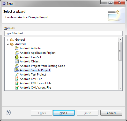
Need More Help Writing Android Apps? Check out our Latest Books and Resources!

Buy Android Wireless Application Development, 3rd Edition, Volume 1  Buy Sam's Teach Yourself Android Application Development in 24 Hours, 2nd Edition  Mamlambo code at Code Canyon


Mobiletuts+ Quiz: Getting Started with Android

$
0
0

Think you’re ready to start building Android applications? Take this quiz to find out!

This quiz was created for readers of our beginners series of Android tutorials is meant to help you build the skills and confidence necessary to build real, quality Android apps. If you are not prepared, see the previous tutorials in this series.


About the Authors

Mobile developers Lauren Darcey and Shane Conder have coauthored several books on Android development: an in-depth programming book entitled Android Wireless Application Development (now in it’s third edition as a two-volume set), Sams Teach Yourself Android Application Development in 24 Hours, and Learning Android Application Programming for the Kindle Fire: A Hands-On Guide to Building Your First Android Application. When not writing, they spend their time developing mobile software at their company and providing consulting services. They can be reached at via email to androidwirelessdev+mt@gmail.com, via their blog at androidbook.blogspot.com, and on Twitter @androidwireless.
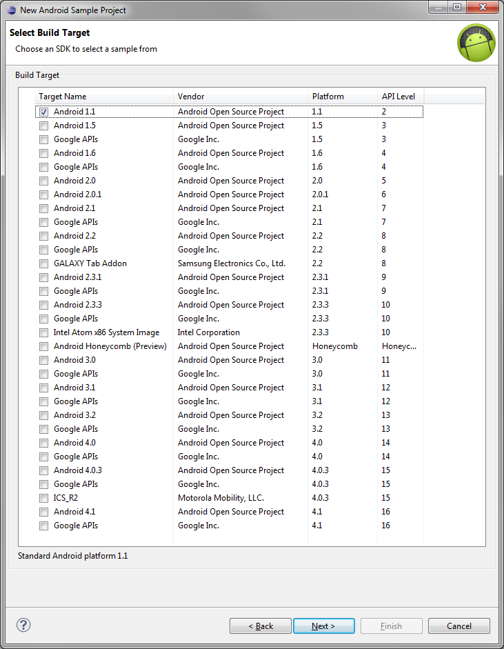
Need More Help Writing Android Apps? Check out our Latest Books and Resources!

Buy Android Wireless Application Development, 3rd Edition, Volume 1  Buy Sam's Teach Yourself Android Application Development in 24 Hours, 2nd Edition  Mamlambo code at Code Canyon


UIActionSheet and UIActionSheetDelegate

$
0
0

In this beginner’s iOS SDK tutorial, we will go over how to implement UIActionSheet and UIActionSheetDelegate. This class will allow you to easily prompt the user for input by displaying a list of menu options.


Step 1: Project Setup

Launch Xcode and click File > New > Project. Click “Application” under the iOS pane on the left and then click the “Single View Application” icon. Click “Next”.

UIActionSheet: Screenshot of project window

In the “Product Name” field, type “ActionSheetDemo” and enter a name for your Company Identifier, such as “com.mobiletuts.” Choose “iPhone” from the “Device Family” menu. Uncheck “Use Storyboards” and “Include Unit Tests,” and check “Use Automatic Reference Counting”. Click “Next”, choose a location to save your project, and click “Create”.

UIActionSheet: Screenshot of saving project

Step 2: Interface Creation

First we declare and define a method that will bring up the action sheet. Click on the “ViewController.m” file and add the following method declaration and definition:

@interface ViewController ()
- (void)showActionSheet:(id)sender; //Declare method to show action sheet
@end
@implementation ViewController
...
- (void)showActionSheet:(id)sender
{
}
...

Look for the viewDidLoad: method in the same file, and add the following code to create a button programmatically:

UIButton *button = [UIButton buttonWithType:UIButtonTypeRoundedRect];
button.frame = CGRectMake(20.0f, 186.0f, 280.0f, 88.0f);
[button setTitle:@"Show Action Sheet" forState:UIControlStateNormal];
[button setTitleColor:[UIColor blackColor] forState:UIControlStateNormal];
button.tintColor = [UIColor darkGrayColor];
[button addTarget:self action:@selector(showActionSheet:) forControlEvents:UIControlEventTouchUpInside];
[self.view addSubview:button];

By making the previous method, showActionSheet:, the target for the button, this method will be called when the button is tapped. Now that we have a button to show the action sheet, let’s move on to creating the logic to bring up the action sheet when the button is pressed.


Step 3: Conforming to the Delegate

Before we can call any of the UIActionSheetDelegate methods, we must conform to the UIActionSheetDelegate protocol. Click on the “ViewController.h” file and update the interface declaration to the following code.

@interface ViewController : UIViewController <UIActionSheetDelegate>

By conforming to the UIActionSheetDelegate protocol, the ViewController class can implement and perform needed tasks when certain delegate methods are called.


Step 4: Adding the Delegate Method

Still in the “ViewController.m” file, add the following UIActionSheetDelegate method.

- (void)actionSheet:(UIActionSheet *)actionSheet clickedButtonAtIndex:(NSInteger)buttonIndex {}

There are many UIActionSheetDelegate methods, however, we’re going to use just one: actionSheet: clickedButtonAtIndex:. This is one of the most commonly implemented delegate methods as it is automatically called when one of the buttons on the action sheet is tapped.


Step 5: Showing the Action Sheet

Look for the showActionSheet: method definition that we added earlier. Add the following code inside the curly braces to create an action sheet with five buttons.

NSString *actionSheetTitle = @"Action Sheet Demo"; //Action Sheet Title
NSString *destructiveTitle = @"Destructive Button"; //Action Sheet Button Titles
NSString *other1 = @"Other Button 1";
NSString *other2 = @"Other Button 2";
NSString *other3 = @"Other Button 3";
NSString *cancelTitle = @"Cancel Button";
UIActionSheet *actionSheet = [[UIActionSheet alloc]
                              initWithTitle:actionSheetTitle
                              delegate:self
                              cancelButtonTitle:cancelTitle
                              destructiveButtonTitle:destructiveTitle
                              otherButtonTitles:other1, other2, other3, nil];
[actionSheet showInView:self.view];

As the name indicates, an action sheet presents the user with different choices and corresponding actions that can be performed. In the first part of the method, we create six strings, one which represents the title of the action sheet and five that represent titles of the buttons in the action sheet. The next part instantiates an action sheet with specific parameters. These parameters include a title for the action sheet, the object that will be the delegate (in this case self, the UIViewController object), and the various buttons to be displayed in the action sheet.

There are three main types of buttons used in an action sheet. The cancelButtonTitle: cancels the action sheet altogether. The destructiveButtonTitle: destroys or deletes something; this button defaults to red in the action sheet. The otherButtonTitles: can be anything, and often offer an option like navigating to a new viewController. In order to leave out one of the buttons, simply pass in nil as the argument for that button’s title. The last part of the method, showInView:, shows the action sheet in the specified view.


Step 6: Responding to a Button Press

Navigate back to the delegate method actionSheet: clickedButtonAtIndex:. Add the following code to determine which button was pressed:

//Get the name of the current pressed button
NSString *buttonTitle = [actionSheet buttonTitleAtIndex:buttonIndex];
if  ([buttonTitle isEqualToString:@"Destructive Button"]) {
    NSLog(@"Destructive pressed --> Delete Something");
}
if ([buttonTitle isEqualToString:@"Other Button 1"]) {
    NSLog(@"Other 1 pressed");
}
if ([buttonTitle isEqualToString:@"Other Button 2"]) {
    NSLog(@"Other 2 pressed");
}
if ([buttonTitle isEqualToString:@"Other Button 3"]) {
    NSLog(@"Other 3 pressed");
}
if ([buttonTitle isEqualToString:@"Cancel Button"]) {
    NSLog(@"Cancel pressed --> Cancel ActionSheet");
}

When a button is pressed, actionSheet: clickedButtonAtIndex: is called. We get the name of the button being pressed and compare it against the different button titles of the action sheet to determine which button was pressed. The NSLog with each if statement will log which button was pressed to the console.


Step 7: Testing the Action Sheet

Click Product > Run to build and run the project in the Simulator. Click “Show Action Sheet” to bring up the action sheet. Open the console by clicking View > Debug Area > Activate Console in Xcode. Click on one of the action sheet buttons to see the corresponding log in the console.


Conclusion

UIActionSheet is commonly used to offer a user many options. Experimenting with UIActionSheet will allow you to find the configuration that works for your application’s needs. Questions or comments? Feel free to leave them in the comments section or send them directly via Twitter @aaron_crabtree.


Smooth Freehand Drawing on iOS

$
0
0

This tutorial will teach you how to implement an advanced drawing algorithm for smooth, freehand drawing on iOS devices. Read on!

Theoretical Overview

Touch is the primary way a user will interact with iOS devices. One of the most natural and obvious functionalities these devices are expected to provide is allowing the user to draw on the screen with their finger. There are many freehand drawing and note-taking apps currently in the App Store, and many companies even ask customers to sign an iDevice when making purchases. How do these applications actually work? Let’s stop and think for a minute about what’s going on “under the hood”.

When a user scrolls a table view, pinches to enlarge a picture, or draws a curve in a painting app, the device display is rapidly updating (say, 60 times a second) and the application run-loop is constantly sampling the location of the user’s finger(s). During this process the “analog” input of a finger dragging across the screen must be converted to a digital set of points on the display, and this conversion process can pose significant challenges. In the context of our painting app, we have a “data-fitting” problem on our hands. As the user scribbles away merrily on the device, the programmer essentially must interpolate missing analog information (“connect-the-dots”) that has been lost among the sampled touch points that iOS reported to us. Further, this interpolation must occur in such a way that the result is a stroke that appears continuous, natural, and smooth to the end user, as if he had been sketching with a pen on a notepad made of paper.

The purpose of this tutorial is to show how freehand drawing can be implemented on iOS, starting from a basic algorithm that performs straight line interpolation and advancing to a more sophisticated algorithm that approaches the quality provided by well-known applications like Penultimate. As if creating an algorithm that works isn’t hard enough, we also need to make sure that the algorithm performs well. As we shall see, a naïve drawing implementation can lead to an app with significant performance issues that will make drawing cumbersome and eventually unusable.


Getting Started

I’m assuming you’re not totally new to iOS development, so I’ve skimmed over the steps of creating a new project, adding files to the project, etc. Hopefully there’s nothing too difficult here anyway, but just in case, the full project code is available for you to download and play around with.

Start a new Xcode iPad project based on the “Single View Application” Template and name it “FreehandDrawingTut“. Be sure to enable Automatic Reference Counting (ARC), but to deselect Storyboards and unit tests. You can make this project either an iPhone or Universal app, depending on what devices you have available for testing.

New Project

Next, go ahead and select the “FreeHandDrawingTut” project in the Xcode Navigator and make sure that only the portrait orientation is supported:

Only Support Portrait

If you’re going to deploy to iOS 5.x or earlier, you can change the orientation support this way:

- (BOOL)shouldAutorotateToInterfaceOrientation:(UIInterfaceOrientation)interfaceOrientation
{
    return (interfaceOrientation == UIInterfaceOrientationPortrait);
}

I’m doing this to keep things simple so we can focus on the main problem at hand.

I want to develop our code iteratively, improving upon it in an incremental fashion – as you would realistically do if you started from scratch – instead of dropping the final version on you in one go. I’m hoping this approach will give you a better handle on the different issues involved. Keeping this in mind, and to save from having to repeatedly delete, modify and add code in the same file, which might get messy and error-prone, I will take the following approach:

  • For each iteration, we’ll be creating a new UIView subclass. I will post all the code needed so you can simply copy and paste into the .m file of the new UIView subclass you create. There won’t be a public interface to the view subclass’ functionality, which means you won’t need to touch the .h file.
  • To test each new version, we will need to assign the UIView subclass we created to be the view currently taking up the screen. I’ll show you how to do that with Interface Builder the first time, going through the steps in detail, and then remind you of this step every time we code a new version.

First Attempt at Drawing

In Xcode, choose File > New > File…, choose Objective-C class as the template, and on the next screen name the file LinearInterpView and make it a subclass of UIView. Save it. The name “LinearInterp” is short for “linear interpolation” here. For the sake of the tutorial, I’ll name every UIView subclass we create to emphasize some concept or approach introduced within the class code.

As I previously mentioned, you can leave the header file as it is. Delete all the code present in LinearInterpView.m file, and replace it with the following:

	#import "LinearInterpView.h"
	@implementation LinearInterpView
	{
	    UIBezierPath *path; // (3)
	}
	- (id)initWithCoder:(NSCoder *)aDecoder // (1)
	{
	    if (self = [super initWithCoder:aDecoder])
	    {
	        [self setMultipleTouchEnabled:NO]; // (2)
	        [self setBackgroundColor:[UIColor whiteColor]];
	        path = [UIBezierPath bezierPath];
	        [path setLineWidth:2.0];
	    }
	    return self;
	}
	- (void)drawRect:(CGRect)rect // (5)
	{
	    [[UIColor blackColor] setStroke];
	    [path stroke];
	}
	- (void)touchesBegan:(NSSet *)touches withEvent:(UIEvent *)event
	{
	    UITouch *touch = [touches anyObject];
	    CGPoint p = [touch locationInView:self];
	    [path moveToPoint:p];
	}
	- (void)touchesMoved:(NSSet *)touches withEvent:(UIEvent *)event
	{
	    UITouch *touch = [touches anyObject];
	    CGPoint p = [touch locationInView:self];
	    [path addLineToPoint:p]; // (4)
	    [self setNeedsDisplay];
	}
	- (void)touchesEnded:(NSSet *)touches withEvent:(UIEvent *)event
	{
	    [self touchesMoved:touches withEvent:event];
	}
	- (void)touchesCancelled:(NSSet *)touches withEvent:(UIEvent *)event
	{
	    [self touchesEnded:touches withEvent:event];
	}
	@end

In this code, we’re working directly with the touch events that the application reports to us every time we have a touch sequence. that is, the user places a finger on the onscreen view, moves the finger across it, and finally lifts his finger from the screen. For each event in this sequence, the application sends us a corresponding message (in iOS terminology, the messages are sent to the “first responder”; you can refer to the documentation for details).

To deal with these messages, we implement the methods -touchesBegan:WithEvent: and company, which are declared in the UIResponder class from which UIView inherits. We can write code to handle the touch events whatever way we like. In our app we want to query the on-screen location of the touches, do some processing, and then draw lines on the screen.

The points refer to the corresponding commented numbers from the code above:

  1. We override -initWithCoder: because the view is born from a XIB, as we’ll set up shortly.
  2. We disabled multiple touches: we are going to deal with only one touch sequence, which means the user can only draw with one finger at a time; any other finger placed on the screen during that time will be ignored. This is a simplification, but not necessarily an unreasonable one -people don’t usually write on paper with two pens at a time either! In any case, it’ll keep us from digressing too far, as we have enough work to do already.
  3. The UIBezierPath is a UIKit class that lets us draw shapes on the screen composed of straight lines or certain types of curves.
  4. Since we’re doing custom drawing, we need to override the view’s -drawRect: method. We do this by stroking the path every time a new line segment is added.
  5. Note also that while the line width is a property of the path, the color of the line itself is a property of the drawing context. If you’re unfamiliar with graphics contexts, you can read about them in the Apple docs. For now, think of a graphics context as a “canvas” you draw into when you override the -drawRect: method, and the result of what you see is the view on screen. We’ll come across another sort of drawing context shortly.

Before we can build the application, we need to set the view subclass we just created to the on-screen view.

  1. In the navigator pane, click on ViewController.xib (in case you created a Universal app, simply carry out this step for both the ViewController~iPhone.xib and ViewController~iPad.xib files).
  2. When the view shows up on the interface builder canvas, click on it to select it. In the utilities pane, click on the “Identities Inspector” (third button from the right at the top of the pane). The topmost section says “Custom Class”, this is where you’ll set the class of the view you clicked on.
  3. Right now it should say “UIView”, but we need to change it to (you guessed it) LinearInterpView. Type in the name of the class (simply typing “L” should cause autocomplete to chime in reassuringly).
  4. Again, if you’re going to be testing this as a universal app, repeat this exact step for both of the XIB files that the template made for you.
Changing the view controller's view's class to our custom UIView subclass

Now build the application. You should get a shiny white view that you can draw into with your finger. Considering the few lines of code we’ve written, the results aren’t too shabby! Of course, they aren’t spectacular either. The connect-the-dots appearance is rather noticeable (and yes, my handwriting sucks too).

Our first attempt at freehand drawing

Make sure you run the app not only on the simulator but on a real device as well.

If you play with the application for awhile on your device, you’re bound to notice something: eventually the UI response begins to lag, and instead of the ~60 touch points that were being acquired per second, for some reason the number of points the UI is able to sample drops further and further. Since the points are becoming further apart, the straight line interpolation renders the drawing even “blockier” than before. This is certainly undesirable. So, what’s going on?


Maintaining Performance and Responsiveness

Let’s review what we’ve been doing: as we draw, we’re acquiring points, adding them to an ever-growing path, and then rendering the *complete* path in every cycle of the main loop. So as the path gets longer, in every iteration the drawing system has more to draw and eventually it becomes too much, making it hard for the app to keep up. Since everything is happening on the main thread, our drawing code is competing with the UI code that, among other things, has to sample the touches on the screen.

You’d be forgiven for thinking there was a way to draw “on top of” what was already on the screen; unfortunately this is where we need to break free of the pen-on-paper analogy as the graphics system doesn’t quite work that way by default. Although, by virtue of the code we’re going to be writing next, we are indirectly going to be implementing the “draw-on-top” approach.

While there are a few things we might try to fix the performance of our code, we’re only going to implement one idea, because it turns out to be sufficient for our present needs.

Create a new UIView subclass as you did before, naming it CachedLIView (the LI is to remind us we’re still doing Linear Interpolation). Delete all the contents of CachedLIView.m and replace it with the following:

	#import "CachedLIView.h"
	@implementation CachedLIView
	{
	    UIBezierPath *path;
	    UIImage *incrementalImage; // (1)
	}
	- (id)initWithCoder:(NSCoder *)aDecoder
	{
	    if (self = [super initWithCoder:aDecoder])
	    {
	        [self setMultipleTouchEnabled:NO];
	        [self setBackgroundColor:[UIColor whiteColor]];
	        path = [UIBezierPath bezierPath];
	        [path setLineWidth:2.0];
	    }
	    return self;
	}
	- (void)drawRect:(CGRect)rect
	{
	    [incrementalImage drawInRect:rect]; // (3)
	    [path stroke];
	}
	- (void)touchesBegan:(NSSet *)touches withEvent:(UIEvent *)event
	{
	    UITouch *touch = [touches anyObject];
	    CGPoint p = [touch locationInView:self];
	    [path moveToPoint:p];
	}
	- (void)touchesMoved:(NSSet *)touches withEvent:(UIEvent *)event
	{
	    UITouch *touch = [touches anyObject];
	    CGPoint p = [touch locationInView:self];
	    [path addLineToPoint:p];
	    [self setNeedsDisplay];
	}
	- (void)touchesEnded:(NSSet *)touches withEvent:(UIEvent *)event // (2)
	{
	    UITouch *touch = [touches anyObject];
	    CGPoint p = [touch locationInView:self];
	    [path addLineToPoint:p];
	    [self drawBitmap]; // (3)
	    [self setNeedsDisplay];
	    [path removeAllPoints]; //(4)
	}
	- (void)touchesCancelled:(NSSet *)touches withEvent:(UIEvent *)event
	{
	    [self touchesEnded:touches withEvent:event];
	}
	- (void)drawBitmap // (3)
	{
	    UIGraphicsBeginImageContextWithOptions(self.bounds.size, YES, 0.0);
	    [[UIColor blackColor] setStroke];
	    if (!incrementalImage) // first draw; paint background white by ...
	    {
	        UIBezierPath *rectpath = [UIBezierPath bezierPathWithRect:self.bounds]; // enclosing bitmap by a rectangle defined by another UIBezierPath object
	        [[UIColor whiteColor] setFill];
	        [rectpath fill]; // filling it with white
	    }
	    [incrementalImage drawAtPoint:CGPointZero];
	    [path stroke];
	    incrementalImage = UIGraphicsGetImageFromCurrentImageContext();
	    UIGraphicsEndImageContext();
	}
	@end

After saving, remember to change the class of the view object in your XIB(s) to CachedLIView!

When the user places his finger on the screen to draw, we start with a fresh path with no points or lines in it, and we append line segments to it just like we did before.

Again, referring to the numbers in the comments:

  1. We additionally maintain in memory an (offscreen) bitmap image of the same size as our canvas (i.e. on screen view), in which we can store what we’ve drawn thus far.
  2. We draw the contents on screen into this buffer every time the user lifts his finger (signalled by -touchesEnded:WithEvent).
  3. The drawBitmap method creates a bitmap context – UIKit methods need a “current context” (a canvas) to draw into. When we are inside -drawRect: this context is automatically made available to us and reflects what we draw into our onscreen view. In contrast, the bitmap context needs to be created and destroyed explicitly, and the drawn contents reside in memory.
  4. By caching the previous drawing in this manner, we can get rid of the previous contents of the path, and in this manner keep the path from getting too long.
  5. Now every time drawRect: is called, we first draw the contents of the memory buffer into our view which (by design) has the exact same size, and so for the user we maintain the illusion of continuous drawing, only in a different way than before.

While this isn’t perfect (what if our user keeps drawing without raising his finger, ever?), it’ll be good enough for the scope of this tutorial. You are encouraged to experiment on your own to find a better method. For example, you could try caching the drawing periodically instead of only when the user lifts his finger. As it happens, this off-screen caching procedure affords us the opportunity of background processing, should we choose to implement it. But we aren’t going to do that in this tutorial. You are invited to try on your own, though!


Improving the Visual Stroke Quality

Now let’s turn our attention to making the drawing “look better”. So far, we’ve been joining adjacent touch points with straight line segments. But normally when we draw freehand, our natural stroke has a free-flowing and curvy (rather than blocky and rigid) appearance. It makes sense that we try to interpolate our points with curves rather than line segments. Luckily, the UIBezierPath class lets us draw its namesake: Bezier curves.

What are Bezier curves? Without invoking the mathematical definition, a Bezier curve is defined by four points: two endpoints through which a curve passes and two “control points” which help define tangents that the curve must touch at its endpoints (this is technically a cubic Bezier curve, but for simplicity I’ll refer to it as simply a “Bezier curve”).

A cubic Bezier curve

Bezier curves allow us to draw all kinds of interesting shapes.

Interesting shapes that cubic Beziers are capable of making

What we’re going to try now is to group sequences of four adjacent touch points and interpolate the point sequence within a Bezier curve segment. Every adjacent pair of Bezier segments will share an endpoint in common in order to maintain the continuity of the stroke.

You know the drill by now. Create a new UIView subclass and name it BezierInterpView. Paste the following code into the .m file:

	#import "BezierInterpView.h"
	@implementation BezierInterpView
	{
	    UIBezierPath *path;
	    UIImage *incrementalImage;
	    CGPoint pts[4]; // to keep track of the four points of our Bezier segment
	    uint ctr; // a counter variable to keep track of the point index
	}
	- (id)initWithCoder:(NSCoder *)aDecoder
	{
	    if (self = [super initWithCoder:aDecoder])
	    {
	        [self setMultipleTouchEnabled:NO];
	        [self setBackgroundColor:[UIColor whiteColor]];
	        path = [UIBezierPath bezierPath];
	        [path setLineWidth:2.0];
	    }
	return self;
	}
	- (void)drawRect:(CGRect)rect
	{
	    [incrementalImage drawInRect:rect];
	    [path stroke];
	}
	- (void)touchesBegan:(NSSet *)touches withEvent:(UIEvent *)event
	{
	    ctr = 0;
	    UITouch *touch = [touches anyObject];
	    pts[0] = [touch locationInView:self];
	}
	- (void)touchesMoved:(NSSet *)touches withEvent:(UIEvent *)event
	{
	    UITouch *touch = [touches anyObject];
	    CGPoint p = [touch locationInView:self];
	    ctr++;
	    pts[ctr] = p;
	    if (ctr == 3) // 4th point
	    {
	        [path moveToPoint:pts[0]];
	        [path addCurveToPoint:pts[3] controlPoint1:pts[1] controlPoint2:pts[2]]; // this is how a Bezier curve is appended to a path. We are adding a cubic Bezier from pt[0] to pt[3], with control points pt[1] and pt[2]
	        [self setNeedsDisplay];
	        pts[0] = [path currentPoint];
	        ctr = 0;
	    }
	}
	- (void)touchesEnded:(NSSet *)touches withEvent:(UIEvent *)event
	{
	    [self drawBitmap];
	    [self setNeedsDisplay];
	    pts[0] = [path currentPoint]; // let the second endpoint of the current Bezier segment be the first one for the next Bezier segment
	    [path removeAllPoints];
	    ctr = 0;
	}
	- (void)touchesCancelled:(NSSet *)touches withEvent:(UIEvent *)event
	{
	    [self touchesEnded:touches withEvent:event];
	}
	- (void)drawBitmap
	{
	    UIGraphicsBeginImageContextWithOptions(self.bounds.size, YES, 0.0);
	    [[UIColor blackColor] setStroke];
	    if (!incrementalImage) // first time; paint background white
	    {
	        UIBezierPath *rectpath = [UIBezierPath bezierPathWithRect:self.bounds];
	        [[UIColor whiteColor] setFill];
	        [rectpath fill];
	    }
	    [incrementalImage drawAtPoint:CGPointZero];
	    [path stroke];
	    incrementalImage = UIGraphicsGetImageFromCurrentImageContext();
	    UIGraphicsEndImageContext();
	}
	@end

As the inline comments indicate, the main change is the introduction of a couple of new variables to keep track of the points in our Bezier segments, and a modification of the -(void)touchesMoved:withEvent: method to draw a Bezier segment for every four points (actually, every three points, in terms of the touches that the app reports to us, because we share one endpoint for every pair of adjacent of Bezier segments).

You might point out here that we’ve neglected the case of the user lifting his finger and ending the touch sequence before we have enough points to complete our last Bezier segment. If so, you would be right! While visually this doesn’t make much difference, in certain important cases it does. For example, try drawing a tiny circle. It might not close completely, and in a real app you’d want to appropriately handle this in the -touchesEnded:WithEvent method. While we’re at it, we’ve also not been giving any special regard to the case of touch cancellation. The touchesCancelled:WithEvent instance method handles this. Have a look at the official documentation and see if there are any special cases that you might need to handle here.

So, what do the results look like? Once more, I remind you to set the correct class in the XIB before building.

Minor improvement, if any

Huh. It doesn’t seem like a whole lot of improvement, does it? I think it might be slightly better than straight line interpolation, or perhaps that’s just wishful thinking. In any case, it’s nothing worth bragging about.


Further Improving the Stroke Quality

Here’s what I think is happening: while we’re taking the trouble to interpolate each sequence of four points with a smooth curve segment, we aren’t making any effort to make a curve segment to transition smoothly into the next one, so effectively we still have a problem with the final result.

So, what can we do about it? If we’re going to stick to the approach we started in the last version (i.e. using Bezier curves), we need to take care of the continuity and smoothness at the “junction point” of two adjacent Bezier segments. The two tangents at the end point with the corresponding control points (second control point of the first segment and first control point of the second segment) seem to be the key; if both these tangents had the same direction, then the curve would be smoother at the junction.

Tangents are the junction of two Bezier segments are

What if we moved the common endpoint somewhere on the line joining the two control points? Without utilizing additional data about the touch points, the best point would seem to be the midpoint of the line joining the two control points in consideration, and our imposed requirement on the direction of the two tangents would be satisfied. Let’s try this!

Shifting the junction point to make the intersegment transition smooth

Create a UIView subclass (yet again) and name it SmoothedBIView. Replace the entire code in the .m file with the following:

	#import "SmoothedBIView.h"
	@implementation SmoothedBIView
	{
	    UIBezierPath *path;
	    UIImage *incrementalImage;
	    CGPoint pts[5]; // we now need to keep track of the four points of a Bezier segment and the first control point of the next segment
	    uint ctr;
	}
	- (id)initWithCoder:(NSCoder *)aDecoder
	{
	    if (self = [super initWithCoder:aDecoder])
	    {
	        [self setMultipleTouchEnabled:NO];
	        [self setBackgroundColor:[UIColor whiteColor]];
	        path = [UIBezierPath bezierPath];
	        [path setLineWidth:2.0];
	    }
	    return self;
	}
	- (id)initWithFrame:(CGRect)frame
	{
	    self = [super initWithFrame:frame];
	    if (self) {
	        [self setMultipleTouchEnabled:NO];
	        path = [UIBezierPath bezierPath];
	        [path setLineWidth:2.0];
	    }
	    return self;
	}
	// Only override drawRect: if you perform custom drawing.
	// An empty implementation adversely affects performance during animation.
	- (void)drawRect:(CGRect)rect
	{
	    [incrementalImage drawInRect:rect];
	    [path stroke];
	}
	- (void)touchesBegan:(NSSet *)touches withEvent:(UIEvent *)event
	{
	    ctr = 0;
	    UITouch *touch = [touches anyObject];
	    pts[0] = [touch locationInView:self];
	}
	- (void)touchesMoved:(NSSet *)touches withEvent:(UIEvent *)event
	{
	    UITouch *touch = [touches anyObject];
	    CGPoint p = [touch locationInView:self];
	    ctr++;
	    pts[ctr] = p;
	    if (ctr == 4)
	    {
	        pts[3] = CGPointMake((pts[2].x + pts[4].x)/2.0, (pts[2].y + pts[4].y)/2.0); // move the endpoint to the middle of the line joining the second control point of the first Bezier segment and the first control point of the second Bezier segment
	        [path moveToPoint:pts[0]];
	        [path addCurveToPoint:pts[3] controlPoint1:pts[1] controlPoint2:pts[2]]; // add a cubic Bezier from pt[0] to pt[3], with control points pt[1] and pt[2]
	        [self setNeedsDisplay];
	        // replace points and get ready to handle the next segment
	        pts[0] = pts[3];
	        pts[1] = pts[4];
	        ctr = 1;
	    }
	}
	- (void)touchesEnded:(NSSet *)touches withEvent:(UIEvent *)event
	{
	    [self drawBitmap];
	    [self setNeedsDisplay];
	    [path removeAllPoints];
	    ctr = 0;
	}
	- (void)touchesCancelled:(NSSet *)touches withEvent:(UIEvent *)event
	{
	    [self touchesEnded:touches withEvent:event];
	}
	- (void)drawBitmap
	{
	    UIGraphicsBeginImageContextWithOptions(self.bounds.size, YES, 0.0);
	    if (!incrementalImage) // first time; paint background white
	    {
	        UIBezierPath *rectpath = [UIBezierPath bezierPathWithRect:self.bounds];
	        [[UIColor whiteColor] setFill];
	        [rectpath fill];
	    }
	    [incrementalImage drawAtPoint:CGPointZero];
	    [[UIColor blackColor] setStroke];
	    [path stroke];
	    incrementalImage = UIGraphicsGetImageFromCurrentImageContext();
	    UIGraphicsEndImageContext();
	}
	@end

The crux of the algorithm we discussed above is implemented in the -touchesMoved:WithEvent: method. The inline comments should help you link the discussion with the code.

So, how are the results, visually speaking? Remember to do the thing with the XIB.

Not bad at all!

Happily, there’s substantial improvement this time around. Considering the simplicity of our modification, it looks rather good (if I do say so myself!). Our analysis of the problem with the previous iteration, and our proposed solution, have been validated as well.


Where to Go From Here

I hope you found this tutorial beneficial. Hopefully you’ll develop your own ideas on how to improve the code. One of the most important (but easy) improvements you can incorporate is handling the end of the touch sequences more gracefully, as discussed previously.

Another case I neglected is handling a touch sequence that consists of the user touching the view with their finger and then lifting it without having moved it -effectively a tap on the screen. The user would probably expect to draw a point or small squiggle on the view this way, but with our current implementation nothing happens because our drawing code doesn’t kick in unless our view receives the -touchesMoved:WithEvent: message. You might want to take a look at the UIBezierPath class documentation to see what other types of paths you can construct.

If your app does more work than what we did here (and in a drawing app worth shipping, it would!), designing it such that the non-UI code (in particular, the off-screen caching) runs in a background thread might make significant difference on a multicore device (iPad 2 onwards). Even on a single-processor device, such as the iPhone 4, the performance ought to improve, since I expect the processor would divvy up the caching work which, after all, happens only once every few cycles of the main loop.

I encourage you to flex your coding muscles and play with the UIKit API in order to develop and improve upon some of the ideas implemented in this tutorial. Have fun, and thanks for reading!


Getting Started with XML Layouts

$
0
0

This tutorial will teach you the fundamentals of building Android interface layouts with XML. Read on!

When you’re getting started with developing Android apps using Eclipse and the ADT plugin, Eclipse’s powerful graphical layout editor is a great place to start visually designing your user interface. However, this “what you see is what you get” approach has its limitations, and at some point you’ll need to switch to XML.

One of the major benefits of declaring your UI in XML is the ability to keep the UI and the behavior of your app separate, giving you the freedom to tweak your app’s presentation without disrupting its underlying functionality.

In this article, I’ll show you how to design a basic XML layout from scratch, including defining the root element, specifying height and width parameters, and adding some basic UI elements. Finally, I’ll use this basic layout to demonstrate some advanced XML options, such as allocating different amounts of space to different objects, and getting started with string resources.

Note: In Android, XML layouts should be stored in the res/layout directory with the .xml extension.


Part 1: XML Layout Basics

First, we’ll get used to XML by creating a very basic Android UI that uses the LinearLayout view group to hold a checkbox element. Open the res/layouts/activity_main.xml file and let’s get started.


Step 1: Specify Your Root Element

The UI must contain a single root element that acts as a visual container for all your other items. The root element can either be a ViewGroup (i.e LinearLayout, ListView, GridView) a merge element or a View, but it must contain the XML namespace. In this example, I’ll be using LinearLayout, a ViewGroup that aligns all children in a specified direction.

A LinearLayout consists of opening and closing XML tags:

< LinearLayout ....... >

In the opening tab, you’ll need to define the XML namespace, which is a standard recommended by the W3C. Defining the XML namespace in Android is easy, simply enter the following code and URL as part of the opening LinearLayout tag:

 xmlns:android="http://schemas.android.com/apk/res/android"

Step 2: Width and Height

Next, specify the width and height parameters for your root element. In most instances, you’ll use the “fill_parent” value for the root element, as this instructs it to take up the device’s entire screen.

Enter the following XML for the height/width parameters:

android:layout_width="fill_parent"
android:layout_height="fill_parent" >

Your XML should now look like this:

<LinearLayout xmlns:android=”http://schemas.android.com/apk/res/android”
    android:layout_width="fill_parent”
    android:layout_height="fill_parent” >
</LinearLayout>

Step 3: Creating a Checkbox

It’s time to add something to that blank canvas! Enter the opening tag for your checkbox. Because this is a UI element, some additional XML is required:

1) Identify Your Item

Eclipse uses an integer ID to identify different UI elements within a tree. This should be referenced as a string, using the ‘id’ attribute and the following syntax:

android:id=”@+id/name”

In this example, we’ll refer to this UI element as ‘CheckBox:’

android:id="@+id/CheckBox"

2) Width/Height Parameters: wrap_content

Once again, you’ll need to enter the height/width parameters. Setting this attribute to ‘wrap_content’ will display the corresponding item large enough to enclose the content resize. We can re-use the height/width syntax structure from earlier, replacing ‘fill_parent’ with ‘wrap_content:’

android:layout_width="wrap_content"
android:layout_height="wrap_content"

3) Set Your Text

Finally, you’ll need to specify the text that should appear alongside the checkbox. We’ll set the checkbox to display ‘Yes’:

 android:text="Yes" /> 

Your XML should now look like this:

<LinearLayout xmlns:android="http://schemas.android.com/apk/res/android”
    android:layout_width="fill_parent”
    android:layout_height="fill_parent” >
        <CheckBox
          android:id="@+id/CheckBox”
          android:layout_width="wrap_content”
         android:layout_height="wrap_content”
         android:text="Yes" />
</LinearLayout>

Run your code in the Android Emulator to see your XML in action!

Android UI XML 1

Part 2: Create Your Second UI with XML

In the second part of this tutorial, we’ll look at some more advanced XML for fine-tuning your UI. We’ll create a layout consisting of two buttons, and then use the ‘weight’ attribute to change the percentage of layout space allocated to each before briefly covering the basics of string resources.


Step 1: Create Your Layout

The first step is to create the barebones of your layout. We’ll re-use the LinearLayout root element from the previous example, along with the width/height parameters and, of course, the XML namespace:

<LinearLayout xmlns:android="http://schemas.android.com/apk/res/android"
    android:layout_width="fill_parent"
    android:layout_height="fill_parent" >
</LinearLayout>

Step 2: Create Your Buttons

To create the first button, add the ‘Button’ opening tag, and the integer ID using the element name ‘button1.’

<Button
      android:id="@+id/button1"

Set the width and height attributes to =”wrap_content.” We’ll be creating a ‘Yes’ and a ‘No’ button, so specify ‘Yes’ as the accompanying text:

android:text="Yes"

Finally, close button1:

 /> 

Now you have the code for one button, you can easily create another by making a few adjustments:

1) Change the ID to ‘button2′
2) Specify that the text should be ‘No’ (android:text=”No”)

Your XML should now look like this:

<LinearLayout xmlns:android="http://schemas.android.com/apk/res/android"
    android:layout_width="fill_parent"
    android:layout_height="fill_parent" >
<Button
      android:id="@+id/button1"
       android:layout_width="wrap_content"
       android:layout_height="wrap_content"
       android:text="Yes" />
<Button
      android:id="@+id/button2"
       android:layout_width="wrap_content"
       android:layout_height="wrap_content"
       android:text="No" />
</LinearLayout>

Step 3: Check the Emulator

To preview how this will look on a real-life Android device, boot up the emulator and take a peek!

Android UI XML 2

Part 3: Advanced XML Options

Now you have your basic UI, we’ll use some more advanced XML to refine this simple layout.

Set Layout_Weight

The ‘android:layout_weight’ attribute allows you to specify the size ratio between multiple UI elements. Put simply, the higher the weight value, the greater proportion of allocated space, and the more the UI element expands. If you don’t specify a weight, Eclipse will assume the weight for all items is zero, and divide the available space up equally. The space ratio can be set with the following XML:

 android:layout_weight="?"

In this example, we will assign ‘button1’ with a value of 1, and ‘button2’ with a value of 2.

Note, this is purely an addition; you do not need to change any of the existing code.

<LinearLayout xmlns:android="http://schemas.android.com/apk/res/android"
    android:layout_width="fill_parent"
    android:layout_height="fill_parent" >
<Button
      android:id="@+id/button1"
       android:layout_width="wrap_content"
       android:layout_height="wrap_content"
       android:layout_weight="1"
       android:text="Yes" />
<Button
      android:id="@+id/button2"
       android:layout_width="wrap_content"
       android:layout_height="wrap_content"
        android:layout_weight="2"
       android:text="No" />
</LinearLayout>

The above XML will create two buttons of different sizes:

Android UI XML 3

An Intro to String Resources

A string resource can provide text strings for your application and resource files. In most instances, it’s good practice to store all your strings in the dedicated ‘strings.xml’ folder, which can be found by:

1) Opening the ‘Res’ folder in Eclipse’s project explorer.

2) Opening the ‘Values’ folder.

3) Opening the ‘strings.xml’ file.

To create a new string in your Android project:

1) Open the ‘strings.xml’ file and select ‘Add.’

Android UI XML 4

2)Select ‘String’ from the list and click ‘Ok.’

Android UI XML 5

3) Select your newly-created string from the ‘Resources Elements’ menu.

4) In the right-hand ‘Attributes for string’ menu, enter a name for the string, and a value (Note, the ‘name’ attribute is used to reference the string value, and the string value is the data that will be displayed.)

In this example, we will give the string the name of ‘agree’ and enter the value ‘I agree to the terms and conditions.’

5) Save this new string resource.

Android UI XML 6

6) Open your ‘activity_main.xml’ file. Find the section of code that defines ‘button1’ and change the ‘android:text’ attribute to call this new string resource. Calling a string resource, uses the following syntax:

android:text="@string/name-of-resource"

So, in this example, the code will be:

 android:text="@string/agree" 

For ease of viewing the output, delete ‘button2.’ Your code should now look like this:

<LinearLayout xmlns:android="http://schemas.android.com/apk/res/android"
    android:layout_width="fill_parent"
    android:layout_height="fill_parent" >
<Button
      android:id="@+id/button1"
       android:layout_width="wrap_content"
       android:layout_height="wrap_content"
       android:layout_weight="1"
       android:text="@string/agree" />
</LinearLayout>

Check the visual output of your code – the text should have been replaced with the value of your ‘agree’ string.

Android UI XML 7

This is a very basic string, without any additional styling or formatting attributes. If you want to learn more about string resources, the official Android docs are a great source of further information.


Conclusion

In this article, we’ve covered the XML essentials of creating a root element for your layout and coded a few basic UI elements, before moving onto some more advanced XML that gives you greater control over your UI. You should now be ready to create your own simple user interfaces using XML!


Build a Custom Music Player – Tuts+ Premium

$
0
0

This three-part tutorial series will teach you how to build a custom music player with the iOS SDK. Read on!


Tutorial Teaser

Welcome to the first of three tutorials in a step-by-step series on building a custom music player with the MediaPlayer framework. In a previous tutorial on Mobiletuts+, I demonstrated how to access an iOS device music library within your own application. This Tuts+ Premium series will focus on building a much more complex player with a custom interface. In this first series installment, we will create the project and display a list of the user’s songs and albums.

NOTE: In order to test this app you will need a physical iOS device. You will also need to be a member of the paid iOS developer program in order to deploy the demo app onto your device for testing.

Step 1: Creating the Project

Open Xcode and select “Create a new Xcode project”. Select “Empty Application” and click “Next”. Enter a name for your project (I called mine “Music”) and make sure you select iPhone for device family and select all the checkboxes, except the “Use Core Data” checkbox. After that, click “Next” and choose a place to save your project and then click “Create”.

Step 2: Setting Supported Orientations

We only want to use our application in portrait mode, so go to the Supported Interface Orientations section and deselect the landscape orientations.

Step 3: Import the MediaPlayer Framework

Go to the “Build Phases” tab and expend the “Link Binary With Libraries” option. Click the “+” button to add a new Framework. Type “MediaPlayer” into the search box and select the MediaPlayer.framework option that appears in the list. Click “Add” to include this framework in the linking phase of your project.

Step 4: Create a Storyboard

Go to “File” > “New” > “File…” or press ⌘N to create a new file. Go to the “Use Interface” section, select “Storyboard and click “Next”. Make sure that the Device Family is set to iPhone and click “Next” again. Name your storyboard MainStoryboard and click “Create”.

Now we have to link the storyboard to our project. Select the project name in the navigator menu of Xcode and select the current target (in our case “Music”). Next select the “Summery” tab and go to the “iPhone / iPad Deployment Info” section. Once there select our storyboard called “MainStoryboard” for the Main Storyboard.


Get the Full Series!

This tutorial series is available to Tuts+ Premium members only. Read a preview of this tutorial on the Tuts+ Premium web site or login to Tuts+ Premium to access the full content.


Joining Tuts+ Premium. . .

For those unfamiliar, the family of Tuts+ sites runs a premium membership service called Tuts+ Premium. For $19 per month, you gain access to exclusive premium tutorials, screencasts, and freebies from Mobiletuts+, Nettuts+, Aetuts+, Audiotuts+, Vectortuts+, and CgTuts+. You’ll learn from some of the best minds in the business. Become a premium member to access this tutorial, as well as hundreds of other advanced tutorials and screencasts.
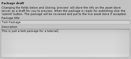

Reader’s Pulse: What Design Topics Should We Cover?

Mobile Experience Design Strategy – CASCADE SF

$
0
0

In this video spotlight, Luke Wroblewski talks about user experience design. Using both statistical and real-world examples, Luke makes the case for embracing a “mobile first” design strategy, and he shows how innovations in mobile design can positively impact the desktop experience as well. If you’re interesting in creating engaging mobile experiences, watch this video!


Key Slides:

Image 1
Image 2
Image 3
Image 4
Image 6
Image 7
Image 8
Image 9
Image 10
Image 11
Image 12
Image 13
Image 14
Image 15
Image 16

Full Slides

The full slides from this talk are not available online yet, but you can find slides for other presentations by Luke on his website here.


CASCADE SF

You can find out more about CASCADE SF and their upcoming events here.

Cascade SF

CASCADE SF teaches designers and developers the latest tips and tricks from accomplished leaders in the web world. Our events continue to elevate attendee’s skills so they can lead, innovate and learn.


Build an ASCII Art Editor: Interface Setup

$
0
0

The Android platform offers a wide range of storage options for use within your apps. In this tutorial series, we are going to explore some of the data storage facilities provided by the Android SDK by building a simple project: an ASCII art editor.


Project Overview

This tutorial series on Creating a Simple ASCII Art Editor is in four parts:

  • Building the User Interface
  • Image Export and User Configuration
  • ASCII Picture Database Creation and Querying
  • Saving and Deleting ASCII Pictures

By the end of this tutorial series, the user will be able to enter text characters to draw their ASCII artwork, save the art to a database, or even export their creation as an image file. The user will also be able to choose to display settings that determine the text and background colors for the ASCII art canvas.

To achieve all of this, the app will use Shared Preferences, an SQLite database, and external storage in the form of the device SD card (if one is available). In this first part of the series we will get the application set up and build most of the user interface elements. In part 2, we will handle exporting the image and letting the user choose display settings. In the final two parts we will work with the SQLite database.

Here is a preview of the app in action while the user enters ASCII characters:

ASCII Art Editor

Step 1: Create an Android Project

Start a new Android project in Eclipse. Choose your application and package names as well as target and minimum SDK versions. If you’re using the newest version of the ADT (Android Developer Tools) for Eclipse, you can select an application icon as well. We won’t be spending too much time on the decorative elements of the app in this series so that we can focus on the storage options. Let Eclipse generate your main app Activity while building the new project, entering an Activity and layout name of your choice:

New Project Activity

Step 2: Build the Main Layout

Eclipse may now open the layout for your new Activity – if it doesn’t open it yourself so that we can work on it. Depending on your ADT, Eclipse may automatically generate a Relative Layout, however we are using a Linear Layout, so replace the existing content with the following:

<LinearLayout xmlns:android="http://schemas.android.com/apk/res/android"
	xmlns:tools="http://schemas.android.com/tools"
	android:layout_width="fill_parent"
	android:layout_height="fill_parent"
	android:orientation="vertical"
	android:padding="5dp" >
	<TextView
	android:layout_width="wrap_content"
	android:layout_height="wrap_content"
	android:text="@string/intro"
	android:textStyle="bold"
	tools:context=".MainActivity" />
</LinearLayout>

If necessary alter the context attribute to reflect the main Activity name you picked. Open the app’s strings resource file (“res/values/strings.xml”). Add the following string, which we referred to in the layout file:

<string name="intro">Enter your ASCII art below!</string>

If your strings file contains a string with “title_activity_main” as its name attribute, alter it to reflect whatever text you want to appear in the app title bar, as this string may be automatically set as the Activity label when Eclipse generates a new project. We will be adding items to the strings resource as we build the layout, so keep the file open.

Back in the main layout file, let’s add the editable text area for users to enter their ASCII characters. After the introductory TextView, add an EditText:

<EditText
	android:id="@+id/ascii_text"
	android:layout_width="fill_parent"
	android:layout_height="wrap_content"
	android:textColor="#ffffff"
	android:background="#000000"
	android:typeface="monospace"
	android:gravity="top|left"
	android:hint=""
	android:inputType="textMultiLine"
	android:lines="10"
	android:maxLines="10"
	android:minLines="10"
	android:singleLine="false"
	android:scrollbars="vertical"
/>

Take a moment to look over these attributes. The ID will let us identify the text-field in Java. The text color and background have initial values, but we will be allowing the user to set these later. The text-field will initially be empty and will have 10 lines for user input. The other attributes are decorative, so you can alter them if you wish to use a different design.

Next we are going to display a series of buttons for user control, so add a layout for them after the EditText:

<LinearLayout xmlns:android="http://schemas.android.com/apk/res/android"
	xmlns:tools="http://schemas.android.com/tools"
	android:layout_width="fill_parent"
	android:layout_height="wrap_content"
	android:orientation="horizontal" >
</LinearLayout>

Inside this, place the first three buttons:

<Button
	android:id="@+id/save_btn"
	android:layout_width="wrap_content"
	android:layout_height="wrap_content"
	android:text="@string/save" />
<Button
	android:id="@+id/export_btn"
	android:layout_width="wrap_content"
	android:layout_height="wrap_content"
	android:text="@string/export" />
<Button
	android:id="@+id/load_btn"
	android:layout_width="wrap_content"
	android:layout_height="wrap_content"
	android:text="@string/load" />

Each button has an ID for identification in Java and an text string which we will define soon. We need a second row of buttons, so after the Linear Layout for these three, add another:

<LinearLayout xmlns:android="http://schemas.android.com/apk/res/android"
	xmlns:tools="http://schemas.android.com/tools"
	android:layout_width="fill_parent"
	android:layout_height="wrap_content"
	android:orientation="horizontal" >
<Button
	android:id="@+id/new_btn"
	android:layout_width="wrap_content"
	android:layout_height="wrap_content"
	android:text="@string/new_pic" />
<Button
	android:id="@+id/delete_btn"
	android:layout_width="wrap_content"
	android:layout_height="wrap_content"
	android:text="@string/delete" />
<Button
	android:id="@+id/set_colors_btn"
	android:layout_width="wrap_content"
	android:layout_height="wrap_content"
	android:background="#333333"
	android:padding="5dp"
	android:text="@string/set_colors"
	android:textColor="#ffffff"
	android:textStyle="italic" />
</LinearLayout>

Notice that the last button is slightly different – it’s for setting the user display preferences. Add the button strings listed to your strings XML values file:

<string name="save">Save</string>
<string name="export">Export</string>
<string name="load">Load</string>
<string name="new_pic">New</string>
<string name="delete">Delete</string>
<string name="set_colors">Settings</string>

Here is a preview of the main Activity:

Main Activity

As you can see, we aren’t dedicating too much effort to the design for the app so that we can focus on the storage aspect in this tutorial series, but you can of course come up with any design features you like.


Step 3: Build the Settings Layout

On pressing the Settings button, the user will be able to choose text and background colors for the text-area. To this end, create a new Activity in your project by selecting its main package in Eclipse and choosing File, New, Class. Give your class the name “ColorChooser” and extend its opening declaration as follows:

public class ColorChooser extends Activity {

You will need to add an import for the Activity class if Eclipse does not add it automatically:

import android.app.Activity;

Add the onCreate method inside the class:

public void onCreate(Bundle savedInstanceState) {
	super.onCreate(savedInstanceState);
	setContentView(R.layout.color_choice);
}

This requires the following import:

import android.os.Bundle;

Save your class and add the specified layout file by choosing the “res/layout” folder and selecting File, New, File. Enter “color_choice.xml” as the file name to match what we have in the Activity class. Click Finish and Eclipse should open your file. This layout is going to include a Scroll View with a Linear Layout inside it, so add them as follows:
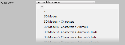
<ScrollView xmlns:android="http://schemas.android.com/apk/res/android"
	android:layout_width="fill_parent"
	android:layout_height="wrap_content" >
<LinearLayout xmlns:android="http://schemas.android.com/apk/res/android"
	android:layout_width="wrap_content"
	android:layout_height="wrap_content"
	android:orientation="vertical"
	android:gravity="center_horizontal"
	android:padding="10dp" >
</LinearLayout>
</ScrollView>

Inside the Linear Layout, first add an explanatory text-field:

<TextView
	android:layout_width="wrap_content"
	android:layout_height="wrap_content"
	android:text="@string/color"
	android:textStyle="italic" />

Add the specified string to your strings values file:

<string name="color">Choose a color scheme:</string>

Back in the layout for the color chooser, add an Image Button for each color scheme you want to use. We will be using three options:

<ImageButton
	android:id="@+id/colors_0"
	android:layout_width="75dp"
	android:layout_height="75dp"
	android:scaleType="fitXY"
	android:background="#00000000"
	android:contentDescription="@string/colors0"
	android:onClick="setColors"
	android:padding="5dp"
	android:src="@drawable/colors0"
	android:tag="#000000 #ffffff" />
<ImageButton
	android:id="@+id/colors_1"
	android:layout_width="75dp"
	android:layout_height="75dp"
	android:scaleType="fitXY"
	android:background="#00000000"
	android:contentDescription="@string/colors1"
	android:onClick="setColors"
	android:padding="5dp"
	android:src="@drawable/colors1"
	android:tag="#ffffff #000000" />
<ImageButton
	android:id="@+id/colors_2"
	android:layout_width="75dp"
	android:layout_height="75dp"
	android:scaleType="fitXY"
	android:background="#00000000"
	android:contentDescription="@string/colors2"
	android:onClick="setColors"
	android:padding="5dp"
	android:src="@drawable/colors2"
	android:tag="#ffcc00 #000099" />

Take a moment to look over this code. Each Image Button has an ID with an incrementing integer suffix. The onClick attribute specifies a method which will execute in the Activity using this layout whenever users click a button. Each button also has a tag representing the two colors for the scheme as hexadecimal strings. When the user clicks a button, the setColors method will execute (we will write it later) – from there the Java code will be able to retrieve the tag, which tells us the colors to set for text and background. You can create your own button images or use these:

Color Scheme 1 Color Scheme 2 Color Scheme 3

You need a copy of each image in each drawables folder in your app directory – you can copy them into each folder in your Eclipse workspace directory. If you are creating your own button images, you can tailor them to different screen sizes. Once you have the images in your drawables folders you can refresh the project in Eclipse to update it. Add the three strings indicated to your strings values file:
<string name="colors0">Black on White</string>
<string name="colors1">White on Black</string>
<string name="colors2">Yellow on Blue</string>

We are going to apply a theme to the Activity when we write the Manifest file, so it will appear as follows:

Color Scheme Settings

Step 4: Edit the Project Manifest

Let’s round part 1 off by editing the project Manifest file. Open it in Eclipse by double-clicking it in the application package. Choose the XML tab to edit the code directly. We need user permission to write to external storage, which is what we are going to do when users export their drawings. Inside the Manifest element but outside the application element, add the permission element:

<uses-permission android:name="android.permission.WRITE_EXTERNAL_STORAGE"/>

The app is going to have three Activities – the main Activity, the color chooser and one which will launch when the user wants to load a saved image. After the existing Activity element in your Manifest, add the other two inside the application element:

<activity android:name=".ColorChooser" android:theme="@android:style/Theme.Dialog"></activity>
<activity android:name=".PicChooser" android:theme="@android:style/Theme.Dialog"></activity>

These two will appear as pop-up style screens on top of the main Activity screen. We will create the Activity and layout for the “PicChooser” screen when we build the database elements of the project. The source code download contains the full Manifest file if you need to check yours (it may vary slightly depending on which ADT version you are using and what options you chose when creating the project). If you run your application now you will see the editable text-field but none of the buttons will function yet.

Conclusion

That’s our project set up and ready for building the application logic. Use the attached source code download to check your code if you are unsure about any of it. In the next part we will handle exporting the user’s entered artwork as an image file and implement the color scheme configuration feature. In the following two parts we will implement the saving, deleting and loading functions, all of which will use an SQLite database.


Viewing all 1836 articles
Browse latest View live