Quantcast
Channel: Envato Tuts+ Code - Mobile Development
Viewing all 1836 articles
Browse latest View live

Corona SDK: Build a Snake Game – Interface Creation

$
0
0

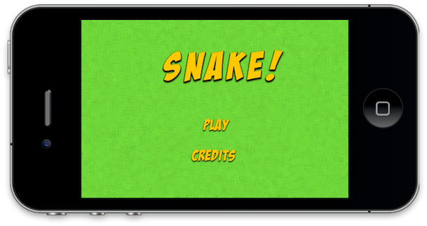
In this tutorial series, you’ll learn how to create a game like Snake. The objective of the game is to grab the apples on screen to raise the score. Read on!


Step 1: Application Overview

Build a Snake Game

Using pre-made graphics we will code an entertaining game using Lua and the Corona SDK API’s.

The player will be able to hit a puck by dragging the paddle on the screen, you can modify the parameters in the code to customize the game.

Step 2: Target Device

The first thing we have to do is select the platform we want to run our app within, this way we’ll be able to choose the size for the images we will use.

The iOS platform has these characteristics:

  • iPad 1/2: 1024x768px, 132 ppi
  • iPad 3: 2048×1536, 264 ppi
  • iPhone/iPod Touch: 320x480px, 163 ppi
  • iPhone 4/iPod Touch: 960x640px, 326 ppi
  • iPhone 5/iPod Touch: 1136×640, 326 ppi

Because Android is an open platform, there are many different devices and resolutions. A few of the more common screen characteristics are:

  • Asus Nexus 7 Tablet: 800x1280px, 216 ppi
  • Motorola Droid X: 854x480px, 228 ppi
  • Samsung Galaxy SIII: 720x1280px, 306 ppi

In this tutorial, we’ll be focusing on the iOS platform with the graphic design, specifically developing for distribution to an iPhone/iPod touch, but the code presented here should apply to Android development with the Corona SDK as well.


Step 3: Interface

A simple and friendly interface will be used. This involves multiple shapes, buttons, bitmaps and more.

The interface graphic resources necessary for this tutorial can be found in the attached download.


Step 4: Export Graphics

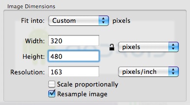
Depending on the device you have selected, you may need to export the graphics in the recommended ppi, you can do that in your favorite image editor.

I used the Adjust Size… function in the Preview app on Mac OS X.

Remember to give the images a descriptive name and save them in your project folder.


Step 5: Sound

We’ll use Sound Effects to enhance the feeling of the game, the sounds used in this app were generated by AS3SFXR.


Step 6: App Configuration

An external file will be used to make the application go fullscreen across devices, the config.lua file. This file shows the original screen size and the method used to scale that content in case the app is run in a different screen resolution.

application =
{
    content =
    {
        width = 320,
        height = 480,
        scale = "letterbox"
    },
}

Step 7: Main.lua

Let’s write the application!

Open your prefered Lua editor (any Text Editor will work, but you won’t have syntax highlighting) and prepare to write your awesome app. Remember to save the file as main.lua in your project folder.


Step 8: Code Structure

We’ll structure our code as if it were a Class. If you know ActionScript or Java, you should find the structure familiar.

Necesary Classes
Variables and Constants
Declare Functions
    contructor (Main function)
    class methods (other functions)
call Main function

Step 9: Hide Status Bar

display.setStatusBar(display.HiddenStatusBar)

This code hides the status bar. The status bar is the bar on top of the device screen that shows the time, signal, and other indicators.


Step 10: Background

A simple graphic is used as the background for the application interface, the next line of code stores it.

-- Graphics
-- [Background]
local bg = display.newImage('bg.png')

Step 11: Title View

This is the Title View, it will be the first interactive screen to appear in our game, these variables store its components.

-- [Title View]
local titleBg
local playBtn
local creditsBtn
local titleView

Step 12: Credits View

This view will show the credits and copyright of the game, this variable will be used to store it.

-- [CreditsView]
local creditsView

Step 13: Game Background

This image will be placed on top of our previous background. The following lines also store the graphics for the on-screen pad.

-- [Game Background]
local gameBg
-- [Pad]
local up
local left
local down
local right

Step 14: Apple

This is the apple graphic, referenced in the next variable. Grabbing these items will increase the snake size/parts.

-- [Apple]
local apple

Step 15: Head

The first part of the snake, it will be in the stage at start. A hit area will be created on top of it and both will be grouped in the head variable.

-- Head
local headGFX
local headHitArea
local head

Step 16: Snake Part

This graphic will be added each time the snake eats an apple.


Step 17: Score

The next line handles the textfield that will display the scores.

--  Score
local score

Step 18: Variables

This are the variables we’ll use, read the comments in the code to know more about them.

-- Variables
local dir --current direction of the snake
local started --used to start the timer
local timerSrc
local speed = 500
local mConst = 17 --# of pixels to move every timer count
local apples --apples group
local lastPart --last part added to snake
local firstPart
local parts -- parts group
local current = 0 --a number assigned to each part

Step 19: Declare Functions

Declare all functions as local at the start.

-- Functions
local Main = {}
local startButtonListeners = {}
local showCredits = {}
local hideCredits = {}
local showGameView = {}
local gameListeners = {}
local movePlayer = {}
local hitTestObjects = {}
local update = {}

Step 20: Constructor

Next we’ll create the function that will initialize all the game logic:

function Main()
	-- code...
end

Step 21: Add Title View

Now we place the TitleView in the stage and call a function that will add the tap listeners to the buttons.

function Main()
	titleBg = display.newImage('titleBg.png', display.contentCenterX - 100.5, 40.5)
	playBtn = display.newImage('playBtn.png', display.contentCenterX - 27, display.contentCenterY + 10)
	creditsBtn = display.newImage('creditsBtn.png', display.contentCenterX - 48, display.contentCenterY + 65)
	titleView = display.newGroup(titleBg, playBtn, creditsBtn)
	startButtonListeners('add')
end

Next Time…

In this part of the series you’ve learned the interface and the basic setup of the game. In the next and final part of the series, we’ll handle the Snake movement, collision detection, and the final steps to take prior to app release like testing, creating a start screen, adding an icon and, finally, building the app. Stay tuned for the final part!


On Working with Web Services

$
0
0

This article is an exploration of web service protocols, common data interchange formats, and best practices. If you’re interested in creating performant mobile applications that connect to the web, read on!


Choosing a Protocol and Data Format

Selecting a proper protocol and data interchange format to pass data between your mobile app and the ‘net is one of the most important decisions to make during the development process. The most common and widely used protocols are REST, XML-RPC, and SOAP.

All of these protocols transport data over the HTTP protocol. The XML-RPC and SOAP protocols are XML-based, while REST services can rely on different data formats, the two most common being XML and JSON. SOAP in particular is widely appreciated and adopted by enterprise applications because it strictly enforces data models and it describes public interfaces through WSDL, thus making some development tools (such as Microsoft Visual Studio for .NET) able to automatically set up objects and methods to consume the services just by adding a reference to the service WSDL to the project.

XML however is by-design less efficient than JSON when operating in a bandwidth limited network scenario like mobile development. Mobile data networks (WWANs) are usually less reliable than wired (LAN) or wireless (WLAN) networks because clients on-the-move may easily drop in-and-out of coverage areas. Also, some users do not subscribe to “flat” data plans and are actually charged by network traffic.

So, while developing for mobile you should always opt for simplicity and traffic reduction.

Let’s compare plain XML to JSON with an example response:

XML

<ServiceResponse>
	<ReturnValue>Hello, device!</ReturnValue>
</ServiceResponse>

JSON

{
    returnValue: "Hello, device!"
}

As you can see, JSON carries a smaller payload because it just needs to wrap its data with brackets (curly for objects, square for arrays) and quotes, while XML needs a full root node and opening-closing tags for each element or group. Saving on those tags can significantly trim down the response payload, and the more data you are transferring, the larger the payload “padding” will be with XML.

Moreover, SOAP and XML-RPC require more complex XML data structures (like the SOAP “envelope”), adding extra weight to the payload.

For this reason, I recommend choosing JSON for your app’s data interchange format and REST for the transfer protocol unless XML, SOAP or XML-RPC are explicitly required for your needs. Should you need to enforce a data model, you can achieve that with JSON as well by using the JSON Schema or WSDL 2.0.

For references and further reading about the discussed protocols and data formats, check out the following:


Network Security Considerations

Since most web services operate over public networks, protecting the data that will be exchanged between the services and the app is one of the most critical issues you need to address. Many web services provide remote functionality to authenticated users, so private user data and authentication credentials need to be transferred over the network as well.

Personal data, account data, and credentials should never travel in cleartext form over a public network, so this means your Web Services and apps should implement cryptography. The good news is that most common protocols transport data over HTTP, so you can rely on the well known, trusted, and robust HTTP SSL/TLS protocol (HTTPS) that enjoys widespread support both server-side and client-side.

Enabling SSL on common web servers is fairly easy (there are a lot of useful resources for Apache, IIS, and Nginx). All you need to do is buy an SSL certificate and set it up on your server. In a worst case scenario, you could also issue a self-signed certificate that will bring you free encryption, but I would not recommend doing so. Some CAs issue low-priced certificates, and the benefits you gain from working with a trusted, signed certificate are worth the extra cost (i.e. preventing man-in-the-middle attacks by utilizing the PKI). Using self-signed certificates could also require extra coding or even application-specific “hacks”, since some network libraries will refuse untrusted HTTPS connections (check these articles about Android, #1 and #2, and about iOS).

Enabling SSL on client side is a no-brainer: common programming languages typically have HTTP classes and libraries that provide native HTTP-SSL support and will “automagically” take care of encryption just by using “https://” URLs rather than “http://” URLs to consume web services.

If you opt for a low priced SSL certificate, just make sure that the devices and operating systems you want to develop for have the issuer CA root certificate bundled in out-of-the-box, otherwise they will not trust the certificate.

You should never ask users to patch, alter or hack their systems in order to run your apps, and if you do, do not expect many of them to comply.

Web Service Authentication

Authentication for REST Based Services

Token Based Authentication

Web Services transactions are meant to be atomic, interoperable and scalable, so Web Services are usually stateless (check this interesting discussion about the meaning of “stateless” connections).

Many web services provide user-related functionality and access to sensitive information. Naturally, doing so requires authentication. Because such transactions are stateless, you traditionally needed to sign requests with a user-specific key, providing authentication with each remote method call. Even when transferring data over HTTPS, user credentials are at the most risk when they are transmitted over a public network. Encryption is sometimes broken.

This dilemma is where token-based authentication like OAuth comes in handy. Using token-based authentication, you need to send a user’s credentials only once. If the user is authenticated successfully, they will be provided with tokens that can be used to authenticate subsequent remote method calls.

A token’s validity spans over a limited lifetime and can be revoked anytime by its issuer (i.e. server-side). With token-based authentication, you can also share the same user credentials between different apps and services without the linked services/apps ever knowing the real user credentials. Further, this authentication method safely keeps a local cache of the credentials on the user’s device, so that the user can be “remembered” and will not need to authenticate each time he will use the app (typing complex passwords on handhelds can be a real pain and can badly damage app reviews).

OAuth Based Authentication

OAuth is the most common token-based auth framework and it has been adopted by big players like Google, Twitter, Facebook, and so on. By allowing users to reuse their existing accounts, skipping annoying registration forms and keeping control over access to their personal data you can significantly increase your user base.

Some OAuth providers require their own SDK to be imported in your apps to enable authentication, otherwise there are a lot of ready-made OAuth libraries around that you can plug into your app. There are also frameworks like oauth-php available to build custom OAuth providers.

I would suggest signpost as an Android OAuth client library and oauthconsumer for iOS.

All these libraries come with useful examples and are easy to implement. However, building the signpost sources on your machine or importing them into your app can be a bit of a pain, but you don’t actually need to go through that process. Instead, you can just import the JAR binaries into your project and you should be set. On iOS, this would be similar to importing a static library (*.a file) into your project.

Authentication for SOAP Based Services

The most common authentication method for SOAP based services is a SOAP extension called HTTP Basic Authentication (sometimes called Digest Authentication). This is a standard, well-supported procedure that is integrated in all the most common web servers like Apache, Nginx, and IIS. It is based on a username-password pair which has to be sent to the server through HTTP headers.

Normally, you will not have to manually implement basic auth in your applications, as it is widely supported in the most common programming languages as well. The .NET framework relies on the NetworkCredential class to supply basic and digest auth credentials to HTTP requests, PHP supports it through cURL, and Java through Authenticator.

Should you have to implement Basic Auth yourself, you just need to add this header to your requests:

Basic username:password

The “username” and “password” values need to be base64-encoded.

Please notice that HTTP Basic Auth is best used in combination with the HTTPS protocol, as it transfers credentials in plaintext form. Digest Auth is a little safer, because it actually hashes the password value, but HTTPS is recommended anyway to avoid hash bruteforce attacks.

More details and specs on this subject can be found in the IETF RFC 2617 memo.

Native Platform Authentication Libraries

When choosing an authentication method or integrating well-known services (such as social networks), you should also take into account the native libraries which are built into many advanced platforms like iOS and Android. This can save you a lot of time and many lines of code.

Android provides a nice framework to centralize user account managment, the AccountManager class. The official Android Developer guide provides some nice documentation for this class, along with some tips to integrate OAuth 2 or write your own “Custom Account Type”.

With iOS 6, Apple has introduced a new Social Framework to integrate major services like Twitter, Facebook, and Sina Weibo at an OS level. Even if you don’t need to integrate these services into your application, you might find a suitable way to take advantage of the built-in authentication methods via customization.


Optimization Tips

Data Compression

When developing for mobile applications, it’s important to keep your data payloads as low as possible. This section will discuss several strategies for doing so.

Archiving Data

ZIP compression can significantly reduce text and also binary data weight, and is well-supported on most platforms, so make good use of it if you need to transfer large data over mobile networks. Useful libraries to manage ZIP files are available for Android (i.e. Decompress) and iOS (i.e. Ziparchive).

Efficient Media Streaming

Should you need to stream audio/video content to your mobile apps, choose advanced streaming platforms that allow them to scale streams depending on network/device performance, such as Apple’s HTTP Live Streaming (HLS) protocol. Otherwise, favoring responsiveness over media quality is usually a good choice. Play around with different video and audio compressors and settings, optimizing as much as you can. You could also group devices by kind (small-screen handhelds, wide-screen handhelds, and tablets) and deliver different content for each kind.

The Problem with HD

Many mobile devices feature HD displays, but is HD content on small screens really worth the extra bandwidth overhead? Be honest about the relevance of media quality in your apps and try to find the best balance between quality and weight.

Local Caching

Let’s suppose you are to code a reader app for an online newspaper. First of all, you should always let your users operate offline whenever possible. While some apps do always require an active network (i.e. messaging services), many others should use the network only to download data packages and cache them on the device.

This will improve application performance, save user’s money on non-flat mobile data plans, and make the app usable when the network is not available (e.g. during flight).

When downloading content on devices that mount external storage (e.g. memory cards), you should let users choose where to store downloaded content (i.e. internal or external storage) or simply prefer external storage anyway. Entry level devices usually feature rather small internal storage and may become unstable or slow when internal storage is full. If your apps are taking up a lot of storage space, they are likely to be uninstalled to save room.

Chunking Data

Let’s go back to the reader app example. Each article is a single piece, and although articles could be linked together, there is no reason why you should not let users begin reading articles even while additional content is still downloading. So, pack each article’s files (text, pictures, attachments and media) in separate ZIP archives and provide a web service method for the app to retrieve the list of available articles. Have your app download ZIP packages one-by-one and then make them available in the app as soon as each one has been downloaded and while others are being downloaded in the background. This is a great performance and user experience improvement compared to waiting until the entire payload has downloaded! You could also let users choose which packages they want to download or not (allowing them to save space, time, and traffic) and allow them to remove single packages to save storage space without removing the whole app.

The following is a response from the demo server app bundled with this article:

{
	apiversion: 1,
	status: 0,
	packages:
		[
			{
				file: "pack01_01_01.zip",
				package: "pack01",
				appversion: 1,
				revision: 1
			},
			{
				file: "pack01_02_01.zip",
				package: "pack01",
				appversion: 2,
				revision: 1
			},
			{
				file: "pack02_01_01.zip",
				package: "pack02",
				appversion: 1,
				revision: 1
			}
		]
}

Change Management

Keep in mind that your app and previously released content could evolve over time.

Provide a “revision” flag for each package in the list method, this will come in handy to release updates, fix bugs in the content, and implement autoupdate functionality in your apps. Even if you are not currently planning to implement auto-update, think forward and put the revision flag in your list anyway for future development.

You should also include an “app-version” flag in your packages list. Should you issue a new major release of your app that carries breaking changes in content format, this will let you provide content for both newer and older apps through the same Web Service.


Fault Tolerance and Remote Data Recovery

While developing service-based apps, network and device fault tolerance should also be taken into account. Mobile data connections are usually less stable than cabled ones, apps can be uninstalled and reinstalled and devices can be lost, replaced with newer ones or factory-restored. Users should be given the possibility to restore apps and content in an easy way and platform developers are offering several useful ready-made solutions to these issues.

Monitoring Network Status

Remember to always check network status before calling remote services, or carefully handle network I/O errors and properly inform your users when the desired task cannot be accomplished due to the lack of an active data connection. Should your apps need to always “work online”, you may want to put a watchdog in your apps that constantly monitors network status and fire an event whenever a change occurs. You may also want to inform users of possible extra costs when transferring large amounts of data over 3G or roaming networks rather than Wi-Fi.

On Android devices, this task can be accomplished through ConnectivityManager, and through SCNetworkReachability on iOS (also check the provided sample app).

Restore Content and Settings

Both Android and iOS provide useful APIs to handle remote cloud backup of user app data that you should keep in mind. Check the iCloud API documentation for iOS and the Android Backup Service documentation for Android. Together with built-in backup services, you also get good data security features. However, you must be careful not to overload backup services with redundant or unnecessary backups.

You could also implement custom remote data backup in your web services, but I strongly recommend you to stick to standards and built-in platform APIs. They will usually save you time and they are actively maintained by platform software engineers. OS patches are also more likely to be promptly installed when released.

Restoring In-App Purchases

If you deliver paid content through in-app billing in your app, allowing users to recover their purchases after app reinstalls and device recoveries is mandatory. Fortunately, iOS and Android do have built-in APIs to handle this scenarios as well.

When your in-app-purchase-enabled apps run for the first time (or the first time after a reinstall), you should run a purchase-restore check procedure. Both iOS and Android provide nice official documentation regarding this matter.

When developing for Android, remember that only “managed” items can be restored at a later time, and they are only available on a one-time-per-use purchase. This implies some considerations that apply to iOS development as well.

Let’s suppose you are to develop a role-playing game and want to allow players to buy items like health potions through in-app billing. First of all, since users can buy as many potions as they want, they cannot be “managed” items, so their purchase transactions are not permanently stored. Also, if a user buys 20 potions and uses 10, then uninstalls and reinstalls the game at a later time, restoring purchases through a simple, standard procedure would place 20 potions back into the user’s inventory, 10 of them being an unintended free gift from the developers.

So, you may need to implement your own custom Web Services and app methods to handle transaction storage and recovery in complex scenarios or edge cases.


Designing for the Future

Deadlines and budgets will often cut you off and not let you follow all the best practices explained in this article. But even if you are forced to stick to a smaller subset of features, think forward, spend some time in good design, and pack your methods and classes into libraries that you can reuse and extend later. Leave stubs when you feel there is room for further development. Also try to enforce backwards compatibility when you extend and improve your libraries, so that older applications can be patched as well.

This is an example of a stub:

public void sendData(Object data) {
         if (validate(data)) {
                 client.send(data);
         }
}
// Stub
public boolean validate(Object data) {
         // TODO - Implement data validation
         return true;
}

Conclusion: Where to Go From Here?

If you are a novice developer or have never developed service based applications, you should start from the provided sample application as a good exercise to improve your knowledge and turn it into a real-world application applying all the concepts explained in this article one at a time. Alternatively, start a new application from scratch and integrate it with some existing service provider (Facebook, Twitter, Last.fm, or Dropbox would be a good starting point) following the same schedule.

If you have already developed some service and network based applications, you could review your existing code and improve them according to the principles explained above, keeping track of each improvement and impact on performance and responsiveness.

Don’t forget to check out the linked resources also, as they will take you deeper into the core of each issue, and to download the sample server and client applications provided with the article.


Build an ASCII Art Editor: Image Export & User Configuration

$
0
0

The Android platform offers a wide range of storage options for use within your apps. In this tutorial series, we are going to explore some of the data storage facilities provided by the Android SDK by building a simple project: an ASCII art editor.

In the first part of this series we created our user interface elements, including a main Activity with a text-field for users to enter their characters and a configuration Activity in which the user will be able to choose color settings. In this installment, we are going to implement this user configuration choice as well as allowing users to export their artworks as PNG images, with the resulting files saved to the external Pictures directory on the SD card. In the final two parts of the series we will be working with an SQLite database to save, load, and delete the user’s artwork.

The outline for this series is as follows:

  • Building the User Interface
  • Image Export and User Configuration
  • ASCII Picture Database Creation and Querying (Pending Publication)
  • Saving and Deleting ASCII Pictures (Pending Publication)

Step 1: Respond to Settings Button Click

Let’s start with the user configuration settings. In your app’s main Activity, before the onCreate method, add a variable to represent the editable text-field:

private EditText textArea;

You will need to add an import:

import android.widget.EditText;

Inside onCreate, after you set the content view, retrieve a reference to the text-field so that we will be able to apply the display settings:

textArea = (EditText)findViewById(R.id.ascii_text);

This is the ID we gave the editable text-field in the XML layout file. Next, retrieve a reference to the Settings button and detect clicks:

Button setBtn = (Button)findViewById(R.id.set_colors_btn);
setBtn.setOnClickListener(this);

You will need the following import added:

import android.widget.Button;

Extend your Activity class declaration opening line to handle clicks as follows:

public class MainActivity extends Activity implements OnClickListener {

Alter the class name if you chose a different one. This requires another import:

import android.view.View.OnClickListener;

Now your class must provide the onClick method, so add it after the onCreate method:

public void onClick(View v) {
}

This method is going to handle various button clicks, so we will be adding code to it throughout the series. You will need the following import:

import android.view.View;

Inside the onClick method, we need to tailor what happens to whatever button has been clicked, as we will be handling more than one:

if(v.getId()==R.id.set_colors_btn) {
}

This is the Settings button we included in our main layout file last time.


Step 2: Start the Settings Activity

We created the Activity to handle user configuration choices last time, so let’s start it running now from our main Activity, inside the onClick “if” statement block:

Intent colorIntent = new Intent(this, ColorChooser.class);
this.startActivityForResult(colorIntent, COLOR_REQUEST);

You will need this import:

import android.content.Intent;

We start an Intent for the Activity we created to handle user color scheme choice. In that Activity, we are going to let the user choose an option and return the result to the main Activity, which is why we use startActivityForResult. We will retrieve the result in the onActivityResult method which we will add next. But first, we need to be able to identify which Activity we are returning from, so we pass a constant as the second parameter to the startActivityForResult method. Add the constant at the top of your class declaration, before the onCreate method:

private final int COLOR_REQUEST=1;

Now add the onActivityResult method after the onClick method:

protected void onActivityResult(int requestCode, int resultCode, Intent data) {
}

Inside this class, we will handle data returned from the Settings chooser Activity (and later from the Activity in which the user chooses a saved picture to load). Inside the method, check that we are returning from the Color Chooser Activity and that we have a valid result:

if (requestCode == COLOR_REQUEST) {
	if(resultCode == RESULT_OK){
	}
}

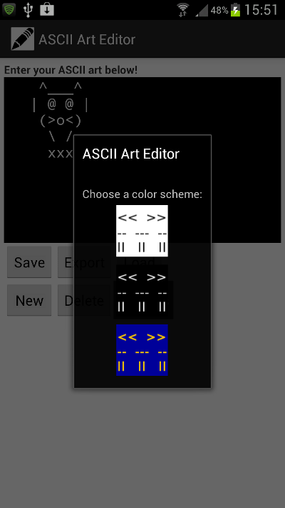
When the user clicks the Settings button, the chooser Activity will start. The user will choose a color scheme and the chooser Activity will finish, returning data representing the user choice to the main Activity, since this is where the chooser Activity was started from. On returning to the main Activity, the onActivityResult method will execute, so we can implement the user choice here (which we will do soon).

Settings Activity

Step 3: Detect User Settings Choices

Now let’s turn our attention to the chooser Activity in which the user can make a color scheme selection. Open your “ColorChooser” Activity. The onCreate method should already be complete. Remember that when we added the Image Buttons representing each color scheme to the “color_choice” XML layout file, we specified “setColors” as their onClick attribute and included a tag representing the two HEX colors for text and background – take a look at the “color_choice.xml” markup now to check this. When users click the Image Buttons, Android will execute the specified method in the Activity hosting the layout. Add the method to your “ColorChooser” Activity after onCreate:

public void setColors(View view){
}

Add the following imports to the class:

import android.view.View;
import android.content.Intent;

Inside the “setColors” method, first retrieve the tag from the View that has been clicked:

String tagInfo = (String)view.getTag();

The tag has the following format: “#000000 #ffffff” – split the two colors into a String array:

String[] tagColors = tagInfo.split(" ");

Now we want to pass this data back to the main Activity so that we can apply the color scheme settings to the user interface elements there. To do this we use an Intent:

Intent backIntent = new Intent();

Add the two colors as extra data:

backIntent.putExtra("textColor", tagColors[0]);
backIntent.putExtra("backColor", tagColors[1]);

The first color represents the text and the second is for the background. Set the return Intent result:

setResult(RESULT_OK, backIntent);

Return to the Activity that called this one by finishing:

finish();

The two HEX color Strings will be passed to the onActivityResult method in the main Activity class.


Step 4: Apply the Color Scheme

Back in your main Activity onActivityResult method, inside the two “if” statement blocks we added to detect returns from the chooser Activity, retrieve the Strings we passed back:

String chosenTextColor = data.getStringExtra("textColor");
String chosenBackColor = data.getStringExtra("backColor");

Let’s use a helper method to set the colors so that we can carry out the same process elsewhere:

updateColors(chosenTextColor, chosenBackColor);

Add the helper method after the onActivityResult method:

private void updateColors(String tColor, String bColor){
}

Inside this method, we can now set the colors for the editable text-field text and background:

textArea.setTextColor(Color.parseColor(tColor));
textArea.setBackgroundColor(Color.parseColor(bColor));

This requires another import:

import android.graphics.Color;
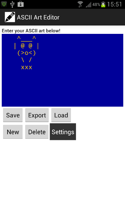
Color Scheme Applied

Step 5: Update the Shared Preferences

We’ve updated the appearance of the text-field to suit the user’s choice, but we want to remember the choice so that each time they run the app it will be observed. Let’s add an instance variable at the top of the class so that we can refer to the Shared Preferences anywhere:

private SharedPreferences asciiPrefs;

Add the import if necessary:

import android.content.SharedPreferences;

In onCreate, after the existing code, get the Shared Preferences, using a name of your choice (you must use the same name each time you retrieve the preferences in your app):

asciiPrefs = getSharedPreferences("AsciiPicPreferences", 0);

Back in the onActivityResult method, after you call the helper method, get the Shared Preferences Editor:

SharedPreferences.Editor prefsEd = asciiPrefs.edit();

Pass the data representing the user’s choice and commit it to the app’s preferences:

prefsEd.putString("colors", ""+chosenTextColor+" "+chosenBackColor);
prefsEd.commit();

We specify a name for the preference data item and pass the two Strings concatenated into one, with a space character between them. This is a typical use of Shared Preferences, which are intended for key-value pairs of primitive type values, so are commonly used for configuration settings.


Step 6: Check the Shared Preferences

We want the user to see their chosen color scheme whenever they run the app in the future, so we need to check their choice when the Activity starts. In the onCreate method, after retrieving the Shared Preferences:

String chosenColors = asciiPrefs.getString("colors", "");

We pass the key String we used when saving the user choice. The user may not yet have saved a preference, so apply the color settings inside a conditional statement:

if(chosenColors.length()>0){
String[] prefColors = chosenColors.split(" ");
updateColors(prefColors[0], prefColors[1]);
}

We split the color String again and call the helper method to apply the settings.


Step 7: Handle Export Button Clicks

Remember that we included an Export button for users to save their artworks as image files. In your main Activity’s onCreate method, detect clicks on it:

Button saveImgBtn = (Button)findViewById(R.id.export_btn);
saveImgBtn.setOnClickListener(this);

Now add an “else if” inside the onClick method:

else if(v.getId()==R.id.export_btn) {
saveImg();
}

This is going to be another helper method so add it to your class file after the “updateColors” method:

private void saveImg(){
}

Step 8: External Storage Availability

The Android system runs on many different devices, and we can’t take anything for-granted about what facilities the user has. Before you attempt to write anything to external storage, you must first check that it is available. Inside the new helper method, add a check on the user’s storage state using the Environment:

String state = Environment.getExternalStorageState();

You need an import for this:

import android.os.Environment;

Now add a conditional test on the result, so that we can tailor what happens next:

if (Environment.MEDIA_MOUNTED.equals(state)) {
}
else {
}

The “if” block will export the image to external storage, with the “else” block handling situations in which there is no storage available. In such a case all we want to do is write an error message to the user letting them know we can’t export the image – inside the “else” block:

Toast.makeText(this.getApplicationContext(), "Sorry - you don't have an external" +
	" storage directory available!", Toast.LENGTH_SHORT).show();

Add the required import:

import android.widget.Toast;

Step 9: Export the Image File

Now let’s handle cases in which external storage is available. Add the following imports for the file output operation:

import java.io.File;
import java.io.FileOutputStream;
import java.util.Date;
import android.graphics.Bitmap;
import android.graphics.Bitmap.CompressFormat;

Back in the helper method for saving pictures, inside the “if” block, retrieve a reference to the Pictures directory:

File picDir = Environment.getExternalStoragePublicDirectory(Environment.DIRECTORY_PICTURES);

Now we have the first part of the path we will use to create the picture file. The image is going to contain the visible content of the editable text-field, including the background color – i.e. it will display what you can see looking at the app screen when you export it. To achieve this we use the cache for the View:

textArea.setDrawingCacheEnabled(true);
textArea.buildDrawingCache(true);
Bitmap bitmap = textArea.getDrawingCache();

This sets up the editable text-field View to be drawable, then saves its current appearance as a Bitmap using the drawing cache.

Now we need to give our file a name, so let’s use the current date and time to make each one unique, appending some informative text and the image file extension:

Date theDate = new Date();
String fileName = "asciipic"+theDate.getTime()+".png";

Here we specify the filename, now let’s create the file using it together with the path to the Pictures directory:

File picFile = new File(picDir+"/"+fileName);

Since we are going to do some file I/O we need try and catch blocks:

try {
}
catch (Exception e) { e.printStackTrace(); }

This allows the program to keep running if something goes wrong with the input/ output operations. Inside the try block, create the file and pass it to an output stream:

picFile.createNewFile();
FileOutputStream picOut = new FileOutputStream(picFile);

Compress the Bitmap and write it to the output stream, saving the result as a boolean:

boolean worked = bitmap.compress(CompressFormat.PNG, 100, picOut);

Output a message to the user depending on the result of the write operation:

if(worked){
	Toast.makeText(getApplicationContext(), "Image saved to your device Pictures " +
		"directory!", Toast.LENGTH_SHORT).show();
}
else {
	Toast.makeText(getApplicationContext(), "Whoops! File not saved.",
		Toast.LENGTH_SHORT).show();
}

Now close the file:

picOut.close();

We can free the resources being used for the drawing cache, after the catch block:

textArea.destroyDrawingCache();

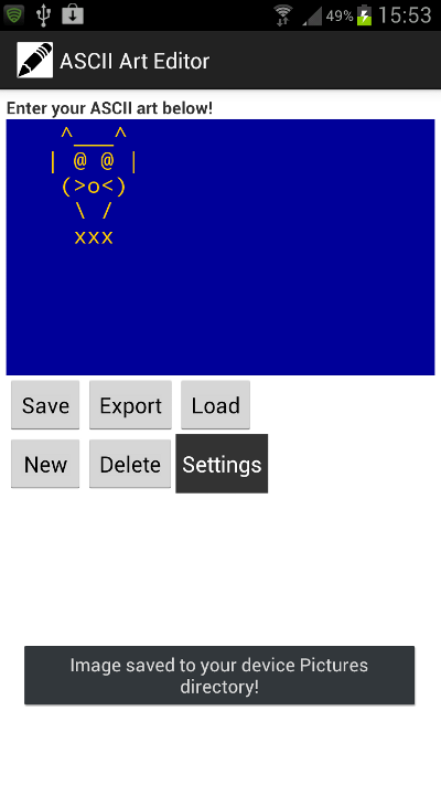
That’s the file output operation complete. The user can view their exported artwork as an image by browsing their device Pictures folder at any time.

Exporting the Image

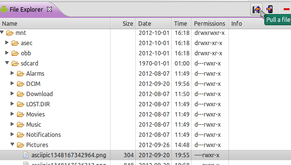
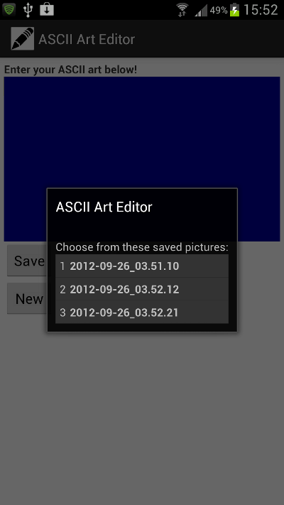
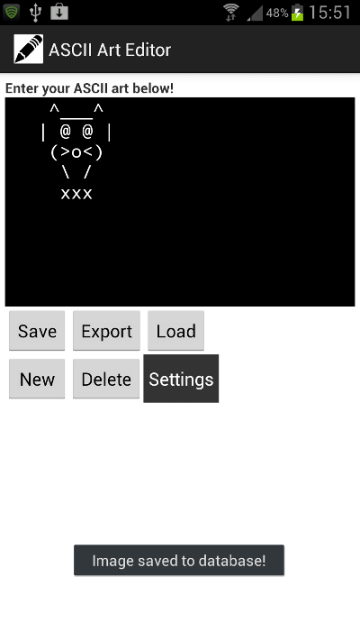
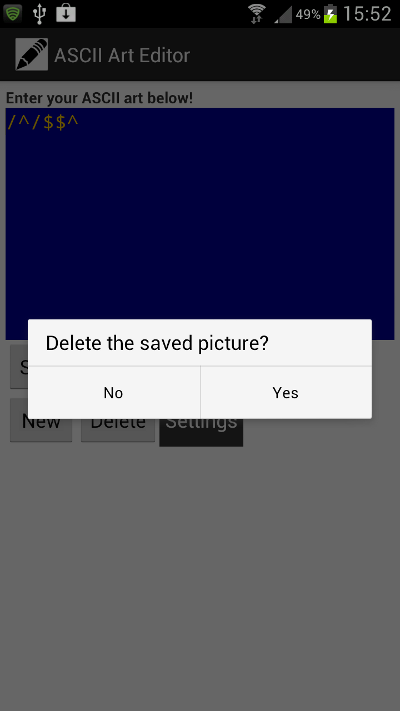
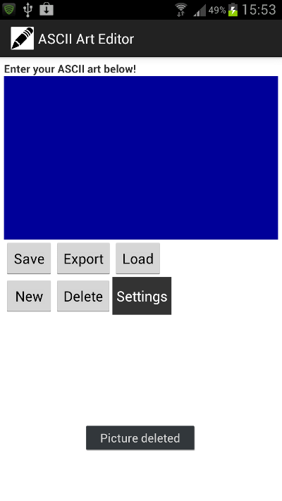
Tip:If you’re running your app on the emulator in Eclipse, you can set it up to contain external storage by editing the AVD and entering the amount of storage space in the SD Card “Size” field. Once you have the AVD running, run your app on it and export an image. In Eclipse, open the DDMS perspective from the Window, Open Perspective menu. Select the device and browse to the Pictures directory (mnt/sdcard/Pictures). You should see any pictures written by the app in this folder. To pull one from the virtual device, select it and click the “Pull a file from the device” button to save and view it on your computer.

Pulling a File From the Device

Conclusion

That’s the user configuration and image export part of the app complete. If you run the app now you should be able to set the color scheme and export images to the SD card (as long as there is one present). Check the source code download if you’re unsure about anything. We’ve used external storage and Shared Preferences in this tutorial. In the next parts we will build an SQLite database, using inserts, queries and updates on it to handle the user saving, loading, deleting and editing their ASCII artworks.


Build a Snake Game – Adding Interaction

$
0
0

In this tutorial series, you’ll learn how to create a game like Snake. The objective of the game is to grab the apples on screen to raise the score. Read on!


Where We Left Off. . .

Please be sure to check part 1 of the series to fully understand and prepare for this tutorial.


Step 1: Start Button Listeners

This function adds the necesary listeners to the TitleView buttons.

function startButtonListeners(action)
	if(action == 'add') then
		playBtn:addEventListener('tap', showGameView)
		creditsBtn:addEventListener('tap', showCredits)
	else
		playBtn:removeEventListener('tap', showGameView)
		creditsBtn:removeEventListener('tap', showCredits)
	end
end

Step 2: Show Credits

The credits screen is shown when the user taps the about button, a tap listener is added to the credits view to remove it.

function showCredits:tap(e)
	playBtn.isVisible = false
	creditsBtn.isVisible = false
	creditsView = display.newImage('credits.png', display.contentCenterX - 110, display.contentHeight+40)
	transition.to(creditsView, {time = 300, y = display.contentHeight-20, onComplete = function() creditsView:addEventListener('tap', hideCredits) end})
end

Step 3: Hide Credits

When the credits screen is tapped, it’ll be tweened out of the stage and removed.

function hideCredits:tap(e)
	playBtn.isVisible = true
	creditsBtn.isVisible = true
	transition.to(creditsView, {time = 300, y = display.contentHeight+creditsView.height, onComplete = function() creditsView:removeEventListener('tap', hideCredits) display.remove(creditsView) creditsView = nil end})
end

Step 4: Show Game View

When the Start button is tapped, the title view is tweened and removed revealing the game view. There are many parts involved in this view so we’ll split them in the next steps.

function showGameView:tap(e)
	transition.to(titleView, {time = 300, x = -titleView.height, onComplete = function() startButtonListeners('rmv') display.remove(titleView) titleView = nil end})

Step 5: Add Game Background

This code places the game background in the stage.

	-- [Add GFX]
	-- Game Bg
	gameBg = display.newImage('gameBg.png')

Step 6: Add Game Pad

In order to move the snake in the screen we’ll need a game pad, this will take care of that. A tap listener will be added later to each arrow to handle the movement.

-- Pad
up = display.newImage('up.png', 33.5, 219.5)
left = display.newImage('left.png', 0, 252.5)
down = display.newImage('down.png', 33.5, 286.5)
right = display.newImage('right.png', 66.5, 252.5)
up.name = 'up'
down.name = 'down'
left.name = 'left'
right.name = 'right'

Step 7: Score Text

This line adds the score textfield:

-- Score Text
score = display.newText('0', 74, 3, native.systemFontBold, 15)
score:setTextColor(252, 202, 1)

Step 8: Head

Next we add the snake’s head. As mentioned in the previous tutorial, a hit area will be added on top of it and then both will be stored in a group.

-- Head
headGFX = display.newImage('head.png', display.contentCenterX-0.3, display.contentCenterY-0.2)
headHitArea = display.newLine(display.contentCenterX+6, display.contentCenterY-0.2, display.contentCenterX + 8, display.contentCenterY-0.2)
headHitArea:setColor(0, 0, 0)
headHitArea.width = 2
head = display.newGroup(headGFX, headHitArea)
lastPart = head
parts = display.newGroup()

Step 9: Initial Apple

The first apple is added by this code at a random position.

	-- Add first apple
	local randomX = 25 + math.floor(math.random() * 402)
	local randomY = 25 + math.floor(math.random() * 258)
	local apple = display.newImage('apple.png', randomX, randomY)
	apples = display.newGroup(apple)
	gameListeners()
end

Step 10: Game Listeners

This function adds the necessary listeners to start the game logic.

function gameListeners()
	up:addEventListener('tap', movePlayer)
	left:addEventListener('tap', movePlayer)
	down:addEventListener('tap', movePlayer)
	right:addEventListener('tap', movePlayer)
end

Step 11: Move Player Function

The direction variable is changed by this function, this will make the snake go in the pressed direction.

function movePlayer(e)
	dir = e.target.name
	if(started == nil) then
		timerSrc = timer.performWithDelay(speed, update, 0)
		started = true
	end
end

Step 12: Hit Test Objects

We’ll use an excellent and useful function for collision detection without physics, you can find the original example and source at the CoronaLabs Code Exchange website.

function hitTestObjects(obj1, obj2)
        local left = obj1.contentBounds.xMin <= obj2.contentBounds.xMin and obj1.contentBounds.xMax >= obj2.contentBounds.xMin
        local right = obj1.contentBounds.xMin >= obj2.contentBounds.xMin and obj1.contentBounds.xMin <= obj2.contentBounds.xMax
        local up = obj1.contentBounds.yMin <= obj2.contentBounds.yMin and obj1.contentBounds.yMax >= obj2.contentBounds.yMin
        local down = obj1.contentBounds.yMin >= obj2.contentBounds.yMin and obj1.contentBounds.yMin <= obj2.contentBounds.yMax
        return (left or right) and (up or down)
end

Step 13: Get Head Last Position

We capture the snake’s head last position to update the parts position, each one replacing the x and y coordinates of the other.

function update()
	-- Capture head last position, this moves the first added piece
	local lastX = head.x
	local lastY = head.y
	local xPos = {}
	local yPos = {}

Step 14: Move Parts

This complements the behavior explained in the past step.

	for i = 1, parts.numChildren do
		-- Capture parts position to move them
		xPos[i] = parts[i].x
		yPos[i] = parts[i].y
		-- Move Parts
		if(parts[i-1] == nil) then
			parts[i].x = lastX
			parts[i].y = lastY
		else
			parts[i].x = xPos[i-1]
			parts[i].y = yPos[i-1]
		end

Step 15: Check for Game Over

The game ends when the snake’s head touches another part of the snake. A sound is played as feedback.

-- Game over if head touches other part of snake
		if(hitTestObjects(headHitArea, parts[i])) then
			print(parts[i].name)
			if(parts[i].name == '1') then
				print('one')
			else
				timer.cancel(timerSrc)
				timerSrc = nil
				audio.play(gameOver)
			end
		end

Step 16: Move Head

These lines move the head according to the direction stablished by the movePlayer function created in step 11.

-- Move Head & Hit Area
if(dir == 'up') then
    head.y = head.y - mConst
    headHitArea.x = headGFX.x
    headHitArea.y = headGFX.y - 7
elseif(dir == 'left') then
    head.x = head.x - mConst
    headHitArea.x = headGFX.x - 8
    headHitArea.y = headGFX.y
elseif(dir == 'down') then
    head.y = head.y + mConst
    headHitArea.x = headGFX.x
    headHitArea.y = headGFX.y + 8
elseif(dir == 'right') then
    head.x = head.x + mConst
    headHitArea.x = headGFX.x + 7
    headHitArea.y = headGFX.y
end

Step 17: Apple-Head Collision

Several actions occurr when the snake eats an apple we will go through them in the following steps.

First we remove the apple.

-- Detect apple-player collision
for i = 1, apples.numChildren do
    if(hitTestObjects(head, apples[i])) then
        -- Remove Apple
        display.remove(apples[i])

Step 18: Update Score

Next we update the score textfield and play a sound to indicate that the apple has been eaten.

-- Add Score
score.text = score.text + tostring(10)
score:setReferencePoint(display.TopLeftReferencePoint)
score.x = 74
audio.play(appleGrab)

Step 19: Add the Snake Part

Then a new part is added to the snake. Its position is calculated by the last part added (the first time is the head) and then they are added to a group.

-- Add snake body
local part = display.newImage('bodyPart.png')
if(dir == 'up') then
    part.x = lastPart.x
    part.y = lastPart.y + mConst
elseif(dir == 'left') then
    part.x = lastPart.x + mConst
    part.y = lastPart.y
elseif(dir == 'down') then
    part.x = lastPart.x
    part.y = lastPart.y - mConst
elseif(dir == 'right') then
    part.x = lastPart.x - mConst
    part.y = lastPart.y
end
current = current + 1
part.name = tostring(current)
lastPart = part
parts:insert(part)

Step 20: New Apple

Lastly, we create a new apple and place it in a random position in the stage.

      -- Add new apple
      local randomX = 25 + math.floor(math.random() * 402)
      local randomY = 25 + math.floor(math.random() * 258)
      local apple = display.newImage('apple.png', randomX, randomY)
      apples = display.newGroup(apple)
  end
end

Step 21: Screen Limits

This makes the snake appear on the other side of the stage.

	-- Screen Limits
	if(head.x < 0) then
		head.x = display.contentWidth - mConst
	elseif(head.x > display.contentWidth) then
		head.x = 0
	end
	-- Vertical
	if(head.y < 0) then
		head.y = display.contentHeight - mConst
	elseif(head.y > display.contentHeight) then
		head.y = 0
	end
end

Step 22: Call Main Function

In order to start the game, the Main function needs to be called. With the above code in place, we’ll do that here:

Main()

Step 23: Loading Screen

The Default.png file is an image that will be displayed right when you start the application while the iOS loads the basic data to show the Main Screen. Add this image to your project source folder, it will be automatically added by the Corona compliler.


Step 24: Icon

Using the graphics you created before you can now create a nice and good looking icon. The icon size for the non-retina iPhone icon is 57x57px, but the retina version is 114x114px and the iTunes store requires a 512x512px version. I suggest creating the 512×512 version first and then scaling down for the other sizes.

It doesn’t need to have the rounded corners or the transparent glare, iTunes and the iPhone will do that for you.


Step 25: Testing in Simulator

It’s time to do the final test. Open the Corona Simulator, browse to your project folder, and then click open. If everything works as expected, you are ready for the final step!


Step 26: Build

In the Corona Simulator go to File > Build and select your target device. Fill the required data and click build. Wait a few seconds and your app will be ready for device testing and/or submission for distribution!


Conclusion

Experiment with the final result and try to make your custom version of the game!

I hope you liked this tutorial series and find it helpful. Thank you for reading!


Build an iOS Music Player – Tuts+ Premium

$
0
0

This three-part tutorial series will teach you how to build a custom music player with the iOS SDK. Read on!


Tutorial Teaser

Step 1: Updating the Storyboard

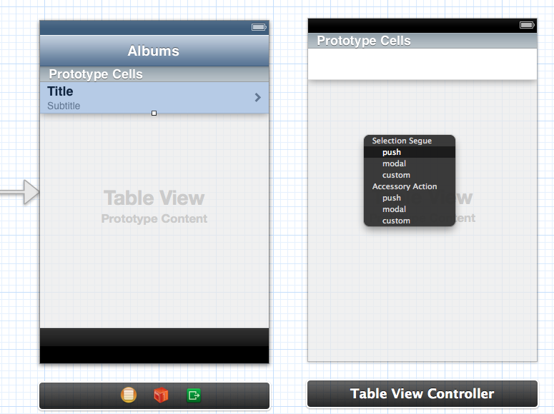
Open the storyboard and drag a table view controller from the Object Library to the canvas. We will use this Table View Controller to show a single album. CTRL-drag from the cell in the Albums Table View Controller to the new Table View Controller we just added and select “push” under the “Selection Segue” section from the pop-up menu.

    Segue

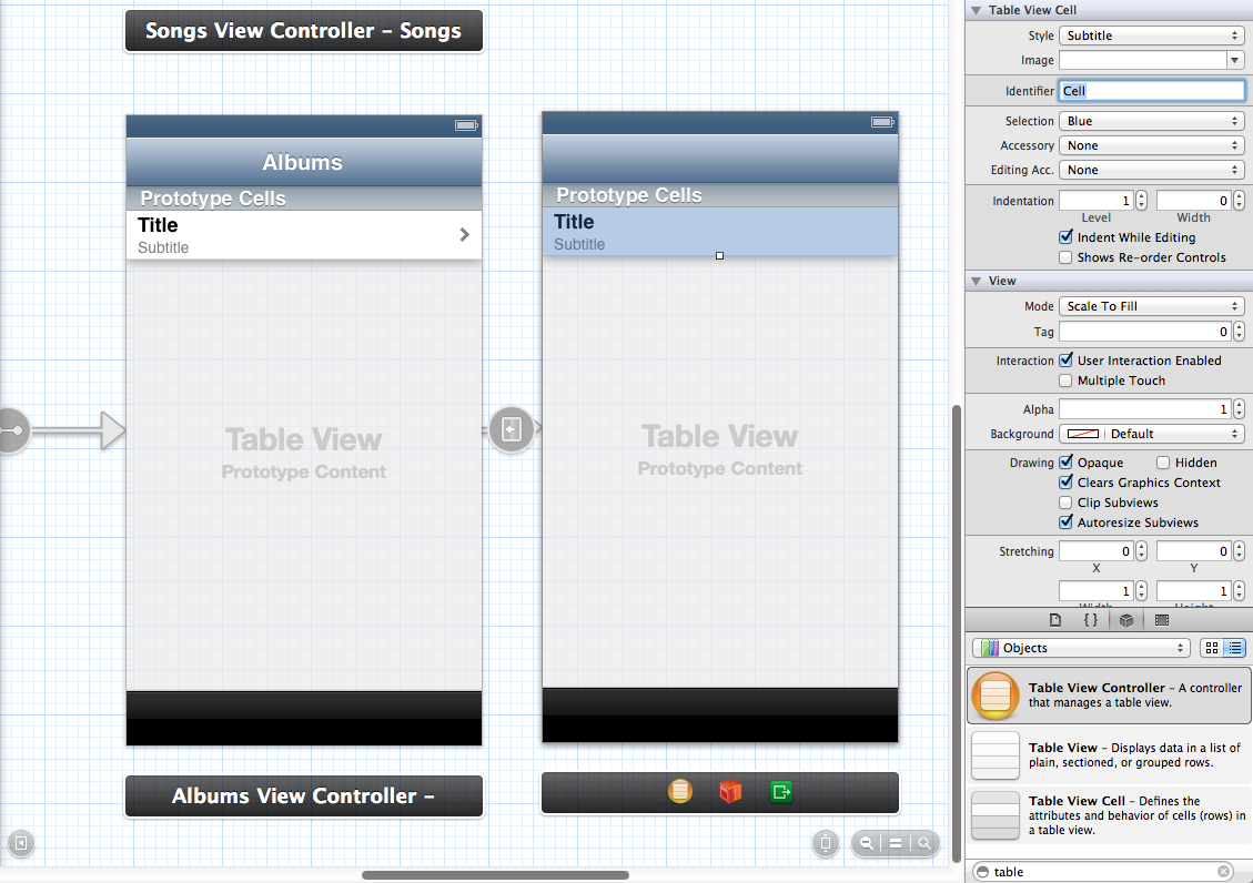
Now we are going to create our cells.The first cell in the table view will contain some information about the album, such as the artwork, the album artist, the duration of the album, and the number of songs on the album. The other cell will contain the songs from the album. Select the cell and open the Attributes Inspector. Set the Identifier to “Cell” and change the Style from “Custom” to “Subtitle”.

    Songs Cell

Now that we have created the cell for the songs, drag a new table view cell from the Object Library on top of the cell we just edited. Change it’s Selection Style from “Blue” to “None” and set the Identifier to “InfoCell”. After that, open the Size Inspector and change the Row Height to 120.

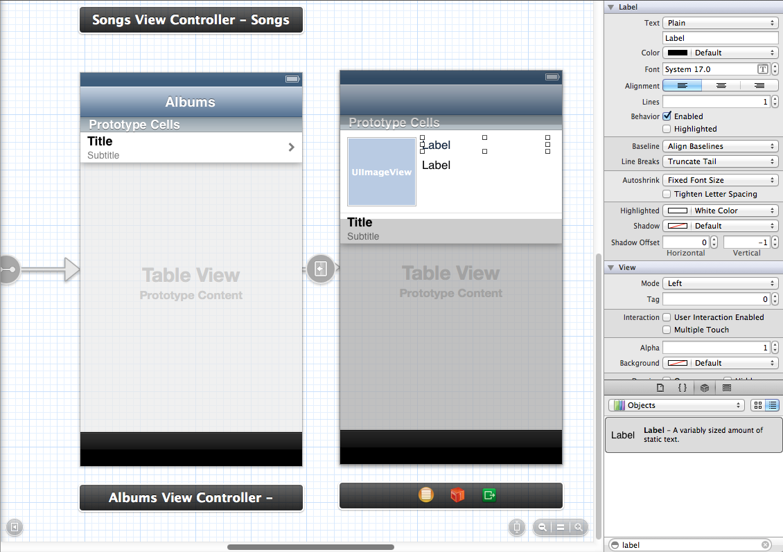
In this cell, we will need an image view for the artwork and two labels for the information. So, first, drag an Image View into the cell and change its size to 100×100. Also change the X and Y properties to 10. After that, drag the two labels in the cell and align them like the image below:

    Album Information Cell

Select the first label, open the Attributes Inspector, and then change the Font to “System Bold 17.0″. Next, delete the text from both the labels and change the tag from the first label to 101 and the tag from the second label to 102. At last, select the image view and change its tag to 100. We will use these tags to adjust the labels and image view in the tableView:cellForRowAtIndexPath: method.

Step 2: Display a Selected Album

Go to “File” > “New” > “File…” to create a new file. Select “Objective-C class” and then click “Next”. Enter “AlbumViewController” for the class and make sure that it’s a subclass of UITableViewController and that both the checkboxes are not selected. Click “Next” again and than click “Create”.

Open AlbumViewController.h and modify the code to read as follows:

#import <UIKit/UIKit.h>
#import <MediaPlayer/MediaPlayer.h>
@interface AlbumViewController : UITableViewController
{
    NSString *albumTitle;
}
@property NSString *albumTitle;
@end

Here, we basically just add the MediaPlayer framework to our table view controller and we create an NSString which will contain the album title. We will update this string when the user selects an album.

Now open AlbumsViewController.m and add the following line under #import "AlbumsViewController.h":

#import "AlbumViewController.h"

After that, add the following method:

- (void) prepareForSegue:(UIStoryboardSegue *)segue sender:(id)sender
{
    AlbumViewController *detailViewController = [segue destinationViewController];
    MPMediaQuery *albumsQuery = [MPMediaQuery albumsQuery];
    NSArray *albums = [albumsQuery collections];
    int selectedIndex = [[self.tableView indexPathForSelectedRow] row];
    MPMediaItem *selectedItem = [[albums objectAtIndex:selectedIndex] representativeItem];
    NSString *albumTitle = [selectedItem valueForProperty:MPMediaItemPropertyAlbumTitle];
    [detailViewController setAlbumTitle:albumTitle];
}

Here we pass the title of the selected album to the detailViewController, which is the AlbumViewController. The storyboard will call this method at runtime when you trigger a segue in the current scene (i.e. when the user selects an album).

Now open AlbumViewController.m and add the following line under the @implementation:

@synthesize albumTitle;

After that, go to the viewDidLoad method and change it to read as follows:

- (void)viewDidLoad
{
    [super viewDidLoad];
    self.title = albumTitle;
}

Here, we simply set the the title of the navigation bar to the selected album title.

Now that we have created a new screen for the selected album, I think it’s a good idea to test the app. Click Build and Run to test the app. If you go to the albums tab and select an album, you will go to a new screen with an empty table view, but the title of the navigation bar should be the same as the selected album.


Get the Full Series!

This tutorial series is available to Tuts+ Premium members only. Read a preview of this tutorial on the Tuts+ Premium web site or login to Tuts+ Premium to access the full content.


Joining Tuts+ Premium. . .

For those unfamiliar, the family of Tuts+ sites runs a premium membership service called Tuts+ Premium. For $19 per month, you gain access to exclusive premium tutorials, screencasts, and freebies from Mobiletuts+, Nettuts+, Aetuts+, Audiotuts+, Vectortuts+, and CgTuts+. You’ll learn from some of the best minds in the business. Become a premium member to access this tutorial, as well as hundreds of other advanced tutorials and screencasts.


Titanium Mobile: Create a Sliding Menu for iOS

$
0
0

This tutorial will teach you how to build a sliding menu similar to the one featured in the Facebook application using Titanium Mobile.


Step 1: Getting Started

The sliding menu consists of a full-sized window (the main window) on top of a smaller one that contains a table view (the menu). To create the sliding effect, we’ll have to trigger an animation that will track and follow a touch event horizontally. However, let’s save that for later. For now, we’ll start by setting up the windows.

First, we’ll create the menu:

//// ---- Menu window, positioned on the left
var menuWindow = Ti.UI.createWindow({
	top:0,
	left:0,
	width:150
});
menuWindow.open();
//// ---- Menu Table
// Menu Titles
var menuTitles = [
	{title: 'Menu 1'},
	{title: 'Menu 2'},
	{title: 'Menu 3'},
	{title: 'Menu 4'},
	{title: 'Menu 5'},
	{title: 'Menu 6'}
];
// Tableview
var tableView = Ti.UI.createTableView({
	data:menuTitles
});
menuWindow.add(tableView);

This is a very basic table view setup, but it will do. So you should now have something like the following:


Step 2: Main Window

Now we need a window with a navigation bar and a button in it that will allow us to open the menu with an animation. So, in order to achieve this, we actually need two windows: one containing a navigationGroup (indispensable in order to have a navigation bar) and another one that is in the navigationGroup:

//// ---- Window with navigationGroup
var navWindow = Ti.UI.createWindow({
    width:320 // Set the width of the sliding window to avoid cut out from animation
});
navWindow.open();
// Main window
var win = Ti.UI.createWindow({
	title:'Main Window',
	backgroundColor:'#28292c',
	barColor:'#28292c'
});
// NavigationGroup
var navGroup = Ti.UI.iPhone.createNavigationGroup({
	window:win
});
navWindow.add(navGroup);
// Top left button
var menuButton = Ti.UI.createButton({
	title:'Menu',
	toggle:false // Custom property for menu toggle
});
win.setLeftNavButton(menuButton);

Hey, you probably noticed that toggle:true property in our button, right? It doesn’t really exist; it’s a custom property that I added. You can pretty much name it however you want or even create a variable for it (like var toggle = true;) if it makes you feel more comfortable. However, I recommend you use this little trick because it is really handy when you have a lot of custom properties in your app.

Here is our main window:


Step 3: Toggle Menu

Okay, now we’re going to animate our window so it slides from left to right when we press the “Menu” button.

Let’s see how it works:

menuButton.addEventListener('click', function(e){
	// If the menu is opened
	if(e.source.toggle == true){
		navWindow.animate({
			left:0,
			duration:400,
			curve:Ti.UI.ANIMATION_CURVE_EASE_IN_OUT
		});
		e.source.toggle = false;
	}
	// If the menu isn't opened
	else{
		navWindow.animate({
			left:150,
			duration:400,
			curve:Ti.UI.ANIMATION_CURVE_EASE_IN_OUT
		});
		e.source.toggle  = true;
	}
});

You see that when we click the button, we call function(e), where e is our object (the button). By calling e.source.toggle, we are checking the custom “toggle” property discussed above (you can also use menuButton.toggle, it’s the same thing). If it is false, we’re moving our window to the right and switching the property to true. So, of course, if it’s true, the window goes back to normal and our property is then set to false again.

The curve:Ti.UI.ANIMATION_CURVE_EASE_IN_OUT is just a way to smooth the animation.


Step 4: Tracking

Yeah, this is looking pretty neat, right? But that was the easy part, because now we are getting serious! We’ll track a touch event so that we can reveal the menu by moving the main window horizontally. But before that, we’ll add some custom properties:

// Main window
var win = Ti.UI.createWindow({
	title:'Main Window',
	backgroundColor:'#28292c',
	barColor:'#28292c',
	moving:false, // Custom property for movement
	axis:0 // Custom property for X axis
});

Again, you can name these properties however you want, or you can even create dedicated variables for them, but I strogly recommend you use this method because it saves memory and it is easier to read than a bunch of variables scattered over your nice file.

Now we’re going to use the touchstart event to get the position of our finger when it touches the screen:

win.addEventListener('touchstart', function(e){
	// Get starting horizontal position
	e.source.axis = parseInt(e.x);
});

Here we take the horizontal coordinate (e.x) of our event, parse it as an integer, and then save it in our custom property axis.

Next we are going to animate the window depending on the position of our finger:

win.addEventListener('touchmove', function(e){
	// Subtracting current position to starting horizontal position
	var coordinates = parseInt(e.globalPoint.x) - e.source.axis;
	// Detecting movement after a 20px shift
	if(coordinates > 20 || coordinates < -20){
		e.source.moving = true;
	}
	// Locks the window so it doesn't move further than allowed
	if(e.source.moving == true && coordinates <= 150 && coordinates >= 0){
		// This will smooth the animation and make it less jumpy
		navWindow.animate({
			left:coordinates,
			duration:20
		});
		// Defining coordinates as the final left position
		navWindow.left = coordinates;
	}
});

To prevent the window from moving everytime we touch it, we are waiting for a movement over 20 pixels before animating. We track our touch coordinate with e.globalPoint.x and subtract it to our starting point (axis) so we can move the window. Also, it can not slide beyond the menu width (150 pixels) or beyond the left side of the screen.


Step 5: Back to Normal

If you try to run your app, you’ll see that your window will stay exactly where you leave it. That’s not what we want. We need to reposition it when the touch event is over, so it will open/close itself depending on where it is:

win.addEventListener('touchend', function(e){
	// No longer moving the window
	e.source.moving = false;
	if(navWindow.left >= 75 && navWindow.left < 150){
		// Repositioning the window to the right
		navWindow.animate({
			left:150,
			duration:300
		});
		menuButton.toggle = true;
	}else{
		// Repositioning the window to the left
		navWindow.animate({
			left:0,
			duration:300
		});
		menuButton.toggle = false;
	}
});

When our finger no longer touches the screen, the touchend event is fired, so we can adjust the position of our window.


Conclusion

We’re done! As you see, we used a very basic animation and math to achieve a great and professional effect. I really hope you enjoyed this tutorial and learned a few new tricks!


Best of Tuts+ in October 2012

$
0
0

Each month, we bring together a selection of the best tutorials and articles from across the whole Tuts+ network. Whether you’d like to read the top posts from your favourite site, or would like to start learning something completely new, this is the best place to start!


Psdtuts+ — Photoshop Tutorials


Nettuts+ — Web Development Tutorials

  • Meet Bower: A Package Manager For The Web

    Meet Bower: A Package Manager For The Web

    As the web platform has matured, the tools for managing our projects, too, have matured. In this tutorial, I’ll introduce you to one of these tools that makes managing the dependencies of your project considerably easier: Bower.

    Visit Article

  • Make JavaScript Testing Fun With Testem

    Make JavaScript Testing Fun With Testem

    JavaScript testing is a sensitive subject. Some developers are huge advocates of it (including myself), while others don’t see the need or benefit. One huge barrier is the simple fact that it can sometimes take a considerable amount of setup to get up and running. The longer it takes, the more likely it is that the developer simply won’t bother. That’s why Testem is so fantastic; it makes testing as effortless as possible, and, more importantly, fun!

    Visit Article

  • Test Driven PHP Session

    Let’s be honest: the PHP community hasn’t been as quick to the test-driven development scene as other communities, such as those around the Ruby and Python languages. We hope to help change that on Nettuts+! In this session, you’ll learn both why and how to test-drive your applications using the fantastic PHPUnit. Ready?

    Visit Article


Vectortuts+ — Illustrator Tutorials

  • Stop Making Bad Logos

    Stop Making Bad Logos

    There’s article after article on websites that talk bout how to make a great logo. But If you’re a logo machine, and you’ve been doing it for a long time, chances are that you’ve developed some pretty awful habits. How do I know this? Because I suffered from some of the same habits I’m about to talk about. A true master of logo creation will refine their work on every project, forcing themselves to get better with each design. It all boils down to a few key things to avoid when you’re creating a logo. While you can take a stab at selling generic logos on places like GraphicRiver, you’ll do your best work when you deeply understand your clients and their company.

    Visit Article

  • How to Create a Self Portrait in a Geometric Style

    How to Create a Self Portrait in a Geometric Style

    In this tutorial we are going to talk about how to create an illustrated self portrait in a geometric based style. We are going to work from a photograph of ourselves as the base of the illustration, then drawing the sketch and to the final piece, so lets get started.

    Visit Article

  • Creating Paisley Graphic Styles with Scatter Brushes and Recolor Artwork

    Creating Paisley Graphic Styles with Scatter Brushes and Recolor Artwork

    In today’s tutorial I’m going to show you how to create a series of Paisley inspired Graphic Styles using Scatter Brushes and the Appearance panel. Once done, I’ll show you how to create additional styles simply by using Recolor Artwork. This is a great tutorial for beginners as there is no Pen Tool (P) involved. So let’s begin!

    Visit Article


Webdesigntuts+ — Web Design Tutorials


Phototuts+ — Photography Tutorials

  • How to Make Fantastically Fun Jack ‘O Lantern Photos

    How to Make Fantastically Fun Jack ‘O Lantern Photos

    “Trick or treat!” Halloween is knocking on the door. It is a very popular holiday in many countries. It brings the spirit of mystic, fear, magic and fairy. Halloween can be a great inspiration for shooting some beautiful lights -” all those jack-o-lanterns and candles.

    Visit Article

  • How to Create a Sense of Depth to Your Photos

    How to Create a Sense of Depth to Your Photos

    Today we will take a look at how to add some sense of depth to your photographs and thus make them become alive and more interesting to the viewer. By making use of some simple but very effective factors that can be applied at the time of exposure, you can make a your picture pop. Today, we’ll talk about perspective, depth of field, and framing.

    Visit Article

  • Dealing With Foliage: Green and Yellow Saturation

    Dealing With Foliage: Green and Yellow Saturation

    I’ve noticed around the internet that a great many people struggle with foliage. A large number of people don’t even seem to notice that there’s an issue, which is unfortunately falsely backed up by the legions of commenters trying to be nice rather than truthful. The problem persists for all levels of photographers, from year one amateurs to multi-year pros.

    Visit Article


Cgtuts+ — Computer Graphics Tutorials

  • Creating The iPhone 4S In 3D Studio Max, Part 4 Texturing & Rendering with V-Ray

    Creating The iPhone 4S In 3D Studio Max, Part 4 Texturing & Rendering with V-Ray

    In the fourth part of the iPhone series we’ll begin creating textures and the many shaders needed for our model. While most will be procedural materials, a few of the elements do require image based textures, so we’ll first tackle the uvmapping on these elements. We’ll then move on and construct a studio lighting rig using V-Ray lights and introduce image based lighting to the scene. Along the way we’ll rely heavily on the power of V-Ray’s RT engine to fine tune our materials, lighting and render settings to balance the scene and achieve the look we’re after for our final render.

    Visit Article

  • Creating an Ice Cream Bar Animation with Maya, RealFlow And AE – Part 1

    Creating an Ice Cream Bar Animation with Maya, RealFlow And AE – Part 1

    Hey folks, in this three part tutorial spanning both Cgtuts+ and Aetuts+, we are going to create liquid chocolate pouring over a branded ice cream bar. To achieve this we will use Maya for mashing and rendering. RealFlow for the chocolate simulation. And finally in After Effects we’ll create the chocolate chunks and glow streaks swoosh, as well as the final compositing.

    Visit Article

  • Create a High Impact Faux Energy Drink Ad with 3D Studio Max, Cinema 4D & AE – Tuts+ Premium

    Create a High Impact Faux Energy Drink Ad with 3D Studio Max, Cinema 4D & AE – Tuts+ Premium

    In this tutorial we are going to create from start to finish an interesting short four shot ad cut for a fake energy drink ’Envato Energy”. This will give you some guidance on how to create something similar for a real life project.

    Visit Article


Aetuts+ — After Effects Tutorials


Audiotuts+ — Audio & Production Tutorials

  • How to Enhance a Live, Out-of-the-Mixer Concert Recording

    How to Enhance a Live, Out-of-the-Mixer Concert Recording

    I was playing at a concert recently where I had the fortune on getting my hands on a 2-track recording out of the FOH mixer. I playing at a festival and all the stages recorded the acts, giving them a CD at the end of their set. Usually, a recording such as this is done straight out of the L/R OUT of the mixer. All the channels of the mixer are fed to the stereo out that’s fed into a stereo recorder. The recording is then burned onto a CD for the bands to listen to.

    Visit Article

  • Essential Subtractive Synthesis: Envelopes

    Essential Subtractive Synthesis: Envelopes

    This is a series of basic synthesis workshops. We assume you’re not entirely new to synthesizers, but you’re not an expert either. Today we look at envelopes.

    Visit Article

  • Essential Listening – Getting Critical

    Essential Listening – Getting Critical

    Welcome back for another round of Essential Listening. Last time we took a look at some of the big albums of all time and how the mixes were so different, but at the same time all great. And while we will certainly revisit looking at some classic songs and albums from an engineering standpoint down the road, today is all about improving your critical listening skills.

    Visit Article


Wptuts+ — WordPress Tutorials

  • WANTED: WordPress Professionals With a Passion for Education. Enquire Within.

    WANTED: WordPress Professionals With a Passion for Education. Enquire Within.

    Are you an experienced WordPress professional with a desire to educate others on standards and best practices? If so, we’d like to speak with you about writing for Wptuts+ 1-4 times per month. We’d like you to submit at least one article a month, and you’re free to choose your topics, as long as they appeal to our audience. This is a paid job. If you’re interesting in helping educate others in The WordPress Way, read on.

    Visit Article

  • Building a Simple Announcements Plugin for WordPress

    Building a Simple Announcements Plugin for WordPress

    Let’s say that you’re a launching new product, giving away freebies or organizing an event. How do you deliver the message to your readers? Popular choice is to display a modal dialog in a lightbox, thus forcing the user to take notice. But there’s another, less obtrusive, yet still effective way, to get a user’s attention. In this tutorial we’ll be creating a plugin that displays custom site-wide announcements across the top of the page, with the ability to schedule messages to appear between two given dates.

    Visit Article

  • The Beginner’s Guide to WordPress Actions and Filters

    The Beginner’s Guide to WordPress Actions and Filters

    When it comes to professional WordPress development, it’s imperative that developers understand both actions and filters – that is, it’s important to understand WordPress hooks.

    Visit Article


Mobiletuts+ — Mobile Development Tutorials


Gamedevtuts+ — Game Development

  • Create a Glowing, Flowing Lava River Using Bézier Curves and Shaders

    Create a Glowing, Flowing Lava River Using Bézier Curves and Shaders

    Most of the time, using conventional graphic techniques is the right way to go. Sometimes, though, experimentation and creativity at the fundamental levels of an effect can be beneficial to the style of the game, making it stand out more. In this tutorial I’m going to show you how to create an animated 2D lava river using Bézier curves, custom textured geometry and vertex shaders.

    Visit Article

  • How to Learn Unity

    How to Learn Unity

    Unity is a feature rich, fully integrated development engine for the creation of interactive 3D content. You want to make 3D games? Unity’s got you covered. In this article we’ll share books, tutorials and suggestions for getting to grips with Unity.

    Visit Article

  • How Heavy Rain’s Narrative Is Strengthened by Its Gameplay

    How Heavy Rain’s Narrative Is Strengthened by Its Gameplay

    Heavy Rain received immense critical praise for being an experience that elevated video game storytelling to a new level. In this article, we’ll look at why that is and what we can learn from it.

    Visit Article


Mactuts+ — Mac & OS X

  • 5 Ways to Make Your Mac’s Desktop Better with GeekTool

    Ways to Make Your Mac’s Desktop Better with GeekTool

    GeekTool is an amazing free app that is a bit like Dashboard for the super nerdy. It allows you to place functional widgets, called “Geeklets,” right on top of your desktop, so you can always see them. Implementation can be a little tricky though so this tutorial will walk you through five different ways to use Geeklets to enhance your desktop experience.

    Visit Article

  • How to Set Up and Use VoIP on Your Mac

    How to Set Up and Use VoIP on Your Mac

    With the advent of faster broadband, the viability of using your data connection for voice communications has become increasingly reliable. VoIP has lower startup and ongoing costs than traditional, fixed-line telephones and has a wealth of flexible features that are often additional cost options from your dinosaur-era fixed-line phone network. If you are a freelancer, a business owner, or even just home user who requires a separate telephone from your home number, then VoIP is for you.

    Visit Article

  • Quick Tip: Trick Out Your Mac with Terminal

    Quick Tip: Trick Out Your Mac with Terminal

    The Mac OS X operating system is already really sleek, but we’re going to look at how to use terminal to activate some cool hidden settings that will make your Mac even better. The terminal tricks I’ll be showing you range from adding spaces to your dock to freeing your Dashboard widgets from the Dashboard. So let’s get started!

    Visit Article


FreelanceSwitch — Freelance Jobs & Information

  • How to Raise Your Freelance Pay Rates in the Next 60 Days

    Freelancers interested in earning big should always be looking for opportunities to raise rates. Luckily, if you’re reading this in the fall, you’re at one of the easiest times of year to get a raise.
    I’ll explain why in a minute.
    But first, let’s talk a little economic reality about why you need to get aggressive about asking for a raise.

    Visit Article

  • How to Set Up Your LinkedIn Profile: A Freelancer’s Guide

    LinkedIn makes sense for professionals, but what about for freelancers?
    In my experience, LinkedIn is an important tool in my marketing toolbox. Being on LinkedIn allows me to showcase my skills and experience. Additionally, LinkedIn is a networking platform, which makes it perfect for finding prospects, hooking up with new clients or reconnecting with past clients.

    Visit Article

  • How to Write an Effective Freelancer About Page

    The most visited page on most websites is the about page. That holds particularly true for freelancers — on my site, almost half of my visitors wind up there. That’s because a client looking to hire some help wants to know exactly who he’ll be working with.
    When he’s found you online, he’s not going to have a sense of who you are and why you’re worth your rates until he’s found out more. Your about page is the easiest way to do so.

    Visit Article


Build an ASCII Art Editor: Database Creation & Querying

$
0
0

The Android platform offers a wide range of storage options for use within your apps. In this tutorial series, we are going to explore some of the data storage facilities provided by the Android SDK by building a simple project: an ASCII art editor.

This tutorial series on Creating a Simple ASCII Art Editor is presented in four parts:


Step 1: Create a Database Helper Class

To manage an SQLite database in Android apps, we extend the SQLiteOpenHelper class. This class will handle database creation, so we will define the data structure within it. Create a new class in your Android project and name it “ImageDataHelper” or any other name of your choice. Extend the class declaration opening line as follows:

public class ImageDataHelper  extends SQLiteOpenHelper {

Add the following imports at the top of the class:

import android.content.Context;
import android.database.sqlite.SQLiteDatabase;
import android.database.sqlite.SQLiteOpenHelper;
import android.provider.BaseColumns;

Step 2: Define the Database Properties

Inside your database helper class, create the following variables to define the database properties. First, the database version:

private static final int DATABASE_VERSION = 1;

Next give the database a name:

private static final String DATABASE_NAME = "asciipics.db";

In order to create a reliable database model, we need an ID column, so add one using the BaseColumns constant:

public static final String ID_COL = BaseColumns._ID;

This automatically gives us a primary key column that will auto-increment. The database is going to contain a single table, so give it a name next:

public static final String TABLE_NAME = "pics";

The table will contain two columns, one for the content of the ASCII artwork, which will be a text string, and one for a name, which will appear in a list when the user attempts to load saved artworks. Define these columns now:

public static final String ASCII_COL = "ascii_text";
public static final String CREATED_COL = "pic_creation";

Now we can define the database creation string:

private static final String DATABASE_CREATE = "CREATE TABLE " + TABLE_NAME + " (" + ID_COL + " INTEGER " +"PRIMARY KEY AUTOINCREMENT, " + ASCII_COL + " TEXT, " + CREATED_COL + " TEXT);";

As you can see, the syntax involves standard SQL in this case.


Step 3: Implement Database Creation

We are going to use a Singleton design pattern for the database helper class, which you may not have come across depending on your Java experience. So that we can use the database helper in more than one Activity, while maintaining efficiency, we want to limit the app so that it can only create a single instance of the class. Add a couple more instance variables:

private static ImageDataHelper dbInstance;
private Context dbContext;

Instead of using the constructor method directly, our Activities will call a factory method we define to return an instance of the class. We will use the first variable here to store the instance, so that it is only created once. The context variable will help us to avoid memory leaks, as we are going to use the application context, rather than the context for the Activity creating the database helper object.

After the constants, add a constructor method to the database helper class:

private ImageDatabase(Context context){
	super(context, DATABASE_NAME, null, DATABASE_VERSION);
}

Notice that the constructor is private, so external code will not be able to call it directly. Now add a factory method so that your Activities will be able to create and access the single instance of this class:

public static ImageDataHelper getInstance(Context context) {
	if (dbInstance == null)
		dbInstance = new ImageDataHelper(context.getApplicationContext());
        return dbInstance;
}

This is a static method, so we will be able to access it by referring to the class itself, rather than through an instance of it. We check if the database helper instance has already been created, only calling the constructor if it has not. We use the application context for efficient memory usage and return an instance of the class. You will see how we instantiate this class from Activities soon.

We will execute creation of the database table in the onCreate method, so add it:

public void onCreate(SQLiteDatabase db) {
	db.execSQL(DATABASE_CREATE);
}

Here we pass the database table creation string. We also need to provide a method to execute when the database is upgraded:

public void onUpgrade(SQLiteDatabase db, int oldVersion, int newVersion) {
	db.execSQL("DROP TABLE IF EXISTS pics");
	db.execSQL("VACUUM");
	onCreate(db);
}

We destroy the existing table and create it again. If you want to change the structure of your database at any point, alter the database creation string and increment the version number – the onUpgrade method will execute.

That’s our database helper class complete. Now we can create an instance of the database helper from the main Activity to use it when the app runs. In your main Activity class, add a new instance variable at the top:

private ImageDataHelper imgData;

Inside the onCreate method, create an instance of the new class:

imgData = ImageDataHelper.getInstance(this);

Notice that we use the class name and the factory method to return the instance of the database helper class, this way we know the app as a whole only has at most one instance of the class.


Step 4: Handle Clicks on the Load Button

Remember that we included a Load button for users to load in previously saved artworks. In your main Activity onCreate method, listen for clicks on the button:

Button loadBtn = (Button)findViewById(R.id.load_btn);
loadBtn.setOnClickListener(this);

Now add a new section to the conditional statement in your onClick method:

else if(v.getId()==R.id.load_btn) {
}

We will add processing to this conditional block later.


Step 5: Create a Load Class

When the user clicks the Load button, we are going to launch a pop-up style Activity which will appear on top of the main Activity. This new Activity will present the list of saved artworks in the database, allowing the user to select one to load. Create a new class in your project and name it “PicChooser” or an alternative name if you prefer. Since the content of this Activity is going to be a list of artworks, we will use a ListActivity, so extend your opening declaration line:

public class PicChooser extends ListActivity {

Add the following imports to the class:

import android.app.ListActivity;
import android.content.Intent;
import android.database.Cursor;
import android.database.sqlite.SQLiteDatabase;
import android.os.Bundle;
import android.view.View;
import android.widget.SimpleCursorAdapter;
import android.widget.TextView;

We will be using the database to list the saved pictures, so add instance variables for the database, helper and a cursor to query the data:

private ImageDataHelper picDataHelp;
private SQLiteDatabase savedPictures;
private Cursor picCursor;

Add the onCreate method:

public void onCreate(Bundle savedInstanceState) {
	super.onCreate(savedInstanceState);
	setContentView(R.layout.load);
}

Step 6: Design the Load Activity Layout

Let’s add the layout we just referred to – add a new file to the “res/layout” folder and name it “load.xml” to match the code above. Add a Linear Layout to the new file:

<LinearLayout xmlns:android="http://schemas.android.com/apk/res/android"
	android:layout_width="fill_parent"
	android:layout_height="wrap_content"
	android:orientation="vertical"
	android:padding="10dp" ></LinearLayout>

Inside the layout, add an informative Text View and a List View to load the saved picture names into:

<TextView
	android:layout_width="wrap_content"
	android:layout_height="wrap_content"
	android:text="@string/load_pics"
	android:textStyle="italic" /><ListView
	android:id="@android:id/list"
	android:layout_width="fill_parent"
	android:layout_height="fill_parent" />

The List View ID will allow us to load data into it in Java. Add the display string indicated here to your “res/values/strings” XML file:

<string name="load_pics">Choose from these saved pictures:</string>

Step 7: Design the List Items

We need to define a layout for each item that will appear within the List View. Add a new layout file to your app, naming it “pic_item.xml” and including a Linear Layout:

<LinearLayout xmlns:android="http://schemas.android.com/apk/res/android"
	android:layout_width="fill_parent"
	android:layout_height="wrap_content"
	android:background="#333333"
	android:clickable="true"
	android:onClick="picChosen"
	android:orientation="horizontal"
	android:padding="5dp" ></LinearLayout>

Notice that we include an onClick attribute, specifying the name of a method we want to execute when users click the list item in question. Inside the Linear Layout, add Text Views for the ID and creation string for the picture represented:

<TextView
	android:id="@+id/picID"
	android:layout_width="wrap_content"
	android:layout_height="wrap_content"
	android:paddingRight="5dp"
	android:textStyle="italic" /><TextView
	android:id="@+id/picName"
	android:layout_width="wrap_content"
	android:layout_height="wrap_content"
	android:textStyle="bold" />

The IDs will allow us to map data from the database to these Views.


Step 8: Query the Saved Pictures

Back in your new picture chooser Activity onCreate method, after the line in which you set the new layout, create instances of the database and helper:

picDataHelp=ImageDataHelper.getInstance(this);
savedPictures=picDataHelp.getReadableDatabase();

We use the factory method again to return the database helper instance. We will use a Cursor to traverse the records in the database table, so create it now, querying everything in the “pics” table:

picCursor = savedPictures.query("pics", null, null, null, null, null, null);

Tip: In this tutorial we are using a very simple database implementation to introduce the basics of data storage on Android. However, for more complex apps you should look into the use of Content Providers for your database operations. See this post on using Content Providers and this one on loading data with Cursor Loaders and Fragments. These will allow you to develop for efficiency by shifting your data loading operations off the app’s main UI thread, but the level of complexity involved is significantly increased on the basic use we are exploring here and is therefore a little beyond the scope of this series.

For each picture in the database, we are going to list the ID and creation string. We will use a Simple Cursor Adapter to map these to the items in the List View, presenting them for users to select. We need to define the database table columns we want to display and the Views we want to map them to in the List View:

String[] columns = {ImageDataHelper.ID_COL, ImageDataHelper.CREATED_COL};
int[] views = {R.id.picID, R.id.picName};

We can refer to the column names using the public constants we created in the database helper class. The layout items are the two Text Views we included in the list item layout. Now we can create the Simple Cursor Adapter to map data to the visible user interface items:

SimpleCursorAdapter picAdapter = new SimpleCursorAdapter(this, R.layout.pic_item, picCursor, columns,
	views, SimpleCursorAdapter.FLAG_AUTO_REQUERY);

We pass the layout we created for each list item, the cursor we created to traverse the database pictures, the columns and views we want mapped. Now we can set this as the Adapter for the List Activity:

setListAdapter(picAdapter);

This will cause the names and IDs of all saved pictures to be listed within the View – next we will implement selecting one from the list to load into the text-field.


Step 9: Implement Saved Picture Selection

Remember that when we created the “pic_item” layout, we specified an onClick attribute for each item in the list. When users click a list item, the specified method will execute – the method should be included in the Activity hosting the layout, and will receive the View clicked as a parameter. Add the method to your “PicChooser” Activity class:

public void picChosen(View view){
}

The View parameter is the layout for the List Item, which contains two Text Views, one for the picture ID and one for the name. We want to get the ID of the picture selected, so inside the method, get the ID Text View from the View clicked, then its text content:

TextView pickedView = (TextView)view.findViewById(R.id.picID);
String chosenID = (String)pickedView.getText();

The ID will allow us to retrieve the picture content from the database. Now we are going to finish the picture chooser Activity and return the chosen picture ID to the main Activity. First close the database connections:

picDataHelp.close();
savedPictures.close();
picCursor.close();

We are going to start this Activity running from the main Activity class, specifying that it should return a result. When this Activity ends, the onActivityResult method will therefore execute in the main class, so we can pass it the ID of the picture chosen by the user. Create an Intent and pass the data:

Intent backIntent = new Intent();
backIntent.putExtra("pickedImg", chosenID);

Set the result:

setResult(RESULT_OK, backIntent);

Now we can finish this Activity:

finish();

Before we finish with the “PicChooser” class, we need to do a bit of housekeeping. If the user selects an image from the list, we have made sure the database connections are closed before the Activity ends. However, the user may press the back button to return to the main Activity instead of choosing a picture. In that case, we can close connections in onDestroy, just add it to the class:

@Override
public void onDestroy() {
	picCursor.close();
	picDataHelp.close();
	savedPictures.close();
	super.onDestroy();
}
Displaying the List of Stored Pictures

Step 10: Load the Chosen Picture

Now we have the facility for users to choose from the pictures stored in the database, we just need to load their chosen picture into the text-field. Back in your main Activity, add the following import statements:

import android.database.Cursor;
import android.database.sqlite.SQLiteDatabase;

In the else if you created for clicks on the load button of the click listener method, start the “PicChooser” Activity for a result:

Intent loadIntent = new Intent(this, PicChooser.class);
this.startActivityForResult(loadIntent, LOAD_REQUEST);

Note that this is similar to the code we used when launching the color configuration Activity, with a constant representing an identifier for the onActivityResult method – add the constant variable at the top of the class:

private final int LOAD_REQUEST=2;

Now when the user has picked a picture from the list displayed, their chosen picture ID will be returned to onActivityResult so let’s work on that method. After the if statement in which you handled users returning from the color chooser Activity, add an else if with a similar outline:

else if(requestCode == LOAD_REQUEST) {
	if(resultCode == RESULT_OK){
	}
}

Inside this block, get the data returned from the “PicChooser” Activity:

String pickedID = data.getStringExtra("pickedImg");

Whenever the image displayed in the text-field is stored in the database, we will keep a record of the stored picture ID. At the top of the class, add a variable to do this:

private int currentPic=-1;

Initializing it to negative one will let us check whether the current image is from the database or not. Back in onActivityResult after retrieving the data from “PicChooser”, update this variable:

currentPic=Integer.parseInt(pickedID);

We will use this when the user either deletes or edits a saved picture. Get an instance of the database from the helper:

SQLiteDatabase savedPicsDB = imgData.getWritableDatabase();

Query the database for the picture with the chosen ID:

Cursor chosenCursor = savedPicsDB.query("pics",
	new String[]{ImageDataHelper.ASCII_COL},
	ImageDataHelper.ID_COL+"=?",
	new String[]{""+currentPic},
	null, null, null);

Take a moment to look over this. The first parameter is the table, the second is a String array representing the columns we want, in this case just the text that makes up the ASCII picture. The third and fourth parameters are the selection, in SQL this would typically be a where query, with the user’s chosen picture ID to be matched in the ID column, so that we retrieve that particular picture.

There should only be a single record with the specified ID, so move the cursor to the first record retrieved:

chosenCursor.moveToFirst();

Get the text for the picture:

String savedChars = chosenCursor.getString(0);

Display the picture in the text-field:

textArea.setText(savedChars);

Close the Cursor, database and helper:

chosenCursor.close();
savedPicsDB.close();
imgData.close();

Conclusion

That’s our database set up for storing and loading pictures. Check the source code download for anything you are unsure about. At the moment, when you run the app, you will not see any saved pictures to choose from. This is because we have not yet implemented saving pictures. We’ll do that next time, in the final part of the tutorial series. We will also handle deleting pictures, creating new pictures and editing existing pictures. Then our ASCII art editor will be fully functional.


A Springboard-Like Layout With the UICollectionView Class

$
0
0

This tutorial will teach you how to use the iOS 6 UICollectionView class to build a “Springboard” layout that looks and acts like the iOS Home Screen! Along the way, you’ll gain a solid grasp of collection view fundamentals in order to create your own grid based layouts.


Project Preview


Collection View Overview

Collection Views are an exciting new addition to the UIKit API in iOS 6. Some platform pundits are of the opinion that collection views are poised to become as fundamental and pervasive a component in iOS app design as table views have been (and your author is humbly inclined to agree!). Collection views and table views share a lot of common design philosophy (not to mention a similar API) because they serve a common purpose – to present a collection of related data. It is best not to think of collection views as a replacement to table views, but rather as a new offering of a more generic and flexible architecture for interacting with non-tabular data sets.

Because collection views are intended to be flexible, extensible and configurable, the architecture and hence API may seem to be a bit daunting at first. There are a number of interacting classes that one needs to know about. Depending on how simple or complex your requirements are, you might need to subclass some of these classes to achieve the results you want. Fortunately, the API is designed from the ground up to help with that. We’ll see several concrete examples of this later in the tutorial.

Let’s start by taking a brief overview of the main classes in the collection view framework. In the collection view world, a concrete unit of data is visually encapsulated by a UICollectionViewCell instance. The UICollectionView class provides a scrollable container that holds a collection of cells. While the collection view is aware of the position of cells, their visibility (or lack thereof) is not actually the responsibility of the class. The responsibility of handling the layout falls on the shoulders of the UICollectionViewLayout class. By switching the layout class for the same collection view, we could cause the same data to be displayed in a dramatically different way.

Speaking of visual elements, besides cells there are two others: supplementary views and decoration views. Data being displayed might be logically organized into sections, and supplementary views might be used to supply section-wise “metadata” (think headers and footers in a table view). On the other hand, decoration views are “ornamental” rather than data-driven: think of the bookshelf backdrop in the iBooks app. Of course, I’ve just mentioned these for the sake of completeness. The UI for this project’s tutorial will be comprised entirely of cell elements and there won’t be any sections.

The UICollectionViewLayout is not restricted to a particular type of layout, but it ships with a subclass, UICollectionViewFlowLayout, that has been designed for constructing both line and grid-based layouts.

Much like table views, a collection view interacts with the underlying data through a data source and responds to UI events with the help of a delegate.

The layout class can manage the layout in a couple of ways – by setting global properties on cells or by means of delegation. The latter endows the layout class with finer grained control of the appearance of the UI.

There are of course some more classes to be mentioned, and I’ll come to them later.


Tutorial Approach

Let’s talk about appearances first: in this tutorial, we’re going to create a UI that looks like the iPhone/iPad home screen (also called the SpringBoard). It will be comprised of a scrollable grid of icons. Swiping left or right will present a new page of icons. Just like the SpringBoard, the interface will have a static background (a “wallpaper”) behind it. Not only that, we’ll also implement icon deletion: long-pressing on any of the icons will trigger deletion mode. The icons will then start quaking (from fear of being deleted!), and a close button will present itself on each of them. Clicking on which will cause the icon to disappear from the grid. Clicking on an icon itself will modally present a new view that can be dismissed with a button to bring back our spring board view.

Behind the scenes, the UI is supported by a very simple data model (which we shall introduce shortly). This is so that we can concentrate on the interface implementation, with minimum added complexity thrown in by the “model” end of the MVC architecture. The icons will present part of the data (like the cells do in table views) and the view presented modally upon clicking on any icon will present the rest of our data.


A Barebones Implementation

Since this is (presumably) the first time we’re designing a layout with collection views, it’s easy to get swamped with lots of interacting objects and lose the bigger picture. To avoid this, I want to kick things off with a minimalistic implementation that still fulfils our essential requirement of a grid-based scrolling layout, and then explore how we can harness the power of the collection view framework to polish our UI and introduce new features.

Fire up Xcode, create a new project with an “Empty Template” (we’ll do everything in code for this tutorial) and call it “SpringBoardLayoutTut”. Make sure it’s an iPad project, and that ARC is enabled.

New project

Deselect all modes except Portrait from “Supported Interface Orientations”.

Portrait mode

Replace all the code in AppDelegate.m with the following:

#import "AppDelegate.h"
@interface ViewController : UICollectionViewController
@end
@implementation ViewController
- (void)viewDidLoad
{
    [super viewDidLoad];
    [self.collectionView registerClass:[UICollectionViewCell class] forCellWithReuseIdentifier:@"ID"];
}
// collection view data source methods ////////////////////////////////////
- (NSInteger)collectionView:(UICollectionView *)collectionView numberOfItemsInSection:(NSInteger)section
{
    return 100;
}
- (UICollectionViewCell *)collectionView:(UICollectionView *)collectionView cellForItemAtIndexPath:(NSIndexPath *)indexPath
{
    UICollectionViewCell *cell = [collectionView dequeueReusableCellWithReuseIdentifier:@"ID" forIndexPath:indexPath];
    UILabel *label = [[UILabel alloc] initWithFrame:cell.bounds];
    label.textAlignment = NSTextAlignmentCenter;
    label.text = [NSString stringWithFormat:@"%d", indexPath.row];
    [cell.contentView addSubview:label];
    return cell;
}
/////////////////////////////////////////////////////////////////////////////////
// collection view delegate methods ////////////////////////////////////////
- (void)collectionView:(UICollectionView *)collectionView didSelectItemAtIndexPath:(NSIndexPath *)indexPath
{
    NSLog(@"cell #%d was selected", indexPath.row);
}
/////////////////////////////////////////////////////////////////////////////////
@end
@implementation AppDelegate
{
    ViewController *vc;
}
- (BOOL)application:(UIApplication *)application didFinishLaunchingWithOptions:(NSDictionary *)launchOptions
{
    self.window = [[UIWindow alloc] initWithFrame:[[UIScreen mainScreen] bounds]];
    UICollectionViewFlowLayout *layout = [[UICollectionViewFlowLayout alloc] init];
    vc = [[ViewController alloc] initWithCollectionViewLayout:layout];
    // setting cell attributes globally via layout properties ///////////////
    layout.itemSize = CGSizeMake(128, 128);
    layout.minimumInteritemSpacing = 64;
    layout.minimumLineSpacing = 64;
    layout.scrollDirection = UICollectionViewScrollDirectionHorizontal;
    layout.sectionInset = UIEdgeInsetsMake(32, 32, 32, 32);
    /////////////////////////////////////////////////////////////////////////////
    self.window.rootViewController = vc;
    self.window.backgroundColor = [UIColor whiteColor];
    [self.window makeKeyAndVisible];
    return YES;
}
@end

Build the app. You should get a (very) basic grid interface.

Very basic grid UI

The above code is only meant to illustrate that a basic grid layout is available pretty much out-of-the-box with the UICollectionViewFlowLayout class. It is not meant to illustrate how you would actually structure your code; that’s what the rest of the tutorial is for!

If you know your table views, a lot of the above code should look familiar.

Our root view controller is an instance of UICollectionViewController, which comes with a UICollectionView instance as its view, and is, by default, set to be the collection view’s data source and delegate. We register the UICollectionViewCell class with the collection view controller and give it an identifier. The UICollectionViewCell is meant to be subclassed, as we shall soon, which is why the registration/identification step is needed. We also create an instance of the UICollectionViewFlowLayout, set it as our collection view’s layout, and set some properties on it defining how our cells will be sized and positioned on the grid. Our “data” just consists of a hundred integers. Note the familiar cell dequeuing step from table views, which recycles cells that have been moved off-screen to save on memory and cell creation. Unlike in iOS 5, the -dequeueReusableCellWithReuseIdentifier: method automatically returns a new cell if none exist in the reuse queue. When a cell is due to appear on the screen, a label is attached to it that displays one of the numbers from our integer list. Clicking on a cell just gives an acknowledgement in the form of a log message.

To reiterate, the point of the above code was just to show you that the basic grid layout is very easy to achieve with collection views and the flow layout class.

The rest of the tutorial is focused on making the UI look pretty, as well as more interactive and functional.


Creating a Simple Data Model

Let’s get down to business. We’ll start by creating a very simple data model, which consists of an array containing the names of all the font families installed on iOS, and a dictionary containing the fonts themselves, keyed by their respective font families.

Create an NSObject subclass called SimpleModel and replace the contents of SimpleModel.h and SimpleModel.m with the following:

// SimpleModel.h
#import <Foundation/Foundation.h>
@interface SimpleModel : NSObject
@property (nonatomic, strong) NSMutableArray *fontFamilies;
@property (nonatomic, strong) NSMutableDictionary *fontFaces;
@end
// SimpleModel.m
#import "SimpleModel.h"
@implementation SimpleModel
- (id)init
{
    if (self = [super init])
    {
        self.fontFamilies = [NSMutableArray arrayWithArray:[UIFont familyNames]];
        self.fontFaces = [NSMutableDictionary dictionaryWithCapacity:self.fontFamilies.count];
        for ( NSString *familyName in self.fontFamilies)
        {
            NSArray *fontsList = [UIFont fontNamesForFamilyName:familyName];
            [self.fontFaces setObject:fontsList forKey:familyName];
        }
    }
    return self;
}
@end

Customizing the Icon

Our second order of business is to subclass UICollectionViewCell in order to make our icons look more like, well, icons!

Add the QuartzCore framework to your project. We’ll need this because we’ll be twiddling with CALayer properties and animating them.

Adding the QuartzCore framework

Create a new Objective-C file, make it a UICollectionViewCell subclass and call it Icon. Replace the code in the Icon.h and Icon.m files with the following:

// Icon.h
#import <UIKit/UIKit.h>
#import <QuartzCore/QuartzCore.h>
@interface Icon : UICollectionViewCell
@property (nonatomic, strong) UILabel *label;
//@property (nonatomic, strong) UIButton *deleteButton; // TO UNCOMMENT LATER
@end
// Icon.m
#define MARGIN 2
#import "Icon.h"
#import <QuartzCore/QuartzCore.h>
//#import "SpringboardLayoutAttributes.h" // TO UNCOMMENT LATER
//static UIImage *deleteButtonImg; // TO UNCOMMENT LATER
@implementation Icon
- (id)initWithFrame:(CGRect)frame
{
    self = [super initWithFrame:frame];
    if (self)
    {
        UIView *insetView = [[UIView alloc] initWithFrame:CGRectInset(self.bounds, self.bounds.size.width/8, self.bounds.size.height/8)];
        [self.contentView addSubview:insetView];
        self.layer.shouldRasterize = YES;
        self.label = [[UILabel alloc] initWithFrame:CGRectMake(0, 0, insetView.frame.size.width, insetView.frame.size.height)];
        self.label.autoresizingMask = UIViewAutoresizingFlexibleHeight | UIViewAutoresizingFlexibleHeight;
        self.label.textAlignment = NSTextAlignmentCenter;
        self.label.numberOfLines = 3;
        self.label.lineBreakMode = NSLineBreakByWordWrapping;
        float dim = MIN(self.label.bounds.size.width, self.label.bounds.size.height);
        self.label.clipsToBounds = YES;
        self.label.layer.cornerRadius = dim/8;
        self.label.layer.opacity = 0.7;
        self.label.layer.borderColor = [UIColor darkGrayColor].CGColor;
        self.label.layer.borderWidth = 1.0;
        self.label.font = [UIFont systemFontOfSize:dim/6];
        self.label.backgroundColor = [UIColor lightGrayColor];
        [insetView addSubview:self.label];
        // INSERT ICON DELETE BUTTON SNIPPET HERE
    }
    return self;
}
// INSERT LAYOUT ATTRIBUTE APPLICATION SNIPPET HERE
// INSERT CELL ANIMATION SNIPPET HERE
@end

Our icon cell’s content view is inset with a slightly smaller view (added as a subview) which serves to hold our UILabel instance which is the main visible feature of our icon. The reason for using the inset subview is so we can later add a delete button that visually extends beyond the bounds of the label (so that it looks cool) yet lies within the bounds of the invisible content view (because making a control register touches when its bounds rectangle lies outside its parent view is a bit tricky and we would like to avoid that).

I’ve commented out some things that aren’t part of our app as it stands currently. I’ll ask you to uncomment them later. Alternatively, we’ll be filling in code wherever it says // INSERT ... SNIPPET HERE. I’ve done things this way so we can work on our app progressively instead of getting bogged down with all the details at once.


Customizing the Layout

Create a new Objective-C class file, make it a UICollectionViewFlowLayout subclass and name it SpringboardLayout. Replace the code in SpringboardLayout.h and SpringboardLayout.m with the following:

// SpringboardLayout.h
#import <UIKit/UIKit.h>
// INSERT DELEGATE PROTOCOL SNIPPET HERE
@interface SpringboardLayout : UICollectionViewFlowLayout
@end
// SpringboardLayout.m
#import "SpringboardLayout.h"
// #import "SpringboardLayoutAttributes.h" // UNCOMMENT LATER
@implementation SpringboardLayout
- (id)init
{
    if (self = [super init])
    {
        self.itemSize = CGSizeMake(144, 144);
        self.minimumInteritemSpacing = 48;
        self.minimumLineSpacing = 48;
        self.scrollDirection = UICollectionViewScrollDirectionHorizontal;
        self.sectionInset = UIEdgeInsetsMake(32, 32, 32, 32);
    }
    return self;
}
// INSERT DELETION MODE SNIPPET HERE
// INSERT ATTRIBUTES SNIPPET HERE
@end

Creating a View Controller

Create a new Objective-C class file. Call the class ViewController and make it a subclass of UICollectionViewController. Replace the code in ViewController.m with the following:

// ViewController.m
#import "ViewController.h"
#import "SimpleModel.h"
#import "Icon.h"
#import "SpringboardLayout.h"
@implementation ViewController
{
    SimpleModel *model;
    // BOOL isDeletionModeActive; // TO UNCOMMENT LATER
}
- (void)viewDidLoad
{
    [super viewDidLoad];
    model = [[SimpleModel alloc] init];
    [self.collectionView registerClass:[Icon class] forCellWithReuseIdentifier:@"ICON"];
    //INSERT GESTURE RECOGNIZER CREATION SNIPPET HERE:
}
#pragma mark - data source methods
- (NSInteger)numberOfSectionsInCollectionView:(UICollectionView *)collectionView
{
    return 1;
}
- (NSInteger)collectionView:(UICollectionView *)collectionView numberOfItemsInSection:(NSInteger)section
{
    return model.fontFamilies.count;
}
- (UICollectionViewCell *)collectionView:(UICollectionView *)collectionView cellForItemAtIndexPath:(NSIndexPath *)indexPath
{
    Icon *icon = [collectionView dequeueReusableCellWithReuseIdentifier:@"ICON" forIndexPath:indexPath];
    icon.label.text = [model.fontFamilies objectAtIndex:indexPath.row];
    // INSERT DELETE BUTTON CONFIG SNIPPET HERE
    // INSERT DELETE BUTTON ACTION SNIPPET HERE
}
#pragma mark - delegate methods
- (void)collectionView:(UICollectionView *)collectionView didSelectItemAtIndexPath:(NSIndexPath *)indexPath
{
    UIViewController *vc = [[UIViewController alloc] init];
    vc.view.frame = [UIScreen mainScreen].bounds;
    NSMutableAttributedString *attribString = [[NSMutableAttributedString alloc] init];
    NSArray *faces = [model.fontFaces objectForKey:[model.fontFamilies objectAtIndex:indexPath.row]];
    for ( NSString *face in faces)
    {
        [attribString appendAttributedString:[[NSAttributedString alloc]
                                              initWithString:
                                              [NSString stringWithFormat:@"%@\n", face]
                                              attributes:[NSDictionary dictionaryWithObject:[UIFont fontWithName:face size:30.0] forKey:NSFontAttributeName]]];
    }
    UITextView *content = [[UITextView alloc] initWithFrame:vc.view.bounds];
    content.attributedText = attribString;
    content.textAlignment = NSTextAlignmentCenter;
    content.editable = NO;
    [vc.view addSubview:content];
    UIButton *b = [UIButton buttonWithType:UIButtonTypeRoundedRect];
    b.frame = CGRectMake(vc.view.bounds.size.width/2 - 40, vc.view.bounds.size.height - 100, 80, 60);
    [b setTitle:@"Close" forState:UIControlStateNormal];
    [b addTarget:self action:@selector(dismiss) forControlEvents:UIControlEventTouchUpInside];
    [vc.view addSubview:b];
    vc.modalTransitionStyle = UIModalTransitionStyleCrossDissolve;
    [self presentViewController:vc animated:YES completion:nil];
}
// INSERT SHOULD SELECT SNIPPET HERE
#pragma mark - dismiss modally presented view controller
- (void)dismiss
{
    [self dismissViewControllerAnimated:YES completion:nil];
}
// INSERT GESTURE RECOGNIZER ACTIONS SNIPPET HERE
// INSERT LAYOUT DELEGATE SNIPPET HERE
@end

Configuring the App Delegate

We’re almost ready to build the new and improved version of our interface.

Add the following two images to your project: Image One, Image Two. They’re going to serve as the backdrop to our springboard-like interface (thanks to Fabio of www.999wallpapers.com for generously letting me use them!).

Replace the contents of AppDelegate.m with the following code that creates and configures the view controller and assigns it to a layout:

// AppDelegate.m
#import "AppDelegate.h"
#import "ViewController.h"
#import "SpringboardLayout.h"
@implementation AppDelegate
{
    SpringboardLayout *springboardLayout;
    ViewController *viewController;
}
- (BOOL)application:(UIApplication *)application didFinishLaunchingWithOptions:(NSDictionary *)launchOptions
{
    self.window = [[UIWindow alloc] initWithFrame:[[UIScreen mainScreen] bounds]];
    springboardLayout = [[SpringboardLayout alloc] init];
    viewController = [[ViewController alloc] initWithCollectionViewLayout:springboardLayout];
    self.window.rootViewController = viewController;
    viewController.collectionView.pagingEnabled = YES;
    viewController.collectionView.backgroundView = [[UIImageView alloc] initWithImage:[UIImage imageNamed:@"coolrobot.png"]];
    self.window.backgroundColor = [UIColor whiteColor];
    [self.window makeKeyAndVisible];
    return YES;
}
@end

Build the app. The UI should have a more sophisticated look and behavior.

A better looking UI

A Brief Recap – and Looking Ahead

Let’s take a step back and review what we’ve done so far, and how the code we’ve written translates our requirements in terms of the framework.

We created an Icon class that knows how to draw itself, and has a label that we can populate with our data. The details of our layout are managed by the SpringboardLayout class, which we subclassed from UICollectionViewLayout, which is intended for building line or grid based layouts. At this moment, if you were to make the observation that we didn’t really need to subclass the UICollectionViewFlowLayout class as we haven’t really extended it’s behaviour in any way, only set a few of its properties, well, you’d be smack on! Since all our cells are visually identical, we were able to get away by just setting some global properties on the layout class to get the grid-like arrangement we wanted, and – if that’s all we wanted – we could have done that on a UICollectionViewFlowLayout instance itself (as we did the first time ’round). We’ve subclassed UICollectionViewFlowLayout in anticipation of the functionality that we’ll be adding to our UI shortly.

At this point, I’ll mention that the other way of passing information to the layout is through delegation. This would be useful if we wanted our cells to have different sizes, for instance, or if we had multiple sections in our UI and we wanted a slightly different look for each section.

The actual data presentation uses the familiar data source and delegation mechanisms that we know and love from table views. The UICollectionViewController instance acts as both by default. The collection view determines the number of cells it contains and the contents of each cell by querying the data source, and it informs the delegate when the user taps on a cell so that it can respond appropriately. In our example, we respond by instantiating and modally presenting a view controller that displays a list of the font faces corresponding to the font family in the clicked cell.

Now, let’s consider our next objective, and continue to organize our code so that each class in the framework carries out the responsibilities it’s been designed for, no more and no less.


Implementing Deletion Mode

In Icon.h, uncomment the line:

@property (nonatomic, strong) UIButton *deleteButton;

In Icon.m, uncomment:

static UIImage *deleteButtonImg;

Then insert the following block of code at the appropriate place:

// INSERT ICON DELETE BUTTON SNIPPET HERE
self.deleteButton = [[UIButton alloc] initWithFrame:CGRectMake(frame.size.width/16, frame.size.width/16, frame.size.width/4, frame.size.width/4)];
if (!deleteButtonImg)
{
    CGRect buttonFrame = self.deleteButton.frame;
    UIGraphicsBeginImageContext(buttonFrame.size);
    CGFloat sz = MIN(buttonFrame.size.width, buttonFrame.size.height);
    UIBezierPath *path = [UIBezierPath bezierPathWithArcCenter:CGPointMake(buttonFrame.size.width/2, buttonFrame.size.height/2) radius:sz/2-MARGIN startAngle:0 endAngle:M_PI * 2 clockwise:YES];
    [path moveToPoint:CGPointMake(MARGIN, MARGIN)];
    [path addLineToPoint:CGPointMake(sz-MARGIN, sz-MARGIN)];
    [path moveToPoint:CGPointMake(MARGIN, sz-MARGIN)];
    [path addLineToPoint:CGPointMake(sz-MARGIN, MARGIN)];
    [[UIColor redColor] setFill];
    [[UIColor whiteColor] setStroke];
    [path setLineWidth:3.0];
    [path fill];
    [path stroke];
    deleteButtonImg = UIGraphicsGetImageFromCurrentImageContext();
    UIGraphicsEndImageContext();
}
[self.deleteButton setImage:deleteButtonImg forState:UIControlStateNormal];
[self.contentView addSubview:self.deleteButton];

We could have included our close button as a bitmap image with our app but since it’s fairly simple to create as a vector graphic with UIBezierPath (which we then convert to a bitmap), we’ve done that instead. One of the advantages of this approach (i.e. creating a vector path and then rasterizing) is that we don’t need to worry about providing multiple images for devices at different resolutions.

Let’s create the target-action method for our close button.

In ViewController.m, insert the following code snippets:

// INSERT DELETE BUTTON CONFIG SNIPPET HERE
[icon.deleteButton addTarget:self action:@selector(delete:) forControlEvents:UIControlEventTouchUpInside];

and

// INSERT DELETE BUTTON ACTION SNIPPET HERE
#pragma mark - delete for button
- (void)delete:(UIButton *)sender
{
    NSIndexPath *indexPath = [self.collectionView indexPathForCell:(Icon *)sender.superview.superview];
    [model.fontFaces removeObjectForKey:[model.fontFamilies objectAtIndex:indexPath.row]];
    [model.fontFamilies removeObjectAtIndex:indexPath.row];
    [self.collectionView deleteItemsAtIndexPaths:[NSArray arrayWithObject:indexPath]];
}
[/obj]
If you were to build and run the app at this point, you’d see a close button with a slightly oversized cross on the upper-left corner of each icon. Clicking on it will cause the icon to be removed from the view, in sync with the deletion of the appropriate data items from our model, of course.
While we’re at it, let’s also write the wriggly animation code for the icons. Insert the following block of code at the appropriate location, in <strong>Icon.m</strong>:
[objc]
// INSERT CELL ANIMATION SNIPPET HERE
- (void)startQuivering
{
    CABasicAnimation *quiverAnim = [CABasicAnimation animationWithKeyPath:@"transform.rotation"];
    float startAngle = (-2) * M_PI/180.0;
    float stopAngle = -startAngle;
    quiverAnim.fromValue = [NSNumber numberWithFloat:startAngle];
    quiverAnim.toValue = [NSNumber numberWithFloat:3 * stopAngle];
    quiverAnim.autoreverses = YES;
    quiverAnim.duration = 0.2;
    quiverAnim.repeatCount = HUGE_VALF;
    float timeOffset = (float)(arc4random() % 100)/100 - 0.50;
    quiverAnim.timeOffset = timeOffset;
    CALayer *layer = self.layer;
    [layer addAnimation:quiverAnim forKey:@"quivering"];
}
- (void)stopQuivering
{
    CALayer *layer = self.layer;
    [layer removeAnimationForKey:@"quivering"];
}

Basically, our animation causes our icon to rock (uneasily) from side-to-side. By adding a smaller random time offset to each icon, we prevent the icons from animating in sync, which would have weakened the illusion we’re going for.

If you want to take a peek at what the animation looks like, stick in the statement [self startQuivering]; at the end of the if(self) {…} block in the Icon init method. Just be sure to remove it afterward, though! The screenshot below shows the delete button and the icons in different phases of the rotation animation.

A snapshot of how the cells would look in deletion mode

We now want to introduce a deletion mode into our app that is activated and deactivated by the appropriate gestures, instead of having the delete button permanently active.

It seems reasonable to make the collection view controller responsible for activating and deactivating the deletion mode. Let’s introduce a boolean variable to keep track of the mode, and override a delegate method that indicates whether it is permitted for a cell the user taps on to be selected or not. We’ll make this method return YES or NO depending on the value of the boolean variable.

In ViewController.m, uncomment the declaration:

BOOL isDeletionModeActive;

Next add the following method at the indicated place in the file:

// INSERT SHOULD SELECT SNIPPET HERE
- (BOOL)collectionView:(UICollectionView *)collectionView shouldSelectItemAtIndexPath:(NSIndexPath *)indexPath
{
    if (isDeletionModeActive) return NO;
    else return YES;
}

A bit further down, we’ll implement a gesture recognizer that can change the value of this variable.

Now then, how do we pass this information to the SpringboardLayout class? We might consider defining a corresponding boolean property on the layout class that the view controller can change. But this creates an unnecessary coupling between the view controller and layout class. Plus, we’ll need to ensure that we synchronise changes in both the property values (i.e. in the view controller and layout). Design-wise, a much better solution is to use delegation: the method required by the protocol lets the layout query its delegate about the state of the app. In fact, by defining a protocol here, we’re mimicking or, rather, extending Apple’s own approach wherein they’ve defined UIViewControllerDelegateFlowLayout that can supply information to the UIViewControllerFlowLayout class. All of the methods in this protocol are optional. If not implemented, the layout falls back on the global properties (that we in fact have set), as I mentioned earlier. A technical point here is that this protocol already extends the UICollectionViewDelegate protocol, and we’re going to be extending it further.

Our protocol will contain a method that the layout can query to determine whether the deletion mode is active or not.

In SpringboardLayout.h add the following protocol declaration:

// INSERT DELEGATE PROTOCOL SNIPPET HERE
@protocol SpringboardLayoutDelegate
@required
- (BOOL)isDeletionModeActiveForCollectionView:(UICollectionView *)collectionView layout:(UICollectionViewLayout *)collectionViewLayout;
@end

I’ve added parameters for the collection view and the layout to be consistent with how Apple defined theirs. The idea is that the same object might act as a delegate for multiple collection views or layouts, and we might need to resolve between them.

In ViewController.h, add #import "SpringboardLayout.h" and declare that the controller adopts our protocol, by appending <SpringboardLayoutDelegate> at the end of the @interface statement, so that it reads:

@interface ViewController : UICollectionViewController<code><SpringboardLayoutDelegate></code>

In ViewController.m, implement the required method:

// INSERT LAYOUT DELEGATE SNIPPET HERE:
#pragma mark - spring board layout delegate
- (BOOL) isDeletionModeActiveForCollectionView:(UICollectionView *)collectionView layout:(UICollectionViewLayout*)collectionViewLayout
{
    return isDeletionModeActive;
}

Admittedly, all we’re doing is passing the value of the boolean mode variable to the layout, but in a larger project, it could make a lot of difference in terms of code reuse and maintainability.

In SpringboardLayout, insert this convenience method:

// INSERT DELETION MODE SNIPPET HERE
- (BOOL)isDeletionModeOn
{
    if ([[self.collectionView.delegate class] conformsToProtocol:@protocol(SpringboardLayoutDelegate)])
    {
        return [(id)self.collectionView.delegate isDeletionModeActiveForCollectionView:self.collectionView layout:self];
    }
    return NO;
}

Note that we want to reuse the same delegate object (which is a property on the collection view class) rather than have to create and set a new one. So we first check whether the delegate conforms to our protocol and if so, we send it the appropriate message. By default, the UICollectionViewController class (and hence our subclass ViewController) is its collection view’s delegate and data source. And since we announced that ViewController conforms to the SpringboardLayoutDelegate, that’s why the if condition in the above method will be true.

Now how do we percolate this information down to the cells, to get them to reveal or hide the close button, and start/stop the animation?

Since our SpringboardLayout instance is responsible for configuring cell properties that have to do with visual presentation and layout of the cells, it ought to be responsible for calling the appropriate changes on the cells when our deletion mode is activated or deactivated. How exactly? This is part of the collection view architecture that we deferred discussion of, earlier.

Apple’s collection view architecture introduces yet another class, called UICollectionViewLayoutAttributes, that vectors information from the layout to the cell. Attribute instances are created for each cell, and these can very well be configured to depend on some property of the state of our app. In our particular case, think normal state vs. deletion state. The cells receive these attributes and configure themselves accordingly.

While at first glance it might seem that this architecture inserts an unnecessary layer of indirection, it’s actually quite smart. In letting the attributes class mediate the communication between the layout and the cells, we could, say, create different subclasses of cells for the same interface, that interpret the attributes differently, leading to different visual behaviours.

The UICollectionViewLayoutAttribute class contains properties that correspond directly with many of the cell’s visual properties (like opacity, transform, etc.), but we’ll need to extend it so that we can define an attribute that conveys whether the app is in deletion mode or not. Let’s do that now.

Create a new subclass of UICollectionViewLayoutAttributes called SpringboardLayoutAttributes. Replace the contents of the *.h and *.m files with the following:

// SpringboardLayoutAttributes.h
#import <UIKit/UIKit.h>
@interface SpringboardLayoutAttributes : UICollectionViewLayoutAttributes
@property (nonatomic, getter = isDeleteButtonHidden) BOOL deleteButtonHidden;
@end
// SpringboardLayoutAttributes.m
#import "SpringboardLayoutAttributes.h"
@implementation SpringboardLayoutAttributes
- (id)copyWithZone:(NSZone *)zone
{
    SpringboardLayoutAttributes *attributes = [super copyWithZone:zone];
    attributes.deleteButtonHidden = _deleteButtonHidden;
    return attributes;
}
@end

We’ve introduced a boolean property that defines whether we want the delete button to be hidden or not. The method -copyWithZone: (a method of NSObject) needs to be overridden so that the newly added property in the subclass is taken into account when an attributes object is copied.

Uncomment the import statement #import "SpringboardLayoutAttributes.h" and insert the following methods that inform the layout of the exact class of the attributes (our custom SpringboardLayoutAttributes class) and the methods that helps it create cell attributes keeping in consideration whether deletion mode is active or not:

+ (Class)layoutAttributesClass
{
    return [SpringboardLayoutAttributes class];
}
- (SpringboardLayoutAttributes *)layoutAttributesForItemAtIndexPath:(NSIndexPath *)indexPath
{
    SpringboardLayoutAttributes *attributes = (SpringboardLayoutAttributes *)[super layoutAttributesForItemAtIndexPath:indexPath];
    if ([self isDeletionModeOn])
        attributes.deleteButtonHidden = NO;
        else
            attributes.deleteButtonHidden = YES;
            return attributes;
}
- (NSArray *)layoutAttributesForElementsInRect:(CGRect)rect
{
    NSArray *attributesArrayInRect = [super layoutAttributesForElementsInRect:rect];
    for (SpringboardLayoutAttributes *attribs in attributesArrayInRect)
    {
        if ([self isDeletionModeOn]) attribs.deleteButtonHidden = NO;
        else attribs.deleteButtonHidden = YES;
    }
    return attributesArrayInRect;
}

The final step is to override a method inherited by our Icon class that lets it configure its instance in accordance with the attributes relayed to it.

In Cell.m insert the following method at the indicated spot:

// INSERT LAYOUT ATTRIBUTE APPLICATION SNIPPET HERE
- (void)applyLayoutAttributes:(SpringboardLayoutAttributes *)layoutAttributes
{
    if (layoutAttributes.isDeleteButtonHidden)
    {
        self.deleteButton.layer.opacity = 0.0;
        [self stopQuivering];
    }
    else
    {
        self.deleteButton.layer.opacity = 1.0;
        [self startQuivering];
    }
}

Now all that’s left to do is to set up our gesture recognizers to activate and deactivate the deletion mode.

In ViewController.h, modify the @interface statement to declare that the view controller class conforms to the UIGestureRecognizerDelegate class:

@interface ViewController : UICollectionViewController<UIGestureRecognizerDelegate>

In the ViewController.m class, insert the following snippet in the -viewDidLoad: method at the indicated place:

//INSERT GESTURE RECOGNIZER SNIPPET CREATION HERE:
UILongPressGestureRecognizer *longPress = [[UILongPressGestureRecognizer alloc] initWithTarget:self action:@selector(activateDeletionMode:)];
longPress.delegate = self;
[self.collectionView addGestureRecognizer:longPress];
UITapGestureRecognizer *tap = [[UITapGestureRecognizer alloc] initWithTarget:self action:@selector(endDeletionMode:)];
tap.delegate = self;
[self.collectionView addGestureRecognizer:tap];

Insert the action methods for the gesture recognizers:

// INSERT GESTURE RECOGNIZER ACTIONS HERE
#pragma mark - gesture-recognition action methods
- (BOOL)gestureRecognizer:(UIGestureRecognizer *)gestureRecognizer shouldReceiveTouch:(UITouch *)touch
{
    CGPoint touchPoint = [touch locationInView:self.collectionView];
    NSIndexPath *indexPath = [self.collectionView indexPathForItemAtPoint:touchPoint];
    if (indexPath && [gestureRecognizer isKindOfClass:[UITapGestureRecognizer class]])
    {
        return NO;
    }
    return YES;
}
- (void)activateDeletionMode:(UILongPressGestureRecognizer *)gr
{
    if (gr.state == UIGestureRecognizerStateBegan)
    {
        NSIndexPath *indexPath = [self.collectionView indexPathForItemAtPoint:[gr locationInView:self.collectionView]];
        if (indexPath)
        {
            isDeletionModeActive = YES;
            SpringboardLayout *layout = (SpringboardLayout *)self.collectionView.collectionViewLayout;
            [layout invalidateLayout];
        }
    }
}
- (void)endDeletionMode:(UITapGestureRecognizer *)gr
{
    if (isDeletionModeActive)
    {
        NSIndexPath *indexPath = [self.collectionView indexPathForItemAtPoint:[gr locationInView:self.collectionView]];
        if (!indexPath)
        {
            isDeletionModeActive = NO;
            SpringboardLayout *layout = (SpringboardLayout *)self.collectionView.collectionViewLayout;
            [layout invalidateLayout];
        }
    }
}

Observe our use of the very convenient -indexPathForItemAtPoint: method in UICollectionView that lets us check whether our long press or tap falls within the bounds of a cell item or not. Also, observe the very key message * [layout invalidateLayout]*. This signals the occurrence of some event that requires the interface be rebuilt. In this event, it is the activation or deactivation of the deletion mode. New attributes are generated by the SpringboardLayout class for all the visible cells (with the deletion mode property having been toggled), and cells apply these attributes to themselves.

Build the project, and check out the cool, animated deletion mode you just built! Long-pressing on any icon activates it, and tapping anywhere in the background disables it, just like in the iOS home screen.


Where To Go From Here?

I would recommend that you read The Collection View Programming Guide for iOS and watch sessions 205 and 219 (introductory and advanced collection views, respectively) from WWDC 2012. The code for some of the examples presented in these talks are available in the session code too, so you can play around with them.

You might like to extend the example we’ve built so far to endow it with more Springboard-like behaviour, such as making the icons fly into position when the app loads for the first time, or enable dragging of icons and the ability to swap their positions. You might like to peruse the API for the different classes in the collection view framework, as there are a lot of methods that we haven’t touched upon in this tutorial, that you might require or be able to make good use of.

I hope this tutorial has given you a solid basis to get started with your own collection view based app. Thanks for reading!


Announcing Crafttuts+: Teaching Everything Craft and Handmade!

$
0
0

We’re excited to let you know about the latest addition to the Tuts+ family — Crafttuts+!

Crafttuts+ is focused on teaching everything crafty — fundamental craft skills, decorations, ceramics, crochet, jewellery-making, embroidery, candles, paper-craft, knitting, woodwork, printmaking, as well as how to market, sell, and promote your craft work.

Whether you’ve never even wondered about your crafty side, or consider yourself an expert, we’ve got you covered! Keep reading to learn a little bit more about what we’ll be offering on the site…


It’s Craft, but Not as You Know It

It’s probably simplest to explain what you won’t find on Crafttuts+. We won’t be publishing half-baked tutorials with poor photography, incoherent steps, and mediocre outcomes. Nor will you find the type of craft projects that your nan might be interested in…

Crafttuts+ is all about teaching you how to embark on exciting craft projects that you’ll be desperate to try out. We’ll be publishing amazingly high-quality, clear, and visually impressive tutorials that are simple to follow. As well as fun one-off projects, we’ll have several sessions that take you through the basics of different types of craft — so you’ll have a solid place to start learning techniques to build upon later.

We’ll be publishing a combination of step-by-step written tutorials and screencasts/video lessons. In most weeks we’ll be publishing 4-5 high quality tutorials, so make sure to subscribe/follow Crafttuts+ below so you don’t miss a thing!


Find Crafttuts+ on Pinterest

Craftuts+ on PinterestWe’ll be making the most of Pinterest, and carefully curating our own set of boards to keep track of our favourite crafty projects and inspiration.

As well as sharing our latest tutorials on there, we’ll be highlighting the work of our authors, favourite crafters, and much more!

Just click below to follow Crafttuts+ on Pinterest, and keep up-to-date with the site:

Follow Me on Pinterest


Follow & Subscribe

Don’t forget to follow Crafttuts+ on Twitter, Pinterest, Facebook, and everywhere else! Here’s how to keep up to date with what’s going on:

Thanks for being part of the site, and we hope you’ll enjoy all the crafty projects we have lined up over the coming weeks!


Win $300 in Our Pinterest Competition

To celebrate the launch, we’re running a competition to win $300 to spend on craft supplies and goodies! Whether you’re in need of new crafty supplies, books, materials, or anything else, this is your chance to win a fantastic prize.

How to Enter


Build an iOS Music Player – Tuts+ Premium

$
0
0

This three-part tutorial series will teach you how to build a custom music player with the iOS SDK. Read on!


Tutorial Teaser

Step 1: Adding the Images

Download the source code attached to this project and drag all the images from the folder titled Images Part 3 into the project. Make sure “Copy items into destination group’s folder (if needed)” is checked and click “Finish”.

    Add Images

Step 2: Design the Now Playing Screen

Open the Storyboard and select the View Controller (not the view). Open the Attributes Inspector and select the “Hides Bottom Bar on Push” checkbox. Also change the Bottom bar in the Simulated Metrics section from “Inferred” to “None”. Now select the view and give it a black background. If you’re ready with that, drag an image view from the Object Library on the view and set the Mode from “Scale to Fill” to “Aspect Fit”. With these options set, the album artwork won’t be stretched out to fit the image view. Now open the Size Inspector and change its size to 320 by 320 pixels. Also modify the autoresizing as follows:

    Artwork Image View Autoresizing

With this autoresizing setup, the image will keep on top of the view and won’t be stretched out on a iPhone with a 3.5″ Retina screen. Now drag another image view onto the current view and modify the size options to look as follows:

    Control Background Size

With this size options the image view will stay at the bottom of the screen. We adjust this autoresizing option so our music player will look good on the newest iPhone 5, but also on an older iPhone or iPod touch. Now open the Attributes Inspector and set the Image to “Music-controls-background.png”.

Now that we have created the background for the controls, let’s next create the controls themselves. First drag a slider from the Object Library on top of the image view we just created. Change the autoresizing settings, so they look the same as the controls image view. After that give the slider a size of 228 by 23 pixels, set the X to 46 and set the Y to 470. Now open the Attributes inspector and set the “Min Track Tint” to a really dark color, so it’s almost black. You can leave the “Max Track Tint” to default.

Drag three buttons from the Object Library on top of the controls image view, change their type to “Custom”, delete the text and select the “Show Touch On Highlight” checkbox. Set the image of the first button to Previous-icon.png, the image of the second button to Play-icon.png and the image of the third button to Next-icon.png. Now open the Size Inspector and change the autoresizing settings so they are the same as the slider’s. Now change the size and position of the buttons as follows:

  • Button 1: width: 106 height: 47 X: 0 Y: 408
  • Button 2: width: 108 height: 47 X: 106 Y: 408
  • Button 3: width: 106 height: 47 X: 214 Y: 408

Now the interface of the now playing screen should look like the following:

    Now Playing Interface

The last thing we need to do for the design of the now playing screen is to add three labels for the song information. First, drag a view from the Object Library on top of the navigation bar. Change the background to “Clear Color”, set the width to 196 pixels and the height to 36 pixels. The X an Y should automatically adjust themselves. This view will contain the 3 labels for the song artist, title, and album names. Now drag three labels into the view we just added. Delete the text, set the Alignment to center and change the font to “System 12.0″ of all the labels. Now change the size and position of the labels as follows:

  • Label 1: width: 196 height: 12 X: 0 Y: 0
  • Label 2: width: 196 height: 12 X: 106 Y: 12
  • Label 3: width: 196 height: 12 X: 214 Y: 24

At last, select the second label and change the font to “System Bold 12.0″. This label will be for the songs title, so with a bold font it will be more prominent.

Now that we have finished the standard design of our now playing screen, I think it’s a good time to test our application. Click Build and Run to test the app. Play a song to go to the now playing screen. You should be able to see the controls, but of course they won’t work.

Step 3: Making the Outlets and Actions

To make our now playing screen work, we first need to create some new files. Go to “File” >“New” >“File…” to create a new file. Select “Objective-C class” and then click “Next”. Enter “NowPlayingViewController” for the class and make sure that it’s a subclass of UIViewController and that both the checkboxes are not selected. Click “Next” again and then click “Create”.

Open NowPlayingViewController.h and modify the code to read as follows:

#import <UIKit/UIKit.h>
#import <MediaPlayer/MediaPlayer.h>
@interface NowPlayingViewController : UIViewController
{
    MPMusicPlayerController *musiPlayer;
    IBOutlet UIImageView *artworkImageView;
    IBOutlet UIButton *playPauseButton;
    IBOutlet UISlider *volumeSlider;
    IBOutlet UILabel *artistLabel;
    IBOutlet UILabel *titleLabel;
    IBOutlet UILabel *albumLabel;
}
@property (nonatomic, retain) MPMusicPlayerController *musicPlayer;
- (IBAction)playPause:(id)sender;
- (IBAction)nextSong:(id)sender;
- (IBAction)previousSong:(id)sender;
- (IBAction)volumeSliderChanged:(id)sender;
- (void) registerMediaPlayerNotifications;
@end

Here we first import the MediaPlayer framework, then we created an MPMusicPlayerController object which we will use to control the music. After that, we create some outlets for the interface elements and at last we create the actions.

Now open the Storyboard and select the View Controler. Open the Identity Inspector and change the Class to the NowPlayingViewController we just created. Then open the Connections Inspector and connect the outlets as follows:

  • Connect the albumLabel outlet to the first label in the navigation bar.
  • Connect the artistLabel outlet to the third label in the navigation bar.
  • Connect the artworkImageView outlet to large the image view.
  • Connect the playPauseButton outlet to the button with the play icon.
  • Connect the titleLabel outlet to the second label in the navigation bar.
  • Connect the volumeSlider outlet to the slider.

Now connect the actions as follows:

  • Drag from the nextSong: action to the button with the next icon and select “Touch Up Inside” from the pop-up menu.
  • Drag from the playPause: action to the button with the play icon and select “Touch Up Inside” from the pop-up menu.
  • Drag from the previousSong: action to the button with the previous icon and select “Touch Up Inside” from the pop-up menu.
  • Drag from the volumeSliderChanged: action to the slider and select “Value Changed” from the pop-up menu.

Get the Full Series!

This tutorial series is available to Tuts+ Premium members only. Read a preview of this tutorial on the Tuts+ Premium web site or login to Tuts+ Premium to access the full content.


Joining Tuts+ Premium. . .

For those unfamiliar, the family of Tuts+ sites runs a premium membership service called Tuts+ Premium. For $19 per month, you gain access to exclusive premium tutorials, screencasts, and freebies from Mobiletuts+, Nettuts+, Aetuts+, Audiotuts+, Vectortuts+, and CgTuts+. You’ll learn from some of the best minds in the business. Become a premium member to access this tutorial, as well as hundreds of other advanced tutorials and screencasts.


Build an ASCII Art Editor: Save and Delete ASCII Pictures

$
0
0

The Android platform offers a wide range of storage options for use within your apps. In this tutorial series, we are going to explore some of the data storage facilities provided by the Android SDK by building a simple project: an ASCII art editor.

This is the final part in a tutorial series on creating an ASCII art editor app for Android. In the first three parts, we created the user interface, implemented saving user ASCII pictures as image files, and set up a database to store saved pictures in. This allowed users to choose from the list of saved pictures to load back in for viewing, exporting, and editing. In this tutorial, we will facilitate saving pictures to the database, deleting pictures previously saved, and starting new pictures.

This tutorial series on Creating a Simple ASCII Art Editor is in four parts:


Step 1: Detect Button Clicks

We will be working entirely in the application’s main Activity class this time. Add the following imports at the top of the class:

import java.text.SimpleDateFormat;
import java.util.Calendar;
import android.app.AlertDialog;
import android.content.ContentValues;
import android.content.DialogInterface;

We will handle clicks on the save, delete, and new buttons. In your main onCreate method, set the class up to handle clicks:

Button saveASCIIBtn = (Button)findViewById(R.id.save_btn);
saveASCIIBtn.setOnClickListener(this);
Button newBtn = (Button)findViewById(R.id.new_btn);
newBtn.setOnClickListener(this);
Button deleteBtn = (Button)findViewById(R.id.delete_btn);
deleteBtn.setOnClickListener(this);

We added these buttons to the layout files earlier in the series. In the onClick method, after the existing code, add to your chain of conditional blocks for these additional three buttons:

//user has clicked new button
else if(v.getId()==R.id.new_btn) {
}
//user has clicked save button
else if(v.getId()==R.id.save_btn) {
}
//user has clicked delete button
else if(v.getId()==R.id.delete_btn) {
}

We will add code to each of these blocks to implement the functionality.


Step 2: Create New Pictures

Let’s start with the easiest function, users pressing the new button. In the conditional block in onClick for the new button, reset the text-field to an empty string ready for user input:

textArea.setText("");

Remember that we used a variable to keep track of the ID of the currently displayed picture if it has been loaded from the database – reset it too:

currentPic=-1;

Step 3: Save the Current Picture

Let’s turn to the conditional block in onClick for the save button. When the user presses the save button, there are two possibilities. Either they are saving a new picture not yet stored in the database or they are saving a picture loaded from the database, then edited. If the user is saving a picture loaded from the database, rather than saving a new entry in the database, we will update the existing record.

First get the content of the Edit Text:

String enteredTxt = textArea.getText().toString();

To model the data we want to commit to the database, either as an insert for a new picture or an update for an existing one, we create a Content Values object:

ContentValues picValues = new ContentValues();

The new data will include the text from the text-field, so add it to the Content Values object, using the table column name we defined last time, stored as a public variable in the database helper class:

picValues.put(ImageDataHelper.ASCII_COL, enteredTxt);

We are going to use a string including the current date and time for the picture name, so build that next:

Date theDate = Calendar.getInstance().getTime();
SimpleDateFormat dateFormat = new SimpleDateFormat("yyyy-MM-dd_hh.mm.ss");
String fileName = dateFormat.format(theDate);

This is what the user will see in the list of saved pictures. Add it to the Content Values using the same technique:

picValues.put(ImageDataHelper.CREATED_COL, fileName);

Get a reference to the database:

SQLiteDatabase savedPicsDB = imgData.getWritableDatabase();

Now we need to tailor what happens to whether the current picture is new or not. Add a conditional statement:

if(currentPic<0){
}
else{
}

The variable will be less than zero if the current picture is not already in the database (as we set it to -1). If the currently displayed picture has been loaded from the database, this variable will have the picture ID from the database stored in it, in which case the else will execute. Inside the if block, we will save the picture as a new database record:

long insertNum = savedPicsDB.insert("pics", null, picValues);

This is an insert statement because it is a new record. We pass the table name and the Content Values we created. The middle parameter is for a column name, but we do not need it. We retrieve the result of the insert as a long value, which is the ID of the newly inserted record. Update the variable so that any new edits saved will be written to the same database record:

currentPic=(int)insertNum;

Now output a confirmation message to the user, providing the insertion was a success:

if(insertNum>=0)
	Toast.makeText(getApplicationContext(), "Image saved to database!",
		Toast.LENGTH_SHORT).show();

Now let’s turn to the else, for updating a picture already stored in the database:

int savedNum = savedPicsDB.update("pics",
	picValues,
	ImageDataHelper.ID_COL+"=?",
	new String[]{""+currentPic});

This time we use an update statement, passing the table name, Content Values and where details. The where part of the statement indicates the ID column and the value to match in it, specifying the current picture ID, so that the correct record is updated. The method expects a string array for the last parameter, even where there is only one value as in this case. Confirm the update to the user:

if(savedNum>0)
	Toast.makeText(getApplicationContext(), "Image saved to database!",
		Toast.LENGTH_SHORT).show();

We are updating the picture name as well as content, but you can opt to leave the name as a reflection of when the picture was originally created if you prefer. After the else, close the connections:

savedPicsDB.close();
imgData.close();
Picture Saved

Step 4: Delete the Current Picture

Now let’s implement deleting the current picture. If the current picture has been loaded from the database, we will delete its record. Otherwise we will just empty the text-field. In the conditional section of the onClick method for the delete button, add a test for this as follows:

if(currentPic>=0){
//picture has been loaded from the database - get user to confirm
}
else{
//picture has not been loaded from database
}

In the if section we will delete from the database. First get the user to confirm using an Alert Dialog:

AlertDialog.Builder confirmBuilder = new AlertDialog.Builder(this);
Delete Dialog

Set the dialog message and cancelable status:

confirmBuilder.setMessage("Delete the saved picture?");
confirmBuilder.setCancelable(false);

Now we need to specify what should happen when the user chooses to go ahead with the deletion, by defining the positive button:

confirmBuilder.setPositiveButton("Yes", new DialogInterface.OnClickListener() {
	public void onClick(DialogInterface dialog, int id) {
	}
});

Here we define a new click listener together with its onClick method. Inside the onClick method, we can delete the saved picture – get a connection to the database:

SQLiteDatabase savedPicsDB = imgData.getWritableDatabase();

Now execute the deletion:

int deleteResult = savedPicsDB.delete("pics",
	ImageDataHelper.ID_COL+"=?",
	new String[]{""+currentPic});

We specify the table name, the ID column and the value to match in it so that we delete the correct record. If deletion was successful, confirm to the user:

if(deleteResult>0)
	Toast.makeText(getApplicationContext(), "Picture deleted",
		Toast.LENGTH_SHORT).show();

Still inside the Dialog Interface click listener onClick method, reset the picture ID variable, empty the text-field and close the database connections:

currentPic=-1;
textArea.setText("");
savedPicsDB.close();
imgData.close();

Now after the block in which you set the positive button, set the negative button:

confirmBuilder.setNegativeButton("No", new DialogInterface.OnClickListener() {
	public void onClick(DialogInterface dialog, int id) {
		dialog.cancel();
	}
});

In this case we simply cancel the dialog. Now we can go ahead and show it:

AlertDialog alert = confirmBuilder.create();
alert.show();
Picture Deleted

Now to complete the deletion section of the Activity onClick method, turn to your else statement for when the current picture has not been loaded from the database. In this case we will simply empty the Edit Text:

textArea.setText("");

Step 5: Tidy Up!

We have closed our database connections in each block we used to query, insert, delete or update records. However, in case the user exits the app while a connection is open, we should make sure all connections are closed. Add the onDestroy method to your Activity:

@Override
public void onDestroy() {
}

Inside it, close the database helper, then call the superclass method:

imgData.close();
super.onDestroy();

Now you can test your app! Check that it correctly saves new pictures, updates existing pictures and deletes pictures on user request by saving a few then experimenting with them.

The Working App

Conclusion

The simple ASCII art editor app is now complete. When you run the app, you should be able to enter text characters, save pictures, export them as image files, load, edit and delete previously saved pictures as well as configuring the display colors. The source code download contains all of the Java and XML files we have worked on during the series.

There are lots of ways you could enhance this app if you want to explore it further. For example, you could improve the styling of the user interface. You could check whether the user wants to overwrite a stored picture before updating an existing database record, giving them the option of saving a new picture instead. A particularly productive enhancement would be to extend the code to use content providers and/or fragments to load data and target tablet devices effectively. You could also improve the picture saving process, for example by allowing the user to choose a name for each picture they save.

In this series we have introduced a few of the basic processes involved in data storage on Android. We have focused on local storage, i.e. data stored on the user device. Another technique commonly used in Android apps is retrieving data over the Internet, which is also a task worth exploring. The Android platform facilitates a wide range of data storage and management options. You should now have basic familiarity with some of those most commonly used, giving you a solid foundation for approaching data in your future projects.


AFNetworking 1.0

$
0
0

A few weeks ago, AFNetworking reached version 1.0, an important milestone for every software project. In this quick tip, I will quickly introduce you to AFNetworking and show what version 1.0 has to offer.


What is AFNetworking?

The README of the AFNetworking GitHub repository sums it up nicely.

AFNetworking is a delightful networking library for iOS and Mac OS X. It’s built on top of NSURLConnection, NSOperation, and other familiar Foundation technologies. It has a modular architecture with well-designed, feature-rich APIs that are a joy to use.

As the README mentions, the most important component of AFNetworking is its community and I couldn’t agree more. Whenever I consider an open-source library for a project, I look for three things:

  1. How active the project is with regard to development
  2. If the project is well documented and understandable
  3. The level of community involvement. Can I find help and support if necessary?

In my opinion, a project maintained by a single person is more likely to get abandoned than a project with dozens of active contributors, such as AFNetworking. It is safe to say that AFNetworking won’t disappear anytime soon!


Background

Mattt Thompson (@mattt) and Scott Raymond (@sco) started AFNetworking while at Gowallo. Unfortunately, in December 2011 Gowalla was acquired by Facebook and subsequently shut down. However, Mattt Thompson didn’t stop working on AFNetworking. He open-sourced the project and that’s when AFNetworking really gained popularity and momentum. A wonderful community of developers has been working on and contributing to AFNetworking over the past year and this has resulted in the release of version 1.0 in October 2012.

As I wrote previously, networking is hard, especially on mobile devices. The majority of mobile applications have a network component of some sort in order to fetch or post data to a web service. It is therefore not surprising that AFNetworking is one of the most popular repositories on GitHub in the Objective-C category. It is gradually replacing the popular ASIHTTPRequest library and giving developers a reliable and wonderful networking library to work with.

If you are new to AFNetworking, you must be wondering why you should be using AFNetworking instead of NSURLConnection or any of the other native networking libraries that are available with the iOS SDK. Let’s take a look at what AFNetworking has to offer.


Benefits

Aside from AFNetworking’s extensive feature set, there are two important benefits to working with AFNetworking. The first benefit is ease of use. AFNetworking makes extensive use of blocks, and this makes its API’s simple, elegant, and, dare I say, beautiful! Even though AFNetworking is built on top of NSURLConnection, as a developer, you don’t need to worry about delegate callbacks when working with AFNetworking. By making use of success and failure blocks, your networking code will be concise, more readable, and generally easier to maintain. The core classes of AFNetworking are based on NSOperation, which gives AFNetworking a lot of power and flexibility in terms of scheduling and queueing requests as well as pausing and cancelling requests.

The second important benefit of AFNetworking is its modularity. Even though AFNetworking ships with a number of specialized classes for handling common tasks, such as fetching and processing JSON data from a web service, it is easy to extend AFNetworking to fit your application’s needs.

What do you get for free when you choose AFNetworking? I won’t cover every feature of this awesome library, but I do want to highlight the features that really make AFNetworking shine.

Core Components

AFURLConnectionOperation is the core component of AFNetworking in terms of request handling. Internally, AFURLConnectionOperation uses NSURLConnection. As I mentioned earlier, the core classes of AFNetworking are subclasses of NSOperation. This means that requests can be queued, paused, and canceled when needed.
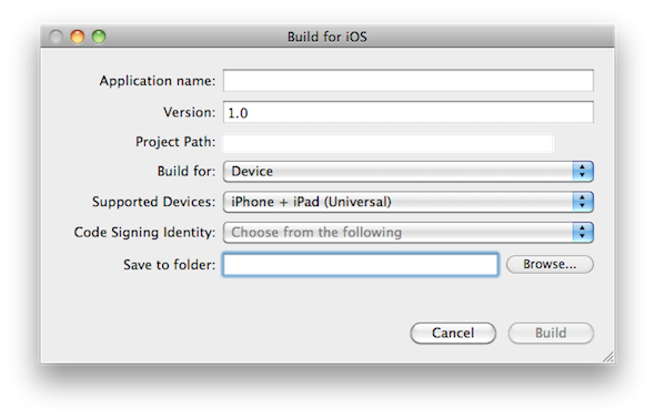
AFHTTPRequestOperation is a subclass of AFURLConnectionOperation and is aimed at handling HTTP(S) requests specifically.

Specialized Subclasses

AFJSONRequestOperation, AFXMLRequestOperation, AFPropertyListRequestOperation, and AFImageRequestOperation are subclasses of AFHTTPRequestOperation. Each of these subclasses takes care of handling a specific type of request. Even though these specialized classes work out of the box, it is easy to subclass AFHTTPRequestOperation to create a subclass that perfectly fits the needs of your application.
HTTP Client

If your application talks to a web service, then you are going to love AFHTTPClient. This class provides a convenient interface for interacting with a web service. By subclassing AFHTTPClient, you can specify default headers for each request, manage authentication, construct multipart form requests, and much more. AFHTTPClient also has the ability to monitor and respond to network changes just like Apple’s reachability class does.

UIImageView

The AFNetworking library also ships with a category on UIImageView, which I discussed a few months ago. This lightweight category makes loading images fast and easy without compromising the responsiveness of the main thread.

Background Tasks

In version 1.0, you can also mark a request operation as a background task, which means that the operation will continue to run in the background when the application is moved to the background.

ARC

Originally, AFNetworking did not support ARC out of the box. However, with the 1.0 release, AFNetworking now offers full ARC support by default.


Community

As I mentioned at the beginning of this article, the community of an open-source project is often pivotal to its success. Not only is it important to keep development active, but developers are often reluctant, and rightly so, to use libraries that aren’t backed by a healthy community for help and support. AFNetworking has an awesome community and Matt Thompson even answers questions on Stack Overflow about AFNetworking.

In addition, the documentation and Wiki of AFNetworking are a great resource to get up and running with AFNetworking. Thanks to the popularity of AFNetworking, there are also a number of excellent tutorials that will help you get up to speed quickly.


Requirements

Even though earlier versions of AFNetworking were compatible with iOS 4.3, version 1.0 requires either iOS 5.0 (or higher) or OS X 10.7 (or higher).


Conclusion

AFNetworking is not just another library with a few utility classes. It is a robust yet flexible library that has proven its value and reliability. If you are looking for a networking library for your next iOS or OS X project there are plenty of reasons to choose this gem!


Create a Lunar Lander Inspired Game – Interface Creation

$
0
0

In this tutorial series, you’ll learn how to create a Lunar Lander inspired game. The objective of the game is to grab the stars on the screen and then land safely on the indicated spot. Read on!


Step 1: Application Overview

Using pre-made graphics we will code an entertaining game using Lua and the Corona SDK API’s.

The player will be able to hit a puck by dragging the paddle on the screen. You can modify the parameters in the code to customize the game.


Step 2: Target Device

The first thing we have to do is select the platform we want to run our app within. This way we’ll be able to choose the size for the images we will use.

The iOS platform has the following characteristics:

  • iPad 1/2: 1024x768px, 132 ppi
  • iPad 3: 2048×1536, 264 ppi
  • iPhone/iPod Touch: 320x480px, 163 ppi
  • iPhone 4/iPod Touch: 960x640px, 326 ppi
  • iPhone 5/iPod Touch: 1136×640, 326 ppi

Because Android is an open platform, there are many different devices and resolutions. A few of the more common screen characteristics are:

  • Asus Nexus 7 Tablet: 800x1280px, 216 ppi
  • Motorola Droid X: 854x480px, 228 ppi
  • Samsung Galaxy SIII: 720x1280px, 306 ppi

In this tutorial, we’ll be focusing on the iOS platform with the graphic design, specifically developing for distribution to an iPhone/iPod touch, but the code presented here should apply to Android development with the Corona SDK as well.


Step 3: Interface

A simple and friendly interface will be used. It will involve multiple shapes, buttons, bitmaps and more.

The interface graphic resources necessary for this tutorial can be found in the attached download.

Freedom font (free for commercial use). Moon and Rocket Graphics from openclipart.org.


Step 4: Export Graphics

Depending on the device you have selected, you may need to export the graphics in the recommended PPI. You can do this in your favorite image editor.

I used the Adjust Size… function in the Preview app on Mac OS X.

Remember to give the images a descriptive name and to save them in your project folder.


Step 5: Sound

We’ll use Sound Effects to enhance the feeling of the game. The sounds used in this app were generated by AS3SFXR.


Step 6: App Configuration

An external file will be used to make the application go fullscreen across devices, the config.lua file. This file shows the original screen size and the method used to scale that content in case the app is run in a different screen resolution.
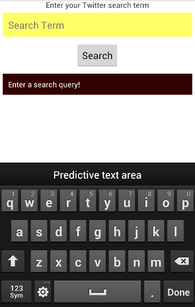
application =
{
    content =
    {
        width = 320,
        height = 480,
        scale = "letterbox"
    },
}

Step 7: Main.lua

Let’s write the application!

Open your prefered Lua editor (any Text Editor will work, but you won’t have syntax highlighting) and prepare to write your awesome app. Remember to save the file as main.lua in your project folder.


Step 8: Code Structure

We’ll structure our code as if it were a Class. If you know ActionScript or Java, you should find the structure familiar.

Necessary Classes
Variables and Constants
Declare Functions
    constructor (Main function)
    class methods (other functions)
call Main function

Step 9: Hide Status Bar

display.setStatusBar(display.HiddenStatusBar)

This code hides the status bar. The status bar is the bar on top of the device screen that shows the time, signal, and other indicators.


Step 10: Import Physics

We’ll use the Physics library to handle collisions. Use this code to import the physics library:

local physics = require('physics')
physics.start()

Step 11: Multitouch

We’ll also use the multi-touch library to handle multiple fingers on the screen. Use this code to import it:

-- Multitouch
system.activate('multitouch')

Step 12: Background

A simple graphic is used as the background for the application interface, the next line of code stores it.

-- Graphics
-- [Background]
local bg = display.newImage('bg.png')

Step 13: Title View

This is the Title View, it will be the first interactive screen to appear in our game. These variables store its components:

-- [Title View]
local titleBg
local playBtn
local creditsBtn
local titleView

Step 14: Credits View

This view will show the credits and copyright of the game, this variable will be used to store it.

-- [CreditsView]
local creditsView

Step 15: Game Pad

This image will be placed on top of our previous background. The following lines store the graphics for the on-screen pad.

-- [Game Background]
local gameBg
-- [Pad]
local up
local left
local right

Step 16: Moons

These are the moons graphics, referenced in the next variables. The bigger moon will be used as the landing spot.

-- [Moons]
local m1
local m2
local m3
local bigM

Step 17: Stars

The items to collect. Four items must be collected before landing.

-- Stars
local s1
local s2
local s3
local s4

Step 18: Rocket

This is the graphic that will be controlled by the player, using the pad on the screen.

-- Rocket (player)
local rocket

Step 19: Landing Point

The landing point indicator becomes active when the four stars are collected.


Step 20: Variables

These are the variables we’ll use. Read the comments in the code to know more about how they will fit in.

-- Variables
local arrow
local stars = 0 -- stars collected
local dir -- current direction
local hitMoon = false -- used for collision detection on update
local starHit
local hitStar = false -- used for collision detection on update
local hitGoal = false -- used for collision detection on update
local complete

Step 21: Declare Functions

Declare all functions as local at the start.

-- Functions
local Main = {}
local startButtonListeners = {}
local showCredits = {}
local hideCredits = {}
local showGameView = {}
local gameListeners = {}
local movePlayer = {}
local update = {}
local onCollision = {}

Step 22: Constructor

Next, we’ll create the function that will initialize all the game logic:

function Main()
	-- code...
end

Step 23: Add Title View

Now we place the TitleView in the stage and call a function that will add the tap listeners to the buttons.

function Main()
	titleBg = display.newImage('titleBg.png', display.contentCenterX - 100.5, 20.5)
	creditsBtn = display.newImage('creditsBtn.png', 14, display.contentHeight - 57)
	titleView = display.newGroup(titleBg, creditsBtn)
	startButtonListeners('add')
end

Next Time…

In this part of the series, you’ve learned the interface and the basic setup of the game. In the next and final part of the series, we’ll handle the game pad actions, collision detection, and the final steps to take prior to release, like app testing, creating a start screen, adding an icon and, finally, building the app. Stay tuned for the final part!


Reader’s Pulse: What Content Style Do You Prefer?

$
0
0

Do you prefer Mobiletuts+ content that can be easily finished in a single sitting, or are you more attracted to in-depth sessions that may take a weekend or more to complete? Let us know by voting in today’s poll!


Easy Core Data Fetching with Magical Record

$
0
0

Magical Record, created by Saul Mora, is an open-source library that makes working with Core Data easier and more elegant. The library was inspired by the active record pattern that is also found in Ruby on Rails. This tutorial will teach you how to use Magical Record in your own apps!

So, why Magical Record? If you’ve been developing for iOS or OS X for some time, chances are that you have had a taste of Core Data. This means that you know that it can be a bit cumbersome to set up a Core Data stack and, to be honest, working with Core Data can be a bit complex mainly due to its verbose syntax. For example, fetching data from a persistent store is quite verbose especially when compared with how a Ruby on Rails application handles this task.


Prerequisites

Even though Magical Record does make working with Core Data easier, it is key that you have a good understanding of Core Data if you decide to use it in a project. Despite its name, Magical Record doesn’t perform any magic behind the scenes that makes Core Data work differently. In other words, if you run into problems at some point, it is crucial that you understand how Core Data works internally so you can fix any problems that might pop up along the way.


Requirements

Since the introduction of Magical Record, the requirements have been increased to iOS 5.0 (or higher) or OS X 10.7 (or higher). It is also worth mentioning that Magical Record supports ARC out of the box.


Magical Notes

The best way to show you what Magical Record has to offer is to create an application that makes use of this great library. It will show you how easy it is to get started with Magical Record and by starting from scratch it will show you what is involved in creating a project with Core Data and Magical Record. The application that we are about to create is a simple note taking application in which the user can create, update, and delete notes – a good candidate for Core Data.

Since you have read this far, I assume that you are familiar with iOS development and have a basic understanding of Core Data. In this article, I will mainly focus on the Core Data aspect of the application, which means that I will not discuss every code snippet in detail.


Step 1: Project Setup

Start by creating a new project based on the Single View Application template (figure 1) and name it Magical Notes (figure 2). Set the device family to iPhone and enable ARC by checking the check box labeled Use Automatic Reference Counting. We won’t be using Storyboards or Unit Tests in this tutorial.

Magical Record and Core Data: Project Setup - Figure 1
Magical Record and Core Data: Project Configuration - Figure 2

Step 2: Add Magical Record

Since we will be using Core Data in this project, don’t forget to link your project against the Core Data framework. Since this is a more advanced tutorial, I assume that you already know how to do this.

Adding the Magical Record library to your project doesn’t require any magic. Download the latest version from GitHub, open the archive, and drag the folder named MagicalRecord into your Xcode project. Make sure to also copy the contents of the folder into your project by checking the check box labeled Copy items into destination group’s folder (if needed) and don’t forget to add the Magical Record library to the Magical Notes target (figure 3). An alternative approach to add Magical Record to your project is to use CocoaPods.

Magical Record and Core Data: Add Magical Record - Figure 3

To make use of Magical Record in your classes, we need to import one header file, CoreData+MagicalRecord.h. However, since we will be using Magical Record quite a bit in this tutorial it is much more convenient to move this import statement to your project’s Prefix.pch file instead. This will make sure that Magical Record is available in every class of your project.

By default, all Magical Record methods are prefixed with MR_. You can omit the MR_ prefix by adding one extra line to your project’s Prefix.pch file, #define MR_SHORTHAND. It is important that you add this line before importing the Magical Record header file.

//
// Prefix header for all source files of the 'Magical Notes' target in the 'Magical Notes' project
//
#import <Availability.h>
#ifndef __IPHONE_4_0
#warning "This project uses features only available in iOS SDK 4.0 and later."
#endif
#ifdef __OBJC__
    #import <UIKit/UIKit.h>
    #import <Foundation/Foundation.h>
    #define MR_SHORTHAND
    #import "CoreData+MagicalRecord.h"
#endif

Step 3: Create a Core Data Model

Before setting up the Core Data stack, we need to create a Core Data model. The Core Data model for this project is simple as it consists of only one entity named Note. The Note entity has four attributes, date, title, body, and keywords. Title, body, and keywords are of type string, whereas date is of type date.

Start by creating a new Core Data model and name it MagicalNotes (figure 4). Create the Note entity and add the four attributes as outlined above (figure 5).

Magical Record and Core Data: Create a Core Data Model - Figure 4
Magical Record and Core Data: Create a Core Data Model - Figure 5

Before we move on, we need to create a custom NSManagedObject subclass for the Note entity. This is important since Magical Record adds a number of useful class methods to the NSManagedObject class, which will make working with the Note entity much easier as you will see in a few minutes. Select the Note entity in your Core Data model, create a new file, select the Core Data tab on the left, and choose the NSManagedObject subclass option on the right (figure 6).

Magical Record and Core Data: Create a Managed Object Subclass - Figure 6

Step 4: Create the Core Data Stack

Setting up a Core Data stack is quite a bit of work if you don’t use one of the provided Xcode templates. With Magical Record, however, this is not the case. Head over to the application:didFinishLaunchingWithOptions: method of your application delegate and add the following code snippet.

[MagicalRecord setupCoreDataStack];

That’s all there is to it. By default, the name of the store that Magical Record creates for you is identical to your application’s name. However, you can customize the store’s name by invoking setupCoreDataStackWithStoreNamed: instead and passing the name of the store.

Behind the scenes, Magical Record will instantiate a managed object context on the main thread as well as a persistent store coordinator and a managed object model. How magical is that?

Logging: The ability to log Core Data messages and errors to the console is built into Magical Record. Take a look at the console after building and running your application for the first time. The logs in the console show you exactly what Magical Record is doing behind the scenes.


Step 5: Laying the Foundation

Before we can start creating new notes, we first need to some grunt work. Revisit your Application Delegate’s application:didFinishLaunchingWithOptions: method and initialize a navigation controller with the main view controller as its root view controller. Take a look at the complete implementation of application:didFinishLaunchingWithOptions:.

- (BOOL)application:(UIApplication *)application didFinishLaunchingWithOptions:(NSDictionary *)launchOptions {
    // Setup Core Data Stack
    [MagicalRecord setupCoreDataStack];
    // Initialize View Controller
    self.viewController = [[MTViewController alloc] initWithNibName:@"MTViewController" bundle:nil];
    // Initialize Navigation Controller
    UINavigationController *nc = [[UINavigationController alloc] initWithRootViewController:self.viewController];
    // Initialize Window
    self.window = [[UIWindow alloc] initWithFrame:[[UIScreen mainScreen] bounds]];
    [self.window setRootViewController:nc];
    [self.window makeKeyAndVisible];
    return YES;
}

We will display the notes in a table view so start by adding an outlet for a table view in the main view controller’s header file. Select the main view controller’s XIB file and drag a UITableView instance in the view controller’s view. Don’t forget to assign the File’s Owner as the table view’s dataSource and delegate. Also, make sure to connect the File’s Owner table view outlet with the table view we just added to its view.

#import <UIKit/UIKit.h>
@interface MTViewController : UIViewController
@property (nonatomic, weak) IBOutlet UITableView *tableView;
@end

In the main view controller’s implementation file, add a private property named notes to the class extension at the top. Make sure the property is of type NSMutableArray. The notes property will store the notes that we fetch from the data store and will serve as the table view’s data source.

#import "MTViewController.h"
@interface MTViewController ()
@property (nonatomic, strong) NSMutableArray *notes;
@end

In the view controller’s viewDidLoad method, we set the view up by calling setupView on the main view controller. This is nothing more than a helper method to keep the viewDidLoad method concise and uncluttered. In setupView, we add an edit and add button to the navigation bar and we fetch the notes from the data store by invoking the fetchNotes method.

- (void)viewDidLoad {
    [super viewDidLoad];
    // Setup View
    [self setupView];
}
- (void)setupView {
    // Create Edit Button
    UIBarButtonItem *editButton = [[UIBarButtonItem alloc] initWithTitle:@"Edit" style:UIBarButtonItemStyleBordered target:self action:@selector(editNotes:)];
    self.navigationItem.leftBarButtonItem = editButton;
    // Create Add Button
    UIBarButtonItem *addButton = [[UIBarButtonItem alloc] initWithTitle:@"Add" style:UIBarButtonItemStyleBordered target:self action:@selector(addNote:)];
    self.navigationItem.rightBarButtonItem = addButton;
    // Fetch Notes
    [self fetchNotes];
}

It might surprise you that the fetchNotes method is only one line of code. This is all thanks to Magical Record. Fetching the notes from the data store is as simple as calling findAll on the Note class. The method returns an array of records as you’d expect. Don’t forget the import the header file of the Note class at the top of the main view controller’s implementation file.

- (void)fetchNotes {
    // Fetch Notes
    self.notes = [NSMutableArray arrayWithArray:[Note findAll]];
}

Sorting records is easy and elegant. Forget sort descriptors and take a look at the updated implementation of the fetchNotes method below.

- (void)fetchNotes {
    // Fetch Notes
    self.notes = [NSMutableArray arrayWithArray:[Note findAllSortedBy:@"date" ascending:YES]];
}

The editNotes: method is straightforward. All we do is toggle the editing style of the table view. That should be sufficient for now.

- (void)editNotes:(id)sender {
    [self.tableView setEditing:![self.tableView isEditing] animated:YES];
}

The addNote: method remains blank for the time being.

- (void)addNote:(id)sender {
}

Before building and running your application, we need to implement the required methods of the table view data source protocol. If you are familiar with iOS development, this shouldn’t be too difficult. Take a look at the implementations of the various methods below for clarification.
- (NSInteger)tableView:(UITableView *)tableView numberOfRowsInSection:(NSInteger)section {
    return [self.notes count];
}
- (UITableViewCell *)tableView:(UITableView *)aTableView cellForRowAtIndexPath:(NSIndexPath *)indexPath {
    static NSString *CellIdentifier = @"Cell";
    UITableViewCell *cell = [aTableView dequeueReusableCellWithIdentifier:CellIdentifier];
    if (cell == nil) {
        cell = [[UITableViewCell alloc] initWithStyle:UITableViewCellStyleSubtitle reuseIdentifier:CellIdentifier];
        // Configure Cell
        [cell setAccessoryType:UITableViewCellAccessoryDisclosureIndicator];
    }
    // Fetch Note
    Note *note = [self.notes objectAtIndex:[indexPath row]];
    // Configure Cell
    [cell.textLabel setText:[note title]];
    [cell.detailTextLabel setText:[note keywords]];
    return cell;
}
- (BOOL)tableView:(UITableView *)tableView canEditRowAtIndexPath:(NSIndexPath *)indexPath {
    return YES;
}
- (void)tableView:(UITableView *)tableView commitEditingStyle:(UITableViewCellEditingStyle)editingStyle forRowAtIndexPath:(NSIndexPath *)indexPath {
    if (editingStyle == UITableViewCellEditingStyleDelete) {
    }
}
- (void)tableView:(UITableView *)tableView didSelectRowAtIndexPath:(NSIndexPath *)indexPath {
    [tableView deselectRowAtIndexPath:indexPath animated:YES];
}

Build and run your application.

Step 6: Creating Notes

When the user taps the add button, a modal view should appear allowing the user to add a new note to the data store. Create a new UIViewController subclass and name it MTEditNoteViewController. As the name indicates, we will also use this view controller to edit notes.
Magical Record and Core Data: Create the Edit Note View Controller - Figure 7

Before heading over to the view controller’s XIB file, add three outlets to the view controller’s header file. The first two outlets are instances of UITextField for the title and the keywords of the note. The third outlet is an instance of UITextView for the body of the note.

#import <UIKit/UIKit.h>
@interface MTEditNoteViewController : UIViewController
@property (nonatomic, weak) IBOutlet UITextField *titleField;
@property (nonatomic, weak) IBOutlet UITextField *keywordsField;
@property (nonatomic, weak) IBOutlet UITextView *bodyView;
@end

Creating the user interface of the edit note view controller shouldn’t be too much of a challenge. Add two UITextField instances and one UITextView instance to the view controller’s view. Configure the text fields as you wish, for example, by giving them a placeholder text. Don’t forget to connect the File’s Owner‘s outlets with the text fields and the text view.

Magical Record and Core Data: Create the User Interface of the Edit Note View Controller - Figure 8

Since we will be using the MTEditNoteViewController class for both adding and editing notes, it is important that we know what state (adding or editing) the view controller is in at any time. There are several ways to solve this problem. One way is to add a private note property to the view controller, which is nil if a new note is created and which is set during initialization when a note is being edited. In situations like this, I prefer to work with specialized initializers to avoid confusion and this is also what allows me to keep the note property private. In addition to the private note property, we also add a second private property named isEditing, a boolean. The reason for this will become clear in a few minutes. Also, don’t forget to import the header file of the Note class.

#import "MTEditNoteViewController.h"
#import "Note.h"
@interface MTEditNoteViewController ()
@property (nonatomic, strong) Note *note;
@property (nonatomic, assign) BOOL isEditing;
@end

Let’s go through the various methods step by step. First, we want to make sure that we can add new notes to the data store without problems. We start with the initWithNibName:bundle: method. The only change we make is setting the isEditing property to NO.

- (id)initWithNibName:(NSString *)nibNameOrNil bundle:(NSBundle *)nibBundleOrNil {
    self = [super initWithNibName:nibNameOrNil bundle:nibBundleOrNil];
    if (self) {
        // Set Flag
        self.isEditing = NO;
    }
    return self;
}

As we saw earlier, in the viewDidLoad method, we set the view up by invoking a setupView method in which we create the cancel and save buttons. Note that we only create the cancel button if the note property is equal to nil. The reason is that we present the view controller modally when adding new notes, but we push the view controller onto a navigation stack when we edit a note. If the note property is not equal to nil, we also populate the text fields and the text view with the contents of the note property.

- (void)viewDidLoad {
    [super viewDidLoad];
    // Setup View
    [self setupView];
}
- (void)setupView {
    // Create Cancel Button
    if (!self.note) {
        UIBarButtonItem *cancelButton = [[UIBarButtonItem alloc] initWithTitle:@"Cancel" style:UIBarButtonItemStyleBordered target:self action:@selector(cancel:)];
        self.navigationItem.leftBarButtonItem = cancelButton;
    }
    // Create Save Button
    UIBarButtonItem *saveButton = [[UIBarButtonItem alloc] initWithTitle:@"Save" style:UIBarButtonItemStyleBordered target:self action:@selector(save:)];
    self.navigationItem.rightBarButtonItem = saveButton;
    if (self.note) {
        // Populate Form Fields
        [self.titleField setText:[self.note title]];
        [self.keywordsField setText:[self.note keywords]];
        [self.bodyView setText:[self.note body]];
    }
}

The cancel: method shouldn’t hold any surprises.

- (void)cancel:(id)sender {
    // Dismiss View Controller
    [self dismissViewControllerAnimated:YES completion:nil];
}

The save: method is a bit more verbose, but shouldn’t be too difficult either. We first check whether the view controller’s note property is set. If it is set then we know that a note is being edited, not created. If the note property is equal to nil then we know that a new note should be created. Dismissing the view controller is a bit tricky since we need to dismiss the view controller if it is presented modally when a note was created and pop it from the navigation stack when a note was edited. That is the reason we created the isEditing property.

- (void)save:(id)sender {
    if (!self.note) {
        // Create Note
        self.note = [Note createEntity];
        // Configure Note
        [self.note setDate:[NSDate date]];
    }
    // Configure Note
    [self.note setTitle:[self.titleField text]];
    [self.note setKeywords:[self.keywordsField text]];
    [self.note setBody:[self.bodyView text]];
    // Save Managed Object Context
    NSError *error = nil;
    [[NSManagedObjectContext defaultContext] save:&error];
    if (error) {
        NSLog(@"Unable to save new note to data store.");
    }
    if (self.isEditing) {
        // Pop View Controller from Navigation Stack
        [self.navigationController popViewControllerAnimated:YES];
    } else {
        // Dismiss View Controller
        [self dismissViewControllerAnimated:YES completion:nil];
    }
}

As you can see, creating a new note is another one-liner when using Magical Record. We populate the note with the contents of the form fields and save the managed object context of the note. Retrieving a reference to the managed object context is easy with Magical Record. All we need to do is ask the NSManagedObjectContext class for the default context. Saving the context is identical to saving a context without Magical Record. Even though we log the error if something goes wrong, this isn’t really necessary since Magical Record will log any errors to the console for us.

It is now time to amend the addNote: method in the main view controller. Don’t forget to import the header file of the MTEditNoteViewController class.

- (void)addNote:(id)sender {
    // Initialize Edit Note View Controller
    MTEditNoteViewController *vc = [[MTEditNoteViewController alloc] initWithNibName:@"MTEditNoteViewController" bundle:[NSBundle mainBundle]];
    // Initialize Navigation Controller
    UINavigationController *nc = [[UINavigationController alloc] initWithRootViewController:vc];
    // Present View Controller
    [self.navigationController presentViewController:nc animated:YES completion:nil];
}

Whenever a new note is added to the data store, we should update the table view to display the changes. For a production application, a better approach would be to observe changes in the managed object context. However, in this sample application, we fetch the notes from the data store and reload the table view every time the main view (re)appears. This is expensive and therefore not recommended if you plan to submit your application to the App Store. For situations like this, a fetched results controller is a perfect solution.

- (void)viewWillAppear:(BOOL)animated {
    [super viewWillAppear:animated];
    // Fetch Notes
    [self fetchNotes];
    // Reload Table View
    [self.tableView reloadData];
}

Step 7: Updating Notes

Updating notes is almost as easy as adding notes. As I mentioned earlier, we will create a specialized initializer to set the view controller’s note property. Update the header file of the MTEditNoteViewController class by adding the new initializer as shown below. Don’t forget to also add a forward class declaration for the Note class to the header file.

#import <UIKit/UIKit.h>
@class Note;
@interface MTEditNoteViewController : UIViewController
@property (nonatomic, weak) IBOutlet UITextField *titleField;
@property (nonatomic, weak) IBOutlet UITextField *keywordsField;
@property (nonatomic, weak) IBOutlet UITextView *bodyView;
- (id)initWithNote:(Note *)note;
@end

The specialized initializer isn’t special actually. All we do is set the view controller’s note and isEditing properties as you can see below.

- (id)initWithNote:(Note *)note {
    self = [self initWithNibName:@"MTEditNoteViewController" bundle:[NSBundle mainBundle]];
    if (self) {
        // Set Note
        self.note = note;
        // Set Flag
        self.isEditing = YES;
    }
    return self;
}

Before we build and run the application one more time, we need to update the main view controller’s tableView:didSelectRowAtIndexPath: method. In this method, we fetch the correct note, initialize an instance of the MTEditNoteViewController class, and push the view controller onto the navigation stack.

- (void)tableView:(UITableView *)tableView didSelectRowAtIndexPath:(NSIndexPath *)indexPath {
    [tableView deselectRowAtIndexPath:indexPath animated:YES];
    // Fetch Note
    Note *note = [self.notes objectAtIndex:[indexPath row]];
    // Initialize Edit Note View Controller
    MTEditNoteViewController *vc = [[MTEditNoteViewController alloc] initWithNote:note];
    // Push View Controller onto Navigation Stack
    [self.navigationController pushViewController:vc animated:YES];
}

Step 8: Deleting Notes

To delete note, we need to amend the tableView:commitEditingStyle:forRowAtIndexPath: method. We fetch the note, delete it from the data source and the managed object context, and update the table view. As you can see, deleting a record or entity from the data store is as simple as sending it a message of deleteEntity.

- (void)tableView:(UITableView *)tableView commitEditingStyle:(UITableViewCellEditingStyle)editingStyle forRowAtIndexPath:(NSIndexPath *)indexPath {
    if (editingStyle == UITableViewCellEditingStyleDelete) {
        // Fetch Note
        Note *note = [self.notes objectAtIndex:[indexPath row]];
        // Delete Note from Data Source
        [self.notes removeObjectAtIndex:[indexPath row]];
        // Delete Entity
        [note deleteEntity];
        // Update Table View
        [tableView deleteRowsAtIndexPaths:[NSArray arrayWithObject:indexPath] withRowAnimation:UITableViewRowAnimationFade];
    }
}

Scratching the Surface

By building Magical Record, we have only scratched the surface. I want to stress that Magical Record is a robust, mature library and not just an amalgamation of a handful of useful categories. As I showed you, Magical Record makes working with Core Data much easier and less verbose. Common tasks are often one-liners. Compare the following code snippets to fetch all the notes and sort them by date. Using Core Data this would result in the following code snippet.

NSFetchRequest *fr = [[NSFetchRequest alloc] init];
NSEntityDescription *ed = [NSEntityDescription entityForName:@"Note" inManagedObjectContext:[NSManagedObjectContext defaultContext]];
[fr setEntity:ed];
NSSortDescriptor *sd = [NSSortDescriptor sortDescriptorWithKey:@"date" ascending:YES];
[fr setSortDescriptors:@[sd]];
NSError *error = nil;
NSArray *result = [[NSManagedObjectContext defaultContext] executeFetchRequest:fr error:&error];

Using Magical Record, however, this only requires one line of code.

NSArray *result = [Note findAllSortedBy:@"date" ascending:YES];

If we were to add the ability to search the list of notes, one approach – although not ideal – would be to search the data store for all the notes with a title or keyword that contained the query. Using Magical Record this would result in the following implementation.

NSPredicate *predicate1 = [NSPredicate predicateWithFormat:@"title contains[cd] %@", query];
NSPredicate *predicate2 = [NSPredicate predicateWithFormat:@"keywords contains[cd] %@", query];
NSPredicate *predicate = [NSCompoundPredicate orPredicateWithSubpredicates:@[predicate1, predicate2]];
NSArray *result = [Note findAllWithPredicate:predicate];

Conclusion

As I said, Magical Record has a lot more to offer than what I have showed you in this tutorial. Since version 2.0, Magical Record can deal with nested contexts and it also provides support for iCloud and threaded operations. The main goal of this tutorial is to show you that Core Data doesn’t have to be cumbersome and Saul Mora illustrates this with Magical Record.


Create a Lunar Lander Inspired Game – Adding Interaction

$
0
0

This is the second installment in our Corona SDK Lunar Lander tutorial. In today’s tutorial, we’ll add to our interface and the game interaction. Read on!


Where We Left Off. . .

Please be sure to check part 1 of the series to fully understand and prepare for this tutorial.


Step 1: Start Button Listeners

This function adds the necesary listeners to the TitleView buttons:

function startButtonListeners(action)
	if(action == 'add') then
		titleBg:addEventListener('tap', showGameView)
		creditsBtn:addEventListener('tap', showCredits)
	else
		titleBg:removeEventListener('tap', showGameView)
		creditsBtn:removeEventListener('tap', showCredits)
	end
end

Step 2: Show Credits

The credits screen is shown when the user taps the about button, a tap listener is added to the credits view to remove this.

function showCredits:tap(e)
	creditsBtn.isVisible = false
	creditsView = display.newImage('credits.png', -130, display.contentHeight-140)
	transition.to(creditsView, {time = 300, x = 65, onComplete = function() creditsView:addEventListener('tap', hideCredits) end})
end

Step 3: Hide Credits

When the credits screen is tapped, it’ll be tweened out of the stage and removed.

function hideCredits:tap(e)
	creditsBtn.isVisible = true
	transition.to(creditsView, {time = 300, y = display.contentHeight+creditsView.height, onComplete = function() creditsView:removeEventListener('tap', hideCredits) display.remove(creditsView) creditsView = nil end})
end

Step 4: Show the Game View

When the Start button is tapped, the title view is tweened and removed revealing the game view. There are many parts involved in this view, so we’ll split them in the next steps.

function showGameView:tap(e)
	transition.to(titleView, {time = 300, x = -titleView.height, onComplete = function() startButtonListeners('rmv') display.remove(titleView) titleView = nil end})

Step 5: Add Moons

This code places the moons in the stage.

-- Moons
m1 = display.newImage('moon.png', 386, 156)
m2 = display.newImage('moon.png', 252, 99)
m3 = display.newImage('moon.png', 131, 174)
m1.name = 'moon'
m2.name = 'moon'
m3.name = 'moon'

Step 6: Big Moon

A bigger moon is used as the landing spot. Use the next code to place it:

-- Big Moon
bigM = display.newImage('moonBig.png', 10, 53)
bigM.name = 'moon'

Step 7: Landing Spot

The landing spot is represented by an arrow graphic. A name property is created to help identify these elements when a collision occurs.

-- Arrow
arrow = display.newImage('arrow.png', 44, 24)
arrow.name = 'goal'

Step 8: Rocket

Next, we add the rocket. This will be our user-controlled element.

-- Rocket
rocket = display.newImage('rocket.png', 409.5, 114)

Step 9: Stars

The following code will place the stars on the screen:

-- Stars
s1 = display.newImage('star.png', 341, 146)
s2 = display.newImage('star.png', 273, 48)
s3 = display.newImage('star.png', 190, 234)
s4 = display.newImage('star.png', 37, 135)
s1.name = 'star'
s2.name = 'star'
s3.name = 'star'
s4.name = 'star'

Step 10: Controls

In order to move the Rocket in the screen we’ll need a game pad, this code will take care of that. A tap listener will be added later to each button to handle the movement.

  -- Controls
  up = display.newImage('dirBtn.png', 404, 246)
  left = display.newImage('dirBtn.png', 10, 246)
  right = display.newImage('dirBtn.png', 84, 246)
  up.name = 'up'
  left.name = 'left'
  right.name = 'right'
  up.rotation = 90
  right.rotation = 180

Step 11: Add Physics

Here we add the physics to the graphic elements.

-- Add Physics
physics.addBody(m1, 'static', {radius = 35})
physics.addBody(m2, 'static', {radius = 35})
physics.addBody(m3, 'static', {radius = 35})
physics.addBody(bigM, 'static', {radius = 40})
physics.addBody(arrow, 'static')
physics.addBody(rocket, 'dynamic')
rocket.isFixedRotation = true
rocket.isAwake = false --prevents initial explosion sound
physics.addBody(s1, 'static', {radius = 12})
physics.addBody(s2, 'static', {radius = 12})
physics.addBody(s3, 'static', {radius = 12})
physics.addBody(s4, 'static', {radius = 12})
arrow.isSensor = true
s1.isSensor = true
s2.isSensor = true
s3.isSensor = true
s4.isSensor = true

Step 12: Game Listeners

This function adds the necessary listeners to start the game logic.

function gameListeners()
	up:addEventListener('touch', movePlayer)
	left:addEventListener('touch', movePlayer)
	right:addEventListener('touch', movePlayer)
	Runtime:addEventListener('enterFrame', update)
	rocket:addEventListener('collision', onCollision)
end

Step 13: Move Player Function

The direction variable is changed by this function, this will make the rocket go in the pressed direction.

function movePlayer(e)
	if(e.phase == 'began' and e.target.name == 'up') then
		dir = 'up'
	elseif(e.phase == 'ended' and e.target.name == 'up') then
		dir = 'none'
	elseif(e.phase == 'began' and e.target.name == 'left') then
		dir = 'left'
	elseif(e.phase == 'began' and e.target.name == 'right') then
		dir = 'right'
	elseif(e.phase == 'ended' and e.target.name == 'left') then
		dir = 'none'
	elseif(e.phase == 'ended' and e.target.name == 'right') then
		dir = 'none'
	end
end

Step 14: Rocket Movement

These lines move the rocket according to the direction stablished by the movePlayer function created in step 13.

function update(e)
	-- Rocket Movement
	if(dir == 'up') then
		rocket:setLinearVelocity(0, -80)
	elseif(dir == 'left') then
			rocket:setLinearVelocity(-100, 0)
	elseif(dir == 'right') then
			rocket:setLinearVelocity(100, 0)
	end

Step 15: Rocket-Moon Collision

The next code listens for a variable set to true when a collision occurs between the rocket and a moon, the variable value is changed by the onCollision function that will be created later.

When true, the rocket will be placed at its original position and put into an sleep state to prevent a collision with the moon under it.

-- Rocket-Moon Collision
if(hitMoon) then
	rocket.x = 421.5
	rocket.y = 134
	hitMoon = false
	rocket.isAwake = false
end

Step 16: Rocket-Star Collision

A similar method is used in the rocket-star collision detection.

-- Rocket-Star Collision
if(hitStar) then
	display.remove(starHit)
	stars = stars + 1
	hitStar = false
end

Step 17: Landing Point Collision

The level will be complete when the player has collected the four stars and lands on the bigger moon. The following code handles that.

-- Goal
if(hitGoal and stars == 4) then
	rocket.x = 52
	rocket.y = 35
	physics.stop()
	display.remove(arrow)
	audio.play(goal)
	hitGoal = false
	complete = display.newImage('complete.png')
elseif(hitGoal and stars ~= 4) then
	hitGoal = false
end

Step 18: Collision Function

This function runs when the rocket collides with another body. The name of the body is then checked to perform the right action. Basically, a sound is played and a variable is set to true (for the update function to see) according to the other body name.

function onCollision(e)
	if(e.other.name == 'moon') then
		hitMoon = true
		audio.play(explo)
	elseif(e.other.name == 'star') then
		audio.play(star)
		starHit = e.other
		hitStar = true
	elseif(e.other.name == 'goal') then
		hitGoal = true
	end
end

Step 19: Call Main Function

In order to start the game, the Main function needs to be called. With the above code in place, we’ll do that here:

Main()

Step 20: Loading Screen

The Default.png file is an image that will be displayed right when you start the application while the iOS loads the basic data to show the Main Screen. Add this image to your project source folder, it will be automatically added by the Corona compliler.


Step 21: Icon

Using the graphics you created before you can now create a nice and good looking icon. The icon size for the non-retina iPhone icon is 57x57px, but the retina version is 114x114px and the iTunes store requires a 512x512px version. I suggest creating the 512×512 version first and then scaling down for the other sizes.

It doesn’t need to have the rounded corners or the transparent glare, iTunes and the iPhone will do that for you.


Step 22: Testing in Simulator

It’s time to do the final test. Open the Corona Simulator, browse to your project folder, and then click open. If everything works as expected, you are ready for the final step!


Step 23: Build

In the Corona Simulator go to File > Build and select your target device. Fill the required data and click build. Wait a few seconds and your app will be ready for device testing and/or submission for distribution!


Conclusion

Experiment with the final result and try to make your custom version of the game!

I hope you liked this tutorial series and find it helpful. Thank you for reading!


Build a Twitter Search App: Project Setup

$
0
0

This two-part tutorial series will introduce you to the fundamentals of working with RESTful web services using the Android SDK. Along the way, you’ll learn how to perform searches against the public Twitter API!

It goes without saying that Internet access is one of the main assets you can exploit in Android devices. Many popular sites and social networks use Web services to provide access to their data, often using architectural models such as REST (Representational State Transfer). Twitter is one such service, with various APIs for accessing tweets and timelines. In this two-part series we will use the Twitter Search API to fetch recent tweets on a search term chosen by the user.

In this first part we will capture the user input and build the URL to use in an HTTP request to the Twitter search URL for tweets on the input term. In the second part we will retrieve the results, which will be formatted in JSON. We will parse the returned JSON tweet feed and display it within a simple visual interface.

This tutorial series on Android Twitter Search is in two parts:

  • Build Request on User Search Term
  • Fetch and Parse JSON Tweet Feed

Step 1: Create a New Project and Layout

Create a new Project in Eclipse: choose File > New > Project, and then select Android Application Project and click Next. Enter your chosen application, project and package names. You can leave the default minimum and target API levels selected. Select your chosen configuration options. In the Create Activity screen, select Blank Activity. In the next screen, enter “TwitterSearchActivity” as the Activity name and let Eclipse generate the layout file for you (“activity_twitter_search” by default).

New Android Activity

On clicking Finish, Eclipse should open your new layout file.

Open the Manifest file for your new project and select the “AndroidManifest.xml” tab to edit the code. Add the following element anywhere inside the Manifest element but outside all other elements:

<uses-permission android:name="android.permission.INTERNET"/>

This is necessary for any app accessing Internet resources.


Step 2: Build the User Interface

Let’s now build the user interface elements. Open your main Activity layout file again and select the XML tab to edit the code directly. Depending on your Eclipse setup, you should have something like the following outline:

<RelativeLayout xmlns:android="http://schemas.android.com/apk/res/android"
	xmlns:tools="http://schemas.android.com/tools"
	android:layout_width="match_parent"
	android:layout_height="match_parent"
	tools:context=".TwitterSearchActivity" ><TextView
		android:layout_width="wrap_content"
		android:layout_height="wrap_content"
		android:layout_centerHorizontal="true"
		android:layout_centerVertical="true"
		android:text="@string/hello_world"
/></RelativeLayout>

If you have something different in your layout file, replace it with this code to begin with.

We can leave the Relative Layout the way it is, but replace the existing Text View with another slightly different one:

<TextView
	android:id="@+id/intro_txt"
	android:layout_width="wrap_content"
	android:layout_height="wrap_content"
	android:layout_centerHorizontal="true"
	android:textStyle="italic"
	android:text="@string/intro"
/>

The ID is for laying out other items relative to this one. The other properties are for simple styling and positioning. Open your “res/values/strings.xml” file and add the string we’ve referred to above:

<string name="intro">Enter your Twitter search term</string>

This is just some informative text. Back in your layout file, after the Text View, add an Edit Text to capture the user search term:

<EditText
        android:id="@+id/search_edit"
        android:layout_width="fill_parent"
        android:layout_height="wrap_content"
        android:inputType="text"
        android:hint="@string/hint"
        android:layout_below="@+id/intro_txt"
        android:padding="10dp"
        android:background="#ffff66"
        android:layout_margin="5dp"
/>

We position the element relative to the Text View we already added. Most of the other attributes are for styling; feel free to amend them as you wish. Add the string mentioned as a hint to your “strings.xml” file:

<string name="hint">Search Term</string>

After the Edit Text, add a button for the user to execute their search:

<Button
	android:id="@+id/search_btn"
	android:layout_height="wrap_content"
	android:layout_width="wrap_content"
	android:layout_centerHorizontal="true"
	android:text="@string/search_label"
	android:layout_below="@+id/search_edit"
	android:onClick="searchTwitter"
	android:layout_margin="5dp"
/>

Here we apply relative positioning and styling attributes again. We also specify a method to execute when the user clicks the button using the onClick attribute – we will add this method to the Activity class later. Add the specified string to your values file:

<string name="search_label">Search</string>

Next we will create the area in which retrieved tweets will be displayed. We do not know how long this section will be when it is displayed on-screen, so let’s add a Scroll View so that users will be able to access all of it – after the Button:

<ScrollView
	xmlns:android="http://schemas.android.com/apk/res/android"
	android:layout_width="fill_parent"
	android:layout_height="fill_parent"
	android:layout_below="@+id/search_btn"></ScrollView>

Inside the Scroll View, add a final Text View:

<TextView
	android:id="@+id/tweet_txt"
	android:layout_width="fill_parent"
	android:layout_height="wrap_content"
	android:layout_gravity="top|center"
	android:padding="10dp"
	android:background="#330000"
	android:textColor="#ffffff"
	android:layout_margin="5dp"
	android:text="@string/placeholder"
	android:freezesText="true"
/>

We will use the ID attribute to identify this Text View in Java when we display the retrieved tweets. Aside from layout properties, we also specify that the text should freeze, so that Android does not discard it on orientation changes. Add the final string to your strings values file:

<string name="placeholder">---</string>

That’s our layout complete. You can of course modify the layout if you like, in these tutorials we are focusing on the practice of fetching the tweet feed over the Web. This is how the app will appear when you run it later:

Activity Layout

Step 3: Prepare the Activity Class

Open your main Activity class. The opening line of your class declaration should appear as follows:

public class TwitterSearchActivity extends Activity {

Eclipse should also have added a default onCreate method and optionally also an options menu method. Your onCreate method should set the main layout file we worked on as follows:

setContentView(R.layout.activity_twitter_search);

If any of the items mentioned are not present in your class file as created by Eclipse, please refer to the download folder attached to this tutorial.

Add the following import statements to your class, replacing any that Eclipse has already filled in:

import java.io.BufferedReader;
import java.io.InputStream;
import java.io.InputStreamReader;
import java.net.URLEncoder;
import org.apache.http.HttpEntity;
import org.apache.http.HttpResponse;
import org.apache.http.StatusLine;
import org.apache.http.client.HttpClient;
import org.apache.http.client.methods.HttpGet;
import org.apache.http.impl.client.DefaultHttpClient;
import org.json.JSONArray;
import org.json.JSONObject;
import android.os.AsyncTask;
import android.os.Bundle;
import android.app.Activity;
import android.view.Menu;
import android.view.View;
import android.widget.EditText;
import android.widget.TextView;

As you can see, we have imports for HTTP request and response handling, for processing incoming data, for parsing JSON data and for general Android components.

Inside your class declaration, add an instance variable to keep track of the Text View we created for displaying the fetched tweets:

private TextView tweetDisplay;

Inside your onCreate method, after the existing code, retrieve a reference to the Text View, storing it in the variable:

tweetDisplay = (TextView)findViewById(R.id.tweet_txt);

Now we can refer to this user interface item throughout the class. We will do so when displaying the fetched tweet feed and also when displaying error messages for the user if something goes wrong.


Step 4: Provide the Click Method

Remember that in the layout file, we added an onClick attribute to the Button, specifying a method named “searchTwitter” – let’s implement that method now. Add it to your class after the existing methods:

public void searchTwitter(View view){
}

Because we listed it as an onClick attribute, the method will receive a reference to the View that was clicked. We do not actually need the Button that was clicked, what we want is the Edit Text View. Let’s retrieve the text entered by the user, storing it as a string:

EditText searchTxt = (EditText)findViewById(R.id.search_edit);
String searchTerm = searchTxt.getText().toString();

We use the ID we gave the Edit Text in the layout file to identify it. Now, before we proceed, let’s check that the user has entered a search term to prevent any unnecessary processing:

if(searchTerm.length()>0){
}
else
	tweetDisplay.setText("Enter a search query!");

If the user has not entered anything, we simply output a message in the tweet feed Text View we have a reference to throughout the class.

Error Message

Step 5: Prepare and Encode the URL

The processing we are going to add next can throw Exceptions, so add try and catch blocks inside the if statement in the “searchTwitter” method:

try{
}
catch(Exception e){
	tweetDisplay.setText("Whoops - something went wrong!");
	e.printStackTrace();
}

If an Exception is thrown we simply write out an error message as we did when the user did not enter a search term.

To use the Twitter Search API, you append your search term to a base URL for the service. In case the user enters characters such as spaces, we will encode their text. Inside the try block, add the following:

String encodedSearch = URLEncoder.encode(searchTerm, "UTF-8");

Now let’s build the Twitter Search API URL. This is the general format:

http://search.twitter.com/search.json?q=query

The text “query” should be replaced by the text you are searching for. To build the user text into this URL, add the following:

String searchURL = "http://search.twitter.com/search.json?q="+encodedSearch;

You can try fetching the JSON tweet feed in your Web browser by pasting the URL into your address bar and using any search term you want on the end, for example:

http://search.twitter.com/search.json?q=android

Your browser should display the JSON results, which are not easy to read but should give you an idea of what your application will receive on executing the query.


Conclusion

We are now ready to execute our Twitter search. In the next tutorial, we will create an AsyncTask class inside the main Activity class. This class will handle fetching the tweet feed using HTTP request and response objects in a background thread, then displaying the results within the UI. We will use the Java JSON processing libraries to parse the tweet feed and present it within the layout we created above.


Updating iOS Applications with GroundControl

$
0
0

Submitting an update to the App Store is unavoidable if you want to add major enhancements to an application. However, it is cumbersome and time-consuming to go through the App Store review process for simple modifications. In this article, I will show you how to update an application remotely using the GroundControl project.


Introduction

The idea behind GroundControl is simple, the application fetches a remote property list and updates its NSUserDefaults with the contents of the property list. Even though many applications download data from a dedicated backend to dynamically update their contents, the strategy that I will lay out in this article is ideal if a dedicated backend isn’t an option or exceeds your application’s requirements.

The setup discussed in this tutorial is lightweight and inexpensive. Not only is it inexpensive, it is also easy to maintain, which is a factor often overlooked by both clients and developers.

It is important to emphasize that property lists are ideal for small chunks of data and shouldn’t be used as a replacement for a dedicated backend. If an application needs to be updated on a daily basis with new content then the strategy dicussed in this tutorial won’t cut it.

To illustrate how all the different pieces fit together, we will build an iOS application appropriately named Remote Control. Even though the application itself won’t do much, by integrating GroundControl to update the application’s NSUserDefaults it will become clear how easy it is to remotely update an application with very little overhead. Let’s get started.


Step 1: Project Setup

Create a new project in Xcode by selecting the Single View Application template from the list of templates (figure 1). Name your application Remote Control, enter a company identifier, set iPhone for the device family, and check Use Automatic Reference Counting. Make sure to uncheck the remaining checkboxes for this project. Tell Xcode where you want to save your project and hit the Create button (figure 2).

Update Your Applications with Dropbox or GroundControl: Project Setup - Figure 1
Update Your Applications with Dropbox or GroundControl: Project Setup - Figure 2

Step 2: GroundControl

The name Mattt Thompson might sound familiar to you. He is one of the creators and the driving force behind AFNetworking, the most popular networking library for iOS and OS X. GroundControl is built on top of AFNetworking and provides an easy solution to remotely configure an application by updating the application’s NSUserDefaults. It does this through a category on NSUserDefaults, which allows NSUserDefaults to update itself asynchronously with a remote property list.

It doesn’t matter where the property list is located as long as it can be reached through the HTTP(S) protocol and the content type of the response is set to application/x-plist.

On the GitHub page of GroundControl, Mattt provides two examples of how to implement the server side of the story, one Ruby implementation and one Python implementation. However, I promised you that the setup would be lightweight and inexpensive. Instead of using a server that you need to maintain, we will be using Amazon’s Simple Storage Service or S3. As I explained earlier, the requirements are simple, that is, (1) the file needs to be a property list and (2) the content type of the response needs to be application/x-plist. Amazon’s S3 is a perfect fit.

Not only is AWS S3 perfectly suited for serving up static files, it has earned its stripes over the years. Even if your application reaches the top 10 in the App Store, S3 will keep serving up the property list this without problems. Before heading over to the AWS (Amazon Web Services) Console, your first need to integrate GroundControl into your project.


Step 3: Adding AFNetworking and GroundControl

GroundControl is built on top of AFNetworking, which means that you need to add AFNetworking to your Xcode project. Even though we could add AFNetworking and GroundControl using CocoaPods, we will add both libraries manually since some of you may not be familiar with CocoaPods. Download the latest version of AFNetworking and GroundControl and drag each library into your Xcode project. Make sure to copy the contents of the folder into your project by checking the checkbox labeled Copy items into destination group’s folder (if needed) and don’t forget to add both libraries to the Remote Control target (figures 3 and 4).

Update Your Applications with Dropbox or GroundControl: Adding AFNetworking and GroundControl - Figure 3
Update Your Applications with Dropbox or GroundControl: Adding AFNetworking and GroundControl - Figure 4

AFNetworking relies on the System Configuration and Mobile Core Services frameworks for some of its functionality. It is therefore necessary to link your project against those frameworks. Select your project in the Project Navigator and select the Remote Control target from the list of targets. Choose Build Phases at the top, open the Link Binary With Libraries drawer, and add both frameworks to your project (figure 5).

Update Your Applications with Dropbox or GroundControl: Adding the Necessary Frameworks - Figure 5

Before we can start working with AFNetworking and GroundControl, we need to update the project’s Prefix.pch file by adding an import statement for the frameworks we just added to the project. Take a look at the snippet below for clarification.

//
// Prefix header for all source files of the 'Remote Control' target in the 'Remote Control' project
//
#import <Availability.h>
#ifndef __IPHONE_4_0
#warning "This project uses features only available in iOS SDK 4.0 and later."
#endif
#ifdef __OBJC__
    #import <UIKit/UIKit.h>
    #import <Foundation/Foundation.h>
    #import <MobileCoreServices/MobileCoreServices.h>
    #import <SystemConfiguration/SystemConfiguration.h>
#endif

Step 4: Integrating GroundControl

We start by adding two import statements to the application delegate’s implementation file, one for AFNetworking and another for GroundControl. If you end up using AFNetworking in various places in your project then it might be a good idea to add the import statement for AFNetworking to your project’s Prefix.pch file.

#import "AFNetworking.h"
#import "NSUserDefaults+GroundControl.h"

Integrating GroundControl is the easy part as it only requires two lines of code. In the application delegate’s applicationDidBecomeActive: method, we call a helper method to initialize GroundControl.

- (void)applicationDidBecomeActive:(UIApplication *)application {
    // Initialize GroundControl
    [self initializeGroundControl];
}

The helper method couldn’t be easier thanks to the category on NSUserDefaults provided by GroundControl. We create the URL for the property list and pass it as an argument in registerDefaultsWithURL:. This will ensure that the property list is downloaded asynchronously. Once downloaded, NSUserDefaults is automatically updated with the contents of the property list.

- (void)initializeGroundControl {
    NSURL *url = [NSURL URLWithString:@"https://www.example.com/RemoteControl.plist"];
    [[NSUserDefaults standardUserDefaults] registerDefaultsWithURL:url];
}

Another option is to call registerDefaultsWithURL:success:failure: instead if you prefer to work with success and failure callbacks. For even more control, GroundControl provides a third method, registerDefaultsWithURLRequest:success:failure:. This method accepts an instance of NSURLRequest as well as a success and failure block.

It might surprise you, but integrating GroundControl was the difficult part. The final two steps are (1) creating the property list and (2) uploading it to Amazon’s S3.


Step 5: Create a Property List

Create a new file in Xcode by selecting the Resource tab on the left and choosing Property List on the right (figure 6). Name the file RemoteControl and save it to your computer’s desktop. It is not necessary to add it to your Xcode project. The easiest way to edit the property list is in Xcode. Take a look at the screenshot below to see how the property list looks like and can be edited in Xcode (figure 7). Keep in mind that a property list can only contain booleans, dates, numbers, binary data, strings, arrays, and dictionaries. It is good practice to namespace the keys (for example, with the project’s class prefix) to make sure they don’t conflict with any other entries stored in NSUserDefaults.

Update Your Applications with Dropbox or GroundControl: Create a Property List - Figure 6
Update Your Applications with Dropbox or GroundControl: Create a Property List - Figure 7

Step 6: Upload the Property List

To use Amazon’s Web Services, you need an Amazon account. The costs associated with Amazon’s S3 are extremely low and chances are that you won’t even be charged for quite some time since the property list is only a few kilobytes in size.

You can upload the property list to Amazon S3 using Amazon’s AWS Console or by using an application that supports Amazon’s S3, such as Panic’s fantastic Transmit.

After uploading the property list, there are three things left to do, (1) copying the URL of the property list, (2) granting public access to the property list, and (3) setting the correct content type.

Copy the URL

In the AWS Console, select the property list and click the Properties button in the top right. Select the tab named Details in the properties panel (figure 8). Copy the link of the property list and update the initializeGroundControl method in the application delegate with the correct URL.

Update Your Applications with Dropbox or GroundControl: Copy the URL in the AWS Console - Figure 8

Grant Public Access

Select the tab named Permissions in the properties panel and add a new set of permissions to the property list by clicking the Add more permissions button. Set the grantee to Everyone and limit the permissions to Open/Download. This will make sure that your application can download the property list. Don’t forget to click the save button to propagate the changes.

Update Your Applications with Dropbox or GroundControl: Granting Public Access to the Property List - Figure 9

Set Content Type

Select the tab named Metadata in the properties panel and set the value of the key Content-Type to application/x-plist. Don’t forget to click the save button to propagate the changes.

Update Your Applications with Dropbox or GroundControl: Set the Content Type of the Response - Figure 10

Step 7: Build and Run

Your application is now ready to be updated remotely. How your application responds to the changes made by the property list depends on your application. This article only shows you how easy it is to remotely update an application without having to submit a new version to the App Store.

You can test if everything works by slightly modifying the initializeGroundControl method. Instead of invoking registerDefaultsWithURL:, we use registerDefaultsWithURL:success:failure: provided by GroundControl. If you have implemented GroundControl correctly, the dictionary of the success block should contain the data of the property list. Your application’s NSUserDefaults will be updated automatically.

- (void)initializeGroundControl {
    NSURL *url = [NSURL URLWithString:@"https://s3.amazonaws.com/com.mobiletuts.bartjacobs/RemoteControl.plist"];
    [[NSUserDefaults standardUserDefaults] registerDefaultsWithURL:url success:^(NSDictionary *defaults) {
        NSLog(@"Defaults > %@", defaults);
    } failure:^(NSError *error) {
        NSLog(@"Error > %@ with user info %@.", error, [error userInfo]);
    }];
}

Dropbox

The immense success and fast adoption rate of Dropbox has resulted in the emergence of numerous clever and useful applications. For people not familiar with AWS and Xcode, it might be easier to work with Dropbox. Even though Dropbox is a great solution and provides the option to make a file publicly accessible by placing it in the public Dropbox folder, Dropbox cannot be used with the current version of GroundControl. The reason is that the content type of a property list served by Dropbox is automatically set to text/plain instead of the required application/x-plist. AFNetworking throws an error due to the fact that the required content type does not match application/x-plist.

However, it is possible to use Dropbox to remotely update an application. The caveat is that you will need to do some of the heavy lifting yourself, that is, asynchronously downloading the property list and updating the application’s NSUserDefaults.

Despite the usefulness of the public Dropbox folder, its future is uncertain. It is also unclear if there is a bandwith limit imposed on files in the public Dropbox folder. In other words, if you wish to use Dropbox for remotely updating an iOS or OS X application, keep in mind that it might break at some point or that your Dropbox account might get suspended due to exceeding certain limitations.


Conclusion

It isn’t always necesarry to build a custom backend for an iOS or OS X application if all you need to do is update a handful of settings from time to time. The strategies discussed in this article demonstrate how to remotely update an application with a simple property list.

Of course, there are several other possibilities to remotely update an application. For example, it is possible to use a service like Parse. However, I find that even Parse is “too much” if all you want to do is update a handful of settings.


Build a Twitter Search App: Fetch & Parse the Twitter JSON Feed

$
0
0

This two-part tutorial series will introduce you to the fundamentals of working with RESTful web services using the Android SDK. Along the way, you’ll learn how to perform searches against the public Twitter API!

In this tutorial we will use AsyncTask to fetch the JSON tweets, parse them, then display them within the user interface. Although the code in this tutorial is specific to Twitter, the principles involved apply to fetching many other Web feeds and APIs using a RESTful architecture.

This tutorial series on Android Twitter Search is in two parts:


Step 1: Create an Inner AsyncTask Class

We are going to use an AsyncTask to carry out the fetching, parsing and displaying of the tweet feed on the user search query. By using AsyncTask, we can shift processing into a background thread, with the results still accessible to the app’s UI for display. In your Activity class, add an inner AsyncTask class after the searchTwitter method:

private class GetTweets extends AsyncTask<String, Void, String> {
}

The AsyncTask class is abstract, which means you have to create a subclass in order to use it. Such subclasses must implement one particular method which we will add next. In the meantime, Eclipse will display error messages (just ignore them for now).

The AsyncTask uses three generic types as you can see from the opening line of the class declaration. The first one specifies parameter type – in our case this is a string as we are going to pass the URL string we created. The middle type is for progress units, which we will not be using in this tutorial so we simply specify void. Progress units can be used to indicate the progress of background tasks. The third type is another string, which the background process returns. In our case this is going to be the retrieved JSON feed text.


Step 2: Perform Background Processing

Inside your AsyncTask class, add the following method, which we override from the parent class:

@Override
protected String doInBackground(String... twitterURL) {
}

The parameter type is string, matching the first type we indicated in the class declaration opening line. This string is going to be the Twitter Search API URL we built last time. Inside this method, we specify what background process we want the AsyncTask to carry out. The method also returns a value of type string, to match what we specified as the third parameter in the class declaration opening line. This returned string will be received as parameter to a second method, which we will implement later.

Tip: If you are unfamiliar with abstract classes or generic types, don’t worry – what we are doing here is really just following a pattern. As with much of the Android platform, you can learn how to use these resources from the examples in the Developer Guide and, in this case, the API Reference.


Step 3: Send the Request

The Twitter search result is going to be a string, which we will build from the response we receive. Inside the doInBackground method, start by creating a String Builder:

StringBuilder tweetFeedBuilder = new StringBuilder();

Although we are using a single URL string, the method is going to receive an array of objects of the type specified (string), so let’s loop through it:

for (String searchURL : twitterURL) {
}

In reality, the loop will only iterate once, but you could extend your code to fetch multiple search feeds, so we will use a loop for now. Inside the loop, create an HTTP Client for executing the request:

HttpClient tweetClient = new DefaultHttpClient();

Now we need to catch I/O exceptions, as is invariably the case when you attempt to fetch data from anywhere outside your application. Add try and catch blocks:

try {
}
catch(Exception e) {
	tweetDisplay.setText("Whoops - something went wrong!");
	e.printStackTrace();
}

If there is an Input/Output error, we simply write a message to the user interface. Inside the try block, create an HTTP Get object to issue the request, passing the search URL:

HttpGet tweetGet = new HttpGet(searchURL);

Now we can go ahead and execute the request, storing the results in an HTTP Response object:

HttpResponse tweetResponse = tweetClient.execute(tweetGet);

We will be able to use the response object to access the content and status of the response message received from Twitter.


Step 4: Process the Response

Before we attempt to process the response message, let’s check the status. Still inside the try block:

StatusLine searchStatus = tweetResponse.getStatusLine();

If the response is OK we can carry on and attempt to parse the tweets, otherwise we will output an error message to the user:

if (searchStatus.getStatusCode() == 200) {
}
else
	tweetDisplay.setText("Whoops - something went wrong!");

Inside the if statement block, we can now retrieve the HTTP Entity and message content as an Input Stream:

HttpEntity tweetEntity = tweetResponse.getEntity();
InputStream tweetContent = tweetEntity.getContent();

Now we can begin bringing the message content into the program, using an Input Stream Reader rather than a Buffered Reader for managing the incoming data:

InputStreamReader tweetInput = new InputStreamReader(tweetContent);
BufferedReader tweetReader = new BufferedReader(tweetInput);

Let’s read in the data a line at a time, appending each line to the String Builder we created:

String lineIn;
while ((lineIn = tweetReader.readLine()) != null) {
	tweetFeedBuilder.append(lineIn);
}

This will keep adding to the String Builder until all of the received data has been processed. Now move to the bottom of the doInBackground method, after the catch block – return the string we’ve built the results into:

return tweetFeedBuilder.toString();

That’s the doInBackground method complete – it carries out the fetching of the tweet feed and importing it into the app, so now we can parse and display it.


Step 5: Parse the JSON Tweet Feed

Now that the AsyncTask has retrieved the tweet feed, we can parse it and display it in our application UI. To do this we can implement another method of the AsyncTask class, added after doInBackground, still inside the AsyncTask class declaration:

protected void onPostExecute(String result) {
}

Notice that this method receives a string parameter, which is what we specified as the third type in the opening class declaration line and what we returned from doInBackground in the last step. The string is the JSON text representing the recent tweets on the user search term retrieved from Twitter. We will need to parse this text to access the content of the tweets and display them in the UI.

We will be building the tweet text into a string for display, so start the onPostExecute method by creating another String Builder:

StringBuilder tweetResultBuilder = new StringBuilder();

The JSON processing methods can throw exceptions, so add try and catch blocks next:

try {
}
catch (Exception e) {
	tweetDisplay.setText("Whoops - something went wrong!");
	e.printStackTrace();
}

You should be noticing a pattern here – as with any program in which you attempt to retrieve and process external data, you must pay careful attention to handling potential errors.

Inside the try block, create a JSON Object, passing the JSON text string:

JSONObject resultObject = new JSONObject(result);

Inside the JSON text string is an array containing the tweets, plus some other data – carry out a Twitter query by pasting the search URL into your browser address bar as we did last time, for example:

http://search.twitter.com/search.json?q=android

You may need to copy and paste the resulting text into a text editor to read it effectively. If you look through the JSON text, you will see the following section, which marks the beginning of the tweet array:

"results":[

We need to retrieve this tweet array, using its name: “results”. Get the “results” array from the JSON Object:

JSONArray tweetArray = resultObject.getJSONArray("results");

Now we can loop through the tweets and prepare them for display.


Step 6: Iterate the Tweet Array

If you look again at the JSON text retrieved through the browser (or, optionally, within Eclipse if you write it to the Android Log while running your app), you can see the content returned for each tweet in the array. In this tutorial we will only write out the username of the account tweeting and the content of the tweet itself. You can extend the app to include any of the information you want. In the text returned from Twitter, the username is represented as “from_user” and the tweet content is named “text” – look at the JSON content to verify this and to see what other data items are in there.

In your try block, after fetching the tweet array, add a for loop to iterate through the tweets:

for (int t=0; t<tweetArray.length(); t++) {
}

Inside the loop, get each item as a JSON Object:

JSONObject tweetObject = tweetArray.getJSONObject(t);

Now retrieve the username from this object, appending it to the String Builder along with some additional text for display purposes:

tweetResultBuilder.append(tweetObject.getString("from_user")+": ");

The JSON Object class provides a getString method for this purpose; there is also an alternative get method. Now retrieve and append the tweet content:

tweetResultBuilder.append(tweetObject.get("text")+"\n\n");

Step 7: Display the Results

Now move to after the catch block inside the onPostExecute method. If the processing has worked, we display the result in the Text View, otherwise we display an error message:

if(tweetResultBuilder.length()>0)
	tweetDisplay.setText(tweetResultBuilder.toString());
else
	tweetDisplay.setText("Sorry - no tweets found for your search!");

Our AsyncTask class is now complete.


Step 8: Instantiate & Execute the AsyncTask

We have an AsyncTask to carry out our processing; we just need to call on it. Move back to your searchTwitter method, inside the try block and after we built the search query URL string. Create an instance of the new AsyncTask class and call the execute method on it, passing the URL string:

new GetTweets().execute(searchURL);

Notice that we pass a string, which is what we specified in the AsyncTask declaration and doInBackground method.

That is the basic app complete – you can test it in the emulator and on Android devices. Try it with different search queries such as hashtags. You can of course extend the app to display more information from the tweets and even to link to Twitter on user clicks. As things stand, the user can scroll through the returned tweet feed and carry out repeated searches as they wish.

Running the App

Conclusion

In these two tutorials we have explored fetching tweets from the Twitter Search API. You can use the same design patterns to fetch data from other Web resources. If your apps are going to involve more complex, ongoing data retrieval processes, you may wish to look into Content Providers and optionally Services to maximize on efficiency. As with any external data-based operations, you cannot assume that retrieving the information you need will be successful, so a level of error handling is essential. The ability to access Internet data is of course one of the key benefits to mobile computing, so these techniques are a vital component in any Android developer’s toolbox.


Viewing all 1836 articles
Browse latest View live